Web/Portfolio Update – Part 2: Performance

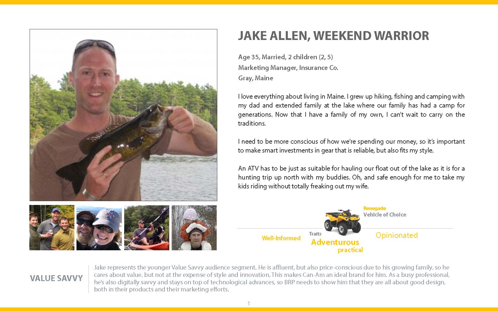
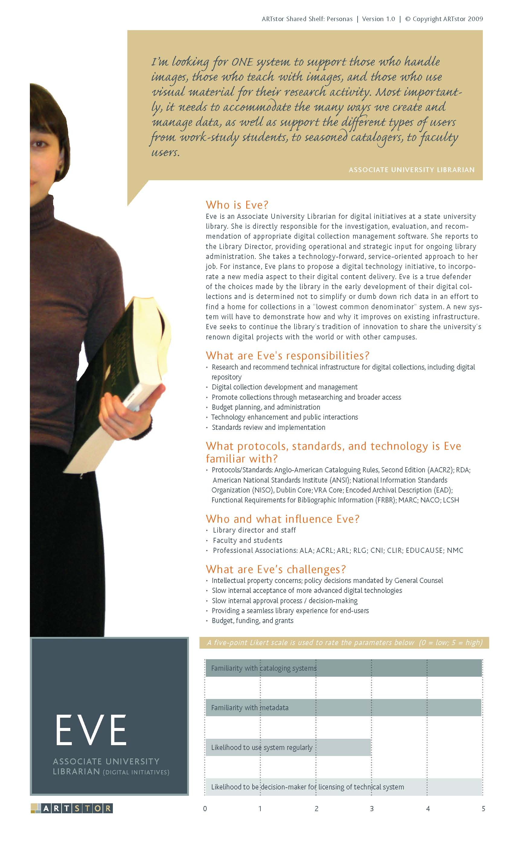
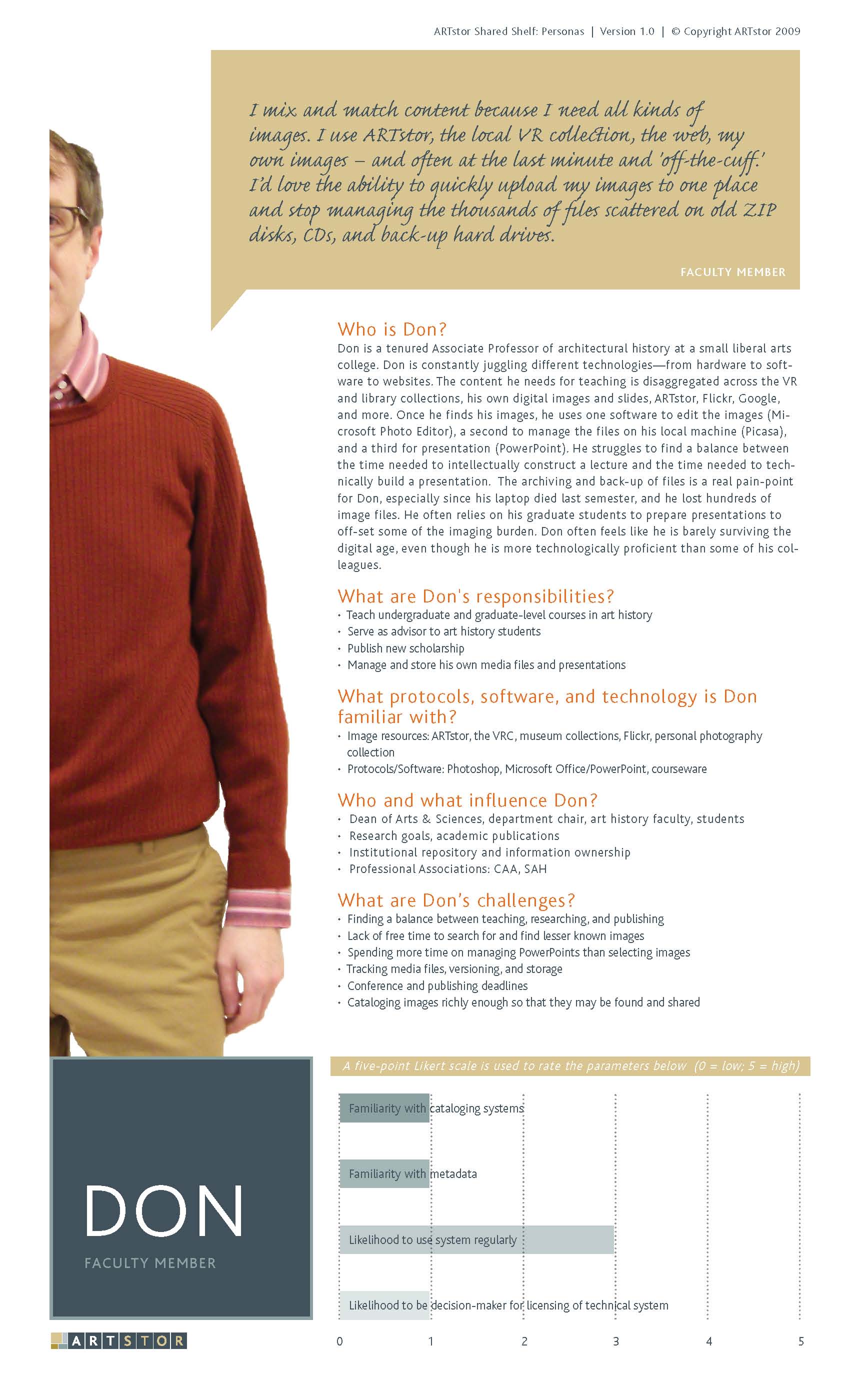
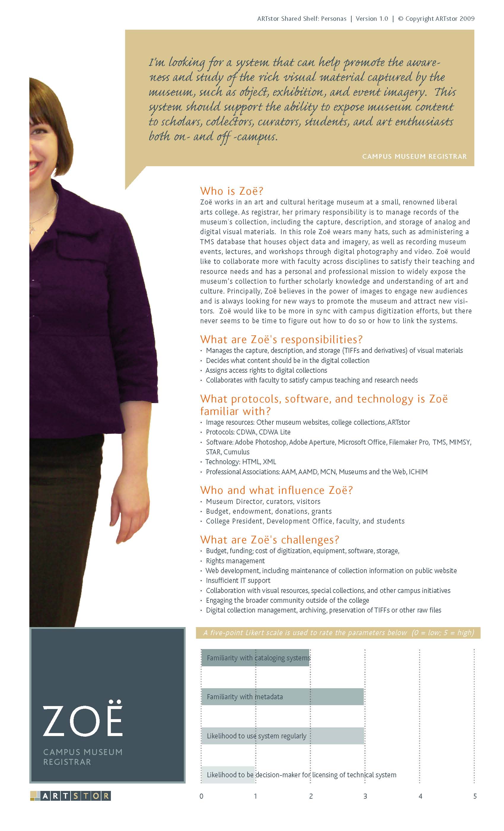
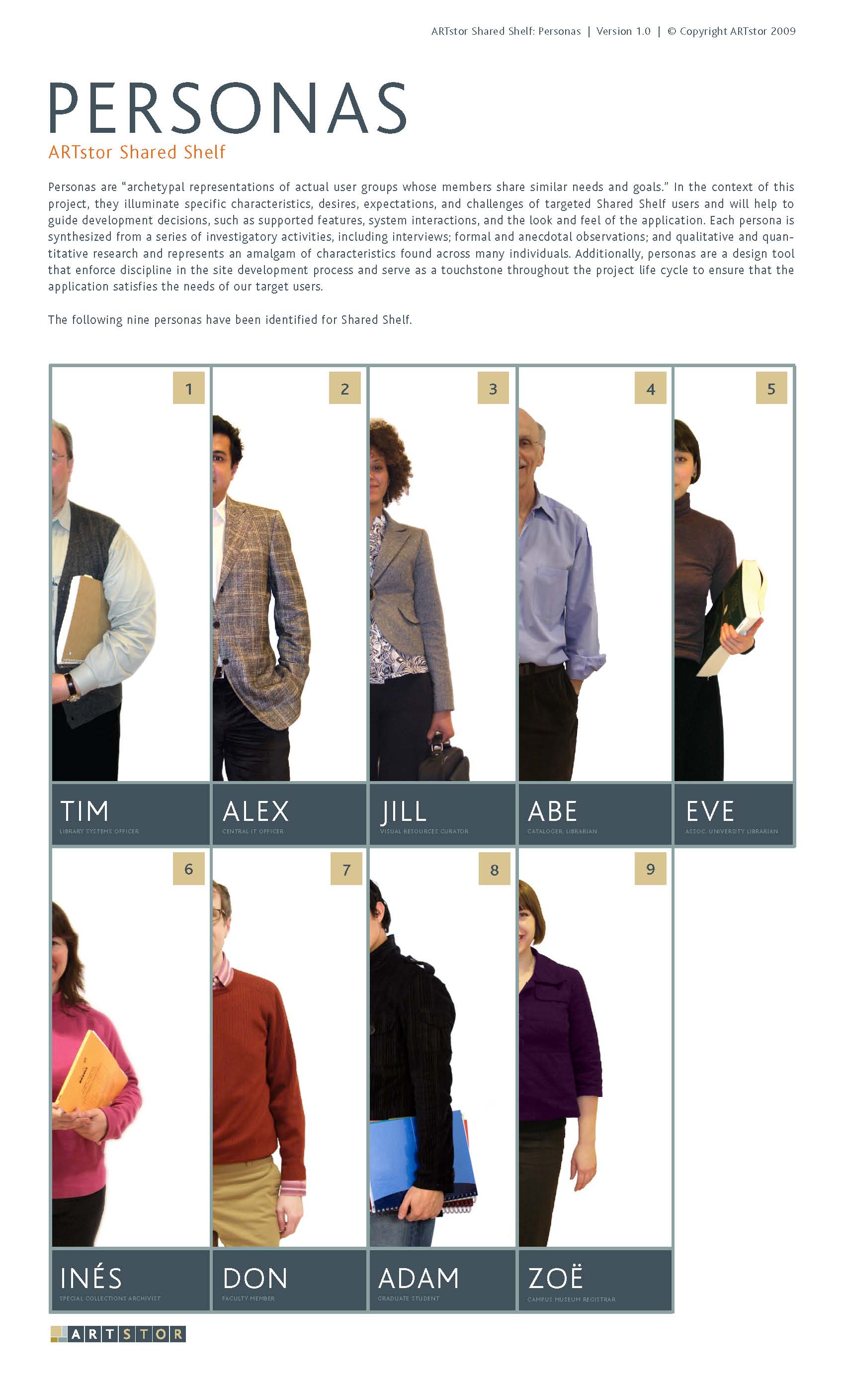
Currently finished with the 90% of the HTML/CSS of my website. I found this great free photograph to use in the main image section of the site. (Looks so classy.) I need to post some of the portfolio image alternatives I came up, but decided not to use.

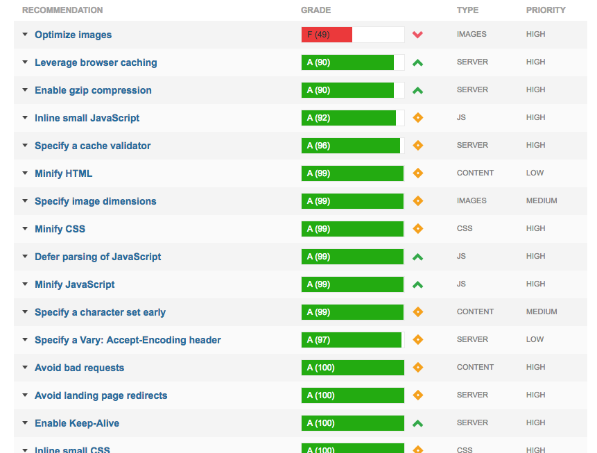
This post is all about site performance optimization, what I did and what I learned. (That big, fat, red F in my cover image is explained below!)

Getting Started
I wasn’t initially set on improving the performance of my site. (It’s only 1 page.) But, remembering all my lessons on Treehouse, I decided to minify some files anyway, like a pro. For CSS minification, here’s a nice simple site for that: cssminifier.com. This site also has a js minifier and image optimizers. In addition to working on my style.css file, I went through and deleted unnecessary classes for my font-awesome css file, and minified the CSS, since I only needed about 12 icons. (I’ve since added a few back.) I also minified the smoothscroll.js file, which gives my site that, you know, smooth scroll effect. It’s a pretty short file, but it doesn’t hurt.

Before I used cssminifier.com, I also took it through a clean CSS filter on http://www.website-performance.org/ to prettify* my style.CSS file before minifying it. While I was there, I also decided check out the site performance. Ouch! Some big issues, especially with compressing images, including my new classy photo. This is where I got started on improving site performance.

Optimizing Files
Two big problems were too many CSS calls and images that were not optimized. I realized that I needed to link to some CDNs to reduce CSS calls. Instead of including the jQuery.js, Bootstrap.js, and Bootstrap CSS files, I’m now linking to the the files via CDN. I tried using one of the above websites to optimize my images, and also convert some of them to PNGs, but the server couldn’t handle it. So I used good, old Photoshop.

“Gzip Compression”
I did not know what this term meant, but I got an F from a few site performance websites. GTMetrix explains that using a compressed, zip, file will save a lot of space. But it’s up to the browser to decide which file to use. GTMetrix and Website-Performance.org both suggested compressing my styles.ccs, bootstrap.css, and font-awesome.min.css files. Well, since I’m going to be using a CDN for the Bootstrap and jQuery files, I’m not too concerned about those. But I did continue as it advised for the relevant files.

Having done all this, I am happy my site loads fast, especially on mobile. And a learned a lot, not just from these websites, but also about the tools I used to complete them. For instance, Cyberduck, an FTP-transfer client doesn’t show .htaccess files, but Filezilla does.

screenshot of checklist of full site optimization recommendationsAnnoyances
The sites were a little pedantic about image compression, and they would complain about the need to compress images another 1-4% or so. Since I’m using a portfolio site, it’s not really that important to me to try to squeeze every last unnecessary pixel out of my images, especially since most of them aren’t visible when the page loads. The only one I might consider continue to optimize is the main hero image, because it’s the first one you see.

The optimization sites also pointed about how long it takes for an embedded Vimeo link to load. This is also not a concern for me, because the video is only visible in a pop-up. And the sites also dinged all my embedded CSS files and image files because they were not coming a CDN. I looked into the option of uploading them into a CDN, but abandoned that idea. (I think it might have required a payment, and per my previous entry, that was not going to work for me.)

Summary
For my next project, I’ll start with this site first, because it lists out everything that’s slowing down a site, such as a missing .htaccess file — or I may use it to improve the performance of my other project sites. The nice thing about the results it provides is that it’s very helpful for organizing tasks and working systematically through the performance optimization process.


* Yes, prettify is word!

Getting Simple

52weeksofUX.com has an article called, “What Does It Mean to Be Simple?“, published in 2011. The goal of the article is intended to help clarify what it means to be simple, when it comes to user experiences. It lists 3 main points:

  • Have a single core idea (not several ideas, or a partial idea)
  • Improve clarity over time (don’t overwhelm with inappropriate details)
  • Use consistency (avoid using unnecessarily unique interfaces and messages)

The author subdivides each point into more specific points, such as:

Be consistent through…Occasionally breaking the rules – know when an interface is genuinely unique–it’s probably not as often as you think.

I’d say that a lot of this advice is helpful and similar to concepts found in Don’t Make Me Think and in cognitive psychology. It’s a short read and I’d recommend the few minutes it takes to read it.

Shortly after reading the article, I came across a related question on Quora, “How to make my life simpler?” Having recently read the UX article, I wanted to see if I could extend the points in the article to other aspects of life. What I liked about doing this idea, is that 3 tips on keeping a simple life is incredibly to remember. Once you get to 5-7, even though those are easier to remember than, say 20, it’s still a lot to apply to all aspects of your life. I also liked the idea that repurposing these UX ideas would require them to become distilled down to basic points, that would possibly relate to day to day life, as opposed to just UI design.

Here is my response.

1. Focus on making your decisions binary. For example, President Obama said he chooses either a dark gray suit or a navy suit. “You’ll see I wear only gray or blue suits,” he said. “I’m trying to pare down decisions. I don’t want to make decisions about what I’m eating or wearing. Because I have too many other decisions to make.” Why Obama Doesn’t Pick Out His Own Suits: Decision Fatigue and How…

The goal is to reduce the amount of time you spend deciding on simple tasks, so that you have a greater cognitive reservoir for more important decisions.

2. Refine your life over time. As apparently many people have been doing, I recently read the book, “The Life Changing Magic of Tidying Up”. This process of tidying is something that is part of Japanese culture. There are actually a few Japanese authors who have written books on this topic, but the book by Marie Kondo is most accessible to English speakers. The main point is of this book to only have items around you that “spark joy”. In practice, this means pick your best gray and navy suits, and toss those other suits that you don’t really care for. This process involves a lot of introspection and reflection on your lifestyle and your needs. Once you do it, however, you will have a good idea of how to manage your life.

The goal is that by practicing this over time, you will eliminate items you don’t care for and only buy or keep items that bring you joy. I’ve been practicing this for a few months, and it’s so much of a relief to only keep items I truly love. (I also save money because I only shop for what I need or what I truly love.)

3. Focus on a routine. Basically, do the same thing every day. For instance, even my iPhone has started suggesting that I go to sleep at the same time every day. (I’ve actually had an alarm, for this purpose, for years.) Some people eat dinner at the same time every day, or workout early in the morning. Find your good habits and repeat them every day.

The goal is to find a pattern that works for you and that you’re comfortable with. Sometimes you’ll need to break your routine, or even change your routine, but the fact that you have one will keep your life simple.


I thought it worked, but there was still something missing. I thought about what the core message was: introspection. Understanding what’s important to each person…because having the best advice in the world means nothing if it’s irrelevant.

Several years ago, I saw a documentary film called Enlighten Up! at the IFC Center. The documentary is a skeptics take on the world of yoga. (Actually, it’s the filmmaker’s vicarious and voyeuristic film project.) Eventually, the skeptic ends up in India where he meets a guru, and is determined to get the guru to tell him which form of yoga is best for him to achieve enlightenment. The answers from the guru were enlightening:

“Everything depends on you. Hangs on you. You should feel the importance of yourself. You are the most important person for any decisions, all the decisions…

[Q. How to achieve happiness?] This is a good question. Let me put a little stress on it: [Look at how hard you are working to achieve your happiness.] Is there any happiness [in that]? You will have to question yourself. Where is it? Where can I get that happiness?

[Q. I am not a religious person.] If you don’t like [something], don’t do it. But you can still be a religious person.

[Q. How can that be?] Be yourself. Be your true self.

[Q. How do I do that?] As much as possible, try to get rid of what you are not and what you are unnecessarily wearing on yourself.

(Emphasis added.)

The guru’s final statement is what led me to add the following to my Quora answer – that ultimately what makes for a simple life is to understand of what is and what is not important to you, and to let life take its course naturally from that.

Whether or not you choose to follow these 3 tips or not, the decision is yours. To reiterate, the main thing is the self-examination of your life. In fully committing to this act, understand and appreciate your own self-worth. Understand and pursue goals that are important to you. When you find out what is truly important to you, allow yourself to decide and naturally remove what is not.*


pexels-photo-94327

So how would I turn the guru’s response into tips for simple UX design?

  1. Clearly define your goals. Know what’s truly important to achieve your goals. In the guru’s words, “Know what is true.” All manner of churn and delay will follow when goals are poorly defined.
  2. Stay on track. As much as possible, eliminate everything that doesn’t achieve these goals. This is probably as close to the 52weeksofUX article as anything.
  3. Don’t force it. If it doesn’t work, it doesn’t work. A related Italian saying, coming from the perfectly-imperfect Italian fashion sense Sprezzatura: “Always cut. Never pull”. Whatever the end result is, it should feel natural. For example, I once presented two designs for a website to my design colleagues. Everyone unanimously decided that they liked choice A over B, yet the group continued to discuss how to make B into a better design. In the end, I as the designer, recognized that the reason the group was still discussing B was because it was inferior but they were trying to force it into a better design. It was my own suggestion that because we had a good option already and we should simply eliminate option B, rather than force it to be something it wasn’t.

*Note: If I could include a clip of this one scene, I would. Unfortunately, most of the clips I found on YouTube were not great, so I’m not going to include them. I found an extended bonus clip, but it doesn’t include the parts I’m quoting above.

Personas: A closer look at two methods

I recently read an article from UX Mag (2011) about personas*. The article described a very traditional approach to creating personas — actually what I learned in grad school — which is different from my experiences at work with “proto-personas”. I wasn’t familiar with the term proto-personas until after I’d participated in creating them at work. To learn about this term, I read a different UX Mag (2012) article about proto-personas and I noted the discrepancies between the two articles immediately.

I thought it would be interesting to compare the two different persona articles, and share my experiences with the approaches described in each one.


Method One: Personas, The Traditional Approach

Personas: The Foundation of a Great User Experience, UX Mag, 2011.
As the author states, this is a primer on personas and how businesses can use them for their organization.

The main activities of this method involve interviewing approximately 30 people. The team then analyzes their responses to find common behaviors and thought patterns, as well as the elimination of extremes. The team then uses the findings to conduct an additional round of research with 5-7 individuals in order to validate and fill in information that was previous missed.

Conducting 30 interviews takes a lot of resources and time, and the article states that the investment in a persona project like this can cost $80,000. In these days of Agile and Lean UX, this estimate strikes me as an expense in time and money that most businesses and clients simply will not be willing to spend. However, the results will be extremely valid and based on actual user data, which is a major aspect of “user” experience.

Personal Experience:

My experience with this type of persona development goes all the way back to 2004, in my grad school days at Michigan. Our project was to complete a thorough usability evaluation of Yahoo! Avatars, which allowed Yahoo! users to create customized avatars for their online chats. We’d previously analyzed the interface, so this wasn’t the first exercise in our evaluation project. We split the work, and spent about 1-2 weeks collecting interviews and analyzing our data. We did find patterns of behavior among our interviewees that we then turned into personas for our project. Although we didn’t spend as much time on the activity as described in UX Mag, I felt very confident that our personas were accurate.


Method Two: Proto-Personas: Getting a seat at the table

Using Personas for Executive Alignment, UX Mag, 2012*.

This goal of this article is to sell the value of personas to executives, or clients, as a way to increase the value and visibility of user experience within an organization, and to describe how to do it.

The main activities of this method involve a 2-day workshop session, with the executives, in order to get them involved and invested in the personas. It goes like this:

  • Day 1: It starts with a proposal, where the goals of the persona workshop are defined. Each persona is defined using 4 quadrants for: high-level basic demographics and a sketch, behaviors and beliefs, demographics, and needs and goals. Each person does this, and as a group they decide on which assumptions are more or less accurate. Following this, each persona is placed on each of 5 spectrums, to differentiate between them each one. The results are digitized.
  • Day 2: The next stage is review and validation of the previous day’s activities, and to use the personas right away in a design workshop.

The investment is only 2 days time, so it’s very accessible to many teams, if you can get executives to participate. However, the important thing to keep in mind here is that these personas are based on assumptions and beliefs, not verified user data. Eventually, these personas will need to be validated with other research methods.

Personal Experience #1:

My experience with this type of persona involved preparing personas for a recreation-vehicle client. Our client was based in Canada, and visiting them for a group session wasn’t possible. The decision was to create the personas, then send them the results for their validation with their marketing team. Our team got together and created the 4 quadrants for each persona. We spent about 15-20 minutes on each person, coming up with ideas to fill in each section. After this, I digitized each persona using Keynote, using a very graphic style. (I don’t recommend Keynote for design purposes.)

In all honesty, I felt like we were just guessing when it came to filling in the quadrants and I felt lost throughout the whole process. Based on the client/product we were designing for, I attributed my confusion to a difference of life experiences or simply that the other people on the team had more information than I did. Perhaps working with executives, who spend time regularly studying their customers, I would have had a different experience.

Personal Experience #2:

My other experience with proto-personas came when supporting the Shared Shelf project for Artstor. In this case, we also relied on non-user data to create the personas. I researched job descriptions for each user type, and created roles for each persona that were then validated by subject-matter experts on our team. The personas were then digitized by our Creative Director using a very sophisticated graphic style and presented to the clients for further validation.

These personas were used in user flows, and they seemed to work very well for this purpose. I do think that maybe the extended team wasn’t as invested in them as much as they might have been if the workshop method had been used. Granted this was in 2009, before either of these articles had been written.


Summary

My opinion is that the traditional approach is best, although I feel that the group participation aspect of the proto-persona workshop is very helpful in getting buy-in from the extended executive or client team. I am dubious that the particular approach my team used for the recreational vehicle client was at all accurate; it simply felt like make-believe, so I would not recommend that. The approach using the job descriptions was not entirely accurate either, but I felt that it was at least based on assumptions that other people familiar with the user roles had written. Whichever method you choose, it’s important to validate your creations with real users and to use your personas in your work.

I hope that these links and my stories are of use to you, in your team and in your practice.

Links:

Note that the second article was written by Jeff Gothelf, who wrote the book Lean UX (which advocates for proto-personas).

*If you’re not aware, personas are archetypes of users and are used to represent a user type as opposed to a specific person.