Tumblr!

I’ve been using Tumblr for a long time now. But, as I’ve discovered with every new social media invention, it’s a little hard to figure out how to incorporate it into my regular life. I’d been using it to post random pictures of walks in the park, cats, and food. You know: life.

I’ve come to the decision to focus on using Tumblr as a re/branding platform. Explicitly, this means that my decision with is to post article links and quick thoughts, almost like a more centralized version of Twitter, and to use this blog as the place for long-writing and extended thoughts.

Hopefully it will work out and I can try to cross-post between them. Now I need to figure out how to incorporate both into the navigation of my website.

Anyway, as you might expect, the URL for my Tumblr blog is alliwalk.tumblr.com. Go figure.

Tips For Better Conference Calls

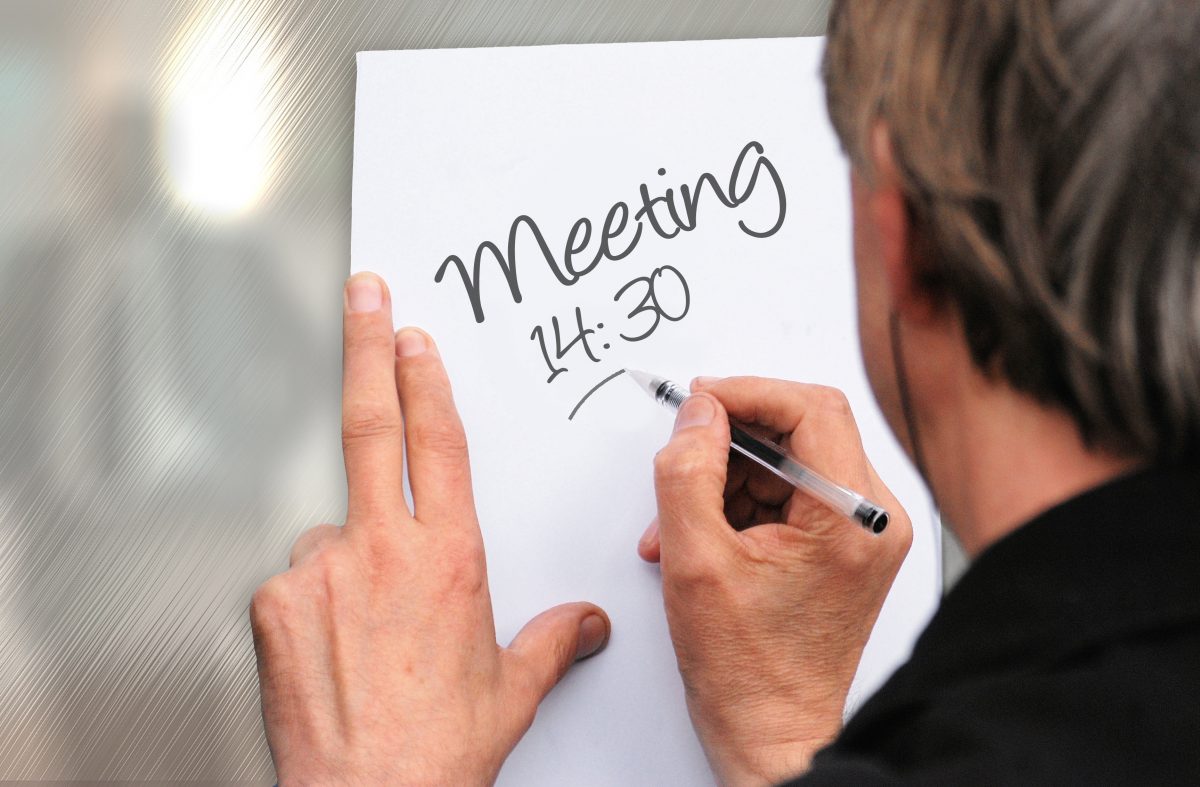
Recently in an interview with a company that has overseas offices, I discussed some tips I picked up while working at Chevron on how to have a good teleconferencing experience. Lots of companies have conference calls, but in my experience not many do a good job of hosting the call or running the meeting when on the phone. Here are a few tips I shared with them.

Background

After I left Chevron, I sort had the assumption that every company did things in the same way. Big companies often get criticized for having a lot of bureaucracy and you might feel burdened to conform. But, although they may have a strong culture, sometimes its for the best. In this case, I thought they did a great job with helping employees have conference calls and not feeling like someone was left out because they weren’t on the phone. Here are a few of my own tips, along with a few others I found online.

Tips

Be on time. This comes from Entrepreneur.com, and I agree. Since you have many people calling in from different locations, it’s a huge waste of time and money to have people sitting on a call waiting to start. If one person is in charge of the host line, and that person is running late, either let everyone know and/or give out the host passcode so that someone else can start the conference call. Plus, many people will simply hang up after 15 min if the host hasn’t joined.

A round of introductions. At the start of each meeting, everyone should say their name and possibly title, if it’s unclear who does what (if that’s important to know). If someone joins late, whomever is speaking pause long enough to make sure to let that person introduce themselves. Don’t sit in the back without speaking up.

Identify yourself. This is one of my pet peeves. Whenever someone in the conversation begins speaking, that person should say their name out loud, so that everyone knows who it is. This isn’t as important if someone has a distinctive voice, if it’s a small group of people, or if only one person will be speaking, like the CEO. But for a group of people that don’t know each other, saying your name before you speak will help personalize the entire experience.

Keep noises down. Side conversations during a conference call are a big no-no. This includes people in the room chatting quietly together or someone who gets a phone call. The microphones in conference call phones cannot distinguish between the noises next to the phone and those far away. So all the noises sound the same, which means that it’s hard to hear the person currently speaking. People in the room, or on the phone, should request that side conversations end so that people on the phone can hear what’s happening.

Mute is your friend. Likewise, use the mute button if you’re not talking. This goes for someone calling in from their desk, or people in a room together. However, if you’re in a room together, you need to be careful to know when the mute is on or off. I remember I once called into a meeting when I was at home with a head cold. I assumed my phone was on mute, but unfortunately it wasn’t before I blew my nose. Trust me, no one wants to hear you blow your nose or bite into your sandwich. Mute your phone.

Watch the microphone. Microphones can be good at picking up stray noises. Don’t be the dreaded mouth-breather! Learn to use your headset. (OK, this one was a useful tip, but also pretty funny. And a true story!)

Present documents slowly. Screen sharing apps are great but they can be kind of slow. Sometimes the people on the other line are still on page one, when you’ve jumped to page 3. Scroll slowly, or a little as possible, to give the other line a chance to catch up. In addition, use the cursor and a good description to help people orient themselves in the documents. I’ve seen companies present documents as though the people on the other line have worked on putting the presentation together with them. This leads them to give short and fast explanations, without giving the people on the other line a chance to understand what they’re seeing.

Be polite. The last tip comes from Jabra.com, and it might be the most important. Actually, I’d say to be extra polite. Tense conference calls are no fun. Give people the benefit of the doubt.


Ultimately, the goal is to run a good meeting. Other websites had tips about taking notes, stating the agenda, not eating, and paying attention, which are all tips about running a good meeting, too.

I hope these tips help you run your next conference call more efficiently and with better communication.

UX Design Fundamentals: UXApprentice.com

UXApprentice.com

UX Apprentice is a static website that takes site visitors through a 3-step UX project to teach visitors about the process of UX. The steps the site goes through are Discovery, Strategy, Design.

As it states on the first page, each step describes what the step is all about, it provides examples, there’s a very short knowledge quiz, and a list of resources consisting of books, articles/sites, and a

As it states on the first page, each step describes what the step is all about, it provides examples, there’s a very short knowledge quiz, and a list of resources consisting of books, articles/sites, and a who’s who list of names.

Alphas:

  • Great connection between the description of the information, using the outlines and icons from the top of each page to the bottom.
  • Good use of navigation to prompt site visitors to go from one explanation to another.

Deltas:

  • The website provides a lot of information, but it’s highly biased to be accessible for people who already know a bit about UX. There just isn’t enough information to help someone who is totally new to UX get started.
  • Many of the articles are a few years old, and a few links for the books and articles are broken. For instance, I tried to take a look at the Kevin Cheng book on the Discovery page, and an article on the strategy page called “What is User Experience Strategy, Anyway?” Both links were dead. See update.
  • It’s an advertisement for Balsamiq. While I like the information this site provides, in the end the entire site is essentially an advertisement for the wireframing tool Balsamiq. It doesn’t hit you over the head with it, but it’s the truth.

Final Thoughts

I’d still recommend the site to someone as a possible resource, along with other resources, but I’d preface it by saying that there might be a lot of broken links in the reference sections.


Update

As you can read in the comments, Jessica from Balsamiq contacted me to let me know that they updated their links. I’ve checked it out and this appears to be the case.

Some of the people they’re linking to may have broken links, but that can’t be helped.

Checking out their resources, I found a 4-video series of Lean UX Strategy YouTube which I recommend because it won’t take more than 15 minutes to watch.

Ancient Information Theory, Symbol Space, and Alphabets

It’s hard to believe that alphabet we use today is essentially a set of symbols that developed over thousands of years. And why are so many alphabets so similar, even though the languages are so different? There’s an answer!

In one of Khan Academy’s Computer Science track of videos, called Journey into Information Theory, there are two videos that are extremely informative in explaining how the written alphabet developed. I’ve included links to the videos on YouTube.

The initial breakthrough is simple: disassociating the meaning of the word from the symbols used to create it. This is also known as the Rebus Principle. (Also seen in picture puzzles and the game show, Catchphrase!) From that, symbols can be rearranged to create different sounds and convey meaning. This principle evolved over thousands of years, getting more and more abstract and, along with writing technology such as papyrus, gives us the alphabets we use today.

There are links below the videos, if you’re interested in learning more. I also recommend watching the whole series of videos on Information Theory.


The first video is the Origin of the Written Language. The video goes into cave drawings, or Pictograms, and the development of symbols called Ideograms, as well as proto-writing.

The second video is called the History of the Alphabet and the development of Hieratic writing, a type of cursive invented for papyrus, and Demotic writing, a further development of hieratic.

Remember that the point of these videos is to explain information theory, so there’s a focus on what is known as symbol space. Symbol space decreased as the use of the alphabet increased, as more information could be shared with fewer symbols.


After watching these, you might be interested in learning more. Here are a few references: