Solving Design Problems like a Mathematician

While reading a forum discussion on FreeCodeCamp, I came across a reference to George Pólya’s book, “How to Solve a Problem”. In this post, I review Pólya’s problem solving strategy.

In a recent FreeCodeCamp forum, someone asked a question about journaling:

Hi coders,
While looking for the source for my project, I saw that some programmers or developers wrote a kind of diary to keep track of the code. I think it’s nice, but I was wondering exactly how you can structure a diary and if any of you use this to write code. Question here.

Good question. I’ve seen other people use diaries or online journals, or those things people use…writing logs or whatever. 🙂

Anyway, the only reply includes a link about using a “logbook”. On the link page, the author references George Pólya and his book How to Solve It. I had never heard of this person or his book, so I did a little research.

George Pólya, (1887 – 1985)

George Pólya was a Hungarian-born mathematician who was known for his mathematics work, as well as his work in heuristics. Heuristics is “any approach to problem solving or self-discovery that employs a practical method”.

“Examples that employ heuristics include using a rule of thumb, an educated guess, an intuitive judgment, a guesstimate, profiling, or common sense.”

He wrote a book about solving problems using common sense principles.

1st edition cover of “How to Solve It”, published in 1945, by George Pólya, a Hungarian mathematician.

The George Pólya Method of Solving Problems

The Wikipedia page shows that Pólya lays out some pretty good heuristics for solving problems. Although he intended for these strategies to be used for solving math problems, I think they could be used to provide a structured method for solving almost any difficult problem.

The Pólya problem solving method involves 4 principles:

  1. First, you have to understand the problem.
  2. After understanding, make a plan.
  3. Carry out the plan.
  4. Look back on your work. How could it be better?

So how does it work?

Principle 1: Understand the Problem

Pólya based the first principle, Understand the Problem, on the idea that math students struggled to solve problems due to a lack of understanding the problem in full or in part. His technique involved coaching teachers to prompt students with the following questions:

  • What are you asked to find or show?
  • Can you restate the problem in your own words?
  • Can you think of a picture or a diagram that might help you understand the problem?
  • Is there enough information to enable you to find a solution?
  • Do you understand all the words used in stating the problem?
  • Do you need to ask a question to get the answer?

Essentially one should not move past principle one until a constructive answer can be given. It’s not clear from the Wikipedia entry if a constructive answer is required for each question or the entire problem.

 Principle 2: Make a Plan

Basically he felt that a person gets better at selecting a good plan/strategy the more times they solve problems. Here’s a big list of strategies:

  • Guess and check
  • Make an orderly list
  • Eliminate possibilities
  • Use symmetry
  • Consider special cases
  • Use direct reasoning
  • Solve an equation
  • Look for a pattern
  • Draw a picture
  • Solve a simpler problem
  • Use a model
  • Work backward
  • Use a formula
  • Be creative – (“[Have] patience to wait until the bright idea appears”)
  • Applying these rules to devise a plan takes your own skill and judgement – (“Always use your own brain first”)

Principle 3: Carry out the plan

Simple enough, but the main problem people have with this step is giving up too soon. For that, the Wikipedia entry says:

“In general, all you need is care and patience, given that you have the necessary skills. Persist with the plan that you have chosen. If it continues not to work, discard it and choose another.”

Principle 4: Review, Reflect and Extrapolate

Take a look at what you’ve done, and evaluate how well it worked (or didn’t), and see how you can use what you’ve discovered for future problems.


Finding the book:

If you want to find this book, I recommend trying your library. I found it by searching for "how to solve it book pdf" (Google suggested the "pdf") and I found a copy.

Update:

An earlier version of this post included an account of how I applied Polya’s technique to my portfolio changes. A follow-up post will focus on that account.

Design Courses with Ellen Lupton on Skillshare

Ellen Lupton is a curator of contemporary design at Cooper Hewitt, Smithsonian Design Museum in New York City and director of the Graphic Design MFA program at Maryland Institute College of Art (MICA) in Baltimore. She is also the author of Thinking with Type, which is widely used in graphic design.

After recently browsing around on Skillshare, I discovered a few of her courses. Many are free and only around 30 min long. Here’s a short list. I haven’t taken them all, but I hope to review them sometime soon.

Typography That Works: Typographic Composition and Fonts

Screenshot from skillshare


Demystifying Beauty: Inspiration for Design

scrreenshot


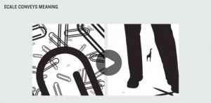
Graphic Design Basics

Screen shot of video on scale


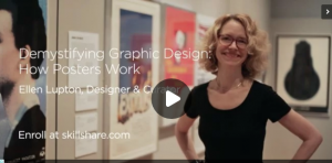
How Posters Work

Title slide for skillshare


I’m not a big fan of the Skillshare interface — for one thing, the videos autoplay when you load the page. But, these are pretty short videos, about 30 minutes, so don’t let autoplay scare you. Plus, they’re all free.

Typography Book Projects: Psychogeographical Mapping, Cooking & Typography

Outlining some ideas for my typography class at Parson’s, for our book making projects.

For class, we will be creating 2 projects, which will turn into books. One is a psychogeographical map and the other is a little cooking memoir. I need to come up with idea for each.

The cooking book is to teach us about book binding and selecting type options for recipes, which can have many options. We need to pick a somewhat personal story/recipe. I think I will write about both my hatred of pot pies, as well as my love of Gordon Ramsay’s shepherd’s pie recipe, which I first made during Hurricane Sandy. This was also the week I adopted my cats, only kittens at the time, only 8-10 weeks old. At the time, the subways had been shut down, so I couldn’t go anywhere for a week. Luckily, because I was living so far north in Manhattan, there was no flooding and basically we didn’t lose any power. (In the East Village, it was another story.) I think there’s enough there to write a good story.

For the Psychogeographical Mapping…I’m drawing a blank. Some ideas:

  • dog runs
  • pet stores
  • Japanese grocery stores
  • Walking down the street listening to Rhapsody In Blue and taking note of what’s around me. (If you haven’t done this, while taking a walk in NYC, you’re really missing out.)
  • Mapping the Central Park Conservatory Garden, a good place to read. Maybe the benches.

Maybe some better ideas:

  • Map movie theaters in NYC that aren’t chains, up to 96th St. Meaning no Regal, AMC, or Imax theaters. City Cinemas is OK.
  • Map Goodwill Donation stores. I do go to Goodwill and the Salvation Army a lot.

I’m leaning towards the theater idea. Now to do some write-ups.

Ladies of Creative Coding, CSS and Web Animations

I was inspired by this post after someone sent a funny video about how a dev team solved a problem and the only woman was the “mean” project manager. Like a few other women who got the link to the video, I thought it was a little stereotypical. That is because as I’ve learned more about CSS and creative uses of CSS and web animations, I’ve come to notice that a few experts and thought leaders in creative CSS and SVG animation are female. There are obviously more than I’m going to list here, but this post is based on my personal experiences with what they’ve put out.

In the order of whose work I last interacted with:

Sarah Drasner

I just finished Sarah’s course on Lynda, Advanced SVG Animations. It was originally produced by Frontend Masters, not Lynda. It’s more of an edited live course (with students in the room) than an online course, so the educational style is very different from Lynda. (I personally did not like this format for Lynda, but I think it would be much better as an in-person course.)

Her course went into using GreenSock Animation Plugin (GSAP) and a few of their plug-ins: Draggable, DrawSVG [Plugin], motion on a path as an animation technique, SplitText, and HSL color tweens. She also talked about how she plans her animations and showed examples of her work throughout the course.


Sarah also made an appearance on The Coding Train, on YouTube. Here she is giving a tutorial on web animations and Mo.js.

Sarah seems like an expert – a Frontend Master, if you will – on web animations, especially with SVG, GSAP, and any host of JavaScript or web plugins related to animation. In her Lynda/Frontend Master’s course, Sarah said she makes it a point to learn the animation capabilities for new JavaScript libraries and plugins. So for React, she’d learn the animation capabilities in React. For Angular, the animation capabilities in Angular. And so on, and so forth. That seems like a really smart way to keep up to date in an area of programming/web that you’re really interested in. (Mental note: I should do this too.)


Val Head

I came across Val’s course, also on Lynda, where she teaches a course on CSS Animations.

In looking up Val’s Lynda profile, I’ve also just discovered that she also teaches a course on responsive typography, called Responsive Typography Techniques! This course looks like it would go really well with the two web typography courses by Laura Franz, Typography for Web Designers and Choosing and Using Web Fonts, both of which I also highly, highly recommend.

Val was also a guest instructor on the Coding Train.

Val also teaches an in-person web animation course with…Sarah Drasner! Web Animation Workshops. These are one- and two-day courses, in multiple cities around North America and Europe (and possibly even further than that). Given that it’s now October, there aren’t many left this year. But, check out the website now so you can ask your boss for some funding for next year. They also have scholarships for underrepresented groups, if you happen to belong to one. You can sign up for announcements on new classes on the website.

Val also curates the UI Animation newsletter. The newsletter is how I found out about and joined, the Creative Coding Club. I feel terrible saying that I haven’t read many of Val’s UI Animation articles in a while. (Let’s be honest: I haven’t had much time to keep up with Creative Coding Club either. And let’s be even more honest and say I haven’t had time to keep up with much of my personal email, in general!) I might need to resubscribe with a different email address, because the links she shares are very inspirational and educational. And I want to keep up with what’s going on.


Leah Verou

I am not quite sure when or where I came across Leah Verou’s work, but it was obviously while I was trying to figure out CSS gradients because I’ve had her wonderful site, CSS Patterns Gallery, bookmarked for a year or two. You can look at my own project sites to see that I’ve used her CSS background patterns multiple times on my own projects. I probably also came across her Cubic Bezier site, as well, most likely during a CSS animation tutorial. You can find more of her projects on her website, http://lea.verou.me/projects/.

As I’m writing this, I cannot remember all the things that made me think of Leah, except for the bookmarks to her CSS gradients page. I think that at one point in the semi-recent past, it seemed that every time I looked for some building block for some cool CSS thing-a-ma-jig, turned out she’d already built it. I really hope she teaches a class somewhere, someday, because she really seems to know her stuff!


Rachel Nabors

To be fair, I have not signed up for any course with Rachel Nabors. Nor have I had much experience with her work. But, she does run a web animation Slack channel, called Animation at Work. Many of the discussions there seem a little over my head right now, but I want to keep involved and stay learning. She also offers a few online courses and has a book published by A Book Apart, called Animation at Work. She also runs a web animation newsletter, Web Animation Weekly. Check out the Archive if you’re interested in learning more. (As you’ve guessed, I am not really reading this newsletter either.)

Rachel is also an amazing Illustrator, and her animations look really good! You can find examples of her work, and get a sense of what I mean about her animation/cartooning skills, by checking out her website(s):

Many of her courses seem to cover a lot of topics as Val Head. But, if you’re interested in CSS animation, motion, and transitions, my experience has been that the best results come from learning from as many sources as possible. Sign up for both!


Shoutouts and More Ladies to Look Up:

Sarah Drasner mentioned Sara Soueidan (pronounced Sweden) a couple of times in her course. I looked her up and she seems like a pretty amazing front-end developer. She is on Twitter @SaraSoueidan. Sarah also mentioned Joni Trythall and Amelia Bellamy-Royds in her credits at the end of her course. I will have to look them up later…

Nat Cooper is the founder of the Creative Coding Club. Like Rachel Nabors, she has amazing graphics skills and comes up with some pretty sweet animations and keeps the group motivated every month. Find her on Twitter @natacoops and the Creative Coding Club (@artcodeclub).

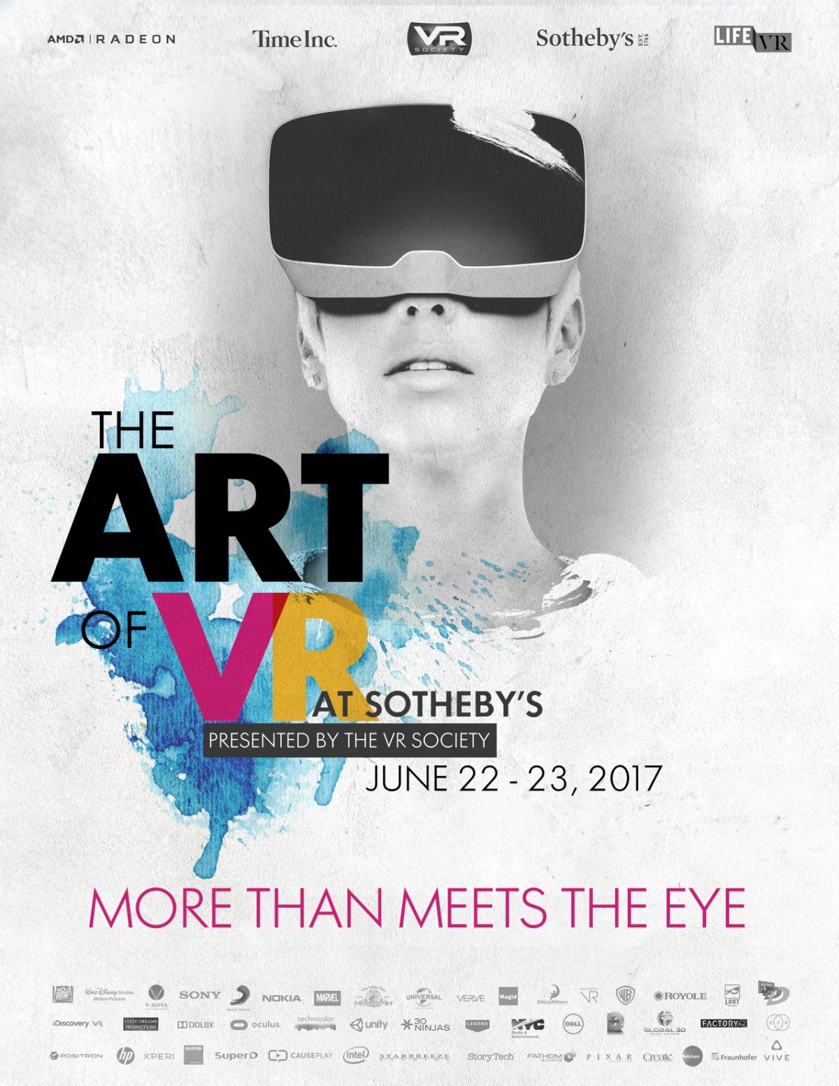
Event: The Art of VR at Sotheby’s

On June 23rd, I attended The Art of VR event, held at Sotheby’s. It was billed as “A 2 day curated VR exhibition featuring: Studio premieres, theatrical & brand case studies, studio exhibitions, hands-on demonstrations.” I signed up through Eventbrite.

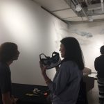
Virtual reality has certainly advanced from Second Life. Now there are headsets and immersive devices. The tickets were somewhat expensive but I went to the event, anyway, because I didn’t have that much experience with virtual reality; I thought it would be a good way to jump in. I spent time trying out VR at the different booths, then spent time listening to the talks, which were pretty good.

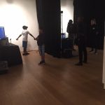
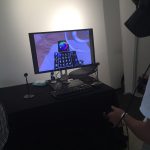
VR Booths and Hands-On Demonstrations

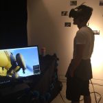
Many works were commercial, intended to demonstrate the graphics capabilities of a type of computer, to promote a film, or for some other commercial purpose. In my opinion, VR for entertainment purposes automatically comes across as a bit insincere, unless the provenance of the work — where it comes from, how it was produced, who produced it and why — is known because it can help the audience get over their skepticism.


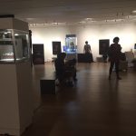
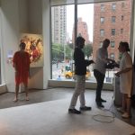
Photos from the Galleries

There were also a number of artworks, and so far I think it works best for art experiences. The mechanics of the experience are incredibly intimate, yet it remains very public – which describes how art is experienced, as well. But, trying VR can be an intimidating activity. You have to get over feeling embarrassed for looking stupid with these giant geeky goggles on your face while other people are watching. And, as a panelist later mentioned, VR can be clunky and clumsy, even in an artistic setting.

Despite my initial embarrassment, I participated as much as I could. I enjoyed the experience and learning about VR.


Discussion Panels

I’ll admit that I initially wasn’t compelled to visit the floor where the discussion panels were being held. But once, I did I was very impressed. The president of the VR Society led at least 2 panels I listened to; he’s a very good moderator. The two discussions that impressed me most were a discussion on medical uses of VR and a discussion about a cinematic experience, called “Lincoln in the Bardo”.

Photos from the panel discussions

Discussion: Medical Uses of VR

On the far right (partially off-camera), is the surgeon moderating the discussion and presenting his use of VR in surgery. The man to the right of center is the psychiatrist.

One of the discussion panels was about medical uses of VR. Overall, this was the most impressive topic discussed or demonstrated for me.

  • Surgery: First, a neurosurgeon described how he used virtual reality to help him remove difficult tumors in the middle of a patient’s head. He showed how, due to the tumor’s location, historically the surgery left people disfigured and possibly blind or deaf. (The images were not attractive.) With VR, he showed, he’s able to more accurately and precisely navigate around major arteries and nerves, to minimize the intrusiveness of the surgery using orthoscopic surgical tools to minimize long-term damage and scarring.
  • Mental Health: Next, a psychiatrist described how he used VR to simulate settings for PTSD patients, to help them overcome their disorder in a controlled setting. For example, he can simulate Iraq for war veterans. He also showed how VR can be used to help patients manage pain, specifically burn patients. Pain, he explained, requires attention. If you can distract patients from their pain, they will experience pain relief. His example was showing a burn patient experiencing an ice world.
  • Medical Education: Finally, a medical artist showed how he used VR drawing tools to augment his work. I don’t entirely remember everything about his discussion, but his work sounded very interesting. And it seems like a type of art that is completely overlooked.

Anyway, the medical talk was very innovative and I’m glad to see this new technology being used in such important ways.


Discussion: Lincoln In the Bardo

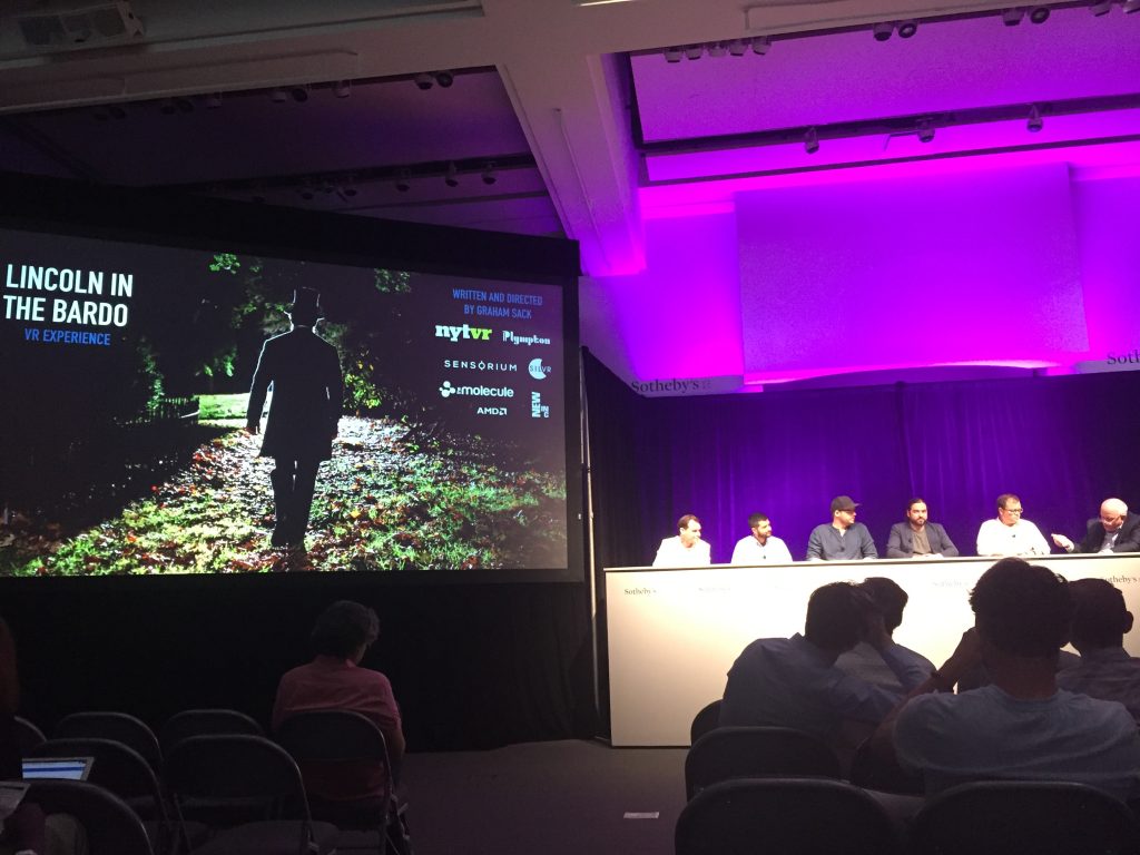
“Lincoln in the Bardo”. The director is on the far left. The NYT VR director is 2nd from left. The VR Society president is on the far right.
Another impressive talk was a discussion about Lincoln in the Bardo, VR experience. This experience was a collaboration with the NY Times. It sounds like it was a pretty intensive project, so although I didn’t see it or write about it that much, don’t underestimate it, especially if you’re into cinematic VR experiences.
Lincoln in the Bardo

In this immersive narrative short, President Lincoln pays a nighttime visit to the haunted cemetery in which his beloved son has just been laid to rest. Based on “Lincoln in the Bardo,” the new novel by George Saunders.

You can possibly view it in 360-video on nytimes.com if your browser supports 360-video. I also found a link on YouTube if it doesn’t. It’s produced for a VR headset, so it won’t be the same if you don’t have a headset (I don’t).


Sotheby’s Art Gallery: BUNKER

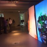
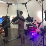
Somewhat related to the VR event, Sotheby’s also had a pop-up gallery, called BUNKER, “which since 2014 has featured artists who collaborate with technology to create code-driven sculpture, augmented reality and virtual installation”. I took some time to check it out. There weren’t that many projects, but here are few projects I especially liked.

One that was really clever used the cassette frames and an audio output. Since it was using headphones, a video would have only caught half of it. So, I didn’t capture it at all.

The installation will be at Sotheby’s until July 20, 2017.

Website Update, June 2017

It might not be easily noticeable from this blog, but over the past few weeks I’ve updated my main website. I tend to do this a few times a year, as I gain feedback, or learn what works and what doesn’t work. Hopefully this change will stick around for a while. This post is documentation of what I did and why.

Research

Over the past several months, I have been trying to get a better understanding of what UX managers look for when they view a candidate’s portfolio. There were a few resources I looked at that helped inform my opinions in this regard. After reading a few articles and slideshow presentations, reviewing websites, and gathering feedback, I had a few ideas. Here are a few points and screenshots demonstrating my ideas and how they affected the design.

I. Overall Design and Home page

One way or another, I ended up looking at a few portfolio pages from designers I’d met in-person or came across online. Despite reading several of those “10 UX Portfolios To Admire” articles, what I’ve discovered is that sometimes simple is best. And that translates to a template site, often paid.

Paid subscription services are anything from $6-$8 or more each month. I don’t think someone should have to pay a monthly fee in order to apply for a job. That meant I’d have to create it myself or use a free service. I’ve used Carbonmade, Coroflot, and even Behance (barely), which are all free. But their designs are limited and my research showed that managers will evaluate candidates on the usability of their portfolio, even when it’s hosted by a third-party.

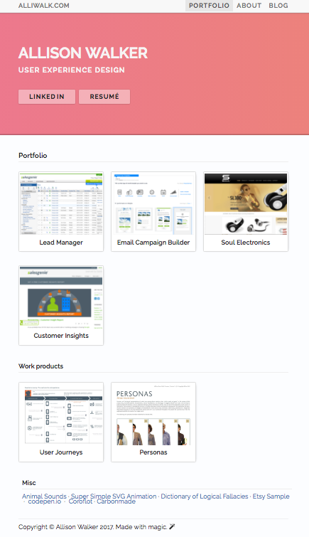
Reviewing both free and paid sites, the ones I liked best were made by the paid services Squarespace or Wix, using remarkably similar templates. Essentially, that template was a site with basic navigation, a grid of projects on the home page, project pages, and a simple About page. Following that template, I came up with a basic grid for my home page. But I jazzed it up a bit with some fancy CSS throughout the site.

II. Presenting an Overview

In previous designs, I assumed that managers would read. But, my research showed that they might spend 30 seconds reviewing a portfolio, for the first time. I also came across numerous resources insisting that candidates outline role, problem or goal, and outcome when presenting their work.

So you can see in the screenshot below how I’ve outlined this information right at the top, next to an image.

Overview of the project and role, along with keywords. This image is actually a screenshot from the company’s website, promoting the product.

II. Fast Scanning

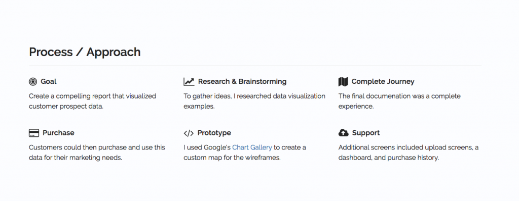
Another consideration was the amount of time a manager spends reviewing a portfolio. My research showed that managers only spend 30 seconds on a portfolio and review 12-50 portfolios for a given position. I used the process/approach section to break up information into digestible, one-sentence long chunks.

An earlier version of this section was a 3-column layout, with longer paragraphs. Breaking it up makes it easier to scan. Fontawesome does this, also, on their homepage. http://fontawesome.io/

III. Tell a Story

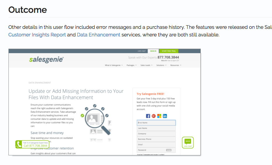
The word “storytelling” is thrown around a lot, especially in relation to self-promotion. I think “storytelling” is overused and cliche, and I’ve written about storytelling a few times.  However, for the redesign, I thought about the concept of beginning, middle, and end. Thinking through these part of a story, I ended up with the following sections: overview, a process/approach section, documentation, and outcome. Outcome really helps “sell” it as a story, because it provides a conclusion.

Outcome

Having talked about outcome, what now?

One idea I thought of, as I was writing this, was to shrink the size of the thumbnails on the home page to show more information on the screen. But, I think the “hero” image/section is what takes up most of the space, vs the size of the thumbnails. This is one change though; I have a running list of updates and ideas on Remember the Milk, where I can also track priority.

I plan to ask more friends for feedback and maybe get feedback from a few connections on LinkedIn. It was fun, I learned a lot. I look forward to adding more projects and the site evolving over time. Or until I redesign it again!