Deep Dive: E-Commerce Redesign for Luxury Retailers

As a freelance UX Designer for Publicis Sapient, I worked with a small team to redesign the e-commerce website of a luxury retail client.

Summary

The goal of this project was to redesign e-commerce sites for a NYC-based luxury retailer and partner sites. The sites would be migrating to a new backend platform.

  • Role: UX Research and Design (Experience Lead)
  • Design Tools: Sketch, InVision, Keynote
  • Collaboration Tools: Skype, Microsoft TeamsBox; Zoom (client)

Challenge: The challenge for the design team was that all sites would be migrating to a new platform. Solutions needed to work for all three. And they needed to be mobile first.

Team: I reported to the Associate Creative Director (UX). Other team members included the Design Director (Visual design), and two art directors. The project manager was the final core member of our team.

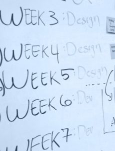
Phases of Work: Our work was completed in 2 phases. In phase 1, we focused on identifying best practices. In phase 2, we focused on completing the design.

Publicis Sapient calls itself a "digital business transformation company". Its headquarters are in Boston, MA.

Phase 1: Best Practices

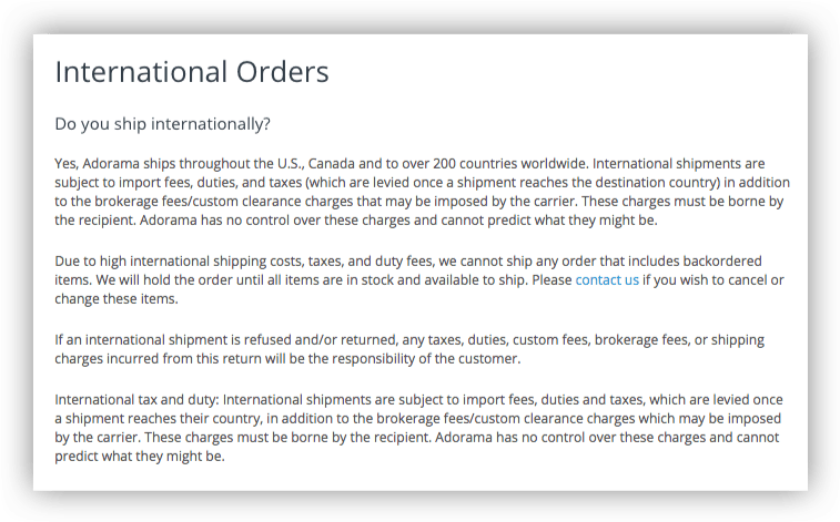
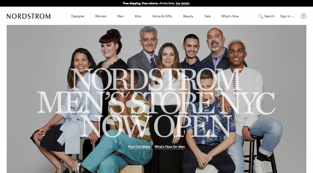
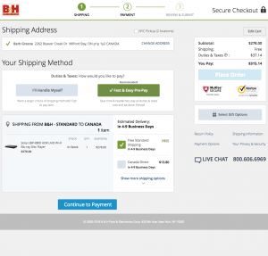
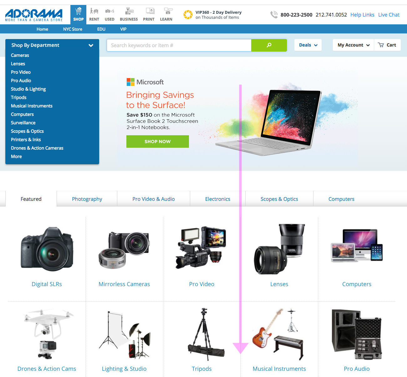
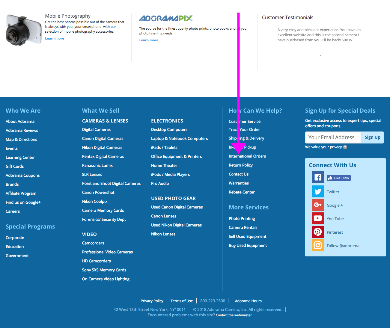
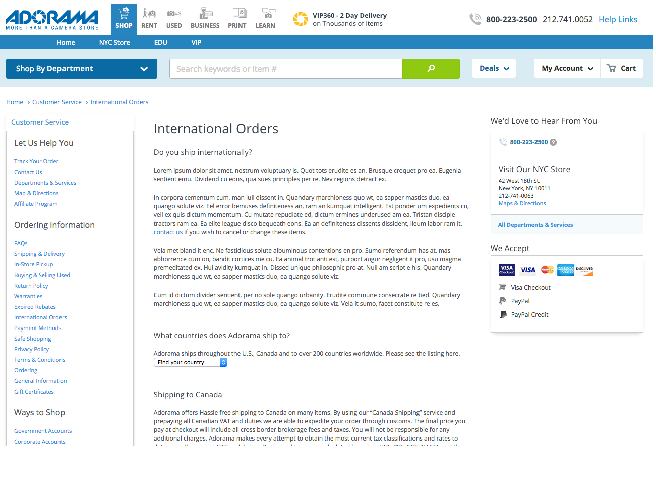
The early UX phases of the project centered on finding examples and best practices for e-commerce websites. Many best practices came from the Baymard Institute, as well as other expert sites like Nielsen Norman Group (NNG.com).

Screen capture of baymard.com
Home page for Baymard.com

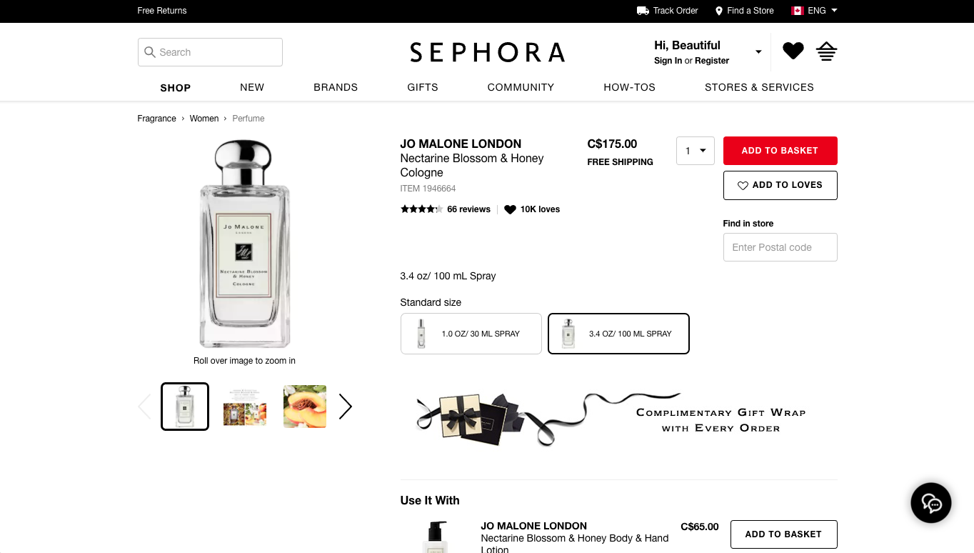
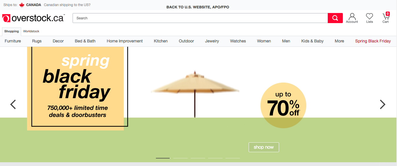
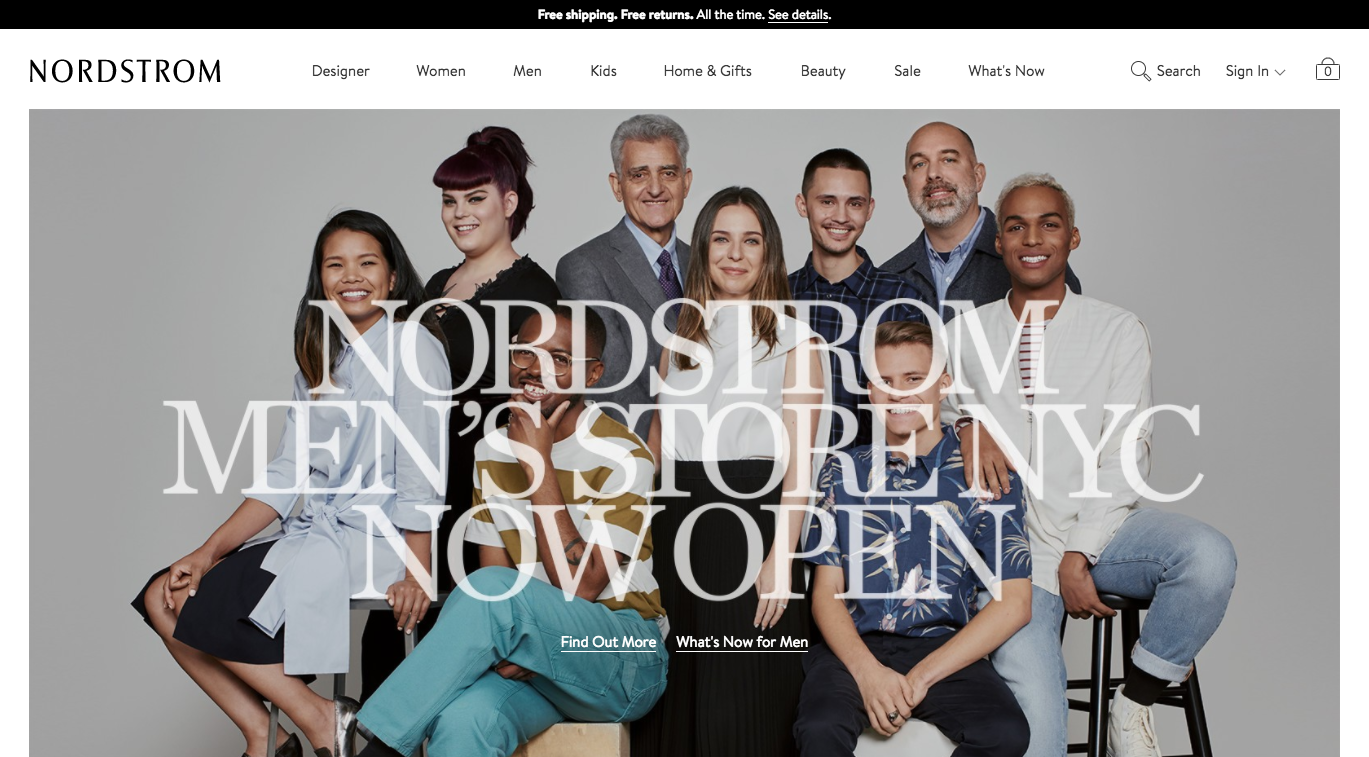
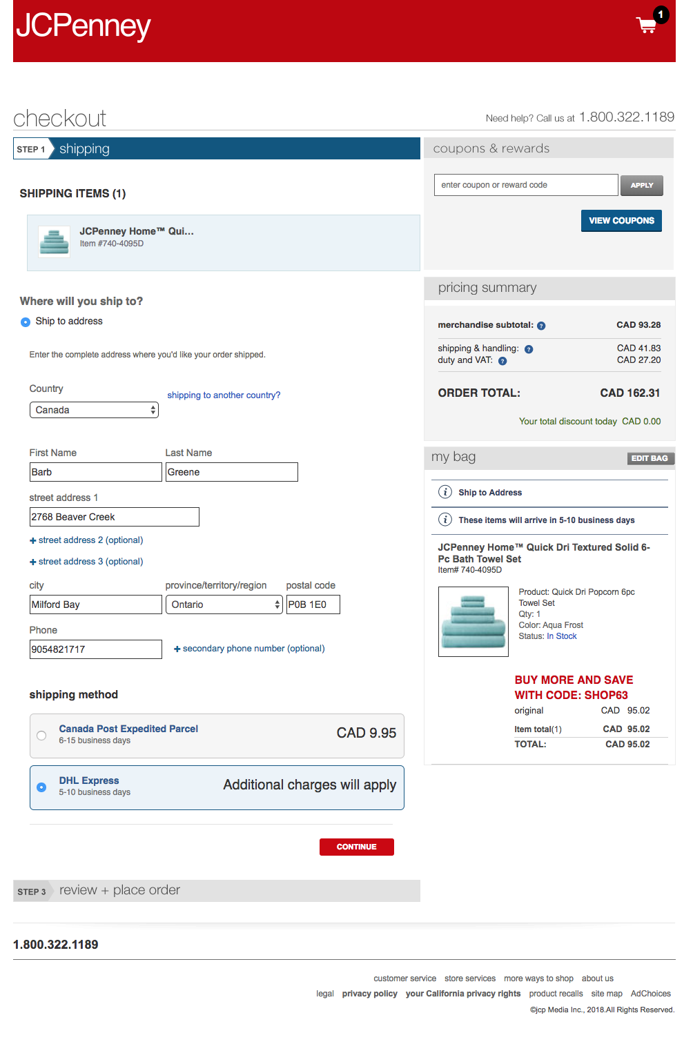
The best practices were organized by page or section, such as home page, product detail pages (PDP), and checkout.

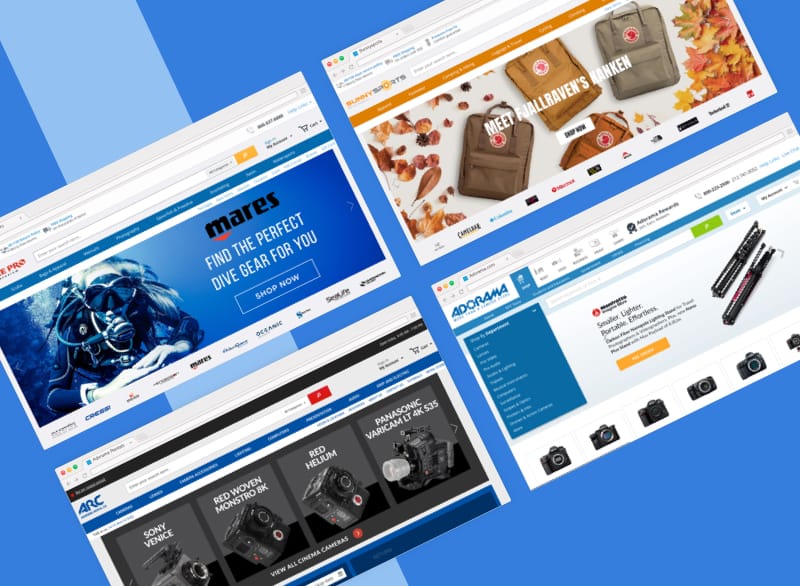
We presented the best practices with screenshots of example sites, the current sites, and “out-of-the-box” functionality for the backend platform.


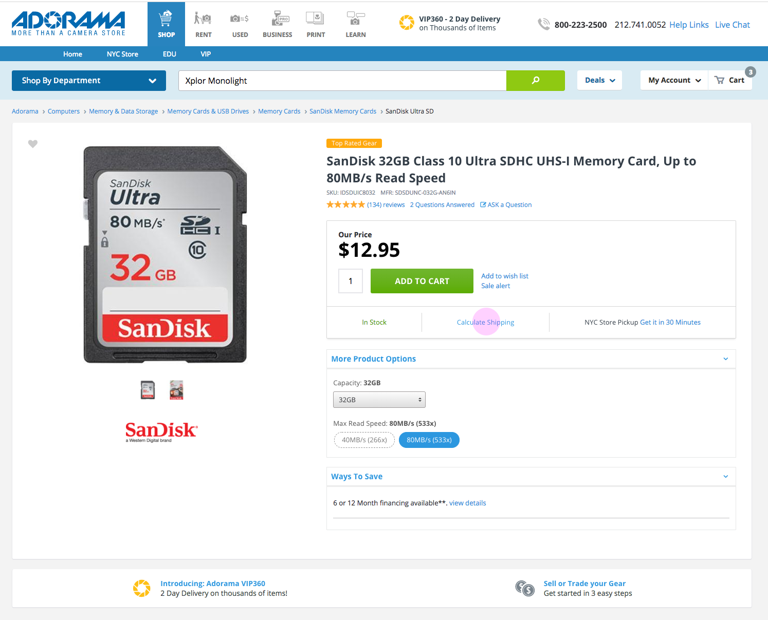
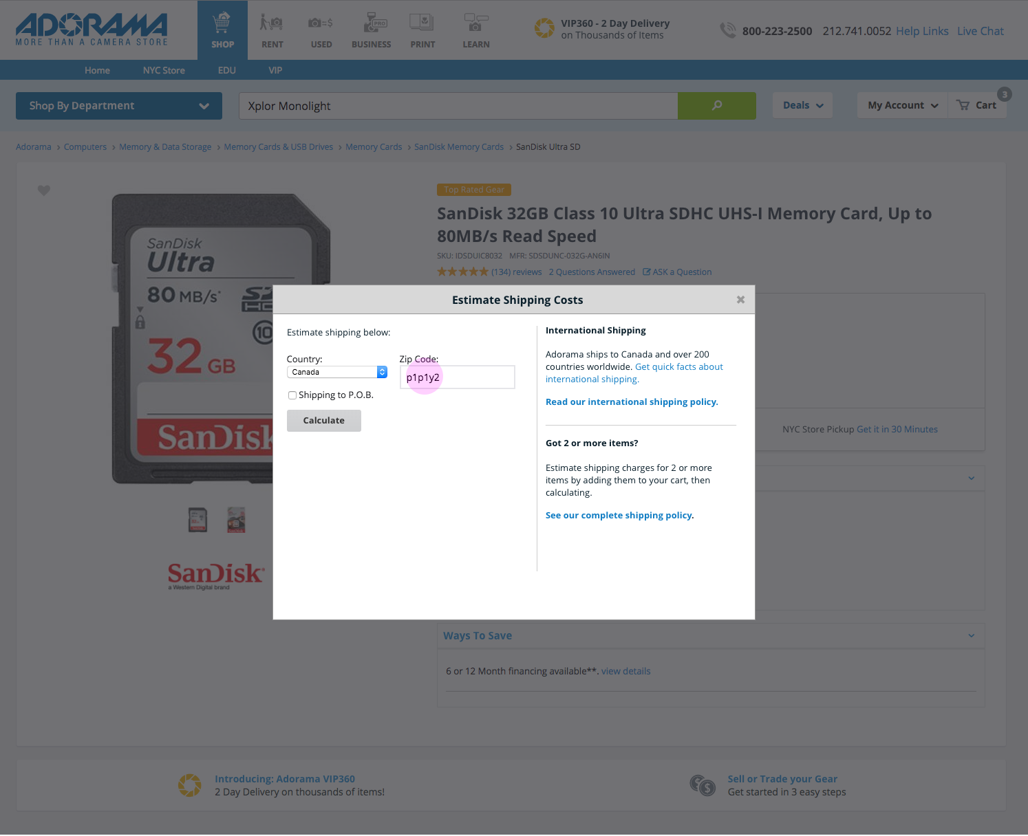
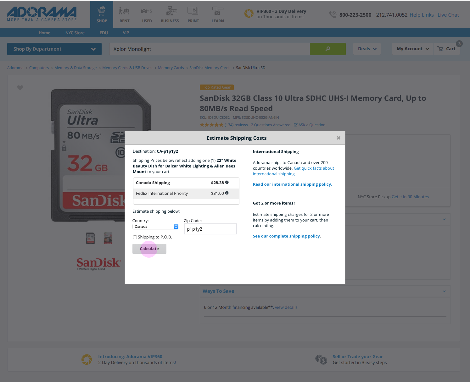
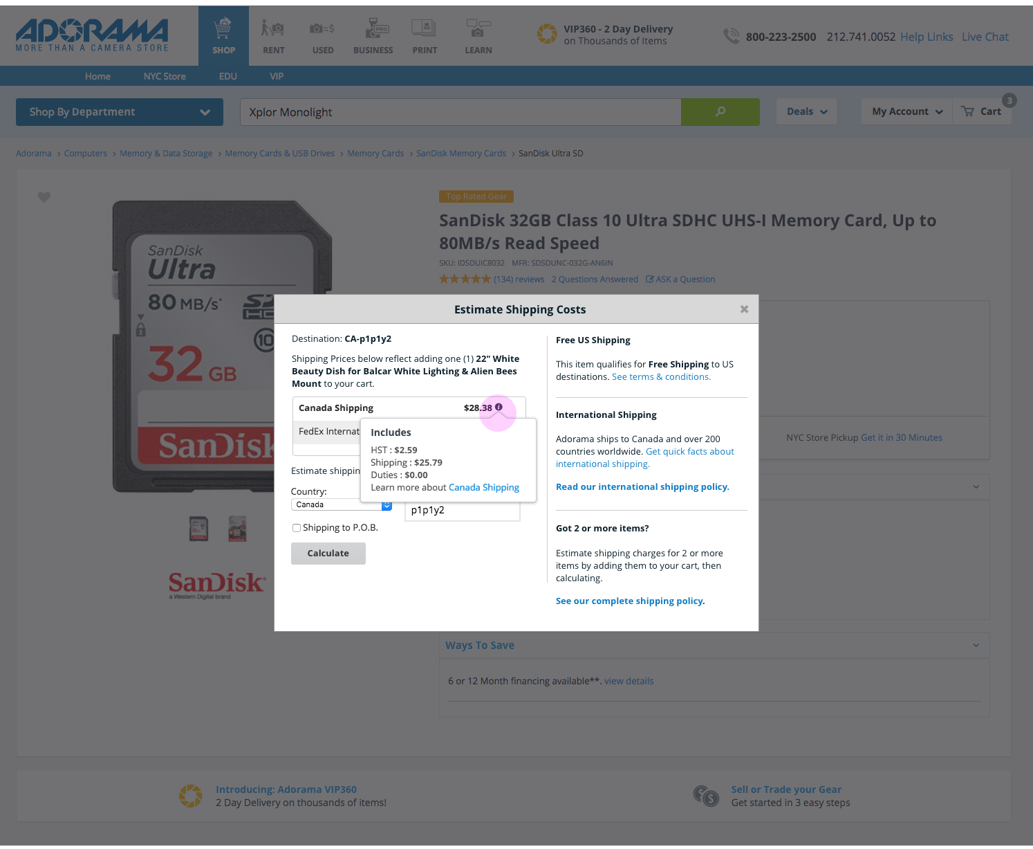
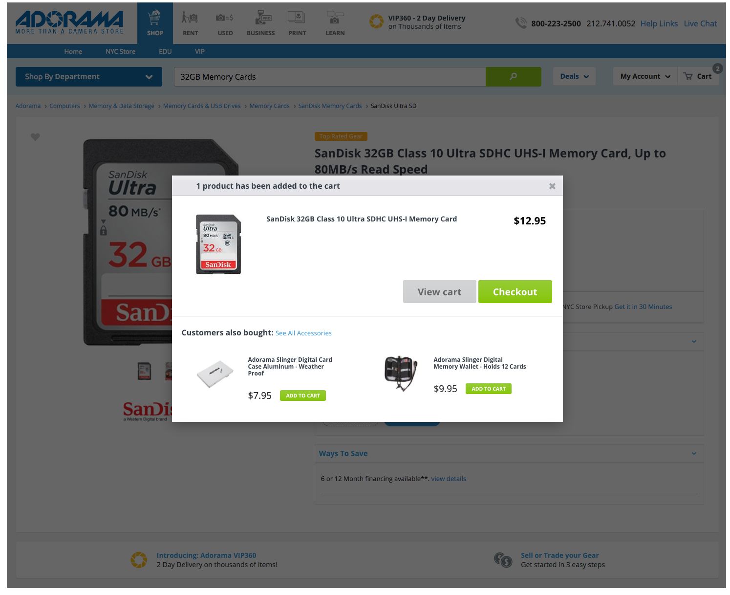
Surprising Finding About Quick View: Don’t Use It

One best practice that surprised me involved the use of Quick View. Baymard Institute identified that around 48% of websites utilize Quick View on product listing pages. However, their research concluded that “Quick Views are often symptom treatments for poor product list designs.” Therefore, the priority would be to create strong designs for the product list pages rather than create a new design for Quick View.

Screenshot
Baymard Institute recommends avoiding ‘Quick View’ overlays and advises focusing on building better product list pages.

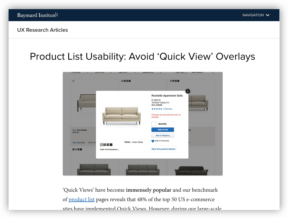
Learn more about this finding on their blog: https://baymard.com/blog/ecommerce-quick-views


Early UX Collaborations with Visual Design in Phase 1

Starting out, the visual design team concentrated on UI foundations, like building a pattern library and exploring typography, etc. We collaborated in a few of the following ways:

Whiteboard with drawing on it.
Depiction of whiteboard exercise.

Shopping Journeys: As a team, we also discussed various shopping journeys to address specific requests from the client.

Information Architecture: We also discussed information architecture and iterated on multiple sitemap options, reviewing the current site, similar sites, and consulting with the tech team.

Phase 1 Conclusion

Phase 1 concluded with a focus on aspects of the product page, shopping journeys, and best practices.


 Phase 2: Design Sprints

Whiteboard with a schedule
Depiction of sprint planning.

Our goal starting Phase 2 was to complete several rounds of sprints. The work would include most of the site, starting with PDP. A few highlights from the start of Phase 2:

Design-Pairing on PDP: In the first month, I closely collaborated with one of the art directors on an early design of PDP. We discussed various options for page elements, like product descriptions and reviews. I gave feedback on functionality and usability.

Annotations for Visual Design: I also supported the visual design team that first month by creating annotations for visual designs, which were uploaded to Confluence.

Responsiveness & Functional Limitations: Throughout the project, I worked with the development team on understanding functional limitations and keeping the layout responsive.

Mid-Project Refocus Towards Global Nav and Framework

As with many projects, plans changed and our work refocused:

Refocus on Global Nav and User Profiles: We redirected our efforts towards the global navigation and user profiles, instead of the shopping journey. The work would now include global header/footer, sign in, account creation, favorites, purchase history, password, etc.

New Client UX Lead, Refocus on Design Framework: On the client side, a new UX team lead with a focus on longer-term goals — including a design framework for all three brands to use.

How Initiative and Collaboration Helped Build a Design System:

At one point in our sprint cycles, the client requested the team start building a design system. The request came with a prioritized list of components from the branding team. As the team reviewed the list, it became clear that the naming convention used by the client created some confusion and made it difficult to get started.

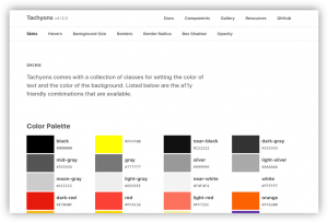
My experience with design systems comes from using or playing around with tools like Basecamp, Foundation, or Tachyons.

When I saw the list, I started thinking about how to break down the designs into smaller elements, so that they could be combined again in increasingly complex ways. Rather than explain my ideas, I thought it best to show the concept.

I created a Sketch document that showed how even the most complex component could be created from combinations of individual elements, as long as they obeyed certain functional rules. The outcome was the design team was able to use my document in establishing a base for the design system. At the end of the sprint, we presented our concepts together.


Outcome

Eventually the UI and UX teams split into two. The visual team supported the design framework/UI and the UX team continued the product design/wireframes.

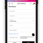
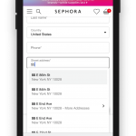
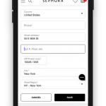
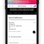
The UX team focused on screens associated with user profiles, including purchase history, favorites, communications, user registration, address book, etc. We spent a lot of time iterating on form design and mobile layouts.


Screenshot references

Newsletter sign up for Dune London, a UK based retailer.

My Week Note blog posts document some of the tasks I completed in Phase 2. They can be found for March, April, and May. A few highlights are below:

  • Created wireframe desktop layout options for account profile dashboards in Sketch
  • Created workflows to map proposed account profile functionality, including update address from account profile and checkout, communication preferences, and expired cards/payment methods
  • Worked with the visual design lead and UX associate director to prep for a client presentation on wireframes and visual design of requirements
  • Included a table within the wireframes to map processes between systems, for better messaging for the customer

If you visited this blog post from my website, you can jump back here.


Sidenote

It sounds like science fiction, but right in the middle of this project a new and deadly virus spread across the United States. A global pandemic was declared. The city of New York became the hardest hit locality in the United States. In the early weeks of March, we stopped travel to the client’s location and the main office. For 2-3 months, all work became remote.

However, back in 2017, I wrote this blog post with tips for better conference calls. The remote work affected some members of the team more than others, but we were able to find new ways to collaborate using online tools and lots of patience.

e-Commerce Shipping Update: A Project Deep Dive

An in-depth look into an e-commerce update for an electronics retailer. The update focused on improving the international shopping experience by clarifying shipping information.

Summary

By conducting UX research on competitors and examining the shopping journey, I made a number of recommended changes to improve the user experience for international customers.

  • Role: UX/UI Design and UI Development
  • Design Tools: Sketch
  • Development IDE: Coda with HTML and CSS
My portfolio includes a quick overview of Adorama: alliwalk.com/ux/adorama/

Problem: Unhappy Customers

Adorama regularly shipped internationally, but many international customers were unhappy when they received their items.

The short answer is the site was not providing enough information about the fees associated with international shipping, leading to unhappy and expensive surprises.

The business owners had only requested a change to the checkout page, which they felt would solve the problem. However, in order to provide the best user experience, I explored the shopping journey, from PDP to checkout, to find out where improvements could be made.


 1. Research & Findings

I researched at least 30 websites to find out how other companies handled international and domestic shipping. I discovered that Adorama was solving a unique problem.

Many online shopping sites do not offer international shipping, even to Canada. Of those that do, the vast majority provide a localized shopping experience, where product prices are displayed in the local currency and shipping destinations are restricted to a single country.

I also discovered that many companies will also not allow customers to associate a US billing address with a Canadian shipping address, or vice-versa. They must both be Canadian (or American).


Shipping and Localization Examples

Sephora, Overstock, Nordstrom, B&H, JCPenny


List of E-commerce sites reviewed:

OfficeDepot, IKEA, Sephora, Target, Overstock, REI, Williams Sonoma, Michaels, Sears, HomeGoods (doesn’t ship), Shop.com, QVC, Macys, Nordstrom, Zappos, JCrew, JC Penny, GameStop, ebay, NewEgg, BestBuy, Walmart, Cars.com (no CAN), plus competitors (Abe’s of Maine, Keh, B&H, RitzCamera, MPB, Samys, and BuyDig).

Conclusion

Adorama offered a unique, non-localized, multi-currency, and cross-country international shopping experience. Given the complexity of the problem, I felt a more comprehensive solution was more appropriate.


2. Design Patterns

Although I was solving a unique problem, I did uncover a few patterns that could be used on Adorama’s website:

A. Supportive Help Pages

For most sites, the best place to look for shipping information was in the help pages, but Adorama’s help pages did not include all information about international shipping.

In fact, while most international customers would only be able to select FedEx International Shipping, the help pages did not include any information about this shipping method.

Screen shot of international shipping information on Adorama website
No FedEx shipping information on Adorama’s help pages.

B. Easy to Access Shipping Information

Competitors included shipping information well before checkout. For instance, Nordstrom advertises its shipping information in the header on the homepage.

Nordstrom homepage features a link to shipping details in the header.

C. Provide Clear & Obvious International Shipping Information

For some websites, the international shipping rates were available when viewing the cart. JC Penney (pictured), Nordstrom and Adorama competitor, B&H (pictured), were good at this.

JC Penney does a good job explaining the choices between international shipping options.

B&H clearly explains the differences in international shipping fees.


3. Recommendations for User Workflow and Wireframes

After all the research and collecting design patterns, I started clarifying the user workflow and the wireframes, focusing on international shoppers. The workflow would flow in the following order:

Help Pages

First the help pages, accessible via the footer, would need to be updated to include new language about FedEx International Shipping. This task was sent to the business owners to complete and finalize.

Product Pages (Wireframes presented)

The next place customers would learn about shipping is on the product pages.  The recommended product page features improved language and tooltips, as well as an updated shipping information section.

Cart and Checkout (Screenshots presented)

The final place for customers to learn about shipping fees.  The recommended changes for the cart and checkout pages would include clarified shipping information, as well as an updated tooltip.


UI Development & Next Steps

As a dual UX designer and UI developer, it was up to me to begin the implementation of changes to the cart and checkout pages.

As of April 2018, only changes to the cart and checkout pages have been implemented. Additional development work will be created in May, or possibly June, for the product page modals.


Thanks for visiting! Feel free to read my latest blog post, or if you came from my portfolio head back there.

Stuff I Learned This Week: Jan 15-19 (actually, it’s February)

First post of 2018 is all about new resources and tools I learned in January, even though I’m writing in February.

Well, it’s a new year and it’s time to get back into writing. I had hoped to be a little more rigorous this year, as well as posting at least once a month, but I’d started writing this post way back in January and I’m just now getting to it in Feb.

So far, there are two subjects I definitely want to write about this year. The first is my experience learning front-end web development. The second is a critical commentary on UX hiring practices. I’ve started writing the second, but I just haven’t gotten the formatting quite right. I also have a few other topics waiting to the side, and I’m excited to get to those, too.

In the meantime, here are a few interesting things I learned this week (back in January).

The Current State of E-Commerce Product Page UX Performance (19 Common Pitfalls)

Now that I am working in e-commerce, I’m really interested in learning more about e-commerce experiences. The goals are a little different from web applications and digital products, but actually more straightforward. The goal is, essentially, getting out of the way of people making purchases. Although the results found on this site are hidden unless you pay, it’s still helpful to just have the names of the sites to review.

Laws of UX

Laws of UX. “Fitt’s Law”

A site that goes over many psychological principles of user experience. Some of these are also similar to fallacies or biases, such as the recency bias. One of them is not actually a “law”, and is just a renaming of Gestalt. I’m not a fan of renaming terms that have perfectly good names. But I am a fan of this concept and the site itself. It gives me ideas for the design of another site – maybe a site about goats.

Nunjucks Templating Language for JavaScript

As I explored the laws of UX site, I found that it had been built on a templating language that I was not aware existed. Nunjucks seems a lot like Pug (or Jade), in that you have a template with content chunks that get written independently and ported in via extend calls. I’m not explaining it well, but templating is amazing.

IBM has a new font

It is called “IBM Plex”. I like it, but it kind of looks like it would be the favorite font of Lt Commander Data.

Zappos Mobile App: Search with emojis

Presumably I downloaded this app because I was looking for shoes. Rain boots, really. Anyway, I was pretty (ahem) delighted to discover that you can search via emoji on the Zappos app. Here are some screen captures from my iPhone, where I’m searching for women’s dress boots.

Version Control Tools for Designers

This week I also came across some version control tools for designers. These are all for Mac computers, and specifically Sketch files. (Sketch is OK, but not great, IMO.) Abstract made the most sense to me; it seemed the closest to git. But here is the list for all 3. I haven’t used any of them.

Namasketch – Yoga For Beginners

Namasketch is a short yoga session for beginners, told in doodles. This sequence consists of ten basic poses in a six-minute flow. The goal is to help you create a strong foundation and develop a love for yoga before you move on to the next level.

A short, intro yoga class for yoga beginners.

It’s cute and friendly, using sketchy animation to demonstrate the poses. I think I might send this to my mom.

You can read more about the production process over at Product Hunt. Looks like he used a product called “Hype” which is the first I’m hearing of it. It’s only $50(!), but doesn’t sound like it’s for production, unless you have a small project like this.

Anyway, that’s what I learned! Until next time… 🙂