Ellen Lupton is a curator of contemporary design at Cooper Hewitt, Smithsonian Design Museum in New York City and director of the Graphic Design MFA program at Maryland Institute College of Art (MICA) in Baltimore. She is also the author of Thinking with Type, which is widely used in graphic design.
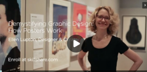
After recently browsing around on Skillshare, I discovered a few of her courses. Many are free and only around 30 min long. Here’s a short list. I haven’t taken them all, but I hope to review them sometime soon.
I’m not a big fan of the Skillshare interface — for one thing, the videos autoplay when you load the page. But, these are pretty short videos, about 30 minutes, so don’t let autoplay scare you. Plus, they’re all free.
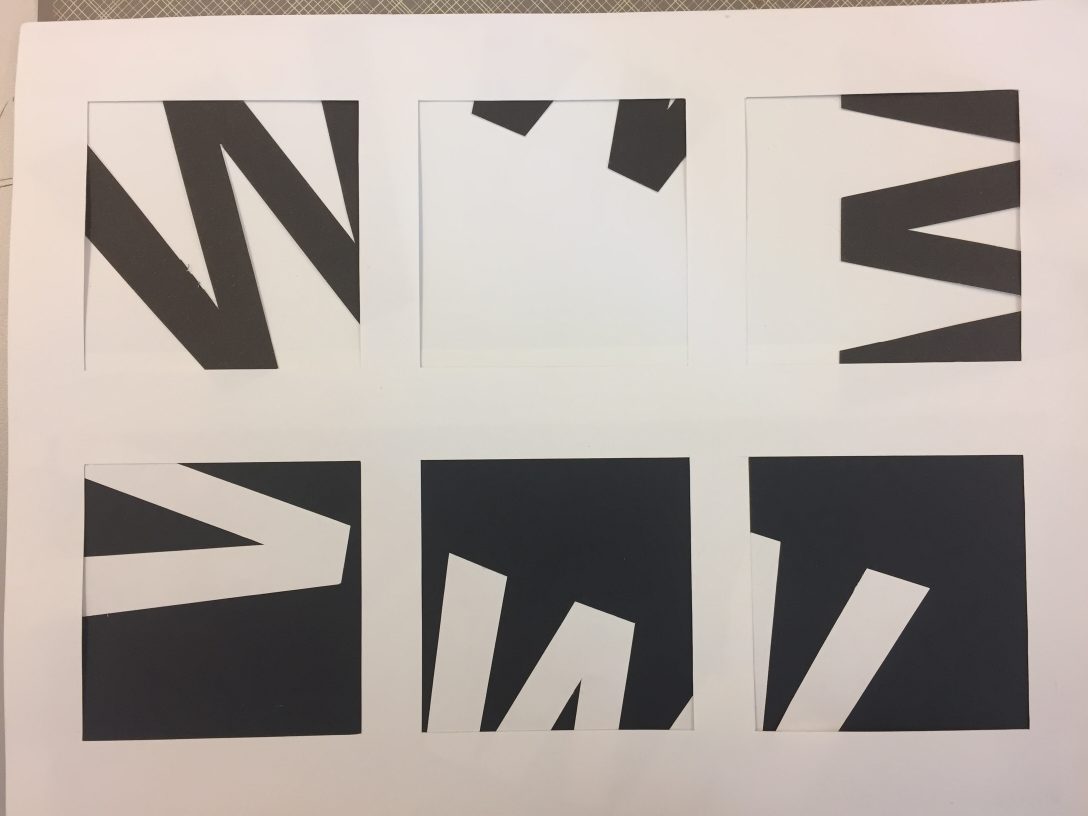
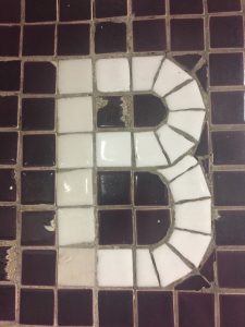
In our last class, we did an exercise where we cut out letters and mounted them on a white or black background. The purpose was using white space and how much we could show the letter. Coincidentally, I got “W”.
Outlining some ideas for my typography class at Parson’s, for our book making projects.
For class, we will be creating 2 projects, which will turn into books. One is a psychogeographical map and the other is a little cooking memoir. I need to come up with idea for each.
The cooking book is to teach us about book binding and selecting type options for recipes, which can have many options. We need to pick a somewhat personal story/recipe. I think I will write about both my hatred of pot pies, as well as my love of Gordon Ramsay’s shepherd’s pie recipe, which I first made during Hurricane Sandy. This was also the week I adopted my cats, only kittens at the time, only 8-10 weeks old. At the time, the subways had been shut down, so I couldn’t go anywhere for a week. Luckily, because I was living so far north in Manhattan, there was no flooding and basically we didn’t lose any power. (In the East Village, it was another story.) I think there’s enough there to write a good story.
For the Psychogeographical Mapping…I’m drawing a blank. Some ideas:
dog runs
pet stores
Japanese grocery stores
Walking down the street listening to Rhapsody In Blue and taking note of what’s around me. (If you haven’t done this, while taking a walk in NYC, you’re really missing out.)
Mapping the Central Park Conservatory Garden, a good place to read. Maybe the benches.
Maybe some better ideas:
Map movie theaters in NYC that aren’t chains, up to 96th St. Meaning no Regal, AMC, or Imax theaters. City Cinemas is OK.
Map Goodwill Donation stores. I do go to Goodwill and the Salvation Army a lot.
I’m leaning towards the theater idea. Now to do some write-ups.
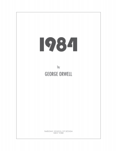
An ongoing assignment for my typography class is a title page design, for book. I chose ‘1984’, by George Orwell, for my first book.
For Typography 1, one of our ongoing assignments is the creation of title pages for a book. Our book choices are limited to the following, with no art or illustrations allowed:
The Great Gatsby—F. Scott Fitzgerald
The Scarlet Letter—Nathaniel Hawthorne
1984—George Orwell
Heart of Darkness—Joseph Conrad
The War of the Worlds—H.G. Wells
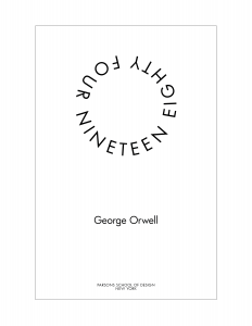
We’ve gone through 1 assignment, and we will be presenting an update to the previous assignment and will be adding another book. My first book choice was 1984. Here are some designs.
1984 – Futura
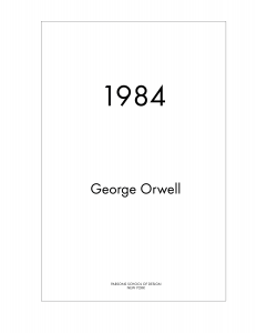
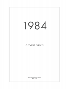
The feedback from critique was this was too much for a title page, but might be OK for a cover.This one was ok, but maybe the title should be bigger, and the author name in all caps and smaller.This one captures all the feedback: larger book title and changes to the author name.
Although the last one captures, all the feedback, it’s not very interesting. Maybe that’s as it should be. I went to Barnes & Noble and saw that many title pages were fairly simple; many followed the style from the cover.
Also, at the time I created this, I thought we were limited to only using the fonts we are going to study in the class which includes Futura. That’s not the case, so in my updates, I found other fonts that I thought suited the title better.
Round 2 – Incorporating Feedback
As of now, I chose 2 fonts that I thought were closer to the feeling of the book. Modern yet restrictive. I chose Bebas Neue and Bauhaus 93 with Futura as my fonts.
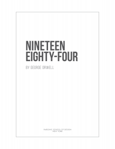
Although I created a bit of a custom version of the numbers, 1984, in Bauhaus 93, to crop the ‘4’ slightly, I prefer the longer ‘nineteen eighty-four’, which I saw in a few examples of the book. It just seemed more polished and finished. I’m undecided if I will use a version with extra space between the title and the author. The publisher is still in Futura.
Updated 1984, using Bauhaus and Futura.Updated Nineteen Eighty-Four in Bebas Neue.Nineteen Eighty-Four with Bebas Neue, with the extra space.
Having looked at them side by side, I think I may go with the version with the extra space between the title and the author. It’s a little less “designy” and seems like it would be better for a title page, whereas when the author is close, it seems more like a cover page.