Update to Free Skillshare Courses: Typography That Works

Not too long ago, I wrote a short post about some free Skillshare courses on typography, presented by Ellen Lupton. What I didn’t write was that for one of those classes, Typography That Works: Typographic Composition and Fonts, I did some of the projects.

Screenshot from skillshare
Typography That Works: Typographic Composition and Fonts

The assignment for this short workshop is to create a few business cards. The first card uses different layout techniques to add hierarchy, interest, and symmetry or asymmetry. The second card is a literary style business card, which looks like a paragraph of text. The third is using one word to create custom letterforms to create a business card.

The first two projects should probably be done in InDesign. The last in Illustrator or some other vector program.

I haven’t yet gotten to the third card project, but here are my first two business cards.

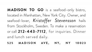
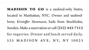
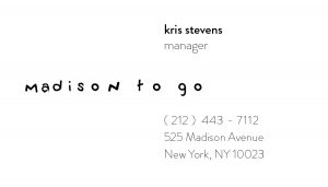
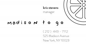
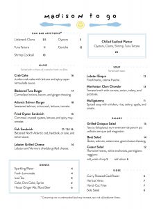
These cards are based on a typography and graphic design project for a business called “Madison To Go”. The business theme is “fresh”. In a previous menu project (see below), I used the font Brandon Grotesque as the body font, but the literary style card with Arno Pro looks really good. I’d have to recreate the menu with Arno Pro to see if it conveyed the same feeling.

Menu for Madison To Go

Design Courses with Ellen Lupton on Skillshare

Ellen Lupton is a curator of contemporary design at Cooper Hewitt, Smithsonian Design Museum in New York City and director of the Graphic Design MFA program at Maryland Institute College of Art (MICA) in Baltimore. She is also the author of Thinking with Type, which is widely used in graphic design.

After recently browsing around on Skillshare, I discovered a few of her courses. Many are free and only around 30 min long. Here’s a short list. I haven’t taken them all, but I hope to review them sometime soon.

Typography That Works: Typographic Composition and Fonts

Screenshot from skillshare


Demystifying Beauty: Inspiration for Design

scrreenshot


Graphic Design Basics

Screen shot of video on scale


How Posters Work

Title slide for skillshare


I’m not a big fan of the Skillshare interface — for one thing, the videos autoplay when you load the page. But, these are pretty short videos, about 30 minutes, so don’t let autoplay scare you. Plus, they’re all free.

Skillshare Course in iOS Design: User Experience

Introduction

In my last post, I discussed a project I had been completing as part of a Skillshare class. This is the second post in that series.

Sketches

As I left off in my last post, I skipped over the persona portion of the course. I did return, in part, to personas but not until the visual design.

I ended up doing about 3 pages of sketches. My documentation shows how I worked out smaller interaction elements, like navigation elements.


This is the part of the workflow is where the interaction design and user experience start to come together. The instructor chose to update the Southwest app. The visual design looked great and I liked her workflow overall. But there was a piece of this workflow that was missing – and that was competitive research. There was little in the way of looking at related apps to get an idea of what people might experience from something similar.

It’s easier to become efficient with a new interface if it contains familiar elements. This is one reason why I research competitors. I’ve also found that using real life examples helps convince others on the team that the product is actually feasible and can implemented as designed.

I did some looking around on my own, finding screenshots from different library websites. The Audible, the Apple Music and Podcast apps, and SoundCloud were helpful. It may be confirmation bias, but this competitive research was far more useful than the personas I didn’t create.

Wireframes

The difference in the wireframes for this project, and projects I’ve done at work, is how she used a vertical layout to present her work. I thought that was pretty smart. And, though it wasn’t specified in the course, I included annotations because I wanted to include ambiguity. (Normally I’d include more.)

For the actual wireframes, I created 2 layouts. I noticed when reviewing the other apps that there’s often a large image in the center of the screen. I felt that this was unnecessary, especially on the playback screen. My solution was to reduce it and focus on the controls.


Next Post…

The next and final post in this series will be about the visual design work I did for this project.

Skillshare Course in iOS Design: Planning

Introduction

As I mentioned in a previous post, I recently completed a Skillshare class on iOS design. The focus of the course is to take an existing app and update it. Part 1 of the 3-part course is all about UX design. The instructor takes students through planning, personas, user journeys, and wireframes. Here is the work I did for Part 1.

Planning

The app I selected was Axis 360. This is an app that allows people to checkout audiobooks and e-books using their library card. It’s an app that I’ve been using quite a bit and I wanted to focus on improving it if possible.

The first thing I did was take screenshots of the existing app.


The course then begins by creating a high level list of activities someone can complete on the app. I focused on listening to an audiobook. The instructor used sticky notes, so I did too.

Scenarios
Scenarios. (You can see sketches on the reverse page.)


User Journey

From there, I created a high-level user journey. This includes a screen with a list of checked out books, a book detail screen, and a playback screen.

User Journey
User Journey, for Axis 360


Personas

At this point in the course, the instructor introduced personas. In this case, these were proto-personas. I admit that I did not complete this part of the 3-part course.

My philosophy is that personas are only useful if they can be validated by objective data. This includes providing completed personas to a client, or by interviewing potential users. In my case, I had neither a client nor potential users. Unvalidated user needs, demographic data (age, marriage status, gender), and interests (stock-car racing) would be a work of fiction and thus useless in directing the experience. So, I skipped this step, although I came back to it during the visual design phase.


Next up…

In the next post, I’ll talk about sketches and wireframes.