Notes on “The Immutable Rules of UX” (video)

I recently watched this quick video on the Immutable Rules of UX, 39min. Curious about what they are? Check out the video, or my notes below.

These are my notes from the video.

  • Even in early tech, people like using a little picture of themselves; customization.
  • Use the 3 principles of UX: design, test, measure. Test with real users. Test before you launch. Use prototypes. Remember your first design will be wrong.
  • Don’t invent new terms to get respect for UX. Producing results will get you respect.
  • People have limited brain capacity. Design accordingly.
  • Usefulness = Utility + Usability. Without both, people will not use your product. AI/Voice Interfaces don’t have much usefulness to increase adoption, yet. They must improve if they will succeed in the future.
  • Remember that the web is really big and most people spend their time on other people’s sites. This means that user expectations keep changing and improving based on other people’s sites. Always keep improving. Satisfaction is a matter of the relationship between what you get relative to what you expect.
  • Remember that UX is about people.

From the presentation

In his presentation, he put the following list, which you can find at this part of the video. https://youtu.be/OtBeg5eyEHU?t=783

  • User centered design
  • early = better
  • more iterations = better
  • low commitment / discount methods = better
  • UX architecture & UI details both important

Thanks to JB for pointing out a small typo!

NNG: The Myth of the UX Unicorn

I hope this short, 2:36 video is just the start of a more public conversation about hiring practices within the UX community. I hope it helps to define UX titles and terms, and I hope it helps UX teams break past unspoken practices in team dynamics and hiring. A video like this is a long time coming and covers one aspect of a topic I have been thinking about for the past few years.

The UX Unicorn Myth (Jakob Nielsen)

Summary: UX constitutes many different specialties such as researcher, interaction designer, and Information architect. Forcing one person to do it all is a prescription for mediocrity.

Stuff I Learned This Week: Jan 15-19 (actually, it’s February)

First post of 2018 is all about new resources and tools I learned in January, even though I’m writing in February.

Well, it’s a new year and it’s time to get back into writing. I had hoped to be a little more rigorous this year, as well as posting at least once a month, but I’d started writing this post way back in January and I’m just now getting to it in Feb.

So far, there are two subjects I definitely want to write about this year. The first is my experience learning front-end web development. The second is a critical commentary on UX hiring practices. I’ve started writing the second, but I just haven’t gotten the formatting quite right. I also have a few other topics waiting to the side, and I’m excited to get to those, too.

In the meantime, here are a few interesting things I learned this week (back in January).

The Current State of E-Commerce Product Page UX Performance (19 Common Pitfalls)

Now that I am working in e-commerce, I’m really interested in learning more about e-commerce experiences. The goals are a little different from web applications and digital products, but actually more straightforward. The goal is, essentially, getting out of the way of people making purchases. Although the results found on this site are hidden unless you pay, it’s still helpful to just have the names of the sites to review.

Laws of UX

Laws of UX. “Fitt’s Law”

A site that goes over many psychological principles of user experience. Some of these are also similar to fallacies or biases, such as the recency bias. One of them is not actually a “law”, and is just a renaming of Gestalt. I’m not a fan of renaming terms that have perfectly good names. But I am a fan of this concept and the site itself. It gives me ideas for the design of another site – maybe a site about goats.

Nunjucks Templating Language for JavaScript

As I explored the laws of UX site, I found that it had been built on a templating language that I was not aware existed. Nunjucks seems a lot like Pug (or Jade), in that you have a template with content chunks that get written independently and ported in via extend calls. I’m not explaining it well, but templating is amazing.

IBM has a new font

It is called “IBM Plex”. I like it, but it kind of looks like it would be the favorite font of Lt Commander Data.

Zappos Mobile App: Search with emojis

Presumably I downloaded this app because I was looking for shoes. Rain boots, really. Anyway, I was pretty (ahem) delighted to discover that you can search via emoji on the Zappos app. Here are some screen captures from my iPhone, where I’m searching for women’s dress boots.

Version Control Tools for Designers

This week I also came across some version control tools for designers. These are all for Mac computers, and specifically Sketch files. (Sketch is OK, but not great, IMO.) Abstract made the most sense to me; it seemed the closest to git. But here is the list for all 3. I haven’t used any of them.

Namasketch – Yoga For Beginners

Namasketch is a short yoga session for beginners, told in doodles. This sequence consists of ten basic poses in a six-minute flow. The goal is to help you create a strong foundation and develop a love for yoga before you move on to the next level.

A short, intro yoga class for yoga beginners.

It’s cute and friendly, using sketchy animation to demonstrate the poses. I think I might send this to my mom.

You can read more about the production process over at Product Hunt. Looks like he used a product called “Hype” which is the first I’m hearing of it. It’s only $50(!), but doesn’t sound like it’s for production, unless you have a small project like this.

Anyway, that’s what I learned! Until next time… 🙂

Skillshare Course in iOS Design: User Experience

Introduction

In my last post, I discussed a project I had been completing as part of a Skillshare class. This is the second post in that series.

Sketches

As I left off in my last post, I skipped over the persona portion of the course. I did return, in part, to personas but not until the visual design.

I ended up doing about 3 pages of sketches. My documentation shows how I worked out smaller interaction elements, like navigation elements.


This is the part of the workflow is where the interaction design and user experience start to come together. The instructor chose to update the Southwest app. The visual design looked great and I liked her workflow overall. But there was a piece of this workflow that was missing – and that was competitive research. There was little in the way of looking at related apps to get an idea of what people might experience from something similar.

It’s easier to become efficient with a new interface if it contains familiar elements. This is one reason why I research competitors. I’ve also found that using real life examples helps convince others on the team that the product is actually feasible and can implemented as designed.

I did some looking around on my own, finding screenshots from different library websites. The Audible, the Apple Music and Podcast apps, and SoundCloud were helpful. It may be confirmation bias, but this competitive research was far more useful than the personas I didn’t create.

Wireframes

The difference in the wireframes for this project, and projects I’ve done at work, is how she used a vertical layout to present her work. I thought that was pretty smart. And, though it wasn’t specified in the course, I included annotations because I wanted to include ambiguity. (Normally I’d include more.)

For the actual wireframes, I created 2 layouts. I noticed when reviewing the other apps that there’s often a large image in the center of the screen. I felt that this was unnecessary, especially on the playback screen. My solution was to reduce it and focus on the controls.


Next Post…

The next and final post in this series will be about the visual design work I did for this project.

UX Design Fundamentals: UXApprentice.com

UXApprentice.com

UX Apprentice is a static website that takes site visitors through a 3-step UX project to teach visitors about the process of UX. The steps the site goes through are Discovery, Strategy, Design.

As it states on the first page, each step describes what the step is all about, it provides examples, there’s a very short knowledge quiz, and a list of resources consisting of books, articles/sites, and a

As it states on the first page, each step describes what the step is all about, it provides examples, there’s a very short knowledge quiz, and a list of resources consisting of books, articles/sites, and a who’s who list of names.

Alphas:

  • Great connection between the description of the information, using the outlines and icons from the top of each page to the bottom.
  • Good use of navigation to prompt site visitors to go from one explanation to another.

Deltas:

  • The website provides a lot of information, but it’s highly biased to be accessible for people who already know a bit about UX. There just isn’t enough information to help someone who is totally new to UX get started.
  • Many of the articles are a few years old, and a few links for the books and articles are broken. For instance, I tried to take a look at the Kevin Cheng book on the Discovery page, and an article on the strategy page called “What is User Experience Strategy, Anyway?” Both links were dead. See update.
  • It’s an advertisement for Balsamiq. While I like the information this site provides, in the end the entire site is essentially an advertisement for the wireframing tool Balsamiq. It doesn’t hit you over the head with it, but it’s the truth.

Final Thoughts

I’d still recommend the site to someone as a possible resource, along with other resources, but I’d preface it by saying that there might be a lot of broken links in the reference sections.


Update

As you can read in the comments, Jessica from Balsamiq contacted me to let me know that they updated their links. I’ve checked it out and this appears to be the case.

Some of the people they’re linking to may have broken links, but that can’t be helped.

Checking out their resources, I found a 4-video series of Lean UX Strategy YouTube which I recommend because it won’t take more than 15 minutes to watch.

UX Design Fundamentals, Part 1: Getting started

Getting started in UX: a comprehensive list of resources. Part of a 3-part series on resources about the fundamentals of UX.

While I haven’t exactly been a mentor before, I have helped people learn more about the field of User Experience. In a few recent jobs, I’ve had someone ask how they can learn more about UX.

I provided my own responses, but since then I’ve come across a few different examples of comprehensive UX introductions that have a lot of good information to offer. I thought reviewing each would make a good blog post. First, I’ll include my tips, then the static examples. Finally, I’ll review a few video courses in the next post.

Part 1: My List

As I mentioned above, I’ve had people ask me about how they can learn more about UX. The thing to keep in mind is that these are people who are totally new to UX – as opposed to people who work in software development, visual design, or some other related field. Or people who’ve gone through some classes and are looking for more information.

One person in particular asked me about more information and I provided a comprehensive list of UX resources. My main focus was to provide a starting place to learn more about the field of UX, and less so about the process of UX. I’ve found that process can change, slightly or drastically, depending on where you work. I did not provide any resources on Lynda, though they’ve updated their site since then, because the resources felt like a starting point for someone who’s already gotten started in UX.


Everything below this point was originally sent in an email, called Lots of UX, though not necessarily in this order.

Also note that my links to Amazon go to smile.amazon.com, in support of the ASPCA.

One quick note!

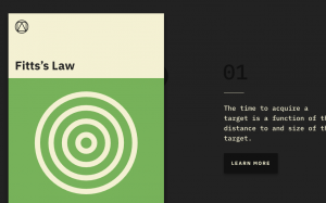
The one thing to know about UX (which is really human-computer interaction), is that the core of it is psychology – think of it as the application of cognitive psychology. So, it can be applied in many different contexts, not just on traditional websites.

Also, not everyone who works in UX is a designer; some people only do research.

Quick Start!

Some things to think about right now, as you go about your way in the world…

Books 

  • The Design of Everyday Things – this will change the way you view the world. About Book
  • The Inmates are Running the Asylum – this discusses the importance of designing for the actual users, not the stakeholders. Book
  • Don’t Make Me Think – simple primer on what usability is all about. Can read in a day. Book
  • Universal Principles of Design – think of these as though they are from a cognitive psychology perspective vs a design perspective. Book

There are many other handbooks about actually designing and testing, but these are good to first get yourself in the right frame of mind!

Sites/Newsletters

A Few People

  • Don Norman, Jakob Nielsen, Bruce Tognazzini (I would look them up individually…)
  • Alan Cooper (designer) – …also look him up…
  • Alan Tufte – …and him, too.
  • Ben Schneiderman – see also his personal project with many names of other people you can learn about! (https://hcipioneers.wordpress.com/)

Accessibility
I don’t have a book, but you should also learn all you can about accessibility because it’s very important. It gets into the field of Ergonomics and Human Factors which is more about the design of chairs, handles, doorways, phones, etc.

http://www.w3.org/standards/webdesign/accessibility

Information-Seeking Behavior
OK, I’m sneaking this in… This is not likely in these books, because it’s a complicated, grad-level concept. Unfortunately, I wasn’t really able to find examples that are not long research papers.

Essentially, information-seeking behavior is the idea that all humans search for information in the same way that we evolved to search for food. We have a need, we act to satisfy that need, either actively or not. We do not always know for sure what we’re looking for, and so we satisfy our queries piece by piece, while all the time asking if this new information gets us closer to what we think we’re looking for or not. Like I said, it’s complicated so if this is still confusing, I can try to explain it to you in person!


Of course I then ended the email with a few nice words, but that’s my list!

The next post will be about a static site I found providing an intro to UX fundamentals, and other websites to add to this list.