Work Sample · Business Application · NYC

UX Audit of Event Management Software

Overview of a UX audit of an event planning and attendee management platform within Condé Nast.

Audience:
DOOR3
Company:
Condé Nast
Role:
UX Designer
Tool:
Google Slides
decorative image for Infogroup

Problem

The client needed to overcome significant tech and design debt and needed help identifying and prioritizing usability issues with their platform. The short-term goal was a UX evaluation to recommend design solutions, with findings to guide a roadmap of future updates.

Approach

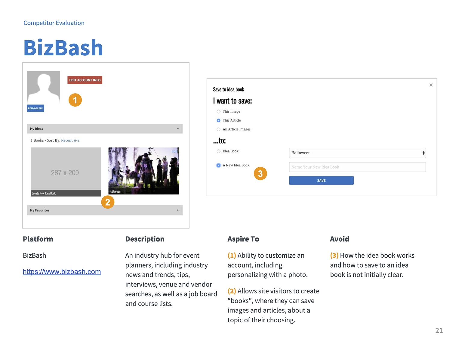
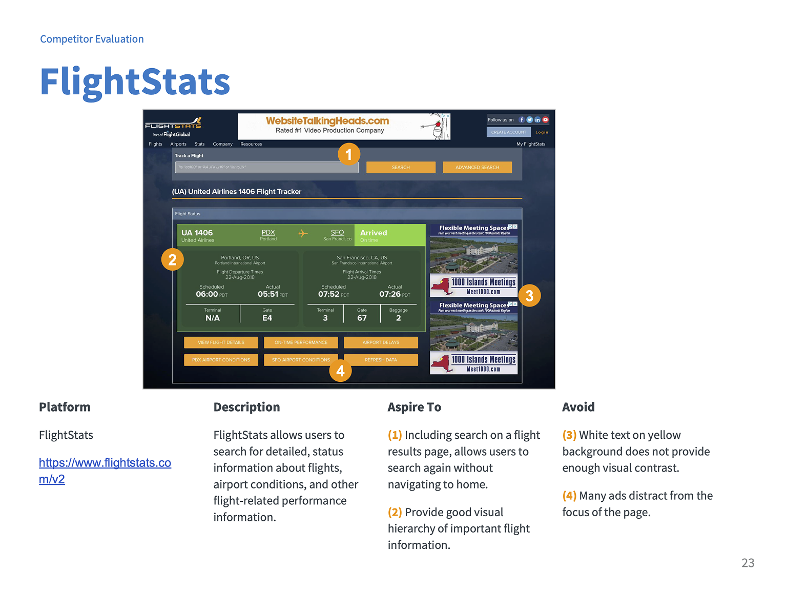
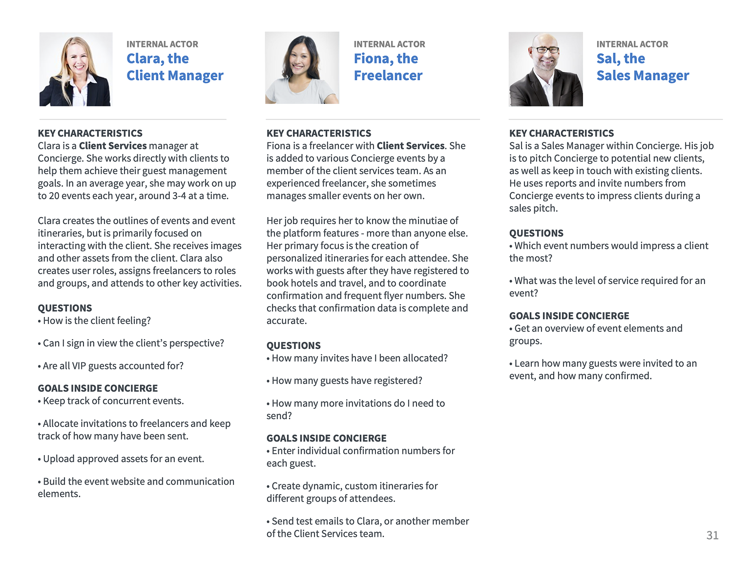
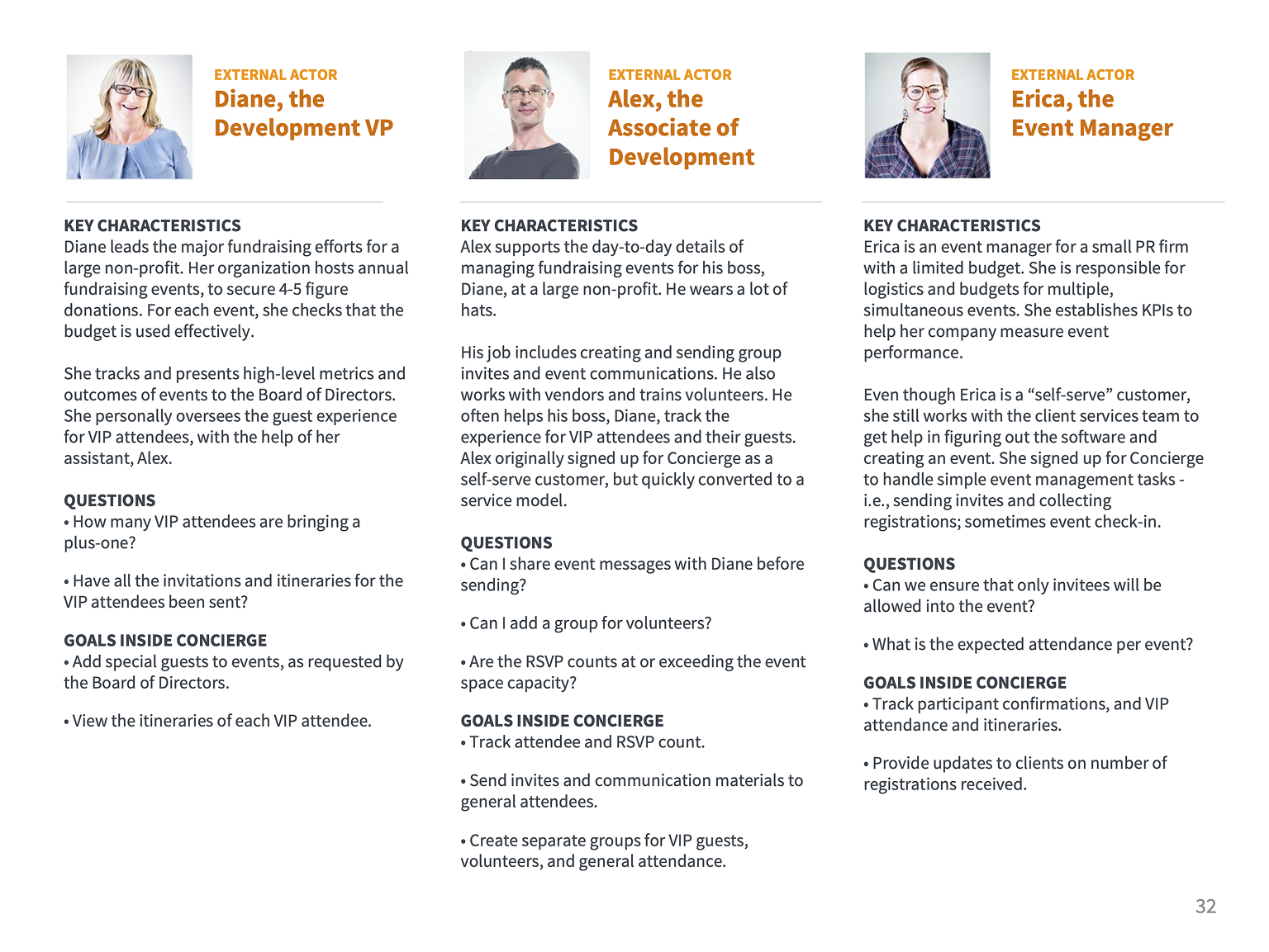
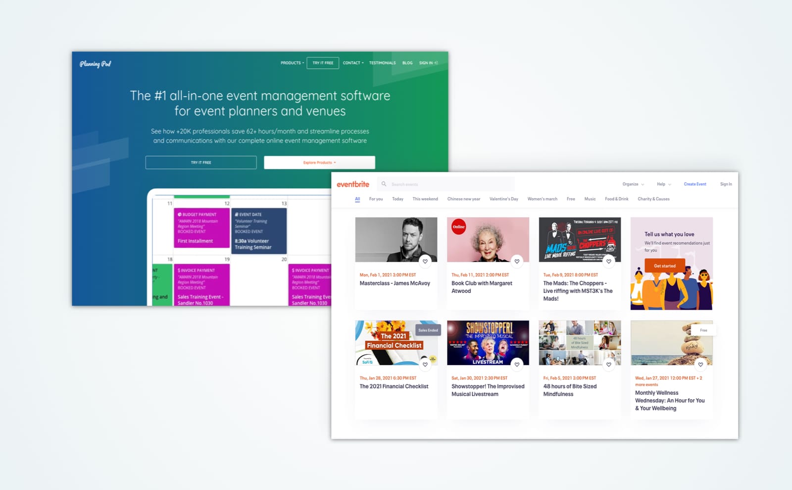
The audit covered three areas: a competitive review of 20+ event management platforms, stakeholder interviews to define personas by role, and a heuristic evaluation referencing Nielsen's 10 Usability Heuristics and Tognazzini's First Principles. Findings were documented in Google Slides.

Outcome

The audit identified over 70 usability issues. Findings were presented with a focus on the connection between usability issues and productivity — a framing chosen specifically because the platform's primary users were internal staff. The audit led to subsequent UX design work on this and related projects for the same client.

Client overview

Concierge was a web-based, event-planning and attendee management platform, within Condé Nast. Members of the Concierge Client Services team used the platform to create personalized, custom itineraries for attendees of their clients’ events.

The platform allowed users to plan and organize event activities, and to create and send custom guest communications. Additional users of the platform included Concierge freelancers and a handful of self-serve clients.

Project context

To provide some context about why the audit emphasized productivity and was given its overall structure, here are a few areas of key background information that made this project distinctive.

  • Audience: The platform was used primarily by internal Condé Nast staff, not end customers.
  • Training: It required extensive training to use, a red flag indicating underlying usability problems.
  • Permissions: Roles and permissions heavily controlled what each user could do, making the persona work especially important.
  • Goal: The goal was to find issues and to prioritize them in a way that had a real business impact (e.g., increased productivity, reduced training time, etc).

I conducted a competitive review to understand industry conventions and identifying potentially useful features before evaluating the client's own platform.

I reviewed over 20+ direct and indirect competitors and related industries. Findings were organized into 4 categories:

  • Overall features (ex: 3rd-party integrations)
  • Platform specific features (e.g. favorites lists)
  • Design and information architecture (e.g. high-contrast color use)
  • Additional event capabilities (e.g. RFID event tracking)
[Alt text]

Overview slide

audit of bizbash

BizBash review

flight stats review

Flight Stats review

The platform's role-based permissions system meant that different users had fundamentally different experiences. Defining personas by role was essential to evaluating the platform fairly.

I conducted stakeholder interviews to define personas by roles, goals, and tasks. Three key factors shaped the user experience:

  • Roles and permissions controlled functionality and access
  • The core user group was internal and rarely used by their clients
  • The platform required extensive training
Personas of internal actors

Internal Actors represent direct users.

Personas of external actors

External Actors represent indirect users, like clients.

Permissions matrix

Permissions matrix of roles and access privileges

The heuristic evaluation provided a structured framework for identifying and presenting usability issues, while ensuring consistency and defensibility.

Methodology

I referenced Jakob Nielsen's 10 Usability Heuristics and Bruce Tognazzini's First Principles of Interaction Design. I identified over 70 usability issues. While many were not showstoppers individually, the cumulative number was a concern.

I also included an appendix covering typography, accessibility, and navigation resources.

Stakeholder obstacle

Our key stakeholder believed that a difficult-to-use application requiring extensive training was a sign of a sophisticated application; that it was not a problem.

Pivot to productivity

To counter this push-back, when presenting my findings, I focused on the connection between usability and productivity costs, given that the primary users were internal staff whose efficiency directly affected the business.

Overview about heuristic evaluations

Overview about heuristic evaluations

Finding about workflow and task order

Finding about workflow and task order

Finding about navigation

Finding about navigation

The audit delivered a comprehensive, prioritized view of over 70 usability issues, presented to stakeholders with a clear connection to productivity impact. In the months following the audit, I continued as a UX designer on this and related projects for the same client. My deep knowledge of the product helped me write detailed documentation for when I eventually moved onto other clients.

Changing priorities later impacted the long-term design roadmap established at the start of the project, however the audit itself remained a strong foundation for future improvements to the platform.