Case Study· E-Commerce, Premium Fashion · NYC

E-Commerce Redesign for Luxury Retail

Research and responsive design for Stuart Weitzman, Kate Spade, and Coach e-commerce sites during a CMS and backend migration.

Agency:
Publicis Sapient
Role:
Contract UX Designer
Timeline:
Late 2019 – Mid 2020
Tools:
Sketch, Keynote, InVision
Decorative image for luxury retail e-commerce project

Problem

Tapestry — parent company of Stuart Weitzman, Kate Spade, and Coach — wanted to introduce design updates across three premium fashion e-commerce sites during a CMS migration. The new CMS offered limited front-end capabilities, so design decisions had to work within a limited technical environment.

Approach

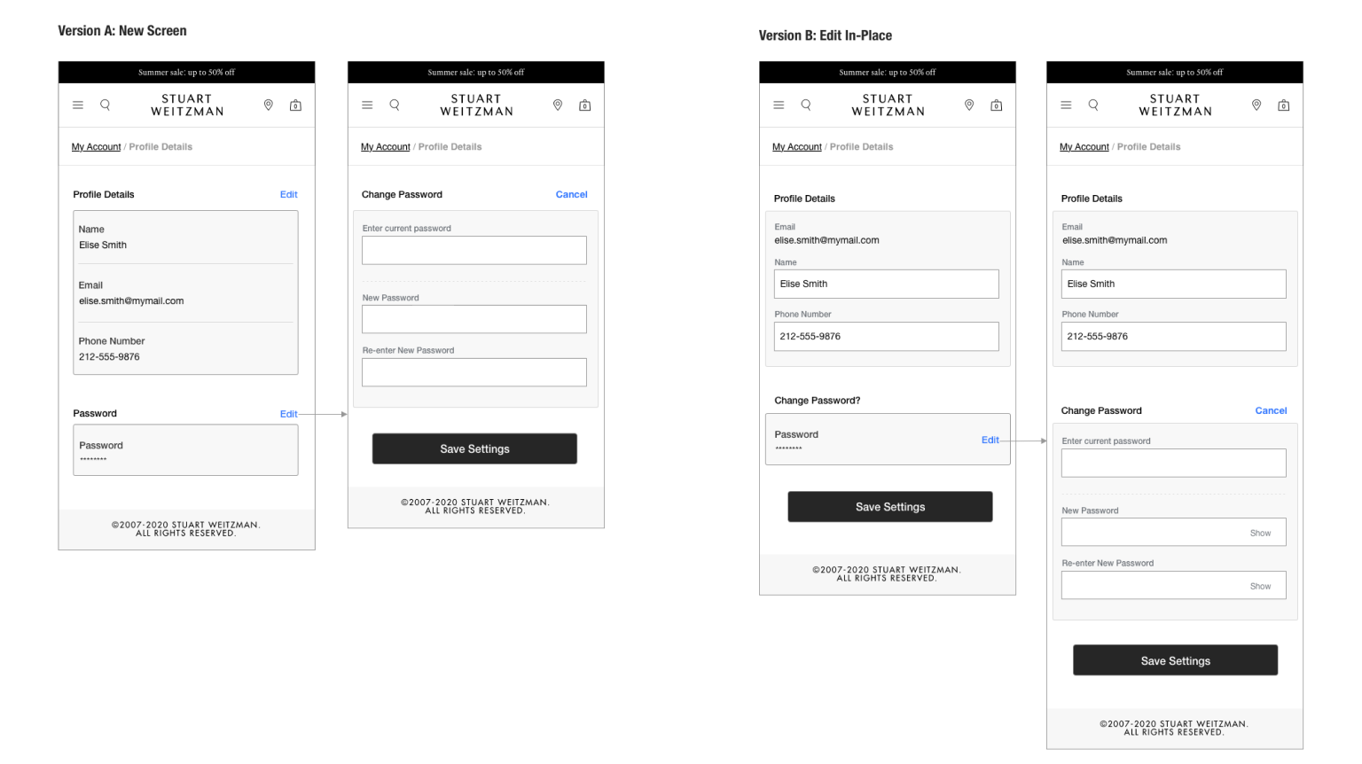
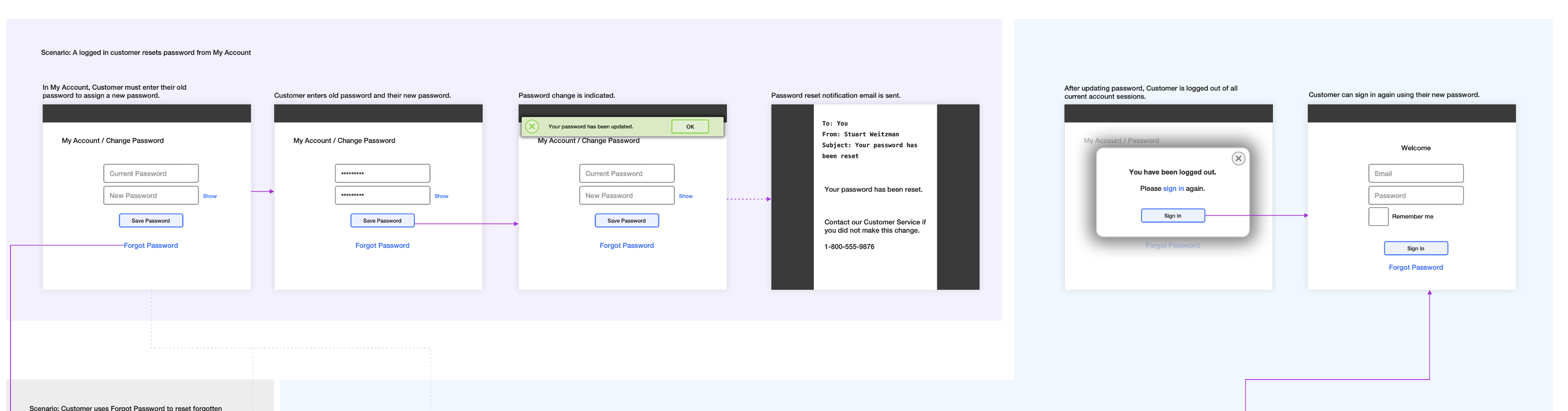
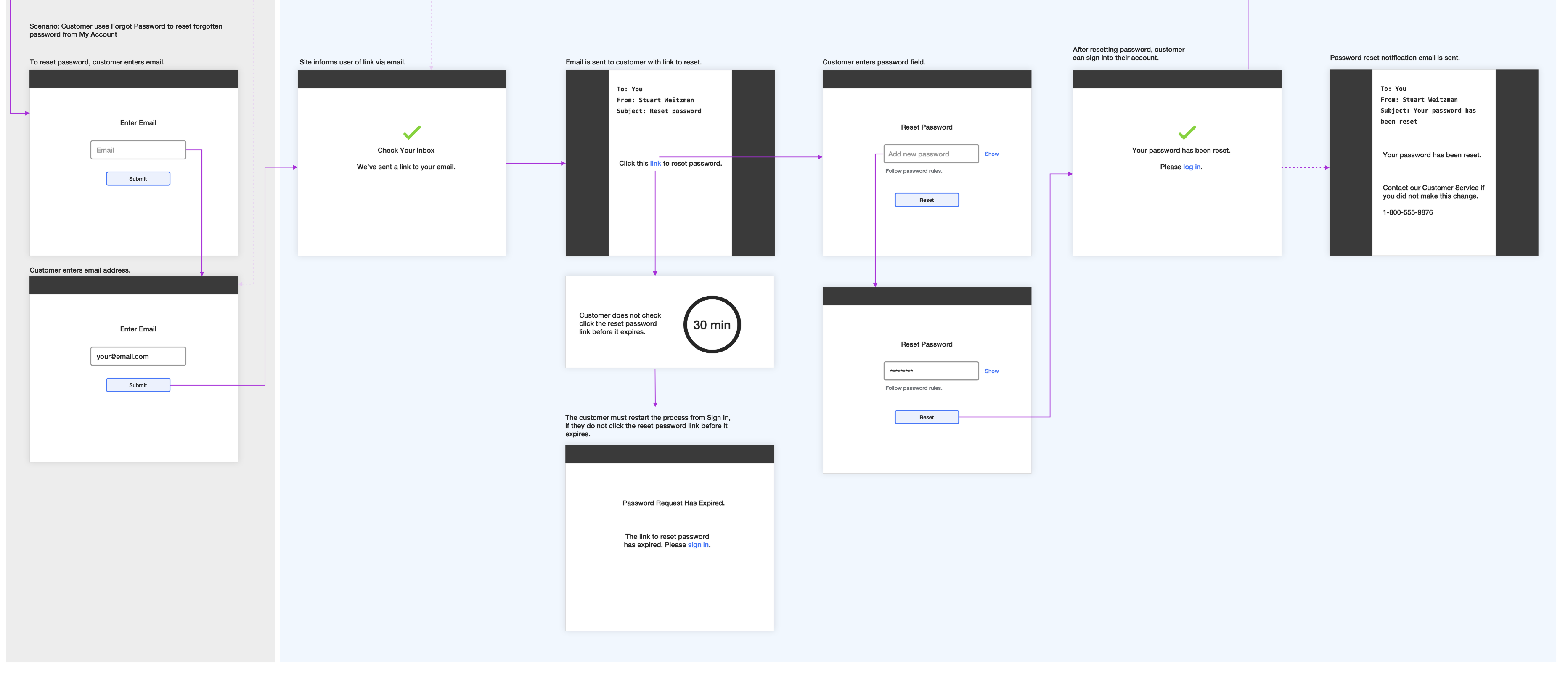
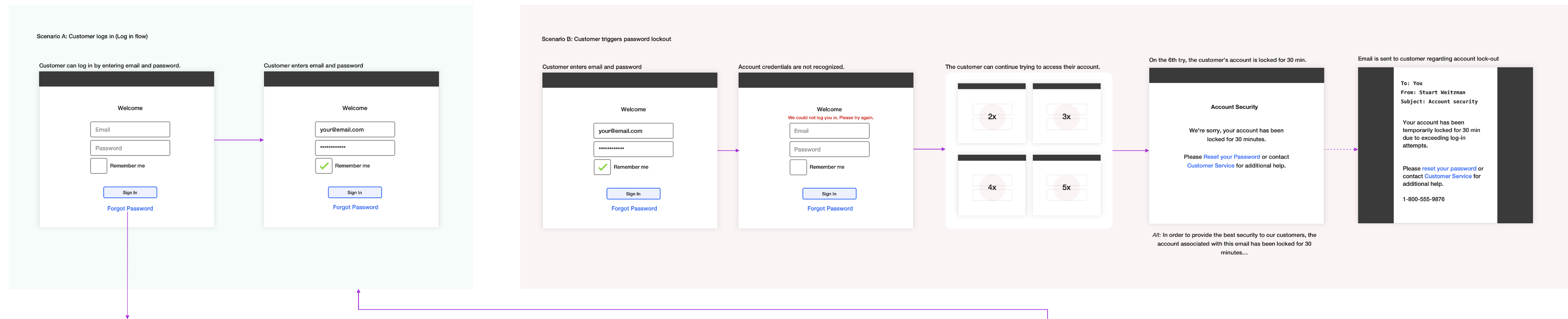
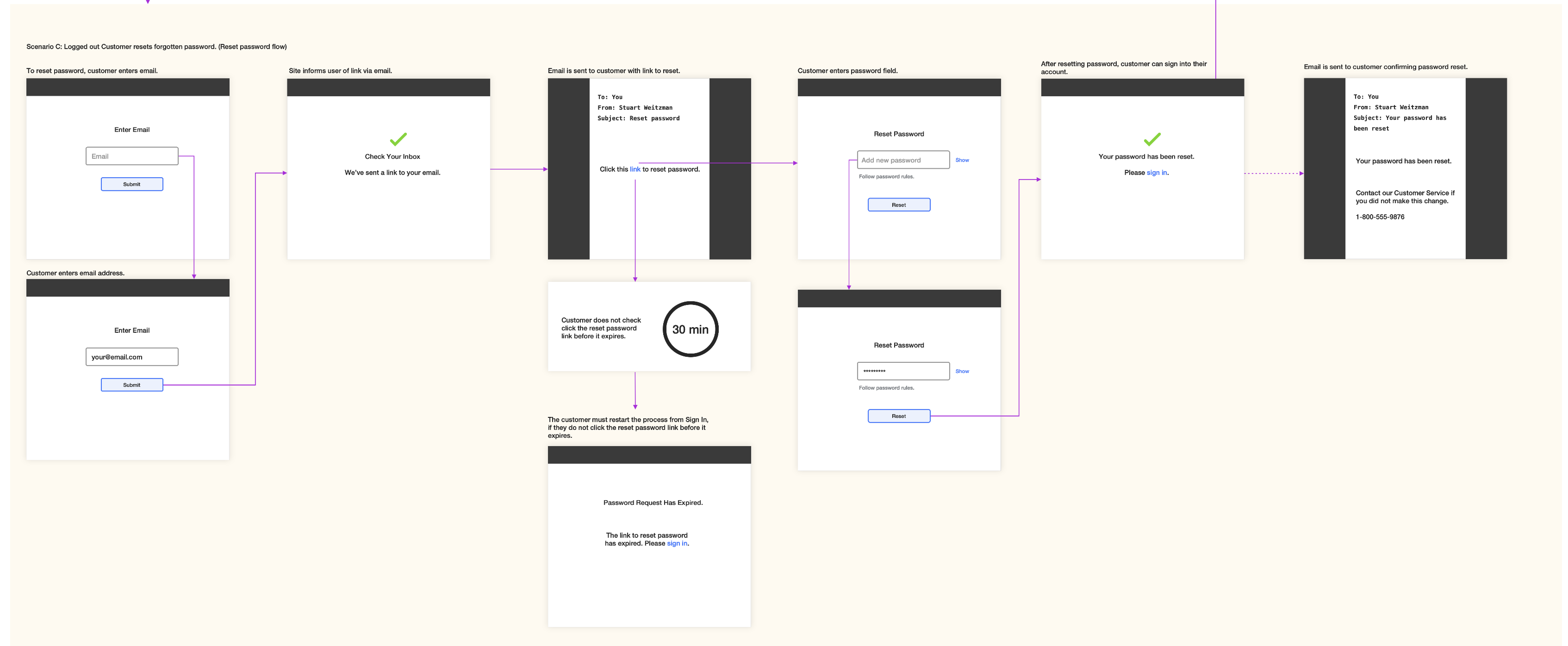
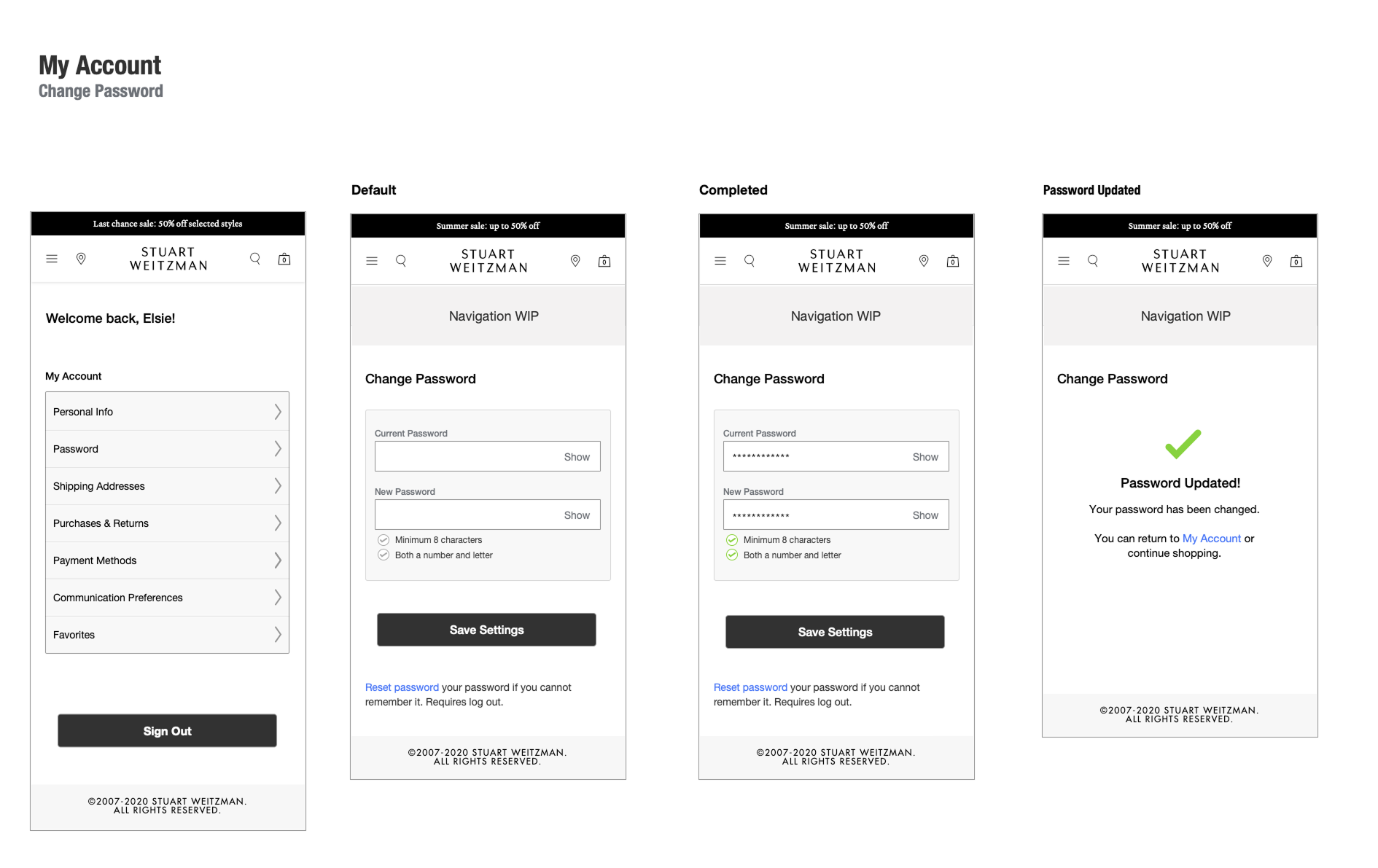
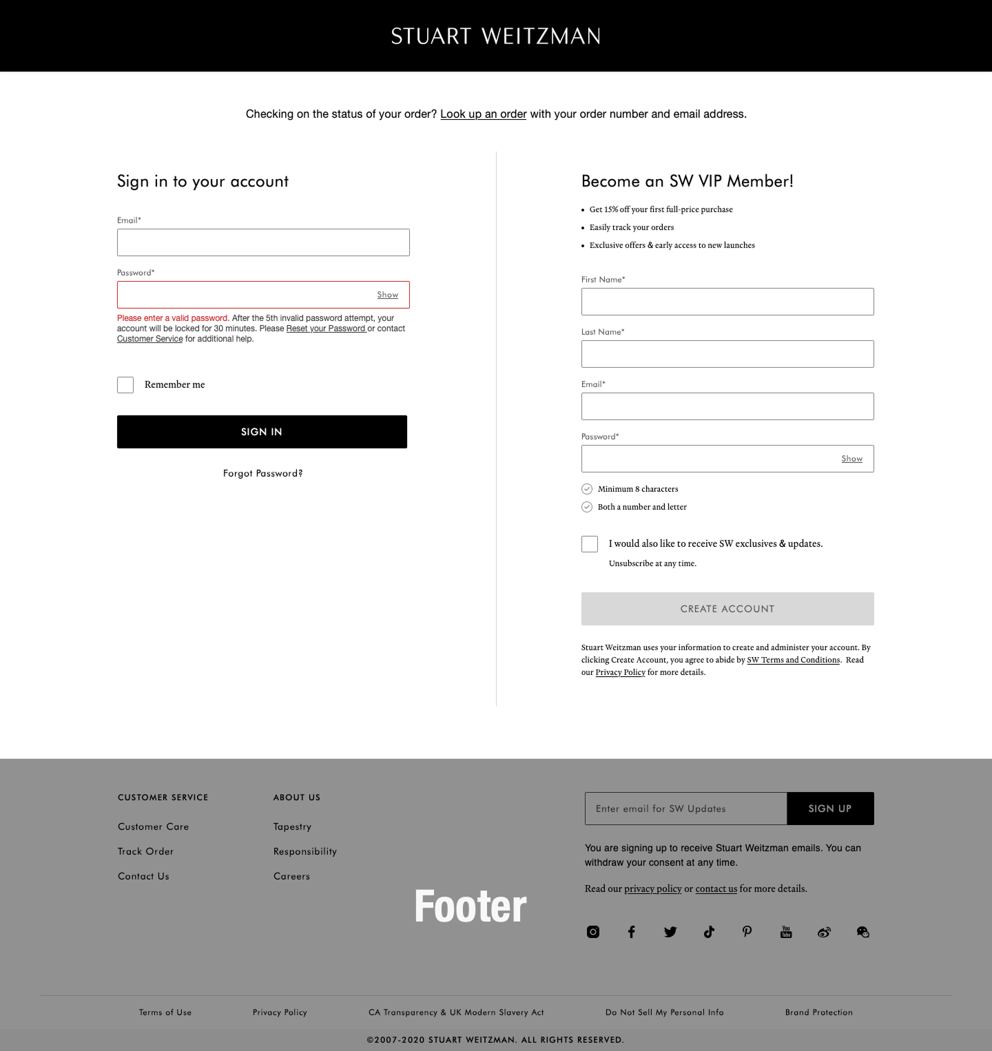
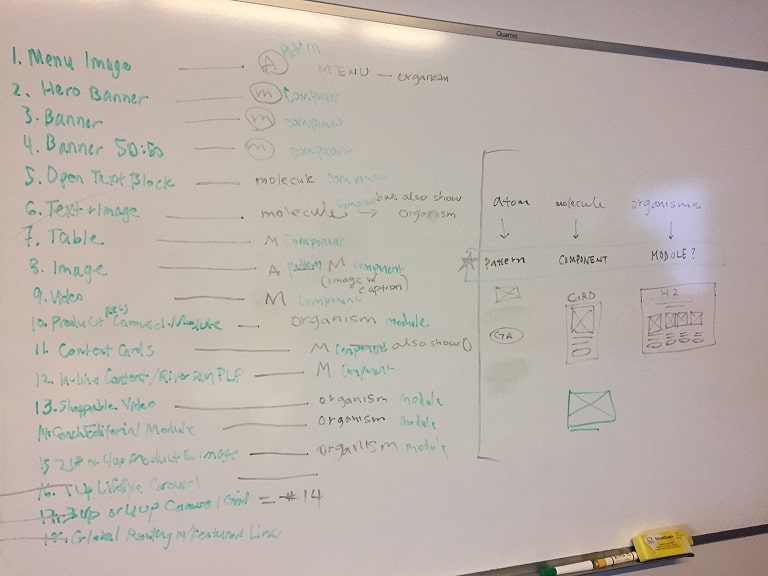
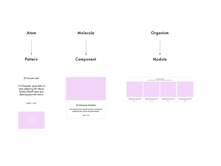
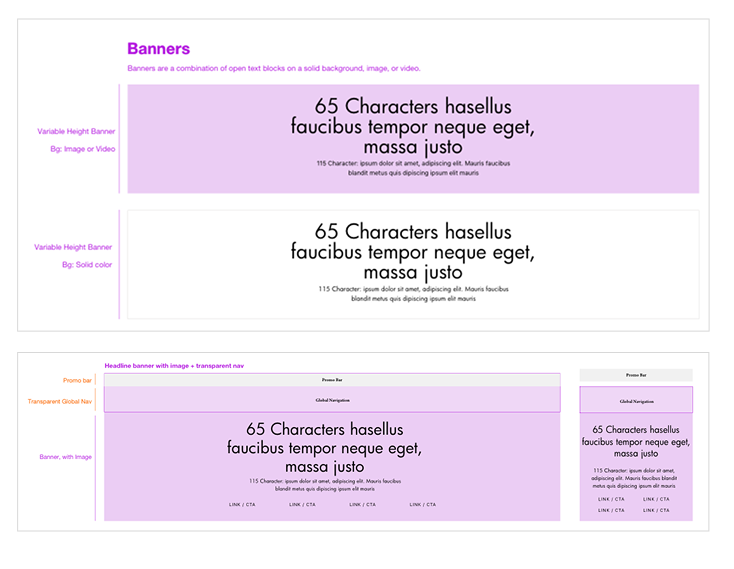
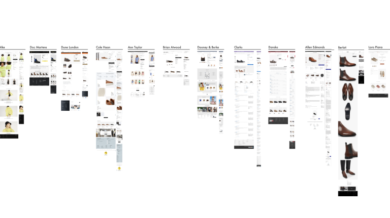
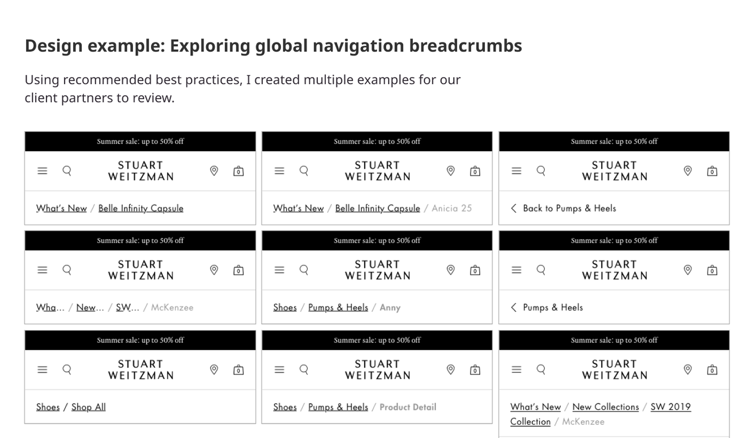
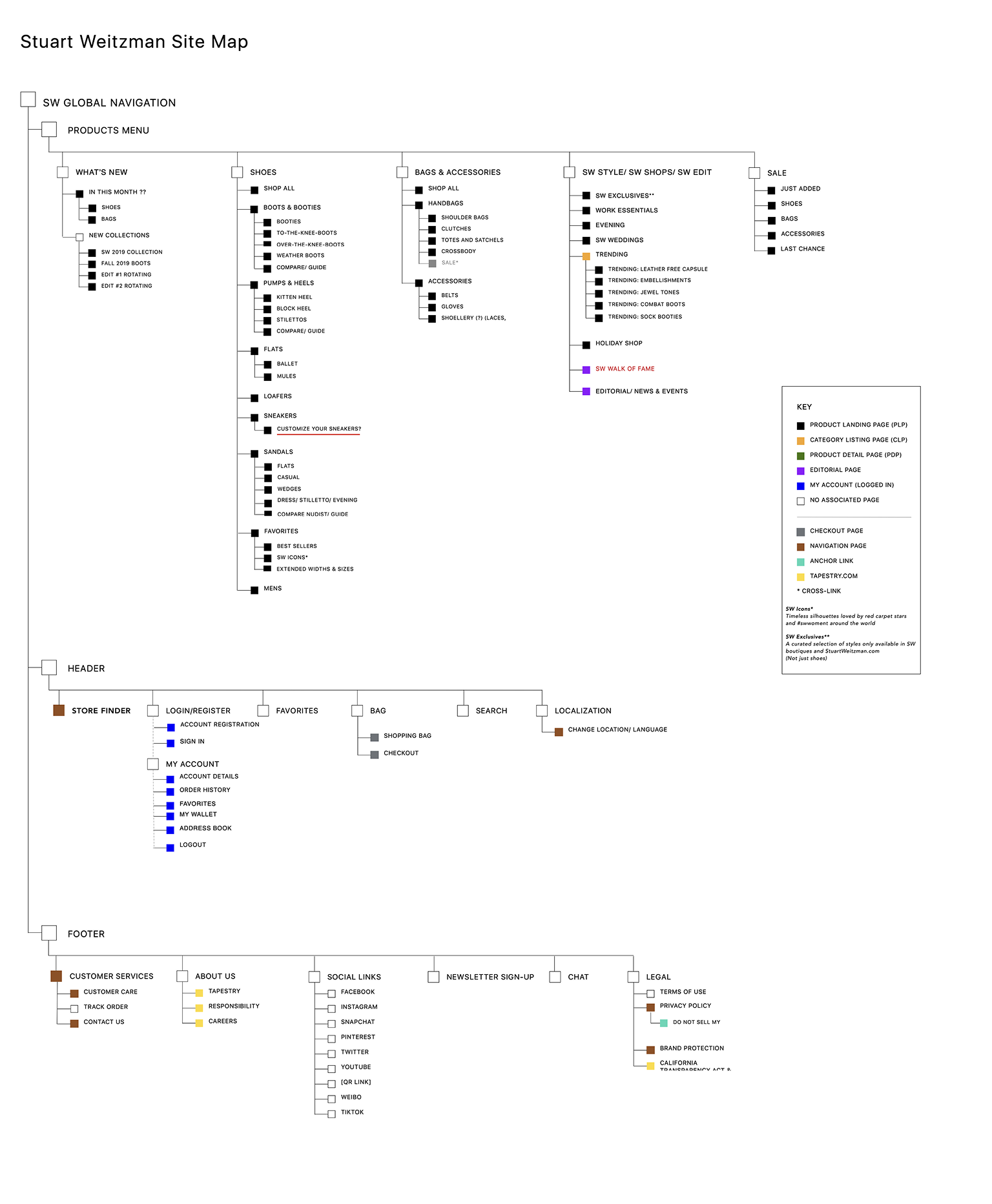
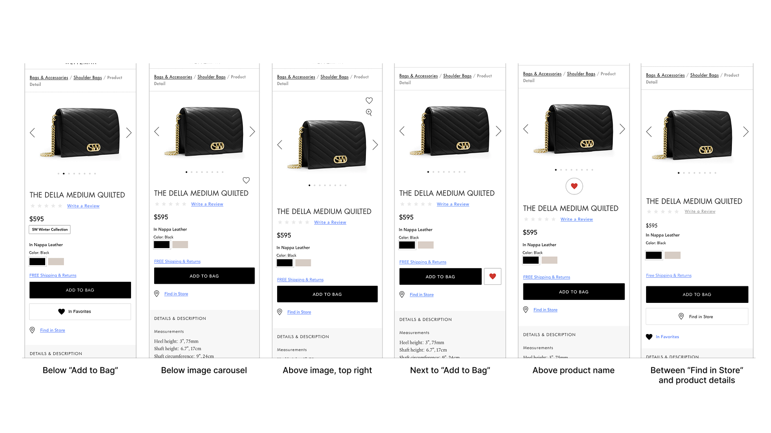
The project ran in two phases: Phase 1 (~6–8 weeks) focused on competitive research and e-commerce best practices. Phase 2 (~4 months) focused on design sprints. My work included producing wireframes, workflows, and sitemaps across at least 3 functional areas: global navigation, product pages, and account pages. I also contributed to a design library.

Outcome

The engagement ran for 6–7 months. Working within the constraints of the new CMS and a growing client team, the project delivered comprehensive UX documentation across three premium fashion brands — wireframes, workflows, sitemaps, and a deconstructed design library to support the visual team's pattern library.

My contract concluded in mid-2020, after the team transitioned to a fully remote arrangement during the COVID-19 pandemic.

Before designing for premium retail, it was important to understand the landscape and best practices of the category.

Best practices were organized by page or section — home page, PDP, checkout — and presented alongside screenshots of example sites, the current sites, and out-of-the-box functionality from the new backend platform. I used Baymard Institute as a primary source, alongside Nielsen Norman Group.

I also collected competitor screenshots focusing on the PDP and other key pages, and reviewed information architecture across the three brand sites — iterating on multiple sitemap options in collaboration with the tech team.

While the visual team exclusively built the pattern library and explored typography, UX and visual design collaborated as a team on shopping journeys and information architecture to address specific client requests.

Screenshot of Baymard Institute website

Baymard Institute was a primary source

Line-up of competitor PDP pages

Competitor screenshots of PDP

--> Research on Quick View challenged common assumptions

Research from Baymard Institute found that while ~48% of e-commerce sites use Quick View, their research concluded Quick Views are often “symptom treatments for poor product list designs.” The recommendation: invest in strong product list page design instead.

Source: baymard.com/blog/ecommerce-quick-views

Starting Phase 2, our goal was to complete several rounds of sprints covering most of the site, beginning with the shopping journey and PDP.

As with many projects, plans changed mid-engagement. Work refocused from the shopping journey toward global navigation and account menu screens — and a new client UX/design lead brought a focus on longer-term goals, including a design framework for all three brands.

Three premium brands sharing a CMS migration meant navigation consistency had to be established early — both in terms of information architecture and interaction design.

I focused on sitemaps and exploring information architecture, considering the interaction design and functionality of global styles. Work included:

  • Main menu and sitemap — where items should live, and how menu functions work
  • Customer Care menus (FAQs, Shipping, etc.) reviewed across all three sites
  • Breadcrumb best practices research and exploration

Navigation exploration: Breadcrumb best practices across three brand sites.

Stuart Weitzman sitemap

We spent time in Phase 1 gathering best practices and researching competitors in preparation for work on the PDP, category detail pages, filters, etc. I collaborated with the visual design team, connecting my recommendations back to the best practices research from Phase 1.

Areas of focus included:

  • Options for Mini Cart, Save to Favorites, and Find in Store
  • Exploration of attribute selectors — dropdowns vs buttons for color, size, and fit selections
  • Options for related styles and cross-sell
  • Layout discussions with the visual design team

Ultimately, the client team decided to pursue the PDP work in-house. However, here are a few specific design challenges we explored prior to that change.

Challenge A: Exploring location and format of Add to Favorites CTA on PDP

I collaborated with the visual team on the Add to Favorites CTA on product pages, including location and format (e.g., button, icon, link, etc).

Challenge B: Presenting product variations within the same category

One challenge for Stuart Weitzman is that some of their shoes come in different heights, sorting them into different categories (e.g., ankle vs over the knee). We explored how to present product variations without breaking the navigation.

Challenge C: Cross-selling matching products from different categories

The existing site used tabs to navigate between matching styles, even if they were from different categories. We learned that solving the product variation challenges might be an out of scope database update, vs a simple IA design change.

After the project refocused, the My Account ("Customer Care") menu became the primary area of focus.

10 Functional Areas

I interpreted client requirements tracked into workflows and wireframes, referencing competitors and best practices, across 10 functional areas:

  • Change & Reset Password
  • Navigation & Dashboard
  • Track Order Form
  • Personal Information
  • Purchase History
  • Payment Methods
  • Email & SMS Sign-Up
  • Returns
  • Communication Preferences
  • Save for Later

Password Reset Wires and Workflows

Below are a few samples of work focused on password reset:

  • Wireframes exploring the organization of password reset
  • Step-by-step workflows for logged-in and guest users
  • Final wireframes from main account menu to final confirmation
  • Example of finished visual design

I created a series of interactive state flows with highly simplified, thumbnail-like UIs to demonstrate system behavior, user states and conditions, email notifications, and time/duration, without getting distracted by visual layouts.

I felt that wireframes would be insufficient, while also providing too much detail, whereas these thumbnail style UIs only include the interactive elements required to convey meaning. I created these flows for password reset, order tracking, and save for later.

Wireframe: Two options for reset password to decide if password reset should have its own page or live with other options? We went with Version A.

Workflow: Reset password workflow for authenticated user. (Click to view 2 images).

Workflow: Reset password workflow for unauthenticated user (2 images).

Wireframes: Reset password screens, from main menu

Visual design: Reset password, with warning, desktop. (Created by visual design team).

When the client requested a design system mid-project, the naming conventions used by the branding team created confusion and made it difficult for the team to get started.

I created a Sketch document that showed how even the most complex component could be created from combinations of individual elements, as long as they obeyed certain functional rules. The outcome was the design team was able to use my document in establishing a base for the design system. At the end of the sprint, we presented our concepts together.

Whiteboard exercise: Working through the client's component list and identifying it as a molecule, atom, or organism.

Design library: Sketch document mapping some of the new designs to the idea of atom/pattern, molecule/component, organism/module.

Demonstrating the elements creating a banner component.

The project delivered comprehensive UX documentation across three premium fashion brands — competitive research, wireframes, workflows, sitemaps, and a design library built on the visual team's pattern library.

In early 2020, the COVID-19 pandemic shifted all work to remote. My contract concluded in mid-2020 as the team transitioned to a fully remote arrangement. Near the end of my engagement, I reconnected with the visual team to align wireframes with the design library and discuss dashboard options.

Not designing PDP: We spent a decent amount of time gathering best practices and researching competitors in preparation to design category detail pages, product detail pages, filters, etc. It's unfortunate that we weren't able to pursue those screens ourselves, however the database issue truly was out of scope.

My Account workflows: The workflows were helpful, but the images ended up being very large. In retrospect, a smaller size for a slideshow would've been just as good.