Work Sample Collection · Various · NYC

Experience Maps, Personas & Research Deliverables

A collection of UX documentation across multiple projects and clients (including workflows, sitemaps, personas, wireframes).

decorative image for Infogroup

Creation of new reporting tools to help a business owner analyze their current customer and business data.

Company:
Infogroup
Role:
Product Designer
Tools:
InDesign

Problem

Some Infogroup sales, marketing, and SMB customers sourced data about their target markets and existing customers on their own. But their data could be incomplete or become outdated.

To serve those customers, the team built a new product to analyze their data and generate a compelling report that visualized customer prospect data. Customers could then purchase the new data for their marketing needs.

Approach

I documented the start-to-finish workflow with annotated wireframes. Functionality included upload to dashboard, pricing tables to purchase history, plus notification emails (including errors).

Outcome

The product eventually launched under the name Data Enhancement.

This project helped me learn to think more holistically about the full engagement experience of a product, as well as how to maximize my productivity to get more work done in the same amount of time.

After this project, the design team changed from using detailed annotations to deeply documenting transition states. An example of this is Email Marketing Tool Upgrade.
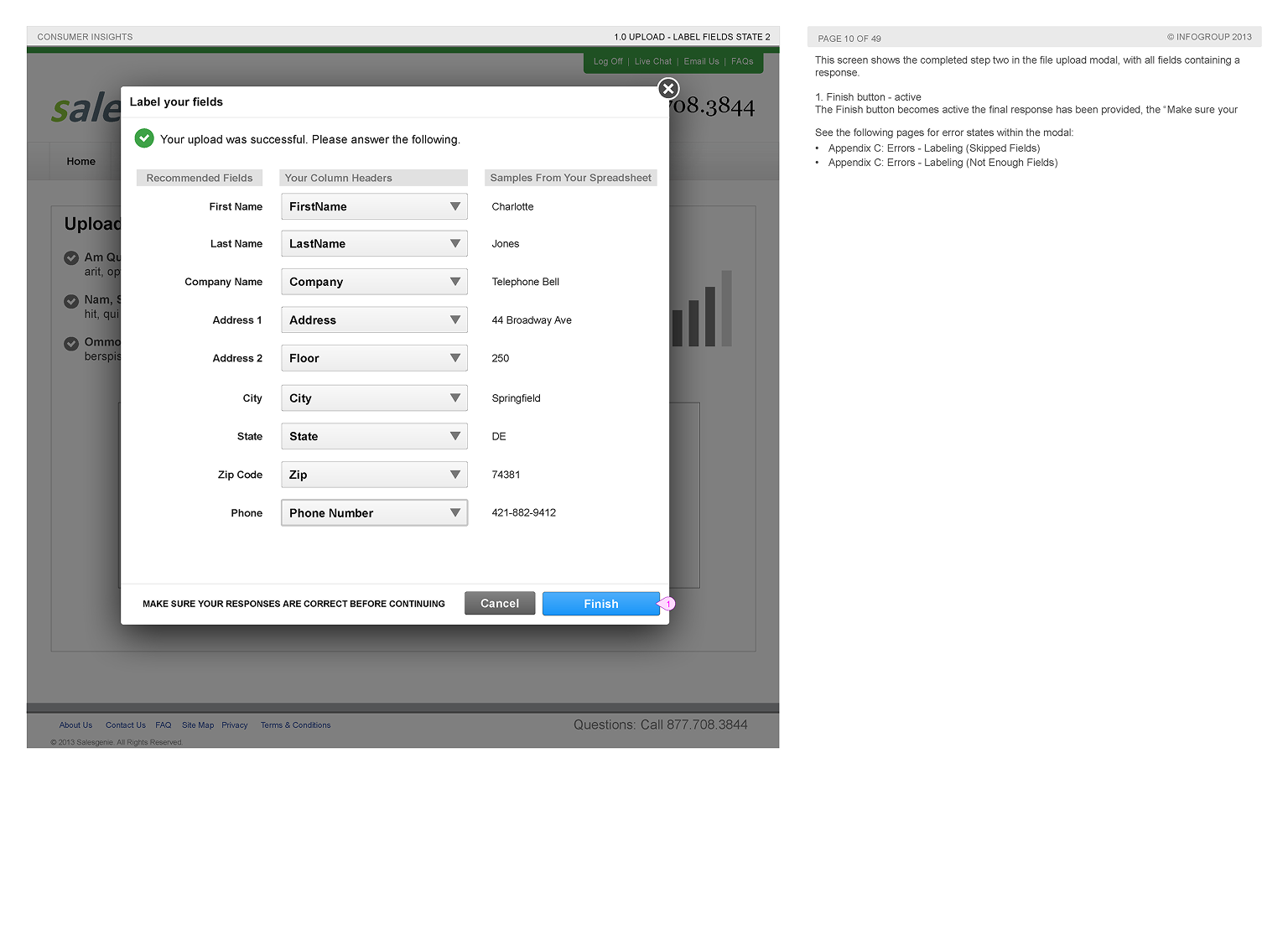
Labeling Columns: In order for the analysis to work, the customer spreadsheet needed to be labeled properly. Some fields could be skipped, but too many would generate an error.
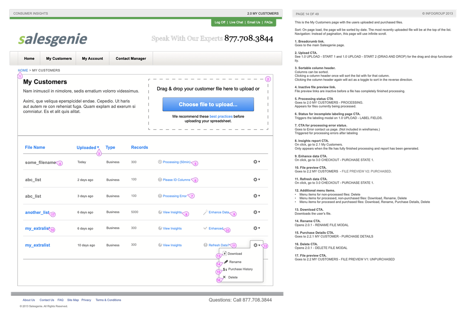
Dashboard: After successfully uploading started, customers would get an email when their report was ready. After returning, a dashboard showed prior sessions. This wireframe shows different outcomes for an upload.
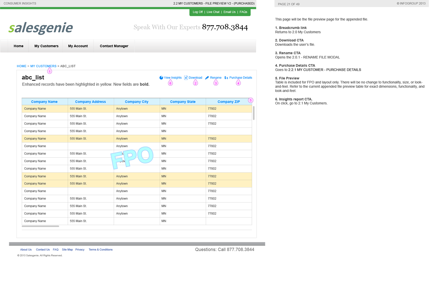
Enhanced Data: Enhanced customer data looked similar to a spreadsheet, but rows with new information were highlighted.
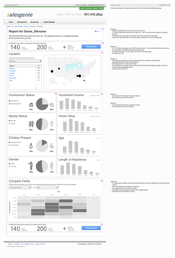
Insights Report: The insights report provided a visual explanation of the user's customer data. This wireframe is an example of "customer" insights.

Purchase Table: Customers could purchase the whole package, individual improvements, or email separately.
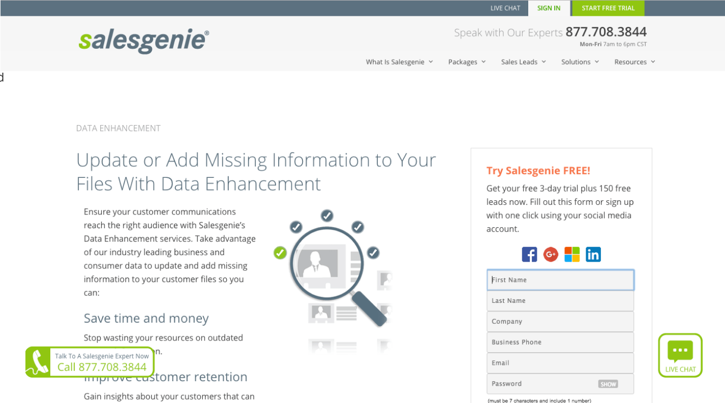
Outcome: The features were released on the Salesgenie website as the Customer Insights Report and Data Enhancement services.
Company:
Infogroup
Role:
Product Designer
Tools:
InDesign

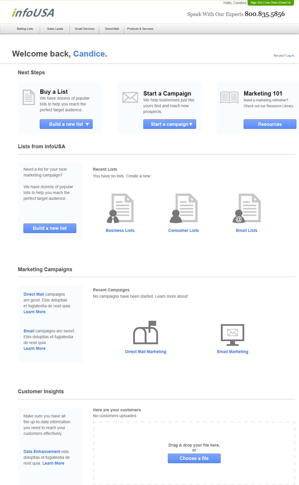
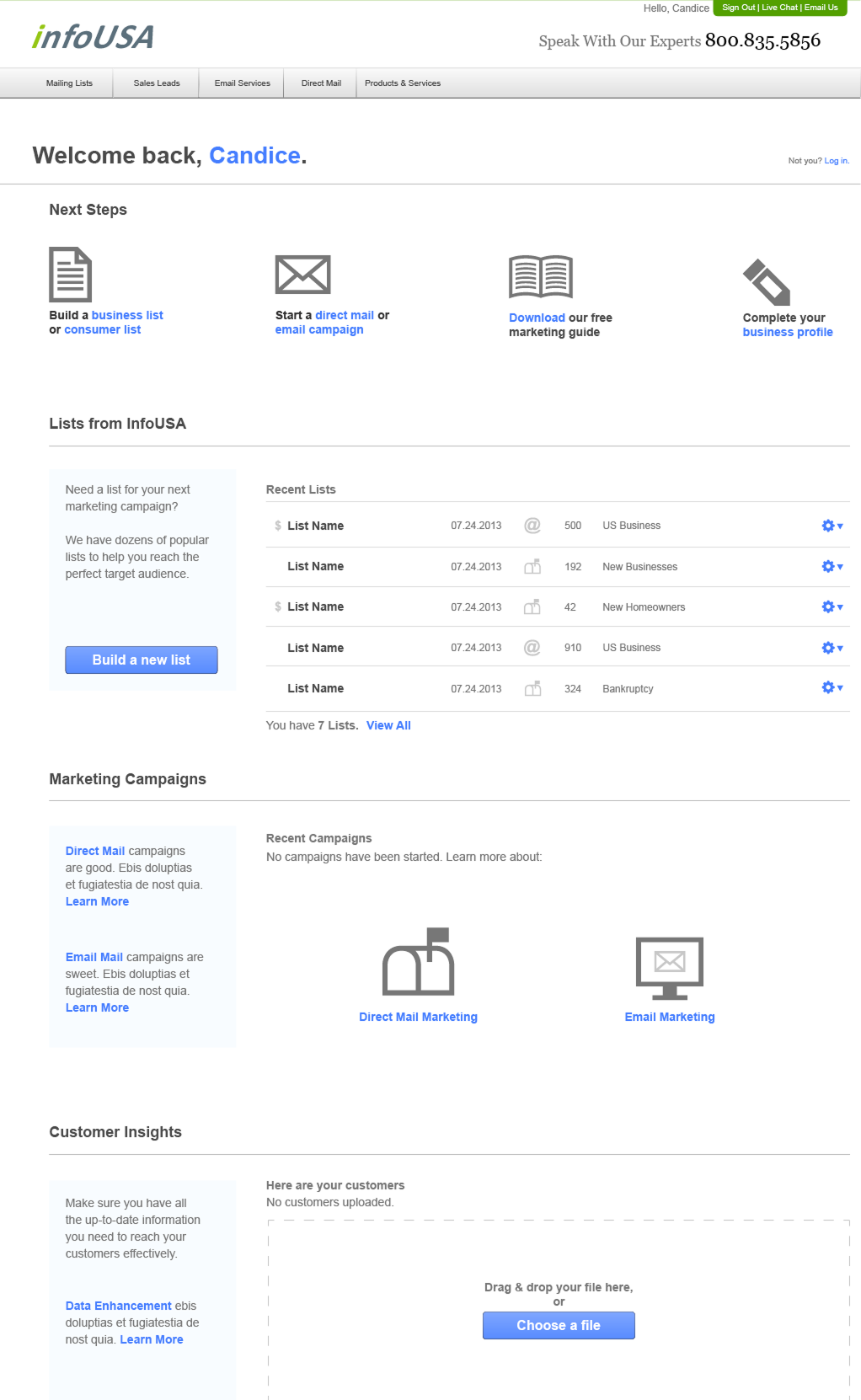
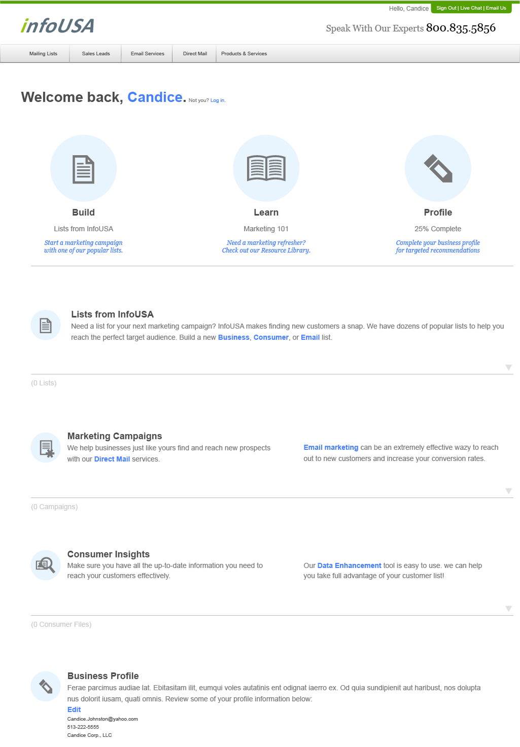
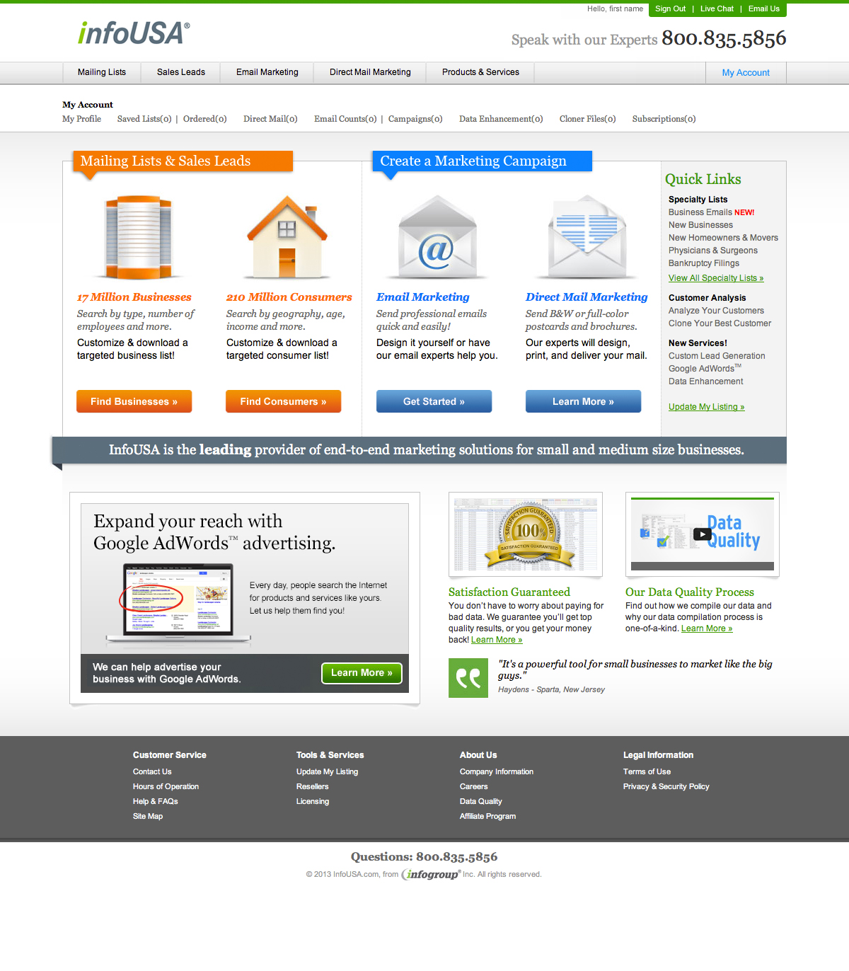
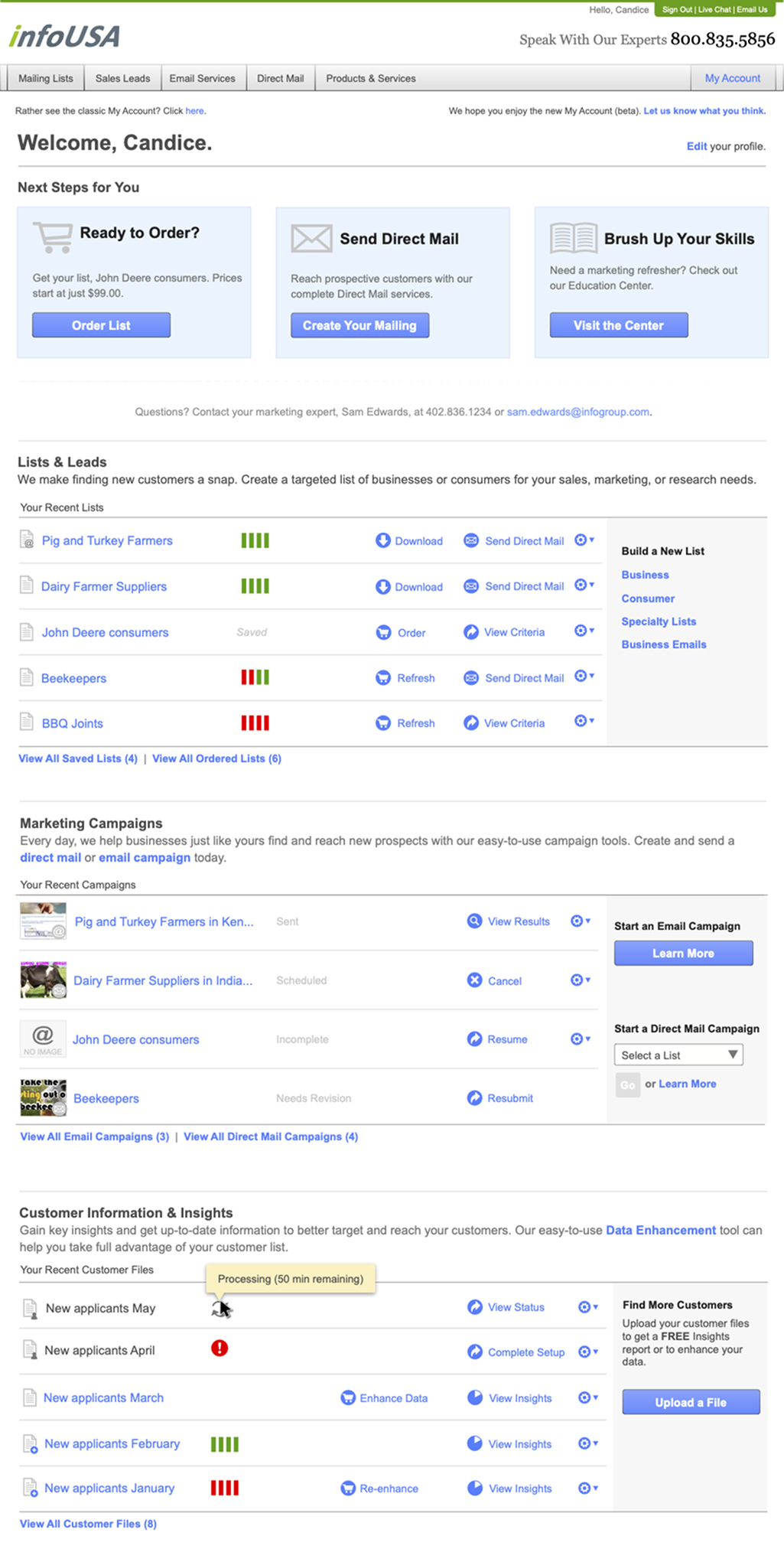
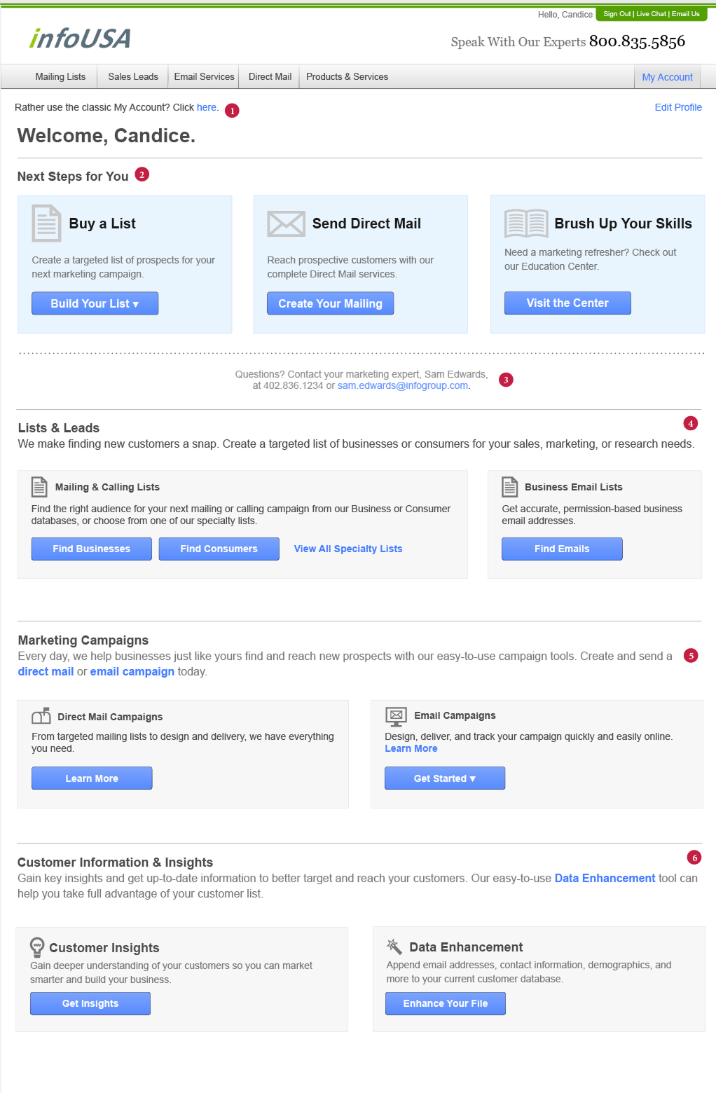
As the SMB division added more products and services, the InfoUSA landing page needed to reflect the new offerings. I created several wireframe options, and developed annotated wireframes for the final option.

By the time this project came around, several product updates had been completed, allowing the Welcome page to feature the updated and even new products.

The updated dashboard encouraged users to start and continue their tasks, and incorporated updates from recent projects, such as:

  • Changes to the list view, including new features, layout, and configuration options
  • Updated direct mail and email campaign workflows
  • Data insights product to help visualize the data in customer and business lists

Wireframe: InfoUSA Welcome Page, Full

Wireframe: InfoUSA Welcome Page, Empty state

Wireframe: Alternate CTA options for intro

Wireframe: Alternate layout A

Wireframe: Alternate layout B

Wireframe: Alternate layout C

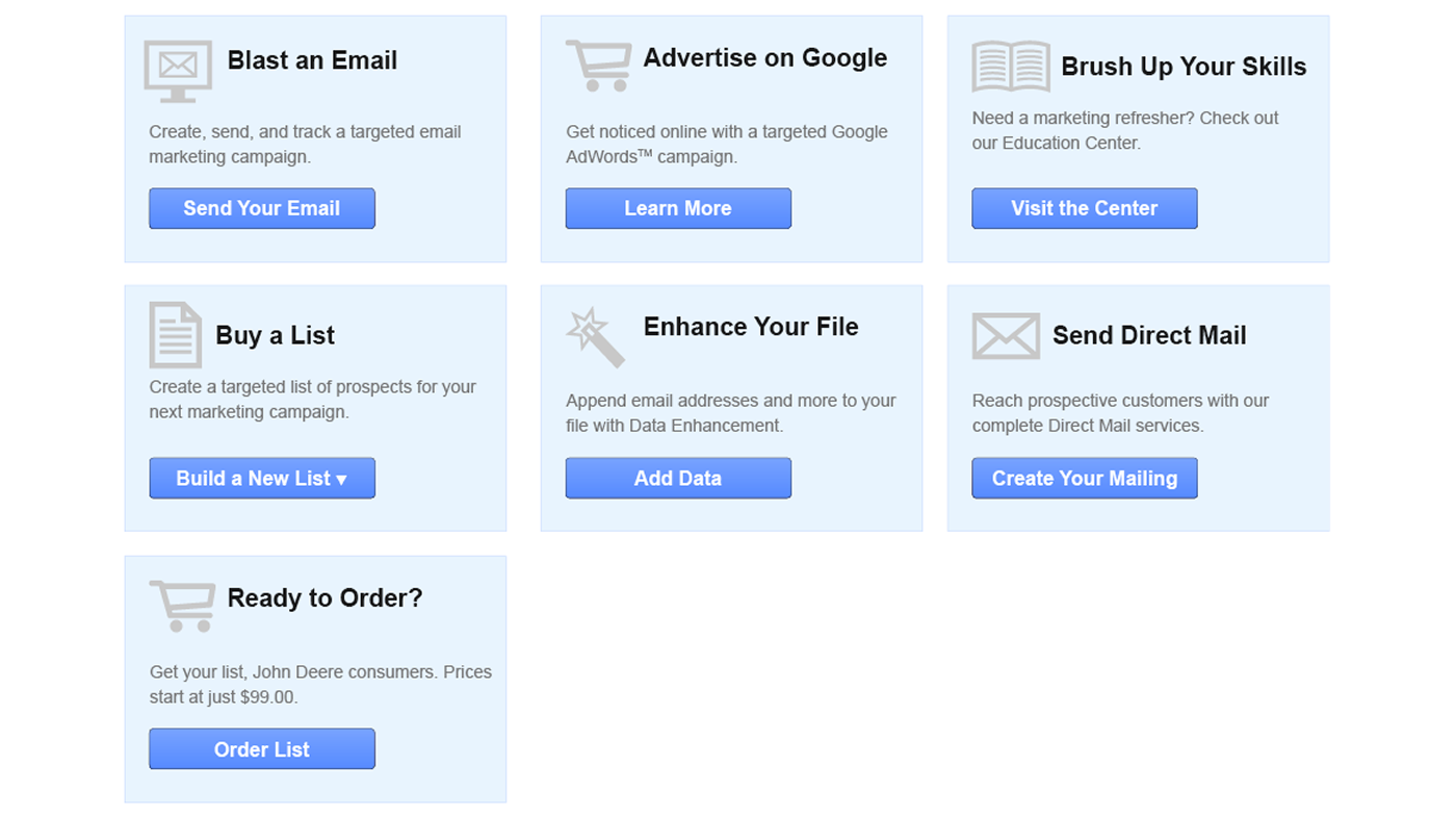
Original dashboard, after log-in

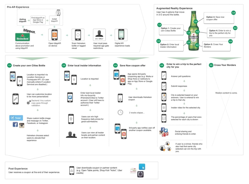
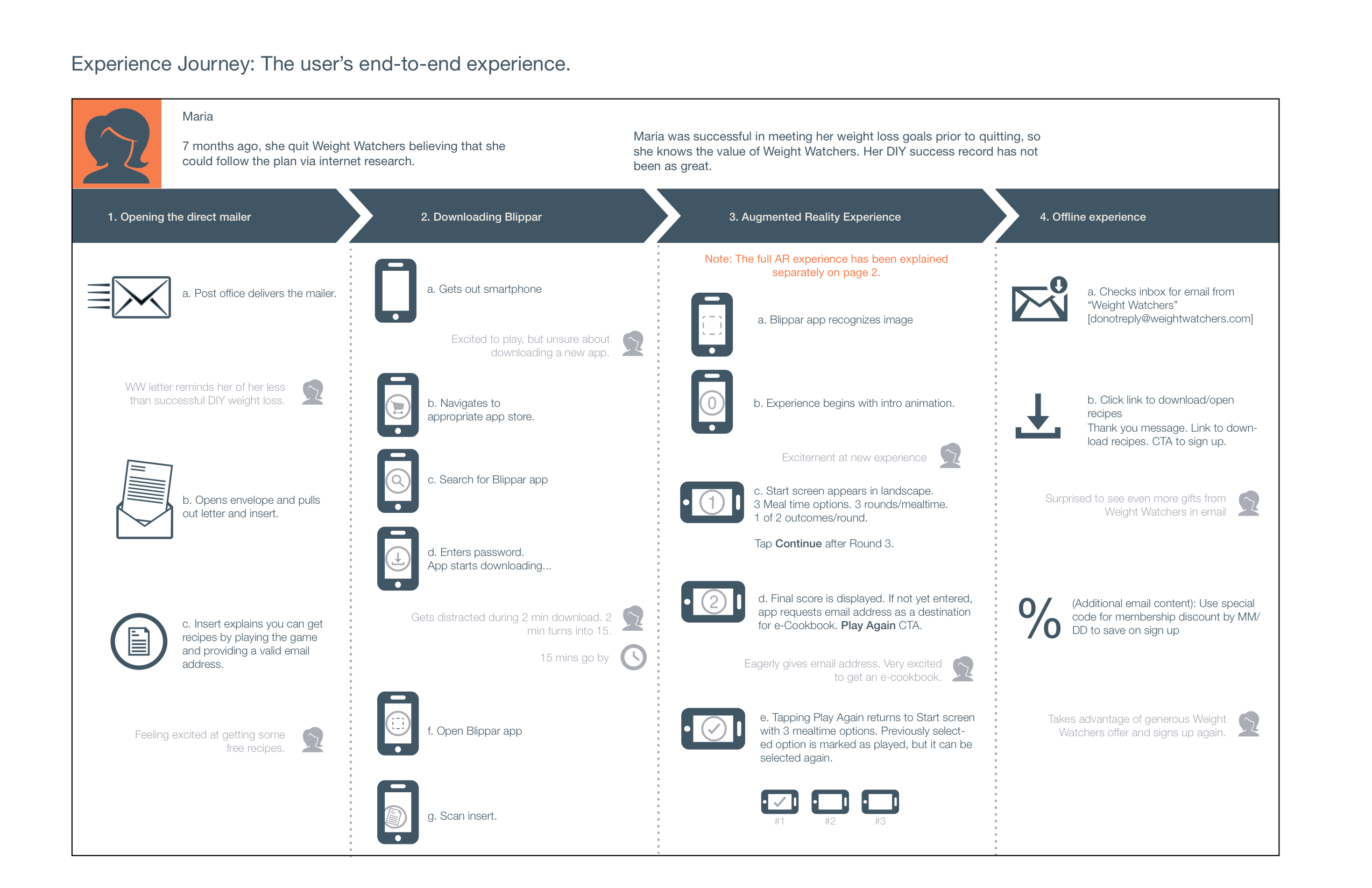
This experience map, site map, and wireframes supported the AR campaign for the Heineken’s “Summer Cities” bottle campaign. The initial map provides an overview of the main aspects of the campaign and their sequence of steps. This map was presented to the client and used internally for presentations.

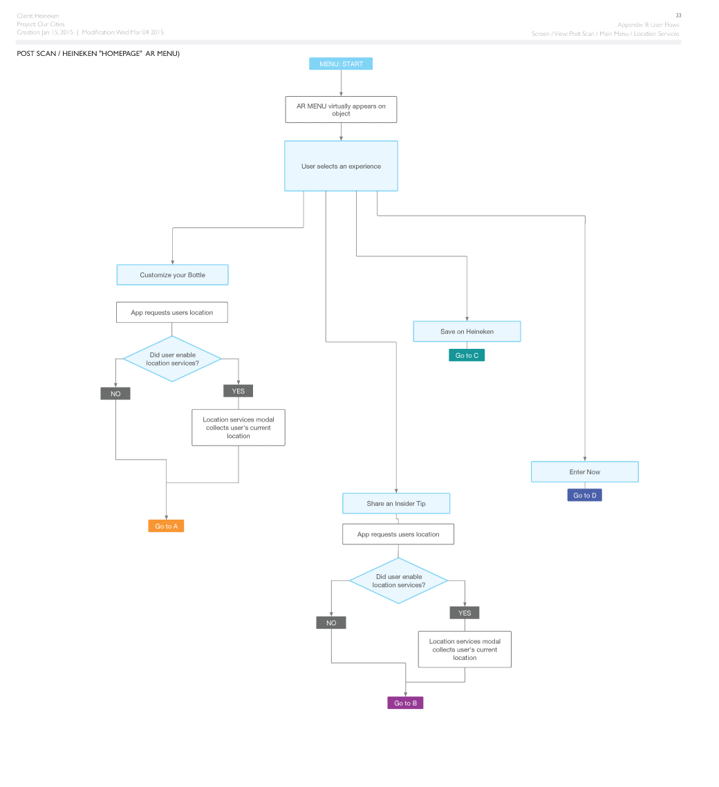
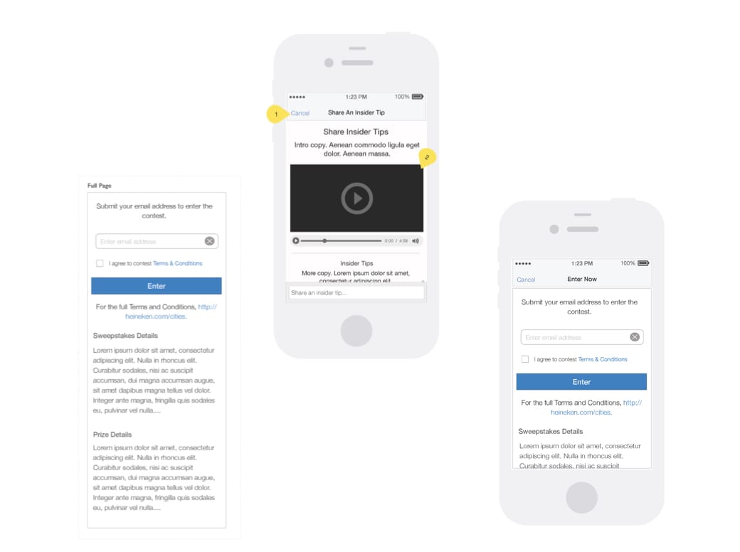
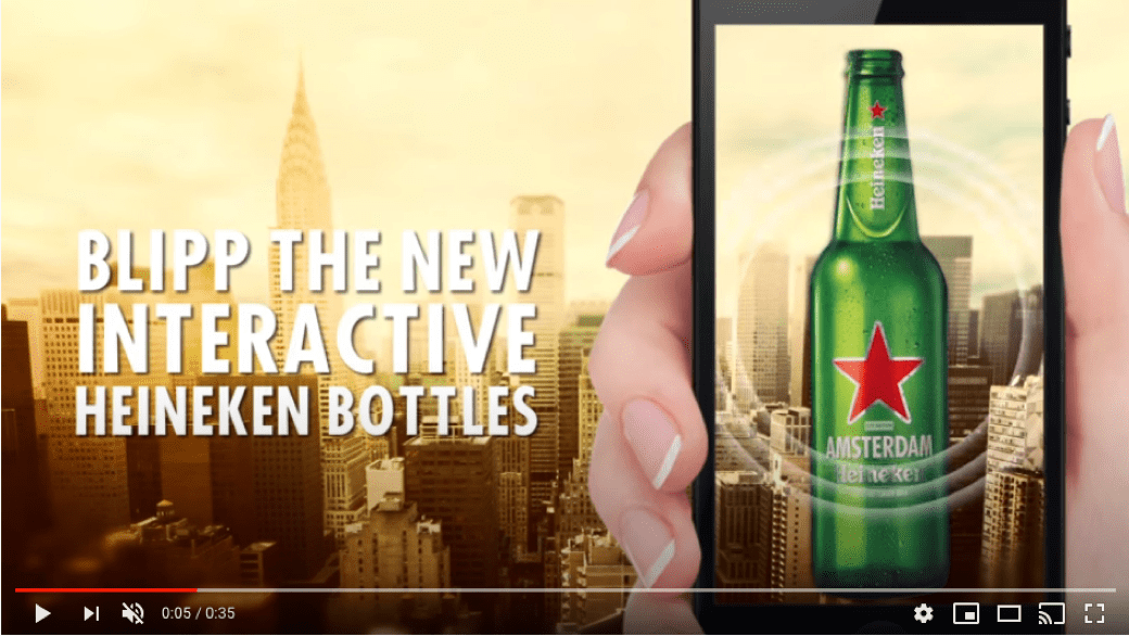
The site map provides a view of the architecture of the main navigation for the AR app. The wireframes show example set-up screens within the app (ex: Terms of Service, sign-up, etc). The final image is from the YouTube promo, which can be found at https://youtu.be/Bbo2kRZfvEQ.

Company/Agency:
Geometry Global
Role:
UX Architect
Tools:
OmniGraffle

Workflow: Experience map in support of the Heineken Cities campaign

Flowchart: Mapping part of the app experience

Wireframes: "Mobile wireframes for contest screens

Campaign video: Start screen from YouTube ad

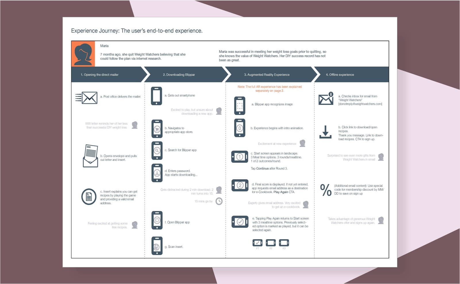
I created these maps to help align the client and the creative team on a conceptual pitch for an AR game played on your smartphone, which was meant to activate customers into sign ups.

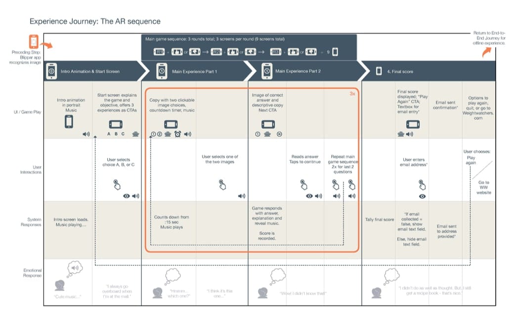
The first map provides context to help provide alignment on where the game fits into the user's end-to-end experience from the direct mail touchpoint to the offline response to the game. The second map helps provide an overview of the actual rounds of game play using the AR app, an expansion of column 3 in the first map.

Company/Agency:
Geometry Global
Role:
UX Architect
Tools:
OmniGraffle

Experience Map: Map of the campaign experience

A map of the AR game

Experience Map: Map of the game experience, activated by a QR code -- Zoom for this image is not available.

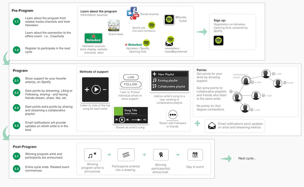
The project was a proposed collaboration between Spotify and Heineken, as Heineken is a regular sponsor of music festivals. The map helped to provide alignment on how customers could engage with Heineken on Spotify and in concerts (such as Coachella). Following the map, I created wireframes for contest pages.

Company/Agency:
Geometry Global
Role:
UX Architect
Tools:
OmniGraffle

Experience map, HKN + Spotify

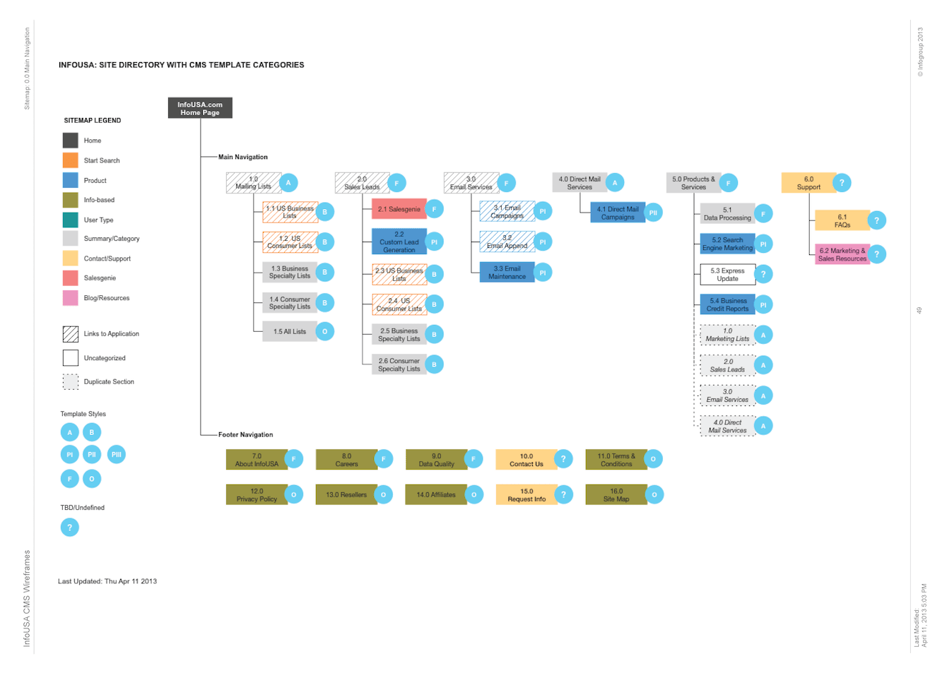
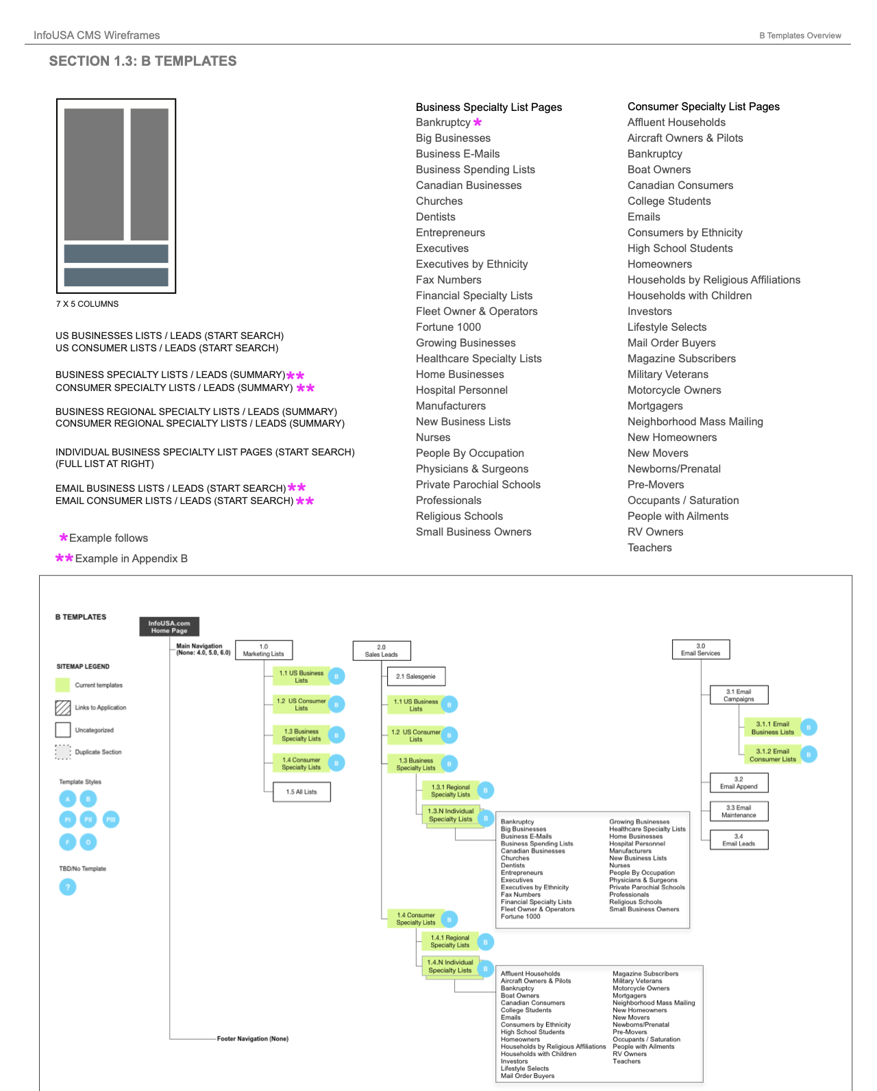
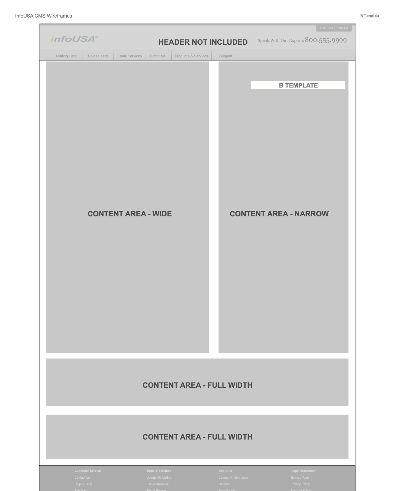
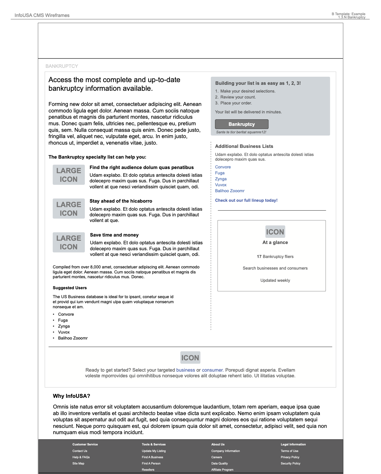
InfoUSA planned a move to a CMS, during a larger SEO initiative. I created a sitemap based on the current website and future needs of the site. Corresponding with the sitemap were high-level page templates, featuring a variety of page-column combinations — as well as a basic module library. Different page types, as indicated by color, received different templates. This was an entirely internal project.

Company:
Infogroup
Role:
Product Designer
Tools:
InDesign

InfoUSA sitemap for CMS migration

InfoUSA template overview and page list

InfoUSA "block" layout

InfoUSA sitemap for CMS migration

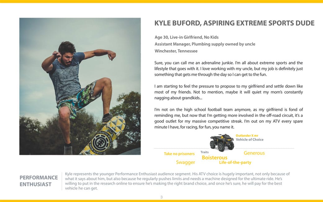
Our task was to create a responsive sales websites for a maker of all-terrain vehicles (ATVs) for snow and water recreation, among other transportation products. The UX team worked together to brainstorm each persona.

I transformed the brainstorms into about 4 proto-personas in OmniGraffle, with input from other UX team members. The personas were sent to the client for validation and feedback.

Company/Agency:
Geometry Global
Role:
UX Architect
Tools:
OmniGraffle

Personas: Overview

Personas: Detail