For Typography 1, one of our ongoing assignments is the creation of title pages for a book. Our book choices are limited to the following, with no art or illustrations allowed:
- The Great Gatsby—F. Scott Fitzgerald
- The Scarlet Letter—Nathaniel Hawthorne
- 1984—George Orwell
- Heart of Darkness—Joseph Conrad
- The War of the Worlds—H.G. Wells
We’ve gone through 1 assignment, and we will be presenting an update to the previous assignment and will be adding another book. My first book choice was 1984. Here are some designs.
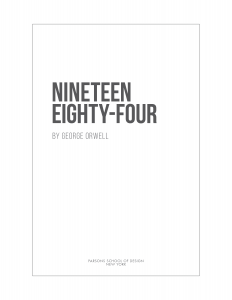
1984 – Futura
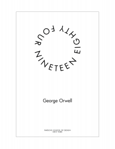
Although the last one captures, all the feedback, it’s not very interesting. Maybe that’s as it should be. I went to Barnes & Noble and saw that many title pages were fairly simple; many followed the style from the cover.
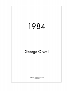
Also, at the time I created this, I thought we were limited to only using the fonts we are going to study in the class which includes Futura. That’s not the case, so in my updates, I found other fonts that I thought suited the title better.
Round 2 – Incorporating Feedback
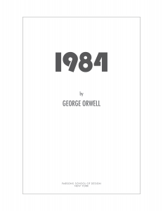
As of now, I chose 2 fonts that I thought were closer to the feeling of the book. Modern yet restrictive. I chose Bebas Neue and Bauhaus 93 with Futura as my fonts.
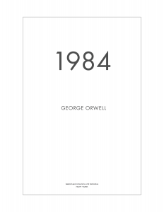
Although I created a bit of a custom version of the numbers, 1984, in Bauhaus 93, to crop the ‘4’ slightly, I prefer the longer ‘nineteen eighty-four’, which I saw in a few examples of the book. It just seemed more polished and finished. I’m undecided if I will use a version with extra space between the title and the author. The publisher is still in Futura.

Having looked at them side by side, I think I may go with the version with the extra space between the title and the author. It’s a little less “designy” and seems like it would be better for a title page, whereas when the author is close, it seems more like a cover page.