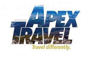
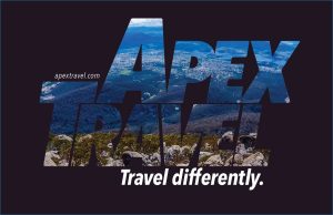
Continuing where I left off from my last post on display typography, here’s an update from last project I completed.
So when I was doing this project, I had this image set up in InDesign, ready to go. But, I kept skipping over it because I couldn’t figure out what to do with it. I really like this image, but it’s difficult to use because there’s so much going on.
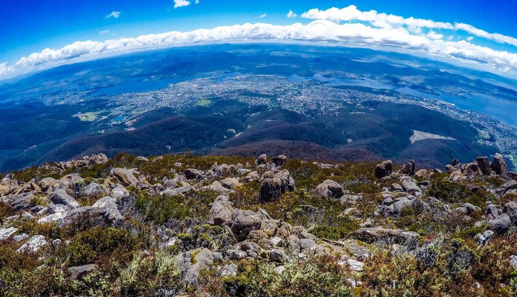
In one of John McWade’s courses, he creates a business card for a flight instructor. And I thought, Hmmmm, I could invent a business to design for! And that’s what I did.
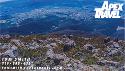
Rather than an airline instructor, I chose a travel agent or guide, specializing in unusual destinations or adventure travel. The company I created was called “Apex Travel”, given that the image is at the top of a mountain or hill. I chose the tagline: Travel differently.
I didn’t have a clear idea in mind of what I was ultimately going for, but I ended up created a kind of wordmark.
Results
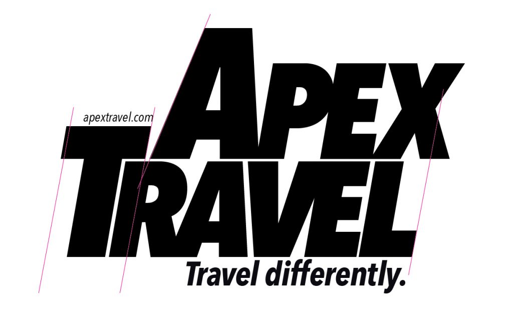
Here is a WIP version, with guidelines in place. I ended up smushing the letters together, creating my own ligatures with the P and the E, the R and the A, and the V and the E. I also was careful to track the letters as well as I could. I used InDesign for this project.
I then used the landscape image, by inserting it into the letters.
Finally, I attempted a business card, which the travel guide would need. Probably needs a little more work.
Critique

When I look at this now, I think the space between the A and the V kind of stands out. This is also the same amount of space as between the top of the E and the L. Of course, a good idea would be to simply fix this before posting, but in order to paste the landscape into the words, I had to create outlines. So I could do it, but it would be time-consuming at this point.
Final Thoughts
I really enjoyed all of these projects, the poster and magazine layout. Even though the business card didn’t turn out as well as the others, I enjoyed the process of creating it and the wordmark for Apex Travel.
