Continuing with my ongoing education in design, I focused recently on typography and layout. And I went through two Lynda.com courses to do it.
Those courses are called Learning to Set Display Type and Learning Graphic Design: Set Perfect Text. They are both taught by John McWade.
The classes John McWade teaches are exceptional because he is such an excellent instructor and quite good at explaining the concepts he is trying to get across. I recommend both of the classes I mentioned above, as well as other classes in the Lynda library by this instructor. Here are previews of these two courses.
Neither of these classes include exercise files. But after watching both of these courses I was inspired and motivated to try my own type projects, to put his advice into use.
Type Rules I Learned
Type Stuff I Made
dropcaps
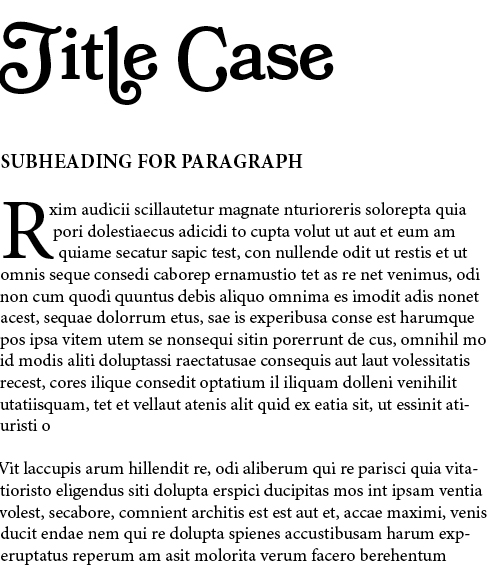
In this one, I was able to move the text corners so that the text flowed around the dropcap R. Looks cool.
Projects with Images
I like to collect stock photos – I know, it’s a bad habit – because I think that someday I’ll use one for a project. So, I end up with many stock photos that I don’t use. (Sometimes I use them here on my blog.) Well, I was finally able to put a few to good use.
All Dressed Up
The first is this nice “Man in a suit putting on a tie”. I wasn’t sure what I was going for. Maybe a book cover or magazine spread. But, I think what I have is some sort of flyer concept.
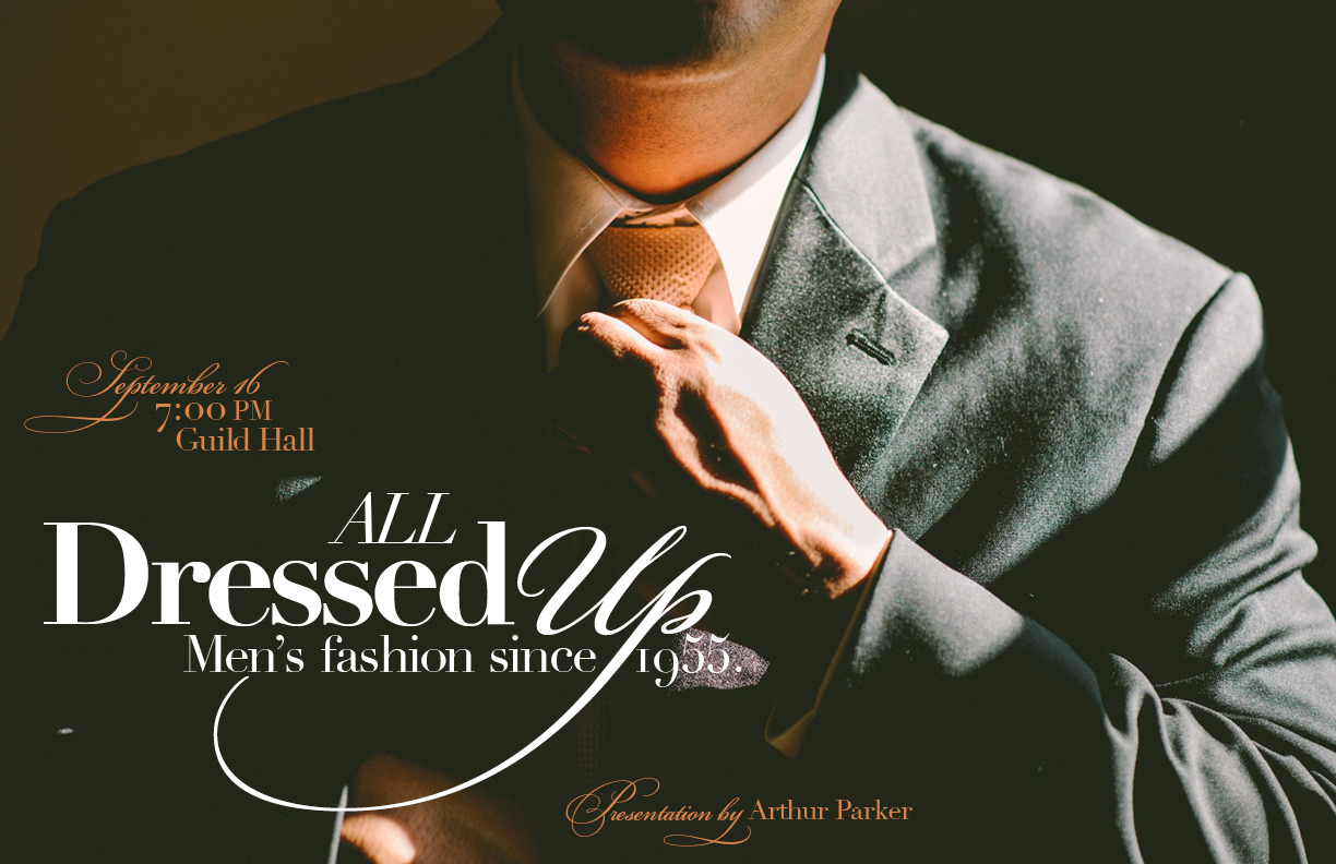
This image uses Bickham Script Pro, which has tons of fancy glyphs, and Didot. Didot has a certain fashionable sense to it, and I think it works. I wanted this to have a bespoke aura about it, yet still masculine. The italicized Dido, and the extra swirls from Bickham Script Pro help to get that across.
New rules of computer technology
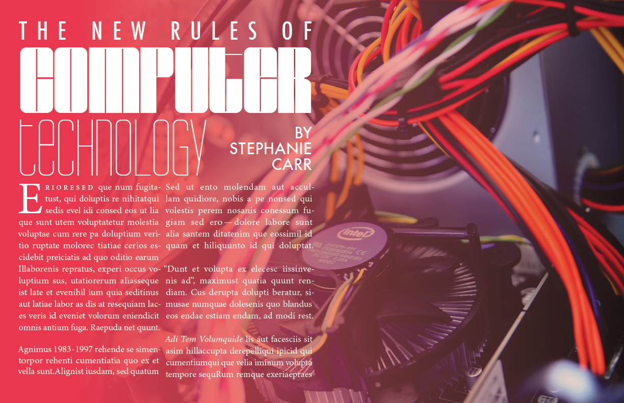
In this case I wanted to use justified type, as John McWade had shown in his course. I stuck with Minion Pro, because it was easier to work with. And I added in a few random elements – a few numbers, some quotes, some pronouns – just to incorporate some of the lessons from the course. One thing I wasn’t able to replicate was keeping the subsequent letters from the word in the dropcap closer than the other words on lines 2 and 3. InDesign just wasn’t cooperating for me.
But I did enjoy this project. BarryW90-Black and Thin are highly stylized, very technical-looking fonts. I was inspired to find a new stock photo for them. Something computer-oriented.
Next time…
In my next post, I’ll talk about a few more projects in InDesign, and another type/logo(!) project I made for a fake company I invented called Apex Travel.
One thought on “Display Text Typography Projects”