Summary
By conducting UX research on competitors and examining the shopping journey, I made a number of recommended changes to improve the user experience for international customers.
- Role: UX/UI Design and UI Development
- Design Tools: Sketch
- Development IDE: Coda with HTML and CSS
My portfolio includes a quick overview of Adorama: alliwalk.com/ux/adorama/
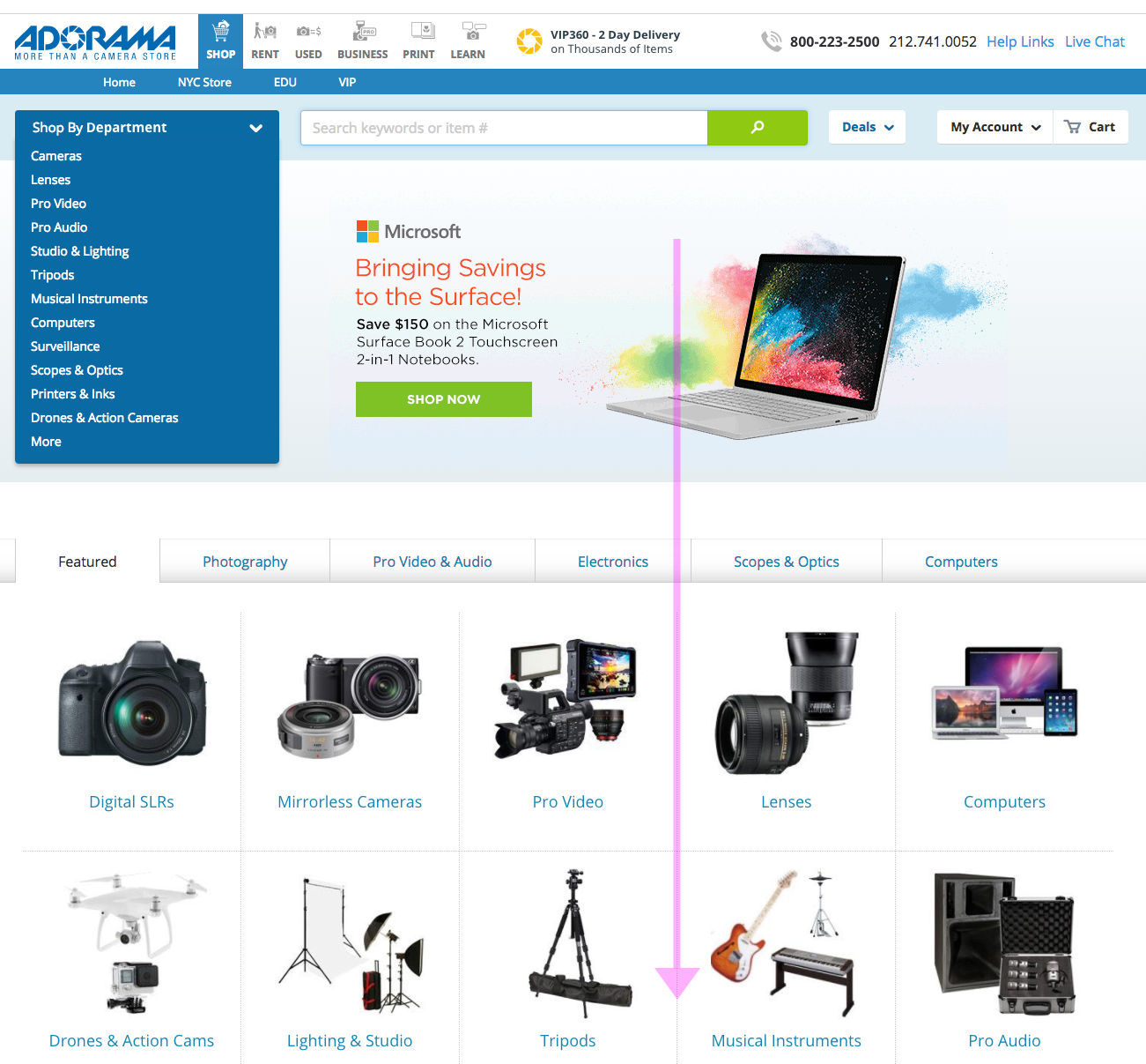
Problem: Unhappy Customers
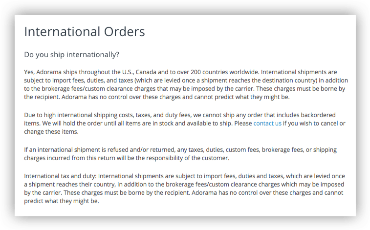
Adorama regularly shipped internationally, but many international customers were unhappy when they received their items.
The short answer is the site was not providing enough information about the fees associated with international shipping, leading to unhappy and expensive surprises.
The business owners had only requested a change to the checkout page, which they felt would solve the problem. However, in order to provide the best user experience, I explored the shopping journey, from PDP to checkout, to find out where improvements could be made.
1. Research & Findings
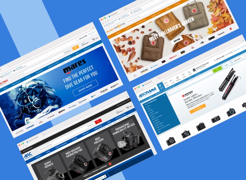
I researched at least 30 websites to find out how other companies handled international and domestic shipping. I discovered that Adorama was solving a unique problem.
Many online shopping sites do not offer international shipping, even to Canada. Of those that do, the vast majority provide a localized shopping experience, where product prices are displayed in the local currency and shipping destinations are restricted to a single country.
I also discovered that many companies will also not allow customers to associate a US billing address with a Canadian shipping address, or vice-versa. They must both be Canadian (or American).
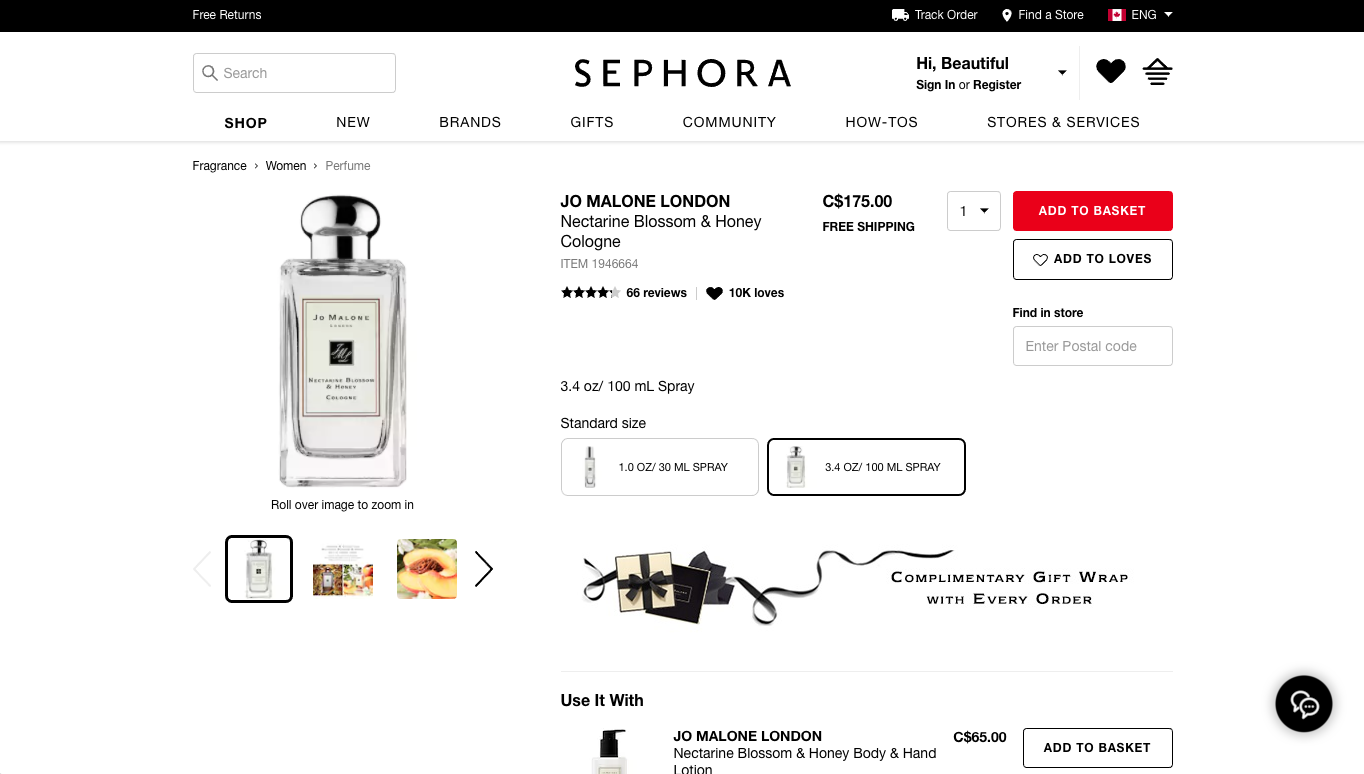
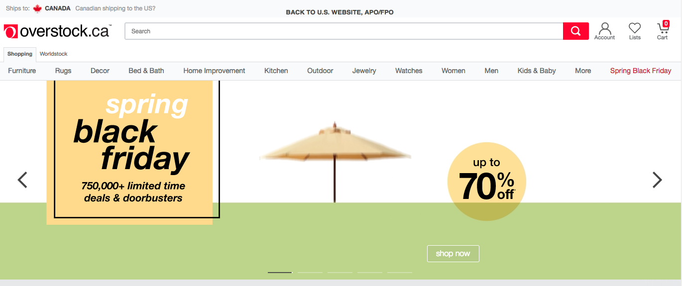
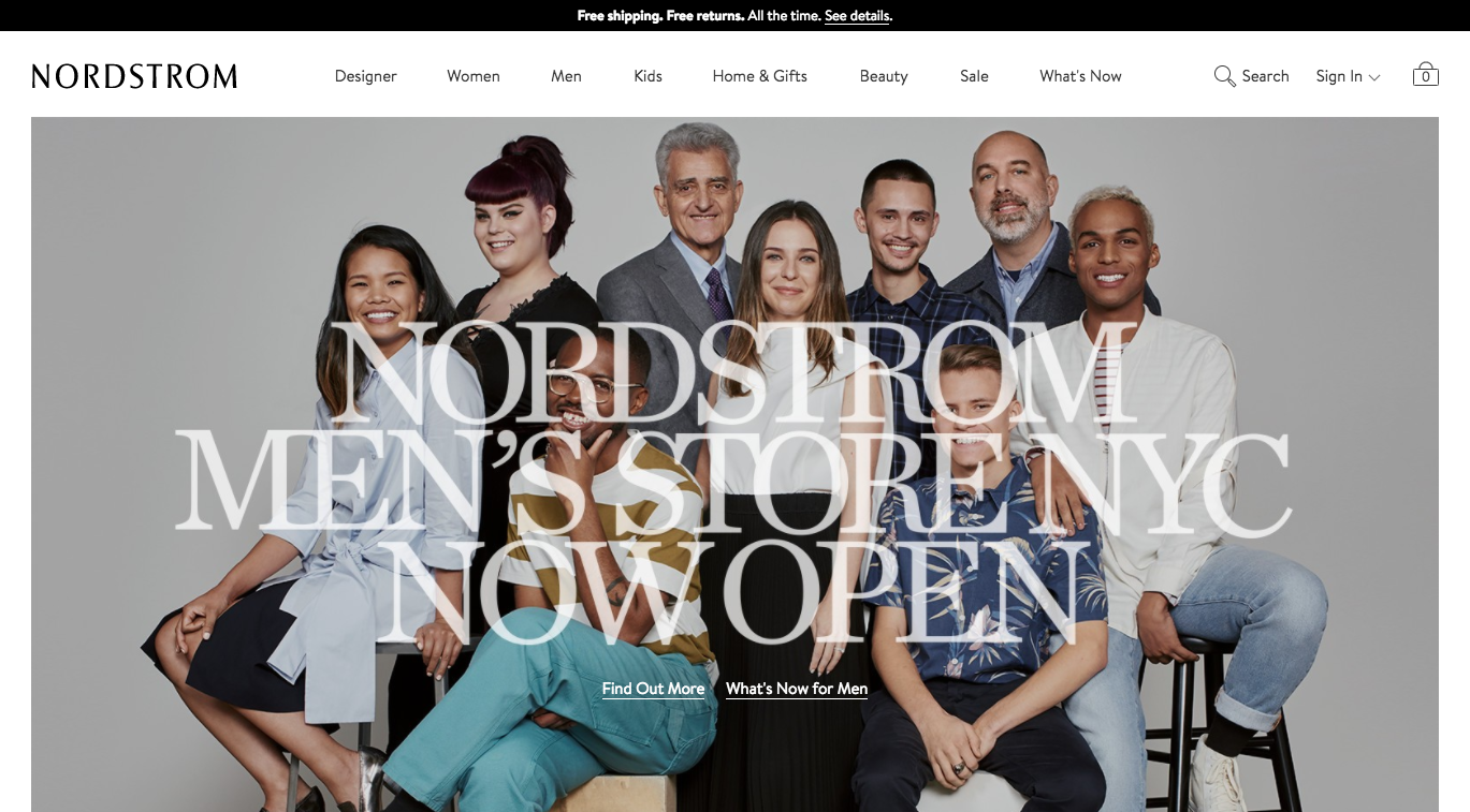
Shipping and Localization Examples
Sephora, Overstock, Nordstrom, B&H, JCPenny

List of E-commerce sites reviewed:
OfficeDepot, IKEA, Sephora, Target, Overstock, REI, Williams Sonoma, Michaels, Sears, HomeGoods (doesn’t ship), Shop.com, QVC, Macys, Nordstrom, Zappos, JCrew, JC Penny, GameStop, ebay, NewEgg, BestBuy, Walmart, Cars.com (no CAN), plus competitors (Abe’s of Maine, Keh, B&H, RitzCamera, MPB, Samys, and BuyDig).
Conclusion
Adorama offered a unique, non-localized, multi-currency, and cross-country international shopping experience. Given the complexity of the problem, I felt a more comprehensive solution was more appropriate.
2. Design Patterns
Although I was solving a unique problem, I did uncover a few patterns that could be used on Adorama’s website:
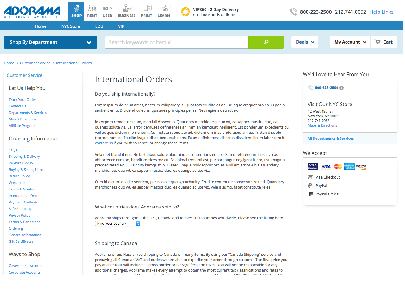
A. Supportive Help Pages
For most sites, the best place to look for shipping information was in the help pages, but Adorama’s help pages did not include all information about international shipping.
In fact, while most international customers would only be able to select FedEx International Shipping, the help pages did not include any information about this shipping method.
B. Easy to Access Shipping Information
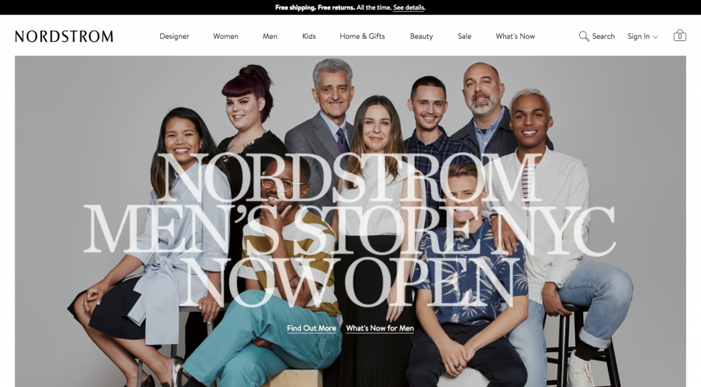
Competitors included shipping information well before checkout. For instance, Nordstrom advertises its shipping information in the header on the homepage.
C. Provide Clear & Obvious International Shipping Information
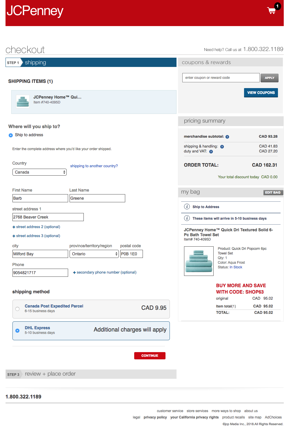
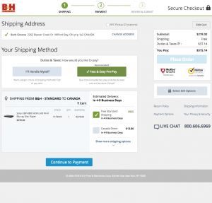
For some websites, the international shipping rates were available when viewing the cart. JC Penney (pictured), Nordstrom and Adorama competitor, B&H (pictured), were good at this.

3. Recommendations for User Workflow and Wireframes
After all the research and collecting design patterns, I started clarifying the user workflow and the wireframes, focusing on international shoppers. The workflow would flow in the following order:
Help Pages
First the help pages, accessible via the footer, would need to be updated to include new language about FedEx International Shipping. This task was sent to the business owners to complete and finalize.
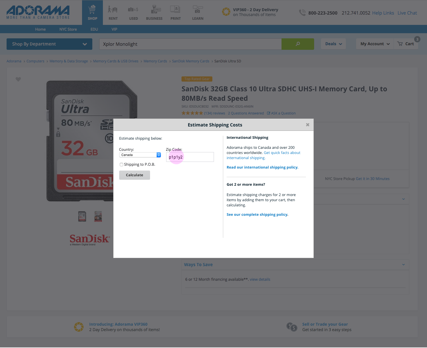
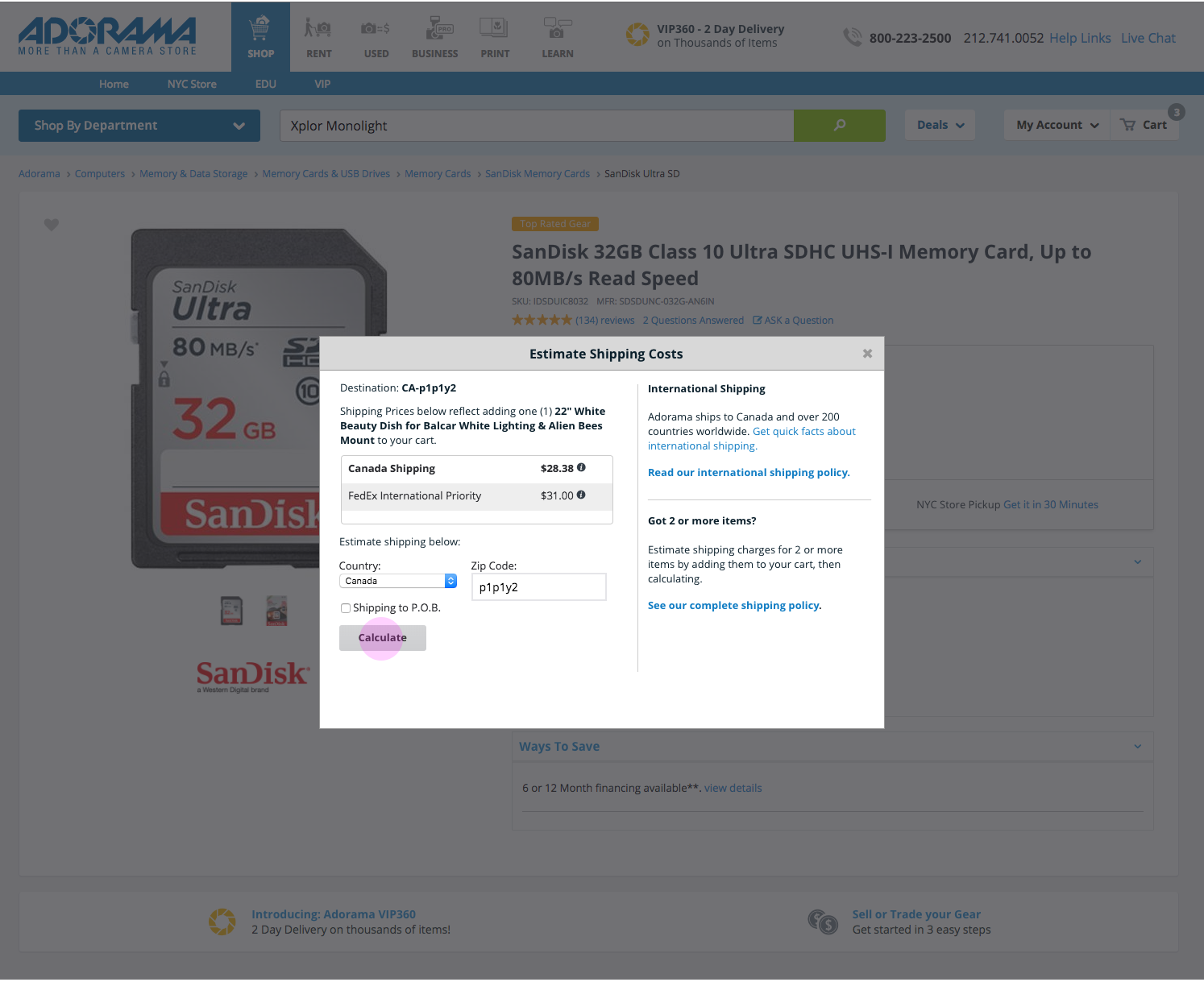
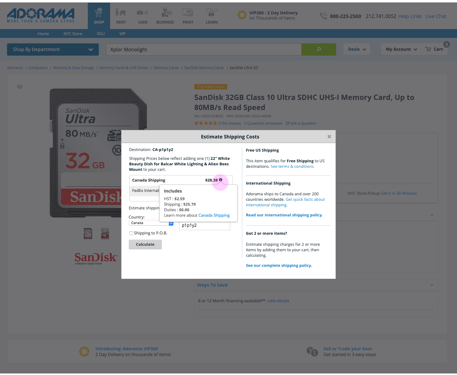
Product Pages (Wireframes presented)
The next place customers would learn about shipping is on the product pages. The recommended product page features improved language and tooltips, as well as an updated shipping information section.
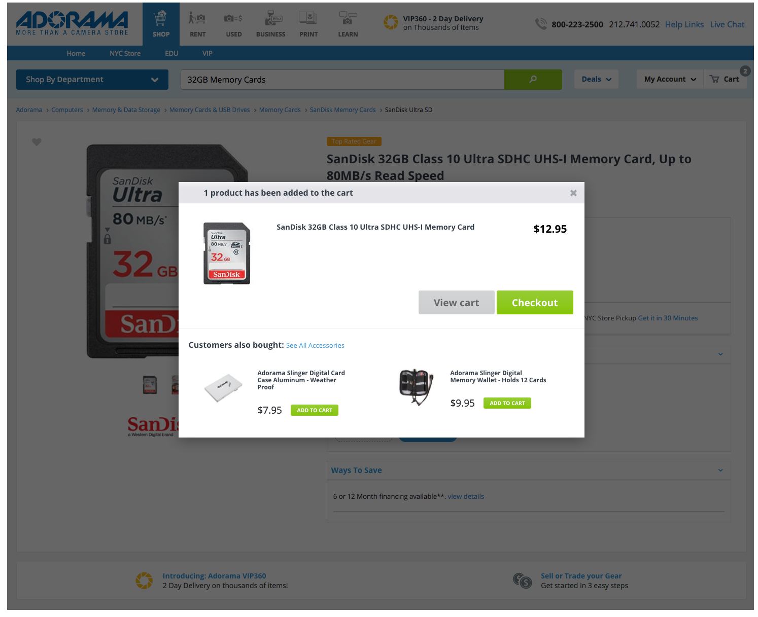
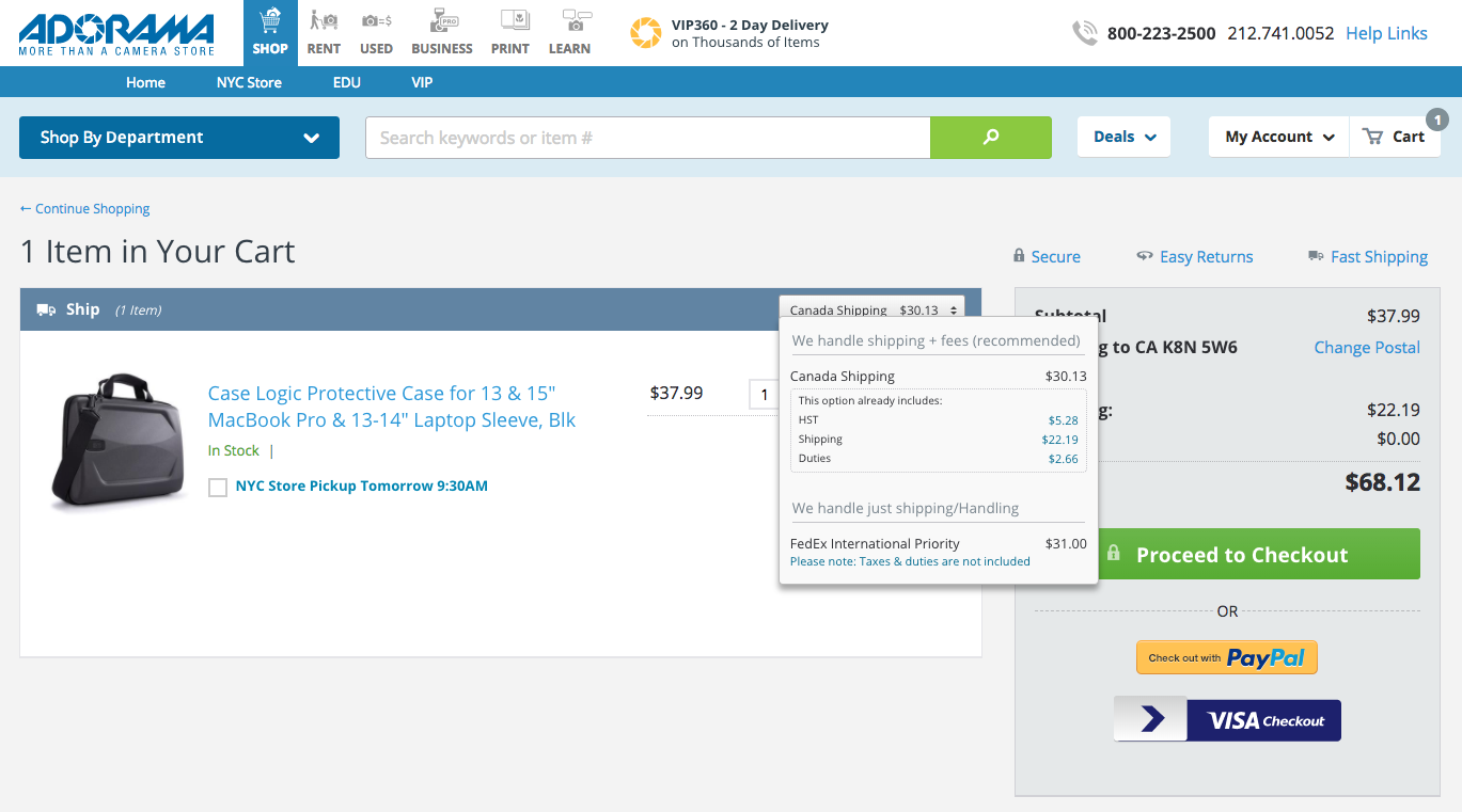
Cart and Checkout (Screenshots presented)
The final place for customers to learn about shipping fees. The recommended changes for the cart and checkout pages would include clarified shipping information, as well as an updated tooltip.

UI Development & Next Steps
As a dual UX designer and UI developer, it was up to me to begin the implementation of changes to the cart and checkout pages.
As of April 2018, only changes to the cart and checkout pages have been implemented. Additional development work will be created in May, or possibly June, for the product page modals.
Thanks for visiting! Feel free to read my latest blog post, or if you came from my portfolio head back there.