March 2021 Portfolio Updates

An overview of portfolio updates, from March 2021.

Introduction

This post is a follow-up on recent changes to my UX portfolio. The changes are detailed below, but here is a quick outline:

  • Main images
  • Featured projects
  • Personal branding
  • Images
  • Colors
  • Language and tone
  • Mobile enhancements
  • About and Colophon pages

Before I get to these changes, here is a quick update from my last post.


Quick Follow-Up: About and Colophon

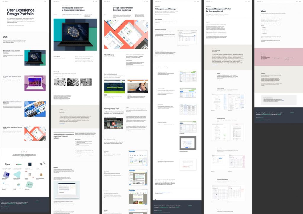
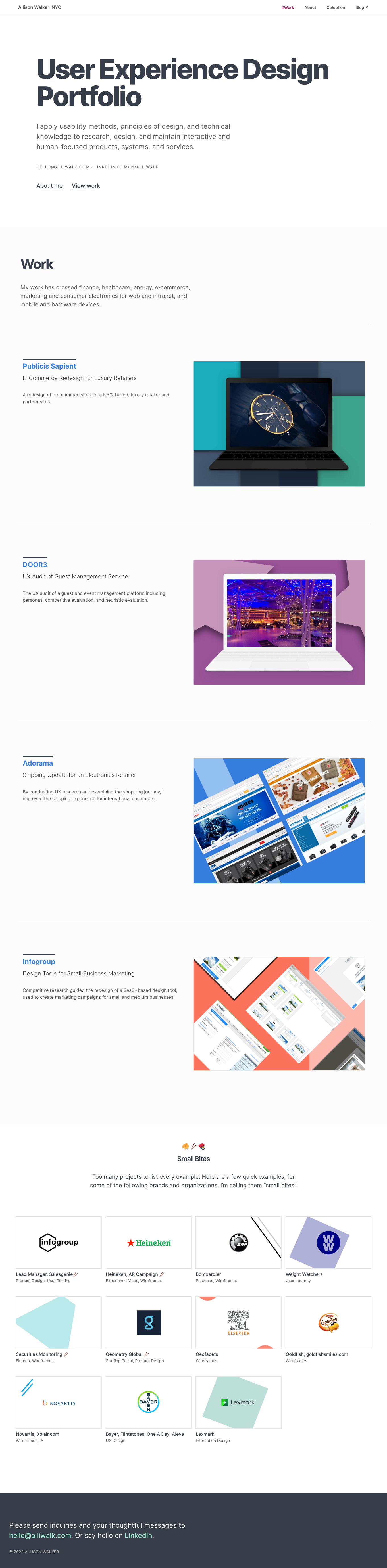
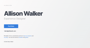
As my last post described, my UX Portfolio previously looked like this:

Side-by-side view of all project pages next to each other, showing an older view.
A look at my previous UX portfolio, with pages displayed side-by-side.

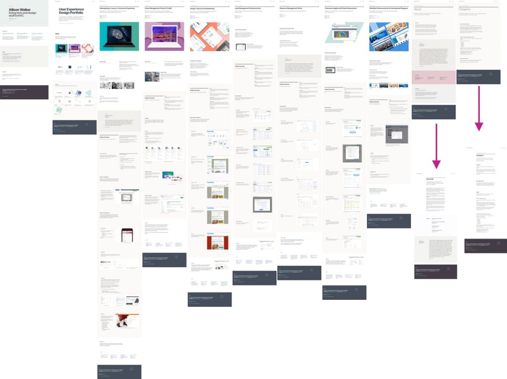
On the About and Colophon pages, on the far right, the arrows show a change from using a thin/fine font weight for the titles to using a heavier font weight. I had also changed the whole page to have much wider margins.

Notice also that, like the About and Colophon pages, some projects do not have images.

Changes from About and Colophon, from skinny headline title and wide width, to heavier headline with narrow width.
Changes to the About and Colophon pages.

Version 4.2, March 2021 — Major changes

With these March 2021 changes, I’ve massively updated the website. As I did with my last major update, I wrote a little note to myself to document the changes. That note…I wrote right in my Sketch file! Below is an edited copy of what I wrote to myself.

Overview & Goal

The goal of these changes was to build on the theme of unification, which I started in the February update. The changes include the following:

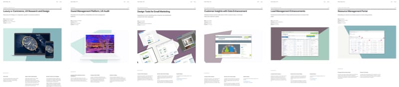
  • Inclusion of a main images for projects
  • Removing and rearranging projects
  • Include principles of personal branding
  • Selecting image ratios for project galleries
  • Updating the color palette
  • Updating the language and tone
  • Inclusion of mobile enhancements
  • Updates to the About and Colophon pages

Detailed Changes

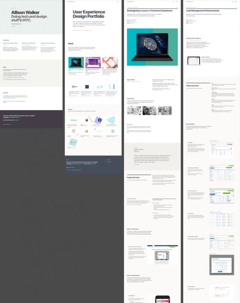
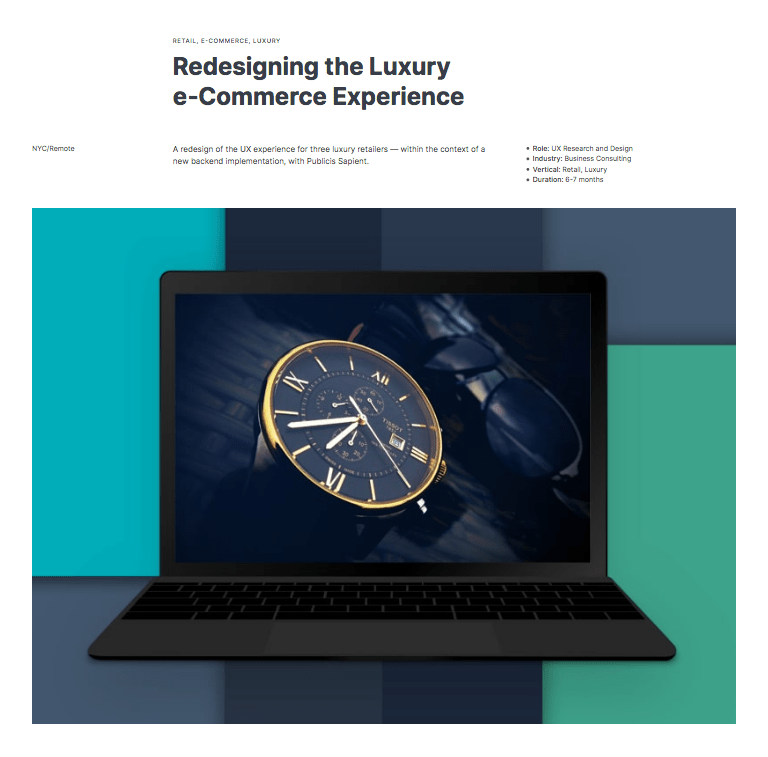
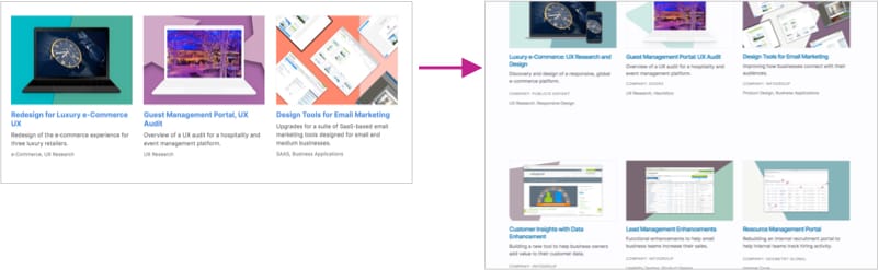
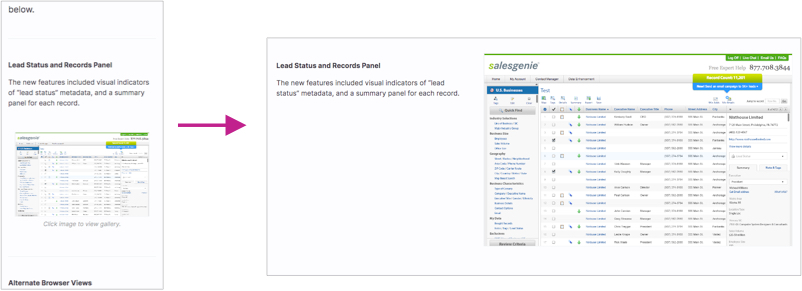
1. Make sure all projects have a main image.
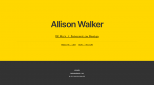
No More “Swiss Image

I decided on a new look for headlines on project pages. In my previous update, I’d changed the headlines so that the projects would have a unified look, regardless of whether or not they had an image. However, after more consideration, I felt that the lack of an image for projects was a weakness.

I was sad to move away from the “Swiss poster” -style headline. I originally selected this style due to its asymmetrical appearance and unusual look. I felt this would help my portfolio seem more memorable. Here is a before and after:

Old Lux-Retail image with Swiss poster style
Previously, project pages used a layout I called “Swiss Image”.
Side-by-side view of project images, showing the unified look of the projects
After: all projects now have images.
2. Removed Adorama project as a page.

My intention for this project was to provide a logical overview of my research activities and thought process. However, due to previous iterations of my portfolio, the presentation of this project was much different from the others:

  • The portfolio page was somewhat short
  • A comprehensive explanation was available, but required linking to a blog post

While the blog post was comprehensive, I felt the project summary on the site wasn’t very strong. In reconsidering my strategy for the experience of this page, I decided that forcing people to click through to a blog post seemed too much. So, I removed the page.

I felt a sense of nostalgia for this page because this project helped kick off the first changes on this website, from Bootstrap to Tachyons.

But there’s an update: Actually, I put this project back! However, I did eliminate the link to the blog post. Instead, I updated the page itself to include more detail. I put this off for a while because I had assumed that this would be more work than the gain I’d get from it. But the effort wasn’t as bad as I thought. So of course there will be another portfolio update!

3. Scrapped a 7th Project

I had plans to include a 7th project page, which would be just user journeys and maps; sort of stand-alone examples. Ultimately, I decided against it:

  • I wasn’t sure it was a strong enough page
  • The page was too different compared to the others
  • Trade-off between showing more work vs showing too much was imbalanced

It’s possible I may reconsider including this page at a later time, if another project gets eliminated.

Project image for mapping page
7th project I didn’t end up using.

“Catalog” SVG Images

In addition to removing the project page, I also ended up removing some of the SVG images at the bottom of the page. These images would have been available as example projects/links.

I ended up adding two new SVGs. Although, I may need to revisit this and look at which SVGs I want to include.

Changes to catalog section at the bottom of the homepage.
Over time, I changed the list of projects/companies displayed at the bottom of the index page.
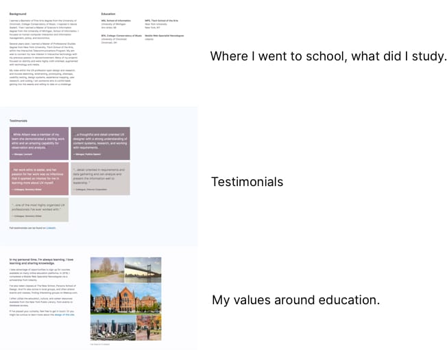
4. Applying Sales Copy and Personal Branding: Index Page, Testimonials

After attending some webinars on personal branding, self-promotion, and writing sales copy (for personal branding), I realized how powerful testimonials can be on a website.

The good news is that I was already including testimonials. The bad news is that they were a little difficult to find. You had to click on each project to find them, which meant some of them might go unnoticed. They were also were long and wordy.

Example of a testimonial from a project page. In order to read this, you had to click on a project.

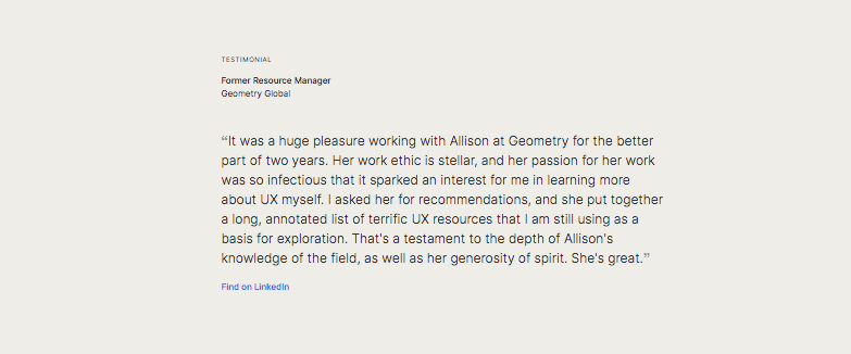
The change I made was to highlight two quotes on the homepage, and then include a link to a Testimonials section on the About page. Rather than include the full testimonial, I included just a sentence or so. Readers can visit LinkedIn to view the full quotes.

Left image shows no testimonials. Middle image includes 2 testimonials. Right image shows a group of testimonials, with a link to LinkedIn.
Transformation of the homepage. Left image shows no testimonials. Middle image includes 2 testimonials. Right image shows a group of testimonials, with a link to LinkedIn.

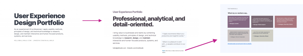
I also changed the home page to reflect more of what I learned during the webinars. For instance, the title is meant to appeal to hiring managers without being too explicit.

The testimonials also provide a sales purpose: as a webinar leader said, testimonials are a way to “borrow” authenticity.

5. Language and Tone

I made a few changes to language and tone with the following activities:

  • Editing corrections by reading out loud
  • Using an active voice
  • Updating project descriptions
  • Using original descriptions in project titles and subtitles
  • Updating descriptions on the homepage

Read each project out loud

Tying into point #4, I went through every project and read it out loud. This helped me find typos, and make sure each page flowed well. I didn’t find too many typos, but I often repeated myself from section to section. Reading out loud helped me find and fix those issues.


Use an Active Voice

I also took the advice of a personal branding expert to use an active voice, especially when describing myself. Here is an example of a change:

  • Old version: I’m the kind of person who can get into the weeds and takes on challenges
  • New version: I am comfortable getting into the weeds and taking on challenges.

Maybe this could be better, but overall it’s an improvement.


Updated Project Background/Overview

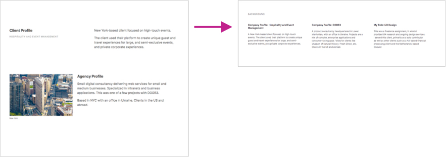
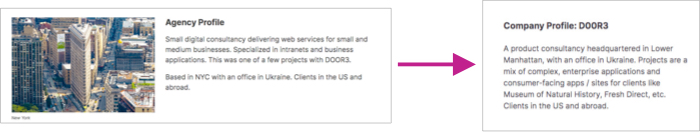
Under each project image is a little background information about my role, the company, the client, etc. I felt this section was too tall and drew too much attention.

I added a title for the Background section and cut down on the client/company overview for each project by creating a 3-column group of text.

Updated background section is shorter, eliminates the image. Goes to 3 paragraphs.

Update Projects with Original Descriptions

I decided maybe I was creating more work for myself by trying to come up with my own interpretation of what a project was about.

My solution was to search through my inbox, and find the specific descriptions used in project or company descriptions, as they were pitched to me. If I couldn’t find an email, I sometimes searched online — sometimes taking descriptions from Wikipedia — for company descriptions. Here’s an example:

Showing how I changed the title and subtitle on project pages; typically going from a longer description to shorter.
The second subtitle comes directly from the job post.
Background section showing a change to the Agency Profile with image to description with a short paragraph.
The description on the right uses language from the hiring manager, describing the company.

Home Page Project Descriptions

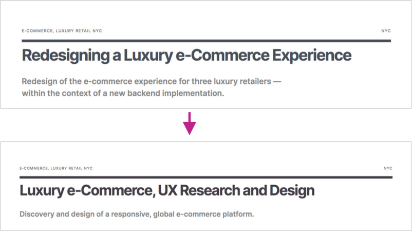
I also considered how I described each project on the home page. It turns out I was describing projects in 2 different ways. For instance:

  • By project activity: “Redesign for…”
  • By project outcome: “Design Tools…”

I decided to update the descriptions. Now the titles describe the project outcome and the description explains the activity/detail.

For another layer of home page detail, I also included the name of the company. I felt I had more space, since I was removing other projects.
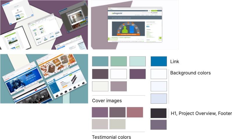
Showing changes to project descriptions on the homepage
On the home page, I modified language and tone for each project so that they were all more consistent in language and style.
6. Color Changes

As I was revisiting some of my research on portfolio websites, and looking for ideas, I came across www.vitsoe.com. This appears to be the website for the company run by the German designer, Dieter Rams.

The website is quite organized. It follows a very clear 3-column layout. And it only has 4 colors: Black, White, Grey, Blue.

vitsoe.com

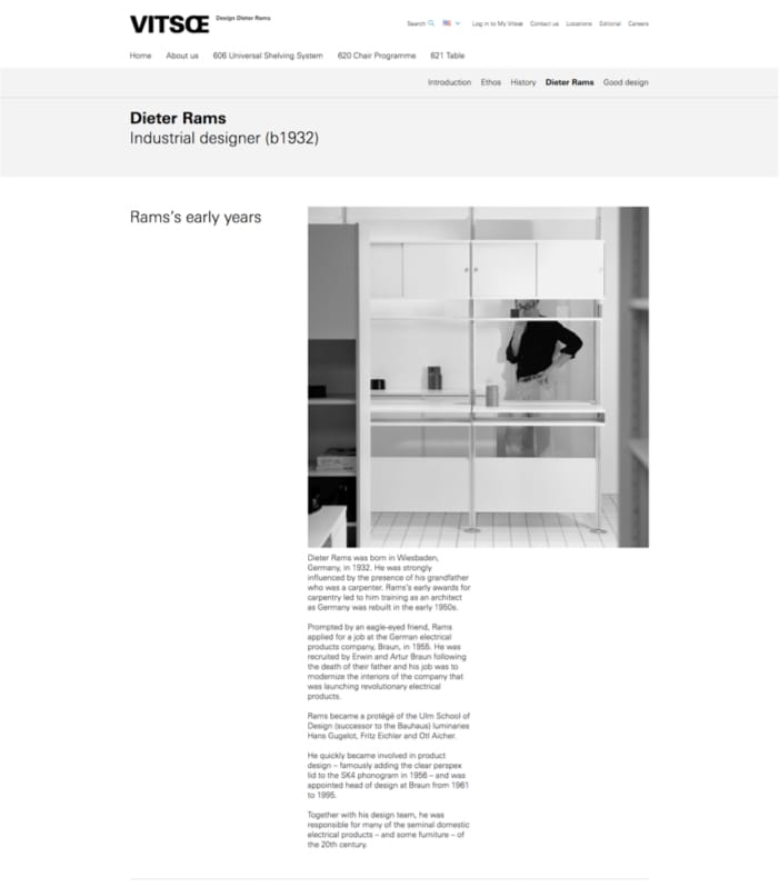
I liked the blue color, which they use for links. After trying it out a bit, I decided to use it for my website — also for links.

After that, I decided to do a lo of color exploration, to make sure all my colors coordinated. This eventually led to an entirely new palette. It was all based on this one color!

Screenshot of a collection of screenshots, of coordinating colors
Exploring colors, using the blue link color as a starting point.

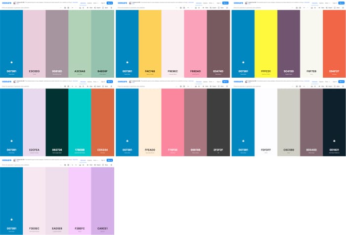
Historic Color Reference

I went back to my 2017 website to find good ideas, since it was a good enough portfolio to get me a 6-month gig. Turns out I used a white background that wasn’t pure white. It was actually an extremely light version of the dark navy blue color I had been using for the footer and the page titles. I took that hue and created a few shades to use as background colors. 

Screenshot of my old website and colors.
The image on left is from my 2017 portfolio. Both of these colors have the same hue, but different saturation and brightness.

After generating so many colors, I decided to try out some of the new dark shades to see if maybe I should make some other changes.

The previous primary font color was 220 HSL, which is that very dark navy. The new color is 280 HSL, which is a very dark purple. I think the new color is a little warmer, and lighter shades look kind of lilac.

I updated all of the project images with hues from the new color palette. The new colors are kind of pastel and muted, including greens, purples, and off-whites.

Overview of updated color palette, based on the blue.
New Palette. These aren’t all the colors, but many of them.
7. Image Ratios

As I mentioned, I had a goal to create more of a unified look across project pages. I knew that one way to do that would be to make sure all the images were the same size or aspect ratio.

This was something I had been thinking about for a while, but I hadn’t quite gotten around to it yet. The Vitsoe.com website, for example, uses 2 sizes: 1×1 and 16×9. 

Image masks to test out image ratios.
Aspect ratios are built into the CSS framework I’m using. They are 8×5, 7×5, 16×9, 6×4, 4×3, and 1×1.

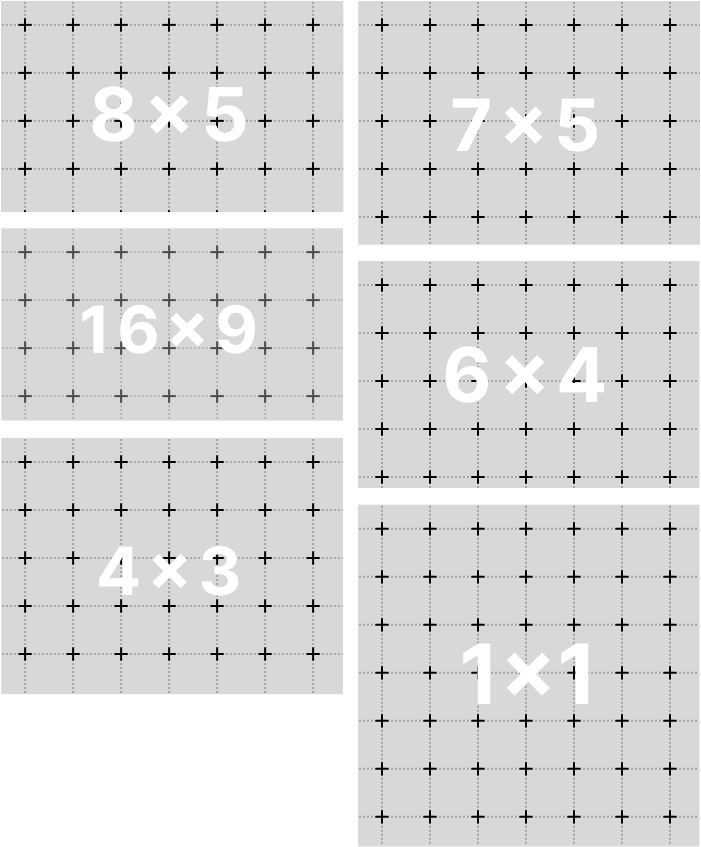
Aspect ratios are built into the CSS framework I’m using. I just needed to apply the styles after making a decision. To decide, I created image masks and tried out a few options. I selected 8×5 for project images and 16×9 for project covers. 

8. Mobile only enhancement on project galleries. 

I was concerned that mobile users might not know to click on the image to see a larger version or to see more images. I added a message to click the image to view the gallery. The message only appears when the browser is resized to a mobile view.

Example of click to view image, on mobile vs desktop
Below the image, it says “Click to view gallery”, which is on mobile only. On desktop, the images change opacity on hover to indicate they’re clickable.
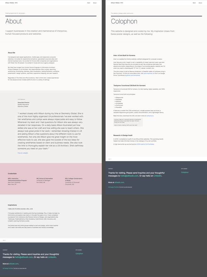
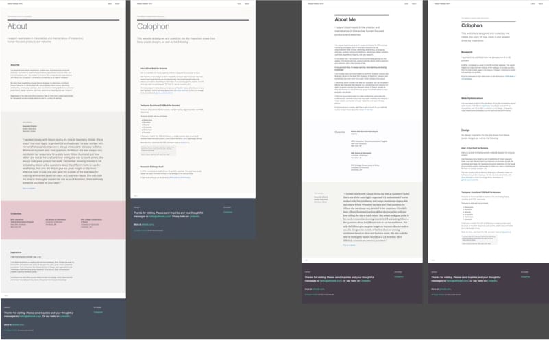
9. About and Colophon

My research on portfolio websites show that About pages are so varied. As a result, I go back and forth on what this page should look like. I honestly really don’t know what people want to see on About pages!

Ironically, it was after I began looking for a dentist that gave me my inspiration. I saw how some of the dentists described themselves, and I thought it was a good approach.

Here’s how the About page is outlined:

Screenshot of my About page showing the different sections
My newest About page
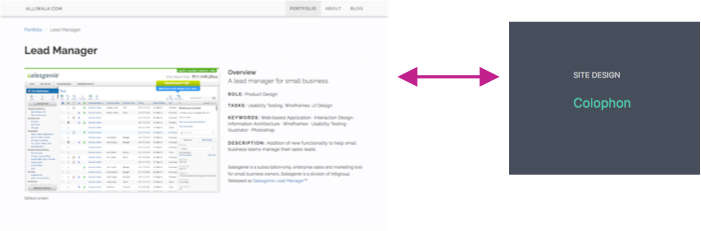
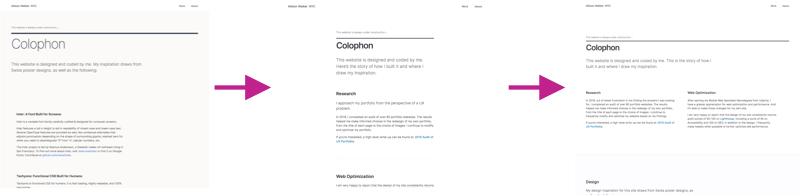
Return to Full-Page Width

For both the Colophon and About, I returned to a full-page width. I think it looks so much better.

Screenshots of changes to the colophon page, from original to narrow width, to wide width again.
Changes to the Colophon, from left to right.

Conclusion

Quite a lot of changes! All focusing on creating a unified look, changing language, and updating colors and aspect ratios. To recap the changes:

  • Main Image: Revised the header for each project by making sure each page has a main image (except About and Colophon)
  • Updated Projects: Removed Adorama project and updated SVGs, though I later changed my mind on the project
  • Personal Branding and Testimonials: Added concepts of personal branding and modified the testimonials used on the site
  • Language and Tone: Focused on language and tone to revised the wording on the home page, project descriptions, descriptions of myself
  • Colors: Updated the color palette to muted colors, after testing a blue I found on vitsoe.com
  • Aspect Ratios: Created a more unified look by selecting image ratios in 8×5 and 16×9
  • Mobile Enhancements: Added mobile enhancements for project images, with instructions to click to view
  • About/Colophon Updates: Updated the bio on the About page and changed page width on the Colophon

And yet the portfolio has changed again! I’m glad I included on the Colophon that the website is always under construction, because that is so true!

Some of those changes have already been explained, but the rest it will be in another update.

February 2021 Portfolio Updates

Updates to my UX portfolio site, what I call “Version 4”.

Screenshots of portfolio site, on a black background.
Portfolio in 2020, using “Swiss” header. At the end of 2020, my portfolio looked like this.

To summarize:

  • Home page with 4 stacked rows of projects, then a grouping of companies and brands at the bottom.
  • Each project had a large image and a “Swiss” style for the title.
  • Three projects at the bottom linked to other projects, but not all of them had images.
  • I included testimonials from LinkedIn, which are the tan blocks of text.
  • And, as always, I was not sure what to do with the About page….

Feedback Generates Ideas…

I can’t remember who reached out to whom, but a friend and I had a video chat about her desire to revise her website. During the chat, I gave her a little walkthrough of what I did to update my own website, including the 2019 Portfolio Analysis and the research I conducted to complete it. She also gave me some feedback as she clicked through my site. So, I knew I would make some changes, but I also got a few new ideas.

Not only did I make updates to my website, she also gave me a suggestion to create a complementary Google Slides presentation. I’ve definitely started that, but of course I got side-tracked into website updates!


Major Changes for 2021

One change I was aiming for was to create a more unified look across all project pages, regardless of whether they had an image or not. For this, I used the same headline style, with a heavy top border above the title. With or without a main image, the headline looks the same.

I also made an update to the main index page, which is all the way on the left in the pale green color.

Mockups of portfolio updates, on a dark background
“Version 4” updates to my portfolio. Two right-most pages have similar treatment to the title, but one has an image and one doesn’t.

There were actually so many changes, I wrote a little note to myself in my own Sketch file! So here is what I wrote to myself:


Version 4, Feb 2021 — Major changes

The goal of these changes was to unify the look of all projects, even those without an image. And to include projects that were on the website in 2019, to provide more balance and make sure the projects are not too research heavy.

Major Changes

  • Changes layout of index page to 2 rows of 3 project + 4 projects. It is a big departure!
  • Removes the “swiss poster” look of project pages. All pages now have a top border, heading, sub heading — including About and Colophon.
  • Addition of Next project section at bottom of every project page, with list of next 4 projects including project and description. Single link to next project is gone.
  • About and Colophon are using an elegant thin weight for titles; it does not read well for longer titles
Updated About and Colophon, with thin font weight for title text.

Other Important Changes

  • Moves Heineken project out of project list
  • Moves Adorama to 2nd tier project (no 7)
  • Changes “Small Bites” to “Catalog”
  • Removes all [project] links to blog, except for Adorama Deep Dive
  • Removing Top “hat” icon from bottom pages, and replacing with character entity arrow to reduce server calls. Only Adorama project calls the Emoji CSS.
  • Removed unused color variables from CSS file, and not really use most of the ‘small-bites’ class

Minor Changes

  • Punched up the contrast by using dark-gray font on all pages, except for subheadlines, “eyebrow” text (mostly all caps/ tracked) using gray
  • Changed the display of company/client profile and role, below header
  • Increased font size of most text on mobile, esp header sizes

Sadly, my updates meant abandoning my beloved Swiss style (which is a template within the CSS framework). But instead, I was able to sort of borrow from other inspirational images.

Examples of Swiss style posters/type design.
Inspirational images from my Sketch file.

Conclusion

Maybe some of these changes don’t seem like much but it was a drastically different site with very different projects.

But it didn’t end there! The next post will have the changes I made in March 2021, for even bigger changes.

2019 Audit of UX Portfolios

In 2019, I began a project to audit over 85 portfolio websites. The result is the 122-page presentation below. The surprising results helped me in the design of my own portfolio.

Last year, I wrote a few blog posts about my portfolio updates and research process. Yet I’ve never shared my full findings. I hoped I’d be able to present my findings at UX Camp 2020, after giving a talk in 2019. But it’s 2020 and everything is cancelled.

In lieu of that, I’ve decided to share snippets of my research here on my blog. I’ve also included links to my previous, portfolio-related posts.

Enjoy and please share feedback in the comments.

Update: I’ve made changes to this post. A few weeks ago, I had included the whole presentation, but I’d prefer to keep that to myself for now.


I. Portfolio Resources

Contents

  • Part 1 – Overview: Introduction, methodology, and general caveats. Or, why I conducted this research, how I analyzed my findings, and what to keep in mind when reviewing the findings.
  • Part 2 – Review: Analysis and quantitative findings. Includes examples of tools, labels, images, layouts, and more.
  • Part 3 – Summary & Final Thoughts: Summary of findings in Part 2 and final thoughts for designers and hiring managers.

II. Previous Portfolio Blog Posts

A few of my previous posts about my process and portfolio updates.

Sept 17 2019: Portfolio Resources. A collection of sites, tools, and people I learned about during my research. Organized into the following lists:

  • Sites – Guides, essays, and portfolio collections
  • Tools – What people use to create their portfolio
  • People – A small handful of portfolios

Nov 4, 2019: Portfolio: Pólya Principles Applied. This post is about how I used ideas by the mathematician, George Pólya, to break down my portfolio issues into manageable subtasks. I’d written about Póyla‘s method, a few weeks earlier.


Nov 11, 2019: My Tachyons Portfolio. A review into the [then] state of my portfolio and thoughts for the future. This post occurred after my research, so I go into design questions. It also gets into some of the questions I hoped to uncover with my research.

  • How many portfolios are from students and do they seem different?
  • What types of profile images to designers use of themselves?
  • What is the most common greeting on portfolios?
  • How many designers use their own domain?
  • What do most people use to create their portfolio?

Thoughts? Questions? Feedback?

I found the results really surprising! How about you? I’m very interested in your feedback. Did you find this information helpful? Was it surprising? Do you have questions? Comments are open below.

If you’d prefer to leave an email, please visit alliwalk.com for my email address.

Portfolio Updates: 2020 Build

I recently updated my portfolio again. I do it every year, I guess. As before, I designed it in Sketch, with some on-the-fly updates in CSS. Here’s a look at the after:

Top to bottom screen capture of portfolio landing page


List of changes

I still have some changes to make, but those are relatively minor. Here are some things that have and haven’t changed:

CSS Framework

I’m still using Tachyons, which is a low-level, utility CSS framework. I’ve started to move some styles to my stylesheet, partially to keep the HTML clean and also because I enjoy writing CSS classes.

Now Optimized for Wide-screens

Something I wasn’t aware of before was that the page content was floating left on super large, 4K screens. I optimize my site for mobile use, but I only have a laptop screen at home. I didn’t even think about this previously!

Well, I fixed this, by giving the pages a max-width and centering content, but I’m annoyed that it happened and I didn’t know until now.

New Inspirations

The overall inspiration for my website comes from Swiss design posters, but I was additionally inspired by two more websites.

  • Paravel has a simple global navigation and conveys a lot of information about projects, without being cluttered. A good example of including text, but not too much. I borrowed from their All Work section at the bottom of the page. paravelinc.com
  • Salt & Pepper sticks to neutral tones of black, white, light tan, has lots of white space, and uses big titles for their sections. It reminds me of some of the original goals for my site. I added more white space to the landing page, similar to their main page. snp.agency/en

New Projects

Overall, I added three projects, moved one, and removed one. The one I moved went to the new section, as described next.

Below the main project area, I replaced the images of brands and companies, and instead added a grid of rectangles with logos. Some of the logos lead to new pages with shortened projects. I decided to call these shortened projects “Small Bites”. Most of these projects are examples of individual design artifacts, rather than complete case-study reviews. The reason for this is I wanted to share examples of good work, but I don’t always have a strong story to tell.

Main web page update

I also updated my main website home page. Previously it was yellow and dark gray. At the time, I wanted to give an equal weight to my Cargo collection portfolio (which is really only because I am paying extra for that), and my blog. I decided that page was embarrassingly bad, so I updated it for something a bit nicer. I had to admit to myself that most people will be viewing my website to view my UX portfolio, so I made that more prominent.

Maybe I’ll update this page to include more personal stuff, like my GoodReads list, or a recent blog post, or something. And, I’d like to make it more Swiss-poster style, so there may be more changes.

Favicon

I updated the favicon to a little green square. I used to get confused about which page I was on, but I’ll probably change it back. It’s  not really meaningful for me.

I like the tree. 🙂

Still no subdirectory for Work

I’ve considered moving my projects into a sub-directory, like alliwalk.com/ux/work/project-name. But there are 2 reasons for not doing that.

The first reason is creating a work directory would require creating an index page. The obvious thing to include on that page is the list of projects, which would mean moving my projects to that page. I’d like to keep the navigation flat and stick to the one-page design.

The second reason is I don’t want to be using long urls. And I guess another reason is that the About and Colophon would then be hierarchically above the project pages, and that’s not right, either. So everything will stay where it is.


Help from StackOverflow

I ran into two CSS/layout issues, related to images and the footer.

Problem 1: Images. In one case, I was getting this thin, black line showing up around some images on a new page I’d added where I wanted to use a different effect for image hovers. The effect meant I had to wrap the images differently than just placing them on the page. The only problem was that I could not figure out where the border was coming from, until finally I found an “How to remove a border of background-image“.

I had been adding images using like this:

<img style="background-image: url(https://www.w3schools.com/css/trolltunga.jpg)"/>

This is incorrect. Image tags require a “src”. The other option is this:

<div style="background-image='url(image.jpg)'"></div>

The only problem is that it’s not exactly semantic, and it’s not accessible, as is. However, it can be made accessible by using role and title attributes, which is what I did.

Problem 2: Footer. The other question I found helpful was related to the footer, which was not sticking to the bottom of the page on some pages. Bootstrap has an easy solution for it, and I thought I found another option that would work, but it failed, too. Finally, I found “DIV content overflows into footer, makes footer go upward on page” which provided a simple solution, though kind of hacky solution.


And, I guess the other thing is I never shared the results of the research I did in 2019 on UX portfolios. I checked on it again, to remember all of my findings. But, I don’t know if it should be on SlideShare, or if I should put it on LinkedIn, or just on this blog. I don’t know. Something to think about.

I was hoping to present it at UX Camp this year, but….

My Tachyons Portfolio

A review into the current state of my portfolio and thoughts for the future.

My last blog post was an account of what I have accomplished in my portfolio journey and ended with some ideas about next steps.

Sample Tachyons page, on github.

At the time, I said I would try and create a design using Tachyons, a lightweight CSS framework. That sample page, pictured, is available on github.

I also wrote about fears using vanilla HTML/CSS, related to updates. I ended up going with DIY anyway. I still have that fear. I also wrote about using WordPress as a portfolio. I considered I installing WordPress in multiple folders and testing out different options.


Current State of My Portfolio

My portfolio is still at the same domain, but now it’s at a subdomain: alliwalk.com/ux. The reason is it gave me more navigation options rather than putting everything on the homepage.

I ended up using Tachyons for the entire site. It took a while to get decode the classes, which are a bit cryptic. I wrote some CSS, but not that much. I kind of missed writing it. But it was also a very interesting way to implement styles. And it looks pretty clean.

As I mentioned in my last post, one of the long-term strategies I had in mind for the site was to create more than one portfolio for my different interests, blogging, art/design, and UX. I got the idea of multiple portfolios after watching a YouTube focused on PDF portfolios for graphic designers.

This video is linked to the appropriate moment in time, or you can watch the relevant 40 seconds here

To alleviate one of my fears about updates, I created a landing page with nav links to each of my three interests. Now I can modify the link destinations, if I need to take a portfolio offline for some reason.

And finally, I did test a WordPress option, but it’s never as quick and easy at it seems. My portfolio went through a few versions, including PDF and a test in WordPress.

PDF Portfolio

Strategy: Some designers create their portfolio as a PDF to supplement their online portfolio. I’ve tried this before and I did not have good results. However, I thought that using my new font and style would help created compelling layouts. Plus, I needed something to point people to while working on updating my website.

Actions: I went through several iterations. I created PDF versions, which I created in Google Docs and Sketch. I attempted to use the J. A. Van de Graaf canon, popularized by Jan Tschichold, to lay out the content. I referenced the book Grids, by Gavin Ambrose and Paul Harris, for inspiration.


Aside: I could write a whole post on page layout, Tschichold, Van de Graaf, but instead I’ll just share a few short videos.


Review: I shared both versions as direct links or by uploading to Behance. I used both for job applications. Neither got me very far. So essentially, my previous experience was the same as it is now. However, creating them helped me later on when I was testing out my blog/website. And I now have portfolios available for future discussions, that I can present and discuss on the phone or in a group.

Quantitative Research and Analysis

Strategy: As per my previous post on portfolio resources, I found that although I had a lot of summary and raw data on portfolios, I hadn’t fully analyzed it. My strategy was to thoroughly research the portfolios listed in one of my linked resources. I wanted to answer questions like:

  • How many portfolios are from students and do they seem different?
  • What types of profile images to designers use of themselves?
  • What is the most common greeting on portfolios?
  • How many designers use their own domain?
  • What do most people use to create their portfolio?

Action: It took a while, but I completed a significant amount of quantitative research. I have not yet shared my report, but I’ll probably post it on SlideShare and link to it. I hope to present it at a UX related talk.

Review: My research clarified many questions about portfolios and helped answer questions on how to design specific areas of the site. For instance, previous reviewers suggested using my own domain (vs using cargocollective). I didn’t understand why this was so important until I concluded my research, which showed the vast majority of designers used their own domain.

The reviewers also made comments related to not getting a sense of who I am. I always find this difficult to articulate, but the research helped again. Ultimately, I decided that this blog would be able to serve as a supplement for anyone to learn more.

The research also helped guide my headlines. Most designers used a very similar type of greeting on their site. I chose to use something that stood out a little bit more. I also used yellow on my landing page, to help people remember that yellow site, if they enter from that page.

WordPress or DIY

My research revealed that most designers, about two-thirds, use a CMS to build their portfolios. The 2 most popular are WordPress and Squarespace. The rest, or one-third, use a DIY solution.

Initially I thought WordPress could be a good option. It’s free, I’ve used it for many years, I know how to install it. I decided against using this blog as a combo portfolio+blog website. I’ve been using it as a blog for too long. And also, I wanted to keep the size of the database down. I considered installing a WP blog into a subdomain.

Free or Paid Themes. Many of the popular WordPress themes, such as Semplice, are not free. But found a solution. As I wrote previously, WordPress Twenty Twenty will be based on the free Chaplin theme by Anders Norén who leads WP 5.3 development. I went to Anders Norén’s lovely website and found multiple free templates.

I created a test site, uploaded images, and added some write-ups. At the same time I was also created some test pages using Tachyons. Ultimately I decided against using WordPress. Anders Norén’s templates are beautiful, but I felt that in order to have a portfolio that could compare to the portfolios I reviewed in my research, I would need to still need to make a number of customizations. DIY was simply more fun and enjoyable.


Present and Future

The site is basically done, but there’s still room for improvement. I plan to implement image zoom using one of the JavaScript resources I listed in my post on portfolio resources. I also plan to make changes with image optimizations and swap out a few images. I want to update a few of the descriptions, perhaps adding another project or two.

And, I have some ideas about updating the layout of the yellow landing page. It might give me a chance to use more of my own CSS.

Maybe one day I’ll use one of the templates on Anders Norén’s WordPress theme site for this blog.

Alternative Portfolios

I’m still using the cargocollective account, but I’ve re-repurposed the site and it’s now back to showing creative/art/design projects. If that site gets too full, maybe I’ll create another portfolio focusing on one or two of those interests.


The next time I write about this, I hope it will just be about my research. Because on this, I’ve written a lot!

For now, I’m happy to be done writing with this topic. Plus, I’ve written a number of other posts that are waiting in drafts to get posted.

Portfolio: Polya Principles Applied

Revisiting my portfolio again, this post is a structured account of the work I’ve completed in updating my portfolio. And I have some nice photos of the East River. 🙂

Time to circle back on some portfolio stuff. For the most part, I’ve finished updating my portfolio. Done enough to publish, ask for more feedback, and start collecting analytics.

But before I get too far into where the portfolio is now, let me jump back to a few weeks ago, and pick up from when I wrote about George Pólya and his book on problem solving…

Applying The Pólya Principles

In the middle of my updates, I had a conversation with someone about my job hunt. I had paused the job hunt to more finish analyzing UX portfolios. The person I spoke with did not understand why I had paused my search. Why was I analyzing portfolios, not fixing my own and getting on with the search.

Thinking back on that conversation, the problem was in how I was communicating. I was only explaining what I had recently done, not what I had already achieved before that point. Much of story got skipped.

When I came across that question on FreeCodeCamp about logging development progress, and the ideas in Pólya’s book on problem solving, I thought I should take the time to write down all the steps I’ve done. It would help provide a comprehensive and structured account of what I’ve accomplished and why.

My strategy is that it will help me organize my thoughts and resulting actions. My hope is it will help me either solve my problem(s) or cross an strategy dud off the list.

Skip to below…


And that’s what I did — I wrote an analysis of my main problem, broke down the steps, and listed what I’d accomplished. I also included some images of my favorite park — sunny days and bike rides, sacrificed to finish up this project.

I have more to add about the present state of my portfolio. That will be in the next post. So two posts: one on the past and one on the present.

Check out the rest of this post below. Keep in mind, it was written several weeks ago, in reverse-chronological order. The next post will be on the present.


Continued from above….

For the rest of this blog post, that’s what I’m going to do. It’s just going to be a bit of a stream of consciousness, so consider yourself forewarned!

Main Problem: All of the portfolio problems I’ve been trying to solve for is directly due to job hunting. I’ve been so focused on my portfolio because of the feedback I received related to that, and I simply haven’t finished making updates.

Breaking this problem down into sub-problems has led me to spend time improving my resume in the beginning of the year, and now I’m focused on improving my portfolio. I don’t truly know if my portfolio is a contributing reason for any job hunting difficulties, but my research has indicated it is incredibly important. And since it’s under my ability to make changes, I’m making updates to see what works.

Although I got some portfolio feedback, I still wasn’t exactly sure how to improve my portfolio or the best tool to use for it. But the information I’ve gathered about portfolios has been helpful to help me narrow my options down.

Pólya Analysis

Sub-Problem: Which tool is best to rebuild my portfolio
  • Option 1: DIY is a common option and I recently discovered Tachyons.io CSS framework.
  • Strategy: Explore Tachyons.io as a DIY option, vs Bootstrap which I have used before. 
  • Actions: I learned that the default WordPress 2020 will be using the typeface ‘Inter‘. From the Inter website: “Inter is a typeface carefully crafted & designed for computer screens.” When I looked at some of the samples, I saw these Swiss style posters.

https://rsms.me/raster/examples/poster.html

labs.jensimmons.com

The posters reminded me of Jen Simmons who uses a similar style for her site labs.jensimmons.com, which explores experimental layouts.

There are a few Swiss poster-inspired websites and articles exploring experimental web layouts:

Anyway, because of CSS grid + the Inter font (which is free), and GridbyDesign.com, a site providing InDesign grids, I thought: Wow I could really create a unified online and offline experience based on the Swiss poster style!

Outcome thus far: Tachyons classes are a little cryptic because they’re meant to be applied one at a time. The other problem is that I don’t really have a design in mind (a sub-sub problem?) so it’s a little difficult to evaluate whether this is a viable option. (A sub-sub-problem I experienced was using BackgroundSync, which I couldn’t initially get to work. I find sub-sub-problems often come up in coding.) Ultimately, I might be better off using a CMS, like Squarespace, to solve the online portfolio problem / job hunting problem, which is more critical than a unified user experience at the moment. WordPress can be free/cheaper and it can be installed on a subdirectory. Squarespace and other CMS tools can only be installed on subdomains or the central domain.

Sub-Problem: How to improve my portfolio.
  • Strategy: Use quantitative analysis to uncover what specific elements make a top UX portfolios. And then replicate those elements on mine.
  • Actions: I started a quantitative analysis of a list of 80-90 UX portfolios to find out what makes them so great. For example, in the portfolio guides I read through, they suggested spending time making images look good. But I realized I didn’t really have a clear understanding of what this meant. And given that I’m an exceptionally private person, I also realized I didn’t really know what was appropriate for an About page. And I was curious to learn what most people used to build their sites. So essentially, I set about answering these questions, to help me put together the pieces for my own portfolio redesign.
  • Outcome thus far: Although DIY makes up a sizable portion of portfolios, I’ve been surprised to learn how many people use paid CMS tools for their portfolios. I’m trying to learn a little more about the backgrounds of the DIY authors, like are they students, who have time to build a DIY site, or developers who do it all the time. But now that I’m writing this down, I think I need to think a bit more about CMS options.
Sub-problem: Feeling overwhelmed with the amount of resources and need a place to put them all.
  • Strategy: Make an orderly list of resources that have been influencing my portfolio revisions and/or could serve as a resource in the future.
  • Action: I created a list of portfolio resources, of guides and websites, JavaScript libraries and CSS tools, and a short list of portfolios that might hopefully come in handy. That list is here.
  • Outcome thus far: Creating this list has led to more investigation on how to create a portfolio. I’m starting to see some overlap and understand more meaning in the portfolio suggestions.
Sub-Problem [Hypothesis]: Online portfolio projects weren’t showing my work and myself as a designer as well as they could.
  • Strategy: Go with a temporary PDF portfolio, and remove all projects from my website. Re-evaluate all online materials.
  • Actions: I removed all projects from my website and put in a message to contact me for sample work. My concern was that my website was a) out of date in both style and programming [Bootstrap 3]; b) didn’t represent me well in part due to A. I also took screenshots of all my online portfolios, at Behance, Cargo1, CarbonMade, and Coroflot, to view how I was really representing myself online.
  • Outcome thus far: Coroflot is still available, but I don’t link to it from anywhere. CarbonMade is online and I also don’t link to it from anywhere. The different sites have slightly different visual expressions and the experience using them can be different and limited based on the way that the site works.
  • Reflections: On her website, which is built with Kirby, Jessica Hische provides the following advice for getting freelance work:

Have a website.

This might be a no-brainer, but a ton of young people looking for work don’t have a functioning website because they’re still struggling to build some crazy flash bonanza themselves. STOP. Unless you want to do web work for a living, sites like cargo collective, indexhibit, and carbonmade are perfectly fine ways to make portfolio sites. Many professionals use them as they are easy to update, which you will learn is THE MOST important trait a portfolio website should have. Illustrators, this goes for you too.

I read this advice a while back and I think I may have misunderstood a little bit. While using a CMS is important, such as cargo collective, it’s apparently MORE important to have your own domain than it is to use a CMS like cargo collective.

Sub-Problem: Without an online portfolio, I need a way to share my site. Also online portfolios might be showing too much, leading to more opportunity for criticism.
  • Strategy: Use large, static images on Behance, rather than a true online portfolio. I attended a virtual portfolio session with Google, where a portfolio from a UX designer and a Visual designer were reviewed. The UX designer was Simon Pan and his Barclay’s bike project. The visual designer’s work was shared on Behance. The visual design project we reviewed was essentially a series of very long images that appeared to be created for Behance. I figured that if Google’s recruiting team was showing us this project as a viable format, it could potentially work for me. I could draw pictures and tell a story vertically, like the Behance version.
  • Actions: I chose to create 4-5 projects in Sketch, for the purpose of sharing on Behance. I figured I could use them as slides for an offline presentation if needed.
  • Outcome thus far: I put them up, but they did not receive wide spread acclaim; like 4 appreciates. And the one recruiter I shared them with for a freelance gig didn’t get back to me, and the “views” didn’t increase so I’m not sure what the response was; my assumption is negative. Reflection: Simon Pan uses a custom WordPress theme. My assumption is that it would be significantly work to customize than even a basic site. But maybe this is an opportunity to use one of Pólya’s heuristics, the inventor’s paradox:

The more ambitious plan may have more chances of success […] provided it is not based on a mere pretension but on some vision of the things beyond those immediately present.

Maybe I should start with BlankSlate and customize the heck out of it.

Sub-problem: Fixing my Cargo1 (Cargo Collective) portfolio and website.

I’m writing these all under this one heading for brevity and also because they’re related.

Strategy to focus my website on only UX: Some of the feedback I got on my Cargo1 portfolio was that other links related to coding and design should be removed. I didn’t ask why, but my guess was they were either not interesting or not very good. When I tried taking a more objective view of my website, I felt that the code examples, which were set in a list, weren’t presented well. I chose to update my website to remove references to code examples. There were still 3 projects available, with individual pages for each.

Having more than one portfolio. I didn’t include this video in my other post on Portfolio Resources, but I came across a YouTuber discussing design portfolios. A point he makes is that it’s OK to have more than one portfolio. For some reason, it seemed revolutionary and I remembered labs.jensimmons.com. I can include my code examples, but I can put them on another site/portfolio that presents them more appropriately and doesn’t confuse an audience looking for UX projects.

Strategy to take my Cargo1 site offline to address negative feedback. I spent a LOT of time writing a significant amount of custom CSS for my Cargo1 site.  I also watched a video on web writing to focus on improving how I explained my projects. It’s a good video; I recommend it.

Despite all this work, I got plenty of feedback. To be honest, the feedback shocked me. I wrote about that in an earlier post.

I did attempt to make many changes back on feedback received — such as describing myself/who I am; improving the writing. I unpublished my entire portfolio of projects at cargocollective.com. I did not want to use the Cargo1 template and site as-is serve as my homepage. This would mean changing my DNS to use the Cargo1 site as my domain. This decision was driven by the design heuristic to not show anything you don’t want criticized. Given the feedback and feeling that my attempts to improve it wouldn’t be enough, I chose to unpublish it entirely until I settled on another strategy for my UX projects. At that time, I can use it again to show my ITP projects.

Strategy to narrowing down projects from 7 to 3. At one point, alliwalk.com had 6-7 projects and an About page with logos of companies and brands I had worked for in the past. But analytics showed that no one was viewing the About page. Actions: I removed the About page because it seemed useless. Meanwhile, the few people that did come to the site in general only viewed a few projects. I decided to remove every project except for the 3 most trafficked, which I re-ordered according to popularity.

Interestingly, one of the projects was a series of experience journey examples, not an actual project. Despite this, visitors were visiting the page. I’ve followed the lead from the analytics ever since. Those 3 projects, including the experience journeys, have always appeared first in their specific order, anytime my projects appear online. Ironically, some of the feedback I got from my acquaintances was that I had too many projects. :/


Reflections

Something I haven’t talked about is how many weekends of beautiful weather I’ve missed trying to solve this main problem and all of these sub-problems.

One of my favorite activities is riding the ferry around NYC or riding my bike to my favorite park. I’ve missed at least a month of weekends and ridden my bike about twice in 3-4 months. It’s really been a heavy feeling to see the sun shining outside and feel so much pressure to complete this project, yet not knowing the right way to solve this problem. We only get so many days on this planet and each day is unique.

Here are some photos from some sunny days.


Next Steps

Writing blog posts takes time but I find writing helps me organize my thoughts. And this exercise has been helpful to review and take an account of what I have already accomplished.

Given everything I just wrote, I’m going to try and create a design for Tachyons, or at least a layout for a portfolio. Or, I should say create a design again – when I reviewed all my other websites, I found a design that I put together a few years ago!

Regarding DIY with vanilla HTML/CSS, I know that there are static site generators people use, but I don’t really know about using them for my own domain. It’s a bit of an esoteric problem that I’m not sure I want to get into yet. Maybe this knocks DIY off the list, since not using a CMS makes updating kind of painful.

I also want to look into some of the themes I found for WordPress. Probably not BlankSlate, but the guy who is leading the design for WordPress 2020 created a free theme called Chaplin. (Although he uses a theme called Harrison that’s not on his site.) Chaplin has 9,500 downloads. Maybe I’ll look into that. Since I have my own site, I can install WordPress in multiple folders and test out different options.

I think it’s also worthwhile exploring Squarespace (again), at least temporarily.

And maybe I’ll go take a walk while the sun is shining.