Time to circle back on some portfolio stuff. For the most part, I’ve finished updating my portfolio. Done enough to publish, ask for more feedback, and start collecting analytics.
But before I get too far into where the portfolio is now, let me jump back to a few weeks ago, and pick up from when I wrote about George Pólya and his book on problem solving…
Applying The Pólya Principles
In the middle of my updates, I had a conversation with someone about my job hunt. I had paused the job hunt to more finish analyzing UX portfolios. The person I spoke with did not understand why I had paused my search. Why was I analyzing portfolios, not fixing my own and getting on with the search.
Thinking back on that conversation, the problem was in how I was communicating. I was only explaining what I had recently done, not what I had already achieved before that point. Much of story got skipped.
When I came across that question on FreeCodeCamp about logging development progress, and the ideas in Pólya’s book on problem solving, I thought I should take the time to write down all the steps I’ve done. It would help provide a comprehensive and structured account of what I’ve accomplished and why.
My strategy is that it will help me organize my thoughts and resulting actions. My hope is it will help me either solve my problem(s) or cross an strategy dud off the list.
Skip to below…
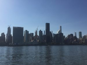
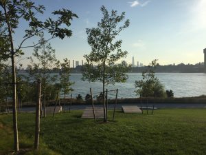
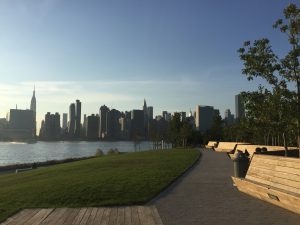
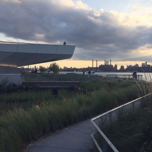
And that’s what I did — I wrote an analysis of my main problem, broke down the steps, and listed what I’d accomplished. I also included some images of my favorite park — sunny days and bike rides, sacrificed to finish up this project.
I have more to add about the present state of my portfolio. That will be in the next post. So two posts: one on the past and one on the present.
Check out the rest of this post below. Keep in mind, it was written several weeks ago, in reverse-chronological order. The next post will be on the present.
Continued from above….
For the rest of this blog post, that’s what I’m going to do. It’s just going to be a bit of a stream of consciousness, so consider yourself forewarned!
Main Problem: All of the portfolio problems I’ve been trying to solve for is directly due to job hunting. I’ve been so focused on my portfolio because of the feedback I received related to that, and I simply haven’t finished making updates.
Breaking this problem down into sub-problems has led me to spend time improving my resume in the beginning of the year, and now I’m focused on improving my portfolio. I don’t truly know if my portfolio is a contributing reason for any job hunting difficulties, but my research has indicated it is incredibly important. And since it’s under my ability to make changes, I’m making updates to see what works.
Although I got some portfolio feedback, I still wasn’t exactly sure how to improve my portfolio or the best tool to use for it. But the information I’ve gathered about portfolios has been helpful to help me narrow my options down.
Pólya Analysis
Sub-Problem: Which tool is best to rebuild my portfolio
- Option 1: DIY is a common option and I recently discovered Tachyons.io CSS framework.
- Strategy: Explore Tachyons.io as a DIY option, vs Bootstrap which I have used before.
- Actions: I learned that the default WordPress 2020 will be using the typeface ‘Inter‘. From the Inter website: “Inter is a typeface carefully crafted & designed for computer screens.” When I looked at some of the samples, I saw these Swiss style posters.
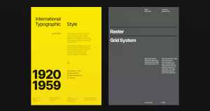
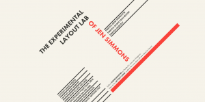
The posters reminded me of Jen Simmons who uses a similar style for her site labs.jensimmons.com, which explores experimental layouts.
There are a few Swiss poster-inspired websites and articles exploring experimental web layouts:
Anyway, because of CSS grid + the Inter font (which is free), and GridbyDesign.com, a site providing InDesign grids, I thought: Wow I could really create a unified online and offline experience based on the Swiss poster style!
Outcome thus far: Tachyons classes are a little cryptic because they’re meant to be applied one at a time. The other problem is that I don’t really have a design in mind (a sub-sub problem?) so it’s a little difficult to evaluate whether this is a viable option. (A sub-sub-problem I experienced was using BackgroundSync, which I couldn’t initially get to work. I find sub-sub-problems often come up in coding.) Ultimately, I might be better off using a CMS, like Squarespace, to solve the online portfolio problem / job hunting problem, which is more critical than a unified user experience at the moment. WordPress can be free/cheaper and it can be installed on a subdirectory. Squarespace and other CMS tools can only be installed on subdomains or the central domain.
Sub-Problem: How to improve my portfolio.
- Strategy: Use quantitative analysis to uncover what specific elements make a top UX portfolios. And then replicate those elements on mine.
- Actions: I started a quantitative analysis of a list of 80-90 UX portfolios to find out what makes them so great. For example, in the portfolio guides I read through, they suggested spending time making images look good. But I realized I didn’t really have a clear understanding of what this meant. And given that I’m an exceptionally private person, I also realized I didn’t really know what was appropriate for an About page. And I was curious to learn what most people used to build their sites. So essentially, I set about answering these questions, to help me put together the pieces for my own portfolio redesign.
- Outcome thus far: Although DIY makes up a sizable portion of portfolios, I’ve been surprised to learn how many people use paid CMS tools for their portfolios. I’m trying to learn a little more about the backgrounds of the DIY authors, like are they students, who have time to build a DIY site, or developers who do it all the time. But now that I’m writing this down, I think I need to think a bit more about CMS options.
Sub-problem: Feeling overwhelmed with the amount of resources and need a place to put them all.
- Strategy: Make an orderly list of resources that have been influencing my portfolio revisions and/or could serve as a resource in the future.
- Action: I created a list of portfolio resources, of guides and websites, JavaScript libraries and CSS tools, and a short list of portfolios that might hopefully come in handy. That list is here.
- Outcome thus far: Creating this list has led to more investigation on how to create a portfolio. I’m starting to see some overlap and understand more meaning in the portfolio suggestions.
Sub-Problem [Hypothesis]: Online portfolio projects weren’t showing my work and myself as a designer as well as they could.
- Strategy: Go with a temporary PDF portfolio, and remove all projects from my website. Re-evaluate all online materials.
- Actions: I removed all projects from my website and put in a message to contact me for sample work. My concern was that my website was a) out of date in both style and programming [Bootstrap 3]; b) didn’t represent me well in part due to A. I also took screenshots of all my online portfolios, at Behance, Cargo1, CarbonMade, and Coroflot, to view how I was really representing myself online.
- Outcome thus far: Coroflot is still available, but I don’t link to it from anywhere. CarbonMade is online and I also don’t link to it from anywhere. The different sites have slightly different visual expressions and the experience using them can be different and limited based on the way that the site works.
- Reflections: On her website, which is built with Kirby, Jessica Hische provides the following advice for getting freelance work:
Have a website.
This might be a no-brainer, but a ton of young people looking for work don’t have a functioning website because they’re still struggling to build some crazy flash bonanza themselves. STOP. Unless you want to do web work for a living, sites like cargo collective, indexhibit, and carbonmade are perfectly fine ways to make portfolio sites. Many professionals use them as they are easy to update, which you will learn is THE MOST important trait a portfolio website should have. Illustrators, this goes for you too.
I read this advice a while back and I think I may have misunderstood a little bit. While using a CMS is important, such as cargo collective, it’s apparently MORE important to have your own domain than it is to use a CMS like cargo collective.
Sub-Problem: Without an online portfolio, I need a way to share my site. Also online portfolios might be showing too much, leading to more opportunity for criticism.
- Strategy: Use large, static images on Behance, rather than a true online portfolio. I attended a virtual portfolio session with Google, where a portfolio from a UX designer and a Visual designer were reviewed. The UX designer was Simon Pan and his Barclay’s bike project. The visual designer’s work was shared on Behance. The visual design project we reviewed was essentially a series of very long images that appeared to be created for Behance. I figured that if Google’s recruiting team was showing us this project as a viable format, it could potentially work for me. I could draw pictures and tell a story vertically, like the Behance version.
- Actions: I chose to create 4-5 projects in Sketch, for the purpose of sharing on Behance. I figured I could use them as slides for an offline presentation if needed.
- Outcome thus far: I put them up, but they did not receive wide spread acclaim; like 4 appreciates. And the one recruiter I shared them with for a freelance gig didn’t get back to me, and the “views” didn’t increase so I’m not sure what the response was; my assumption is negative. Reflection: Simon Pan uses a custom WordPress theme. My assumption is that it would be significantly work to customize than even a basic site. But maybe this is an opportunity to use one of Pólya’s heuristics, the inventor’s paradox:
The more ambitious plan may have more chances of success […] provided it is not based on a mere pretension but on some vision of the things beyond those immediately present.
Maybe I should start with BlankSlate and customize the heck out of it.
Sub-problem: Fixing my Cargo1 (Cargo Collective) portfolio and website.
I’m writing these all under this one heading for brevity and also because they’re related.
Strategy to focus my website on only UX: Some of the feedback I got on my Cargo1 portfolio was that other links related to coding and design should be removed. I didn’t ask why, but my guess was they were either not interesting or not very good. When I tried taking a more objective view of my website, I felt that the code examples, which were set in a list, weren’t presented well. I chose to update my website to remove references to code examples. There were still 3 projects available, with individual pages for each.
Having more than one portfolio. I didn’t include this video in my other post on Portfolio Resources, but I came across a YouTuber discussing design portfolios. A point he makes is that it’s OK to have more than one portfolio. For some reason, it seemed revolutionary and I remembered labs.jensimmons.com. I can include my code examples, but I can put them on another site/portfolio that presents them more appropriately and doesn’t confuse an audience looking for UX projects.
Strategy to take my Cargo1 site offline to address negative feedback. I spent a LOT of time writing a significant amount of custom CSS for my Cargo1 site. I also watched a video on web writing to focus on improving how I explained my projects. It’s a good video; I recommend it.
Despite all this work, I got plenty of feedback. To be honest, the feedback shocked me. I wrote about that in an earlier post.
I did attempt to make many changes back on feedback received — such as describing myself/who I am; improving the writing. I unpublished my entire portfolio of projects at cargocollective.com. I did not want to use the Cargo1 template and site as-is serve as my homepage. This would mean changing my DNS to use the Cargo1 site as my domain. This decision was driven by the design heuristic to not show anything you don’t want criticized. Given the feedback and feeling that my attempts to improve it wouldn’t be enough, I chose to unpublish it entirely until I settled on another strategy for my UX projects. At that time, I can use it again to show my ITP projects.
Strategy to narrowing down projects from 7 to 3. At one point, alliwalk.com had 6-7 projects and an About page with logos of companies and brands I had worked for in the past. But analytics showed that no one was viewing the About page. Actions: I removed the About page because it seemed useless. Meanwhile, the few people that did come to the site in general only viewed a few projects. I decided to remove every project except for the 3 most trafficked, which I re-ordered according to popularity.
Interestingly, one of the projects was a series of experience journey examples, not an actual project. Despite this, visitors were visiting the page. I’ve followed the lead from the analytics ever since. Those 3 projects, including the experience journeys, have always appeared first in their specific order, anytime my projects appear online. Ironically, some of the feedback I got from my acquaintances was that I had too many projects. :/
Reflections
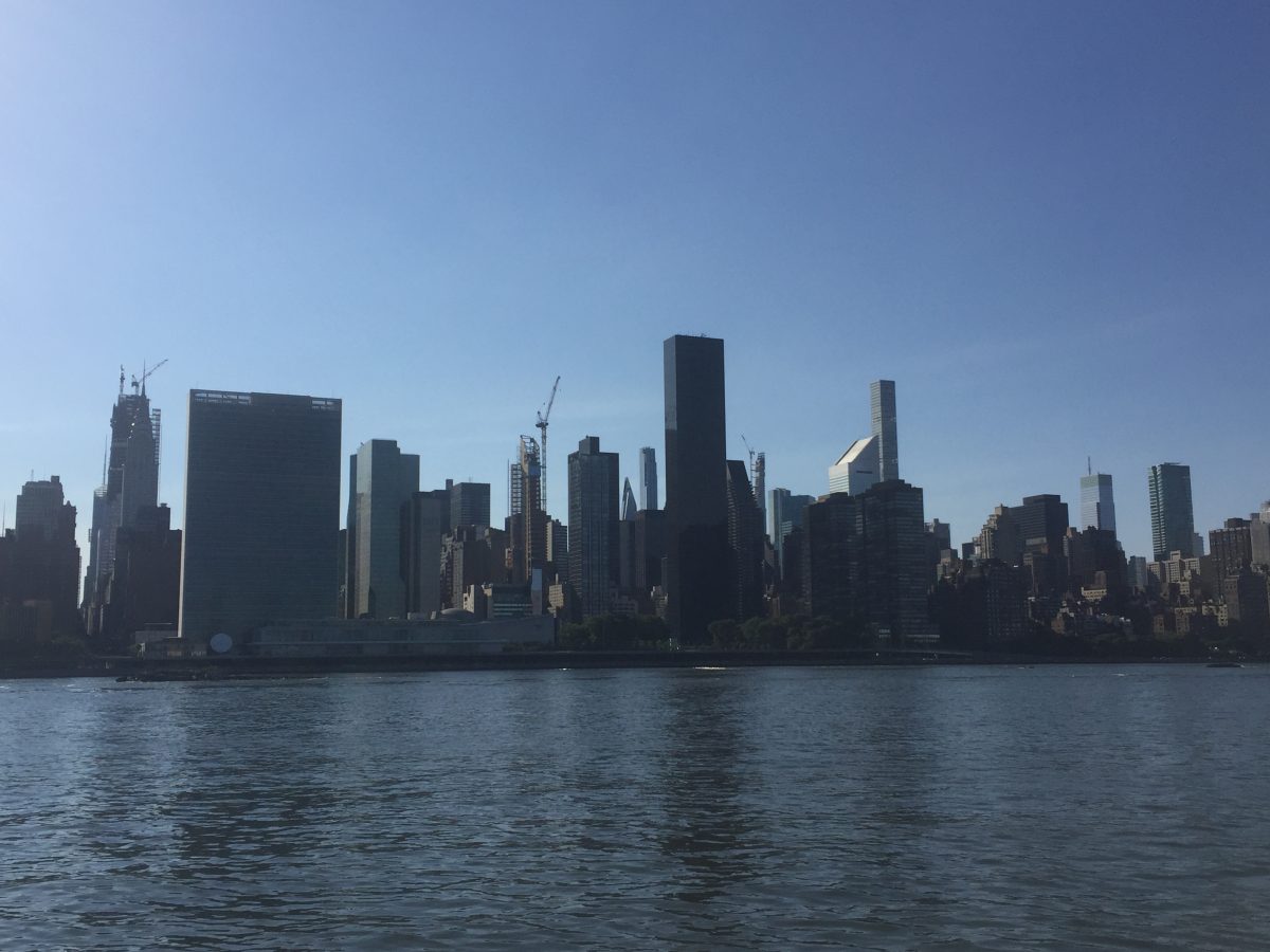
Something I haven’t talked about is how many weekends of beautiful weather I’ve missed trying to solve this main problem and all of these sub-problems.
One of my favorite activities is riding the ferry around NYC or riding my bike to my favorite park. I’ve missed at least a month of weekends and ridden my bike about twice in 3-4 months. It’s really been a heavy feeling to see the sun shining outside and feel so much pressure to complete this project, yet not knowing the right way to solve this problem. We only get so many days on this planet and each day is unique.
Here are some photos from some sunny days.


Next Steps
Writing blog posts takes time but I find writing helps me organize my thoughts. And this exercise has been helpful to review and take an account of what I have already accomplished.
Given everything I just wrote, I’m going to try and create a design for Tachyons, or at least a layout for a portfolio. Or, I should say create a design again – when I reviewed all my other websites, I found a design that I put together a few years ago!
Regarding DIY with vanilla HTML/CSS, I know that there are static site generators people use, but I don’t really know about using them for my own domain. It’s a bit of an esoteric problem that I’m not sure I want to get into yet. Maybe this knocks DIY off the list, since not using a CMS makes updating kind of painful.
I also want to look into some of the themes I found for WordPress. Probably not BlankSlate, but the guy who is leading the design for WordPress 2020 created a free theme called Chaplin. (Although he uses a theme called Harrison that’s not on his site.) Chaplin has 9,500 downloads. Maybe I’ll look into that. Since I have my own site, I can install WordPress in multiple folders and test out different options.
I think it’s also worthwhile exploring Squarespace (again), at least temporarily.
And maybe I’ll go take a walk while the sun is shining.