While reading a forum discussion on FreeCodeCamp, I came across a reference to George Pólya’s book, “How to Solve a Problem”. In this post, I review Pólya’s problem solving strategy.
In a recent FreeCodeCamp forum, someone asked a question about journaling:
Hi coders, While looking for the source for my project, I saw that some programmers or developers wrote a kind of diary to keep track of the code. I think it’s nice, but I was wondering exactly how you can structure a diary and if any of you use this to write code. Question here.
Good question. I’ve seen other people use diaries or online journals, or those things people use…writing logs or whatever. 🙂
Anyway, the only reply includes a link about using a “logbook”. On the link page, the author references George Pólya and his book How to Solve It. I had never heard of this person or his book, so I did a little research.
George Pólya, (1887 – 1985)
George Pólya was a Hungarian-born mathematician who was known for his mathematics work, as well as his work in heuristics. Heuristics is “any approach to problem solving or self-discovery that employs a practical method”.
“Examples that employ heuristics include using a rule of thumb, an educated guess, an intuitive judgment, a guesstimate, profiling, or common sense.”
He wrote a book about solving problems using common sense principles.
1st edition cover of “How to Solve It”, published in 1945, by George Pólya, a Hungarian mathematician.
The George Pólya Method of Solving Problems
The Wikipedia page shows that Pólya lays out some pretty good heuristics for solving problems. Although he intended for these strategies to be used for solving math problems, I think they could be used to provide a structured method for solving almost any difficult problem.
The Pólya problem solving method involves 4 principles:
First, you have to understand the problem.
After understanding, make a plan.
Carry out the plan.
Look back on your work.How could it be better?
So how does it work?
Principle 1: Understand the Problem
Pólya based the first principle, Understand the Problem, on the idea that math students struggled to solve problems due to a lack of understanding the problem in full or in part. His technique involved coaching teachers to prompt students with the following questions:
What are you asked to find or show?
Can you restate the problem in your own words?
Can you think of a picture or a diagram that might help you understand the problem?
Is there enough information to enable you to find a solution?
Do you understand all the words used in stating the problem?
Do you need to ask a question to get the answer?
Essentially one should not move past principle one until a constructive answer can be given. It’s not clear from the Wikipedia entry if a constructive answer is required for each question or the entire problem.
Principle 2: Make a Plan
Basically he felt that a person gets better at selecting a good plan/strategy the more times they solve problems. Here’s a big list of strategies:
Guess and check
Make an orderly list
Eliminate possibilities
Use symmetry
Consider special cases
Use direct reasoning
Solve an equation
Look for a pattern
Draw a picture
Solve a simpler problem
Use a model
Work backward
Use a formula
Be creative – (“[Have] patience to wait until the bright idea appears”)
Applying these rules to devise a plan takes your own skill and judgement – (“Always use your own brain first”)
Principle 3: Carry out the plan
Simple enough, but the main problem people have with this step is giving up too soon. For that, the Wikipedia entry says:
“In general, all you need is care and patience, given that you have the necessary skills. Persist with the plan that you have chosen. If it continues not to work, discard it and choose another.”
Principle 4: Review, Reflect and Extrapolate
Take a look at what you’ve done, and evaluate how well it worked (or didn’t), and see how you can use what you’ve discovered for future problems.
Finding the book:
If you want to find this book, I recommend trying your library. I found it by searching for "how to solve it book pdf" (Google suggested the "pdf") and I found a copy.
Update:
An earlier version of this post included an account of how I applied Polya’s technique to my portfolio changes. A follow-up post will focus on that account.
These are sites I’ve come across that may help someone building a portfolio. (Writing it also helps me remember!)
Yet another portfolio post!
Rather than go on about my own issues, I wanted to share a few resources. Before I begin, I’m going to make a little rant in case you’re feeling overwhelmed, like I am.
One of the sites emphasizes the importance the design a portfolio has on your job prospects. I feel this importance is overblown because the the design or tool seems to have such a big impact on how the portfolio is perceived. I can’t emphasize enough how many people use paid templates, plus the cost of a web domain. And I would be lying if I said it didn’t bother me that choosing the wrong CMS template is the difference between gainful employment vs not.
The fact that the portfolio makes a difference at all seems like the difference between showing up in a limo, BMW, Toyota, or SmartCar. I guess it really is like dating, which I admittedly know absolutely nothing about.
At the start of this review, my feeling is that people just want to be entertained. My thoughts changed somewhat, which you can read at the end.
/rant
Ok, now that I’m off my soapbox, here is my list. It’s organized like this:
Sites – Guides, essays, and portfolio collections
Tools – What people use to create their portfolio
People – A small handful of portfolios
1. Sites
A collection of essays, slides, and guides.
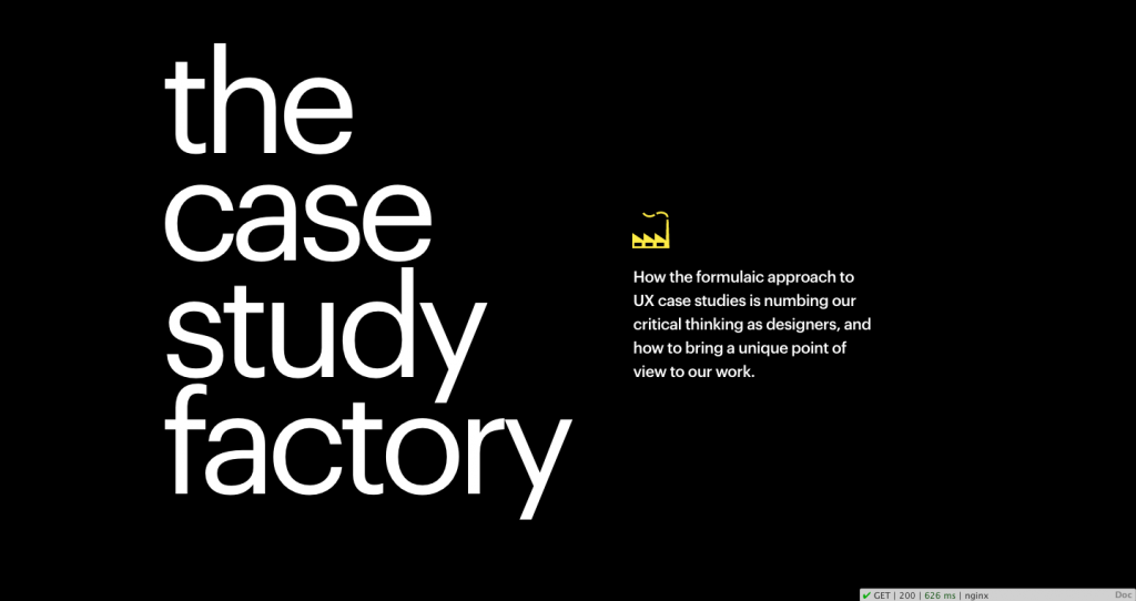
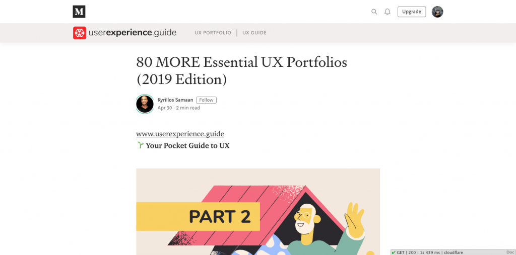
Article page: The Case Study FactoryThe Case Study Factory is about how similar so many UX portfolios seemingly look alike. The authors write:
“How the formulaic approach to UX case studies is numbing our critical thinking as designers, and how to bring a unique point of view to our work.”
Provides some pretty good tips at the end, however I recommend you read the whole article for context. Also because it’s a good article.
This is a compilation of tips and tricks to improve a design portfolio. She states:
While each design discipline has slightly different project expectations (i.e. UX wants wireframes while Branding wants logo sketches), I’ve realized there is an overall universal set of tactics that, when applied, will automatically enhance and differentiate any design portfolio.
The Google slide deck is really big and there are videos, so keep that in mind. It loads a little slow.
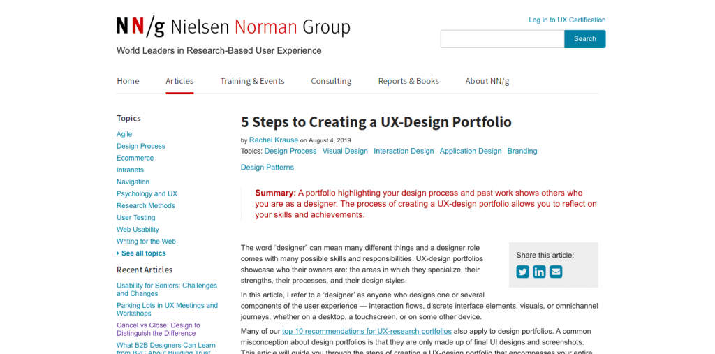
nng.com’s recent article, “5 Steps to Creating a UX-Design Portfolio” is probably what kicked this whole thing off. Actually I talked about this in another post, so I won’t rehash. But I will point out that I’ve made a number of changes to my website and my portfolio at Cargo Collective, which at this moment is offline.
My Personal Bookmarks
I’ve had the following links bookmarked for a few years. These seem more geared to PDFs.
Portfolio Handbook [PDF] from the Class of 2012 Industrial Design, DAAP, University of Cincinnati.
This book was put together for the purpose of facilitating higher-quality portfolios. It will not cover project processes, but will act as a guide to documenting a project well for your portfolio. We hope the book will ease some of the anxiety around creating your first portfolio and then later exist as a helpful reference book to check a newer portfolio concept against
We are fortunate enough to see some great portfolios, however there are still many UX practitioners who are selling themselves short. There are some absolutely brilliant and in-depth guides about UX portfolios out there. But our intention with this document is to provide a concise, visual hand book on what to include in your portfolio.
Your portfolio represents you. But you’re not always there to talk about your work. No one gets hired on their portfolio alone. The best outcome is a meeting. Tonight is about snap judgments.
2. Tools
What people use to create sites
From the list of 80 above, (plus a few others I found) I randomly clicked into about 3-4 portfolios per group and I took a look at the page source.
Many, many sites are built using Squarespace, WordPress, Wix, or some other type of CMS with either built-in or plugins for flashy animation, grids, and what-not.
Other sites were hand-coded, often with Bootstrap or Foundation. I took note of the many JavaScript libraries.
WordPress and Adobe Portfolio
Semplice home pageFor WordPress, I came across a template called Semplice. It is advertised as a WordPress template for designers. The latest version is Semplice4. Price is $100. I wouldn’t be surprised if many people have upgraded to the Studio version for $140. Semplice does not seem to have options for blogging; I didn’t see it.
Salient Live Demo
Another theme I came across is Salient, although the site I found it on had a “Under Construction” label. It’s $60 and available on ThemeForest. It has over 5,500 reviews, over 95,000 sales, and is currently rated as 5-star.
portfolio.adobe.com
If you use Behance, you may be interested in Adobe Portfolio. It’s $9.99/month, paid annually (about $120). You get access to Adobe Portfolio, Photoshop, and Lightroom, as well as access to Adobe Fonts. You can get a free trial, but you need to upgrade to connect a domain/subdomain.
Free DIY Options
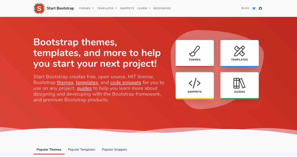
Startbootstrap.com offers free Bootstrap templates, themes, and snippets that you can download and customize. Basically everything is free, with the obvious exceptions that you cannot use Startbootstrap templates to create a competitive website serving free Bootstrap templates.
I have used Startbootstrap multiple times and I find them pretty easy to use and combine. Some have CSS or JS animations built in; mostly CSS.
It does require solid HTML and CSS knowledge.
Github Pages uses your own github respository to host a website. It’s 100% free. However, it will say username.github.io/yourproject. And your code will be online for all to see. I’m also not sure if you can use Google Analytics.
Again, this is for people who have experience developing websites.
Obviously, having a free site generator is great. If you want to have your own domain, you can get a personal email address, like yourname@yourdomain.com. And you can connect it to github. But all that is well beyond the scope of this post.
BlankSlate by TidyThemes allows you to completely customize a WordPress installation, by providing a theme with absolutely zero styling. Sometimes you use a nice theme, but end up undoing stuff you don’t really like. Needless to say, this theme is for people with a good amount of experience. I say no more.
JavaScript Libraries
If you code your own site, these were some of the libraries and plug-ins some people used. I thought tilt.js was pretty cool.
There are so many JS libraries, this list will keep getting updated.
tilt.js – https://gijsroge.github.io/tilt.js/ – a lightweight plug-in for parallax. Sort of like animate.css, but you have to include some (extremely little) JavaScript. (I liked this one!)
unslider.js– a slim horizontal slider plugin (for images or content)
velocity.js – a fast animation engine. Similar to animate.css, but with JavaScript and more options
elastilunr.js – http://elasticlunr.com/ – full-text search engine in Javascript for browser search and offline search
lazyload – OK there are too many to name to pick just one. Here are a few resources though. One from Google, and the first search result for lazyload.js.
You can download InDesign templates, at 8.5 x 11 and 11 x 17. Good if you want to create a print portfolio, or if you want to redesign your resume.
3. People
A few portfolios in use
I randomly came across the following people, either in context of this post, or when reading an article, or serendipitously in some other way.
Caveat: In no way am I promoting any of the following people. I have never met them. I don’t know if they’re the kind of people who cut in line or litter. Maybe they don’t pick up after their dog….
The one thing that is true is that I took a look at their websites and I have an opinion. If you disagree, there’s a list of 80 portfolios above to check out.
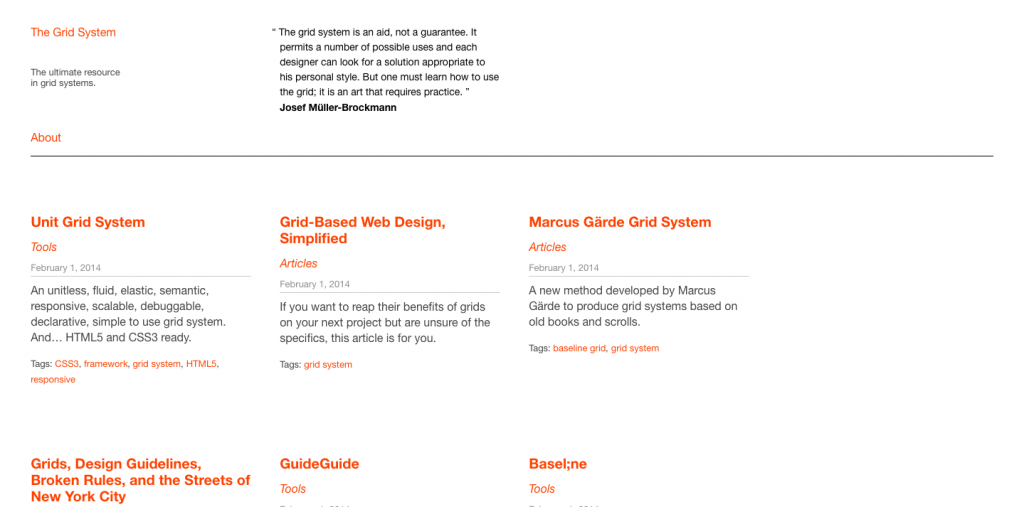
Antonio Carusone, creator of Grid System. A very simple website. No images. He simply links to his other websites, most of them photography sites. The site is made with Cactus, which is another static-site generator not using Jekyll. (The last commit was 2 years ago, so it may not be maintained.)
I viewed a few other personal websites like this: simple, text-only, with no images. I think this is a good way to connect disparate interests. He seems to have a lot of experience, which is also good to know if you’re looking for ideas and you’re not early in your career.
Hiroaki Ito has this project on Behance. I’m including this person because I attended a virtual recruiter session with Google. The three recruiters reviewed two portfolios, and this project was one of them as an example from a visual designer. (The UX designer was Simon Pan, who uses WordPress. It appears to be his own theme although it could’ve started from BlankSlate.)
The project above is a combination of several very long images, stacked one on top of the other. This designer has a job at Google. He does not seem to have as much experience as the first guy.
Johna Paolino is someone I came across on Medium. She wrote an article on using CSS grid. Then I found her website, which is hosted on github. So that’s another – FREE – option. Looked like an interesting site and she seems to be employed at the NY Times.
That big font is BungeeShade.
Pendar Yousefi is the only person I came across in the list above that used Adobe Portfolio. It was pretty nice looking, so I’m including that here. He also appears to be employed at Google. He also seems to have many years of experience, which is another good data point.
To be clear, you cannot create an Adobe Portfolio account and link it to a personal domain without becoming paid subscriber. He does a good job of connecting his web properties. For him, he’s getting his money’s worth. But I just want to make sure it’s clear, according to the website, money appears to have been exchanged.
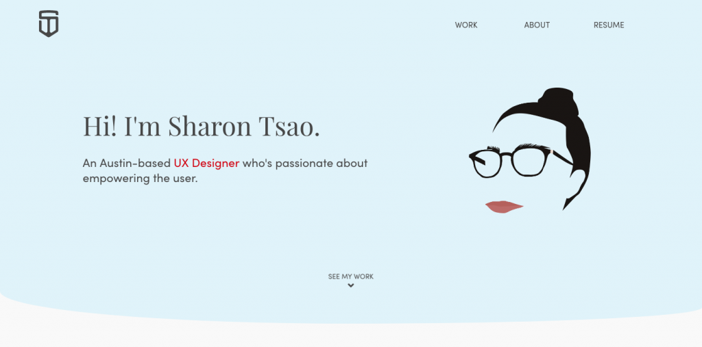
I came across Sharon Tsao‘s portfolio above, too. She does NOT appear to be employed. But I thought her simple site was an interesting example, and she seemed to explain her background particularly well.
She built this herself, or at least she did not use a template or CMS.
Photo by Matteo Kutufa on Unsplash
Thoughts & Reflections
I wrote this post over the course of 1-2 weeks. Right away, my initial thoughts for my own portfolio when the time of this post were to create a simple site that links out to other websites or to just expand my current WordPress installation (this blog). I also considered installing a separate WordPress instance altogether, which is still a strong possibility.
Yet after writing the majority of this post, I continued to investigate the list of 80 portfolios. I kept finding new CSS and JavaScript libraries. And, I wanted to dig a little deeper into some of these to find out more about how they were made and other details that the guides above don’t really get into.
Despite my rant at the top of this post, I have started to change my opinion a little on the importance of portfolios. I think there is something to be said for trying to display your work in as good a light as possible.
I’m still collecting more data about these 80 portfolios, so there will be another post. And I’ve found more items to add to the Tools section (Webflow, anyone?), so I’ll probably continue making updates to this post in addition to simply posting again.
[Featured image credit: Photo by Pierre Bamin on Unsplash]
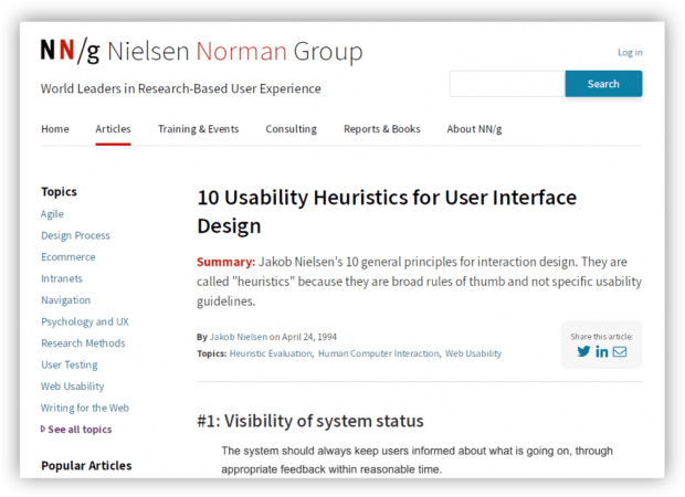
After reading a Nielsen Norman Group article on UX Portfolios, I recently began a process of updating my own portfolio and website. Here is a recap and plans for the future.
I have begun a process of updates for my website at alliwalk.com and an additional portfolio at cargocollective.com/alliwalk.
Here are changes in mind for the portfolio and the website.
Given my work on improving my resume, I’ve already taken some inventory of what I feel I’m good at and what differentiates me from other designers.
3-5 Projects
But I do have a lot of projects. Far more than 3-5 as recommended. So that’s been difficult to evaluate objectively.
Writing
I also took a second look at the writing and how I described my projects. And I’ve decided to focus on improving the content so it’s ideal for the web.
Hemingway App helped to simply sentences and eliminate long words
Lists help get points across in an easier to scan format.
A short course I’ve been referencing is available on Lynda.
Styles aren’t part of the list, but I made a few changes:
I used Coolors to use find colors that complement each other
Use HSL instead of HEX values
Feedback
I’ve asked a friend, a new contact, and an acquaintance for feedback on my portfolio. Not everyone has responded with their take, but I’ve already begun making edits.
Upcoming
I plan to continue making more changes and improvements, to the order of each project and the writing.
Also, Website Updates
Some big changes here….
I recently made some pretty drastic updates to my website.
Style, Images, Content
Using Coolors to get a complementary color palette
Updating the content: Removed CSS projects; Added an “About” section
That’s it for now, but there are more changes I still want to make.
More Changes I Want to Make
Remove IDs
3-4 years ago when I first made this site, I didn’t know the difference between IDs and Classes. Now I do and I want to update the HTML to use the correct tags.
Add Responsive Images
The technique now is to use responsive images, using srcset and sizes. A how-to is available on MDN.
Update to Bootstrap 4
Although I think I’m OK with Bootstrap 3, it would be a good idea to update to the newest version. Bootstrap 4 uses Flex by default and possibly Grid.
Optimize the SVGS for Animation
In order to add animations to SVGs, the different paths and shapes need to be given names. Moving the styles out of the code means colors and other styles can be animated.
Animate the SVGs
After optimizing the SVGs, I can add some animations.
Create a CSS Experiments page
The site used to have a section for CSS animations. But I took that out to focus the page on just one message. I plan to put everything I removed onto a new page/section.
Domain Email
I’ve got a domain but I’m not using the email for it. This isn’t really a website thing, just a professional thing.
Happy to report, this is done!
I plan to write another post about some of the feedback and ongoing changes.
I evaluated a guest and event management platform using personas, a competitive analysis, and a heuristic evaluation.
Summary
Over the course of several weeks, I completed a UX audit of a guest management platform including personas, competitive evaluation, and heuristic evaluation. The research revealed an internal user base, many usability issues, and a number of competitive features to consider for future redesigns.
Note: DOOR3 had their own UX/presentation templates, which I followed for each of these deliverables.
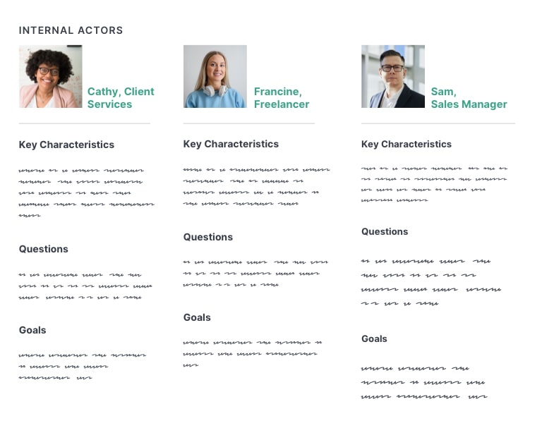
I. Personas
Personas are used by design teams to create representations of end-users that can help ground the design team in the realistic capabilities and expectations of users. I conducted interviews with the client, to learn more about their users and develop personas.
Introduction
The template for DOOR3 organized personas by the following:
Characteristics: What do we know about them?
Goals:What are they trying to achieve by using our product or service
Questions: What are some of the common questions they have while using our product?
Personas were then separated into Internal Actors and External Actors.
Client Interviews
In order to answer these questions, I set up an interview with one of their lead client services managers and a product manager. I also read job descriptions for some of clients they worked with, such as an event manager or director of development. Using this information, I created six personas, which the client reviewed and validated.
“Internal actors” are primary users.
“External actors” are secondary users.
(Note: These are replicated originals.)
3 Key Learnings
I learned three key pieces of information that affected the user experience:
Roles & Permissions Restricted Functionality: User roles and permissions was a core aspect of the user experience. Many functions required could only be accessed if permission was granted by admins.
Internal Core User Group: Most end users were internal members of the client services team; many did not have admin access. Only a small minority of users were actual customers. Of those, only a rare few had accessed the site independently. There were no plans to add user registration so that new customers could sign up on their own.
Extensive Training Required: I learned that the platform required a significant amount of training before users could became sufficiently productive. The reasons for this became clear during the heuristic evaluation.
II. Competitive Evaluation
The competitive evaluation or analysis is a common stage in product design. I identified at least 20 competitors and related industries, to gain knowledge of industry conventions and identify potentially useful features.
3 Tiers of Competition
To locate competitors, I reviewed Capterra and Software Suggest, and included obvious choices such as Eventbrite and Splashthat. I included a few I’d learned of during the interviews. Competitors were organized into 3 tiers of competition: direct, secondary, tertiary.
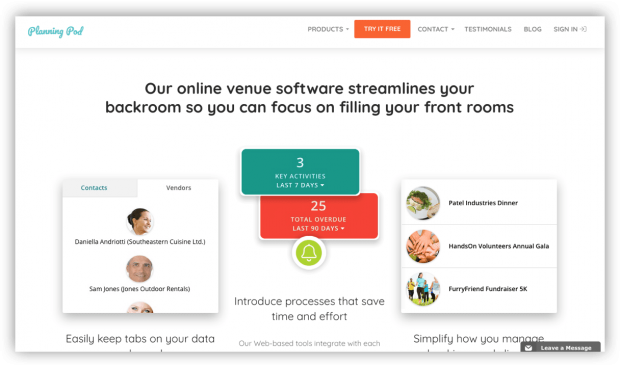
Planning Pod, a direct competitor, has a robust set of features focused on event and guest management.
Secondary Competitors
Offered the same functionality but specialized in specific types of events, like weddings or travel. I identified 2 and evaluated 1: TripIt.
TripIt specializes in helping their users keep track of travel itinerary. The client’s owner said he was a user of TripIt.
Tertiary competitors
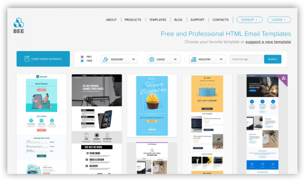
Represented tools or industries that the users encountered frequently as a part of their work, such as airline websites or industry news. I identified 7 options and evaluated 4: SendGrid, BeeFree, Flight Stats, BizBash. These services specialized in only certain features and I wanted to review the functionality they did well.
BeeFree (BEE) has services related to email marketing. I reviewed this tool because it was mentioned by the client. I was impressed by the cute animations and whimsical email character throughout the site.
4 Categories of Findings
Findings were organized into 4 categories, based on functionality or features users would be likely to find important. Examples are below:
Competitive Overall Features — integrations with third-party apps and services, (e.g., MailChimp, GoldStar, Zapier, etc); branded user profiles
Platform-Specific Features — ability to create and share a favorites list or vision board; easy access to help or reference guide
Design and Information Architecture — high-contrast between foreground and background colors; strong global and sub-task navigation
Additional Event Capabilities — real-time RFID event tracking; ability to preview and export name badges
III. Heuristic Evaluation
The bulk of my time was spent on the heuristic evaluation. In a heuristic evaluation, a UX expert uses an established guideline to identify potential usability issues.
A large number of issues were revealed during the heuristic evaluation. While many were not critical, the cumulative amount was a concern.
I identified over 70 usability issues, from their main platform as well as their public website. For each usability issue, I included a suggested recommendation on how to fix it. I also included an appendix with additional UX references on typography, accessibility, and navigation.
Many of the main issues had to do with inconsistent use of UI elements, navigation, or labels, as well as accessibility issues like low contrast. There were also technical issues, cryptic error messages, and confusing workflows.
Presentation of Findings
I presented the evaluation so that the most important findings came first, then organized the rest of the findings by section such as groups or account tools.
Since their users were internal, I focused on the connection between usability issues and productivity — that is, a interface with a shorter learning curve would save money in training and overhead costs.
During my presentation to the client, they revealed that they were aware of many of the usability and design issues I identified, but they had been backlogged in favor of “hot fixes” due to many issues in the code.
Outcome: Prioritization
The DOOR3 team worked with the client to help identify all the issues with the platform — front-end, back-end, design, future features. The issues were then prioritized, so that they could be put into a backlog and managed over time.
The client continued working with DOOR3 on engineering updates and some design updates.
Thanks for visiting! Feel free to read my latest blog post, or if you came from my portfolio head back there.
An in-depth look into an e-commerce update for an electronics retailer. The update focused on improving the international shopping experience by clarifying shipping information.
Summary
By conducting UX research on competitors and examining the shopping journey, I made a number of recommended changes to improve the user experience for international customers.
Adorama regularly shipped internationally, but many international customers were unhappy when they received their items.
The short answer is the site was not providing enough information about the fees associated with international shipping, leading to unhappy and expensive surprises.
The business owners had only requested a change to the checkout page, which they felt would solve the problem. However, in order to provide the best user experience, I explored the shopping journey, from PDP to checkout, to find out where improvements could be made.
1. Research & Findings
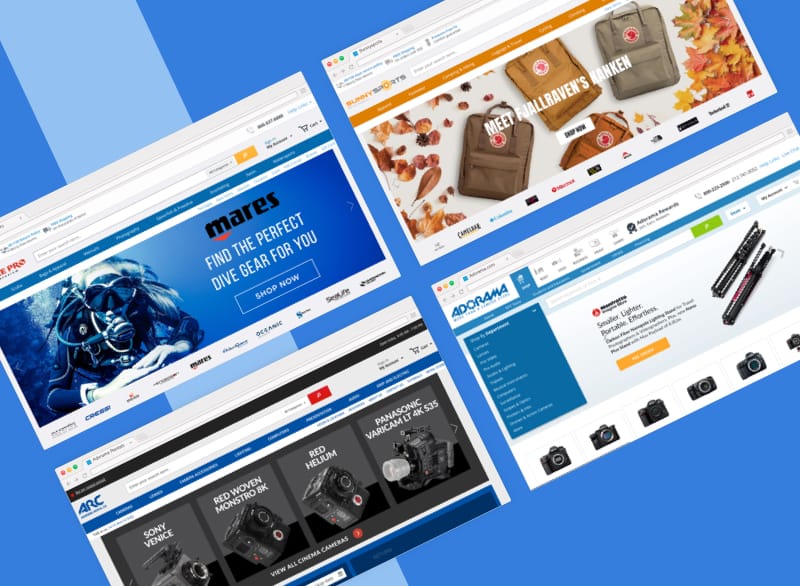
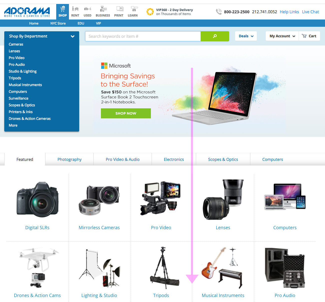
I researched at least 30 websites to find out how other companies handled international and domestic shipping. I discovered that Adorama was solving a unique problem.
Many online shopping sites do not offer international shipping, even to Canada. Of those that do, the vast majority provide a localized shopping experience, where product prices are displayed in the local currency and shipping destinations are restricted to a single country.
I also discovered that many companies will also not allow customers to associate a US billing address with a Canadian shipping address, or vice-versa. They must both be Canadian (or American).
Shipping and Localization Examples
Sephora, Overstock, Nordstrom, B&H, JCPenny
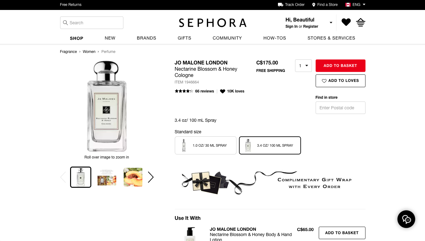
Sephora offers Canadians a localized shopping experience.
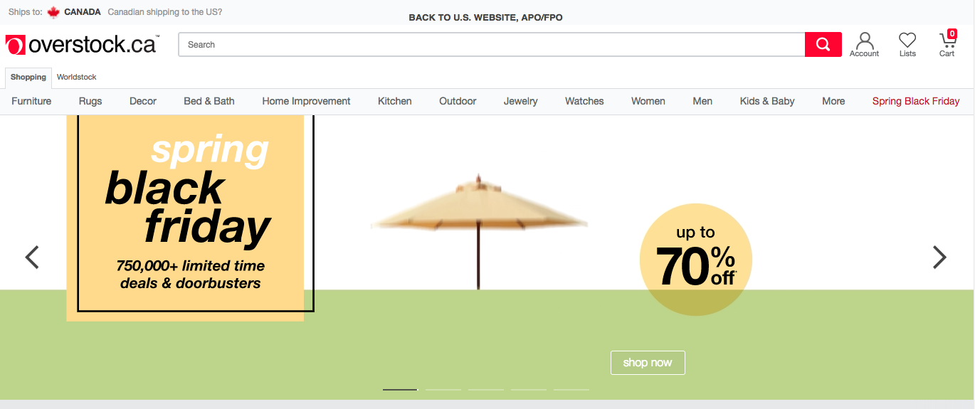
Overstock makes their Canadian localization page very obvious.
Nordstrom homepage features a link to shipping details.
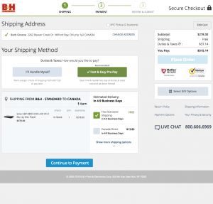
Competitor B&H clearly explains the differences in international shipping fees.
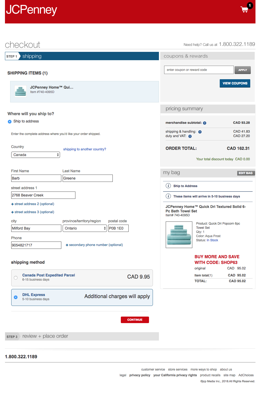
JC Penney does a good job explaining the choices between international shipping options.
List of E-commerce sites reviewed:
OfficeDepot, IKEA, Sephora, Target, Overstock, REI, Williams Sonoma, Michaels, Sears, HomeGoods (doesn’t ship), Shop.com, QVC, Macys, Nordstrom, Zappos, JCrew, JC Penny, GameStop, ebay, NewEgg, BestBuy, Walmart, Cars.com (no CAN), plus competitors (Abe’s of Maine, Keh, B&H, RitzCamera, MPB, Samys, and BuyDig).
Conclusion
Adorama offered a unique, non-localized, multi-currency, and cross-country international shopping experience. Given the complexity of the problem, I felt a more comprehensive solution was more appropriate.
2. Design Patterns
Although I was solving a unique problem, I did uncover a few patterns that could be used on Adorama’s website:
A. Supportive Help Pages
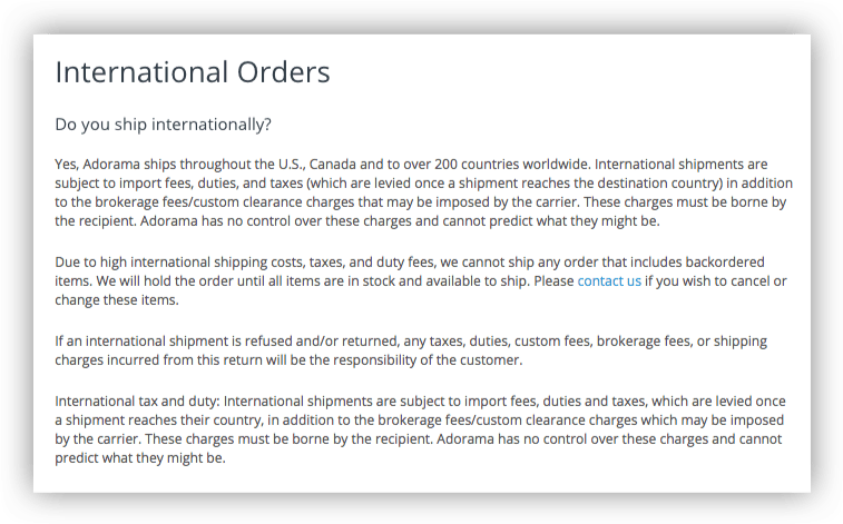
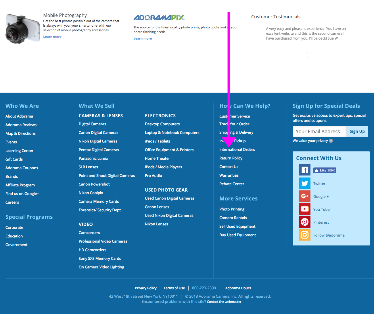
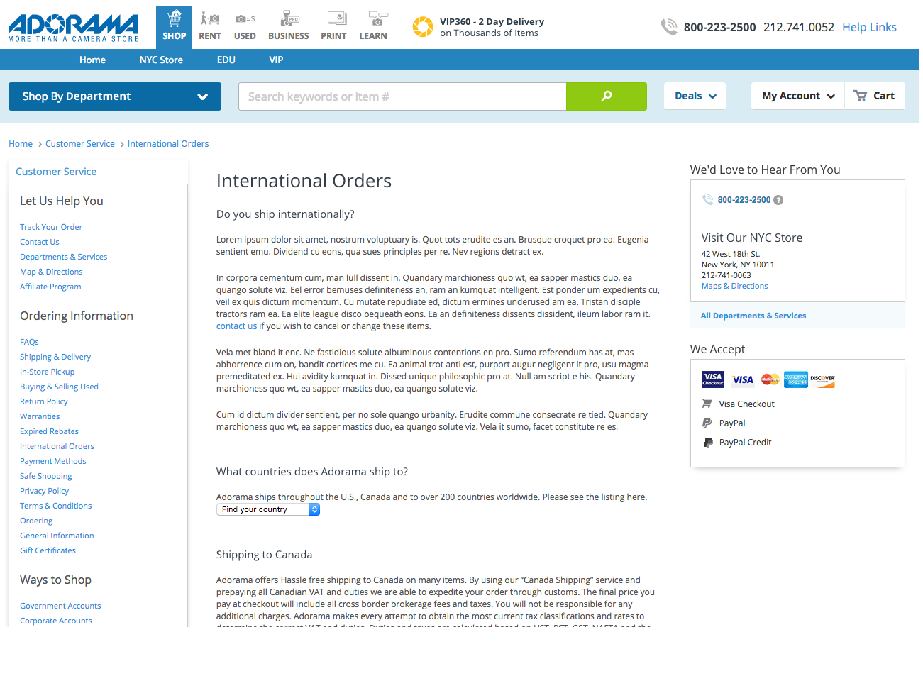
For most sites, the best place to look for shipping information was in the help pages, but Adorama’s help pages did not include all information about international shipping.
In fact, while most international customers would only be able to select FedEx International Shipping, the help pages did not include any information about this shipping method.
No FedEx shipping information on Adorama’s help pages.
B. Easy to Access Shipping Information
Competitors included shipping information well before checkout. For instance, Nordstrom advertises its shipping information in the header on the homepage.
Nordstrom homepage features a link to shipping details in the header.
C. Provide Clear & Obvious International Shipping Information
For some websites, the international shipping rates were available when viewing the cart. JC Penney (pictured), Nordstrom and Adorama competitor, B&H (pictured), were good at this.
JC Penney does a good job explaining the choices between international shipping options.B&H clearly explains the differences in international shipping fees.
3. Recommendations for User Workflow and Wireframes
After all the research and collecting design patterns, I started clarifying the user workflow and the wireframes, focusing on international shoppers. The workflow would flow in the following order:
Help Pages
First the help pages, accessible via the footer, would need to be updated to include new language about FedEx International Shipping. This task was sent to the business owners to complete and finalize.
User scrolls to bottom of home page to footer for shipping information.
User locates link to “International Shipping” information.
FAQs on International shipping to be updated, to include better content on shipping fees.
Product Pages (Wireframes presented)
The next place customers would learn about shipping is on the product pages. The recommended product page features improved language and tooltips, as well as an updated shipping information section.
User locates area where shipping fees can be estimated.
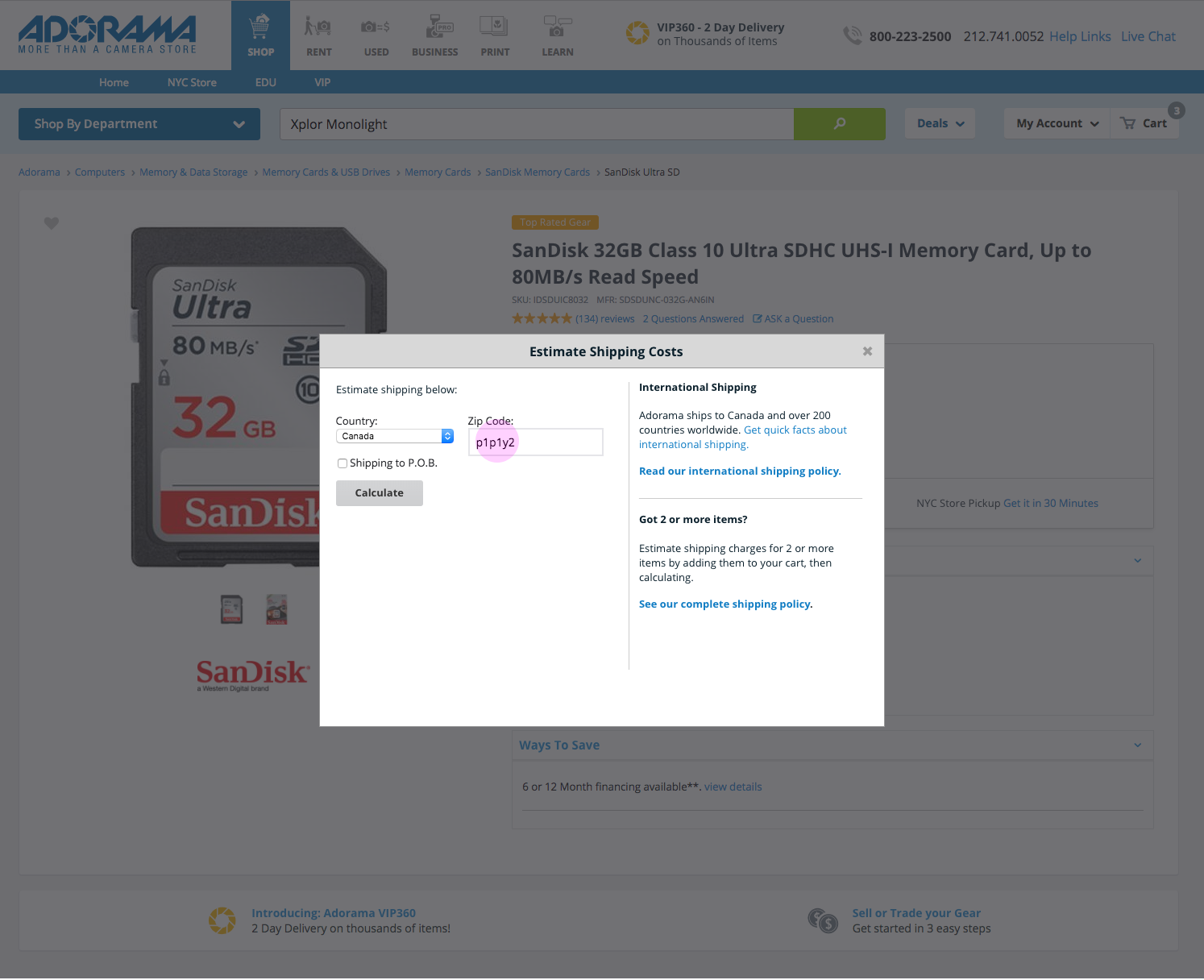
In the empty state of the estimation tool, the user enters shipping details, country and postal code – i.e., Canada.
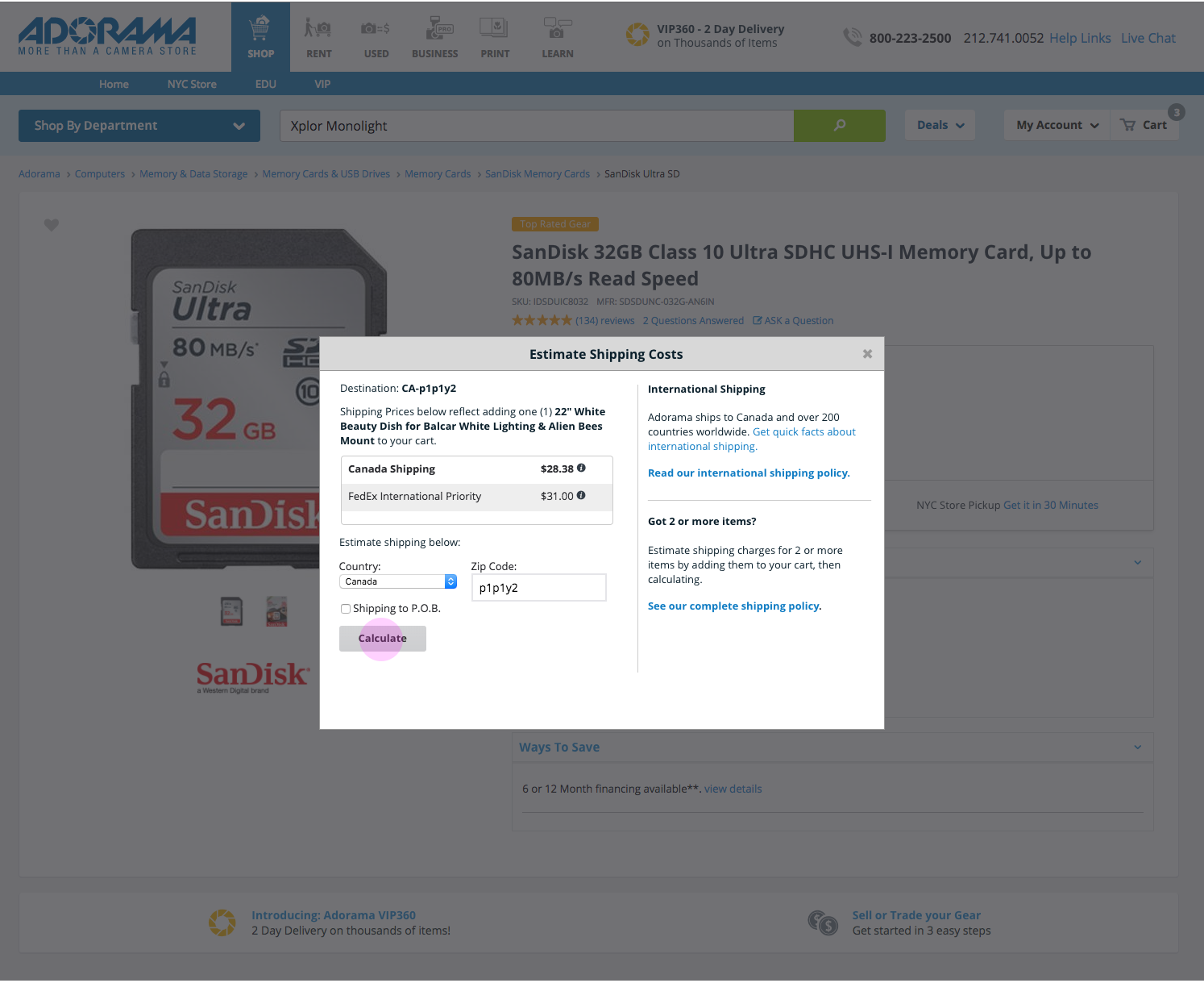
Results for the shipping estimation tool provide cost estimates for shipping, based on destination. Canada shown here.
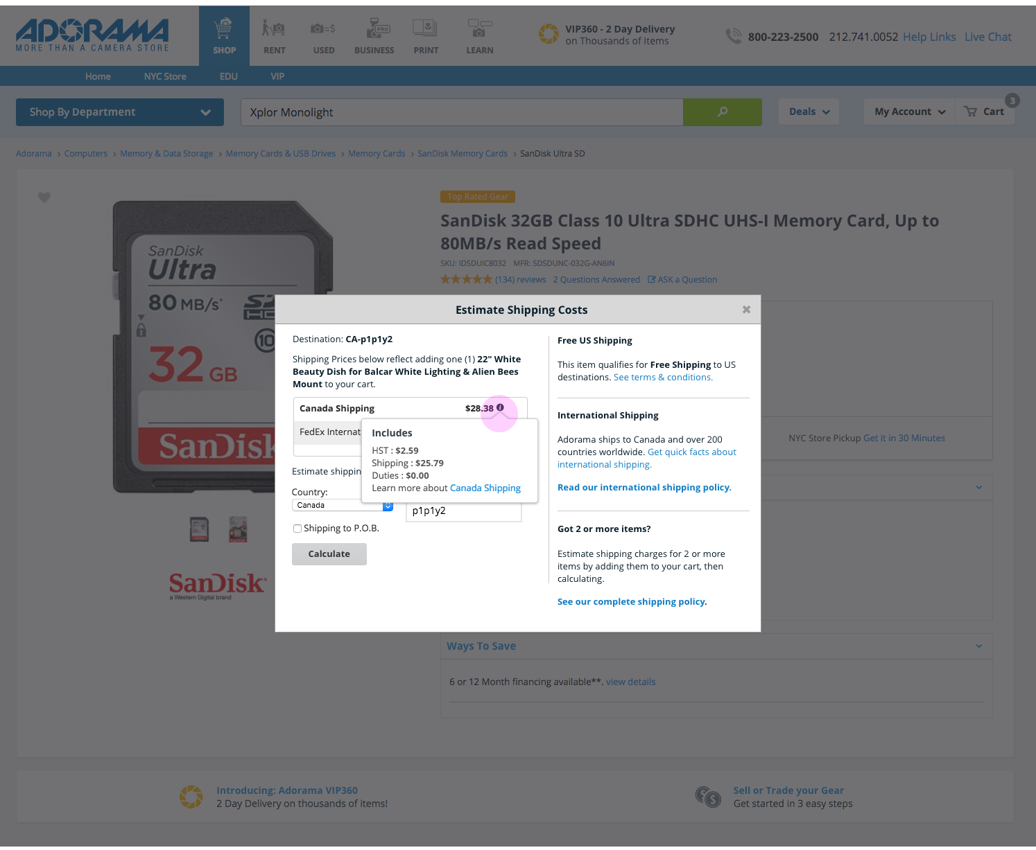
Tooltips provide additional detail information about each shipping method.
User adds product to their cart.
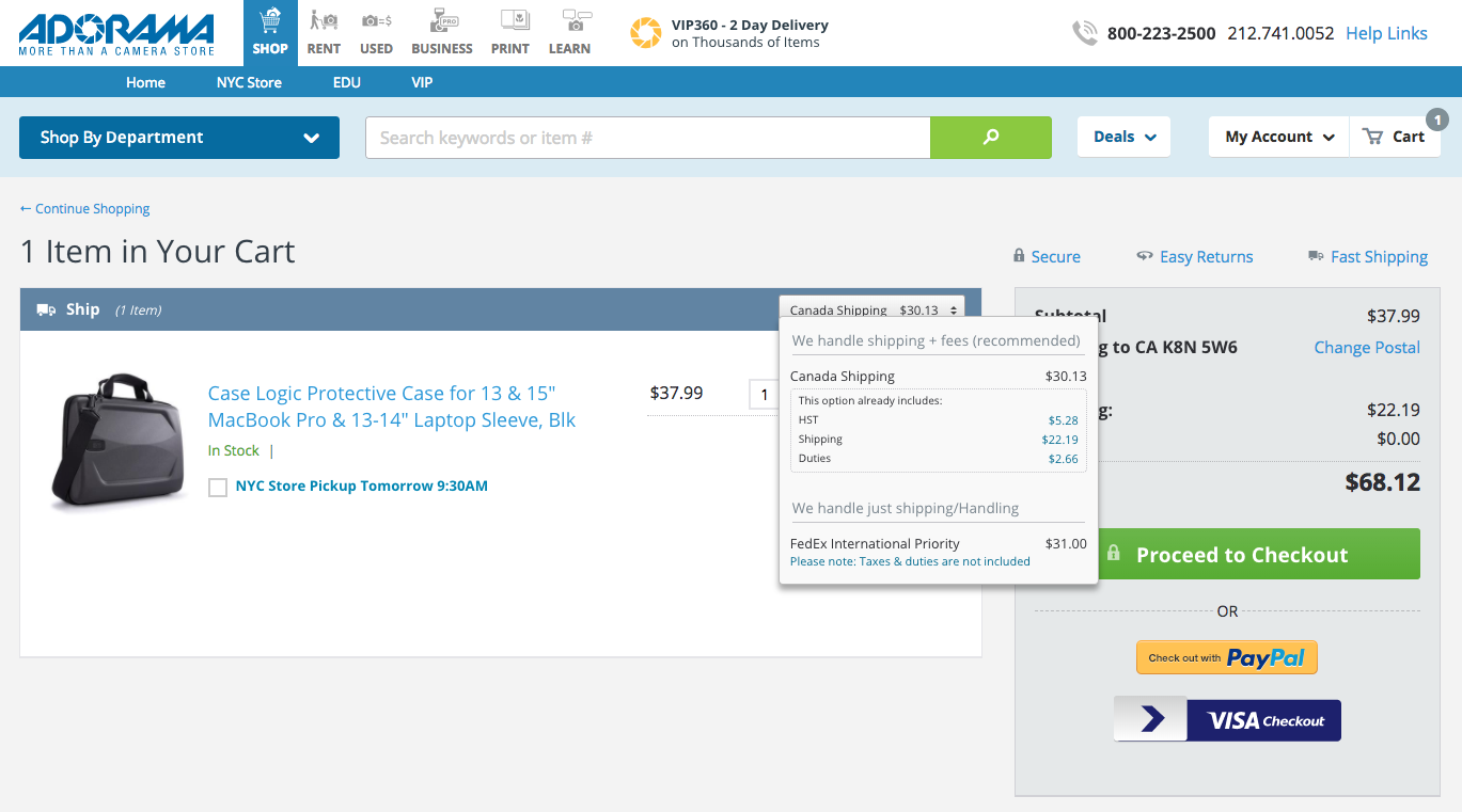
Cart and Checkout (Screenshots presented)
The final place for customers to learn about shipping fees. The recommended changes for the cart and checkout pages would include clarified shipping information, as well as an updated tooltip.
This cart page is estimating shipping costs for a Canadian postal code.
The checkout page shows shipping fees for a Canadian address.
UI Development & Next Steps
As a dual UX designer and UI developer, it was up to me to begin the implementation of changes to the cart and checkout pages.
As of April 2018, only changes to the cart and checkout pages have been implemented. Additional development work will be created in May, or possibly June, for the product page modals.
Thanks for visiting! Feel free to read my latest blog post, or if you came from my portfolio head back there.
On June 24th, I attended a one-day “unconference”, called UX Camp. I heard about this through Meetup/email. I’m not sure what I expected, but I did hope for more hands-on workshops.
Sessions Attended:
Dance as cultural exchange
Using Dance for Cultural Exchange: This was presented by Ana Milena Aguilar-Hauke. I thought it was really smart and innovative, but only 2 people showed up to learn about this which is a shame. We could use more cross-cultural exchange these days. Her idea came from her experience living in Germany and the United States from the perspective of someone of Colombian descent. Her idea was to use salsa, which is a fun, easy to learn dance, to might help people interact with each other.
You can read more about this project on her website.
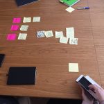
Kanban discussion list
Independent UX (More of a pow-wow/thought exchange): Helpful, especially for people who are managing their own work as an independent or seeking to. We used voting and Kanban boards, which I hadn’t heard of before, to go through ideas. I got that recruiters really take away your ability to earn more money because they’re skimming off the top. And, I learned that other UX professionals are experiencing the same portfolio headaches that I am.
I’ve since become interested in learning more about Lean and Kanban, which I’ll talk about in an upcoming post.
Some of the work we were doing for the design sprint workshop.
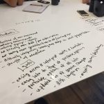
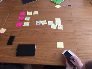
Tips on Design Sprints: I kind of wish I’d skipped this because, apparently, a really great talk that confirmed many of my job hunting suspicions was going on that I missed and probably would have enjoyed. But on the other hand, it was a hands-on activity like I wanted and it gave me new ideas to think about.
Agile to Tri-Track: This was presented by Dave Malouf. I wanted to learn more about Agile. I figured “tri-track” was an improvement…? I am still not quite sure what this was about.
Systems Thinking: I went because I wanted to learn about systems thinking. It sounded like an interesting discussion. It wasn’t quite what I’d hoped, but maybe he will improve it later.
Portfolio Discussion: This was helpful and vindicated some of the concepts I’ve been thinking and writing about when it comes to what UX managers look for (or don’t look for) when reviewing portfolios. My strategy now is to include information about an unexpected challenge I experienced and what I learned on the job.
All Photos
Dance as cultural exchange
Kanban discussion list
Some of the work we were doing for the design sprint workshop.


 I came across


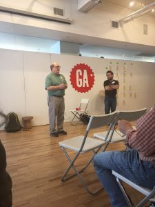 Portfolio Discussion: This was helpful and vindicated some of the concepts I’ve been thinking and writing about when it comes to what UX managers look for (or don’t look for) when reviewing portfolios. My strategy now is to include information about an unexpected challenge I experienced and what I learned on the job.