Black Hair Tutorials — In the Style of Famous Movie Directors and Their Films

Alfred Hitchcock Presents
The famous statue of Dinard in tribute to Alfred Hitchcock and his movie “The Birds”, erected on the occasion of the “Festival du Film Britannique”. Photo by Thibaut Démare.

Like so many other people, I too watch hair and makeup tutorials on YouTube. I’ve found that the majority of videographers film their hair tutorials from the front. Or from the back, like from the perspective of a hair stylist. Well, I came across some pretty unique hair tutorials sometime in 2019. The videographers/hair stylists filmed their tutorials completely different. They chose to film their tutorials in the style of famous movie directors and their movies.

My series of tiny home posts shows that many YouTubers create high-quality videos. The videos below are no different. The videos below, are extra special: they were filmed on a sound stage, with props and special effects. Both entertaining and educational!

Overview

What you’ll see below, where possible, is a short background on the movie and/or director, a preview of the original film or an excerpt, and then the tutorial. Thankfully, IMBD has some nice overview videos of famous directors. (Thanks, IMDB!)

The directors/movies are:

  • Stanley Kubrick/The Shining
  • Spike Lee/Do The Right Thing
  • Wes Anderson/Moonrise Kingdom
  • Alfred Hitchcock
  • Stan Lee & Brian Cooglar / Black Panther

I am very excited to share this post. I wrote it way back in 2019, and have been saving and adding to it, while sharing other posts. Now it’s finally time to share. So with probably my longest blog post title yet, enjoy!


1. Stanley Kubrick, “The Shining”

The Shining is a movie adaptation of the book of the same name, written by mystery/thriller writer extraordinaire, Stephen King. The book was published in 1977. The movie was directed by Stanley Kubrick and released in 1980.

Stanley Kubrick didn’t just make thrillers, but his movies did have a psychologically subversive twist to them. Kubrick was pretty influential in film making. Here’s a summary of his style, by IMDB.

The Shining

The Shining is about a man who takes his family to live in an isolated mountain retreat as the winter caretakers. He…succumbs to the isolation.

Twist Out Tutorial In The Style Of “The Shining”


2. Spike Lee, “Do the Right Thing”

Do The Right Thing was released in 1989 and directed by Spike Lee. Many of his films, or joints, are set in New York City, and especially the Brooklyn neighborhoods of Crown Heights or Bed Stuy. Many of his films’ themes center around race and society. He has some distinctive film making cues that this IMDB video showcases.

Do The Right Thing is about the day to day life for residents in a predominately black Brooklyn neighborhood during a hot summer. The tutorial picks up style and scene elements from this movie, some of which are seen in this trailer.

Wash and Go, in the style of Spike Lee (with Do The Right Thing references)


3. Wes Anderson, “Moonrise Kingdom”

Hair Puff Tutorial, in the style of Moonrise Kingdom (Wes Anderson)


4. Alfred Hitchcock

Another dominating name in film making. Unlike Stanley Kubrick, Alfred Hitchcock specialized in thrillers and psychological thrillers, only. Pretty much all of his movies and Alfred Hitchcock Presents shorts have a very similar style. Check out the guide below and the tutorial following.


5. Stan Lee/Ryan Cooglar, “Black Panther”

Black Panther is based on a comic by Marvel, heavily influenced by legendary comic book artist Stan Lee. The movie, released in 2018, immediately became a cultural phenomenon. This scene below is when the main character, T’chala, goes into the underground science lair to check out some new tools and suit. The director, Ryan Cooglar, has completed other movies, but not really enough to have a distinctive style.

Scene from Black Panther

Bantu knots tutorial, in the style of Black Panther

Greatly mimics the scene above.


Learn More

What I liked about these tutorials were was not just the reference to pop culture — they also reflected the booming business of Black hair and the natural hair movement and acceptance within the African American community.

The business of Black hair is a big business and natural hair video tutorials are a popular sub-genre of beauty “vlogs” which are themselves very popular on YouTube. CNBC did a good job of summarizing the business of Black hair, in their video below, if you’re curious to learn more.


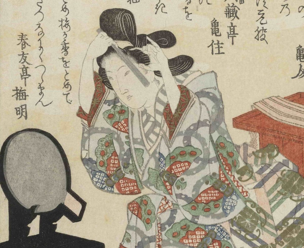
Image credit: Ceremonie van volwassen worden, Totoya Hokkei, c. 1822, colour woodcut, h 204mm × w 178mm – View original at Rijksmuseum.nl

Tiny Homes: More Features and My Favorite Ideas

More Features and My Favorite Ideas

Beautiful example of hidden, under-rail lighting from “Beautiful Tiny Home Built To Look Like Earthen Cottage”.

There are many other videos I’ve seen, on the Living Big in a Tiny Home YouTube channel and others I’ve seen on YouTube about making the best use of a small space.

The videos I highlighted in my other post stand out for the cleverness of their designs and features that seem to make it easier to transition and thrive in a tiny house.

Additional Tips

Some of the other features and tips I saw include:

  • Using hidden lighting (see image above)
  • Spend money on what you cannot see, like the frame, the electrical wiring
  • Make sure there are enough fire exits
  • 12 volt energy use

The Question of Land Use

Aside from not too many videos from long-time tiny home owners, one of the biggest unresolved issues about tiny home living is the question about land: where to park the home. Many tiny home owners have been able to set up on land owned by friends or family. One guy owned a home which he rented out, and lived in a tiny home in his own driveway/backyard.
Some people live in the middle of a city and some live way out in the country. Depending on where you live, it may be possible to connect into existing septic systems and electrical grids. Some home owners have a goal of going fully off-grid.

My Ideal Setup

My ideal setup would be a combo of staying connected, but a focus on reducing grid use by supplementing or fully relying on solar panels, as well as a focus on water conservation and reuse.

The Jamestown Net-Zero season of This Old House proves that it’s possible to design and build an energy efficient home, so I’d like that to be a focus too.

Based on the videos I’ve seen, if I were able to build a tiny home, here are features I would ideally be able to include:

  • Cat run
  • Large porch, ideally closed and covered
  • Stand-up bedroom
  • Side entry, with a ramp option
  • Main home plus guest-home or addition
  • Large windows or garage opening
  • Smart storage
  • Thoughtfully designed room separation
  • Hidden lighting
  • Soft-touch openings
  • Single-floor or stairs with secure railings
  • Future proof

Tiny Homes: My Favorite Episodes

LBTH Logo
Intro for Living Big in a Tiny House

A Review of Eight Tiny Homes

My last post on the topic of tiny homes introduced the concept of tiny homes and why I think they’ve become so popular.

This first post of 2020 includes 8 of my favorite episodes from the YouTube series, Living Big in a Tiny House.


1. Disability / Mobility / Elderly Friendly: A home to grow old in.

I’m really glad this home was included. It shows that tiny homes can be for everyone and can be an option for people as they grow older or people who have or develop mobility difficulties. My favorite features of this home are the single-level floor plan, the wide hallways, the screened in and open porch-like front room (veranda), and the ramp. It also features non-slip floors, soft-touch openings, and an induction stove which is a little safer than gas.

This home consists of a tiny home which essentially has a heavily outfitted covered porch in front, which they call a veranda. The bed is on a motor that comes up and down. I think the bed is clever, but I suspect that makes a bit heavy on the budget. I’d probably prefer an analog mechanical solution, rather than digital. The tiny home cost about $85,000, the veranda cost about $15,000, and the high-end blinds cost about $6,000-7,000.

The elderly homeowner is also so charming and pleasant. It’s clear this home means so much to her. She even manages to out-charm Bryce!

2. Clever Space-Saving and Room Separated Flat

This couple live together in a converted flat. The building used to be some kind of warehouse or work house, which is why the ceilings are so high. They used that feature in their design. In their home design, they created kind of a tunnel effect, with a foyer/desk area, a white and almost Space Odyssey: 2001 center storage area, and then an very open kitchen and living area. The cleverness of this tunnel effect is a separation between the different areas of the apartment, and that feeling of being welcomed into the living area. The storage in the white closet-tunnel is pretty impressive, so that’s why I’m including it.

The downside of this build is that the bedroom is in a hidden loft and there are some I-beams going across that I know I would hit my head pretty frequently. I am also not sure how fire safe that bedroom is, either. Aside from that, I think it’s a pretty clever design. Their interior design tastes are pretty fancy.

3. Minimalist, Small-Space Philosophy

This home was designed by the owner, an architect. He imbued a lot of ideas from minimalism, and ideas about transitioning in space. He also lives in a city, similar to the two guys in the video from above.

He had some interesting design ideas about contrasts: dark vs light, contrasting textures, small vs large sizes. His red grout + black tiled bathroom looks very cool, almost Tron-like. I also took note of some of his book titles! 🙂

4. Clever Sun Cover, Massive Cat Run and Exquisite Craftsmanship

A cat run is one of my top requirements given my cats are very important to me. This home also features hidden under-lighting on the stairs, a lovely feature. In addition, this is also one of the few tiny homes with a strong railing for the stairs and loft area, so it seems a lot safer going up and down.

I can’t exactly put my finger on it, but I’m not sure I would choose this home for myself. Maybe it’s just because it seems so masculine, ha!

Regardless of style and trimmings, this home has so many wonderful features. I do love the cat run, the hidden lighting, the semi-covered porch. The loft area design runs front to back and allows you to fully stand up, though I would also prefer more horizontal railings on the loft itself, to avoid accidentally slipping through.

Beautiful craftsmanship on flooring

The male homeowner builds bathrooms for a living so the craftsmanship throughout the home is exceptional. For instance, around 10:58, the homeowners discuss the transition between the kitchen and bathroom, using a beautiful tiling pattern. Needless to say, the bathroom in this home is spectacular.

5. Garage Doors with Porch and Trailer Home

This home has really tall ceilings and a bedroom that isn’t in a loft. The garage doors are a great idea to bring in a lot of light and open up the space, especially with that big porch.

Cost would be the big downside for most people for this home. As a successful musician with the Trans-Siberian Orchestra, she probably has more income available for building than many other people. Having said that, her home looks so quaint and I love the traveling micro- music studio and the fantastic porch.

6. Double Train Car Home

It’s really hard to beat the charm of these old railcars turn into tiny homes. This is such a clever idea, and the fact that she has 2 of them, with one as a guest house/room, is even better.

She estimated $50,000 as a total cost, but I think that is a very generous guess for this home, because she’s spent over 5 years building it. In addition, at the time of the video she wasn’t living there full-time so it’s hard to say how well it works as a primary living space. The other downside is she’s very remote so (internet and phone) connectivity is spotty.

7. Full-Bath and Standing Room Bed, with Greenhouse Complex

Aside from the home for a resident with mobility issues, this home is also one of my favorite-favorites! I love the full-size bathtub and the beautiful tiles she installed. I especially like her layout which allows her to use a small staircase to enter her bedroom, which has a ceiling that allows her to stand up.

Many tiny homes have lofts and a half-height ceiling. So there’s a lot of bending. I also a fear of slipping or falling, because many tiny homes do not have full or secure railing. She does have a loft in her living room, but it’s not meant for sleeping.

She says her home cost between $90,000 to $100,000, not including the domes. The enormous greenhouses are also interesting, although that’s kind of outside the scope of my interests at this point.

8. Micro Home in Japan

Finally the smallest, but not the least, is the smallest home I’ve seen featured. The storage, modularity, and multi-use aspects of this home make it worth checking out. It’s difficult to pinpoint exactly one feature that makes this home ideal. One of the design inspirations was remaining connected to nature, which is also an inspiration in traditional Japanese architecture. All of the storage and configurations available make this seem like a home that folds in on itself. One smart feature is the use of hollowed out wood panels, for the table and seating, which helps keep the all-cedar home very light. I think a lot of these tricks could be used in many tiny homes.

One major downside: This home does not have a bathroom! For my needs, it wouldn’t work as a full-time residence — at least not in the United States. It works for these two, and one reason for that is those famous Japanese hot springs (onsens) and public baths (sento). For them, there is relatively easy access to bathing, although not on demand. For using the toilet, they use a portable toilet with a biodegradable bag and a powder. They also said there are many places in Japan that accommodate travelers.

The owners said this home cost about $30,000 US.

To clarify, there are 2 videos for this home. One is a tour with the homeowners and the other is a tour with the craftsman. I recommend checking out both, because the craftsman discusses his design inspiration and the homeowners show how they live. Based on the finish of the outside panels, it looks like the craftsman walkthrough comes later.

Walkthrough with Craftsman


My final post will have a few more tips, plus a summary of features for my ideal setup.

Portfolio and Website Updates: Incorporating Feedback

An update to a previous post on the feedback I received from friends and acquaintances on my portfolio, and ongoing work.

I’ve been making updates to my portfolio and website, and I have even more updates to report. In this post, I want to go a little deeper on some of the feedback I received from friends and acquaintances, and how that has influenced some of my updates.

I’ll continue to make updates, of course. These are just changes I’ve made so far.

My Initial Reaction

I asked most people to review my portfolio, which is on CargoCollective. When I got the feedback, my emotions ranged between feeling overwhelmed and disappointed.

I was overwhelmed with what I had received, which was not all negative, because I felt that I’d wasted so many first impressions.

For months, I’ve been sending out links to my portfolio and not getting anywhere with it. Despite my hard work with updating my resume, including the time I spent gathering tips, I felt I had ultimately been short-changing myself by sending out a lackluster portfolio. It felt like a huge waste of time. I even felt like a fraud, giving out tips at the NYC UX Camp 2019.

It was disappointing that other people weren’t seeing my vision or hadn’t understood the history how this site came to be. But, you know, people only reviewed what I asked them to review. They weren’t providing holistic direction on how to reframe my image as a designer. And they weren’t evaluating anything a hiring manager wouldn’t evaluate, either. In other words, it wasn’t personal.

In any case, after a few days (or hours), I started thinking about how I could make changes. My personal website, alliwalk.com, actually went through a whirlwind of changes, large and small. And then I started focusing on my portfolio.

So let’s go through some of the top feedback and how I addressed it.

The Feedback: 1-2-3

The 3 biggest areas of feedback centered on:

  • Domain: Using a real domain name, instead of a third party site.
  • List of projects: Feeling overwhelmed by the number of projects; not sure where to start; emphasizing the projects.
  • About: Adding a tagline or a paragraph to the home page to give a sense of who I am.

Now I’ll go through these top 3 pieces of feedback and give my thoughts, and what I did (or didn’t) do to address them.

1.Personal Domain

Jared Spool gave a talk at BostonCHI in Jan 2019, about the difficulty of hiring designers. In the talk, he called out employers who discriminate against candidates who use third-party sites like Wix or other CMS tools.

Specifically, in his example, he recounts an encounter with a design leader who felt that “good designers” should be able to code and would have coded their own websites. The video is linked to this point in the presentation.

If you’re reading this on my blog, it’s clear that I do have my own domain. I also have own website and I did code it myself.

The reasons I coded my own site were not to prove myself as a “good” designer. They were due to: a) cost, and; b) exploration/personal expression. Let’s review:

A. Cost: It’s cheaper to code your own website on your own domain than to pay a 3rd-party site to do it. A site that costs $12/mo is $112/year, which is over $500 after 5 years, assuming you keep it running all that time. Many sites cost more than $12/month. About five years ago, when I first created my site in Bootstrap, I needed to find areas to cut back on my expenses. This was an easy choice to make and I’ve stuck with it.

B. Exploration: As mentioned above, about five years ago, I started seriously learning more about front-end development. I used building my portfolio and a few side projects as opportunities to learn. I like designing my own website. So why am I also using Cargo? Because updating a domain can be a small project but updating a CMS takes a few minutes.

I could use my own domain to host an external website, but it feels like giving up control of my own website. And, I’m not sure that the external template available is what I want to use on my own site. Plus I get control over my own analytics.

Ultimately, I won’t be moving the Cargo portfolio to my domain. But, I did update my website to more prominently point to the portfolio.

2. List of Projects

I admit: I do have a lot of projects. I’ve heard that using 3-5 projects is a must. I don’t know if that’s a max of 5, but I’d definitely heard a minimum of 3.

Even the NN/g article that prompted this redo suggests 3-5 projects:

Step 2: Choose 3–5 Projects as Detailed Case Studies

But I want to share an image from the NN/g article on UX portfolios. It depicts a gallery of projects.

Web PortfolioHow many projects do you see? I see 8. Clearly the maximum number of projects is not hard-limited to 3-5.

At the moment, I may have too many at 11. However, the first 3 projects are the same as from my website. And on my website, I used analytics to narrow the list from 6-7, to 3 based on visitor traffic.

Most people view a website in an F shape. Using that logic, my most popular projects are placed first. This doesn’t mean I shouldn’t continue trying to narrow the list. But there’s clearly some discrepancy what’s too many, and my choice of projects and the order they’re presented have some thought behind them.

Providing Signposts with the Writing

To help address the feedback that people might be feeling lost, within each project page, I have been working on improving the writing. As mentioned in my last post, I’m updating the writing make it easier for people to scan.

I’ve made changes such as:

  • Incorporated images at the top of projects, when appropriate. (Suggested by feedback.)
  • Organized the writing a bit better. The format is now: a) description; b) images.
  • Included additional promo information, like videos, for people to find more information if wanted.
  • Used more headings, lists, and bold text.

My hope is that even if people feel like they don’t know where to start, once they do, they will feel more directed.

3. About

I used to have an About Me page on my website, alliwalk.com. I removed it because analytics showed that very few people ever visited the page.

But, two respondents mentioned making About info more prominent, like right on the homepage. They asked about adding a heading sub-title or adding a paragraph above the project.

Unfortunately, those are not options I can pursue due to limitations of the CMS template. There are other changes I can make:

A. Using a Landing Page: The template does allow me to select any page as the landing page, even if that page is not public. (Public pages do not show in the nav in the template I’m using.) So I am working on creating a landing/about page, but it’s not something I can easily test without it immediately going live. So, I’m being very cautious.

B. Improving “About”: While working on the writing and updating images, I have updated how I described myself on both my website and my portfolio. I used a combination of my resume and cover letter. I also provided answers to a few questions I tend to get in interviews, like:

  • Are you more of an information architect or visual designer?
  • Do you typically work full-time or freelance?

I just wove that information into the writing itself, and then I put the same information on both my website and my portfolio.


Still more to go. I haven’t made much progress on my website regarding the responsive images, semantic HTML, or migrating to Bootstrap 4.

And, coincidentally, I recently participated in a virtual session with Google, on their design review process. I learned a few things…which is for another post.

Portfolio and Website Updates

After reading a Nielsen Norman Group article on UX Portfolios, I recently began a process of updating my own portfolio and website. Here is a recap and plans for the future.

I have begun a process of updates for my website at alliwalk.com and an additional portfolio at cargocollective.com/alliwalk.

Here are changes in mind for the portfolio and the website.


Portfolio Updates

Changes for my portfolio began after I read a Nielsen Norman Group article on UX Portfolios. The article is called 5-Steps to Creating a UX-Design Portfolio. The 5 steps are:

  1. Take Inventory of All Your Projects
  2. Choose 3–5 Projects as Detailed Case Studies
  3. Choose Your Desired Format
  4. Create Your Portfolio
  5. Get Feedback and Iterate

Implementing the Tips & Other Updates

Take Inventory

Given my work on improving my resume, I’ve already taken some inventory of what I feel I’m good at and what differentiates me from other designers.

3-5 Projects

But I do have a lot of projects. Far more than 3-5 as recommended. So that’s been difficult to evaluate objectively.

Writing

I also took a second look at the writing and how I described my projects. And I’ve decided to focus on improving the content so it’s ideal for the web.

  • Hemingway App helped to simply sentences and eliminate long words
  • Lists help get points across in an easier to scan format.

A short course I’ve been referencing is available on Lynda.

Styles

Styles aren’t part of the list, but I made a few changes:

  • I used Coolors to use find colors that complement each other
  • Use HSL instead of HEX values

Feedback

I’ve asked a friend, a new contact, and an acquaintance for feedback on my portfolio. Not everyone has responded with their take, but I’ve already begun making edits.

Upcoming

I plan to continue making more changes and improvements, to the order of each project and the writing.


Also, Website Updates

Some big changes here….

I recently made some pretty drastic updates to my website.

Style, Images, Content

  • Using Coolors to get a complementary color palette
  • Adding SVGs from UnDraw.co
  • Updating the content: Removed CSS projects; Added an “About” section

That’s it for now, but there are more changes I still want to make.

More Changes I Want to Make

Remove IDs

3-4 years ago when I first made this site, I didn’t know the difference between IDs and Classes. Now I do and I want to update the HTML to use the correct tags.

Add Responsive Images

The technique now is to use responsive images, using srcset and sizes. A how-to is available on MDN.

Update to Bootstrap 4

Although I think I’m OK with Bootstrap 3, it would be a good idea to update to the newest version. Bootstrap 4 uses Flex by default and possibly Grid.

Optimize the SVGS for Animation

In order to add animations to SVGs, the different paths and shapes need to be given names. Moving the styles out of the code means colors and other styles can be animated.

Animate the SVGs

After optimizing the SVGs, I can add some animations.

Create a CSS Experiments page

The site used to have a section for CSS animations. But I took that out to focus the page on just one message. I plan to put everything I removed onto a new page/section.

Domain Email

I’ve got a domain but I’m not using the email for it. This isn’t really a website thing, just a professional thing.

Happy to report, this is done!


I plan to write another post about some of the feedback and ongoing changes.

Event: The Art of VR at Sotheby’s

On June 23rd, I attended The Art of VR event, held at Sotheby’s. It was billed as “A 2 day curated VR exhibition featuring: Studio premieres, theatrical & brand case studies, studio exhibitions, hands-on demonstrations.” I signed up through Eventbrite.

Virtual reality has certainly advanced from Second Life. Now there are headsets and immersive devices. The tickets were somewhat expensive but I went to the event, anyway, because I didn’t have that much experience with virtual reality; I thought it would be a good way to jump in. I spent time trying out VR at the different booths, then spent time listening to the talks, which were pretty good.

VR Booths and Hands-On Demonstrations

Many works were commercial, intended to demonstrate the graphics capabilities of a type of computer, to promote a film, or for some other commercial purpose. In my opinion, VR for entertainment purposes automatically comes across as a bit insincere, unless the provenance of the work — where it comes from, how it was produced, who produced it and why — is known because it can help the audience get over their skepticism.


Photos from the Galleries

There were also a number of artworks, and so far I think it works best for art experiences. The mechanics of the experience are incredibly intimate, yet it remains very public – which describes how art is experienced, as well. But, trying VR can be an intimidating activity. You have to get over feeling embarrassed for looking stupid with these giant geeky goggles on your face while other people are watching. And, as a panelist later mentioned, VR can be clunky and clumsy, even in an artistic setting.

Despite my initial embarrassment, I participated as much as I could. I enjoyed the experience and learning about VR.


Discussion Panels

I’ll admit that I initially wasn’t compelled to visit the floor where the discussion panels were being held. But once, I did I was very impressed. The president of the VR Society led at least 2 panels I listened to; he’s a very good moderator. The two discussions that impressed me most were a discussion on medical uses of VR and a discussion about a cinematic experience, called “Lincoln in the Bardo”.

Photos from the panel discussions

Discussion: Medical Uses of VR

On the far right (partially off-camera), is the surgeon moderating the discussion and presenting his use of VR in surgery. The man to the right of center is the psychiatrist.

One of the discussion panels was about medical uses of VR. Overall, this was the most impressive topic discussed or demonstrated for me.

  • Surgery: First, a neurosurgeon described how he used virtual reality to help him remove difficult tumors in the middle of a patient’s head. He showed how, due to the tumor’s location, historically the surgery left people disfigured and possibly blind or deaf. (The images were not attractive.) With VR, he showed, he’s able to more accurately and precisely navigate around major arteries and nerves, to minimize the intrusiveness of the surgery using orthoscopic surgical tools to minimize long-term damage and scarring.
  • Mental Health: Next, a psychiatrist described how he used VR to simulate settings for PTSD patients, to help them overcome their disorder in a controlled setting. For example, he can simulate Iraq for war veterans. He also showed how VR can be used to help patients manage pain, specifically burn patients. Pain, he explained, requires attention. If you can distract patients from their pain, they will experience pain relief. His example was showing a burn patient experiencing an ice world.
  • Medical Education: Finally, a medical artist showed how he used VR drawing tools to augment his work. I don’t entirely remember everything about his discussion, but his work sounded very interesting. And it seems like a type of art that is completely overlooked.

Anyway, the medical talk was very innovative and I’m glad to see this new technology being used in such important ways.


Discussion: Lincoln In the Bardo

“Lincoln in the Bardo”. The director is on the far left. The NYT VR director is 2nd from left. The VR Society president is on the far right.
Another impressive talk was a discussion about Lincoln in the Bardo, VR experience. This experience was a collaboration with the NY Times. It sounds like it was a pretty intensive project, so although I didn’t see it or write about it that much, don’t underestimate it, especially if you’re into cinematic VR experiences.
Lincoln in the Bardo

In this immersive narrative short, President Lincoln pays a nighttime visit to the haunted cemetery in which his beloved son has just been laid to rest. Based on “Lincoln in the Bardo,” the new novel by George Saunders.

You can possibly view it in 360-video on nytimes.com if your browser supports 360-video. I also found a link on YouTube if it doesn’t. It’s produced for a VR headset, so it won’t be the same if you don’t have a headset (I don’t).


Sotheby’s Art Gallery: BUNKER

Somewhat related to the VR event, Sotheby’s also had a pop-up gallery, called BUNKER, “which since 2014 has featured artists who collaborate with technology to create code-driven sculpture, augmented reality and virtual installation”. I took some time to check it out. There weren’t that many projects, but here are few projects I especially liked.

One that was really clever used the cassette frames and an audio output. Since it was using headphones, a video would have only caught half of it. So, I didn’t capture it at all.

The installation will be at Sotheby’s until July 20, 2017.