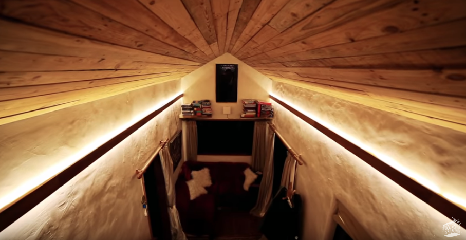
Beautiful example of hidden, under-rail lighting from “Beautiful Tiny Home Built To Look Like Earthen Cottage”.
There are many other videos I’ve seen, on the Living Big in a Tiny Home YouTube channel and others I’ve seen on YouTube about making the best use of a small space.
The videos I highlighted in my other post stand out for the cleverness of their designs and features that seem to make it easier to transition and thrive in a tiny house.
Additional Tips
Some of the other features and tips I saw include:
Using hidden lighting (see image above)
Spend money on what you cannot see, like the frame, the electrical wiring
Make sure there are enough fire exits
12 volt energy use
The Question of Land Use
Aside from not too many videos from long-time tiny home owners, one of the biggest unresolved issues about tiny home living is the question about land: where to park the home. Many tiny home owners have been able to set up on land owned by friends or family. One guy owned a home which he rented out, and lived in a tiny home in his own driveway/backyard.
Some people live in the middle of a city and some live way out in the country. Depending on where you live, it may be possible to connect into existing septic systems and electrical grids. Some home owners have a goal of going fully off-grid.
My Ideal Setup
My ideal setup would be a combo of staying connected, but a focus on reducing grid use by supplementing or fully relying on solar panels, as well as a focus on water conservation and reuse.
I’m really glad this home was included. It shows that tiny homes can be for everyone and can be an option for people as they grow older or people who have or develop mobility difficulties. My favorite features of this home are the single-level floor plan, the wide hallways, the screened in and open porch-like front room (veranda), and the ramp. It also features non-slip floors, soft-touch openings, and an induction stove which is a little safer than gas.
This home consists of a tiny home which essentially has a heavily outfitted covered porch in front, which they call a veranda. The bed is on a motor that comes up and down. I think the bed is clever, but I suspect that makes a bit heavy on the budget. I’d probably prefer an analog mechanical solution, rather than digital. The tiny home cost about $85,000, the veranda cost about $15,000, and the high-end blinds cost about $6,000-7,000.
The elderly homeowner is also so charming and pleasant. It’s clear this home means so much to her. She even manages to out-charm Bryce!
This couple live together in a converted flat. The building used to be some kind of warehouse or work house, which is why the ceilings are so high. They used that feature in their design. In their home design, they created kind of a tunnel effect, with a foyer/desk area, a white and almost Space Odyssey: 2001 center storage area, and then an very open kitchen and living area. The cleverness of this tunnel effect is a separation between the different areas of the apartment, and that feeling of being welcomed into the living area. The storage in the white closet-tunnel is pretty impressive, so that’s why I’m including it.
The downside of this build is that the bedroom is in a hidden loft and there are some I-beams going across that I know I would hit my head pretty frequently. I am also not sure how fire safe that bedroom is, either. Aside from that, I think it’s a pretty clever design. Their interior design tastes are pretty fancy.
This home was designed by the owner, an architect. He imbued a lot of ideas from minimalism, and ideas about transitioning in space. He also lives in a city, similar to the two guys in the video from above.
He had some interesting design ideas about contrasts: dark vs light, contrasting textures, small vs large sizes. His red grout + black tiled bathroom looks very cool, almost Tron-like. I also took note of some of his book titles! 🙂
A cat run is one of my top requirements given my cats are very important to me. This home also features hidden under-lighting on the stairs, a lovely feature. In addition, this is also one of the few tiny homes with a strong railing for the stairs and loft area, so it seems a lot safer going up and down.
I can’t exactly put my finger on it, but I’m not sure I would choose this home for myself. Maybe it’s just because it seems so masculine, ha!
Regardless of style and trimmings, this home has so many wonderful features. I do love the cat run, the hidden lighting, the semi-covered porch. The loft area design runs front to back and allows you to fully stand up, though I would also prefer more horizontal railings on the loft itself, to avoid accidentally slipping through.
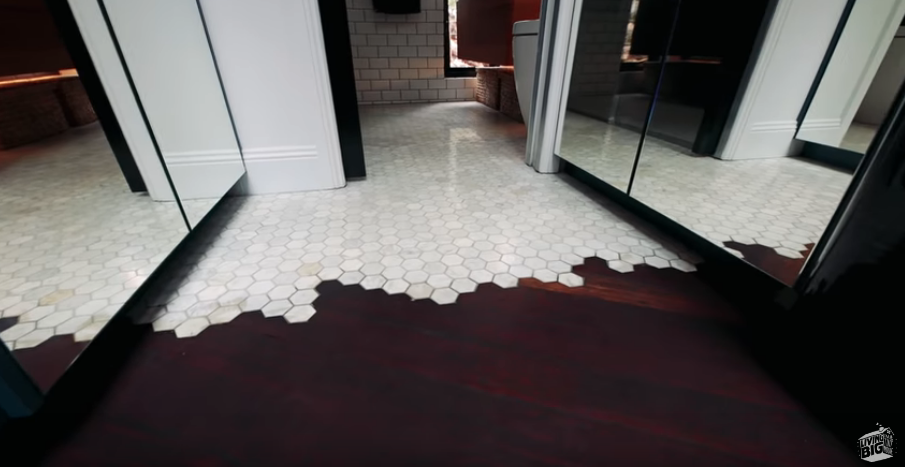
Beautiful craftsmanship on flooring
The male homeowner builds bathrooms for a living so the craftsmanship throughout the home is exceptional. For instance, around 10:58, the homeowners discuss the transition between the kitchen and bathroom, using a beautiful tiling pattern. Needless to say, the bathroom in this home is spectacular.
This home has really tall ceilings and a bedroom that isn’t in a loft. The garage doors are a great idea to bring in a lot of light and open up the space, especially with that big porch.
Cost would be the big downside for most people for this home. As a successful musician with the Trans-Siberian Orchestra, she probably has more income available for building than many other people. Having said that, her home looks so quaint and I love the traveling micro- music studio and the fantastic porch.
It’s really hard to beat the charm of these old railcars turn into tiny homes. This is such a clever idea, and the fact that she has 2 of them, with one as a guest house/room, is even better.
She estimated $50,000 as a total cost, but I think that is a very generous guess for this home, because she’s spent over 5 years building it. In addition, at the time of the video she wasn’t living there full-time so it’s hard to say how well it works as a primary living space. The other downside is she’s very remote so (internet and phone) connectivity is spotty.
Aside from the home for a resident with mobility issues, this home is also one of my favorite-favorites! I love the full-size bathtub and the beautiful tiles she installed. I especially like her layout which allows her to use a small staircase to enter her bedroom, which has a ceiling that allows her to stand up.
Many tiny homes have lofts and a half-height ceiling. So there’s a lot of bending. I also a fear of slipping or falling, because many tiny homes do not have full or secure railing. She does have a loft in her living room, but it’s not meant for sleeping.
She says her home cost between $90,000 to $100,000, not including the domes. The enormous greenhouses are also interesting, although that’s kind of outside the scope of my interests at this point.
Finally the smallest, but not the least, is the smallest home I’ve seen featured. The storage, modularity, and multi-use aspects of this home make it worth checking out. It’s difficult to pinpoint exactly one feature that makes this home ideal. One of the design inspirations was remaining connected to nature, which is also an inspiration in traditional Japanese architecture. All of the storage and configurations available make this seem like a home that folds in on itself. One smart feature is the use of hollowed out wood panels, for the table and seating, which helps keep the all-cedar home very light. I think a lot of these tricks could be used in many tiny homes.
One major downside: This home does not have a bathroom! For my needs, it wouldn’t work as a full-time residence — at least not in the United States. It works for these two, and one reason for that is those famous Japanese hot springs (onsens) and public baths (sento). For them, there is relatively easy access to bathing, although not on demand. For using the toilet, they use a portable toilet with a biodegradable bag and a powder. They also said there are many places in Japan that accommodate travelers.
The owners said this home cost about $30,000 US.
To clarify, there are 2 videos for this home. One is a tour with the homeowners and the other is a tour with the craftsman. I recommend checking out both, because the craftsman discusses his design inspiration and the homeowners show how they live. Based on the finish of the outside panels, it looks like the craftsman walkthrough comes later.
If you haven’t noticed, tiny homes have become really popular.
My theory is that the consumerist lifestyle advertised in capitalist societies have led to physical, psychological, and financial burdens, such as high-debt, overpacked garages, unaffordable McMansions. In addition, the financial crisis of 10 years ago and the resulting Great Recession left many people with a visceral fear of becoming burdened again. Given the dual rise in popularity of decluttering and minimalism — ex: Marie Kondo; “Goodbye, Things” — these events have clearly had an impact and many people are looking to avoid or escape this lifestyle. One outcome of this search for freedom is the rise of the tiny home movement.
One YouTube a series I’ve been watching features an extraordinarily good-natured New Zealand-based host, Bryce, and his talented videographer (girlfriend/partner who always remains offscreen). Together, they travel around the world to visit different individuals, couples, and families who are living in tiny homes. The pair don’t just visit people from New Zealand, although there are many people with tiny homes in New Zealand. The show also visits people from all over the world: Canada, Australia, Japan, the United States. It has some great theme music.
As a resident of NYC, I have been interested in small space living for a while. There are a lot of different tips and tricks for small space living:
For small space living, I found another YouTube series a few years ago. Here’s a video where the tenant transformed her very small studio into a little gem.
In this next one, the tenant (or owner) has used a center storage unit to create zones in his studio. It’s pretty clever.
[Note: I do not vouch for their website!]
There are a number of different styles of tiny homes. Watching the show as an apartment dweller, I have fantasized about living in one. Could it be so different? Fewer neighbors? A garden? What would my tiny home be like?
I decided to share features from some of my favorite homes to look for patterns that would make a tiny home more pleasurable to live in.
Having looked at the YouTube channel on my computer and not just on my Roku, I can see there are other videos that aren’t just home tours. There are a series of videos about building a tiny home and building a tent (like a yurt). To be honest, I haven’t looked at those. Maybe I will; maybe not.
In an upcoming post, I’ll go through some of my favorite Living Big in a Tiny House videos!
This past week at ITP, I was one of 16 lucky students to participate in a workshop on “Intervention/Interaction – Multi-person Interface” hosted by the co-creators of the awesome design firm Antenna Design. Sigi Moeslinger (ITP Alumna ’96) and Masamichi Udagawa led the workshop over 3 days. Our task was to create an intervention of some type in a public space, keeping in mind that the focus of our interactive experience should be on people.
Along with Nien Lam and David Phillips, I created an intervention in the Bobst academic library at NYU. Our proposal was a type of “relaxation station” that transported the users to different natural environments. It was targeted towards busy students needing a short break from their studies, but could still be unobtrusive enough to still be situated within the library.
As I mentioned, each station would be based on a natural theme, which were organized by the floors of the library. So, the ocean-themed station was on the 2nd Floor, which the night sky-theme was on the top floor. Within each station, students would be able to participate in the shared experience of being transported to another natural environment, complete with enhanced oxygen and sound design that would become more complex depending on how many other students were also sitting in the station. Each station would also have some type of visual aspect, since there would be some type of overhang to each bench or seating area, that sort of resembled a bus stop. What I specifically worked on was the sound design aspect, which I found I really enjoyed from the sound editing assignment in Communications Lab. Additional credit goes to Nien for developing the 3-D software model of our station, and David for the presentation and photo-manipulations.
I really liked our project, as did many other students. The breaking point for us was spending several hours in the library and simply observing the behavior of students there, and taking careful consideration of what would really be feasible in that space. I’m really proud that we were able to come up with something really nice in just 3 days. Nice job David and Nien, especially for putting up with my paranoia and perfectionism! 🙂
Project Description:
Design an intervention (= installation or an automated machine) for “interactive services” in public space which will generate a new interaction amongst people.
An “interactive service” is a “mechanism” which provides some service or product for people. It is a kind of hybrid object/environment, such as an automated vending machine, information or entertainment kiosk, street furniture, etc.
The task is to go beyond an interface between a system/object and a singular user, to coming up with an interaction amongst multiple people mediated by the new system/object.
In this project, the essence of design is to “activate” people who encounter your intervention. The design should be safe and enjoyable, help people become more curious, more intellectually and/or physically active, cultivate relations with others (strangers, family, community, friends, colleagues, etc.) and grow as humans. It sounds obvious, but people must always be the focus of design.
How they were used: I expected that people would use them to purchase their tickets. But, I also noticed that people used them to see what movies were playing. And, sometimes they tested the machines to see if they could purchase tickets for a movie that was sold out.
Overall take-away about self-ticketing machines Most of the time we use technology we’re not being watched by people whose opinions we actually care about. Given the context, it seems like the self-ticketing machines are in an environment in which key members of your social group are around you watching you use a machine that could possibly make you look stupid. If I were designing self-ticketing machines, I would keep in mind that clarity and ease of use are important to users, so that they don’t look stupid to the people who are important to them. For the most part that’s true, except in the purchasing part, which is the part that actually matters.
I. Difficulties
Responsiveness of the machines: At the Loews Theater on 3rd Ave, the machine didn’t respond to very well, which prompted the person using the machine to touch the screen repeatedly.
Confusion when using the credit card swipe: Both at the Loews and at Regal Union Square Stadium 14, I observed at least two people becoming confused when trying to use the credit card machine. At Loews, I was too far away to notice read the screen to see what particular problem the woman was having, but the effect was that she tried to swipe her card about 4-5 times before she finally completed her purchase. At the other theater, the difficulty another person experienced with the credit card swipe had to do with the fact that she kept swiping her card in the wrong direction. Eventually, she was able to figure it out.
Even myself, at yet another theater, City Cinemas Village East, I had difficulty using the machine, too. Twice. First, I used my debit card to pay and when I got to a numeric keyboard display, I assumed that what I needed to press was my PIN, when I actually needed to press my zip code. The result was that I canceled the process. Then when I tried again, I got this screen. It’s a very accurate picture, as you can tell.
Inconsistency within the self-ticketing machine.
II. Completion time
When used correctly, the machine takes less than one minute to operate, from selecting a movie to picking up your tickets. I observed someone using the machine in under a minute. Actually, it was probably more like 30 seconds. (I looked away so that the people inside the theater lobby wouldn’t think I was stalking them. When I looked back, the person had finished.) At any stage during the process, it seems that you get about 1.5-2 minutes to complete a step before it asks if you need more time. With continued inactivity, it cancels the process and returns to the “home” screen.
III. Context of use
There were a couple of things I noticed about people using these machines that were affected by the general layout of the theater and the general social atmosphere of the environment at the movies.
Theater Layout: The Regal Cinema at Union Square had the most issue with layout affecting self-ticketing machines because at the Loews Theater on 3rd Ave, most people purchase their tickets from the person in the ticket booth outside, so they have their tickets before entering the theater. The biggest effect layout had on people using the self-ticketing machines had to do with crowding. This effect was exacerbated by the social context of people going to the movies.
The crowding effect – In the ticket machine room, there are about 15-18 machines. Most of them are grouped underneath the light board showing the movie titles and schedule. If you’re like me, when you walk into Regal Union Square Stadium 14, the first thing you do is turn right into this room, because it’s faster than waiting in line. I observed that as soon as people walked into this space they tended to stop a few feet from the entrance to the room in order to read the board. Stopping in front of the entrance, of course, blocks anyone else from coming in…which blocks people from using the machines.
(Solution!) To fix this problem, my thought was that if the board were on a different wall, this would get a better flow of people through the space. Particularly if it were on a back wall, since the majority of the people didn’t come more than two-thirds into the room.
Social Context of Use – If you’re not like me when you go to the movies, this probably means you have come to the movies with at least one other person. When people arrived at the theater, they often came with friends and family, or they came alone and then met up with another person. So pretty much anything that a person does at the theater, they do with another person or more. When people are interacting with the self-ticketing machines, what really happens is that there are at least two people standing at one machine watching the screen while one of them actually touches the interface. I also noticed that even when there are more than two people are at the theater together all of them stand around the machine while to purchase their tickets.
This is why I feel that it’s very important that these machines not make people look like they don’t know how to operate a machine. Their friends are watching. Their date is watching. It’s not cool to make someone look dumb when they’re out on a date.
My last two observations to note are: “Proximity to the machine” and “What else do people do in self-ticketing space?”.
Proximity: When purchasing tickets, I noticed that when a person reached the point of purchase, he or she took a step closer to the machine. Maybe this behavior is just to get close enough to actually swipe their credit card effectively, or maybe it’s just that people feel better when they’re standing closer to the machine when paying for their tickets. Anyway, getting closer to the machines can be difficult in a crowded theater.
Sometimes, people also had a tendency to sort of play with the machines. Occasionally, a person who clearly did not intend to purchase a ticket would go to a machine and touch it as if they were going to purchase a ticket. When people did this, they often stood a little farther away from the machine, so that the machine was not really too much in their personal space. They also stood at an angle to the machine, so that they were not “squared off” in front of it – shoulders and hips aligned on top of each other so as to create a square, directly facing the machine.
What else do people do in the self-ticketing space: Aside from waiting around and chatting with their friends, the majority of people were using their cell phones. It seemed sometimes that maybe 50% of the people in the space were on the phone. They used their phones before and after purchasing tickets, perhaps to see what other movies were playing nearby, and possibly also to purchase tickets via their phone.
Alone again at the movies, I think I was the only person watching people use the self-ticketing machines.