
Yet another portfolio post!
Rather than go on about my own issues, I wanted to share a few resources. Before I begin, I’m going to make a little rant in case you’re feeling overwhelmed, like I am.
One of the sites emphasizes the importance the design a portfolio has on your job prospects. I feel this importance is overblown because the the design or tool seems to have such a big impact on how the portfolio is perceived. I can’t emphasize enough how many people use paid templates, plus the cost of a web domain. And I would be lying if I said it didn’t bother me that choosing the wrong CMS template is the difference between gainful employment vs not.
The fact that the portfolio makes a difference at all seems like the difference between showing up in a limo, BMW, Toyota, or SmartCar. I guess it really is like dating, which I admittedly know absolutely nothing about.
At the start of this review, my feeling is that people just want to be entertained. My thoughts changed somewhat, which you can read at the end.
/rant
Ok, now that I’m off my soapbox, here is my list. It’s organized like this:
- Sites – Guides, essays, and portfolio collections
- Tools – What people use to create their portfolio
- People – A small handful of portfolios
1. Sites
A collection of essays, slides, and guides.
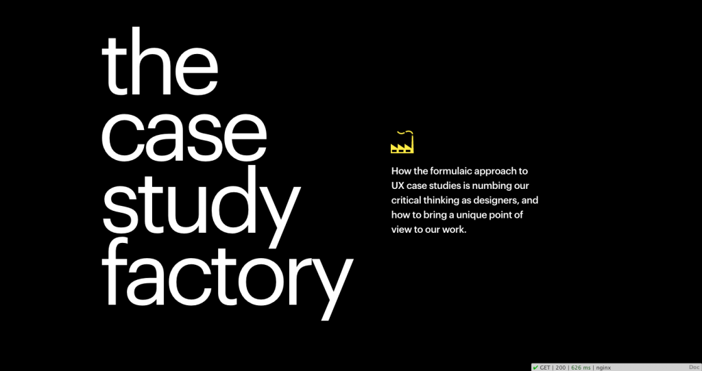
Article page: The Case Study FactoryThe Case Study Factory is about how similar so many UX portfolios seemingly look alike. The authors write:
“How the formulaic approach to UX case studies is numbing our critical thinking as designers, and how to bring a unique point of view to our work.”
Provides some pretty good tips at the end, however I recommend you read the whole article for context. Also because it’s a good article.
- Define your area of focus
- Align the story with the medium
- Set up the context of the project
- Focus on insights rather than process
- Design your case study reading experience
- Obsess over your case study visuals
- Make it personal
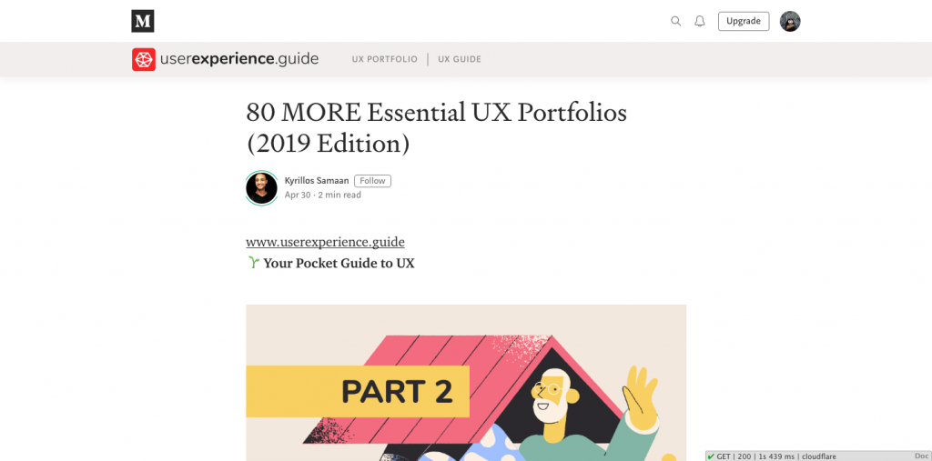
Sometimes it’s just helpful to look at a big list. Here’s a list of 80 portfolios. I talked about 2 in the People section.
Guides and Slides

Design a Winning Portfolio — Tips + Tricks from a Google Designer is a slide deck of tips and tricks. The slides are shared from Google slides (link).
This is a compilation of tips and tricks to improve a design portfolio. She states:
While each design discipline has slightly different project expectations (i.e. UX wants wireframes while Branding wants logo sketches), I’ve realized there is an overall universal set of tactics that, when applied, will automatically enhance and differentiate any design portfolio.
The Google slide deck is really big and there are videos, so keep that in mind. It loads a little slow.
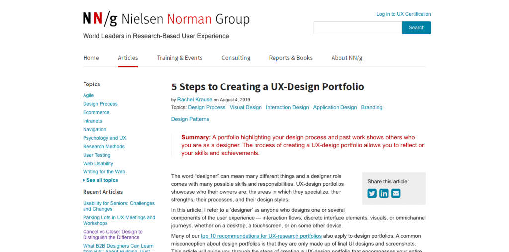
nng.com’s recent article, “5 Steps to Creating a UX-Design Portfolio” is probably what kicked this whole thing off. Actually I talked about this in another post, so I won’t rehash. But I will point out that I’ve made a number of changes to my website and my portfolio at Cargo Collective, which at this moment is offline.
My Personal Bookmarks
I’ve had the following links bookmarked for a few years. These seem more geared to PDFs.
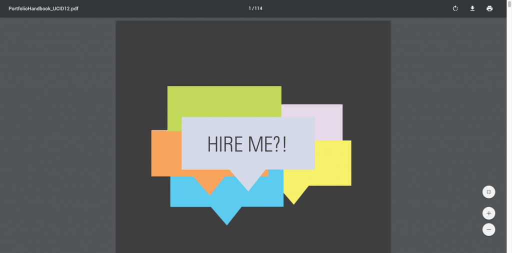
Portfolio Handbook [PDF] from the Class of 2012 Industrial Design, DAAP, University of Cincinnati.
This book was put together for the purpose of facilitating higher-quality portfolios. It will not cover project processes, but will act as a guide to documenting a project well for your portfolio. We hope the book will ease some of the anxiety around creating your first portfolio and then later exist as a helpful reference book to check a newer portfolio concept against
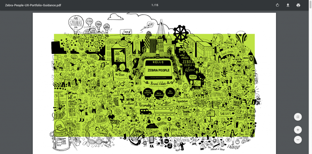
UX Portfolio Guidance, from Zebra People [PDF], London
We are fortunate enough to see some great portfolios, however there are still many UX practitioners who are selling themselves short. There are some absolutely brilliant and in-depth guides about UX portfolios out there. But our intention with this document is to provide a concise, visual hand book on what to include in your portfolio.
Your portfolio represents you. But you’re not always there to talk about your work. No one gets hired on their portfolio alone. The best outcome is a meeting. Tonight is about snap judgments.
2. Tools
What people use to create sites
From the list of 80 above, (plus a few others I found) I randomly clicked into about 3-4 portfolios per group and I took a look at the page source.
Many, many sites are built using Squarespace, WordPress, Wix, or some other type of CMS with either built-in or plugins for flashy animation, grids, and what-not.
Other sites were hand-coded, often with Bootstrap or Foundation. I took note of the many JavaScript libraries.
WordPress and Adobe Portfolio
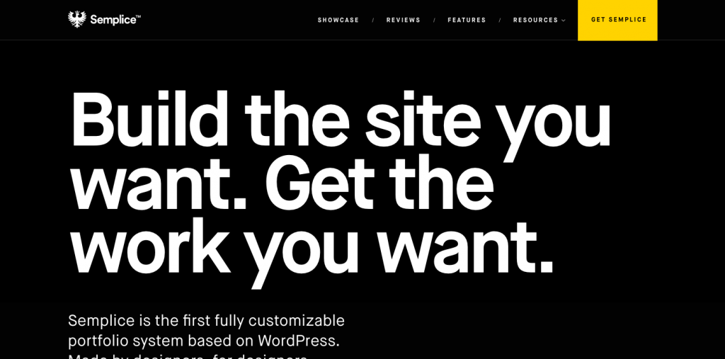
Semplice home pageFor WordPress, I came across a template called Semplice. It is advertised as a WordPress template for designers. The latest version is Semplice4. Price is $100. I wouldn’t be surprised if many people have upgraded to the Studio version for $140. Semplice does not seem to have options for blogging; I didn’t see it.

Another theme I came across is Salient, although the site I found it on had a “Under Construction” label. It’s $60 and available on ThemeForest. It has over 5,500 reviews, over 95,000 sales, and is currently rated as 5-star.
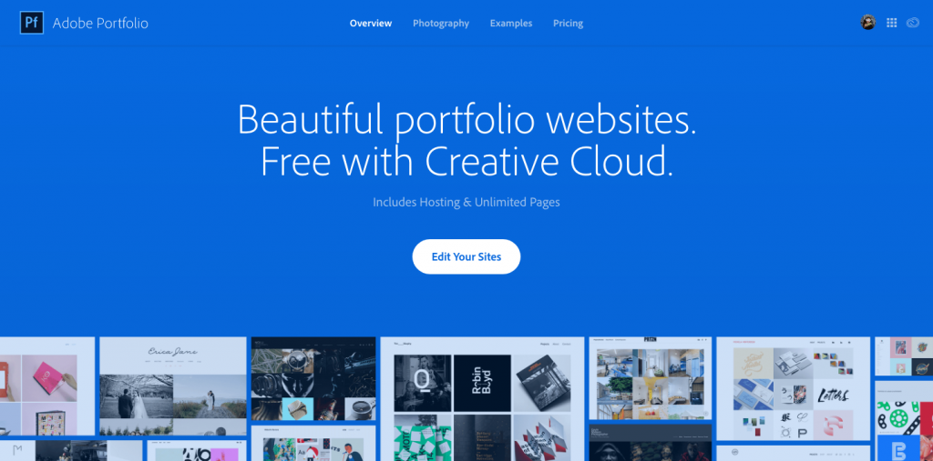
If you use Behance, you may be interested in Adobe Portfolio. It’s $9.99/month, paid annually (about $120). You get access to Adobe Portfolio, Photoshop, and Lightroom, as well as access to Adobe Fonts. You can get a free trial, but you need to upgrade to connect a domain/subdomain.
Free DIY Options
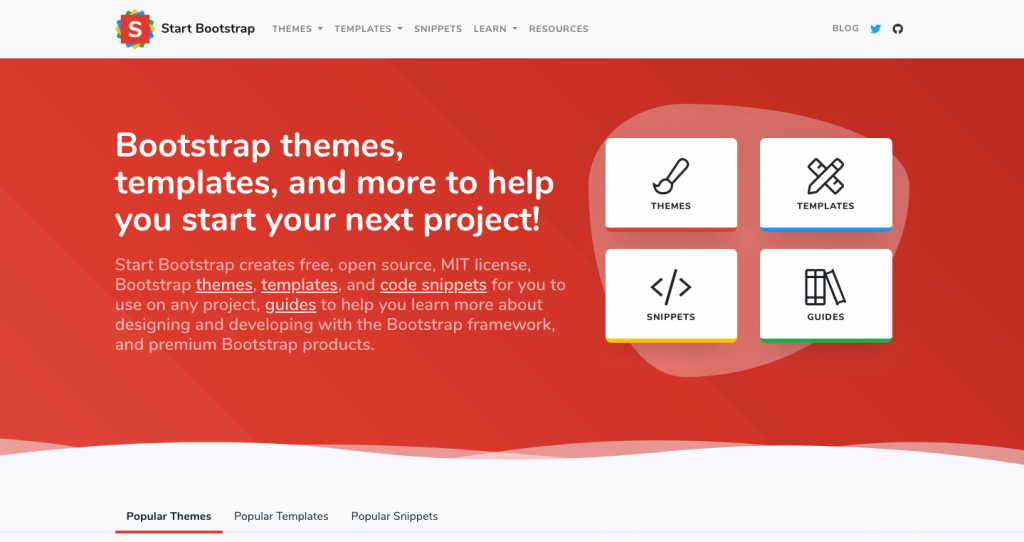
Startbootstrap.com offers free Bootstrap templates, themes, and snippets that you can download and customize. Basically everything is free, with the obvious exceptions that you cannot use Startbootstrap templates to create a competitive website serving free Bootstrap templates.
I have used Startbootstrap multiple times and I find them pretty easy to use and combine. Some have CSS or JS animations built in; mostly CSS.
It does require solid HTML and CSS knowledge.
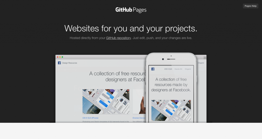
Github Pages uses your own github respository to host a website. It’s 100% free. However, it will say username.github.io/yourproject. And your code will be online for all to see. I’m also not sure if you can use Google Analytics.
Again, this is for people who have experience developing websites.
Obviously, having a free site generator is great. If you want to have your own domain, you can get a personal email address, like yourname@yourdomain.com. And you can connect it to github. But all that is well beyond the scope of this post.
![]()
BlankSlate by TidyThemes allows you to completely customize a WordPress installation, by providing a theme with absolutely zero styling. Sometimes you use a nice theme, but end up undoing stuff you don’t really like. Needless to say, this theme is for people with a good amount of experience. I say no more.
JavaScript Libraries
If you code your own site, these were some of the libraries and plug-ins some people used. I thought tilt.js was pretty cool.
There are so many JS libraries, this list will keep getting updated.
- stellar.js – https://markdalgleish.com/projects/stellar.js/ – Parallax plugin
- easing.js – jQuery plugin to create custom animation easing
- superfish.js – https://superfish.joelbirch.design/ – improvements for dropdown menus
- hoverintent.js – https://briancherne.github.io/jquery-hoverIntent/ – an alternative to hover in jQuery
- waypoints.js – http://imakewebthings.com/waypoints/ – You know those things that fly in from the side, when you scroll down a page? This does that.
- typed.js – https://mattboldt.com/demos/typed-js/ – Creates a typing animation effect
- tilt.js – https://gijsroge.github.io/tilt.js/ – a lightweight plug-in for parallax. Sort of like animate.css, but you have to include some (extremely little) JavaScript. (I liked this one!)
- in-view.js – https://camwiegert.github.io/in-view/ – notifies you when your item is in view. Used to be called scrollie.js.
- scrollSpeed.js – https://code.nath.co/scrollSpeed – allows custom scroll speed in browsers
- scrollrevealjs.org – https://scrollrevealjs.org/ – JavaScript library for easily animating elements as they enter/leave the viewport
- countdown.js – http://countdownjs.org/ – simple JS API countdown
- masonry.js – https://masonry.desandro.com/ – creates masonry layout
- sidemenu.js – https://github.com/kami-zh/jquery.sidemenu.js?files=1 – creates a side menu. Might be mobile only.
- jQuery.mb.YTPlayer – Creates HTML5 video backgrounds for YouTube videos
- unslider.js – a slim horizontal slider plugin (for images or content)
- velocity.js – a fast animation engine. Similar to animate.css, but with JavaScript and more options
- elastilunr.js – http://elasticlunr.com/ – full-text search engine in Javascript for browser search and offline search
- lazyload – OK there are too many to name to pick just one. Here are a few resources though. One from Google, and the first search result for lazyload.js.
- whatinput.js – https://ten1seven.github.io/what-input/ – Detects if the input is coming from keyboard, mouse, or touch.
Lightboxes & Carousels
- lightbox.js – https://lokeshdhakar.com/projects/lightbox2/ – creates lightboxes and carousels
- flexslider.js – http://flexslider.woothemes.com/ – Another image carousel, from/for Woothemes
- chocolat.js – http://chocolat.insipi.de/#home – jquery lightbox plugin
- fancybox.js – https://fancyapps.com/fancybox/3/ – It’s a pretty fancy image lightbox. Very fancy, indeed.
- slick.js – https://kenwheeler.github.io/slick/ – Responsive image carousel
Instagram Embeds
- lightwidget.com – Embeds Instagram photos into a webpage.
- spectragram.js – http://spectragram.js.org/ – Instagram API plugin
CSS
- animate.css – https://daneden.github.io/animate.css/ – Creates animations on elements, with classes.
- superfish.css – There’s a CSS stylesheet for superfish.js, and you need to include both to use it.
- themify icons – https://themify.me/themify-icons. An alternative icon font to font awesome, with thinner strokes. Also it’s 100% free.
Obviously Bootstrap, Foundation, grid/flex, and icon font libraries also showed up.
Jekyll/Jekyll Themes
- poole – http://demo.getpoole.com/ – the Butler for Jekyll
- hyde – http://hyde.getpoole.com/ – a 2-column Jekyll theme
Layout
If you are a PDF portfolio person, you might be interested in using a grid.
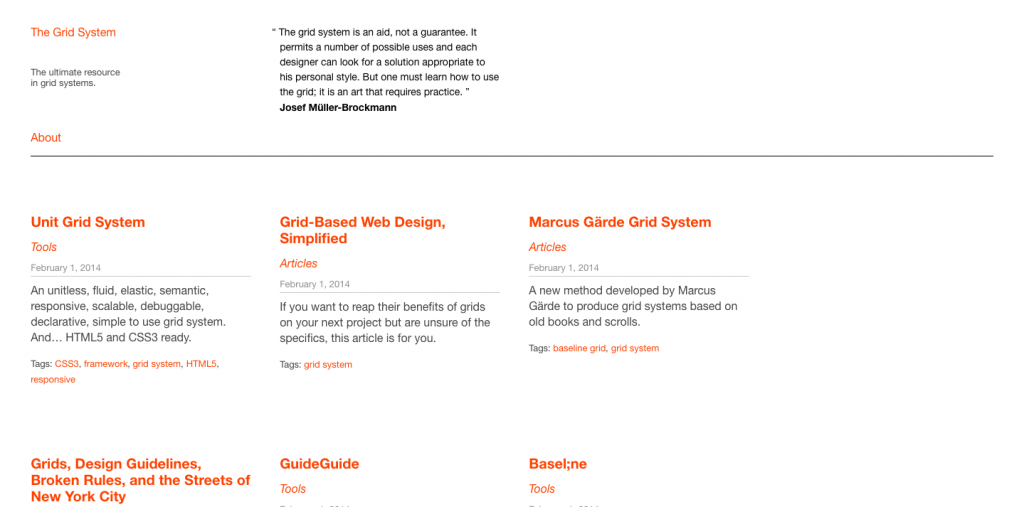
“The ultimate resource in grid systems.”
You can download InDesign templates, at 8.5 x 11 and 11 x 17. Good if you want to create a print portfolio, or if you want to redesign your resume.
3. People
A few portfolios in use
I randomly came across the following people, either in context of this post, or when reading an article, or serendipitously in some other way.
Caveat: In no way am I promoting any of the following people. I have never met them. I don’t know if they’re the kind of people who cut in line or litter. Maybe they don’t pick up after their dog….
The one thing that is true is that I took a look at their websites and I have an opinion. If you disagree, there’s a list of 80 portfolios above to check out.
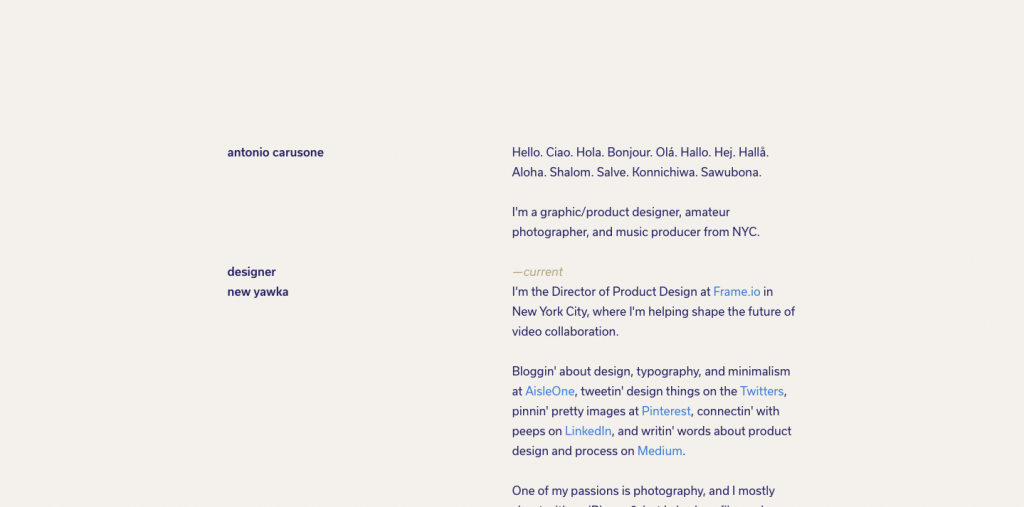
Antonio Carusone, creator of Grid System. A very simple website. No images. He simply links to his other websites, most of them photography sites. The site is made with Cactus, which is another static-site generator not using Jekyll. (The last commit was 2 years ago, so it may not be maintained.)
I viewed a few other personal websites like this: simple, text-only, with no images. I think this is a good way to connect disparate interests. He seems to have a lot of experience, which is also good to know if you’re looking for ideas and you’re not early in your career.
Hiroaki Ito has this project on Behance. I’m including this person because I attended a virtual recruiter session with Google. The three recruiters reviewed two portfolios, and this project was one of them as an example from a visual designer. (The UX designer was Simon Pan, who uses WordPress. It appears to be his own theme although it could’ve started from BlankSlate.)
The project above is a combination of several very long images, stacked one on top of the other. This designer has a job at Google. He does not seem to have as much experience as the first guy.
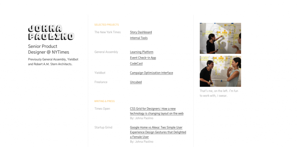
Johna Paolino is someone I came across on Medium. She wrote an article on using CSS grid. Then I found her website, which is hosted on github. So that’s another – FREE – option. Looked like an interesting site and she seems to be employed at the NY Times.
That big font is BungeeShade.
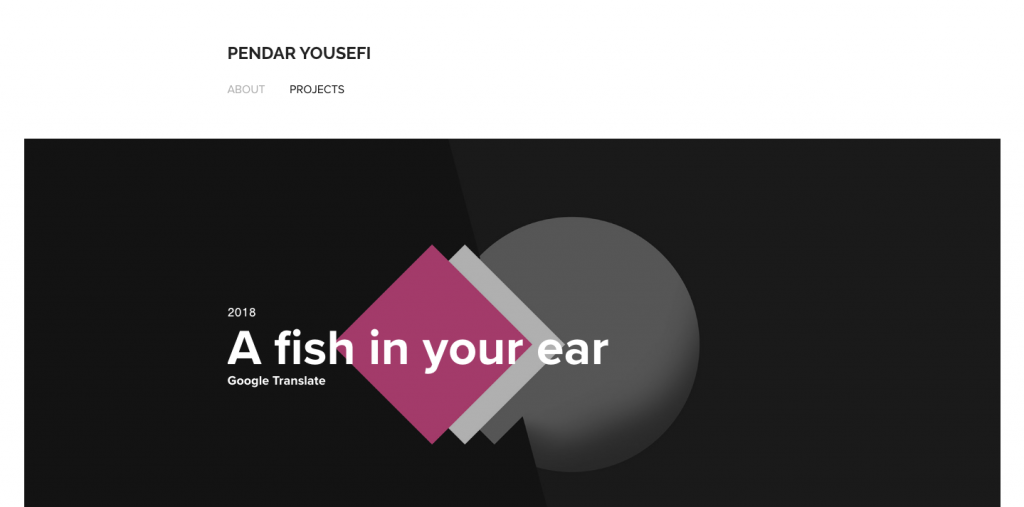
Pendar Yousefi is the only person I came across in the list above that used Adobe Portfolio. It was pretty nice looking, so I’m including that here. He also appears to be employed at Google. He also seems to have many years of experience, which is another good data point.
To be clear, you cannot create an Adobe Portfolio account and link it to a personal domain without becoming paid subscriber. He does a good job of connecting his web properties. For him, he’s getting his money’s worth. But I just want to make sure it’s clear, according to the website, money appears to have been exchanged.
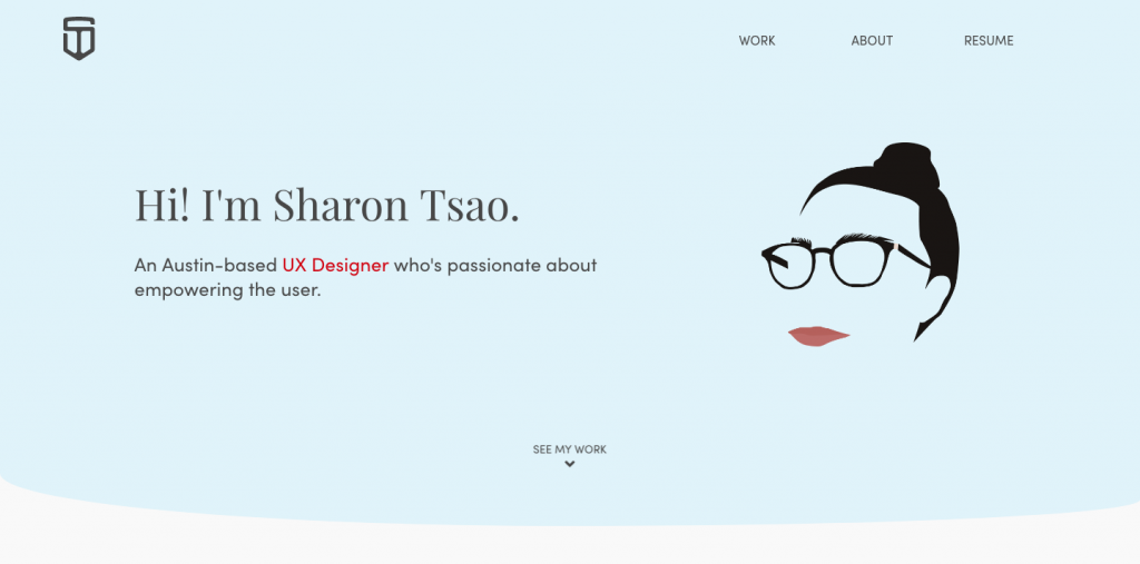 I came across Sharon Tsao‘s portfolio above, too. She does NOT appear to be employed. But I thought her simple site was an interesting example, and she seemed to explain her background particularly well.
She built this herself, or at least she did not use a template or CMS.

Thoughts & Reflections
I wrote this post over the course of 1-2 weeks. Right away, my initial thoughts for my own portfolio when the time of this post were to create a simple site that links out to other websites or to just expand my current WordPress installation (this blog). I also considered installing a separate WordPress instance altogether, which is still a strong possibility.
Yet after writing the majority of this post, I continued to investigate the list of 80 portfolios. I kept finding new CSS and JavaScript libraries. And, I wanted to dig a little deeper into some of these to find out more about how they were made and other details that the guides above don’t really get into.
Despite my rant at the top of this post, I have started to change my opinion a little on the importance of portfolios. I think there is something to be said for trying to display your work in as good a light as possible.
I’m still collecting more data about these 80 portfolios, so there will be another post. And I’ve found more items to add to the Tools section (Webflow, anyone?), so I’ll probably continue making updates to this post in addition to simply posting again.
[Featured image credit: Photo by Pierre Bamin on Unsplash]