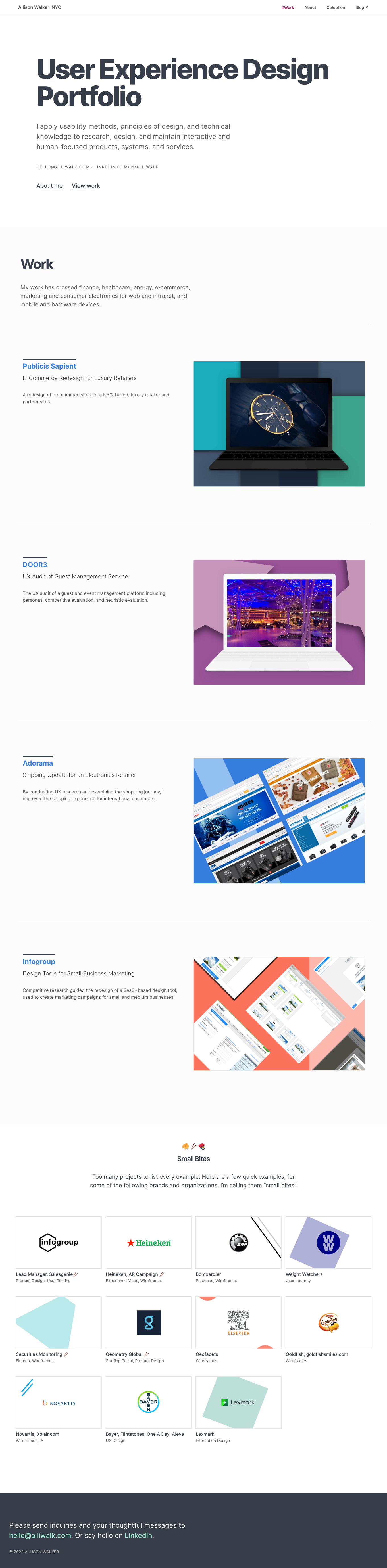
I recently updated my portfolio again. I do it every year, I guess. As before, I designed it in Sketch, with some on-the-fly updates in CSS. Here’s a look at the after:
List of changes
I still have some changes to make, but those are relatively minor. Here are some things that have and haven’t changed:
CSS Framework
I’m still using Tachyons, which is a low-level, utility CSS framework. I’ve started to move some styles to my stylesheet, partially to keep the HTML clean and also because I enjoy writing CSS classes.
Now Optimized for Wide-screens
Something I wasn’t aware of before was that the page content was floating left on super large, 4K screens. I optimize my site for mobile use, but I only have a laptop screen at home. I didn’t even think about this previously!
Well, I fixed this, by giving the pages a max-width and centering content, but I’m annoyed that it happened and I didn’t know until now.
New Inspirations
The overall inspiration for my website comes from Swiss design posters, but I was additionally inspired by two more websites.
- Paravel has a simple global navigation and conveys a lot of information about projects, without being cluttered. A good example of including text, but not too much. I borrowed from their All Work section at the bottom of the page. paravelinc.com
- Salt & Pepper sticks to neutral tones of black, white, light tan, has lots of white space, and uses big titles for their sections. It reminds me of some of the original goals for my site. I added more white space to the landing page, similar to their main page. snp.agency/en
New Projects
Overall, I added three projects, moved one, and removed one. The one I moved went to the new section, as described next.
Below the main project area, I replaced the images of brands and companies, and instead added a grid of rectangles with logos. Some of the logos lead to new pages with shortened projects. I decided to call these shortened projects “Small Bites”. Most of these projects are examples of individual design artifacts, rather than complete case-study reviews. The reason for this is I wanted to share examples of good work, but I don’t always have a strong story to tell.
Main web page update
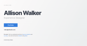
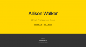
I also updated my main website home page. Previously it was yellow and dark gray. At the time, I wanted to give an equal weight to my Cargo collection portfolio (which is really only because I am paying extra for that), and my blog. I decided that page was embarrassingly bad, so I updated it for something a bit nicer. I had to admit to myself that most people will be viewing my website to view my UX portfolio, so I made that more prominent.
Maybe I’ll update this page to include more personal stuff, like my GoodReads list, or a recent blog post, or something. And, I’d like to make it more Swiss-poster style, so there may be more changes.
Favicon
I updated the favicon to a little green square. I used to get confused about which page I was on, but I’ll probably change it back. It’s not really meaningful for me.
I like the tree. 🙂
Still no subdirectory for Work
I’ve considered moving my projects into a sub-directory, like alliwalk.com/ux/work/project-name. But there are 2 reasons for not doing that.
The first reason is creating a work directory would require creating an index page. The obvious thing to include on that page is the list of projects, which would mean moving my projects to that page. I’d like to keep the navigation flat and stick to the one-page design.
The second reason is I don’t want to be using long urls. And I guess another reason is that the About and Colophon would then be hierarchically above the project pages, and that’s not right, either. So everything will stay where it is.
Help from StackOverflow
I ran into two CSS/layout issues, related to images and the footer.
Problem 1: Images. In one case, I was getting this thin, black line showing up around some images on a new page I’d added where I wanted to use a different effect for image hovers. The effect meant I had to wrap the images differently than just placing them on the page. The only problem was that I could not figure out where the border was coming from, until finally I found an “How to remove a border of background-image“.
I had been adding images using like this:
<img style="background-image: url(https://www.w3schools.com/css/trolltunga.jpg)"/>
This is incorrect. Image tags require a “src”. The other option is this:
<div style="background-image='url(image.jpg)'"></div>
The only problem is that it’s not exactly semantic, and it’s not accessible, as is. However, it can be made accessible by using role and title attributes, which is what I did.
Problem 2: Footer. The other question I found helpful was related to the footer, which was not sticking to the bottom of the page on some pages. Bootstrap has an easy solution for it, and I thought I found another option that would work, but it failed, too. Finally, I found “DIV content overflows into footer, makes footer go upward on page” which provided a simple solution, though kind of hacky solution.
And, I guess the other thing is I never shared the results of the research I did in 2019 on UX portfolios. I checked on it again, to remember all of my findings. But, I don’t know if it should be on SlideShare, or if I should put it on LinkedIn, or just on this blog. I don’t know. Something to think about.
I was hoping to present it at UX Camp this year, but….