For my final, I wanted to go back to some of the themes we’d discussed earlier in the class, related to advertising and basically using attractive people to make us think that we can be like them if we subscribe to the advertising message, too. But, in our teacher’s lottery to pick a pre-ordained theme, I’d chosen Romeo and Juliet.
At first, I’d decided to make ads featuring items from various scenes or speeches in the play. Maybe a new GPS for that lousy messenger you know. Or maybe an ad for poison, for you and your loved one. I looked on archive.org for good old videos about poisons, while I didn’t find any on poisons when I started using “drugs” as my keyword, I got a nice little video featured George W. Bush. Given my attitude towards this former president, I wondered if sexy advertisements would have positive effects for me….
I think not, but decide for yourself. It’s short but there’s a lot in there. (NSFW)
Seems like sometimes things happen at the 11th hour! After submitting my dress to the Winter Show, I ran into a few logistical snags in the assembly and finish of my dress. Namely, misplacing my trimming and, after replacing what I thought I’d lost, running out of material and needing to make another trip. But, it was all finalized in time for the show, which was great.
Where I last left off, I was remaking the form of the dress in order to make for a more attractive silhouette. The Photoshop image really did help a lot, not just for the structure, but also with helping me imagine the colors – looks miles better in person. I did end up adding more connections between each section, which came in very handy when I was dealing with the wood, but what I didn’t account for was the rather significant weight difference between the foam core pieces and the wood. Even though my pieces were only 1/16″ in depth, they were much heavier than the foam core which made. This wouldn’t have been an issue, but my new connection was a very pretty semi-elastic, black mesh material about 1″ wide – not as strong as my macrame, but less initial work I suppose.
Anyway, after I was finally satisfied as much as I could be with the structure of the dress, I took out a ruler and notated the dimensions of each piece, on each piece. These dimensions, I transferred to Illustrator so that I could use the laser cutter to cut out each piece. Meanwhile, I spent some time on the websites for Sephora, Chanel, L’Oreal, MAC (really just for color), Lancome, etc., to find the names of foundation colors. I also decided on a font after downloading several: a slightly modified Perpetual Titling MT. Using this font, I put the names of a foundation color, either real or imagined, onto each piece of wood with a raster etch setting using the laser cutter. This step took a 2-3 days; human error issues.
Finally, I had all my pieces…but still, I had to dye and attach them!! This is finally where my hard work in finding the right colors paid off. At first I felt really overwhelmed because it had been so difficult the first time. But, when I finally sat down, with a good chunk of time to work, it was fine. Writing down the formula on the back of each sample piece was super helpful, but so were my notes. My only regret for this step was getting flustered and rushing when trying to meet an earlier deadline, and not dying both sides of each piece. In the first case, I wasn’t very methodical about the colors and in the second, it meant that the wood pieces slightly curled a bit when they dried. Apparently, this is a feature of basswood….
On to attaching! For this, I used black felt in 2 layers. The first layer went directly onto the back of each wood piece. Then, my connections attached to the under layer of felt, which was then covered with the 2nd layer of felt, to give it a nice attractive finish. Let me just say that I love hot glue. It was at this point that I realized that my wood panels were so much heavier than the foam core, and so I spent a decent amount of extra time reinforcing what I’d already glued. Very time consuming.
Finally, with dyed, felted and attached and reattached pieces, I decided that enough was enough, and I just needed to put it on the dress form. Right before I did so, I draped some black felt over the form to make a little dress, which I actually quite liked and got a few compliments on my unknown draping skills. I thought the black just helped the pieces pop out nicely, but it was difficult to see the connections between each piece. I also made the dress because while I’d done what I could to help the dress fit properly, it wasn’t perfect, and an under-form seemed to help give it more body than it would if it had directly been on the dress form. Ultimately, the front and back pieces were not connected to each other, and I used straight pins to help the pieces sit flatter on the black felt. An aesthetic decision.
During the show, I got a lot of “But, does it do anything?” questions. No, I told them. It’s more conceptual. Then I began explaining my process and how I’d done everything by hand. Sometimes they tried to find their colors, which was fun to help them with. I’d gotten much faster at it. It was a fun project. Definitely different from my video piece, but still the same in that the last piece required a physical action that affected your own experience, with a slight augmentation by technology to affect the experience, rather than using a physical action to use technology directly to augment the technical experience. I do have to say that I enjoyed many of the other students’ projects – very magical. Still, it was a fun project for me. I hope you enjoyed the photos!
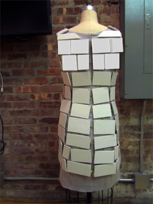
A few days ago, I got a turn with the dress form again and, taking another look at the silhouette of the dress, I realized that I needed to make an adjustment. Compared to the back of the dress, the front just wasn’t very flattering. It didn’t have a very feminine shape and didn’t hang properly. So, I went back and remade the front of the dress, which now looks very good. I put more connections between each of the pieces, so now, in addition to looking better, it’s also sturdier – which is very good. I’ve decided to take a more critical look at the back, and it’s possible that I’ll redo the back again as well. The way I redid the front of the dress without getting too committed was to sort of recut the dress in Photoshop. I got a much clearer idea of the finished piece without doing anything drastic. Plus, I used these wood samples I found on the internet to stand in for the foam core. Doesn’t look as nice as I want the final piece to look, but it’s fine for now. For the back, I don’t think I need too many changes to most of the pieces, but I do think that adding more connections between the pieces will help it look less saggy.
The pictures show the original front, with wood; the modified front; and the back, with rows 3 and 4 modified.
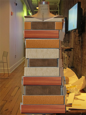
I’ve spent a good deal of time recently experimenting with mixing different strengths of dyes and water, and mixing them together to find the believable skin tone shades. While this has been fun, it’s also been really tedious since skin isn’t just light or dark brown, it’s also a little red and a little green and yellow. I’ve been mixing and mixing…and it was just today that I added the red. I think I might be getting a bit too specific, in that I’m trying to find the “right” shade, even though in the end, it’s going to look like wood that’s been dyed, no matter how much time I spend mixing. What I might try is to hold a few shades up to someone, and then take a picture. Cameras tend to flatten shades and from far away, I’m not sure if I would really be able to notice the individual fluctuations in skin tones, so I’d just see the overall tone (and be satisfied!). Eventually, I’m just going to have to stop and move on. But, I think I’m close.
The wood I’ve been using has been balsa and bass wood, that I found at Blick. I’ve been cutting them into 1″x3″ rectangles. For a while, I was using both types of wood but I’ve just been using the bass wood for now. The color is more consistent and the texture is smoother, which makes experimenting with shades easier. I guess it could be argued that skin is not always smooth and consistent. Alright, well, I just like it better. Plus, it’s cheaper.
In mixing the shades, I used a medicine dropper for infants to be precise in my measuring – not only so I can remake the shades again, but also so I can use tiny amounts of dye at a time. The dye is aniline dye, both in liquid (brown, red) and powder (blue, yellow). The dye is extremely strong, so only a tiny, tiny amount is needed at a time. The dropper lets me use 0.2mL of dye at a time, whereas for the powder I found this little plastic/rubber thing that has very shallow rectangles that I can fill with dye. Each little rectangle is about the size of a fingernail clipping, so these are very tiny rectangles. I think I prefer the liquid dye. It’s easier to work with; I’ve found very small particles of blue dye on what I thought was clean bass wood, which is annoying and wasteful since I have to start over with another piece.
When I first started, I was using foam cups, and starting over with my mixing everyday. Recently, I started using this Press and Seal plastic wrap and switched to small Dixie cups to store mixed dye so I don’t have to go through the whole process of making it again. The Dixie cups aren’t very storage friendly – not as good as the foam cups – but I can store more stuff on my desk and I don’t need to fill them up completely. And the Press n Seal lets me clean as I go. I also have a little notebook that I’ve written down a bunch of colors in and given them code names, like P1R20Y1G3. I just write down the ratios and how much water to dye I added so I can remix the colors again, if needed. For instance:
P1 = .2mL dye/25ml H20
R20 = .2mL dye/100mL H20
Y1 = 1rect of yellow dye powder/100mL H20
G3 = 3:1 ratio of green to water
…and so on. This can go on forever. I just bought the red today, so I’m looking forward to finally narrowing these colors down. I’m determined to find my skin color, which is hard to find anyway. I think if I can find me, I can find anyone.
So, I’m now researching wood, wood stains, and bindings. I’ve got a good idea, sort of, for the wood stains – just mix until I get a color that sort of looks like a skin tone. Repeat. The difficulty will be in getting quality dyes, doing the mixing, and preparing and finishing the wood.
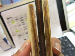
The bindings, or how to connect everything together, is a challenge. It’s easy with foam core and hot glue, but now I’m thinking of the wood. Hot glue is not going to cut it. I sort of worked out this thing with twine…. I don’t know. Looks ugly to me. The difficulty is the fact that the pieces need to attach both vertically and horizontally. It’s the side-by-side stuff that screws everything up.
My next activity is to brainstorm more on the binding aspect. I’m going to try researching samurai costumes, since that’s what everyone says my prototype reminds them of, and also Hussein Chalayan’s work. I’ll also just try sketching out a few ideas and working more with twine and the pieces of wood.
In Frame by Frame, my assignment was to create a new piece using video. Originally, I wanted to use this footage I’d picked up on a train ride to Beacon, NY. Here’s a short video of stills from the train ride. Short, fast film
BUT, as it turns out, I ended up sticking with my whole body image theme. As I explained it originally, I had the idea to tackle plastic surgery. I wanted to take a picture of a face and then turn it into a face that had seriously been “augmented” with plastic surgery.
Then, right around the week before the project was due, I got this book about my grandmother. It’s actually her biography and oral history, which is one of the Legacy Projects coming out of Washington State.
As soon as I saw her picture on the cover, I changed my project idea. I decided to focus on identity – the personal identity we use to describe ourselves, the identity of who we are in our families, and the basic identity we have as humans and organisms on Earth. With a few images of my grandmother, I was able to morph a picture of her in her 80’s to a picture of her as a young woman, and then finally to me. Then, to add video, I overlaid some clips from a Prelinger Archive video on conception.
As I did the work, and thinking about the final product, I feel that I was able to capture our simultaneous inner and external identities, while still representing the fears we hold about our aging appearance and ever approaching deaths. And, yet, even with the objective knowledge of who we are and who we originate from, which experience only subjectively and idiosyncratically, in the end we cannot escape science and biology. All of us, every living thing on this planet, starts life the same way – just a bunch of DNA dividing. Lucky or not to be human, despite all the time and effort we put on forward on this earth, no matter how much we may achieve or may not achieve, we can never escape our genetic fate. It was decided at conception.
So, here’s what I made. But, I need to upload a new version without the sound. At this point, I think adding the sound is too early. Particularly because it extends the timeline too far after the video stuff has ended.


