Human factors design for subway escalators

As a recent transplant New York City, I of course compare my experience of living here with my experience of living everywhere else I’ve ever lived or visited. Just recently, I was using an escalator on the subway to go up to street level. As I rode up, I noticed that there were no emergency stop options anywhere on the escalator. I know such an options exist in plain site in other cities subway systems because during a recent trip to London I actually had to push the emergency stop button to stop the motion of the escalator. Just as I had gotten on, an old Italian couple in front of began falling down the stairs, literally, head over heels. The old woman had to have been at least 70 years old, and her husband was probably older. If I hadn’t pushed it I think they would have just kept falling forever, or at least until one of them had broken their neck.

When it happened, I was so shocked by what was happening, I couldn’t move. A woman standing in front of the couple, roughly in her late 30s, started yelling for someone to stop the escalator. Not being from London, or even, at the time, a regular rider of subway escalators I wasn’t really sure what to look for. It was only 3 or 4 seconds of the couple falling, but I felt a sense of panic that my hesitation in stopping the escalator would lead to the couple seriously injuring themselves. Luckily, as you can see from the photo from Transport for London.gov, the emergency stop button is right in the middle of the escalator, red, and accessible from all sides. (I had just gotten on the escalator, so I was about 3 steps away.)

Emergency stop on London Underground

To me, this is a really good example of the importance of human factors design. I couldn’t tell you now what the button said, if anything at all, but I can tell you that it was very easy to push and to see once I knew what to look for. Sometimes it’s important to just remember what we’re designing for. It worked, in an emergency, by someone who had never used it before and was not even from the country. That’s a pretty successful design if you ask me.

Bronx Rhymes via Twitter

A celebration of the birthplace of hip-hop, Bronx Rhymes combines online experience, with music, creativity and the urban environment. The site asks users to post their own rhymes via text message or email. The website also features a map and there are posters at each corresponding map location. Not only is this such an interesting way to combine several media types, and interactive experiences, I also like the website! 🙂

Bronx Rhymes logo
Bronx Rhymes logo

http://transition.turbulence.org/Works/bronx_rhymes/index.php

I recently attended a talk at NYU Reynolds Speaker Series, on January 26, featuring Chuck D who conversed with the audience on the need for the hip-hip community to raise their level of expectation for hip-hop music quality, and on developing a personal, unbiased opinion of hip-hop music.

Interview on Tea with Teresa, on “What the Heck is User Experience Design??!!”

TeawithTeresa.com has posted a podcast with Jesse James Garrett on ‘What the heck is User Experience Design?’ (21 minutes).

http://www.teawithteresa.com/2009/02/what-heck-is-user-experience-design.html

One of my favorite parts of the interview is when Garrett likens User Experience Design to the experience of a date. Very fascinating and quite the coincidence for me, especially since I just saw the movie “He’s Just Not That Into You“.

Here’s a link to download the podcast, or you can download it from iTunes.

SafeUnsubscribe, a nice way to send a rejection

I recently relocated to New York City. As a consequence, I’ve been unsubscribing from a lot of email lists lately. A surprising number of them are using this service called “SafeUnsubscribe“/(SafeSubscribe) from Constant Contact. I guess this post is what you call “free advertising”. Actually, I don’t mind this at all. The service is really simple to use, and actually somewhat enjoyable. It makes me wish I had signed up for more newlists so that I could remove myself from even more.

Here’s a screen capture of the unsubscribe link at the bottom of the email I received. (Yes, I frequented the Russian Cultural Center in Houston).

Screen capture of the SafeUnsubscribe link in my inbox.

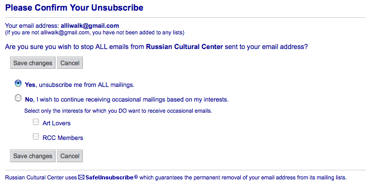
When I clicked on the “Instant removal with SafeUnsubscribe” link, I got to this page, where it gives me a few clear options on what I’m unsubscribing from.

Unsubscribe options page

A few things I like about this page:

  • The email confirmation at the top that says that I don’t have anything to worry about if I’m not the person listed.
  • It’s a confirmation page, and technically it hasn’t done anything yet.
  • It gives me an option to reduce my emails vs. remove myself entirely.
  • It doesn’t features some log-in and then unsubscribe option. Usually when I’m unsubscribing it’s because I haven’t found whatever I signed up for originally interesting anymore and/or I can’t remember my password and log-in information anyway.
  • The Yes/No responses are written in sentence form, so it’s easier to understand that Yes = remove me/No = Cancel the unsubscribe; and not, Yes = keep me on the list/No = Unsubscribe.
  • The little guarantee notice at the bottom, which offers an extra dose of credibility to the site.

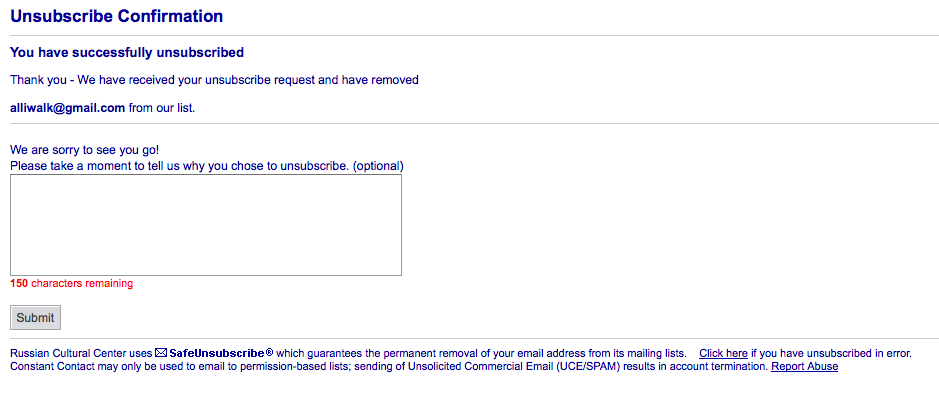
Finally, after clicking Save Changes, I get:

Final unsubscribe page

So, at this point, I feel really impressed that the Houston Russian Cultural Center is so dedicated to respecting my wishes and my privacy, and has such a fast way for me to get off their subscriber list. Check out Constant Contact’s Anti-Spam Policy, which they state is no tolerance:

“Constant Contact is a permission-based email-marketing tool that follows the strictest permission-based philosophies:

  • Communication – Your Constant Contact registration page already states why you are collecting the site visitor’s email address, how you plan to use their address, and that you are following the embedded privacy policy. Additionally, by accepting our license agreement you have agreed to use only permission-based lists and never to sell or rent your lists.
  • Verification – Constant Contact automatically sends all of your new contacts an email confirming their interest in receiving emails from you. Additionally, if your contact changes his or her interests or unsubscribes, Constant Contact automatically sends an email confirmation.
  • Unsubscribe – Every email generated from Constant Contact contains an unsubscribe link which allows your contacts to opt-out of future emails and automatically updates your contact lists to avoid the chance of sending unwanted emails to visitors who have unsubscribed.
  • Identification – Your email header information is correct because it is pre-set for you by Constant Contact. Your email’s “From” address is verified and already accurately identifies you as the sender.
  • Contact Information – all of your emails are pre-filled with your contact information including your physical address.”

This service certainly beats sending an email to someone’s personal email list and telling them you don’t want to get their emails anymore. Unsubscribe is not really rejection, per se, but it is an “I’m not interested” or “I don’t have time for you” type of thing. It’s nice to see such a well-thought out approach to goodbye. Kudos to Constant Contanct!

Art/Programming with A.B.S.M.L.

From the website at transition.turbulenc.org,

“[HTML and XML] allow us to write code that make up the internet as we know it today. But like it or not, the internet is boring and dumb.] A.B.S.M.L. (pronounced ABSML) is different because it is a language which writes itself, thereby making the internet interesting and smart. ABSML could be considered a text generator, but it’s much more sophisticated than that.”

Check out the screen saver on the site: flying toast and toasters with wings.

A.B.S.M.L. was used to supply the brain’s of James Chimpton, a robotic chimpaneze who interviews artists. Watch Chimpton work, inside the artist’s studio.

See also Turbulence.org, supporters of net art.

My gripe with tiny urls

The other day I got this newsletter via emai about some new conference in UX. Reading through the newsletter, I got to a few sections that used a few of those shorted URLs, such as created by websites like tinyurl.com. While I think shortened URLs are great for interfaces that have a restriction on characters, such as Twitter or SharePoint, I fail to see the good of a shortened URL in a newsletter. There are already gobs of text swimming around, what are a few extral characters in a URL going to do? I mean, if you’re going to take the time to write out an entire newsletter, I’d much rather see a longer and more meaningful URL than some shortened one that tells me nothing about the destination.