BBC News on UseIt.com

Today’s new UseIt.com article, “World’s Best Headlines: BBC News” is an article after my own heart: a glowing review of BBC News. More specifically, it’s about the concisely written, yet richly explanatory headlines on the BBC News website.

I am so excited to see this wonderful review because for a few years, I was absolutely obsessed with getting a job at the BBC. To be honest, I guess I still am. I started listened to the BBC News World Report on NPR a few years ago when I didn’t have a cable (and had THE worst TV reception) and therefore no T.V. I was so impressed with the quality of their reporting and how much I learned about news from around the world as opposed to the very US-centric news reporting that I tend to get even from NPR or other US news sources. They easily could’ve focused on British news and just tossed in tidbits of world affairs, but it really was “fair and balanced” reporting from around the world.

I was also very impressed with the aggressiveness of the BBC reporters in their interviews who don’t let anyone get away with ambiguity – even when they speak to British, US or other Western officials. I loved how they would just call people out and tell them point blank how whatever rap they were supposed to give to reporters was just a load of bull. Wonderful.

I even tried to apply to the BBC after gradschool. Unfortunately, it never worked out, but even in the job rejections I was so impressed with the their class. They would send hand-signed rejection letters. Typically, the standard response is no response, or when I was lucky I would sometimes get a dry, automated email message telling me that there were no jobs for me but my resume would be kept on file for a year. So, yeah. I guess I am still a bit in love with the BBC. 🙂

So, I was so happy to see this article about their online news source. It’s really great to see props given to a deserving news site. I do have one qualm about the article: Nielsen says that using “4” instead of “four” in the headline would provide more space. That may be true for many other non-journalism websites, but here it would just be bad grammar. In this case, I think it’s better to stick with news writing convention – which is to write out numbers from 0-9, and use numerals for 10 and above – than with website convention. (I am writing a blog, so who cares!? ;P)

I also thought Nielsen’s explanation of BBC’s excellence as originating from their days as a radio broadcaster was also interesting.

“The news organization originated as a radio station, where word count is at a premium and you must communicate clearly to immediately grab listeners. In a spoken medium, each word is gone as soon as it’s uttered…”

That is very true for the performing arts as well. Dance and music are both art forms that exist only the present (videos and recordings aside) and the art is gone as soon as it has been danced or played. For instance, one of my dance teachers once said to me that it’s important to be fully committed to your technique even in class and not just on stage because you only get the one chance to do that pirouette or that arabesque as best you can. You can try it again, but it’s won’t be the same step. I guess it’s the same as saying you never step in the same river twice. That type of attitude, that is doing your best even for mundane things, is a bit of a perfectionist attitude, but over time it can lead to excellence.

Ha! Yet again I’ve managed to connect dance and technology! Yay for me! 🙂

Cities that shape

Last Friday I saw the movie Tokyo!, directed by Michel Gondry, Leos Carax, and Bong Joon-Ho. It asks the question, do we define our cities, or do they define us?

Today, while checking my RSS feeds, I eventually saw something related to this idea. “Theory of the DĂ©rive”, by Guy Debord:

One of the basic situationist practices is the dĂ©rive [literally: “driftingĂ®], a technique of rapid passage through varied ambiances. DĂ©rives involve playful-constructive behavior and awareness of psychogeographical effects, and are thus quite different from the classic notions of journey or stroll.

He also writes:

In his study Paris et lĂ­agglomĂ©ration parisienne (BibliothĂ‹que de Sociologie Contemporaine, P.U.F., 1952) Chombart de Lauwe notes that “an urban neighborhood is determined not only by geographical and economic factors, but also by the image that its inhabitants and those of other neighborhoods have of it.Ă® In the same work, in order to illustrate “the narrowness of the real Paris in which each individual lives . . . within a geographical area whose radius is extremely small,Ă® he diagrams all the movements made in the space of one year by a student living in the 16th Arrondissement. Her itinerary forms a small triangle with no significant deviations, the three apexes of which are the School of Political Sciences, her residence and that of her piano teacher.

It’s basically mapping someone’s movements over a course of time, and displaying this information graphically. I disagree with the quote on MoonRiver’s blog describing “the narrowness of the real Paris in which each individual lives and which, according to Debord, ought to provoke outrage at the fact that anyone’s life can be so pathetically limited.”

Pathetic seems unfair. This is just a map of someone’s movements for a year. It’s not a determination of the quality of those movements and interactions. Let’s not forget, the map is of Paris; I’m sure there are many who would have loved to trade places with this student for that year. I guess perhaps it depends on what de Lauwe means by “image”, above. To be less serious, here’s another example from a dad mapping the movements of himself, his 2 kids, and their cat for 1 hour in front of the TV, on Flickr. Interesting stuff.

To answer the question, do our cities shape us, or us them, I think it’s a little of both, but perhaps as much as we make it so. In any case, the movie was quite entertaining and quirky to say the least.

Tokyo! is playing at the Landmark Sunshine Theaters, in NYC.

Gesture interfaces to getting a (fake) job – Part 2

I went to the Pace show last night and I tried out the School of Perpetual Training installation. My thoughts…

Actually, I think it’s rather difficult to design an interface using the whole body or using gestures in 3-D space. As I was interacting with the game, I found that I did not know which way I was expected to move my body. There are infinite possibilities within 3-D space and using this interface, there were no rules for how the interaction should occur.

I think this is one of the benefits choreographers and dancers have when moving in space. There are clear rules, based purely on aesthetic or artistic intent, that govern how movement should occur. As far as I can see, in terms of moving in 3-D space, with the purpose of interacting with a device, there are no rules defined. The result from last night: I felt, and I’m sure I looked, awkward.

And, actually, although it seems illogical or self-centered, I think most people do not want to look awkward. High-heels were invented to let ladies feel awkward, but look it we do not. It seems that making people look good while they use gesture-based input devices should be one of the top priorities for designers.

Using a gesture control interface to get a (fake?) job

Turbulence@PaceDigitalGallery is presenting 3 performances this month. One of them, School of Perpetual Training is an “edutainment” website that uses your web cam and an avatar to guide you through training exercises, so that you can get a new job.

I don’t have a web cam so I wasn’t able to try it out. However, I do live in NYC, so I’ll try to make it over to the opening tomorrow. If you have a web cam, try it out and let me know how it goes.

Event Details:

Pace Digital Gallery is pleased to present Turbulence@ PaceDigitalGallery, an exhibition premiering 3 works commissioned by Turbulence.org :: April 7 – May 1, 2009 :: Reception: April 7, 5:00 – 7:00 pm :: 163 William Street, New York City.

perpetual-training

I Met The Walrus – Manhattan Short Film Festival

I Met The Walrus, player

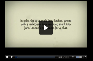
This week’s Manhattan Short Film Festival film, is “I Met The Walrus”. It’s an interview with John Lennon, portrayed graphically. I really like the interpretation the artist has with the graphics, sometimes being extremely literal but still funny. Click the image above, and head off on their site.

What’s important

Last Sunday our graphic design homework was to create some type of visual representation of our possessions, splitting them into things we care about and things we don’t care about. When I imagined this homework, I could not think of excluding the things that I used to own, very recently, in Houston. I actually didn’t want to do the assignment, because I felt that I had recently lost so much, in terms of property, friends, salary, change of lifestyle…etc. So when I approached this assignment, I could not imagine doing it in some type of sentimental fashion. I could only see the final outcome as something cold or clinical.

What I came up with is essentially a mock computer screen, representing a MySQL database dump of 3 lists. The lists fade in terms of importance (or non-importance), and the most faded list is the list of stuff that I no longer have. I decided to use a green screen, like DOS(?), like a command-line interface because it’s basic and the least comforting way to use a computer.

Moving.pdf