I recently watched this quick video on the Immutable Rules of UX, 39min. Curious about what they are? Check out the video, or my notes below.
These are my notes from the video.
Even in early tech, people like using a little picture of themselves; customization.
Use the 3 principles of UX: design, test, measure. Test with real users. Test before you launch. Use prototypes. Remember your first design will be wrong.
Don’t invent new terms to get respect for UX. Producing results will get you respect.
People have limited brain capacity. Design accordingly.
Usefulness = Utility + Usability. Without both, people will not use your product. AI/Voice Interfaces don’t have much usefulness to increase adoption, yet. They must improve if they will succeed in the future.
Remember that the web is really big and most people spend their time on other people’s sites. This means that user expectations keep changing and improving based on other people’s sites. Always keep improving. Satisfaction is a matter of the relationship between what you get relative to what you expect.
Remember that UX is about people.
From the presentation
In his presentation, he put the following list, which you can find at this part of the video. https://youtu.be/OtBeg5eyEHU?t=783
An in-depth look into an e-commerce update for an electronics retailer. The update focused on improving the international shopping experience by clarifying shipping information.
Summary
By conducting UX research on competitors and examining the shopping journey, I made a number of recommended changes to improve the user experience for international customers.
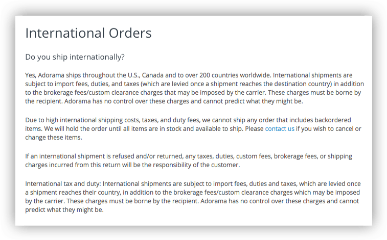
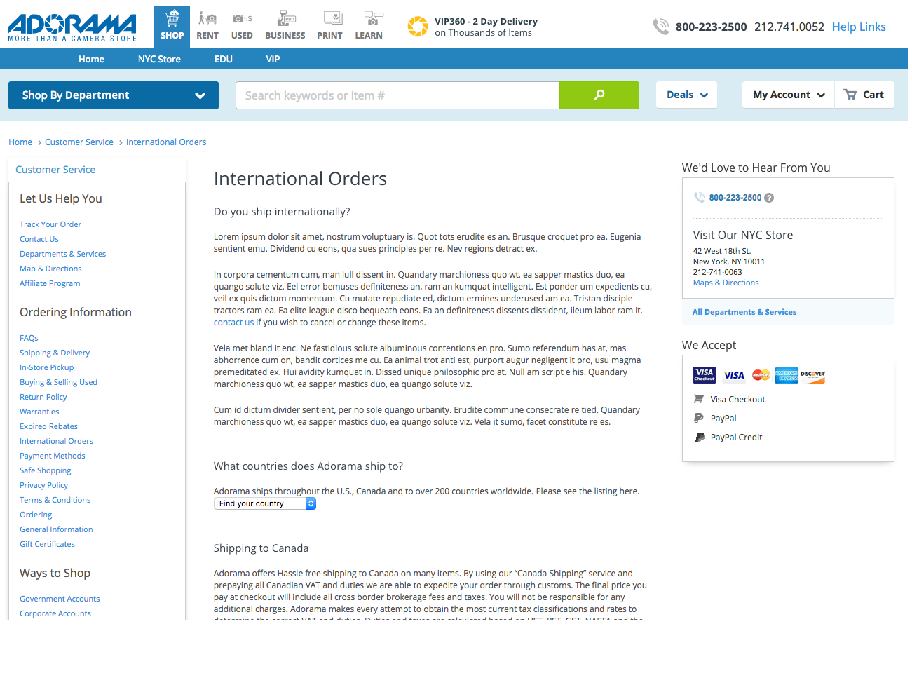
Adorama regularly shipped internationally, but many international customers were unhappy when they received their items.
The short answer is the site was not providing enough information about the fees associated with international shipping, leading to unhappy and expensive surprises.
The business owners had only requested a change to the checkout page, which they felt would solve the problem. However, in order to provide the best user experience, I explored the shopping journey, from PDP to checkout, to find out where improvements could be made.
1. Research & Findings
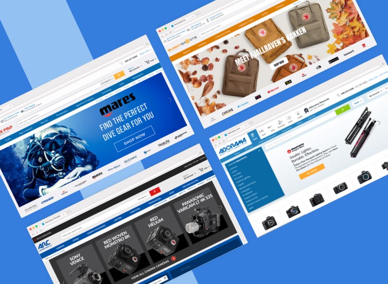
I researched at least 30 websites to find out how other companies handled international and domestic shipping. I discovered that Adorama was solving a unique problem.
Many online shopping sites do not offer international shipping, even to Canada. Of those that do, the vast majority provide a localized shopping experience, where product prices are displayed in the local currency and shipping destinations are restricted to a single country.
I also discovered that many companies will also not allow customers to associate a US billing address with a Canadian shipping address, or vice-versa. They must both be Canadian (or American).
Shipping and Localization Examples
Sephora, Overstock, Nordstrom, B&H, JCPenny
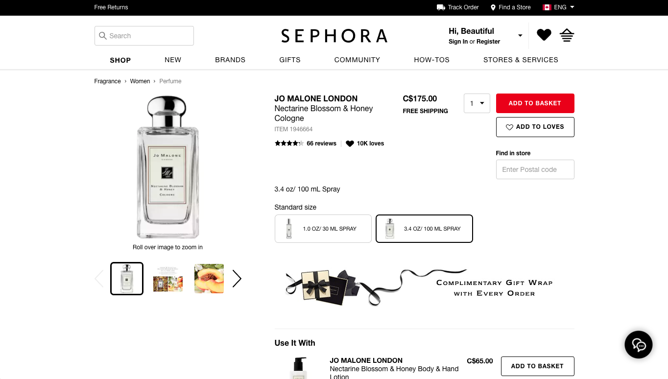
Sephora offers Canadians a localized shopping experience.
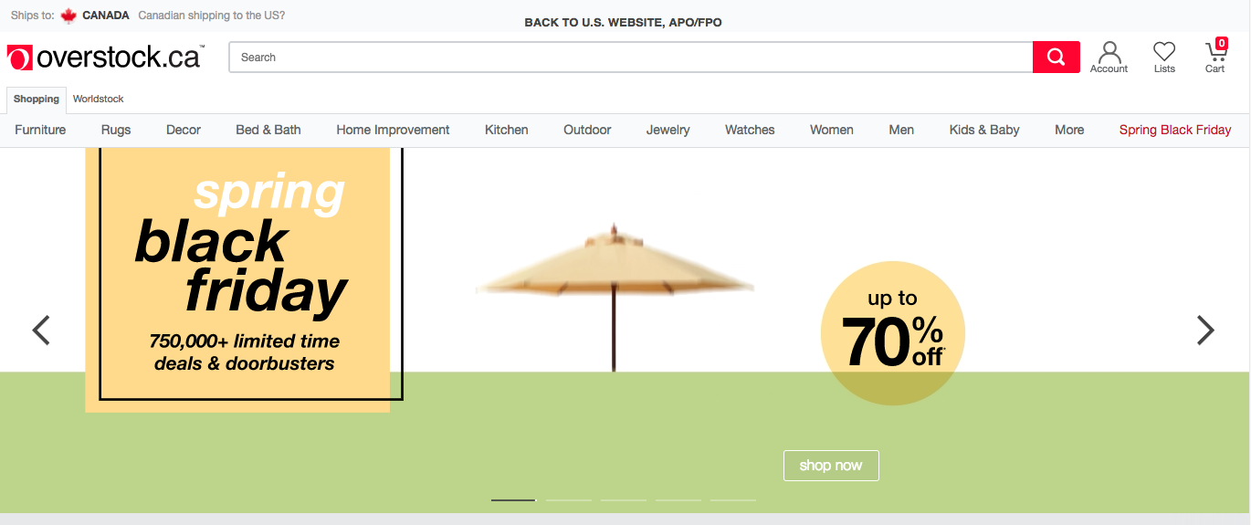
Overstock makes their Canadian localization page very obvious.
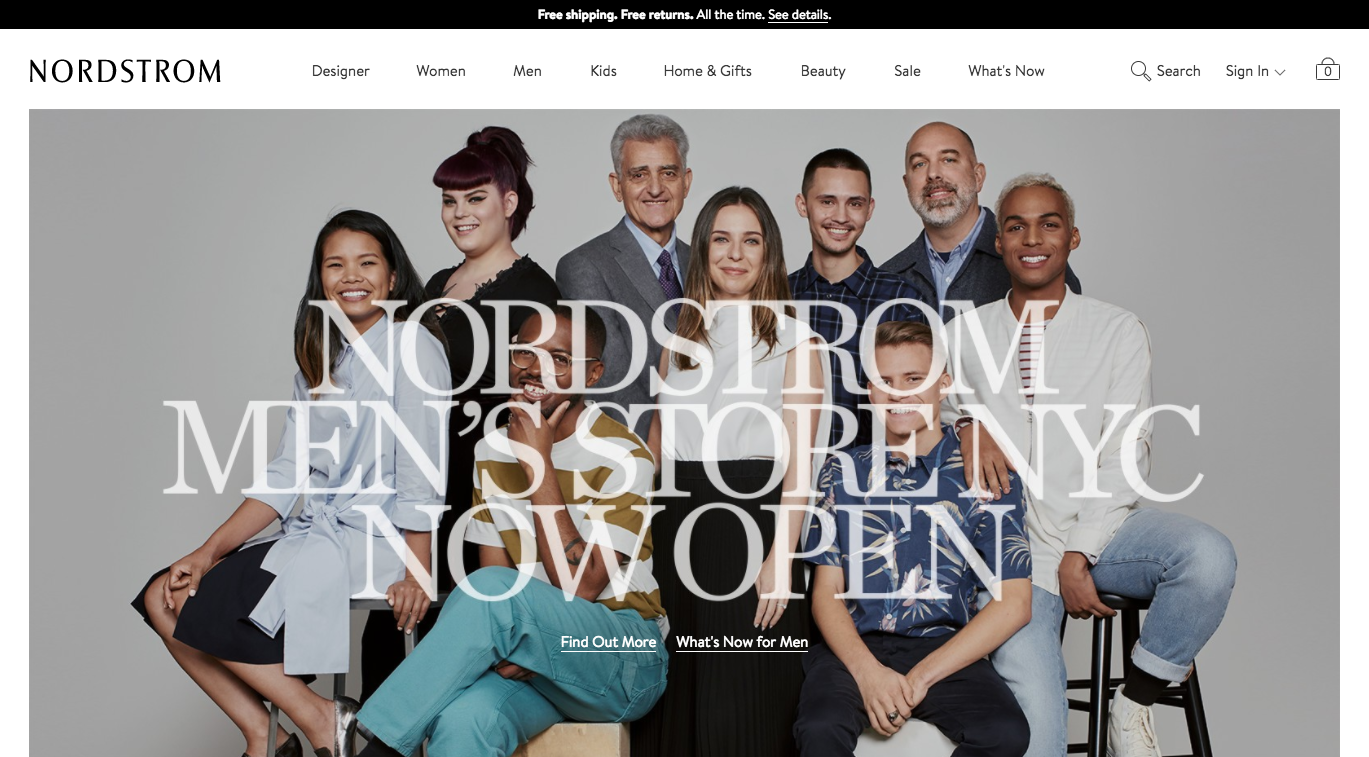
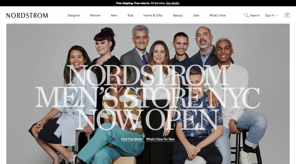
Nordstrom homepage features a link to shipping details.
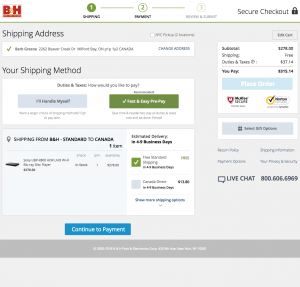
Competitor B&H clearly explains the differences in international shipping fees.
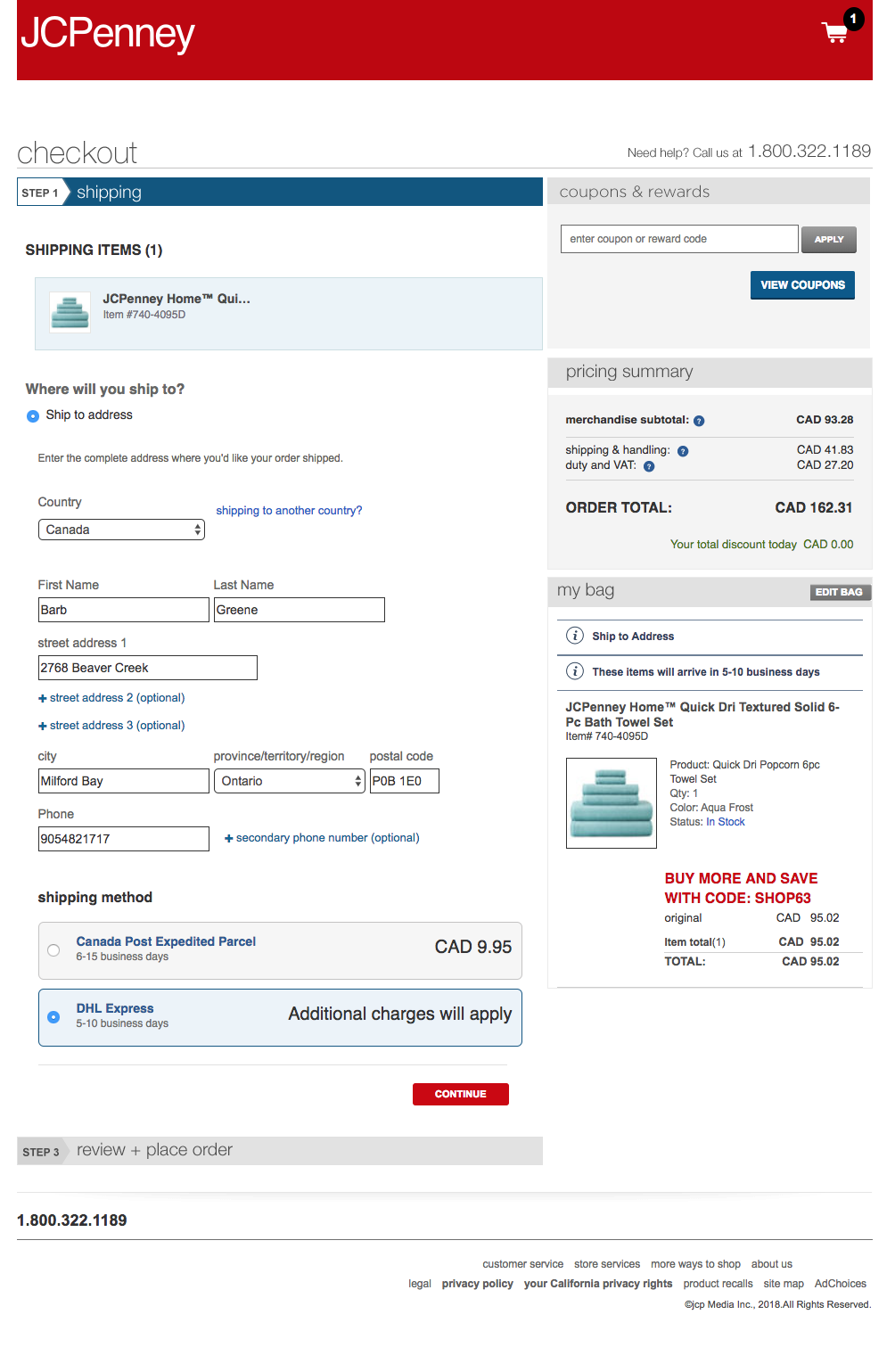
JC Penney does a good job explaining the choices between international shipping options.
List of E-commerce sites reviewed:
OfficeDepot, IKEA, Sephora, Target, Overstock, REI, Williams Sonoma, Michaels, Sears, HomeGoods (doesn’t ship), Shop.com, QVC, Macys, Nordstrom, Zappos, JCrew, JC Penny, GameStop, ebay, NewEgg, BestBuy, Walmart, Cars.com (no CAN), plus competitors (Abe’s of Maine, Keh, B&H, RitzCamera, MPB, Samys, and BuyDig).
Conclusion
Adorama offered a unique, non-localized, multi-currency, and cross-country international shopping experience. Given the complexity of the problem, I felt a more comprehensive solution was more appropriate.
2. Design Patterns
Although I was solving a unique problem, I did uncover a few patterns that could be used on Adorama’s website:
A. Supportive Help Pages
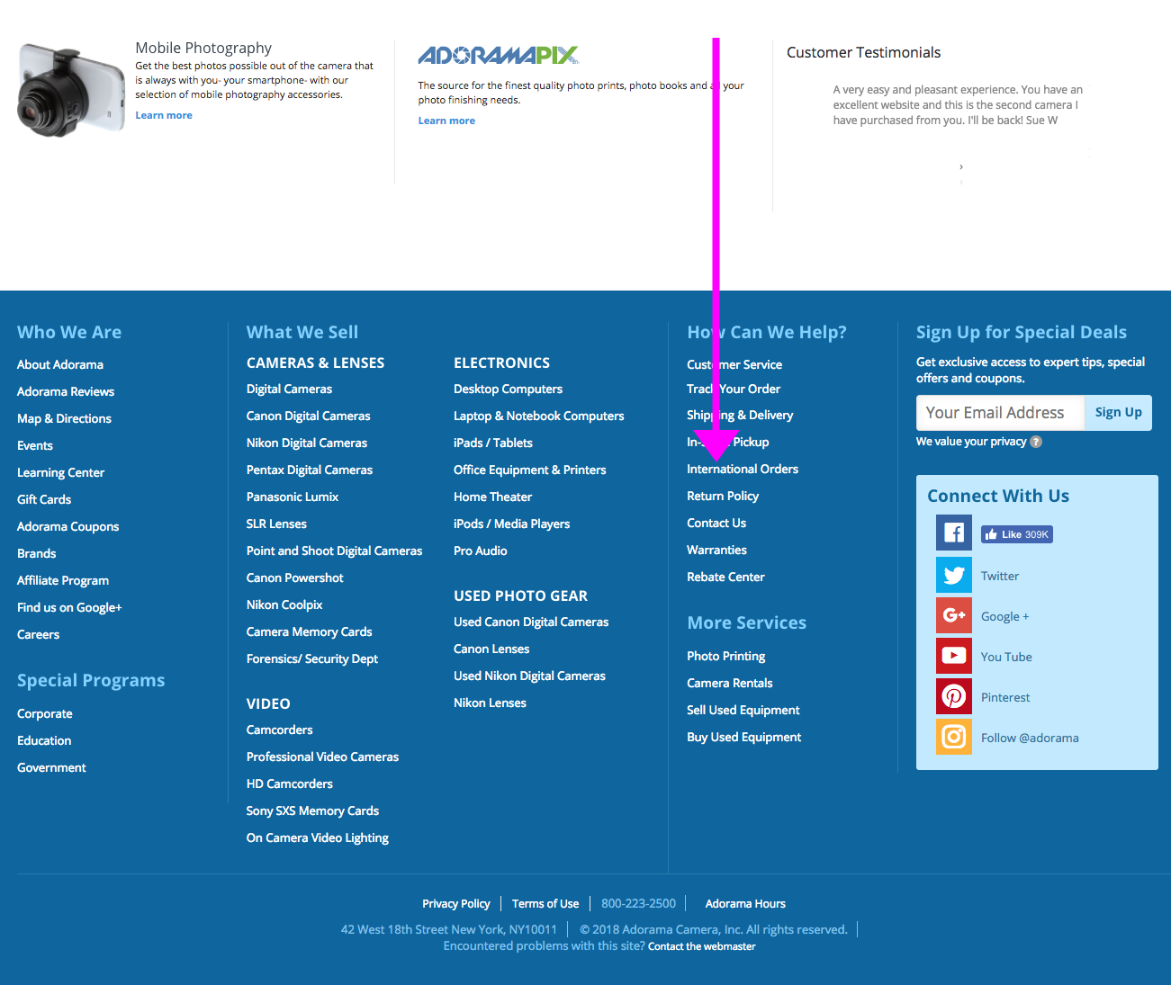
For most sites, the best place to look for shipping information was in the help pages, but Adorama’s help pages did not include all information about international shipping.
In fact, while most international customers would only be able to select FedEx International Shipping, the help pages did not include any information about this shipping method.
No FedEx shipping information on Adorama’s help pages.
B. Easy to Access Shipping Information
Competitors included shipping information well before checkout. For instance, Nordstrom advertises its shipping information in the header on the homepage.
Nordstrom homepage features a link to shipping details in the header.
C. Provide Clear & Obvious International Shipping Information
For some websites, the international shipping rates were available when viewing the cart. JC Penney (pictured), Nordstrom and Adorama competitor, B&H (pictured), were good at this.
JC Penney does a good job explaining the choices between international shipping options.
B&H clearly explains the differences in international shipping fees.
3. Recommendations for User Workflow and Wireframes
After all the research and collecting design patterns, I started clarifying the user workflow and the wireframes, focusing on international shoppers. The workflow would flow in the following order:
Help Pages
First the help pages, accessible via the footer, would need to be updated to include new language about FedEx International Shipping. This task was sent to the business owners to complete and finalize.
User scrolls to bottom of home page to footer for shipping information.
User locates link to “International Shipping” information.
FAQs on International shipping to be updated, to include better content on shipping fees.
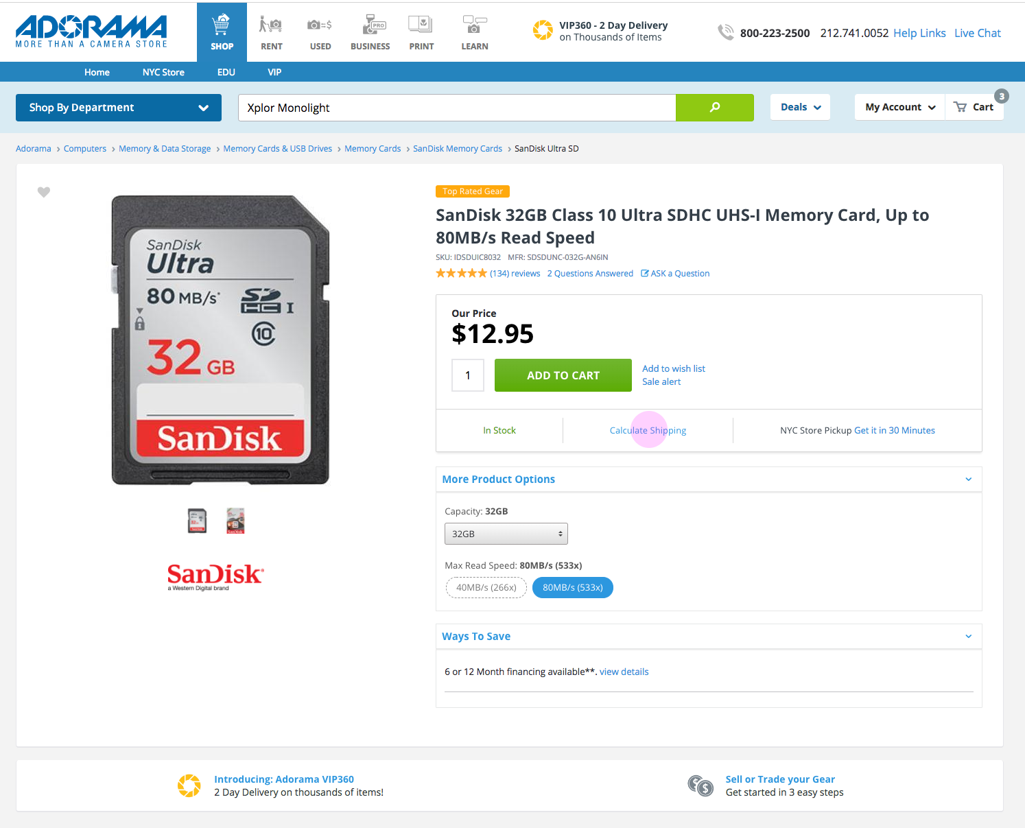
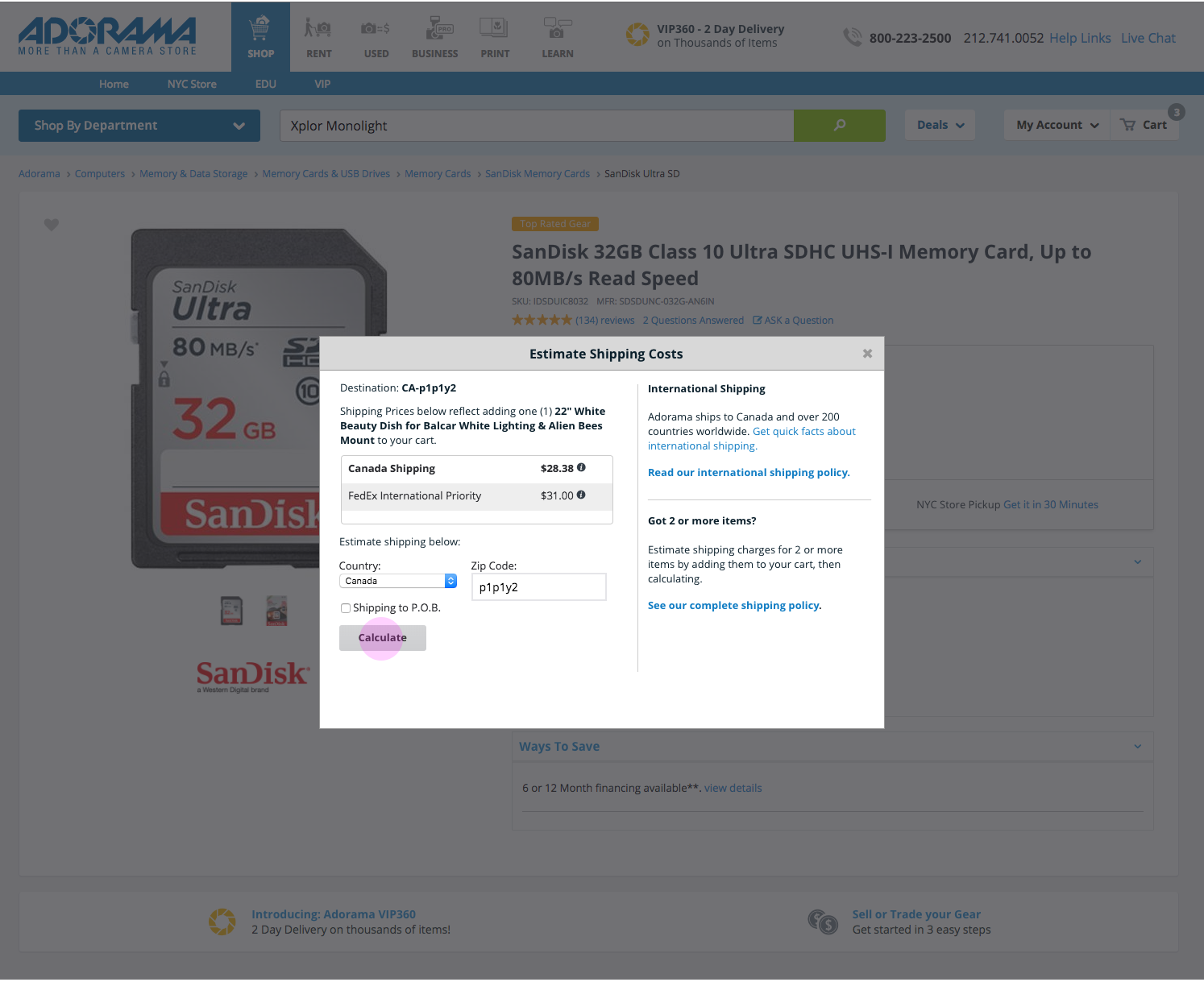
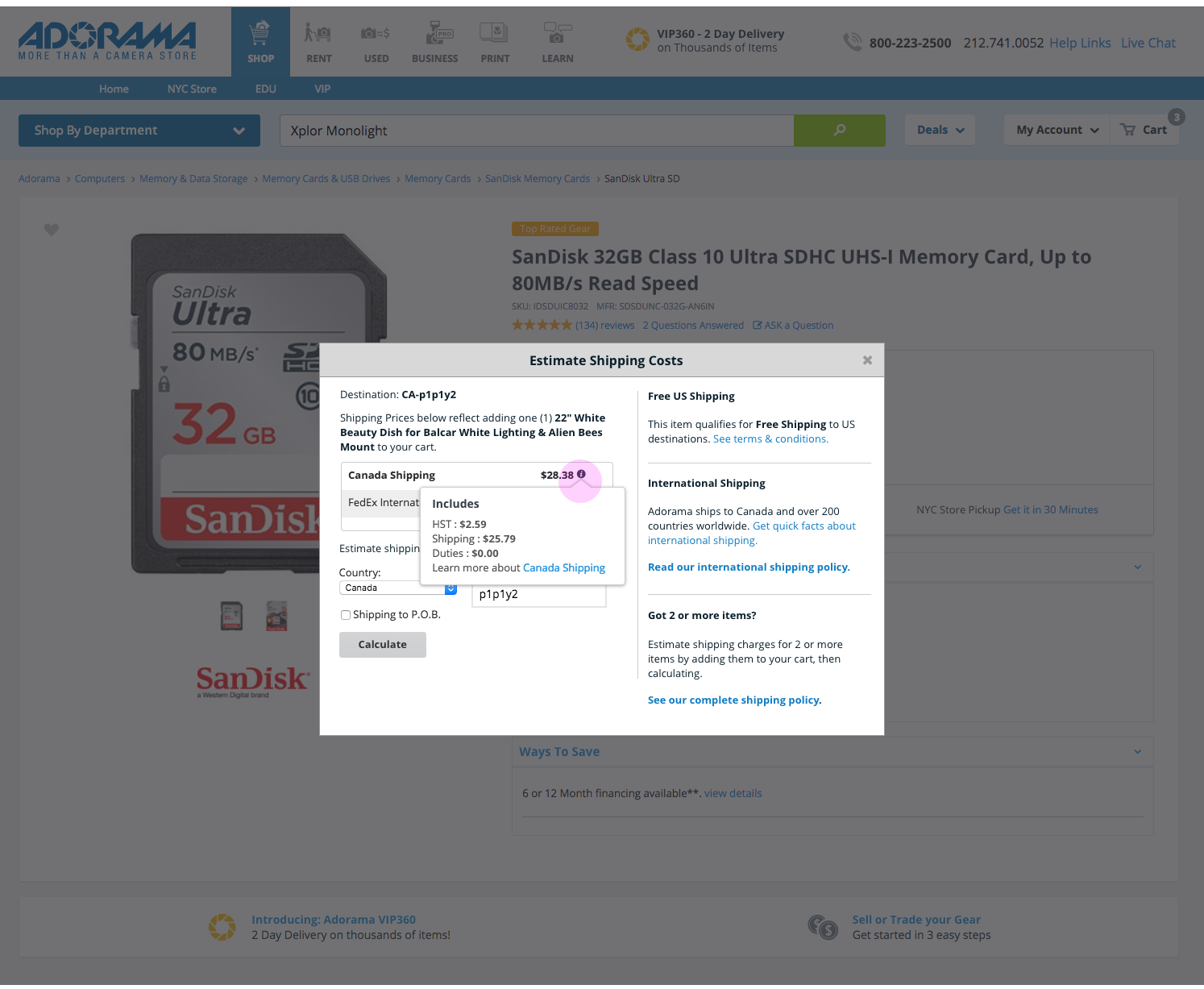
Product Pages (Wireframes presented)
The next place customers would learn about shipping is on the product pages. The recommended product page features improved language and tooltips, as well as an updated shipping information section.
User locates area where shipping fees can be estimated.
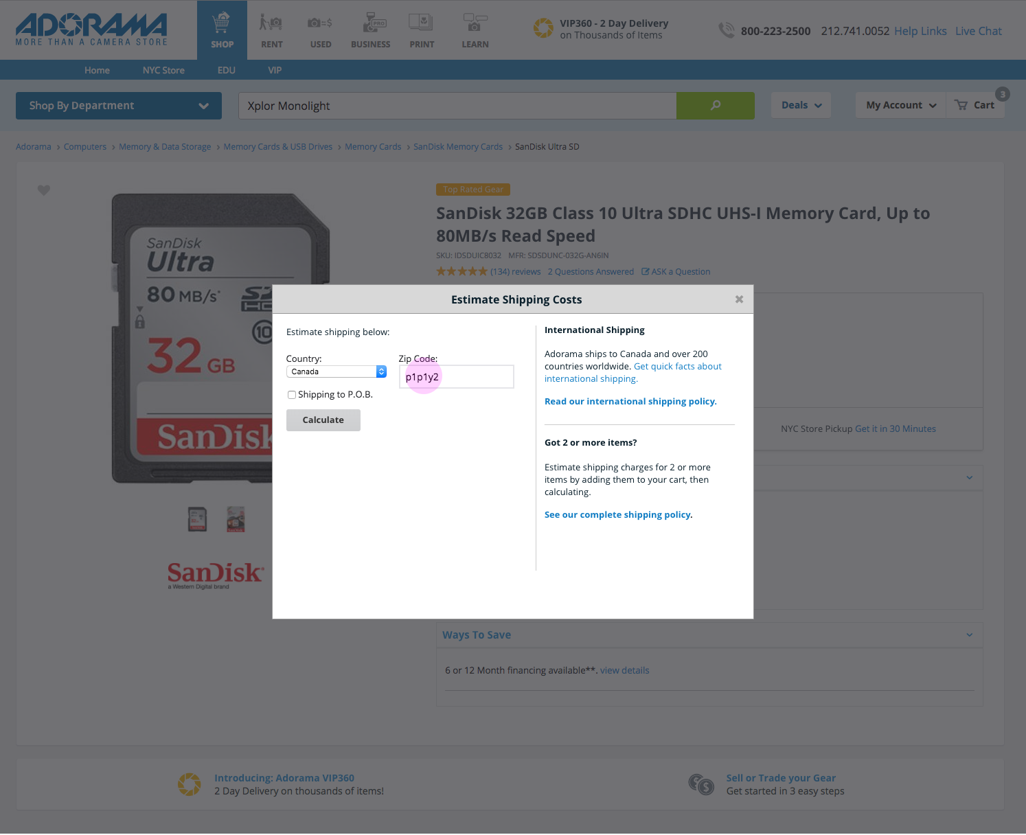
In the empty state of the estimation tool, the user enters shipping details, country and postal code – i.e., Canada.
Results for the shipping estimation tool provide cost estimates for shipping, based on destination. Canada shown here.
Tooltips provide additional detail information about each shipping method.
User adds product to their cart.
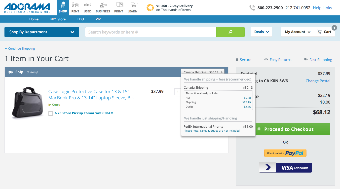
Cart and Checkout (Screenshots presented)
The final place for customers to learn about shipping fees. The recommended changes for the cart and checkout pages would include clarified shipping information, as well as an updated tooltip.
This cart page is estimating shipping costs for a Canadian postal code.
The checkout page shows shipping fees for a Canadian address.
UI Development & Next Steps
As a dual UX designer and UI developer, it was up to me to begin the implementation of changes to the cart and checkout pages.
As of April 2018, only changes to the cart and checkout pages have been implemented. Additional development work will be created in May, or possibly June, for the product page modals.
Thanks for visiting! Feel free to read my latest blog post, or if you came from my portfolio head back there.
I hope this short, 2:36 video is just the start of a more public conversation about hiring practices within the UX community. I hope it helps to define UX titles and terms, and I hope it helps UX teams break past unspoken practices in team dynamics and hiring. A video like this is a long time coming and covers one aspect of a topic I have been thinking about for the past few years.
The UX Unicorn Myth (Jakob Nielsen)
Summary: UX constitutes many different specialties such as researcher, interaction designer, and Information architect. Forcing one person to do it all is a prescription for mediocrity.
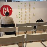
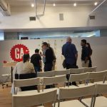
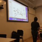
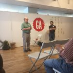
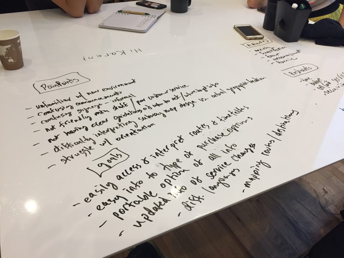
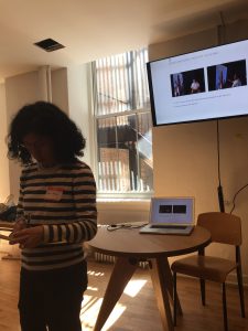
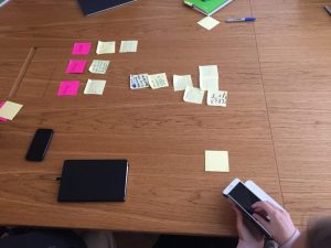
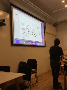
On June 24th, I attended a one-day “unconference”, called UX Camp. I heard about this through Meetup/email. I’m not sure what I expected, but I did hope for more hands-on workshops.
Sessions Attended:
Dance as cultural exchange
Using Dance for Cultural Exchange: This was presented by Ana Milena Aguilar-Hauke. I thought it was really smart and innovative, but only 2 people showed up to learn about this which is a shame. We could use more cross-cultural exchange these days. Her idea came from her experience living in Germany and the United States from the perspective of someone of Colombian descent. Her idea was to use salsa, which is a fun, easy to learn dance, to might help people interact with each other.
You can read more about this project on her website.
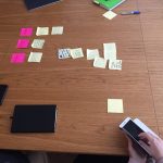
Kanban discussion list
Independent UX (More of a pow-wow/thought exchange): Helpful, especially for people who are managing their own work as an independent or seeking to. We used voting and Kanban boards, which I hadn’t heard of before, to go through ideas. I got that recruiters really take away your ability to earn more money because they’re skimming off the top. And, I learned that other UX professionals are experiencing the same portfolio headaches that I am.
I’ve since become interested in learning more about Lean and Kanban, which I’ll talk about in an upcoming post.
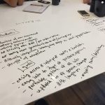
Some of the work we were doing for the design sprint workshop.
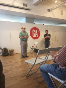
Tips on Design Sprints: I kind of wish I’d skipped this because, apparently, a really great talk that confirmed many of my job hunting suspicions was going on that I missed and probably would have enjoyed. But on the other hand, it was a hands-on activity like I wanted and it gave me new ideas to think about.
Agile to Tri-Track: This was presented by Dave Malouf. I wanted to learn more about Agile. I figured “tri-track” was an improvement…? I am still not quite sure what this was about.
Systems Thinking: I went because I wanted to learn about systems thinking. It sounded like an interesting discussion. It wasn’t quite what I’d hoped, but maybe he will improve it later.
Portfolio Discussion: This was helpful and vindicated some of the concepts I’ve been thinking and writing about when it comes to what UX managers look for (or don’t look for) when reviewing portfolios. My strategy now is to include information about an unexpected challenge I experienced and what I learned on the job.
All Photos
Dance as cultural exchange
Kanban discussion list
Some of the work we were doing for the design sprint workshop.
OK, XYZ Foundation is not really the name of the organization. But I really was asked to complete a UX challenge for a job application.
Since it helped me get through to the 2nd round, I thought it would be nice to share it. The challenge description (from them) and my submission (from me) are indented and given a different color.
Kudos to them for choosing a challenge that had nothing to do with the company itself. They don’t have anything to do with food or supply distributions.
UX Challenge
Scenario We are building a tool to connect restaurateurs and chefs with food and kitchen equipment distributors. We want both groups of users to have the capacity to search for one another and set requirements in order to get their needs met. Also, each set of users should have the capacity to record and broadcast their needs or resources so that other users can browse through them.
Task We’d like to see a plan for how you would go about assessing the needs of the various users, collecting and studying similar projects and potential competition, and designing and testing the experience of this tool’s users. We are expecting a roadmap for what steps will be involved in conceiving, developing, and testing the design of this tool.
My only clarifying question was what “record and broadcast” meant. They estimated this to take 1-2 hours, so I didn’t try to go into too much depth.
Submission
I wasn’t really sure who would be reviewing this, or how it would be used. Ostensibly, this was just for them to understand if I really understand usability. But if this was real, and I had been asked to create a plan, I wasn’t sure if they would use this as a formal plan or as a general outline.
So, like going to a party where you don’t know the dress code, I decided to go a little more formal with a report using a Google template.
New restaurateurs and chefs expanding or creating a new restaurant need kitchen equipment to stock their kitchens. Kitchen supply distributors (KSDs) want to be able to find restaurateurs looking for kitchen equipment.
Goals
1 – Restaurateurs need to be able to search for equipment and post requests for quotes.
2 – KSDs can search for restaurateurs and send quotes.
Potential Solution
Online exchange where restauranteurs can search for supplies, as well as post request for quotes from participating KSDs. KSDs can search for restauranteurs and send quotes. Perhaps a Craigslist for restaurant equipment. There may also be a weekly newsletter with new requests.
Note:
Below are milestones that would be part of the design process for this tool. In the real world, constraints such as the budget and release date would have a bigger impact on the functional scope and timeline. Also, the actual process might not be this clean, or steps might be skipped or combined, as needed.
Milestones
1. High-Level Process Map / High-Level Research
Create a basic high-level map of the process, to get a fuller picture of the scope of the problem. High-level research of kitchen supply distributors, to get a sense of what they do and offer. (See example, below.)
2. Stakeholder Interviews
Interview 2-4 restaurateurs and 2-4 distributors. Analyze finding and create personas if needed.
3. Research kitchen equipment distribution sites
What do these sites do well, what do they do poorly. How are their times organized and catalogued. Probably will return to this list often.
4. Create list of tasks tool should support
Decide on the scope of the tool. Don’t need to work on everything at once, but have a sense of the bigger picture. This is also a time to figure out the overall information architecture.
5. Create workflow for first task(s)
Pick one section of the tool, and sketch or list out a more in-depth workflow. For instance, what is the post process for chefs? What is the search and reply process for suppliers.
6. Create a draft of wireframes for task(s) – repeat
Sketch wireframes and create a first set of wireframes for whichever tasks were identified in part 5. Use these documents to meet with internal teams regarding feasibility, scope, business strategy, research, and timeline.
7. Refine designs / Prototype
Use feedback from internal meetings to refine wireframes, as needed. Progressively getting more detailed. Create a prototype, if possible.
8. Usability Testing
Return to earlier users, or sample of users, to test prototype or designs. Update design based on feedback. Could also try paper prototypes, between step 6 and 7.
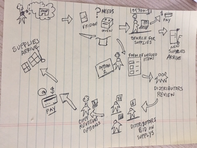
Example: High-Level Process Map / High-Level Research
Sketch of a high-level workflow for overall concept.
1 – Chef wants to open a restaurant. 2 – Thinks about his needs.
3 – Option 1: Goes online and searches for supplies. 4 – Pays for items. 5 – Items are delivered.
6 – Option 2: Chef fills out a form or posts needs online. 7 – Distributors get or view the request. 8 – Distributors create bids/quotes for chef and send them. 9 – Chef reviews options and picks a quote that works. 10 – See 4. 11 – See 5.
This overview can be digitized, if it needs to be shared out.
The Beyond User Research presentation, from World Information Architecture Day, got me thinking about a related article called The UX Audit: A Beginner’s Guide, from Usability Geek. My other blog post about World IA Day was long enough, so I didn’t mention it then. But, the similarities in the article and the presentation were close and I wanted to mention it.
Alternative Methods for User Research
Unlike the article, the Beyond User Research presentation isn’t a strict guideline. It doesn’t mention any particular research methods to follow. It shows that a UX team can schedule different research methods within a UX research plan. The presentation mentions at least two types of data sources: web metrics and user research.
Web metrics examples included: search query data, logs from a call center, data from analytics reports, voice of the customer reports, CRM applications, and so on. A web analyst might try to reduce the volume of calls to call centers. A user researcher might want to know what most people are calling about. Rather than use this information as a web analyst would, a UX team can use this data as UX research.
UX Audit Methodology
The UX Audit article, being a guide, does mention several methods, including:
Review of business and user objectives
Conversion metrics
Customer care data
Sales data
Traffic/engagement
Compliance with UX standards
It suggests using, for example, conversion metrics this way:
Conversion rates or sales figures: If the premise of your site or app is eCommerce, sales or download figures can be useful to a UX audit. For example, here at Justinmind, we measure how many blog readers download our prototyping tool and from which particular posts…
It breaks down an audit into individual steps and mentions 3 goals that should be clarified before getting started: audit goals, time limit, and resources.
There are a lot of resources in this article, including links to Usability.gov, and even a sample UX audit report. There’s definitely a cross-over between these two information sources.
Differences
The article warns that a UX audit can be time-consuming and expensive. For an external team, which they recommend, it states that a UX audit can cost “upwards of $1000 for a couple of days with a one-person team; the full monty of a UX team coming in for four weeks and providing in-depth, goal-orientated insights could cost up to $10,000”. It presents a UX audit as an official stage of a design cycle, and should be completed early on.
The presentation, meanwhile, makes the case that teams can incorporate a variety of user research methods as an ongoing part of their UX activities. Rather than conduct a full-fledged UX audit, for instance, a UX team could schedule one of these methods periodically. The research cost, in time, money and resources, depends on the method and the goals.
Discussion
Quoting a high price tag for a usability study could be a limitation for teams eager to get started on conducing user research. The article mentions that a UX audit is most beneficial at the beginning of a project. Even with everyone knowing that, the high costs might dissuade a team from getting behind the research. What sounds like a boring activity might push them to just start designing.
And it’s a rare opportunity to have the time and resources to publish an official report, like this. There’s a lot of other work to do.
Instead of treating UX audits as a costly, one-time activities, why not use UX audit methods throughout the year?
Conclusion
These two information sources can work together as complements. The article is very informative with specific guidelines. But the presentation shows how to ‘break the rules’ a little, by conducting research on a regular schedule. This allows a team to keep up with their product throughout the year. A custom approach, such as doing repetitive quick hits seems like the best option.
In any case, I recommend taking a look at the UX audit article. It links to many useful usability resources and websites providing analytics data.


 Portfolio Discussion: This was helpful and vindicated some of the concepts I’ve been thinking and writing about when it comes to what UX managers look for (or don’t look for) when reviewing portfolios. My strategy now is to include information about an unexpected challenge I experienced and what I learned on the job.