An ongoing assignment for my typography class is a title page design, for book. I chose ‘1984’, by George Orwell, for my first book.
For Typography 1, one of our ongoing assignments is the creation of title pages for a book. Our book choices are limited to the following, with no art or illustrations allowed:
The Great Gatsby—F. Scott Fitzgerald
The Scarlet Letter—Nathaniel Hawthorne
1984—George Orwell
Heart of Darkness—Joseph Conrad
The War of the Worlds—H.G. Wells
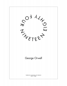
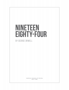
We’ve gone through 1 assignment, and we will be presenting an update to the previous assignment and will be adding another book. My first book choice was 1984. Here are some designs.
1984 – Futura
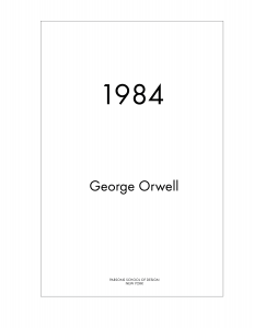
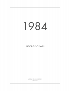
The feedback from critique was this was too much for a title page, but might be OK for a cover.This one was ok, but maybe the title should be bigger, and the author name in all caps and smaller.This one captures all the feedback: larger book title and changes to the author name.
Although the last one captures, all the feedback, it’s not very interesting. Maybe that’s as it should be. I went to Barnes & Noble and saw that many title pages were fairly simple; many followed the style from the cover.
Also, at the time I created this, I thought we were limited to only using the fonts we are going to study in the class which includes Futura. That’s not the case, so in my updates, I found other fonts that I thought suited the title better.
Round 2 – Incorporating Feedback
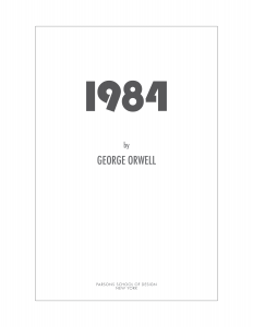
As of now, I chose 2 fonts that I thought were closer to the feeling of the book. Modern yet restrictive. I chose Bebas Neue and Bauhaus 93 with Futura as my fonts.
Although I created a bit of a custom version of the numbers, 1984, in Bauhaus 93, to crop the ‘4’ slightly, I prefer the longer ‘nineteen eighty-four’, which I saw in a few examples of the book. It just seemed more polished and finished. I’m undecided if I will use a version with extra space between the title and the author. The publisher is still in Futura.
Updated 1984, using Bauhaus and Futura.Updated Nineteen Eighty-Four in Bebas Neue.Nineteen Eighty-Four with Bebas Neue, with the extra space.
Having looked at them side by side, I think I may go with the version with the extra space between the title and the author. It’s a little less “designy” and seems like it would be better for a title page, whereas when the author is close, it seems more like a cover page.
So when I was doing this project, I had this image set up in InDesign, ready to go. But, I kept skipping over it because I couldn’t figure out what to do with it. I really like this image, but it’s difficult to use because there’s so much going on.
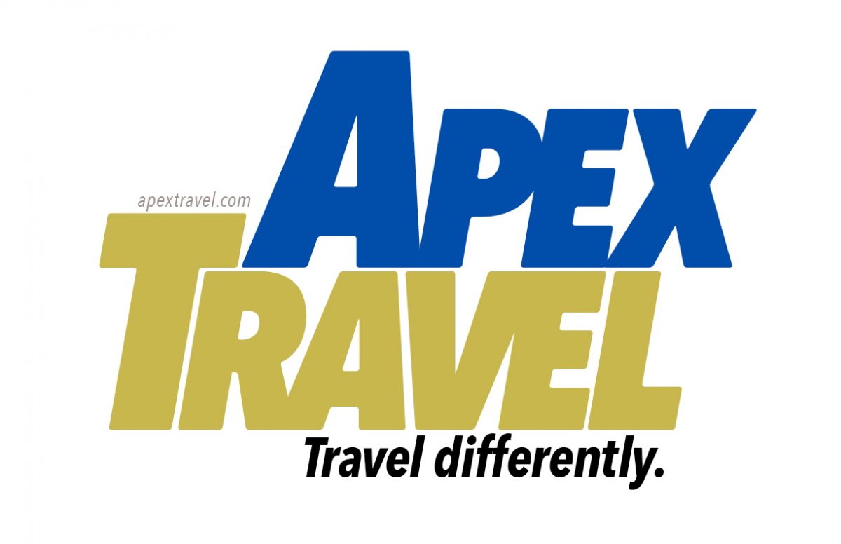
In one of John McWade’s courses, he creates a business card for a flight instructor. And I thought, Hmmmm, I could invent a business to design for! And that’s what I did.
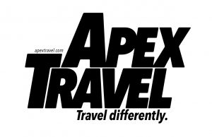
Rather than an airline instructor, I chose a travel agent or guide, specializing in unusual destinations or adventure travel. The company I created was called “Apex Travel”, given that the image is at the top of a mountain or hill. I chose the tagline: Travel differently.
I didn’t have a clear idea in mind of what I was ultimately going for, but I ended up created a kind of wordmark.
Results
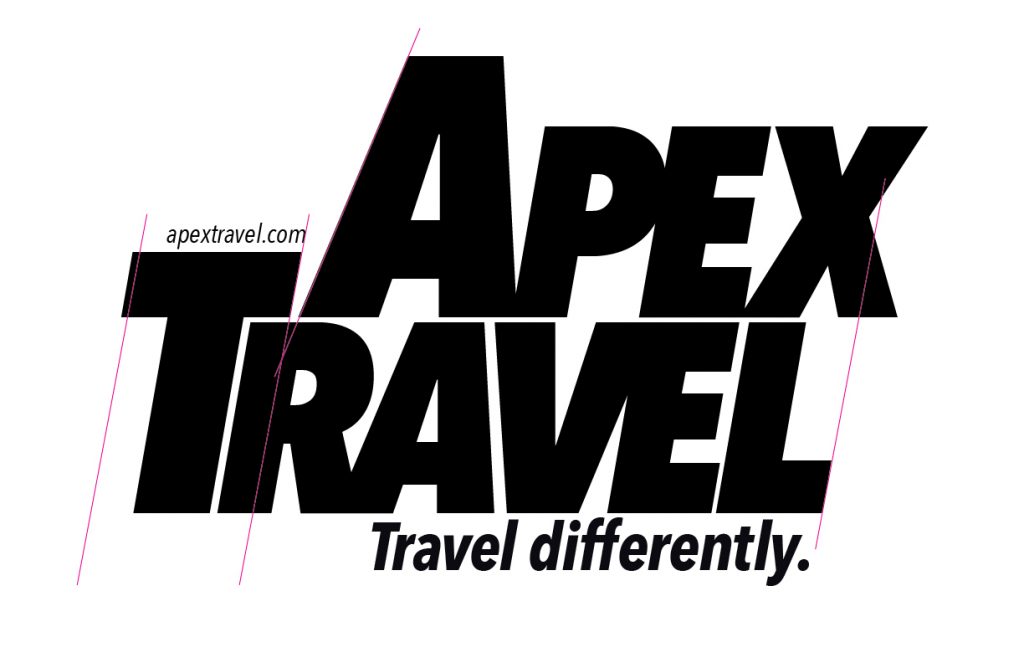
Here is a WIP version, with guidelines in place. I ended up smushing the letters together, creating my own ligatures with the P and the E, the R and the A, and the V and the E. I also was careful to track the letters as well as I could. I used InDesign for this project.
Black and White
Finished version, b/w
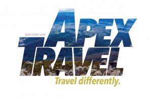
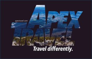
Finished versions, color
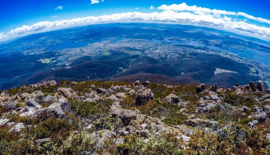
I then used the landscape image, by inserting it into the letters.
Landscape, white
Landscape, black
Finally, I attempted a business card, which the travel guide would need. Probably needs a little more work.
Critique
Finished version, b/w
When I look at this now, I think the space between the A and the V kind of stands out. This is also the same amount of space as between the top of the E and the L. Of course, a good idea would be to simply fix this before posting, but in order to paste the landscape into the words, I had to create outlines. So I could do it, but it would be time-consuming at this point.
Final Thoughts
I really enjoyed all of these projects, the poster and magazine layout. Even though the business card didn’t turn out as well as the others, I enjoyed the process of creating it and the wordmark for Apex Travel.
Continuing with my ongoing education in design, I focused recently on typography and layout. And I went through two Lynda.com courses to do it.
Those courses are called Learning to Set Display Type and Learning Graphic Design: Set Perfect Text. They are both taught by John McWade.
The classes John McWade teaches are exceptional because he is such an excellent instructor and quite good at explaining the concepts he is trying to get across. I recommend both of the classes I mentioned above, as well as other classes in the Lynda library by this instructor. Here are previews of these two courses.
Neither of these classes include exercise files. But after watching both of these courses I was inspired and motivated to try my own type projects, to put his advice into use.
Type Rules I Learned
It sounds basic, but I wasn’t aware that some fonts have additional glyphs that can be used instead of the regular font. Bookmania is an example of a font with tons of extra options for letters.
I also learned about justifying text, using hyphenation and spacing to help words fit. I also learned about using hair-spaces and thin-spaces, and using drop-caps.
Actually, the class doesn’t go into how exactly one would create a dropcap. So, I turned to YouTube – or as I like to call it, the second internet – to find another tutorial.
And I found one. This one is actually by another Lynda instructor, Anne-Marie Concepcion. She makes it look so easy.
As soon as I learned how to do this, I wanted to try it right away. Voila!
Type Stuff I Made
dropcaps
Now we’re getting to the fun part. First is the dropcap I made after watching the YouTube video.
Used Bookmania and a Lynda tutorial to create a dropcap.
In this one, I was able to move the text corners so that the text flowed around the dropcap R. Looks cool.
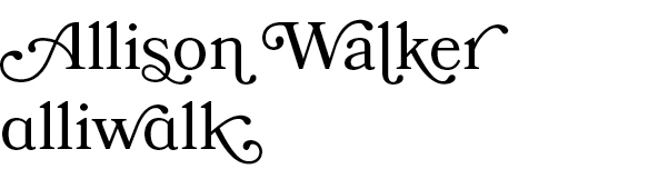
I was inspired to use the extra glyphs in Bookmania to create my own name. I used the smallcap version of the letter ‘A’ in the word, “alliwalk”.
Projects with Images
I like to collect stock photos – I know, it’s a bad habit – because I think that someday I’ll use one for a project. So, I end up with many stock photos that I don’t use. (Sometimes I use them here on my blog.) Well, I was finally able to put a few to good use.
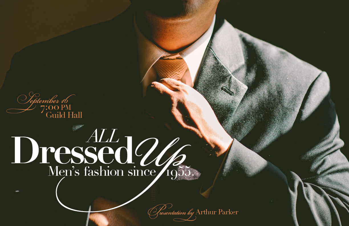
All Dressed Up
The first is this nice “Man in a suit putting on a tie”. I wasn’t sure what I was going for. Maybe a book cover or magazine spread. But, I think what I have is some sort of flyer concept.
This image uses Bickham Script Pro and Didot.
This image uses Bickham Script Pro, which has tons of fancy glyphs, and Didot. Didot has a certain fashionable sense to it, and I think it works. I wanted this to have a bespoke aura about it, yet still masculine. The italicized Dido, and the extra swirls from Bickham Script Pro help to get that across.
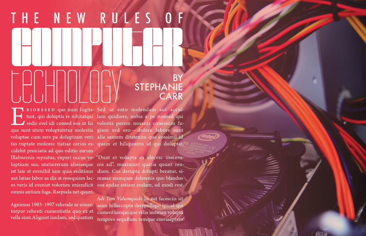
New rules of computer technology
BarryW90-Black, BarryW90-Thin, Futura Medium, and Minion Pro
In this case I wanted to use justified type, as John McWade had shown in his course. I stuck with Minion Pro, because it was easier to work with. And I added in a few random elements – a few numbers, some quotes, some pronouns – just to incorporate some of the lessons from the course. One thing I wasn’t able to replicate was keeping the subsequent letters from the word in the dropcap closer than the other words on lines 2 and 3. InDesign just wasn’t cooperating for me.
But I did enjoy this project. BarryW90-Black and Thin are highly stylized, very technical-looking fonts. I was inspired to find a new stock photo for them. Something computer-oriented.
Next time…
In my next post, I’ll talk about a few more projects in InDesign, and another type/logo(!) project I made for a fake company I invented called Apex Travel.