
Summary
Over the course of several weeks, I completed a UX audit of a guest management platform including personas, competitive evaluation, and heuristic evaluation. The research revealed an internal user base, many usability issues, and a number of competitive features to consider for future redesigns.
- Role: Freelance Product Designer
- Firm: DOOR3 Business Solutions
- Design Tools: G Suite
- Tasks: Personas, Competitive Research, Heuristic Evaluation
My portfolio includes a quick overview of DOOR3: alliwalk.com/ux/guest-audit/
Note: DOOR3 had their own UX/presentation templates, which I followed for each of these deliverables.
I. Personas
Personas are used by design teams to create representations of end-users that can help ground the design team in the realistic capabilities and expectations of users. I conducted interviews with the client, to learn more about their users and develop personas.
Introduction
The template for DOOR3 organized personas by the following:
- Characteristics: What do we know about them?
- Goals: What are they trying to achieve by using our product or service
- Questions: What are some of the common questions they have while using our product?
Personas were then separated into Internal Actors and External Actors.
Client Interviews
In order to answer these questions, I set up an interview with one of their lead client services managers and a product manager. I also read job descriptions for some of clients they worked with, such as an event manager or director of development. Using this information, I created six personas, which the client reviewed and validated.
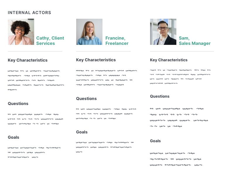

(Note: These are replicated originals.)
3 Key Learnings
I learned three key pieces of information that affected the user experience:
Roles & Permissions Restricted Functionality: User roles and permissions was a core aspect of the user experience. Many functions required could only be accessed if permission was granted by admins.
Internal Core User Group: Most end users were internal members of the client services team; many did not have admin access. Only a small minority of users were actual customers. Of those, only a rare few had accessed the site independently. There were no plans to add user registration so that new customers could sign up on their own.
Extensive Training Required: I learned that the platform required a significant amount of training before users could became sufficiently productive. The reasons for this became clear during the heuristic evaluation.
II. Competitive Evaluation
The competitive evaluation or analysis is a common stage in product design. I identified at least 20 competitors and related industries, to gain knowledge of industry conventions and identify potentially useful features.
3 Tiers of Competition
To locate competitors, I reviewed Capterra and Software Suggest, and included obvious choices such as Eventbrite and Splashthat. I included a few I’d learned of during the interviews. Competitors were organized into 3 tiers of competition: direct, secondary, tertiary.
Direct Competitors
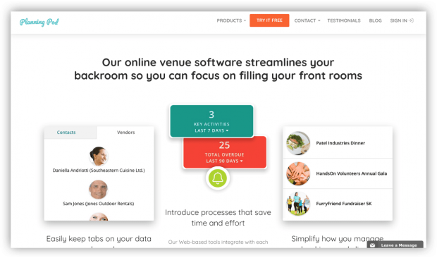
I identified 10 and evaluated 4: PlanningPod, EventSquid, Eventbrite, Envoy Visitors. I reviewed all competitors, but included examples from these four in more detail.
Secondary Competitors
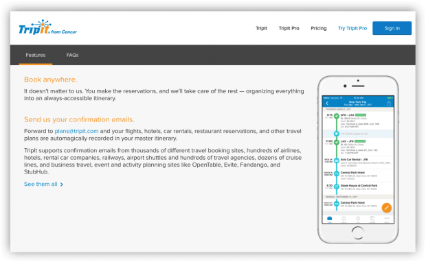
Offered the same functionality but specialized in specific types of events, like weddings or travel. I identified 2 and evaluated 1: TripIt.
Tertiary competitors
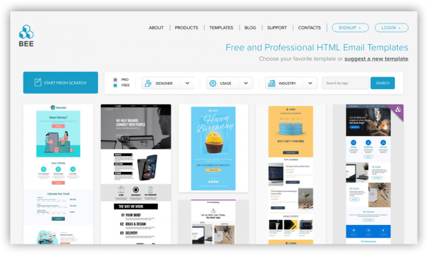
Represented tools or industries that the users encountered frequently as a part of their work, such as airline websites or industry news. I identified 7 options and evaluated 4: SendGrid, BeeFree, Flight Stats, BizBash. These services specialized in only certain features and I wanted to review the functionality they did well.
4 Categories of Findings
Findings were organized into 4 categories, based on functionality or features users would be likely to find important. Examples are below:
Competitive Overall Features — integrations with third-party apps and services, (e.g., MailChimp, GoldStar, Zapier, etc); branded user profiles
Platform-Specific Features — ability to create and share a favorites list or vision board; easy access to help or reference guide
Design and Information Architecture — high-contrast between foreground and background colors; strong global and sub-task navigation
Additional Event Capabilities — real-time RFID event tracking; ability to preview and export name badges
III. Heuristic Evaluation
The bulk of my time was spent on the heuristic evaluation. In a heuristic evaluation, a UX expert uses an established guideline to identify potential usability issues.
A large number of issues were revealed during the heuristic evaluation. While many were not critical, the cumulative amount was a concern.
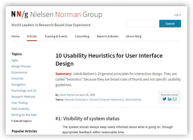
Method: 10 Usability Heuristics
DOOR3’s template only referenced Jakob Nielsen’s 10 Usability Heuristics for User Interface Design, which I used. I also included principles from Bruce Tognazzini’s, First Principles of Interaction Design.
Over 70 Usability Issues Identified
I identified over 70 usability issues, from their main platform as well as their public website. For each usability issue, I included a suggested recommendation on how to fix it. I also included an appendix with additional UX references on typography, accessibility, and navigation.
Many of the main issues had to do with inconsistent use of UI elements, navigation, or labels, as well as accessibility issues like low contrast. There were also technical issues, cryptic error messages, and confusing workflows.
Presentation of Findings
I presented the evaluation so that the most important findings came first, then organized the rest of the findings by section such as groups or account tools.
Since their users were internal, I focused on the connection between usability issues and productivity — that is, a interface with a shorter learning curve would save money in training and overhead costs.
During my presentation to the client, they revealed that they were aware of many of the usability and design issues I identified, but they had been backlogged in favor of “hot fixes” due to many issues in the code.
Outcome: Prioritization
The DOOR3 team worked with the client to help identify all the issues with the platform — front-end, back-end, design, future features. The issues were then prioritized, so that they could be put into a backlog and managed over time.
The client continued working with DOOR3 on engineering updates and some design updates.
Thanks for visiting! Feel free to read my latest blog post, or if you came from my portfolio head back there.