Website Update, June 2017

It might not be easily noticeable from this blog, but over the past few weeks I’ve updated my main website. I tend to do this a few times a year, as I gain feedback, or learn what works and what doesn’t work. Hopefully this change will stick around for a while. This post is documentation of what I did and why.

Research

Over the past several months, I have been trying to get a better understanding of what UX managers look for when they view a candidate’s portfolio. There were a few resources I looked at that helped inform my opinions in this regard. After reading a few articles and slideshow presentations, reviewing websites, and gathering feedback, I had a few ideas. Here are a few points and screenshots demonstrating my ideas and how they affected the design.

I. Overall Design and Home page

One way or another, I ended up looking at a few portfolio pages from designers I’d met in-person or came across online. Despite reading several of those “10 UX Portfolios To Admire” articles, what I’ve discovered is that sometimes simple is best. And that translates to a template site, often paid.

Paid subscription services are anything from $6-$8 or more each month. I don’t think someone should have to pay a monthly fee in order to apply for a job. That meant I’d have to create it myself or use a free service. I’ve used Carbonmade, Coroflot, and even Behance (barely), which are all free. But their designs are limited and my research showed that managers will evaluate candidates on the usability of their portfolio, even when it’s hosted by a third-party.

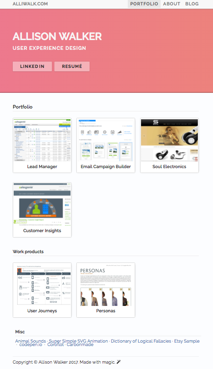
Reviewing both free and paid sites, the ones I liked best were made by the paid services Squarespace or Wix, using remarkably similar templates. Essentially, that template was a site with basic navigation, a grid of projects on the home page, project pages, and a simple About page. Following that template, I came up with a basic grid for my home page. But I jazzed it up a bit with some fancy CSS throughout the site.

II. Presenting an Overview

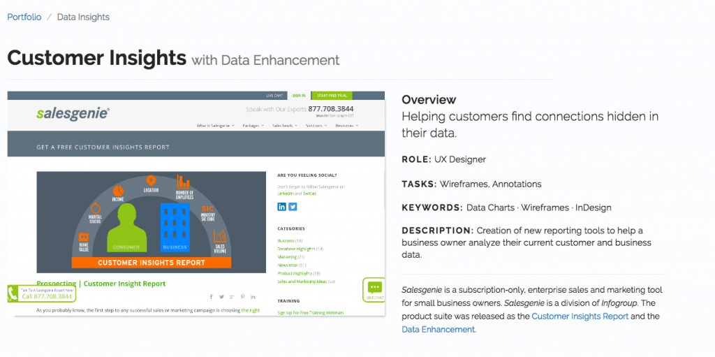
In previous designs, I assumed that managers would read. But, my research showed that they might spend 30 seconds reviewing a portfolio, for the first time. I also came across numerous resources insisting that candidates outline role, problem or goal, and outcome when presenting their work.

So you can see in the screenshot below how I’ve outlined this information right at the top, next to an image.

Overview of the project and role, along with keywords. This image is actually a screenshot from the company’s website, promoting the product.

II. Fast Scanning

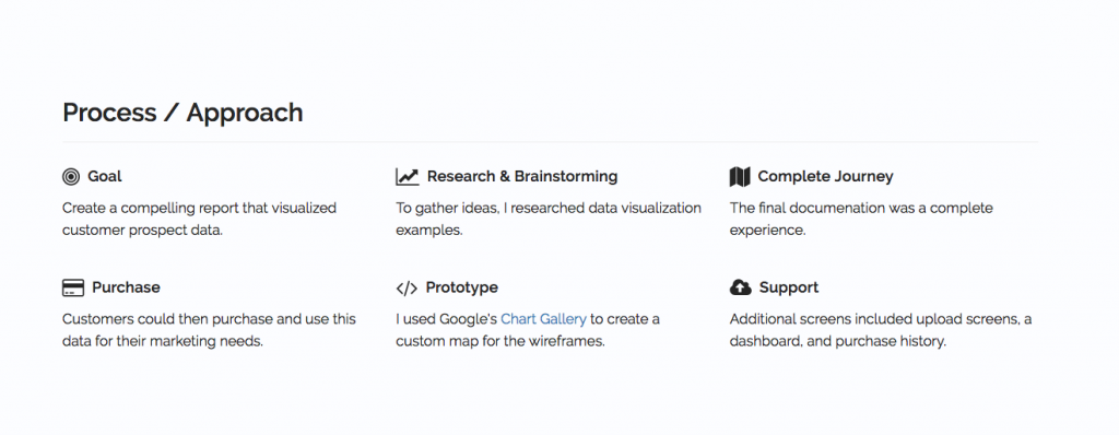
Another consideration was the amount of time a manager spends reviewing a portfolio. My research showed that managers only spend 30 seconds on a portfolio and review 12-50 portfolios for a given position. I used the process/approach section to break up information into digestible, one-sentence long chunks.

An earlier version of this section was a 3-column layout, with longer paragraphs. Breaking it up makes it easier to scan. Fontawesome does this, also, on their homepage. http://fontawesome.io/

III. Tell a Story

The word “storytelling” is thrown around a lot, especially in relation to self-promotion. I think “storytelling” is overused and cliche, and I’ve written about storytelling a few times.  However, for the redesign, I thought about the concept of beginning, middle, and end. Thinking through these part of a story, I ended up with the following sections: overview, a process/approach section, documentation, and outcome. Outcome really helps “sell” it as a story, because it provides a conclusion.
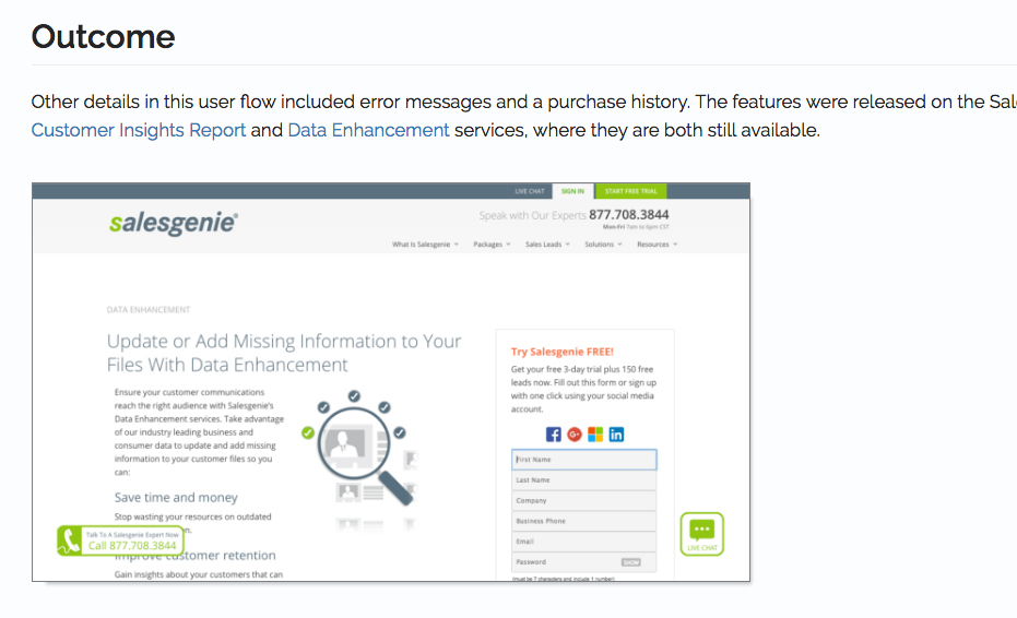
Outcome

Having talked about outcome, what now?

One idea I thought of, as I was writing this, was to shrink the size of the thumbnails on the home page to show more information on the screen. But, I think the “hero” image/section is what takes up most of the space, vs the size of the thumbnails. This is one change though; I have a running list of updates and ideas on Remember the Milk, where I can also track priority.

I plan to ask more friends for feedback and maybe get feedback from a few connections on LinkedIn. It was fun, I learned a lot. I look forward to adding more projects and the site evolving over time. Or until I redesign it again!

UX Challenge for Job Application with XYZ Foundation

OK, XYZ Foundation is not really the name of the organization. But I really was asked to complete a UX challenge for a job application.

Since it helped me get through to the 2nd round, I thought it would be nice to share it. The challenge description (from them) and my submission (from me) are indented and given a different color.

Kudos to them for choosing a challenge that had nothing to do with the company itself. They don’t have anything to do with food or supply distributions.


UX Challenge

Scenario
We are building a tool to connect restaurateurs and chefs with food and kitchen equipment distributors. We want both groups of users to have the capacity to search for one another and set requirements in order to get their needs met. Also, each set of users should have the capacity to record and broadcast their needs or resources so that other users can browse through them.

Task
We’d like to see a plan for how you would go about assessing the needs of the various users, collecting and studying similar projects and potential competition, and designing and testing the experience of this tool’s users. We are expecting a roadmap for what steps will be involved in conceiving, developing, and testing the design of this tool.

My only clarifying question was what “record and broadcast” meant. They estimated this to take 1-2 hours, so I didn’t try to go into too much depth.


Submission

I wasn’t really sure who would be reviewing this, or how it would be used. Ostensibly, this was just for them to understand if I really understand usability. But if this was real, and I had been asked to create a plan, I wasn’t sure if they would use this as a formal plan or as a general outline.

So, like going to a party where you don’t know the dress code, I decided to go a little more formal with a report using a Google template.

Here is my submission below, with a link to the final document.


Problem Overview

New restaurateurs and chefs expanding or creating a new restaurant need kitchen equipment to stock their kitchens. Kitchen supply distributors (KSDs) want to be able to find restaurateurs looking for kitchen equipment.

Goals

1 – Restaurateurs need to be able to search for equipment and post requests for quotes.

2 – KSDs can search for restaurateurs and send quotes.

Potential Solution

Online exchange where restauranteurs can search for supplies, as well as post request for quotes from participating KSDs. KSDs can search for restauranteurs and send quotes. Perhaps a Craigslist for restaurant equipment. There may also be a weekly newsletter with new requests.

Note:

Below are milestones that would be part of the design process for this tool. In the real world, constraints such as the budget and release date would have a bigger impact on the functional scope and timeline. Also, the actual process might not be this clean, or steps might be skipped or combined, as needed.

Milestones

1. High-Level Process Map / High-Level Research

Create a basic high-level map of the process, to get a fuller picture of the scope of the problem. High-level research of kitchen supply distributors, to get a sense of what they do and offer. (See example, below.)

2. Stakeholder Interviews

Interview 2-4 restaurateurs and 2-4 distributors. Analyze finding and create personas if needed.

3. Research kitchen equipment distribution sites

What do these sites do well, what do they do poorly. How are their times organized and catalogued. Probably will return to this list often.

4. Create list of tasks tool should support

Decide on the scope of the tool. Don’t need to work on everything at once, but have a sense of the bigger picture. This is also a time to figure out the overall information architecture.

5. Create workflow for first task(s)

Pick one section of the tool, and sketch or list out a more in-depth workflow. For instance, what is the post process for chefs? What is the search and reply process for suppliers.

6. Create a draft of wireframes for task(s) – repeat

Sketch wireframes and create a first set of wireframes for whichever tasks were identified in part 5. Use these documents to meet with internal teams regarding feasibility, scope, business strategy, research, and timeline.

7. Refine designs / Prototype

Use feedback from internal meetings to refine wireframes, as needed. Progressively getting more detailed. Create a prototype, if possible.

8. Usability  Testing

Return to earlier users, or sample of users, to test prototype or designs. Update design based on feedback. Could also try paper prototypes, between step 6 and 7.

Example: High-Level Process Map / High-Level Research

Sketch of a high-level workflow for overall concept.

1 – Chef wants to open a restaurant.
2 – Thinks about his needs.

3 – Option 1: Goes online and searches for supplies.
4 – Pays for items.
5 – Items are delivered.

6 – Option 2: Chef fills out a form or posts needs online.
7 – Distributors get or view the request.
8 – Distributors create bids/quotes for chef and send them.
9 – Chef reviews options and picks a quote that works.
10 – See 4.
11 – See 5.

This overview can be digitized, if it needs to be shared out.


View the submission yourself, with this link.

Display Text Typography Projects

Continuing with my ongoing education in design, I focused recently on typography and layout. And I went through two Lynda.com courses to do it.

Those courses are called Learning to Set Display Type and Learning Graphic Design: Set Perfect Text. They are both taught by John McWade.

The classes John McWade teaches are exceptional because he is such an excellent instructor and quite good at explaining the concepts he is trying to get across. I recommend both of the classes I mentioned above, as well as other classes in the Lynda library by this instructor. Here are previews of these two courses.


Neither of these classes include exercise files. But after watching both of these courses I was inspired and motivated to try my own type projects, to put his advice into use.

Type Rules I Learned

It sounds basic, but I wasn’t aware that some fonts have additional glyphs that can be used instead of the regular font. Bookmania is an example of a font with tons of extra options for letters.
I also learned about justifying text, using hyphenation and spacing to help words fit. I also learned about using hair-spaces and thin-spaces, and using drop-caps.
Actually, the class doesn’t go into how exactly one would create a dropcap. So, I turned to YouTube – or as I like to call it, the second internet – to find another tutorial.
And I found one. This one is actually by another Lynda instructor, Anne-Marie Concepcion. She makes it look so easy.

 As soon as I learned how to do this, I wanted to try it right away. Voila!

Type Stuff I Made

dropcaps

Now we’re getting to the fun part. First is the dropcap I made after watching the YouTube video.
Drop cap and Display type
Used Bookmania and a Lynda tutorial to create a dropcap.

In this one, I was able to move the text corners so that the text flowed around the dropcap R. Looks cool.

I was inspired to use the extra glyphs in Bookmania to create my own name. I used the smallcap version of the letter ‘A’ in the word, “alliwalk”.

Projects with Images

I like to collect stock photos – I know, it’s a bad habit – because I think that someday I’ll use one for a project. So, I end up with many stock photos that I don’t use. (Sometimes I use them here on my blog.) Well, I was finally able to put a few to good use.

All Dressed Up

The first is this nice “Man in a suit putting on a tie”. I wasn’t sure what I was going for. Maybe a book cover or magazine spread. But, I think what I have is some sort of flyer concept.

This image uses Bickham Script Pro and Didot.

This image uses Bickham Script Pro, which has tons of fancy glyphs, and Didot. Didot has a certain fashionable sense to it, and I think it works. I wanted this to have a bespoke aura about it, yet still masculine. The italicized Dido, and the extra swirls from Bickham Script Pro help to get that across.

New rules of computer technology

BarryW90-Black, BarryW90-Thin, Futura Medium, and Minion Pro

In this case I wanted to use justified type, as John McWade had shown in his course. I stuck with Minion Pro, because it was easier to work with. And I added in a few random elements – a few numbers, some quotes, some pronouns – just to incorporate some of the lessons from the course. One thing I wasn’t able to replicate was keeping the subsequent letters from the word in the dropcap closer than the other words on lines 2 and 3. InDesign just wasn’t cooperating for me.

But I did enjoy this project. BarryW90-Black and Thin are highly stylized, very technical-looking fonts. I was inspired to find a new stock photo for them. Something computer-oriented.


Next time…

In my next post, I’ll talk about a few more projects in InDesign, and another type/logo(!) project I made for a fake company I invented called Apex Travel.

7 Web Design Articles

At some point, I came up with the idea that reading 10 articles on one topic was a good idea. Well, I only made it to 7. But these 7 articles, on LESS and 404 pages, were very helpful for me so I’m still glad I read them.


Learn LESS in 10 Minutes

Related:

  • http://tutorialzine.com/2017/04/15-interesting-javascript-and-css-libraries-for-april-2017/
  • http://lesscss.org/features/#features-overview-feature
  • http://less2css.org/

I really enjoyed learning LESS, although I think it would be easier to use with a task runner.


15 Interesting JavaScript and CSS Libraries for April 2017

http://tutorialzine.com/2017/04/15-interesting-javascript-and-css-libraries-for-april-2017/ 


34 brilliantly designed 404 error pages

http://www.creativebloq.com/web-design/best-404-pages-812505

Getting inspiration and a sense of best practices while creating my own 404 page. I have to say, Bloomberg’s is hilarious. (Creative Bloq, October 10, 2016)


How Do I Create a Custom 404 Error Page?

http://www.htmlgoodies.com/beyond/reference/article.php/3472591/How-Do-I-Create-a-Custom-404-Error-Page.htm

Yes, I did create a 404 page, which is located at alliwalk.com/404/. But given that my current website is only one page, it’s hard to get lost.


Should I use a video as a background?

https://css-tricks.com/should-i-use-a-video-as-a-background/

(CSS Tricks, Dec 2015)


Create Fullscreen HTML5 Page Background Video

http://thenewcode.com/777/Create-Fullscreen-HTML5-Page-Background-Video


CSS Filters

https://css-tricks.com/almanac/properties/f/filter/

This is one of the coolest things I’ve seen in a while, but it’s still experimental so don’t use it for anything important.

Incorporating UX Audit Tasks into a User Research plan

The Beyond User Research presentation, from World Information Architecture Day, got me thinking about a related article called The UX Audit: A Beginner’s Guide, from Usability Geek. My other blog post about World IA Day was long enough, so I didn’t mention it then. But, the similarities in the article and the presentation were close and I wanted to mention it.

Alternative Methods for User Research

Unlike the article, the Beyond User Research presentation isn’t a strict guideline. It doesn’t mention any particular research methods to follow. It shows that a UX team can schedule different research methods within a UX research plan. The presentation mentions at least two types of data sources: web metrics and user research.

Web metrics examples included: search query data, logs from a call center, data from analytics reports, voice of the customer reports, CRM applications, and so on. A web analyst might try to reduce the volume of calls to call centers. A user researcher might want to know what most people are calling about. Rather than use this information as a web analyst would, a UX team can use this data as UX research.

UX Audit Methodology

The UX Audit article, being a guide, does mention several methods, including:

  • Review of business and user objectives
  • Conversion metrics
  • Customer care data
  • Sales data
  • Traffic/engagement
  • Compliance with UX standards

It suggests using, for example, conversion metrics this way:

Conversion rates or sales figures: If the premise of your site or app is eCommerce, sales or download figures can be useful to a UX audit. For example, here at Justinmind, we measure how many blog readers download our prototyping tool and from which particular posts…

It breaks down an audit into individual steps and mentions 3 goals that should be clarified before getting started: audit goals, time limit, and resources.

There are a lot of resources in this article, including links to Usability.gov, and even a sample UX audit report. There’s definitely a cross-over between these two information sources.

Differences

The article warns that a UX audit can be time-consuming and expensive. For an external team, which they recommend, it states that a UX audit can cost “upwards of $1000 for a couple of days with a one-person team; the full monty of a UX team coming in for four weeks and providing in-depth, goal-orientated insights could cost up to $10,000”. It presents a UX audit as an official stage of a design cycle, and should be completed early on.

The presentation, meanwhile, makes the case that teams can incorporate a variety of user research methods as an ongoing part of their UX activities. Rather than conduct a full-fledged UX audit, for instance, a UX team could schedule one of these methods periodically. The research cost, in time, money and resources, depends on the method and the goals.

Discussion

Quoting a high price tag for a usability study could be a limitation for teams eager to get started on conducing user research. The article mentions that a UX audit is most beneficial at the beginning of a project. Even with everyone knowing that, the high costs might dissuade a team from getting behind the research. What sounds like a boring activity might push them to just start designing.

And it’s a rare opportunity to have the time and resources to publish an official report, like this. There’s a lot of other work to do.

Instead of treating UX audits as a costly, one-time activities, why not use UX audit methods throughout the year?

Conclusion

These two information sources can work together as complements. The article is very informative with specific guidelines. But the presentation shows how to ‘break the rules’ a little, by conducting research on a regular schedule. This allows a team to keep up with their product throughout the year. A custom approach, such as doing repetitive quick hits seems like the best option.

In any case, I recommend taking a look at the UX audit article. It links to many useful usability resources and websites providing analytics data.

William Kentridge: South African Artist

In February, I watched a EuroNews report about a South African artist named William Kentridge, whose work is being shown in Copenhagen, Denmark. Here’s the article video.

Link to the article on EuroNews.com

I was very interested in learning more about the artist after seeing that he uses a combination of video installations, animation, and live action. As seen in clips in the article, he’s also not afraid to explore the difficult history of his country. As MoMA puts it, “Dealing with subjects as sobering as apartheid, colonialism, and totalitarianism, his work is often imbued with dreamy, lyrical undertones or comedic bits of self-deprecation that render his powerful messages both alluring and ambivalent.”

This can be seen in the following video, which is embedded in the text of the article. It’s like a New Orleans marching band, set in a lyrically dystopian world.

When I looked up more about the artist, I was surprised to find that he was not ethnically African, because as the video shows he is using black subjects in the artwork. In my experience, it’s not that common to find an artist using the experience of another ethnicity in their artwork, although it does occur in decorative arts, photography, and performing arts.

I suppose performing artists do this because music, dance, and theater are somewhat universally accessible for all people. Photography is a little different, in that the photographer has to take a documentarian or voyeuristic point of view, as opposed to being part of the art. Wikipedia explains that Kentridge is Jewish, with attorney parents that fought against apartheid. Perhaps he felt like both an outsider, voyeur-documentarian and part of the struggle in South Africa.

What I find revealing is how well Kentridge’s use of African subjects shows his strong empathy and understanding of apartheid and this difficult period of South African history. He says, in Pain & Suffering, shown on art:21, that artists use the pain and suffering of others for their work.

Animation Style

Wikipedia explains one of his animation methods:
“in all of his animated works do the concepts of time and change comprise a major theme. He conveys it through his erasure technique, which contrasts with conventional cel-shaded animation, whose seamlessness de-emphasizes the fact that it is actually a succession of hand-drawn images. This he implements by drawing a key frame, erasing certain areas of it, re-drawing them and thus creating the next frame. He is able in this way to create as many frames as he wants based on the original key frame simply by erasing small sections. Traces of what has been erased are still visible to the viewer; as the films unfold, a sense of fading memory or the passing of time and the traces it leaves behind are portrayed.”

The video above doesn’t show one of this animation style very well, but his style can be seen in other clips. He also uses stop-motion.

Other Work

Aside from animation, he uses live video and different masking and editing effects in his work. Here’s a video of him, from the Danish museum, the Louisiana, interviewing himself:

More Resources

I won’t be in Copenhagen anytime soon. But if you’re interested in learning more about William Kentridge, there are examples of his work online.

Louisiana Museum of Modern Art

Of course, there is the Louisiana Museum that is currently holding a William Kentridge exhibition. It looks like an interesting exhibit. The site is in Danish, but Google should be able to translate.

art:21

art:21 has the most examples of him working and explaining his process. There are several clips of some of his video/media pieces.

MoMA

MoMA has an archival page documenting his 2010 exhibition, Five Themes. Also still available is a flash-site that contains many examples of his work and his process.

Wikipedia

Wikipedia also has plenty of information about Kentridge, from his bio, to listing his films and many exhibitions around the world. There are also external links, if you’re interested even more information about this artist.


UPDATE: ARTSy.NET

In August 2017, Artsy.net reached out to me to inform me of their web page on William Kentridge.

Our William Kentridge page provides visitors with Kentridge‘s bio, over 350 of his works, exclusive articles, and up-to-date Kentridge exhibition listings. The page also includes related artists and categories, allowing viewers to discover art beyond our Kentridge page.

I took a look and it does have a lot of great information about this artist, including many images. So if you are looking for additional info, take a look!