Continuing on from my previous post about my experience with the Khan Academy course, Pixar in a Box: The Art of Storytelling, the next lessons are ‘What if?’ and ‘World and Character’.
Lesson 3: What If?
Video 3 and Activity 3 are all about What if? Coming up with a story scenario, by asking “What if?”, the Pixar story tellers do a great job of putting popular movies into What if statements. For instance, what if our toys were sentient and could come alive? This is Toy Story.
Part A. What would the What if statements be for my favorite films?
- What if unicorns still existed and could only be seen by a few people?
- What if a couple accidentally adopted a girl, instead of a boy?
- What if the King of England lost his mind?
- What if the new Emperor of China was just a little boy?
The exercise is a little hard with true stories, but I guess they still work.
Part B: Come up with 3-5 What if stories
I have to admit something embarrassing. I created a list of about 30 what ifs about a week before I wrote this – but somehow, I lost them all! So I had to come up with new ones. I needed some inspiration.
Inspiration: Sanjay’s Super Team
For inspiration, I watched a short video called “Sanjay’s Super Team”. One of the Pixar storytellers mentions the movie. “Sanjay’s Super Team’s” What if question is: What if an Indian father could show his son, who loves action figures, what he sees when he’s praying? It is a pretty impressive video and it’s only about 7 minutes long, so no excuses!
Update: Unfortunately, Sanjay’s Super Team is no longer available online. But, there is a “Making of…” video available to view.
My What ifs?
Sanjay’s Super Team did inspire me. I didn’t come up with as many ideas this time around, but here are a few:
- What if my cats could be real people?
- What if pets could give their owners advice about life?
- What if there was a world where your imagination rule everything?
- What if my lost What if stories came true?
- What if there was a land of lost and found, where every lost item lived?
- What if my search to find my lost stories took me on a quest to an imaginary land, where my cats came along as my companions but were turned into humans?
Turns out, I’ve got cats and lost stories on my mind!
Lesson 4: World and Character
Part A: Identify the main characters and worlds in your three movies.
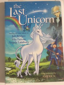
The Last Unicorn
World: Medieval world of magic. Most action is on the road or the woods, and then in a castle.
Main Characters: Unicorn, Magician, Cook, Evil King
Connection: I definitely connected more with the unicorn, but sometimes with the magician.
Anne of Green Gables
World: Small yet idyllic town in the 1800s.
Main Characters: Anne, Marilla, Matthew, Gilbert, Donna
Connection: Definitely connected with Anne!
Madness of King George
World: England, English palaces, late 1700s.
Main Characters: King George, Dr Willis, Equerry
Secondary: Queen, Lady Pembroke, Prime Minister, Lord Chamberlain
Connection: I connected with the equerry, who’s just trying to do the right thing.
Part B: Mix characters and worlds from a different stories
Combining worlds and characters gives pretty interesting results. The first time I did this exercise, I used The Last Emperor instead of the Madness of King George. So I got Unicorn + Forbidden City combinations. The combinations that make the most sense would be Anne of Green Gables + The Last Unicorn. Helping a unicorn find other unicorns would be Anne Shirley’s life’s dream. I could also see the Evil King thriving in the Forbidden City, or the mad King George doing pretty well in the medieval world of magic.
[pic]
Part C: Pick your favorite What if statement. Imagine a possible world and character.
Going back to my favorite What if statement, I guess the last one is the most obvious. A main character would be someone socially anxious who spends a lot of time living in his head. My cats as people would be about 11 years old. One cat would be an energy-filled girl. Not that different from Anne of Green Gables, Pollyanna, or Pippi Longstocking. The other cat would be a girl that’s a little bit overweight. She would have a pleasant demeanor, but also be easily frightened. Both of them, would at times be absentminded and always ready to take naps. But they would be very loyal and supportive.
Final: Storytelling Advice
The final video in this lesson features Pixar storytellers giving advice to new storytellers. The thing that I connected with in this video, is that getting good takes practice. Even if you think you’re not getting better, what you will see over time is a stack of drawings and papers that show your progress. Sometimes what you think are mistakes are not mistakes. They are signs of the search for the right story.
It’s going to take some time for me to think about Part D of Activity 4: What would my world look like? Until then, I’m going to keep thinking about storytelling inspirations, and remember to keep chipping away at it.
I don’t know when the next section in the Khan Academy course will come out. But, in the meantime, I will post more articles about storytelling.
More artwork from Sanjay Patel, the creator of Sanjay’s Superteam, can be found at Ghee Happy. It’s just cool.