Introduction
In my last post, I discussed a project I had been completing as part of a Skillshare class. This is the second post in that series.
Sketches
As I left off in my last post, I skipped over the persona portion of the course. I did return, in part, to personas but not until the visual design.
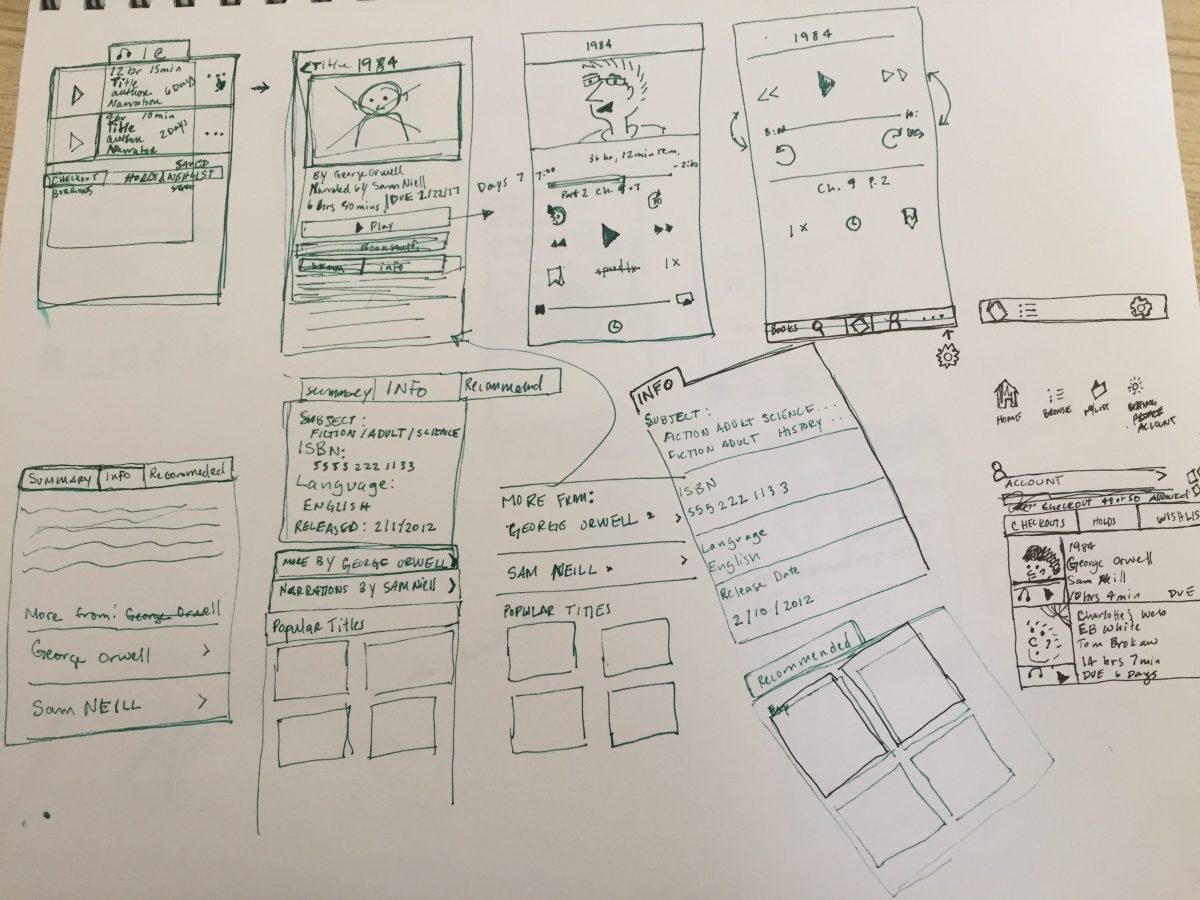
I ended up doing about 3 pages of sketches. My documentation shows how I worked out smaller interaction elements, like navigation elements.
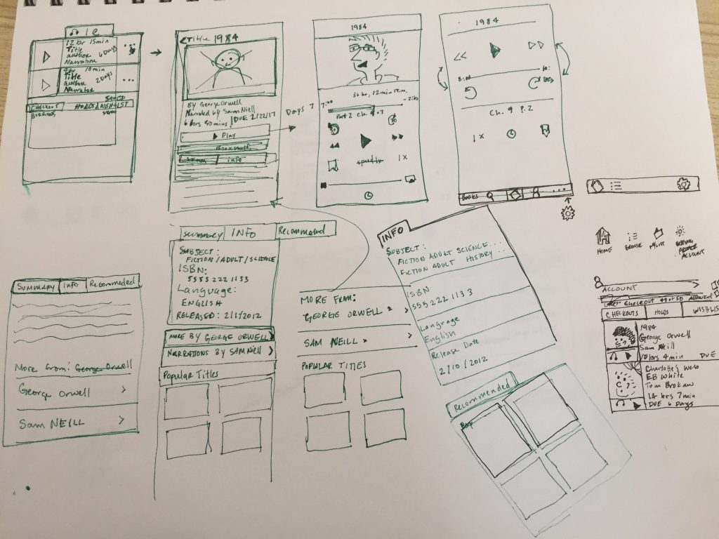
This is the part of the workflow is where the interaction design and user experience start to come together. The instructor chose to update the Southwest app. The visual design looked great and I liked her workflow overall. But there was a piece of this workflow that was missing – and that was competitive research. There was little in the way of looking at related apps to get an idea of what people might experience from something similar.
It’s easier to become efficient with a new interface if it contains familiar elements. This is one reason why I research competitors. I’ve also found that using real life examples helps convince others on the team that the product is actually feasible and can implemented as designed.
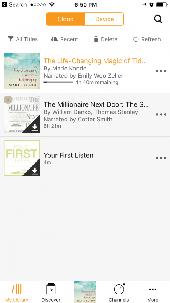
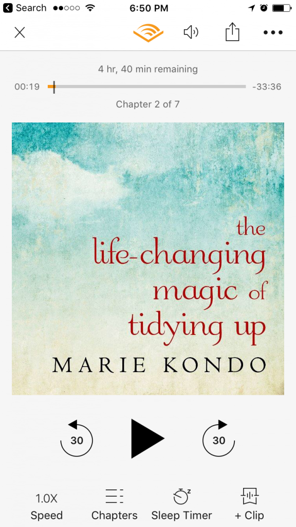
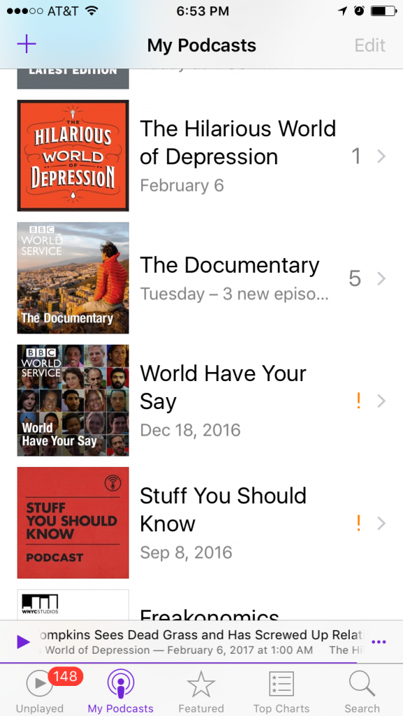
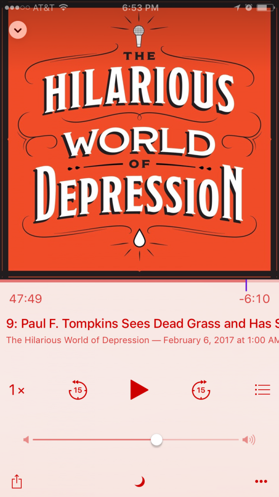
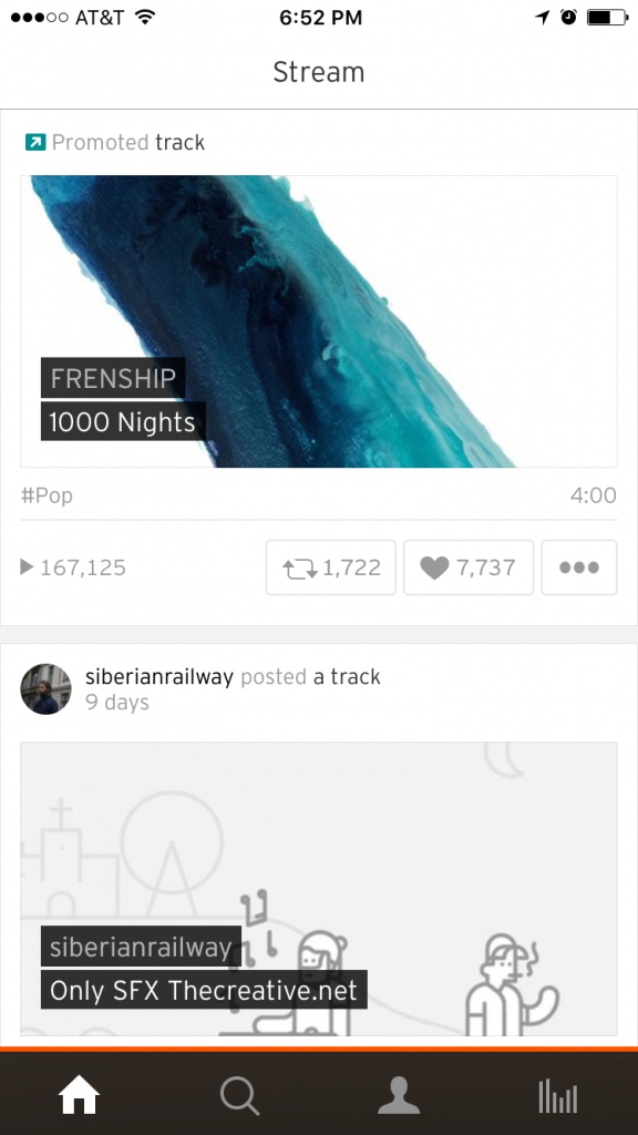
I did some looking around on my own, finding screenshots from different library websites. The Audible, the Apple Music and Podcast apps, and SoundCloud were helpful. It may be confirmation bias, but this competitive research was far more useful than the personas I didn’t create.
Wireframes
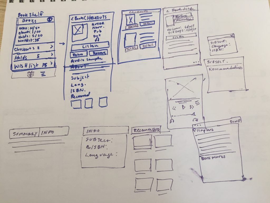
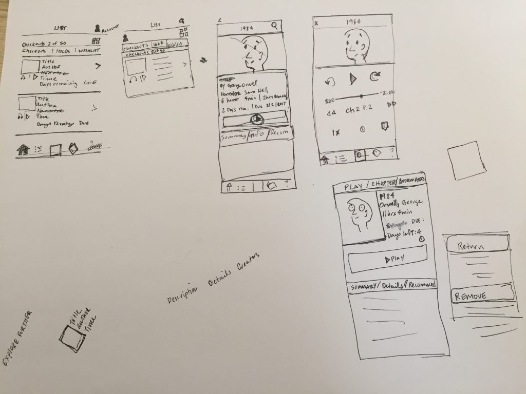
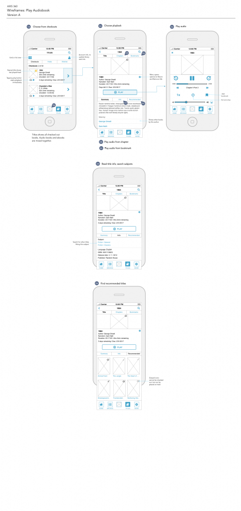
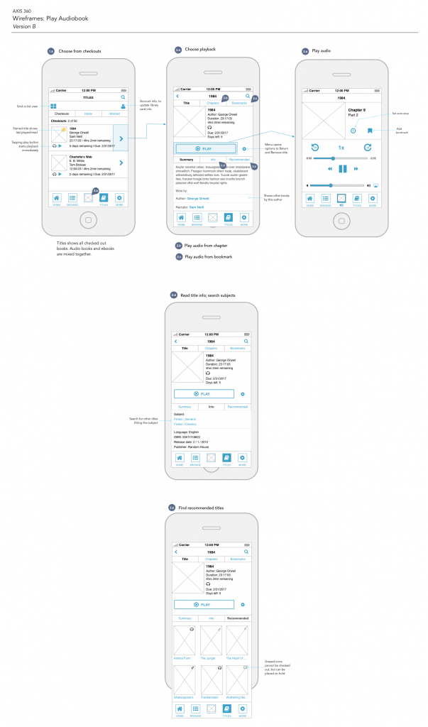
The difference in the wireframes for this project, and projects I’ve done at work, is how she used a vertical layout to present her work. I thought that was pretty smart. And, though it wasn’t specified in the course, I included annotations because I wanted to include ambiguity. (Normally I’d include more.)
For the actual wireframes, I created 2 layouts. I noticed when reviewing the other apps that there’s often a large image in the center of the screen. I felt that this was unnecessary, especially on the playback screen. My solution was to reduce it and focus on the controls.
Next Post…
The next and final post in this series will be about the visual design work I did for this project.