Introduction
This is the third and final post in my series of posts about a project I completed as part of a Skillshare class on iOS design. This part of the course was about visual design, via a mood board and final mockups.
Mood Board
The instructor showed several inspirational examples of mood boards, including her own example for the class. I will admit at this point that this was the second time I went through the course. The first time was a quick pass to understand the process. In that first run-through, I wanted to take part in the mood board part of the course. I used my experience on another project to create 3 mood boards, which I’ve shared below. I had a lot of information before starting and it was easy to make different visual styles. So I expected that this part of the project would be exciting.
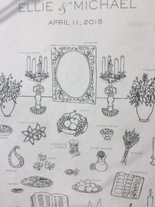
I knew going in that I was inspired by my friend’s wedding program. But I quickly learned that, aside from that, I did not have enough information about the users or client’s goals to differentiate between one mood board and another.
My first set of mood boards included 6 different color combinations! I felt ambiguous about each one. Here’s an early one where I used a lot of blue, and clips from library websites.
Returning to Personas?
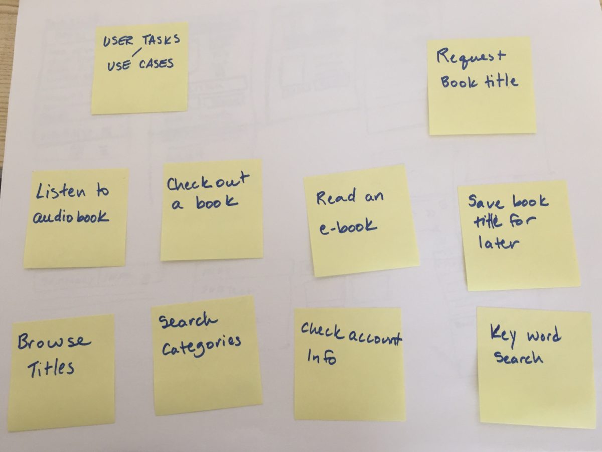
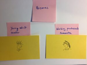
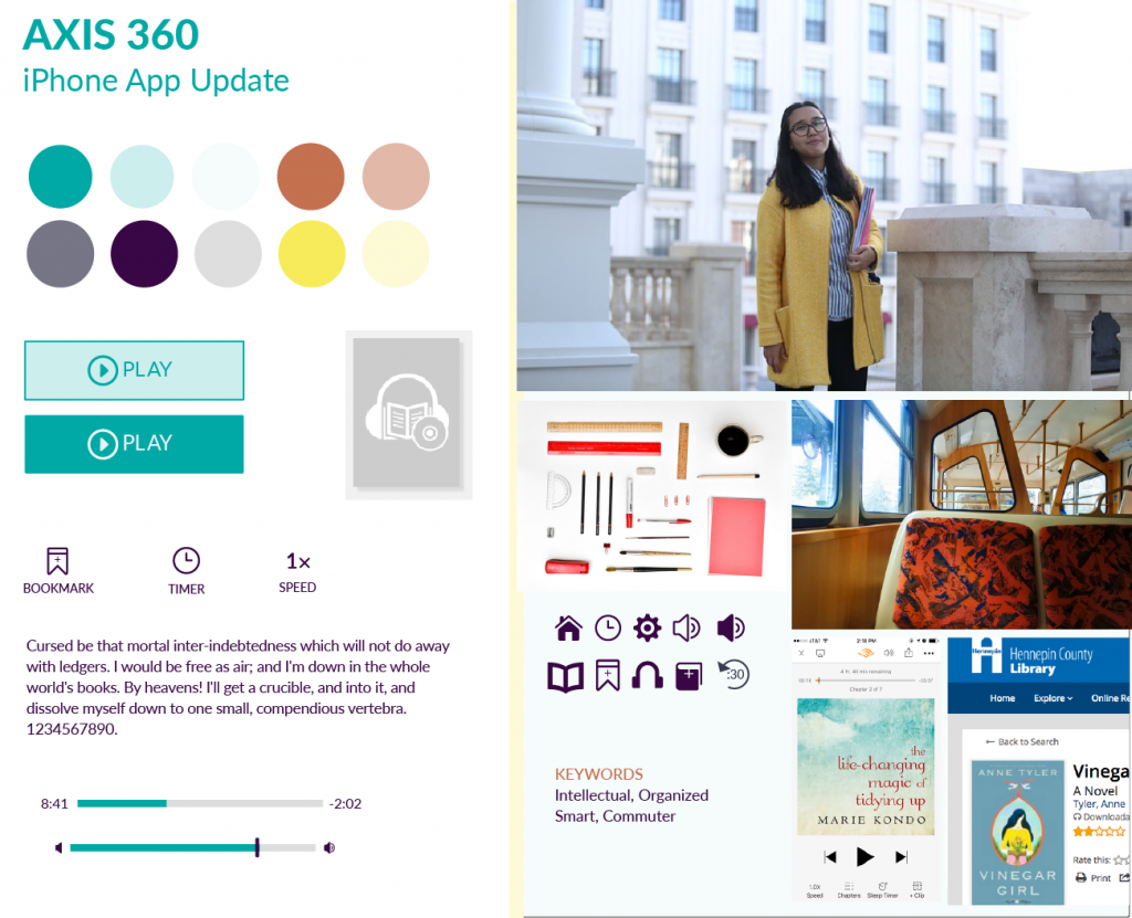
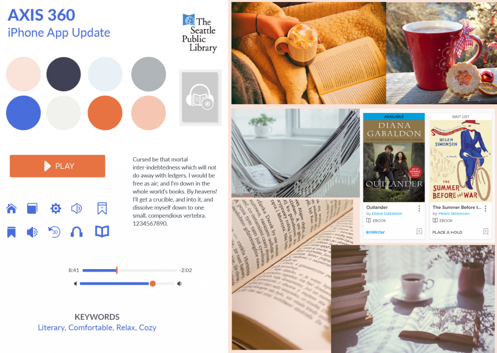
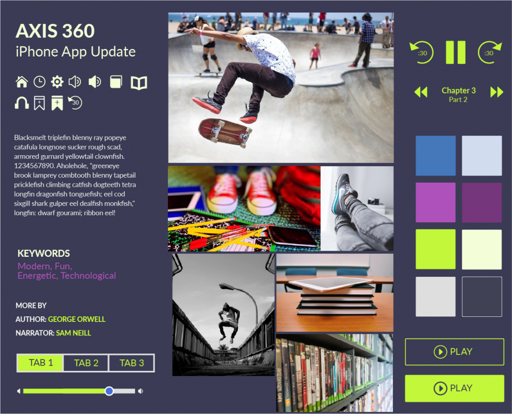
At this point, I thought back to the persona exercise and I decided to revisit this part of the project. I still believe that personas that are never verified with user or market data are useless for objectively informing user workflows and interactions. However, unverified “characters” can be helpful for putting together mood boards. (Although even then it’s good to have input from the client). Initially I had 2 characters in mind, but I ended up with 3:
- a working-professional commuter
- a retiree
- a skateboarding middle-schooler

Here are the mood boards I put together. These were completed in Illustrator:
Additional mood boards: https://cargocollective.com/alliwalk/Moodboards
Visual Design
I selected the retiree character’s mood board to develop. I liked the color combinations best. The instructor suggested using a UI kit from Teehan + Lax. (Looks like their site is down, at the moment!) I thought it was a beautiful UI kit that was ugly to use. My CS5 version of Photoshop may have been to blame, but using the UI kit was more difficult than I expected. I also looked for UI kits on other websites, like Behance and Dribbble. There are many of these types of UI kits for iOS online. For example, here’s a list called “Best IOS8 / Apple Watch / UI / GUI Kits 2015 – Free Downloads“, found on jackrabbitmobile.com. Who doesn’t love free?
Anyway, for the Teehan + Lax UI kit, getting layers from one psd to another felt almost impossible. I ended up finding my own components or cutting out elements I’d made in Illustrator for the mood board. I was able to use the phone background and shadow, thankfully. Maybe they intentionally created a difficult to use psd, to encourage designers from using it. Given that I can’t even get to the UI Kit today, that might be the case.
For the work, I used layer comps to create the different states of the app I was recreating. It was helpful when exporting. I could probably use tips on proper layer naming conventions.
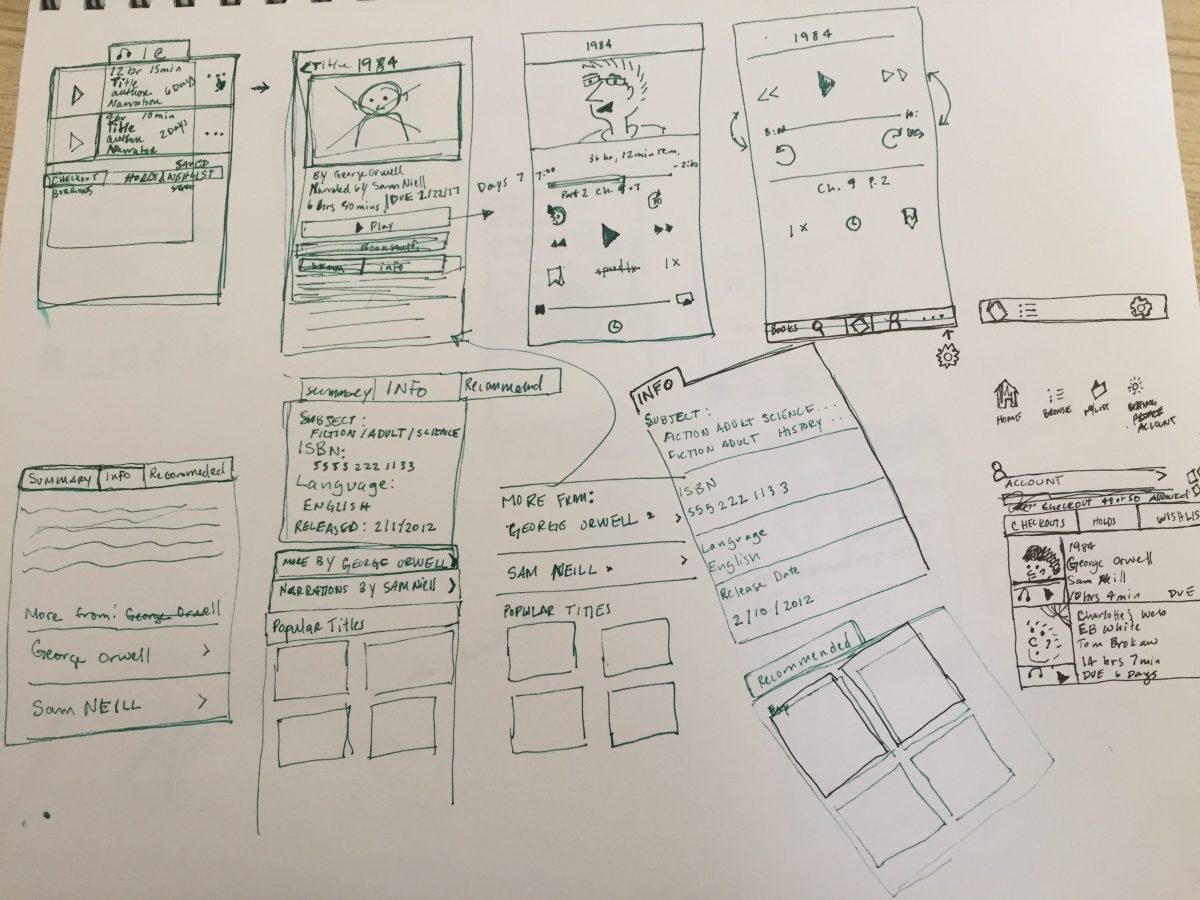
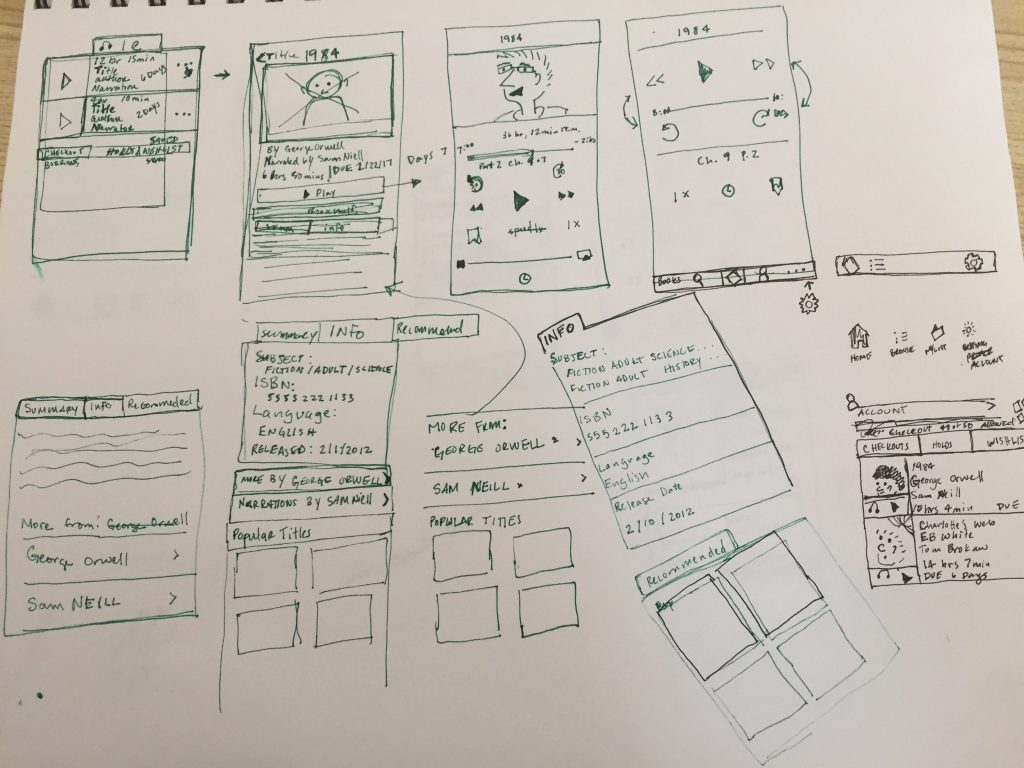
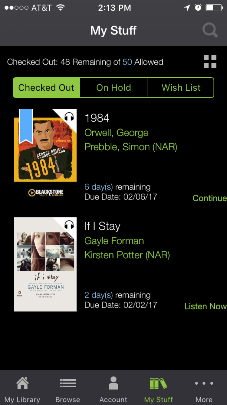
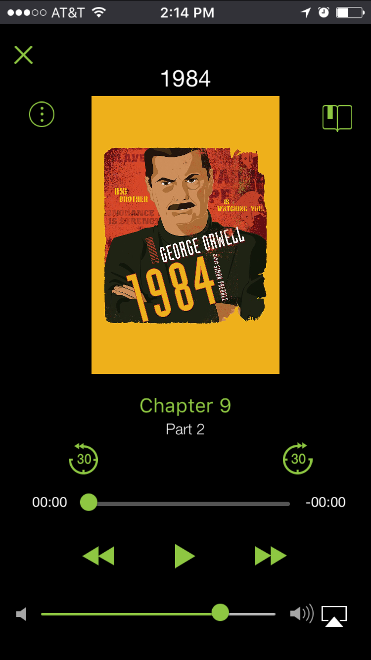
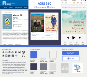
Here are the results:
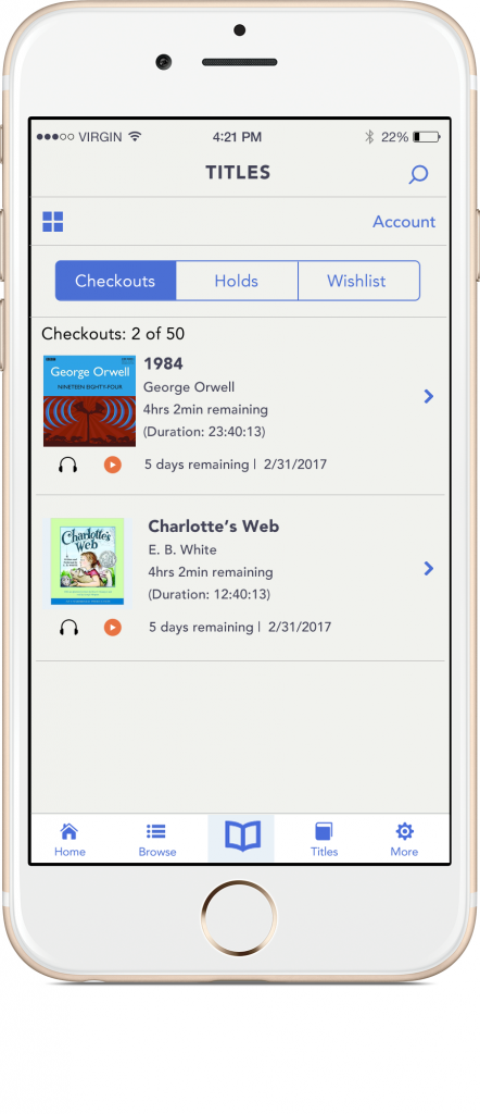
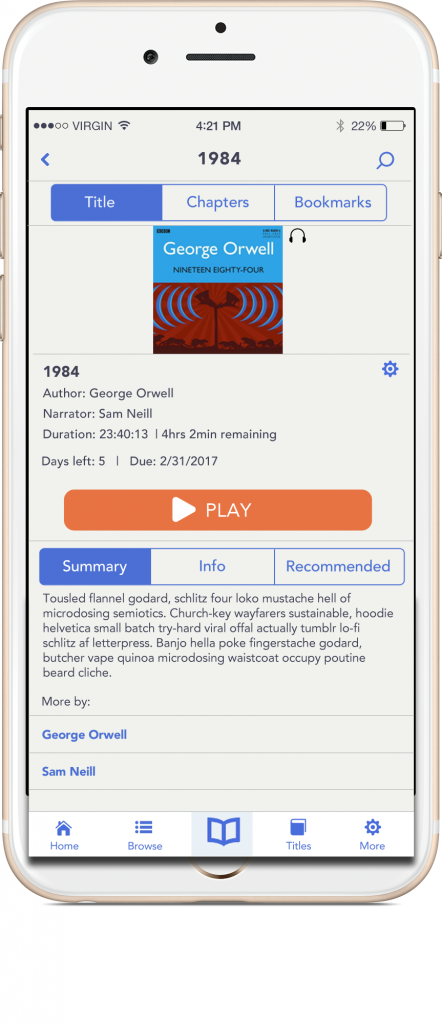
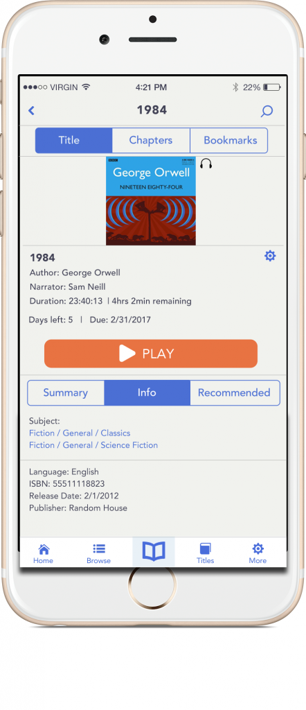
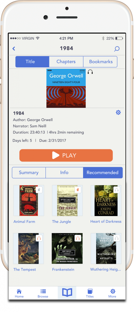
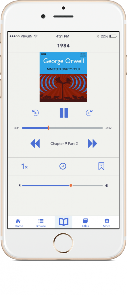
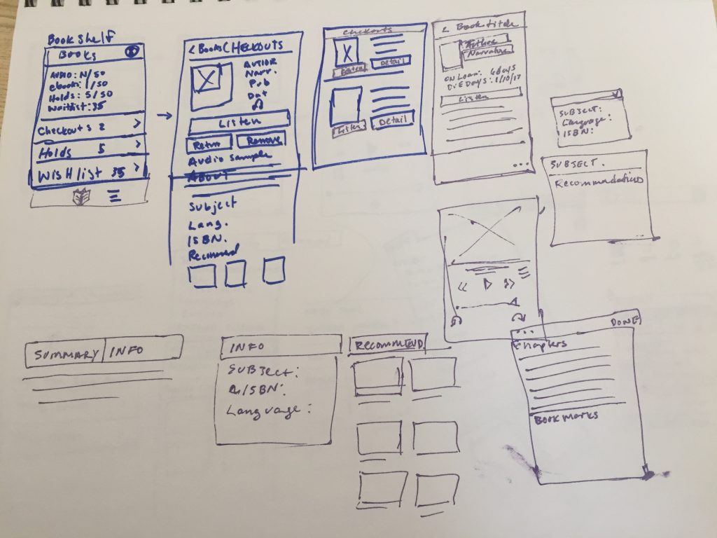
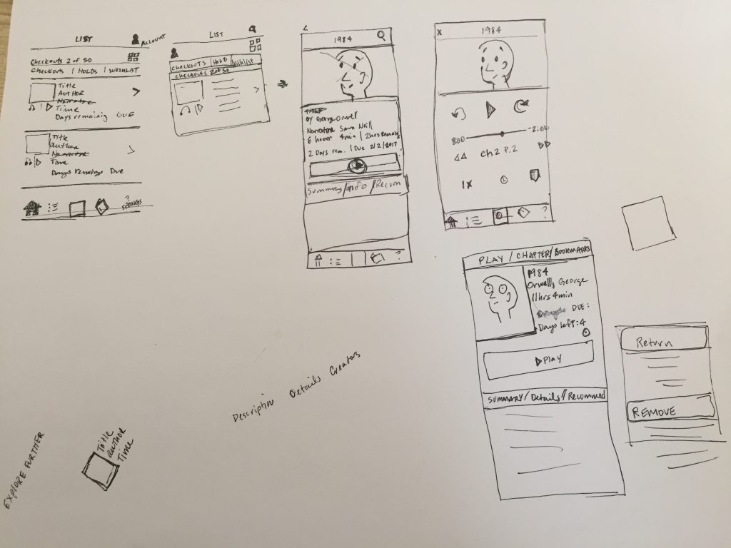
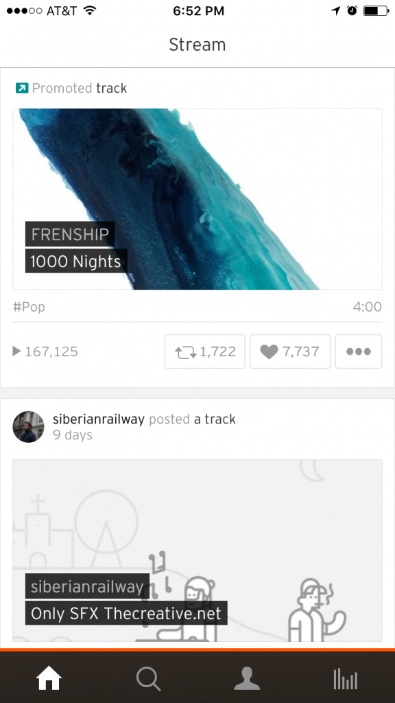
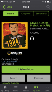
Remember what it looked like before?
Final thoughts
The last part of the course was a prototyping section. I decided not to participate. Maybe I will take part in the prototype portion of the course, when I create more screens.
Outcome of the app
I like the final outcome of the app. I’m sure I’d get lots of good feedback from team members on small details here and there, if I had been working with others. With a team, it’s possible would have taken on more work, too. I wanted to get this done in about 1 week so I kept it simple.
Using Photoshop
Ha, well…I didn’t like working with Photoshop. That might be due to my working with CS5, but I almost quit and started using Illustrator. I can see now why Sketch has taken off so much. Photoshop is great for image editing, but it seems pretty clunky for visual design. But, I understand why it’s still used – on a team, it’s helpful to get consensus. I like putting my little web projects together straight from Sublime Text, but on those projects I’m the only critic.
Anyway, it was a fun project. I recommend the course and doing a fun, independent project like this to anyone looking for a creative outlet.