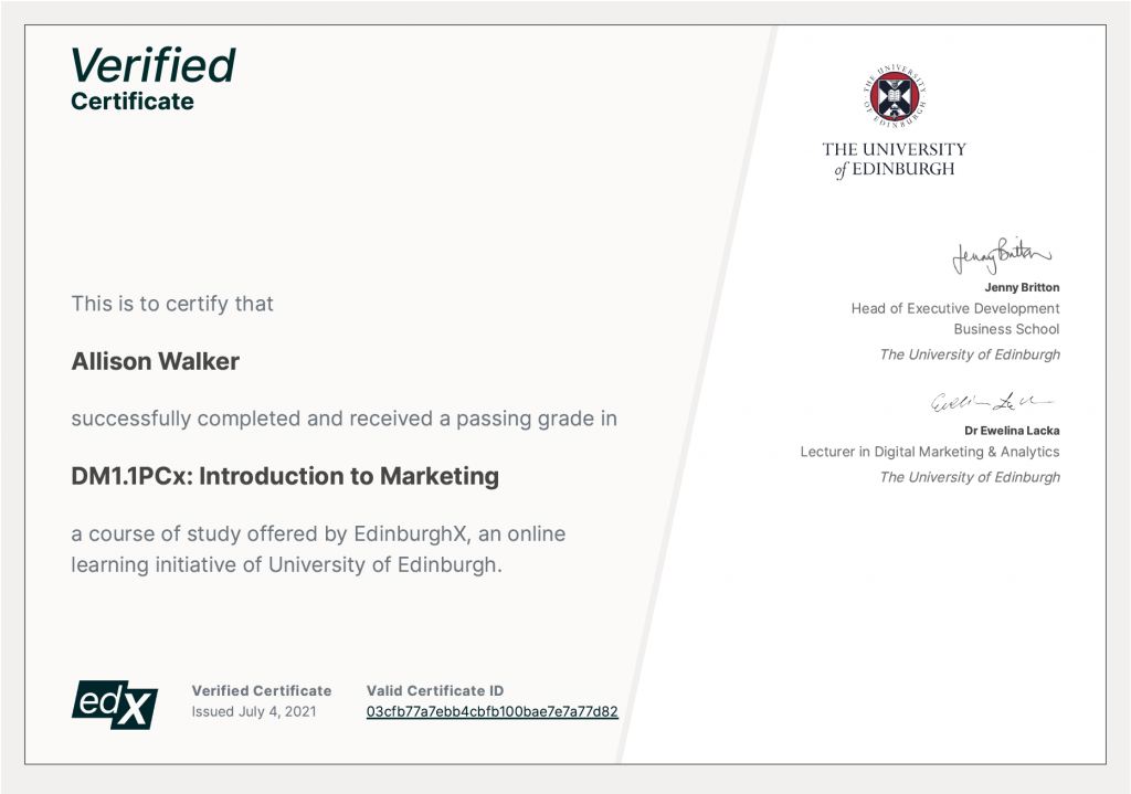
Self-Regulation and Cognitive Distortions

I recently completed a class on Emotional and Social Intelligence, also known as ESI. One part of the course was about self-regulation (or self-management), one of four competencies in emotional and social intelligence.

Self-regulation includes self-control and adaptability. It builds on self-awareness — we have to recognize our emotions in order to regulate them. One way we can use self-regulation is to recognize and think about our feelings to avoid becoming a victim of emotional hijacking.

A thought pattern of emotional hijacking is called Cognitive Distortion. Cognitive distortions are ways our mind convinces us of things that aren’t true. This way of thinking can reinforce negative thinking and emotions, keep us feeling bad about ourselves, and interfere with our ability to self-regulate.

I wanted to share this post about cognitive distortions because I recognized some of this type of thinking in myself. By sharing, maybe others will recognize this type of thinking, too, and learn how to address it before it gets out of hand.

In this post, I’ll provide a few examples of cognitive distortion, plus a few humorous examples from pop culture. I’ll then share 6 strategies for self-regulation and a few resources to find more information.


Examples of Cognitive Distortion

A few examples of cognitive distortion provided by the class include:

  • Polarized Thinking
  • Overgeneralization
  • Labeling
  • Jumping to Conclusions
  • Personalization and Blame
  • Magnification and Minimization

Polarized Thinking

Seeing only in black and white.

An example of cognitive distortion includes polarized thinking. That is, instead of seeing variation, this line of thinking excludes all possible outcomes to only black or white options: success or failure, win or lose, friend or foe, etc. But there’s often more nuance than those two extremes.

Overgeneralization

Something is everything.

Another example of cognitive distortion is overgeneralization. In this case, it means taking the negative outcome of one event or experience and concluding all similar experiences or events will result in the same outcome. Or concluding that the one bad outcome was due to an inherent character flaw. Ex: Going on one bad date means you’re terrible at relationships.

Labeling

You are not a clumsy fool.

In this example, you identify with your shortcomings. This is the same as tripping on a broken sidewalk and instead of saying, “The city should fix this sidewalk. It’s dangerous,” you say, “Oh, of course I tripped. I’m clumsy!”

Jumping to Conclusions

You are not a psychic.

There are two examples of this. One is called mind reading. This is assuming other people are reacting negatively to you, even though there’s no evidence for it. Ex: The security guard at work didn’t say hello this morning, so you assume it’s because they don’t like you anymore. It could be because they were distracted or having a bad day.

The other example of jumping to conclusions is fortune telling, which is predicting things will turn out badly, also without evidence. Ex: You decide not to apply to a job in which you’re objectively qualified because you tell yourself you won’t get it anyway.

Personalization and Blame

Who really done it?

In the case of personalization, you may blame yourself for an outcome that you weren’t entirely responsible for. For instance, you’re on a creative team for a big client. Unexpectedly, the client decides to cancel all accounts and withdraw from the agency entirely. While there are multiple people working on this client’s account, you put all the blame on yourself for their decision.

Blame is when you overlook how your own behavior could have contributed to an outcome. For instance, perhaps the security guard from above didn’t say hello to you this morning because you never say hello back, and today was the day they just stopped trying.

Magnification and Minimization

Live in a van down by the river! or Tis but a scratch!

In magnification, this is an example of taking a single bad outcome and blowing it way out of proportion. Ex: You went on a date that went poorly, so this means that for the rest of your life you’ll never find someone to settle down with…which means you’ll die alone and no one will come to your funeral. Or you didn’t get a perfect score on the SAT, which means you’ll never get into Harvard, which means you’ll have to go to community college…which of course you’ll fail out of and then end up homeless on the street.

Minimization is taking something that should rightly be of concern and shrinking it’s importance. Ex: You have pains in your stomach, but tell yourself it will go away on its own. A child in 3rd grade is still reading at a 1st grade level, but it’s overlooked instead of trying correct it or understand why this is the case. There’s find incontrovertible evidence a spouse is having an affair, but it’s dismissed. You discover financial fraud at work, but say it’s no big deal.

If you want to read a few more examples, there are links at the end. But first, here are a few examples from pop culture.


Pop Culture Examples of Magnification and Minimization

I guess this type of distortion can seem so wildly ridiculous it can seem hilarious to others, and we can find examples in pop culture. It is funny, but it also shows that it’s not uncommon. It happens so often, to so many people, and going back so many centuries…we can all be in on the joke. (So if you find yourself identifying with one of these examples, remember to not identify with your shortcomings: you’re not a magnification-ist!)

A few examples of magnification and minimalization are from Saturday Night Live, Monty Python, and Shakespeare.

Example 1: The Saturday Night Live skit, Van Down By The River, is a funny take on magnification. A motivational speaker is brought in to talk to the teenagers about drugs and their future, but he blows everything out of proportion and says that if they keep making bad choices they’ll live in a van down by the river — just like he does.

Example 2: Monty Python and The Holy Grail has a hilarious take on minimization in the Black Knight scene. Arthur reaches a “bridge”, which is defended by a knight dressed in black. He’s offered a position at court, but the knight doesn’t accept and refuses to let Arthur pass. A battle begins, with Arthur eventually cutting off one of the knight’s arms. Instead of conceding the battle the knight says, “Tis a scratch!” and continues fighting. Despite further devastating injuries, the knight remains obstinately defiant, saying things like, “I’ve had worse.” https://en.wikipedia.org/wiki/Black_Knight_(Monty_Python)

Example 3: There is a similar line from Romeo and Juliet, after Mercutio and Tybalt duel. Mercutio says, “Ay, ay, a scratch, a scratch. Marry, ’tis enough. Where is my page?—Go, villain, fetch a surgeon.” Ironically, Mercutio is not engaging in minimization, as he promptly asks for a doctor. He has recognized the seriousness of his injury. But, by calling it “a scratch”, he uses irony to convey his message which perhaps causes others to minimize the seriousness of his wound, because they assume that he’s joking.


Self-Talk: Where Cognitive Distortion Begins

Part of the reason we begin engaging in this type of thinking is because we let our self-talk get out of control. Self-talk is that inner voice we all have. But sometimes it can become negative and damage our ability to self-manage. We let our inner voice create our outer reality.


Strategies for Self-Regulation

The course discussed a few strategies for self-regulation.

  1. Take control of your self-talk. Recognize when you’re doing it and when it’s getting out of control.
  2. Focus on your freedoms, not your limitations. Getting stuck on your limitations is demoralizing and can conjure negative feelings. Focus on remaining flexible and open.
  3. Find something to learn from everyone you encounter. This can be hard, but try to do it even after encountering people you find irritating, annoying, or critical of you. Perhaps you will learn patience from those people. Try to find something to gain from every encounter.
  4. Stop and think. Take a moment to stop and think before responding. Hard to do in the moment! Try to think about how you can learn from the situation.
  5. Focus on a purpose. I strongly recommend this Coursera course on learning to live a life of purpose: Finding Purpose and Meaning In Life: Living for What Matters Most. I wrote two posts about my experience with this course. Read Part One and Part Two.
  6. Talk less and listen more. Listening doesn’t mean agreeing, but it does mean making an effort to understand. This effort will demonstrate empathy and make for a better relationship.
Journaling

Another strategy is to try journaling. Journaling can help you become more aware of your thoughts and help you catch destructive or counterproductive self-talk. You can write about concerns, accomplishments, disappointments, interactions with other people, and positive and negative incidents in your life.

Greater Good Magazine has several articles on journaling for gratitude, to avoid rumination, and to help get through hard times. https://greatergood.berkeley.edu/search?q=journaling


Summary

  • This post began with a brief introduction to self-regulation as a key component of emotional and social intelligence, or ESI.
  • I introduced cognitive distortion which is a way our mind can convince us of things that aren’t true.
  • A few examples of cognitive distortion include polarized thinking, overgeneralization, labeling, jumping to conclusions, personalization and blame, and magnification and minimization.
  • Pop culture examples of magnification and minimization show that cognitive distortions can be very common and widespread. No one should feel unique if they find that they’ve been thinking this way. (Don’t label, overgeneralize, or personalize!)
  • I explained that cognitive distortion can begin with negative self-talk — that is, we let our inner voice become negative.
  • Finally, I gave a few strategies for self-regulation, to help get back on track.

Self-Reflection: As I mentioned at the top, when I learned about cognitive distortion, I recognized some of this type of thinking in myself. Although it’s better to avoid this type of thinking, it was a comfort to have a name for it. And the pop culture examples helped me see it’s so common we can joke about it. I hope this post is helpful for someone else.

I plan to continue learning more about cognitive distortions. I’ve included a few additional resources below with more information.

Learn More About Cognitive Distortions

Web

There are more cognitive distortions than the ones I included. Find out more about cognitive distortions here: https://www.healthline.com/health/cognitive-distortions

Book

David Burn’s Book “Feeing Good: The New Mood Therapy” (New York: William Morrow & Company, 1980, Signet, 1981), is apparently a seminal book on the topic. More information about this book can be found on the author’s website, feelinggood.com.

Purpose

Web: As I linked to above, Greater Good Magazine has many helpful articles which can help with self-regulation. Find them at greatergood.berkeley.edu.

Course: I took a great course that explained purpose and how to live a life with purpose. It is offered by the University of Michigan on Coursera. Finding Purpose and Meaning In Life: Living for What Matters Most. I highly recommend this course. Greater Good Magazine also has a course on finding happiness in life, though I have yet to sign up.


Cover image: Photo by Elina Krima from Pexels

The #1 Lesson in Constructive Communication

When I signed up for the course, Basic Skills in Constructive Communication, I have to admit that I was initially judgmental about what I thought the quality of the course would be. A few things I noticed about this course made it seem different from the many courses I’ve taken online.

It was from a university I had never heard of and didn’t know the reputation. Also the instructor had a strong accent and sometimes chose strange words to convey his points. I questioned whether this class would provide high-quality information.

Despite my initial impressions, I eventually did come to appreciate the lessons as having high-value when it comes to improving my ability to verbally communicate.


#1 Communication Advice: Ask Clarifying Questions

To distill this course down to a single lesson, it would be this: ask clarifying questions. You will not get better advice when it comes to verbal communication.

The reason why this is such good advice is because we have a tendency to misunderstand and miscommunicate. There can be a substantial gap in understanding between what we think we’ve heard another person say and what they actually meant for us to understand.

Sources of Misunderstanding

Here are four reasons why we might misunderstand:

1. Presumption

Assuming we know what someone else means to say before they’ve finished their message. This may result in interrupting or trying to finish their sentence, because we think we know what they’re going to say. Not only could our assumptions be wrong, but the other person doesn’t get to finish their statement.

2. Move Too Quickly to Judgment

Making a judgement on someone’s statement before we’ve fully understood what they mean. We don’t like what they’re saying and want to argue against it. Instead of listening to the meaning of their message, we start thinking about how we’re going to respond.

3. Rejection Based on Communication Style

We discount a person’s opinion because they’re expressing their opinion in a style that we wouldn’t choose for ourselves. Maybe they have an accent(!?), or they chose words we would not have selected.

4. Ego Stops Us from Listening

We simply believe our opinion is more important than theirs. We don’t listen because we think we don’t need to listen. Our opinion is already right, so what’s the point. A decision will be made, without even letting another person speak.


The Damage of Presumption, Judgment, Style, and Ego

There can be a few problems when we don’t listen or take the time to clear up potential misunderstandings. Imagine how a decision maker could miss out on potential opportunities or make poor decisions in the following scenarios:

  • Cutting someone off before they’re done speaking, because we assume we know what another person means.
  • Discounting a good idea because didn’t like how someone said it.
  • Making decisions without gathering enough information, because we haven’t given others an opportunity to speak.

For example, I initially judged the course based on style. If I had let my judgement prevail, I would’ve missed out on very good information.

In addition, miscommunication can be seen as rude and lead to interpersonal conflict. A conversation can easily become derailed, as the communicator responds to the response, rather than the substance of the conversation.


Asking Clarifying Questions is a Sign of Emotional and Social Intelligence

When we ask clarifying questions, we get away from our assumptions and our ego. We listen to what another person has to say. We take their message for what it is and we try to understand. Only after we’ve fully understood, do we decide how we want to respond based on our own values and judgements.

You may think that asking someone to explain themselves could be seen as annoying. However, making an effort to show that you’re interested in understanding another person’s point of view, whether you agree with it or not, can deepen relationships and is a sign of emotional and social intelligence.


Types of Clarifying Questions

It just requires a little imagination to come up with clarifying questions. These are a few questions I’ve found useful:

  • I’m not sure I fully understand what you mean by ____. Can you explain a little more?
  • I’m not sure I fully understand what you mean by ____. Could you describe an example of what you mean?
  • Thank you for sharing that feedback. I want to fully understand you, but I’m not exactly sure I do. Can you elaborate a little bit?
  • Thanks for that question. Just so I’m clear, when you said ____, did you mean ABC or XYZ?

This is not a comprehensive list, just some examples. As you can see, I try to emphasize that my intention in asking the question is to understand their meaning further. This generally leads to a very positive response.


Summary

In a conversation, it’s easy to misunderstand another person’s message.

If there’s any doubt in the meaning of another person’s message, ask a clarifying question.

Presumption, premature judgement, style, and ego are four reasons why we might miscommunicate, intentionally or not.

Clarifying questions will not only help to clear up any misunderstandings, but the effort alone can help deepen relationship. It is also a sign of emotional and social intelligence.

In my experience, asking questions that emphasize your intent to understand are the best framework to use.

Event: NYPL Financial Planning Demonstration

Overview and notes from a financial planning demonstration, provided by the business center at the NY Public Library.

Introduction

I recently attended the online seminar, Financial Planning Demonstration, which was presented by the NY Public Library, Thomas Yoseloff Business Center.

The webinar covered a lot of great information and much of what I jotted down seemed quick and easy to remember. I thought it was really helpful, so hopefully others will learn something.

Here’s what I have to share:

  • Overview: A bit about the presentation and the speaker
  • Presentation Notes: Presented in Q&A style
  • Final Takeaways: The speaker’s wrap-up and final thoughts

Then I’ll share a few of my own concluding thoughts and where to find more events.


I. Overview

Event Name

Financial Planning Demonstration (Eventbrite)

Webinar Description

You have probably heard about “Financial Planning”, but do you know exactly what is involved in the process? Learn how the financial planning process can be used to quantify your resources and how you can then best use those resources to reach your financial goals.If you have been curious about what, exactly, a financial plan is and how it can be used to navigate turbulent markets, then, this is a webinar you will not want to miss.

Presenter

Charles Failla, CFP®

Chuck understands the importance of working as a Fiduciary and uses those standards to oversee the financial planning and investment management work done at Sovereign Financial. As a Board Certified Financial Planning™ practitioner, Chuck understands that shepherding a client’s financial and retirement plan requires more than simply “picking investments”. In addition to working with clients, Chuck is a regular speaker and commentator on financial topics and has been featured in Forbes, The New York Daily News, Reuters, CBS Market Watch and numerous other media outlets. Chuck is also committed to the financial planning community and advancing the cause of financial literacy. To that end, he currently serves on the Board of Directors for the Financial Planning Association of Connecticut as the Chairperson of their Pro Bono / Public Outreach Committee.


II. Q & A Notes

What is financial planning?

Determining how much money is needed, and when it is needed.

Why do financial planning?

2 reasons:

  1. Avoid Sequence of Return risk
  2. Helps you optimize investments conservatively vs aggressively

What is Sequence of Return?

This impacts people in retirement, but not people while they’re saving in retirement.

Sequence risk is the danger that the timing of withdrawals from a retirement account will have a negative impact on the overall rate of return available to the investor. This can have a significant impact on a retiree who depends on the income from a lifetime of investing and is no longer contributing new capital that could offset losses. Sequence risk is also called sequence-of-returns risk.

Investopedia, Sequence Risk, Nov 2020: https://www.investopedia.com/terms/s/sequence-risk.asp

The short answer is running out of money in retirement. Apparently, a lot of people have never heard of this before. (I understood the concept, but this was my first time hearing this term and the first time it had been demonstrated so clearly.)

What is Long-Term Care Insurance?

A long-term care insurance policy helps cover the costs of that care when you have a chronic medical condition, a disability or a disorder such as Alzheimer’s disease.

NerdWallet, Long-Term Care Insurance Explained, May 2019, https://www.nerdwallet.com/blog/insurance/long-term-care-insurance/

Doesn’t recommend for someone who is: a.) Very wealthy or b.) Already pretty sick.

How do I optimize my investments?

This image shows a computer screen, with bar charts that increase from left to right.
Split money into buckets, based on when you need it.

Split money into buckets, based on when you need it. For instance, think of how much money will you need in:

  • 1-5 years
  • 5-10 years
  • 10+ years

This gives more control and helps protect money from risk.

When should you rebalance a portfolio?

  • It could be on a regular schedule: quarterly, annually, etc.
  • Setting and forgetting is a mistake!

How do you use buckets to protect your portfolio from sequence risk?

You want money you will need in 1-5 years to be the most secure. Money that’s needed 10+ can be treated more aggressively. Aggressive portfolios will always provide the most returns, but they also have the greatest risk.

Here’s a breakdown of how to think about the buckets in relation to portfolio types, based on when you need the money:

  • Conservative portfolio: 1-5 years
  • Moderate portfolio: 5-10 years
  • Aggressive portfolio: 10+ years

Ex: Money that’s needed in 1-5 years would be in the conservative portfolio. It won’t grow as much, but it won’t lose as much. Money that’s not needed until 10 years from now can be put in the aggressive portfolio.

What’s a good site to find a planner?

plannersearch.org

If I’m looking for a financial planner, what should I look for?

  • Talk to 2-3 advisors
  • Get to know their fees
  • Know their bias

Bias: A good planner will sign a fiduciary agreement, meaning they are required to treat your money as their own. If you work with a bank, which tries to sign you up with one of their products, they might have bias and not be willing to sign this agreement.

What does “cash” mean on a portfolio statement?

Generally cash is saved/safe. It’s in that conservative bucket. Rate of return is lower. Could be in a CD, a structured CD, money market, etc.

Is there a difference between money management and financial planning? Could the same person do both?

The answer to both is Yes! A financial planner helps create the structure. A money manager directs the money, helps select the products, etc.

It’s possible to find someone who’s able to do both, which could be cheaper than getting 2 people. Often it’s the money manager who does not do financial planning, vs the other way around.


III. Final Takeaways

The purpose is to emphasize that taking a look at finances can lead to small changes, that can have big impacts later.
Small tweaks can lead to big changes.

Small Tweaks → Big Changes

Small tweaks to your plans could lead to big changes. These changes could be, for instance:

  • Choosing to retire later: Instead of 60, retire at 64
  • Downsizing: Selling a large house for something smaller can lead to more money available to reinvest
  • Living on less money: Reducing the amount of money you expect to need per year; instead of $130,000, go to $100,000

Other Planning Tips

Selecting a Planner: You don’t need to know everything before choosing a financial planner. But, when they’re explaining things, you should feel comfortable that you know everything. Know enough, to know what to ask.

Bias: Make sure you find a CFP who will sign a fiduciary agreement. The worst stories come from people whose planner had bias.

Buckets: Use the buckets to protect money in the future. People who start off with the exact same amount of money in retirement can run it down too soon, if their money isn’t protect from unexpected losses.

Rebalancing: Setting and forgetting your portfolio is a mistake because markets change. If you don’t adjust, or rebalance, your portfolio from time to time, changes in the market could mean not protecting your investments or missing opportunities to get good stocks at low prices.


Conclusion

So, those are all of the notes I had to share! Hope they were helpful.

To recap: I shared an event overview, my Q&A notes of the presentation, and the speaker’s final wrap-up comments.

My thoughts: As I mentioned at the beginning, I thought it was a very informative webinar. For instance, I hadn’t heard of long-term care insurance, so that was good to know.

Additional events: There are more webinars related to money management and finance on the NYPL website. You can also subscribe to their email list, and they’ll send announcements of upcoming webinars or other resources.

Tips for Improved Time Management & Productivity

Three time management and productivity tips anyone can use to account for time, plan ahead, and prioritize tasks.

Overview

I recently learned some productivity and time management tips and tricks, after attending an online seminar from the New York Public Library and a course on Coursera. I decided to make a blog post after several weeks of using some of the concepts and tools.

In this post, I will share 3 tips I learned on how to:

  • Better account for time on task
  • Schedule long-term and complex tasks
  • Prioritize difficult tasks with a change in mindset

I also have some research on the importance of timing.


Time Tracking: Accounting for Time

One of the tips I learned on time management was on the importance of getting an accurate recording of how you spend your time. There were a few suggestions around this:

  • Create a calendar with 30 min slots of time and then write down what you did
  • Create a task list for the day, and prioritize what needs to get done vs what can be postponed
  • Generally schedule time for the inevitable distraction

I haven’t yet tried the 30 min calendar, but I have been planning for being distracted. Or to put it a better way, I’ve been using a digital countdown timer to account for how much time I spend on tasks.

Smart Countdown Time for PC and Mac helps me account for how much time I spend on a task.

The product I’m using is Smart Countdown Timer, which is available for Mac and PC. It has two benefits so far:

  • Stay focused on a task
  • Time-block different activities, both scheduled and unscheduled

For scheduled tasks, if I have my list of tasks to complete, I can set the time for how long I want to work; (ex: 30 min, 20 min, etc). I know that I will have worked for at least that period of time. And when that time is over, I can reset the clock again, or move on to another task. It’s also great to keep track of how much time I’ve been sitting in one place!

For unscheduled tasks, like if I get a text, or I just have that feeling to check social media or email, it helps me in 2 ways:

  • First, I can look at how much time is left to finish my scheduled work. Then I can decide whether it makes sense to put off my distraction or just go do it. For instance, if I see there’s only 5 minutes left for my task, I’ll just finish my work and then go check my email. If it’s longer, that’s a different decision but you get the idea.
  • The other thing it helps me do is put a time limit on how much time to allow myself for a distraction. For instance, after I finish my work and want to reward myself with a little distraction, I can give myself 12 min, or whatever, to make tea, check email, etc. This way, I still get my distractions, but I don’t get carried away with the time.

For both of these scenarios, when I need more time, I can just add it. But the main point is to stay on task and hold my time to account.


Task Management: Keeping a 30-60-90 Calendar

Another tip I learned was to create a special type of calendar to keep track of longer term goals and tasks. It’s called a 30-60-90 calendar, which stands for 30 days, 60 days, and 90 days. The idea is that it can be hard to take action on 1-year plans or 5-year plans…if you can even plan that far ahead! But 30 days out is a little bit more manageable, as well as 60 days or 90 days. So this calendar is a method to help get some of those longer term goals started and accomplished.

Example of 30-60-90 calendar for tasks scheduled 30 days from the current date.
Using Google Sheets

For my calendar, I use Google Sheets, with different sections for the chunks of time. I use formulas for the dates, so they’re always accurate relative to the current date. My columns are:

  • Activity – The task to be accomplished
  • Date Assigned – The date I added the task to the calendar
  • Deadline – Either a hard deadline, like taxes, or n+30, n+60, etc.
  • Est Time – How much time I think it will take, though I don’t always enter this information
  • Priority – I don’t always include this and instead rely on order
  • Progress – See below.

In the progress column, I write down activities on what I’ve done to complete a task or notes related to that task. Related notes might be phone numbers, addresses, etc. For instance, I had a task to ‘Get dental X-rays’. The progress column kept track of my activity in locating a dentist, getting a quote, and finally putting in an address, phone number, and date after making an appointment.

Bonus Tip: Break apart big tasks into smaller pieces

And just to make another point on tracking progress, which maybe goes without saying: it can be helpful to break apart big tasks into smaller pieces and tackle each one at a time. For instance, getting dental X-rays could involve getting a quote. Getting a quote could involve calling multiple offices, and so on. So this task could be broken up in a few different ways.

In my experience, it feels nice to accomplish tasks and make progress, even if those tasks are small.

Creating Artificial Deadlines

This type of calendar can be used to create an artificial deadline on long-term tasks that don’t have one already. For my X-ray example, for instance, there was no real deadline for that. But I created one with this calendar by giving it a date 30 or 60 days in the future.

I’ve also found that this calendar is also helpful for scheduling calls with friends and keeping up with people, generally speaking. Rather than say, Hey, let’s talk later and then kind of forgetting about it, now I can actually put down that phone call for 60 days out. It’s like a CRM for friends!

Working Through Tasks

As I work through the list, I move tasks from bottom to top. When they’re completed, I cross them off and move them to another tab. I had a task, Publish a blog post on productivity resources, which I put on the list 60 days ago. Little by little, I added more and more detail, moving it through the lists. Here I am now, accomplishing that goal.

Calendar Modifications: 10 days, 20 days

One way I’ve augmented this calendar is to add more sections for immediate tasks. I found that the 30-day slot was too broad to help me prioritize things that need to get done in the next 1-2 weeks. So I created new sections for 10 days and 20 days, respectively. As I move tasks up the list, the new sections help me keep track of things that need to get done right away.

Downsides

While this calendar is helpful for future and complex tasks, I find that this list is not great for daily or routine events. Something like going for a daily 30-minute walk will never leave the list, because it occurs every day. If a task never gets finished, it can feel discouraging because it seems like there’s never any progress being made. So I recommend not using it for that.


Prioritizing Tasks: Eating Your Daily Frog

The final concept came from the productivity seminar. It’s focused on ranking your daily task list, from most dreaded to most favored, and tackling the worst of the worst first. It requires changing your mindset towards how you look at your tasks.

“Eat your frog” by prioritizing tasks.
Putting It Off

In the past, when I had a list of activities to get through, there would often be one that I really did not want to do. I would put it off! My mindset was something like this: “I’ll postpone it until I’m able to work myself into finally getting it done”. Whether it was a difficult phone call, or just a tedious task, I would put it off by doing all the fun stuff first.

Challenging That Mindset

The concept here challenges that mindset by reversing that order. It says: Take that worst thing and get it done first. The concept supposedly comes from a Mark Twain quote about “eating your daily frog”. It goes something like this:

“If you eat a frog first thing in the morning, this will probably be the worse thing you do all day.”

Mark Twain (maybe)

Eating your frogs means that by prioritizing your worst tasks first, you’ll be able to get them out of the way and work on tasks you enjoy more and more. It will be a relief that the most difficult task you needed to do is already done.

Putting It Into Practice

I’ve been putting this into practice and it has been pretty helpful. But some days I think, “Wow, I really have a lot of frogs today!” But actually, there’s another Mark Twain quote that goes something like this: If you have two frogs, start with the biggest one. 🐸

It can be a little difficult when unscheduled “frogs” show up. I don’t really have a solution for that, other than using the timer to account for my time. But for those that are on the list, it’s a helpful motivator.


The importance of timing

Unrelated to my course or the productivity seminar, I watched a talk from the Royal Society for Arts, Manufactures and Commerce (RSA) YouTube channel. The talk, The Secret of Perfect Timing, was given by Dan H. Pink, who is the author of When: The Scientific Secrets of Perfect Timing.

The talk is about his research on the importance of time or timing. He argues that being mindful of when tasks take place can make a difference in their outcome. For some people, it can also be useful to help prioritize when tasks take place based on when their mind is most efficient.

I also like that this research supports the idea of taking care of your most challenging or difficult tasks early, though even Dan Pink says that’s not universally the case.

The Secret of Perfect Timing | Dan Pink – 58:23

Summary

In this post, I reviewed three tips on time management and productivity:

Time Tracking: Accounting for Time

Tip: Use a digital timer to account for elapsed time.

  • A timer can help keep track of how long you’ve been working on a task, or even how long you’ve been sitting.
  • It can also help structure time, by tracking how much time is being allotted to scheduled and unscheduled tasks.
Task Management: Keeping a 30-60-90 Calendar

Tip: Plan ahead by managing tasks with a calendar focused 30, 60, and 90 day intervals.

  • This works best for long-term and complex tasks with clear ends, such as filing taxes.
  • It’s not great for recurring tasks, like taking a daily walk.
Prioritizing Tasks: Eating Your Daily Frog

Tip: Take care of your most difficult task first, rather than putting it off.

  • Change your mindset: Once your most difficult task is accomplished, everything else that day will be easier in comparison.
Video: Dan Pink, When

Overview: When a task is accomplished can make a difference, sometimes a big difference, in the outcome.

  • The video from Dan Pink’s talk, The Secret of Perfect Timing, goes into detail on how the timing of certain tasks can affect the outcome — e.g, when a decision is made, when a procedure is scheduled, etc.
  • Some people are more efficient at different times of the day, due to how their brain works.

That’s it! I hope these tips are as useful for you as they have been for me!

March 2021 Portfolio Updates

An overview of portfolio updates, from March 2021.

Introduction

This post is a follow-up on recent changes to my UX portfolio. The changes are detailed below, but here is a quick outline:

  • Main images
  • Featured projects
  • Personal branding
  • Images
  • Colors
  • Language and tone
  • Mobile enhancements
  • About and Colophon pages

Before I get to these changes, here is a quick update from my last post.


Quick Follow-Up: About and Colophon

As my last post described, my UX Portfolio previously looked like this:

Side-by-side view of all project pages next to each other, showing an older view.
A look at my previous UX portfolio, with pages displayed side-by-side.

On the About and Colophon pages, on the far right, the arrows show a change from using a thin/fine font weight for the titles to using a heavier font weight. I had also changed the whole page to have much wider margins.

Notice also that, like the About and Colophon pages, some projects do not have images.

Changes from About and Colophon, from skinny headline title and wide width, to heavier headline with narrow width.
Changes to the About and Colophon pages.

Version 4.2, March 2021 — Major changes

With these March 2021 changes, I’ve massively updated the website. As I did with my last major update, I wrote a little note to myself to document the changes. That note…I wrote right in my Sketch file! Below is an edited copy of what I wrote to myself.

Overview & Goal

The goal of these changes was to build on the theme of unification, which I started in the February update. The changes include the following:

  • Inclusion of a main images for projects
  • Removing and rearranging projects
  • Include principles of personal branding
  • Selecting image ratios for project galleries
  • Updating the color palette
  • Updating the language and tone
  • Inclusion of mobile enhancements
  • Updates to the About and Colophon pages

Detailed Changes

1. Make sure all projects have a main image.

No More “Swiss Image

I decided on a new look for headlines on project pages. In my previous update, I’d changed the headlines so that the projects would have a unified look, regardless of whether or not they had an image. However, after more consideration, I felt that the lack of an image for projects was a weakness.

I was sad to move away from the “Swiss poster” -style headline. I originally selected this style due to its asymmetrical appearance and unusual look. I felt this would help my portfolio seem more memorable. Here is a before and after:

Old Lux-Retail image with Swiss poster style
Previously, project pages used a layout I called “Swiss Image”.
Side-by-side view of project images, showing the unified look of the projects
After: all projects now have images.
2. Removed Adorama project as a page.

My intention for this project was to provide a logical overview of my research activities and thought process. However, due to previous iterations of my portfolio, the presentation of this project was much different from the others:

  • The portfolio page was somewhat short
  • A comprehensive explanation was available, but required linking to a blog post

While the blog post was comprehensive, I felt the project summary on the site wasn’t very strong. In reconsidering my strategy for the experience of this page, I decided that forcing people to click through to a blog post seemed too much. So, I removed the page.

I felt a sense of nostalgia for this page because this project helped kick off the first changes on this website, from Bootstrap to Tachyons.

But there’s an update: Actually, I put this project back! However, I did eliminate the link to the blog post. Instead, I updated the page itself to include more detail. I put this off for a while because I had assumed that this would be more work than the gain I’d get from it. But the effort wasn’t as bad as I thought. So of course there will be another portfolio update!

3. Scrapped a 7th Project

I had plans to include a 7th project page, which would be just user journeys and maps; sort of stand-alone examples. Ultimately, I decided against it:

  • I wasn’t sure it was a strong enough page
  • The page was too different compared to the others
  • Trade-off between showing more work vs showing too much was imbalanced

It’s possible I may reconsider including this page at a later time, if another project gets eliminated.

Project image for mapping page
7th project I didn’t end up using.

“Catalog” SVG Images

In addition to removing the project page, I also ended up removing some of the SVG images at the bottom of the page. These images would have been available as example projects/links.

I ended up adding two new SVGs. Although, I may need to revisit this and look at which SVGs I want to include.

Changes to catalog section at the bottom of the homepage.
Over time, I changed the list of projects/companies displayed at the bottom of the index page.
4. Applying Sales Copy and Personal Branding: Index Page, Testimonials

After attending some webinars on personal branding, self-promotion, and writing sales copy (for personal branding), I realized how powerful testimonials can be on a website.

The good news is that I was already including testimonials. The bad news is that they were a little difficult to find. You had to click on each project to find them, which meant some of them might go unnoticed. They were also were long and wordy.

Example of a testimonial from a project page. In order to read this, you had to click on a project.

The change I made was to highlight two quotes on the homepage, and then include a link to a Testimonials section on the About page. Rather than include the full testimonial, I included just a sentence or so. Readers can visit LinkedIn to view the full quotes.

Left image shows no testimonials. Middle image includes 2 testimonials. Right image shows a group of testimonials, with a link to LinkedIn.
Transformation of the homepage. Left image shows no testimonials. Middle image includes 2 testimonials. Right image shows a group of testimonials, with a link to LinkedIn.

I also changed the home page to reflect more of what I learned during the webinars. For instance, the title is meant to appeal to hiring managers without being too explicit.

The testimonials also provide a sales purpose: as a webinar leader said, testimonials are a way to “borrow” authenticity.

5. Language and Tone

I made a few changes to language and tone with the following activities:

  • Editing corrections by reading out loud
  • Using an active voice
  • Updating project descriptions
  • Using original descriptions in project titles and subtitles
  • Updating descriptions on the homepage

Read each project out loud

Tying into point #4, I went through every project and read it out loud. This helped me find typos, and make sure each page flowed well. I didn’t find too many typos, but I often repeated myself from section to section. Reading out loud helped me find and fix those issues.


Use an Active Voice

I also took the advice of a personal branding expert to use an active voice, especially when describing myself. Here is an example of a change:

  • Old version: I’m the kind of person who can get into the weeds and takes on challenges
  • New version: I am comfortable getting into the weeds and taking on challenges.

Maybe this could be better, but overall it’s an improvement.


Updated Project Background/Overview

Under each project image is a little background information about my role, the company, the client, etc. I felt this section was too tall and drew too much attention.

I added a title for the Background section and cut down on the client/company overview for each project by creating a 3-column group of text.

Updated background section is shorter, eliminates the image. Goes to 3 paragraphs.

Update Projects with Original Descriptions

I decided maybe I was creating more work for myself by trying to come up with my own interpretation of what a project was about.

My solution was to search through my inbox, and find the specific descriptions used in project or company descriptions, as they were pitched to me. If I couldn’t find an email, I sometimes searched online — sometimes taking descriptions from Wikipedia — for company descriptions. Here’s an example:

Showing how I changed the title and subtitle on project pages; typically going from a longer description to shorter.
The second subtitle comes directly from the job post.
Background section showing a change to the Agency Profile with image to description with a short paragraph.
The description on the right uses language from the hiring manager, describing the company.

Home Page Project Descriptions

I also considered how I described each project on the home page. It turns out I was describing projects in 2 different ways. For instance:

  • By project activity: “Redesign for…”
  • By project outcome: “Design Tools…”

I decided to update the descriptions. Now the titles describe the project outcome and the description explains the activity/detail.

For another layer of home page detail, I also included the name of the company. I felt I had more space, since I was removing other projects.

Showing changes to project descriptions on the homepage
On the home page, I modified language and tone for each project so that they were all more consistent in language and style.
6. Color Changes

As I was revisiting some of my research on portfolio websites, and looking for ideas, I came across www.vitsoe.com. This appears to be the website for the company run by the German designer, Dieter Rams.

The website is quite organized. It follows a very clear 3-column layout. And it only has 4 colors: Black, White, Grey, Blue.

vitsoe.com

I liked the blue color, which they use for links. After trying it out a bit, I decided to use it for my website — also for links.

After that, I decided to do a lo of color exploration, to make sure all my colors coordinated. This eventually led to an entirely new palette. It was all based on this one color!

Screenshot of a collection of screenshots, of coordinating colors
Exploring colors, using the blue link color as a starting point.

Historic Color Reference

I went back to my 2017 website to find good ideas, since it was a good enough portfolio to get me a 6-month gig. Turns out I used a white background that wasn’t pure white. It was actually an extremely light version of the dark navy blue color I had been using for the footer and the page titles. I took that hue and created a few shades to use as background colors. 

Screenshot of my old website and colors.
The image on left is from my 2017 portfolio. Both of these colors have the same hue, but different saturation and brightness.

After generating so many colors, I decided to try out some of the new dark shades to see if maybe I should make some other changes.

The previous primary font color was 220 HSL, which is that very dark navy. The new color is 280 HSL, which is a very dark purple. I think the new color is a little warmer, and lighter shades look kind of lilac.

I updated all of the project images with hues from the new color palette. The new colors are kind of pastel and muted, including greens, purples, and off-whites.

Overview of updated color palette, based on the blue.
New Palette. These aren’t all the colors, but many of them.
7. Image Ratios

As I mentioned, I had a goal to create more of a unified look across project pages. I knew that one way to do that would be to make sure all the images were the same size or aspect ratio.

This was something I had been thinking about for a while, but I hadn’t quite gotten around to it yet. The Vitsoe.com website, for example, uses 2 sizes: 1×1 and 16×9. 

Image masks to test out image ratios.
Aspect ratios are built into the CSS framework I’m using. They are 8×5, 7×5, 16×9, 6×4, 4×3, and 1×1.

Aspect ratios are built into the CSS framework I’m using. I just needed to apply the styles after making a decision. To decide, I created image masks and tried out a few options. I selected 8×5 for project images and 16×9 for project covers. 

8. Mobile only enhancement on project galleries. 

I was concerned that mobile users might not know to click on the image to see a larger version or to see more images. I added a message to click the image to view the gallery. The message only appears when the browser is resized to a mobile view.

Example of click to view image, on mobile vs desktop
Below the image, it says “Click to view gallery”, which is on mobile only. On desktop, the images change opacity on hover to indicate they’re clickable.
9. About and Colophon

My research on portfolio websites show that About pages are so varied. As a result, I go back and forth on what this page should look like. I honestly really don’t know what people want to see on About pages!

Ironically, it was after I began looking for a dentist that gave me my inspiration. I saw how some of the dentists described themselves, and I thought it was a good approach.

Here’s how the About page is outlined:

Screenshot of my About page showing the different sections
My newest About page
Return to Full-Page Width

For both the Colophon and About, I returned to a full-page width. I think it looks so much better.

Screenshots of changes to the colophon page, from original to narrow width, to wide width again.
Changes to the Colophon, from left to right.

Conclusion

Quite a lot of changes! All focusing on creating a unified look, changing language, and updating colors and aspect ratios. To recap the changes:

  • Main Image: Revised the header for each project by making sure each page has a main image (except About and Colophon)
  • Updated Projects: Removed Adorama project and updated SVGs, though I later changed my mind on the project
  • Personal Branding and Testimonials: Added concepts of personal branding and modified the testimonials used on the site
  • Language and Tone: Focused on language and tone to revised the wording on the home page, project descriptions, descriptions of myself
  • Colors: Updated the color palette to muted colors, after testing a blue I found on vitsoe.com
  • Aspect Ratios: Created a more unified look by selecting image ratios in 8×5 and 16×9
  • Mobile Enhancements: Added mobile enhancements for project images, with instructions to click to view
  • About/Colophon Updates: Updated the bio on the About page and changed page width on the Colophon

And yet the portfolio has changed again! I’m glad I included on the Colophon that the website is always under construction, because that is so true!

Some of those changes have already been explained, but the rest it will be in another update.

February 2021 Portfolio Updates

Updates to my UX portfolio site, what I call “Version 4”.

Screenshots of portfolio site, on a black background.
Portfolio in 2020, using “Swiss” header. At the end of 2020, my portfolio looked like this.

To summarize:

  • Home page with 4 stacked rows of projects, then a grouping of companies and brands at the bottom.
  • Each project had a large image and a “Swiss” style for the title.
  • Three projects at the bottom linked to other projects, but not all of them had images.
  • I included testimonials from LinkedIn, which are the tan blocks of text.
  • And, as always, I was not sure what to do with the About page….

Feedback Generates Ideas…

I can’t remember who reached out to whom, but a friend and I had a video chat about her desire to revise her website. During the chat, I gave her a little walkthrough of what I did to update my own website, including the 2019 Portfolio Analysis and the research I conducted to complete it. She also gave me some feedback as she clicked through my site. So, I knew I would make some changes, but I also got a few new ideas.

Not only did I make updates to my website, she also gave me a suggestion to create a complementary Google Slides presentation. I’ve definitely started that, but of course I got side-tracked into website updates!


Major Changes for 2021

One change I was aiming for was to create a more unified look across all project pages, regardless of whether they had an image or not. For this, I used the same headline style, with a heavy top border above the title. With or without a main image, the headline looks the same.

I also made an update to the main index page, which is all the way on the left in the pale green color.

Mockups of portfolio updates, on a dark background
“Version 4” updates to my portfolio. Two right-most pages have similar treatment to the title, but one has an image and one doesn’t.

There were actually so many changes, I wrote a little note to myself in my own Sketch file! So here is what I wrote to myself:


Version 4, Feb 2021 — Major changes

The goal of these changes was to unify the look of all projects, even those without an image. And to include projects that were on the website in 2019, to provide more balance and make sure the projects are not too research heavy.

Major Changes

  • Changes layout of index page to 2 rows of 3 project + 4 projects. It is a big departure!
  • Removes the “swiss poster” look of project pages. All pages now have a top border, heading, sub heading — including About and Colophon.
  • Addition of Next project section at bottom of every project page, with list of next 4 projects including project and description. Single link to next project is gone.
  • About and Colophon are using an elegant thin weight for titles; it does not read well for longer titles
Updated About and Colophon, with thin font weight for title text.

Other Important Changes

  • Moves Heineken project out of project list
  • Moves Adorama to 2nd tier project (no 7)
  • Changes “Small Bites” to “Catalog”
  • Removes all [project] links to blog, except for Adorama Deep Dive
  • Removing Top “hat” icon from bottom pages, and replacing with character entity arrow to reduce server calls. Only Adorama project calls the Emoji CSS.
  • Removed unused color variables from CSS file, and not really use most of the ‘small-bites’ class

Minor Changes

  • Punched up the contrast by using dark-gray font on all pages, except for subheadlines, “eyebrow” text (mostly all caps/ tracked) using gray
  • Changed the display of company/client profile and role, below header
  • Increased font size of most text on mobile, esp header sizes

Sadly, my updates meant abandoning my beloved Swiss style (which is a template within the CSS framework). But instead, I was able to sort of borrow from other inspirational images.

Examples of Swiss style posters/type design.
Inspirational images from my Sketch file.

Conclusion

Maybe some of these changes don’t seem like much but it was a drastically different site with very different projects.

But it didn’t end there! The next post will have the changes I made in March 2021, for even bigger changes.