Fundamentals of UX: Video Courses from Lynda and Skillshare

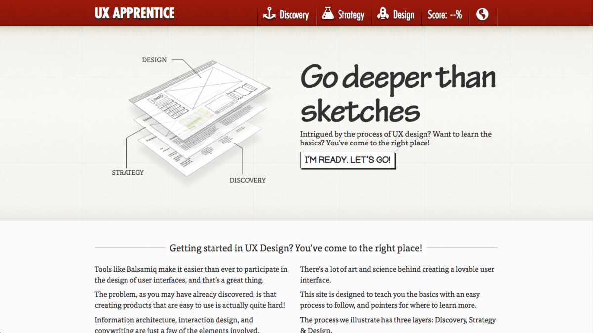
Following up my earlier posts about online resources that teach the fundamentals of UX, here is a review of a few video courses. There are a lot of good websites and “schools” that specialize in video-based learning. The courses I’m reviewing today are from Lynda and Skillshare.

Overview

Lynda offers classes on many creative topics. Topics include web design, graphic design, programming, music composition, and more. It’s a great site to use to get structured overview of a topic. For instance, if you want to learn the basics of After Effects, Lynda would be a good source. It’s been around for a while, but somehow many of their courses still seem relevant. Lynda offers a consistent site experience with high production quality. Sometimes it can seem like their courses are out of date.

Skillshare also offers classes on creative topics. I haven’t checked, but they seem to have a few more lettering courses. The service is new and they don’t have as much content as Lynda. Skillshare emphasizes the teachers over the subjects. Teachers sign up to teach classes; they do their own recording and supply site the content. The result is that the site experience is inconsistent. Some classes are good, but have low production quality. But since it seems like a startup, the content feels more “fresh”.

Membership

Lynda is by paid membership only, although you can get a free trial for 10 days. They have paid plans for individual members and organizations, that start at around $25/month. But, many public libraries will let their patrons sign up for free Lynda memberships. Check with your local library to see if they offer this, and if they do you’re all set. If not, you can still sign up with Lynda by getting a library card with another city. Although the rules for out-of-town library cards depends on each library.

Skillshare requires site registration, but it has both free and paid accounts. The paid accounts are “premium” accounts which opens up “premium” classes. I was able to find a 3-month coupon for Skillshare which allowed me to take a few premium classes. I am not confident in recommending a premium account, though. I am not convinced premium classes are “better” than non-premium. Unfortunately, Skillshare is still too inconsistent for me to recommend a premium account.

Teaching style

If it hasn’t become obvious yet, I am a Lynda. I prefer the Lynda teaching style, for a few reasons. One reason is that each instructor is very rehearsed before they record their lesson. The result is a smooth lesson with instructors that speak with clarity about their topic. Lessons are well-organized and logical, with the course description listing class topics.

Some Skillshare instructors are well-rehearsed but many others are not. Even having an organized instructor doesn’t always result in a good class. One pet peeve of mine is the poor audio quality for most Skillshare lessons. Lynda classes sound high-end. I suspect they are either recorded in a sound studio or with a good microphone on a set. In comparison, Skillshare instructors sound amateur, recorded at home or with inferior microphones. You may find yourself adjusting the sound level between lessons. The course descriptions are pretty good, but they could be better with a list of the class topics.

Relevant classes

Finally, the relevant classes! Remember, the classes I am reviewing fit the pattern of being either a what is UX class or a how to UX class. That’s what I’ll go through next with Lynda and Skillshare.

Lynda

What is UX

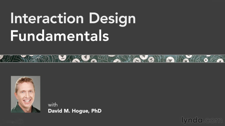
Interaction Design Fundamentals with David Hogue provides an overview of interaction design. What I liked about this class was that it described theory and application. For instance, there was a lesson on tools, and then another lesson on UX principles. Course topics included cognition, neural models, and vision. They even mentioned cognitive load! I definitely recommend this 3-hour class.

Cover slide for Interaction Design Fundamentals
Interaction Design Fundamentals with David Hogue (Lynda)
How to UX

UX Design Techniques, from instructor Chris Nodder, is all about how to do UX. This is actually a set of 7 videos, that go from user analysis to implementation. Topics include observation and experience mapping. Techniques include as personas, scenarios, storyboards, and paper prototyping. Each lesson builds on the previous one. There’s a UX playlist that only includes 6 courses, so make sure to include this one if you decide to take this course, too.

UX Design Techniques: analyzing user data
Analyzing User Data with Chris Nodder (Lynda)

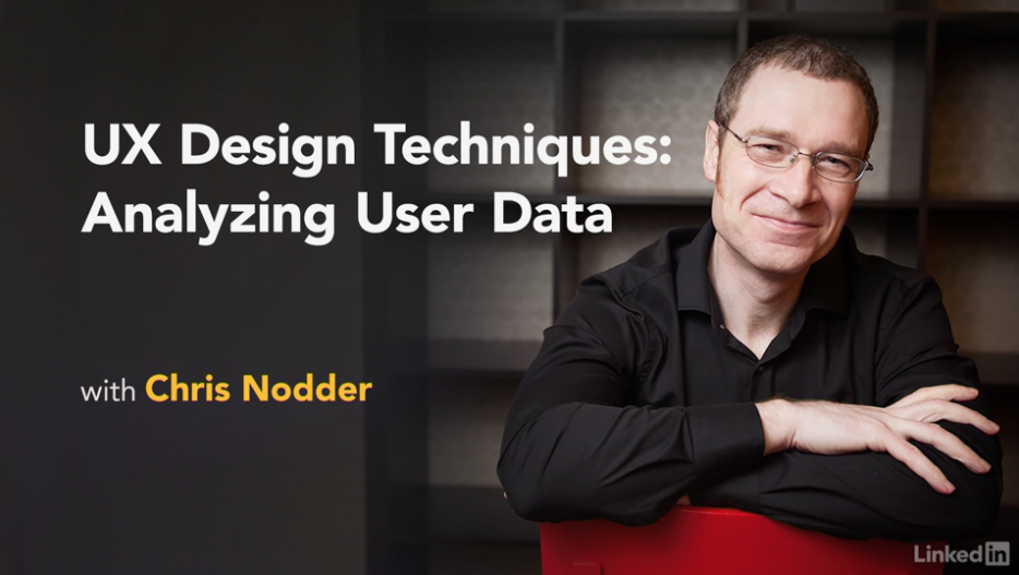
I enjoyed this class a lot. I became a fan of the method he describes. It seems fun to create paper prototypes. My only hesitation with this method is that it might be difficult for teams of one. It also focused on building a new product. I find that I get involved in many redesigns of existing products.


Skillshare

On Skillshare, there are again two sets classes I want to mention focused on what is UX and how to UX.

What is UX

The What is UX class is UX Design Fundamentals: Everything You Need to Know (and More) by Joe Natoli. The description for this premium class states that it is a comprehensive overview on UX. This is a 12-hour, 8 chapter course. Each video is between 8-15 minutes long.

I’m not against long classes, and 12 hours sounds like you’re getting your money’s worth. Yet…I couldn’t finish the course. Despite this instructor being well-organized, he has a speaking style that is too hard to follow. His style is too loose and casual. He has a tendency to interject rhetorical jokes and questions. And he makes statements that only serve to confirm his own points, such as below:

Paths on the other hand are what users leave to enter and leave. (pause) Ok? Pretty straightforward.

“Ok? Pretty straightforward” may not sound like much. But, it’s pretty noticeable when happens in every other sentence.

I also noticed that the slides don’t always match the voiceover. I felt that I was constantly fighting a cognitive disconnect between what I was seeing and what I was hearing.

To summarize, I do not recommend this class. It’s far too long and his speaking style will drive you nuts. In lieu of a screenshot from the course, I will include this Placekitten.

Placekitten
Placekitten
How to UX

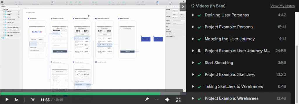
iOS Design by Kara Hoedecker is a good hands-on course in UX design. This is a three-part course on redesigning a mobile app.
She takes the class from planning stages and sketching, through wireframes and visual design. She ends with prototyping and testing. Her class wasn’t perfect: she had some technical issues with her class. For instance, her cat walking into the room where she was recording was pretty cute. Her longest class is almost 2 hours; the shortest is a little over 30 min.

Intro to UX
iOS Design I: Getting Started with UX (Skillshare)

What I liked about this class was how she went through the class. First, she presented the idea and what the final outcome should be. Then she went through the exercise herself, showing how she did the work. This was important for me because when I watched her going over her work, I felt very confident that I could do the work, too. I was so confident, I ended up doing my own project. (I’ll post my work in a separate post since this one has become so long.)

She also emphasized sketching a bit more so than I’ve done in the past. Her course includes visual design, so it expands the definition of UX to a wider range of skills than is typically associated with UX.

Conclusion

If you like video-based learning, Lynda and Skillshare both offer courses on UX theory and techniques. My conclusion is that Lynda is more consistent overall. Skillshare has some good resources, but it’s a little hit or miss without a premium account. As for what I learned, I liked the sense of accomplishment I had completing the Skillshare course. There were a few techniques from each course that I look forward to using soon, such as the sticky-note experience mapping or group ideation sessions from the Lynda course. I also hope to use sketching more than usual, and I will start taking on UI design tasks. A combination the techniques used in each class would be beneficial in any UX practice.

I look forward to posting my work from the Skillshare class, in an upcoming post. In the meantime, here’s a bonus video about Building and Maintaining Your UX Design Portfolio, from Lynda.

UX Design Fundamentals: UXApprentice.com

UXApprentice.com

UX Apprentice is a static website that takes site visitors through a 3-step UX project to teach visitors about the process of UX. The steps the site goes through are Discovery, Strategy, Design.

As it states on the first page, each step describes what the step is all about, it provides examples, there’s a very short knowledge quiz, and a list of resources consisting of books, articles/sites, and a

As it states on the first page, each step describes what the step is all about, it provides examples, there’s a very short knowledge quiz, and a list of resources consisting of books, articles/sites, and a who’s who list of names.

Alphas:

  • Great connection between the description of the information, using the outlines and icons from the top of each page to the bottom.
  • Good use of navigation to prompt site visitors to go from one explanation to another.

Deltas:

  • The website provides a lot of information, but it’s highly biased to be accessible for people who already know a bit about UX. There just isn’t enough information to help someone who is totally new to UX get started.
  • Many of the articles are a few years old, and a few links for the books and articles are broken. For instance, I tried to take a look at the Kevin Cheng book on the Discovery page, and an article on the strategy page called “What is User Experience Strategy, Anyway?” Both links were dead. See update.
  • It’s an advertisement for Balsamiq. While I like the information this site provides, in the end the entire site is essentially an advertisement for the wireframing tool Balsamiq. It doesn’t hit you over the head with it, but it’s the truth.

Final Thoughts

I’d still recommend the site to someone as a possible resource, along with other resources, but I’d preface it by saying that there might be a lot of broken links in the reference sections.


Update

As you can read in the comments, Jessica from Balsamiq contacted me to let me know that they updated their links. I’ve checked it out and this appears to be the case.

Some of the people they’re linking to may have broken links, but that can’t be helped.

Checking out their resources, I found a 4-video series of Lean UX Strategy YouTube which I recommend because it won’t take more than 15 minutes to watch.

Ancient Information Theory, Symbol Space, and Alphabets

It’s hard to believe that alphabet we use today is essentially a set of symbols that developed over thousands of years. And why are so many alphabets so similar, even though the languages are so different? There’s an answer!

In one of Khan Academy’s Computer Science track of videos, called Journey into Information Theory, there are two videos that are extremely informative in explaining how the written alphabet developed. I’ve included links to the videos on YouTube.

The initial breakthrough is simple: disassociating the meaning of the word from the symbols used to create it. This is also known as the Rebus Principle. (Also seen in picture puzzles and the game show, Catchphrase!) From that, symbols can be rearranged to create different sounds and convey meaning. This principle evolved over thousands of years, getting more and more abstract and, along with writing technology such as papyrus, gives us the alphabets we use today.

There are links below the videos, if you’re interested in learning more. I also recommend watching the whole series of videos on Information Theory.


The first video is the Origin of the Written Language. The video goes into cave drawings, or Pictograms, and the development of symbols called Ideograms, as well as proto-writing.

The second video is called the History of the Alphabet and the development of Hieratic writing, a type of cursive invented for papyrus, and Demotic writing, a further development of hieratic.

Remember that the point of these videos is to explain information theory, so there’s a focus on what is known as symbol space. Symbol space decreased as the use of the alphabet increased, as more information could be shared with fewer symbols.


After watching these, you might be interested in learning more. Here are a few references:

UX Design Fundamentals, Part 1: Getting started

Getting started in UX: a comprehensive list of resources. Part of a 3-part series on resources about the fundamentals of UX.

While I haven’t exactly been a mentor before, I have helped people learn more about the field of User Experience. In a few recent jobs, I’ve had someone ask how they can learn more about UX.

I provided my own responses, but since then I’ve come across a few different examples of comprehensive UX introductions that have a lot of good information to offer. I thought reviewing each would make a good blog post. First, I’ll include my tips, then the static examples. Finally, I’ll review a few video courses in the next post.

Part 1: My List

As I mentioned above, I’ve had people ask me about how they can learn more about UX. The thing to keep in mind is that these are people who are totally new to UX – as opposed to people who work in software development, visual design, or some other related field. Or people who’ve gone through some classes and are looking for more information.

One person in particular asked me about more information and I provided a comprehensive list of UX resources. My main focus was to provide a starting place to learn more about the field of UX, and less so about the process of UX. I’ve found that process can change, slightly or drastically, depending on where you work. I did not provide any resources on Lynda, though they’ve updated their site since then, because the resources felt like a starting point for someone who’s already gotten started in UX.


Everything below this point was originally sent in an email, called Lots of UX, though not necessarily in this order.

Also note that my links to Amazon go to smile.amazon.com, in support of the ASPCA.

One quick note!

The one thing to know about UX (which is really human-computer interaction), is that the core of it is psychology – think of it as the application of cognitive psychology. So, it can be applied in many different contexts, not just on traditional websites.

Also, not everyone who works in UX is a designer; some people only do research.

Quick Start!

Some things to think about right now, as you go about your way in the world…

Books 

  • The Design of Everyday Things – this will change the way you view the world. About Book
  • The Inmates are Running the Asylum – this discusses the importance of designing for the actual users, not the stakeholders. Book
  • Don’t Make Me Think – simple primer on what usability is all about. Can read in a day. Book
  • Universal Principles of Design – think of these as though they are from a cognitive psychology perspective vs a design perspective. Book

There are many other handbooks about actually designing and testing, but these are good to first get yourself in the right frame of mind!

Sites/Newsletters

A Few People

  • Don Norman, Jakob Nielsen, Bruce Tognazzini (I would look them up individually…)
  • Alan Cooper (designer) – …also look him up…
  • Alan Tufte – …and him, too.
  • Ben Schneiderman – see also his personal project with many names of other people you can learn about! (https://hcipioneers.wordpress.com/)

Accessibility
I don’t have a book, but you should also learn all you can about accessibility because it’s very important. It gets into the field of Ergonomics and Human Factors which is more about the design of chairs, handles, doorways, phones, etc.

http://www.w3.org/standards/webdesign/accessibility

Information-Seeking Behavior
OK, I’m sneaking this in… This is not likely in these books, because it’s a complicated, grad-level concept. Unfortunately, I wasn’t really able to find examples that are not long research papers.

Essentially, information-seeking behavior is the idea that all humans search for information in the same way that we evolved to search for food. We have a need, we act to satisfy that need, either actively or not. We do not always know for sure what we’re looking for, and so we satisfy our queries piece by piece, while all the time asking if this new information gets us closer to what we think we’re looking for or not. Like I said, it’s complicated so if this is still confusing, I can try to explain it to you in person!


Of course I then ended the email with a few nice words, but that’s my list!

The next post will be about a static site I found providing an intro to UX fundamentals, and other websites to add to this list.

Building up HTML Skill

Normally, I do not spend a lot of my time using HTML or CSS, but I got a little caught up in reading on UX blogs and discussion forums about how web designers and UX professionals should or should not be required to know how to “code”. One person asked why they kept getting applications from UX designers who did not “code” (i.e., design from scratch with HTML, CSS, JavaScript, etc.) their own portfolio site. Those applications, according to the original poster, were apparently not good enough because he wanted someone who could design their own site rather than use a WordPress template or theme.

Much of the debate, which I won’t go into now, had to do with whether or not this type of UX person exists – some said this person is a mythical “unicorn” and the poster would be better off looking for UX designers who had a better grasp of psychology (which is also true). My question, and one of my arguments against this UX People Must Code, is that it does not specify the degree to which a (web-based) UX specialist should understand code. (And really, what they’re specifically talking about is HTML/CSS, not Java or .NET.)

I was curious: how much should a UX person learn about HTML/CSS and how fast can they do it? Well, in my own experience, I’ve found that spending a dedicated but serious amount of time learning something difficult (Russian, OpenFrameworks, driving) will not likely get you to mastery, but it will get you somewhere. I wondered if a UX designer dedicated, say, a month of time learning about HTML/CSS would that get them “far enough”?

I typed into my trusty Google search box “learn HTML in 30 days”…and voila! I came across a great website called TutsPlus.com. This site offers tutorials on all kinds of creative and design related topics, included web design and development. Web Development is actually on a sub-site, called webdesign.tutsplus.com. Turns out someone has already created a 30 day tutorial to learn HTML and CSS. And it’s FREE!

Checking it out, and skipping ahead, I was pretty impressed by this tutorial. I like movies and I love learning via video. The tutorial eventually has the pupil try to skin and recreate a website from a PS template. I became inspired to try something similar. Except I didn’t use a template. I used a page from a real website. It was an Etsy tutorial on how to sew a skirt. (I did make my own skirt, eventually, too.)

I’m still working on it, but I’m over halfway finished. The sidebar is a little bit tricky, so I’m taking a break. I’m using the 960.gs grid in 16-columns, and a few HTML5 tags. There’s not much need for CSS3 yet, but I think some of the buttons will need some styling for gradients and corners. It’s been fun, but I’m not sure I’d want to do it everyday. (Maybe, though…if I had more practice.)

*****

The funny part, is that the part of my brain that is working hard to format an HTML page and troubleshoot what could be going wrong with the CSS does not feel like the same part of my brain that comes up with UX inspirations and designs, and makes the associations between how a person would use a system with what the system offers. More on the Coding Designer later. For now, here’s a screenshot of my sample Etsy project and the real Etsy webpage. There’s still quite a lot of tweaking left to do, but you can see how it’s coming together.

My version of an Etsy webpage
Etsy.com Sew a skirt in an hour

Giant Stories Final: Riding

To do the project, I set up at a couple of intersections in NY, and focused the camera on people already in cabs or people about to get in or out of cabs. I took footage at a couple of intersections and areas around Manhattan. Columbus Circle, Times Square/Port Authority, Houston and Allen/1st Ave, and 9 Ave. Most the shots were at night, but there were some during the day too – just haven’t worked them in yet.