UX Design Fundamentals: UXApprentice.com

UXApprentice.com

UX Apprentice is a static website that takes site visitors through a 3-step UX project to teach visitors about the process of UX. The steps the site goes through are Discovery, Strategy, Design.

As it states on the first page, each step describes what the step is all about, it provides examples, there’s a very short knowledge quiz, and a list of resources consisting of books, articles/sites, and a

As it states on the first page, each step describes what the step is all about, it provides examples, there’s a very short knowledge quiz, and a list of resources consisting of books, articles/sites, and a who’s who list of names.

Alphas:

  • Great connection between the description of the information, using the outlines and icons from the top of each page to the bottom.
  • Good use of navigation to prompt site visitors to go from one explanation to another.

Deltas:

  • The website provides a lot of information, but it’s highly biased to be accessible for people who already know a bit about UX. There just isn’t enough information to help someone who is totally new to UX get started.
  • Many of the articles are a few years old, and a few links for the books and articles are broken. For instance, I tried to take a look at the Kevin Cheng book on the Discovery page, and an article on the strategy page called “What is User Experience Strategy, Anyway?” Both links were dead. See update.
  • It’s an advertisement for Balsamiq. While I like the information this site provides, in the end the entire site is essentially an advertisement for the wireframing tool Balsamiq. It doesn’t hit you over the head with it, but it’s the truth.

Final Thoughts

I’d still recommend the site to someone as a possible resource, along with other resources, but I’d preface it by saying that there might be a lot of broken links in the reference sections.


Update

As you can read in the comments, Jessica from Balsamiq contacted me to let me know that they updated their links. I’ve checked it out and this appears to be the case.

Some of the people they’re linking to may have broken links, but that can’t be helped.

Checking out their resources, I found a 4-video series of Lean UX Strategy YouTube which I recommend because it won’t take more than 15 minutes to watch.

UX Design Fundamentals, Part 1: Getting started

Getting started in UX: a comprehensive list of resources. Part of a 3-part series on resources about the fundamentals of UX.

While I haven’t exactly been a mentor before, I have helped people learn more about the field of User Experience. In a few recent jobs, I’ve had someone ask how they can learn more about UX.

I provided my own responses, but since then I’ve come across a few different examples of comprehensive UX introductions that have a lot of good information to offer. I thought reviewing each would make a good blog post. First, I’ll include my tips, then the static examples. Finally, I’ll review a few video courses in the next post.

Part 1: My List

As I mentioned above, I’ve had people ask me about how they can learn more about UX. The thing to keep in mind is that these are people who are totally new to UX – as opposed to people who work in software development, visual design, or some other related field. Or people who’ve gone through some classes and are looking for more information.

One person in particular asked me about more information and I provided a comprehensive list of UX resources. My main focus was to provide a starting place to learn more about the field of UX, and less so about the process of UX. I’ve found that process can change, slightly or drastically, depending on where you work. I did not provide any resources on Lynda, though they’ve updated their site since then, because the resources felt like a starting point for someone who’s already gotten started in UX.


Everything below this point was originally sent in an email, called Lots of UX, though not necessarily in this order.

Also note that my links to Amazon go to smile.amazon.com, in support of the ASPCA.

One quick note!

The one thing to know about UX (which is really human-computer interaction), is that the core of it is psychology – think of it as the application of cognitive psychology. So, it can be applied in many different contexts, not just on traditional websites.

Also, not everyone who works in UX is a designer; some people only do research.

Quick Start!

Some things to think about right now, as you go about your way in the world…

Books 

  • The Design of Everyday Things – this will change the way you view the world. About Book
  • The Inmates are Running the Asylum – this discusses the importance of designing for the actual users, not the stakeholders. Book
  • Don’t Make Me Think – simple primer on what usability is all about. Can read in a day. Book
  • Universal Principles of Design – think of these as though they are from a cognitive psychology perspective vs a design perspective. Book

There are many other handbooks about actually designing and testing, but these are good to first get yourself in the right frame of mind!

Sites/Newsletters

A Few People

  • Don Norman, Jakob Nielsen, Bruce Tognazzini (I would look them up individually…)
  • Alan Cooper (designer) – …also look him up…
  • Alan Tufte – …and him, too.
  • Ben Schneiderman – see also his personal project with many names of other people you can learn about! (https://hcipioneers.wordpress.com/)

Accessibility
I don’t have a book, but you should also learn all you can about accessibility because it’s very important. It gets into the field of Ergonomics and Human Factors which is more about the design of chairs, handles, doorways, phones, etc.

http://www.w3.org/standards/webdesign/accessibility

Information-Seeking Behavior
OK, I’m sneaking this in… This is not likely in these books, because it’s a complicated, grad-level concept. Unfortunately, I wasn’t really able to find examples that are not long research papers.

Essentially, information-seeking behavior is the idea that all humans search for information in the same way that we evolved to search for food. We have a need, we act to satisfy that need, either actively or not. We do not always know for sure what we’re looking for, and so we satisfy our queries piece by piece, while all the time asking if this new information gets us closer to what we think we’re looking for or not. Like I said, it’s complicated so if this is still confusing, I can try to explain it to you in person!


Of course I then ended the email with a few nice words, but that’s my list!

The next post will be about a static site I found providing an intro to UX fundamentals, and other websites to add to this list.

Personas: A closer look at two methods

I recently read an article from UX Mag (2011) about personas*. The article described a very traditional approach to creating personas — actually what I learned in grad school — which is different from my experiences at work with “proto-personas”. I wasn’t familiar with the term proto-personas until after I’d participated in creating them at work. To learn about this term, I read a different UX Mag (2012) article about proto-personas and I noted the discrepancies between the two articles immediately.

I thought it would be interesting to compare the two different persona articles, and share my experiences with the approaches described in each one.


Method One: Personas, The Traditional Approach

Personas: The Foundation of a Great User Experience, UX Mag, 2011.
As the author states, this is a primer on personas and how businesses can use them for their organization.

The main activities of this method involve interviewing approximately 30 people. The team then analyzes their responses to find common behaviors and thought patterns, as well as the elimination of extremes. The team then uses the findings to conduct an additional round of research with 5-7 individuals in order to validate and fill in information that was previous missed.

Conducting 30 interviews takes a lot of resources and time, and the article states that the investment in a persona project like this can cost $80,000. In these days of Agile and Lean UX, this estimate strikes me as an expense in time and money that most businesses and clients simply will not be willing to spend. However, the results will be extremely valid and based on actual user data, which is a major aspect of “user” experience.

Personal Experience:

My experience with this type of persona development goes all the way back to 2004, in my grad school days at Michigan. Our project was to complete a thorough usability evaluation of Yahoo! Avatars, which allowed Yahoo! users to create customized avatars for their online chats. We’d previously analyzed the interface, so this wasn’t the first exercise in our evaluation project. We split the work, and spent about 1-2 weeks collecting interviews and analyzing our data. We did find patterns of behavior among our interviewees that we then turned into personas for our project. Although we didn’t spend as much time on the activity as described in UX Mag, I felt very confident that our personas were accurate.


Method Two: Proto-Personas: Getting a seat at the table

Using Personas for Executive Alignment, UX Mag, 2012*.

This goal of this article is to sell the value of personas to executives, or clients, as a way to increase the value and visibility of user experience within an organization, and to describe how to do it.

The main activities of this method involve a 2-day workshop session, with the executives, in order to get them involved and invested in the personas. It goes like this:

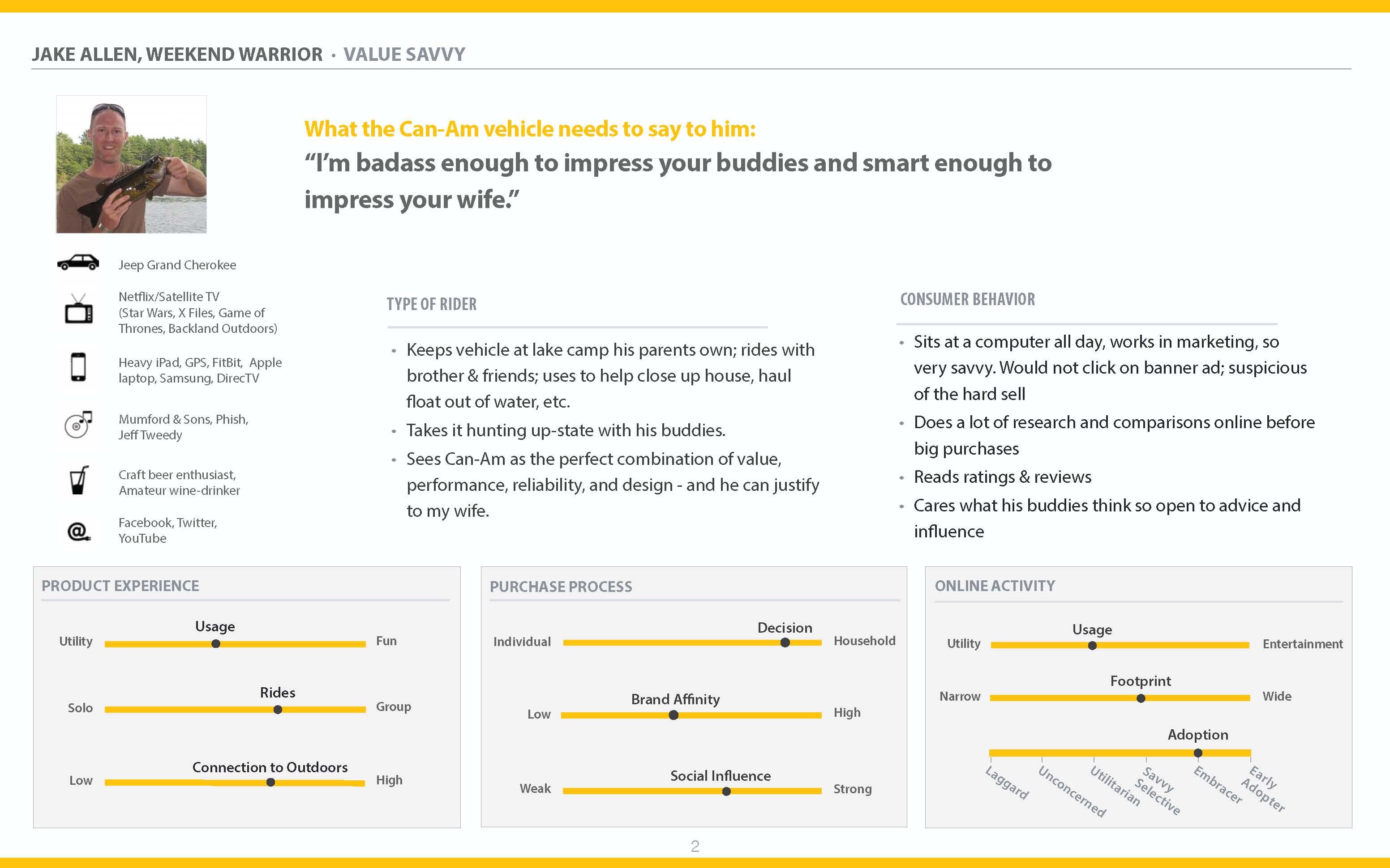
  • Day 1: It starts with a proposal, where the goals of the persona workshop are defined. Each persona is defined using 4 quadrants for: high-level basic demographics and a sketch, behaviors and beliefs, demographics, and needs and goals. Each person does this, and as a group they decide on which assumptions are more or less accurate. Following this, each persona is placed on each of 5 spectrums, to differentiate between them each one. The results are digitized.
  • Day 2: The next stage is review and validation of the previous day’s activities, and to use the personas right away in a design workshop.

The investment is only 2 days time, so it’s very accessible to many teams, if you can get executives to participate. However, the important thing to keep in mind here is that these personas are based on assumptions and beliefs, not verified user data. Eventually, these personas will need to be validated with other research methods.

Personal Experience #1:

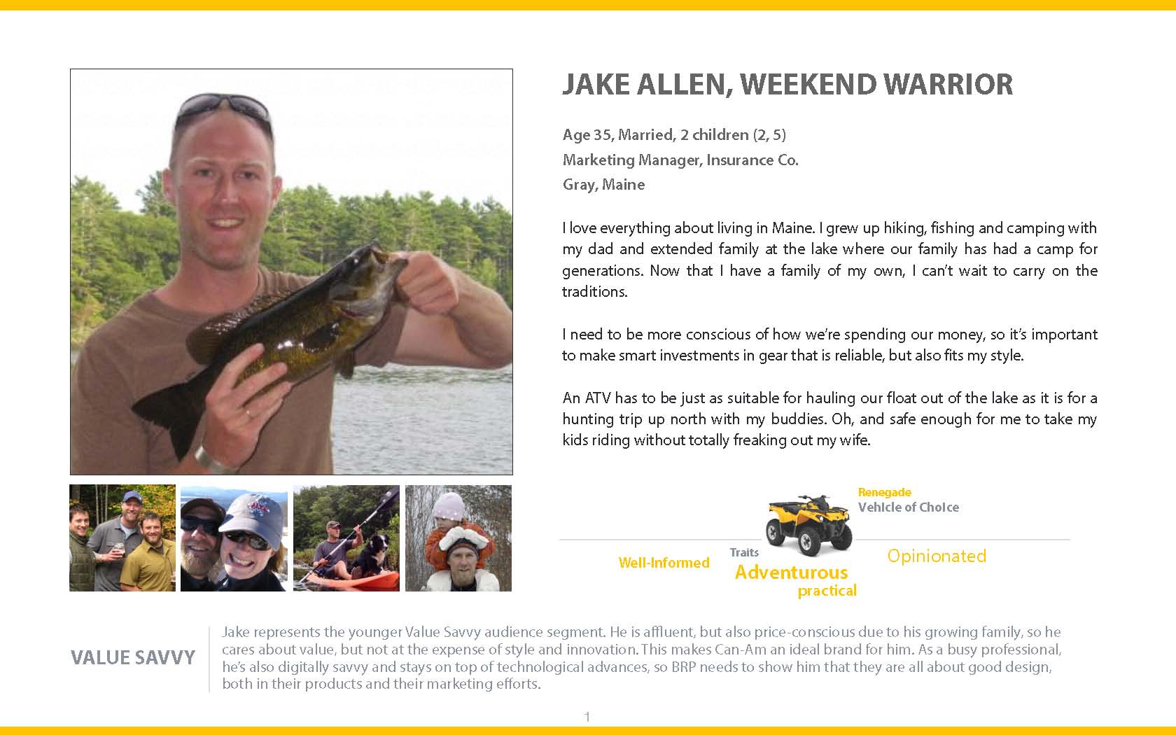
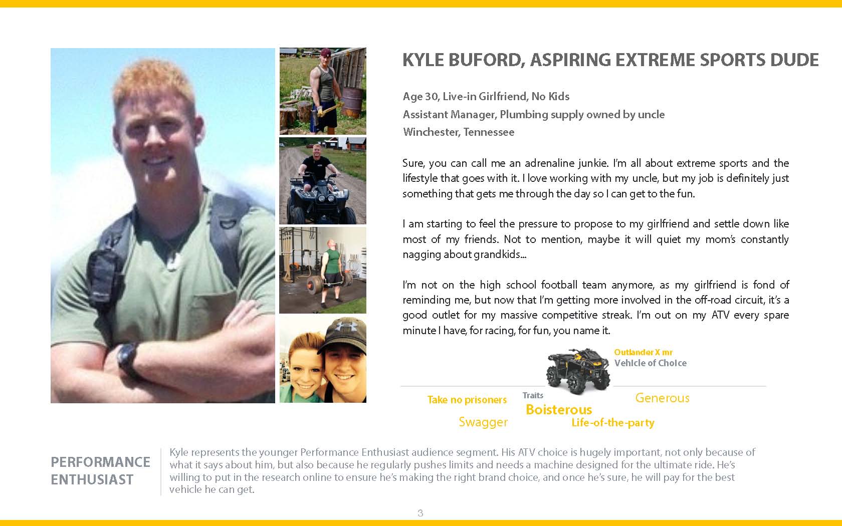
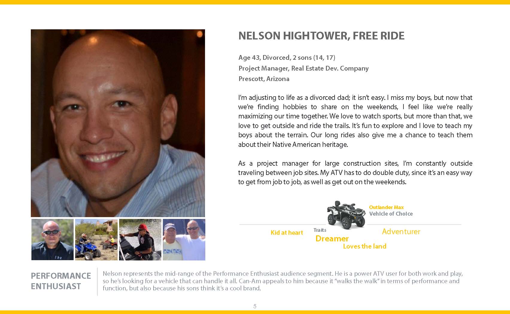
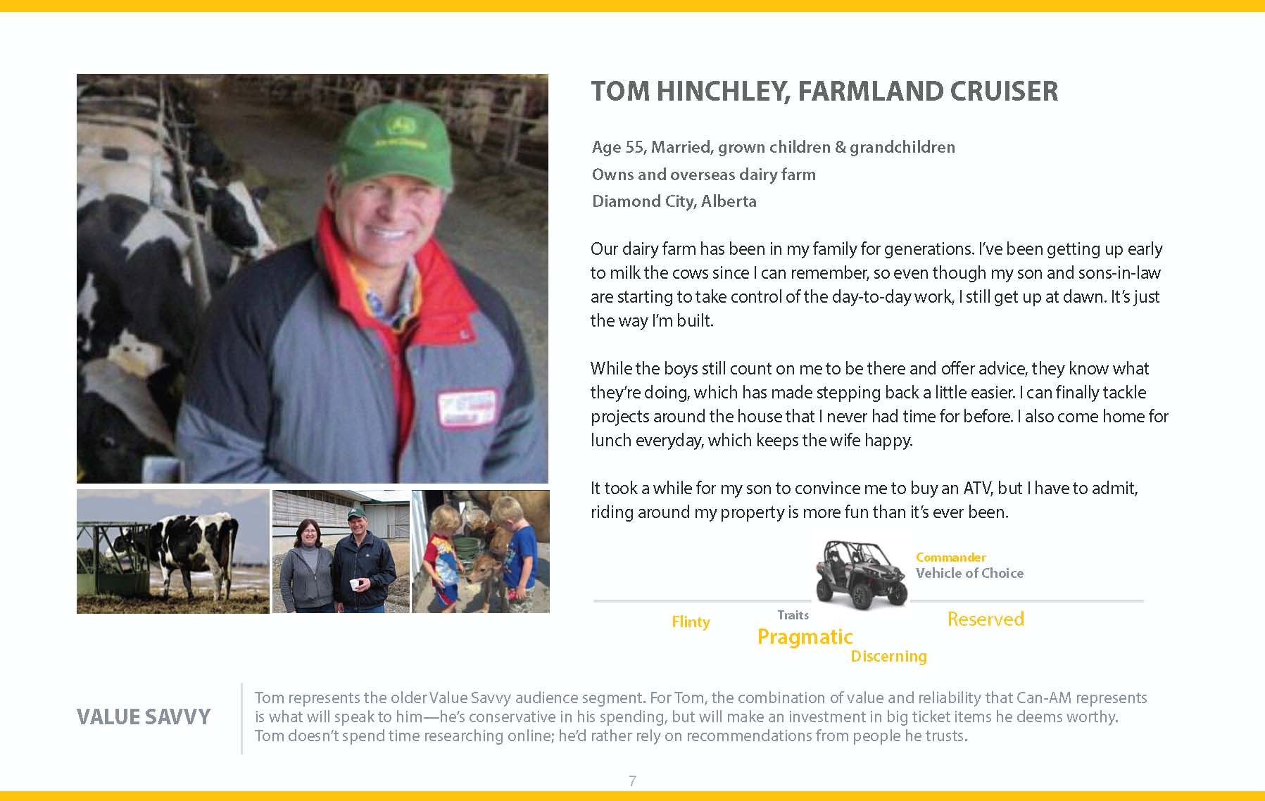
My experience with this type of persona involved preparing personas for a recreation-vehicle client. Our client was based in Canada, and visiting them for a group session wasn’t possible. The decision was to create the personas, then send them the results for their validation with their marketing team. Our team got together and created the 4 quadrants for each persona. We spent about 15-20 minutes on each person, coming up with ideas to fill in each section. After this, I digitized each persona using Keynote, using a very graphic style. (I don’t recommend Keynote for design purposes.)

In all honesty, I felt like we were just guessing when it came to filling in the quadrants and I felt lost throughout the whole process. Based on the client/product we were designing for, I attributed my confusion to a difference of life experiences or simply that the other people on the team had more information than I did. Perhaps working with executives, who spend time regularly studying their customers, I would have had a different experience.

Personal Experience #2:

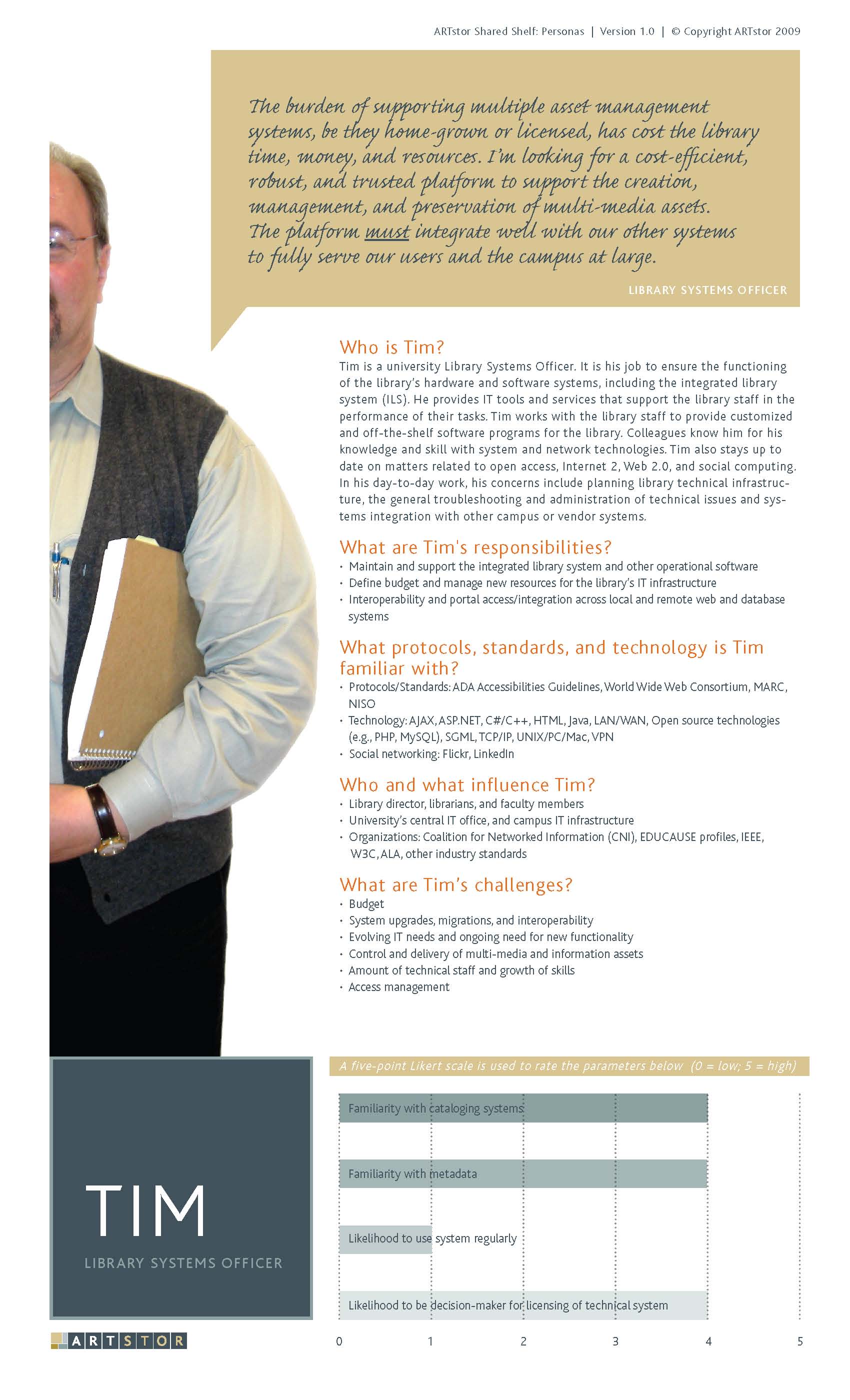
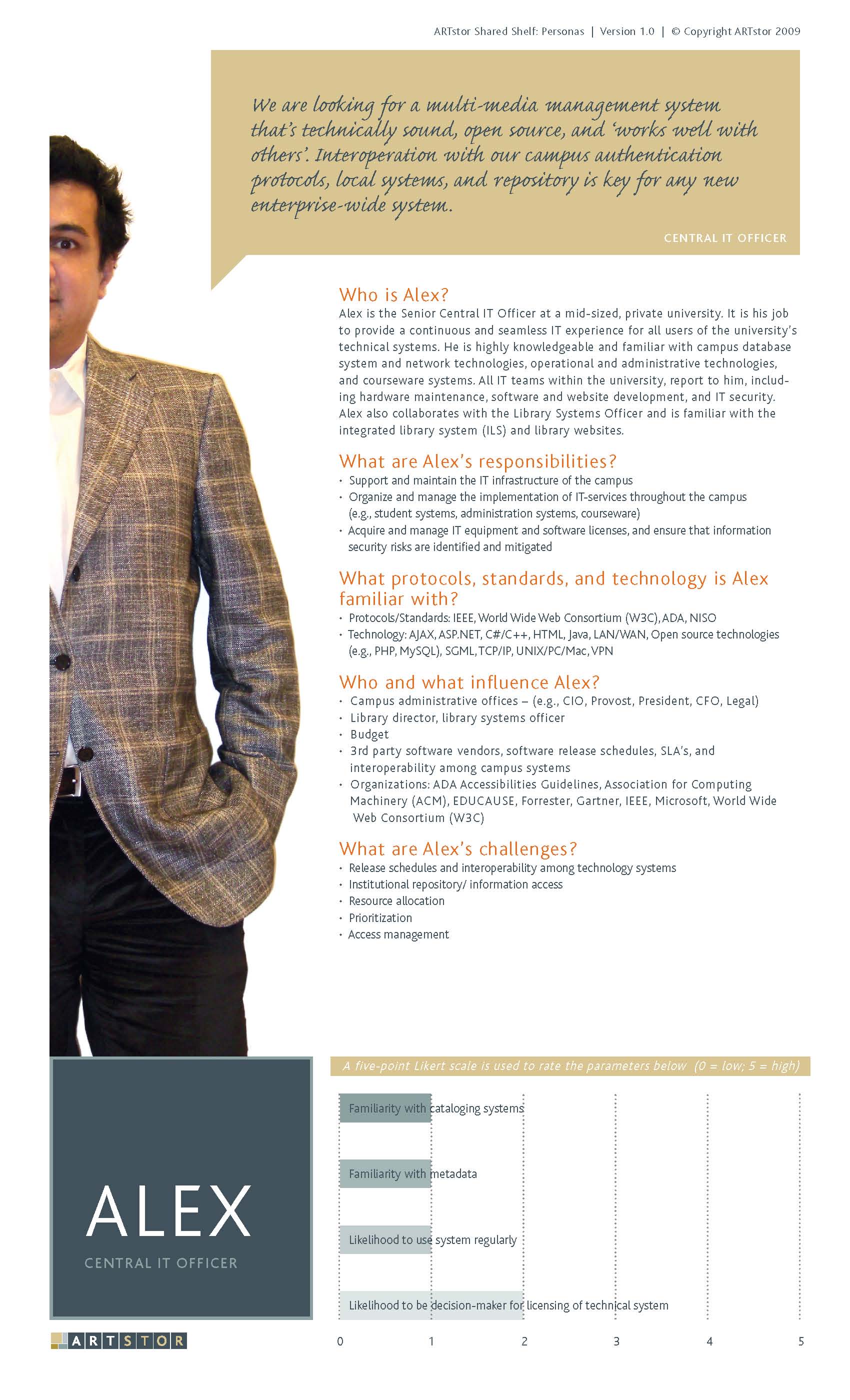
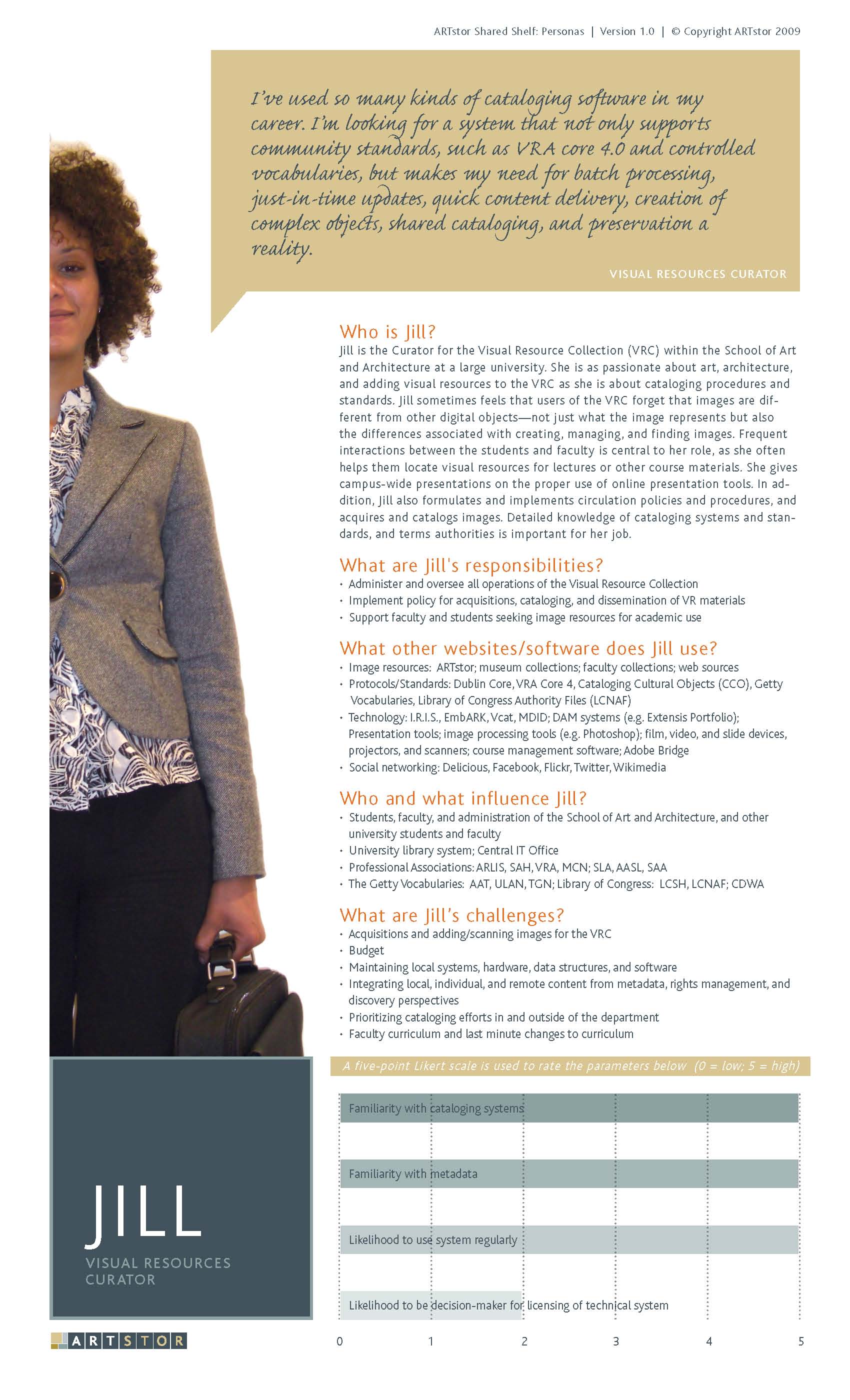
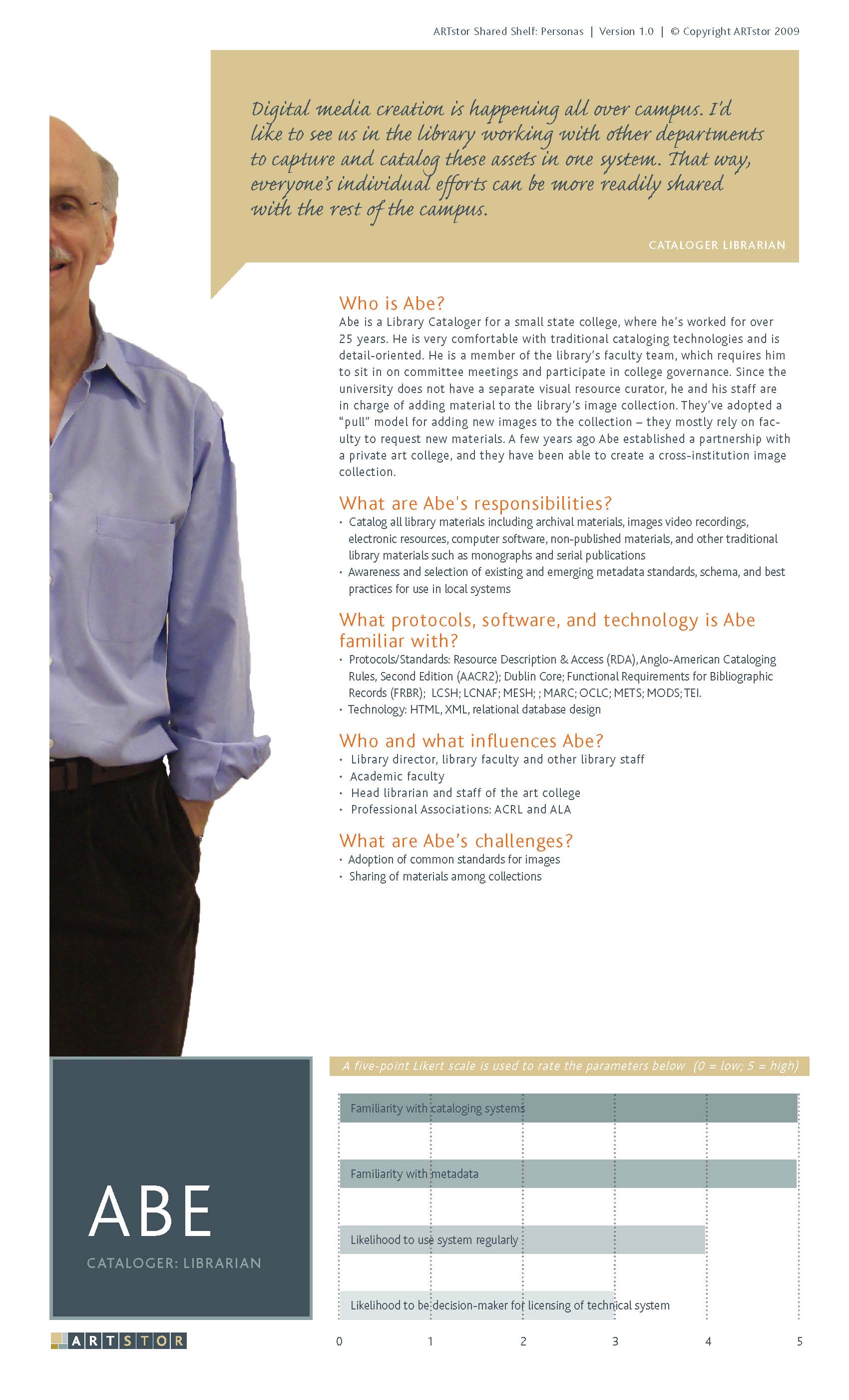
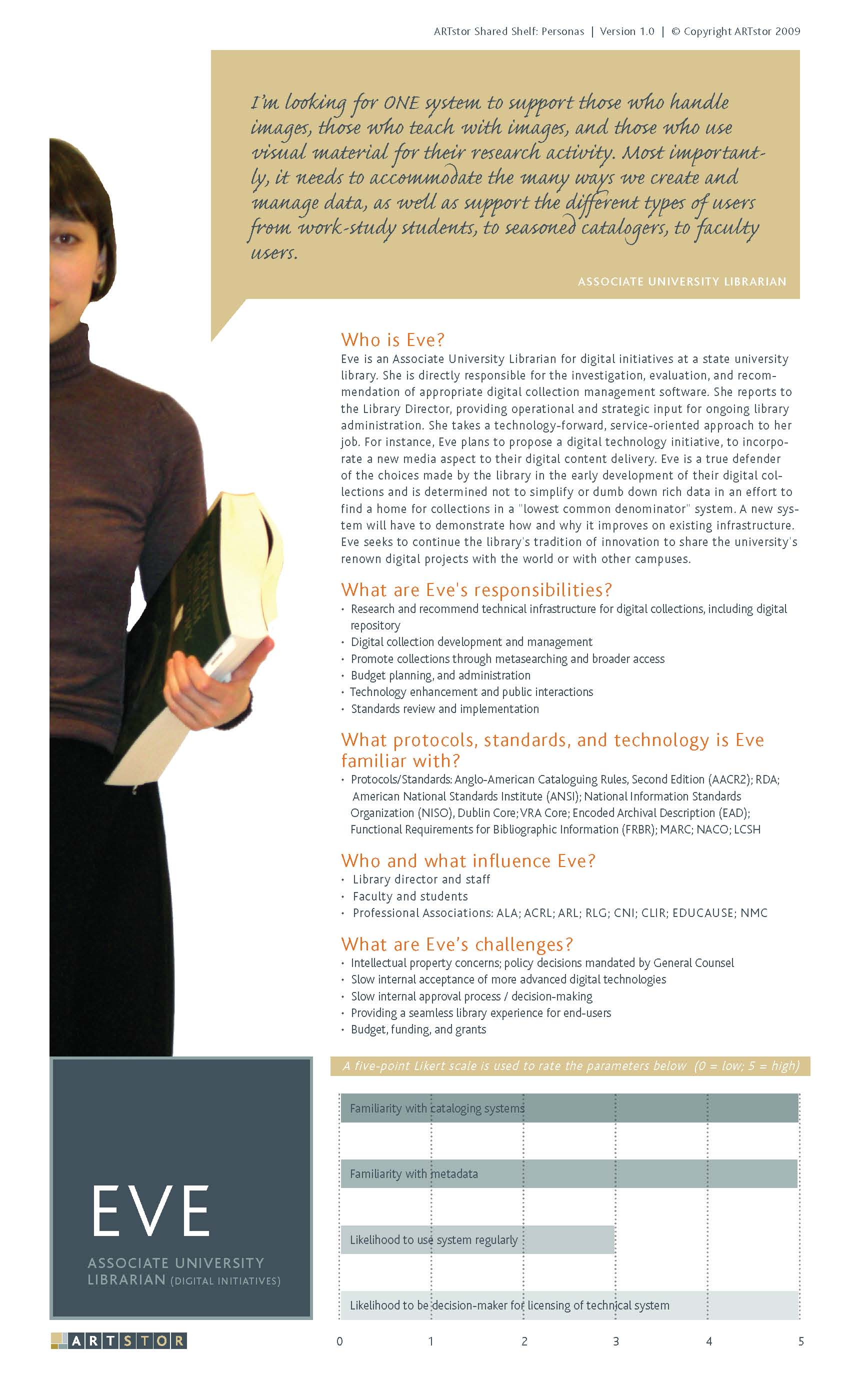
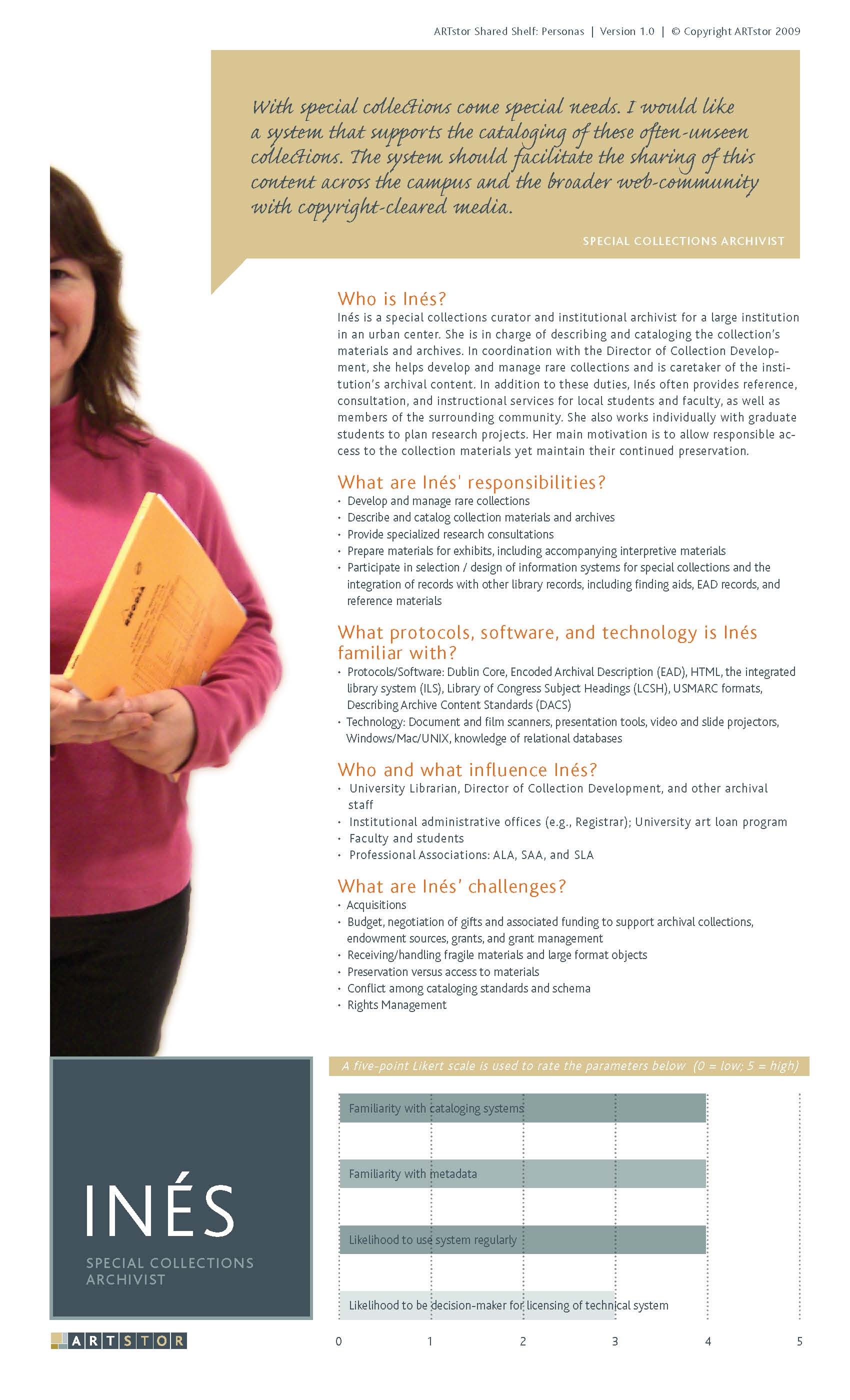
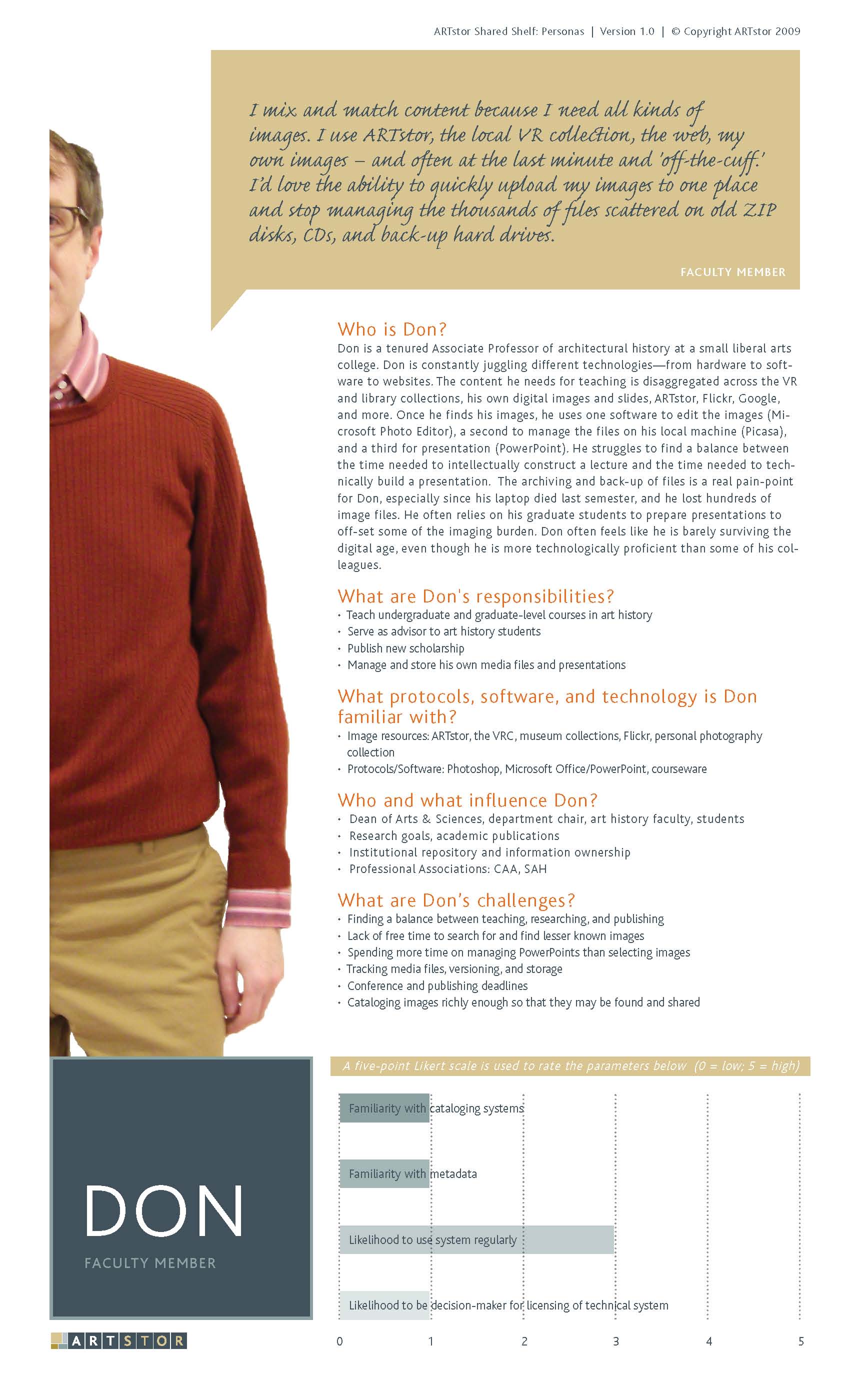
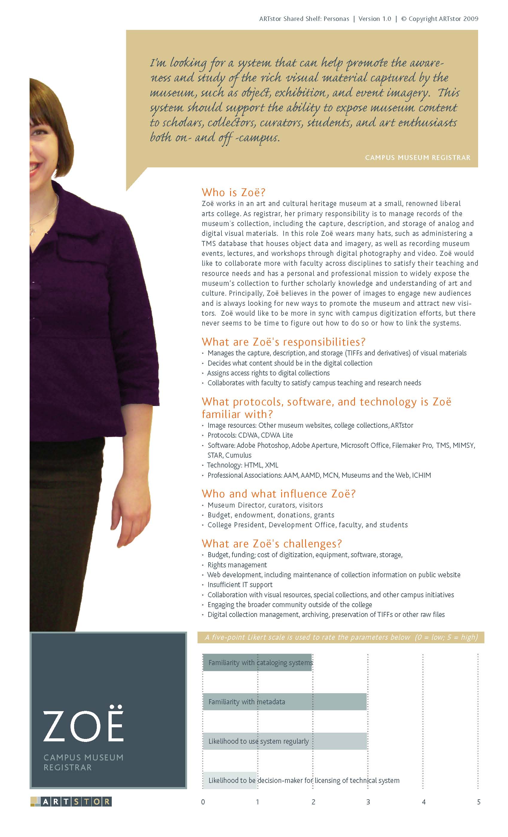
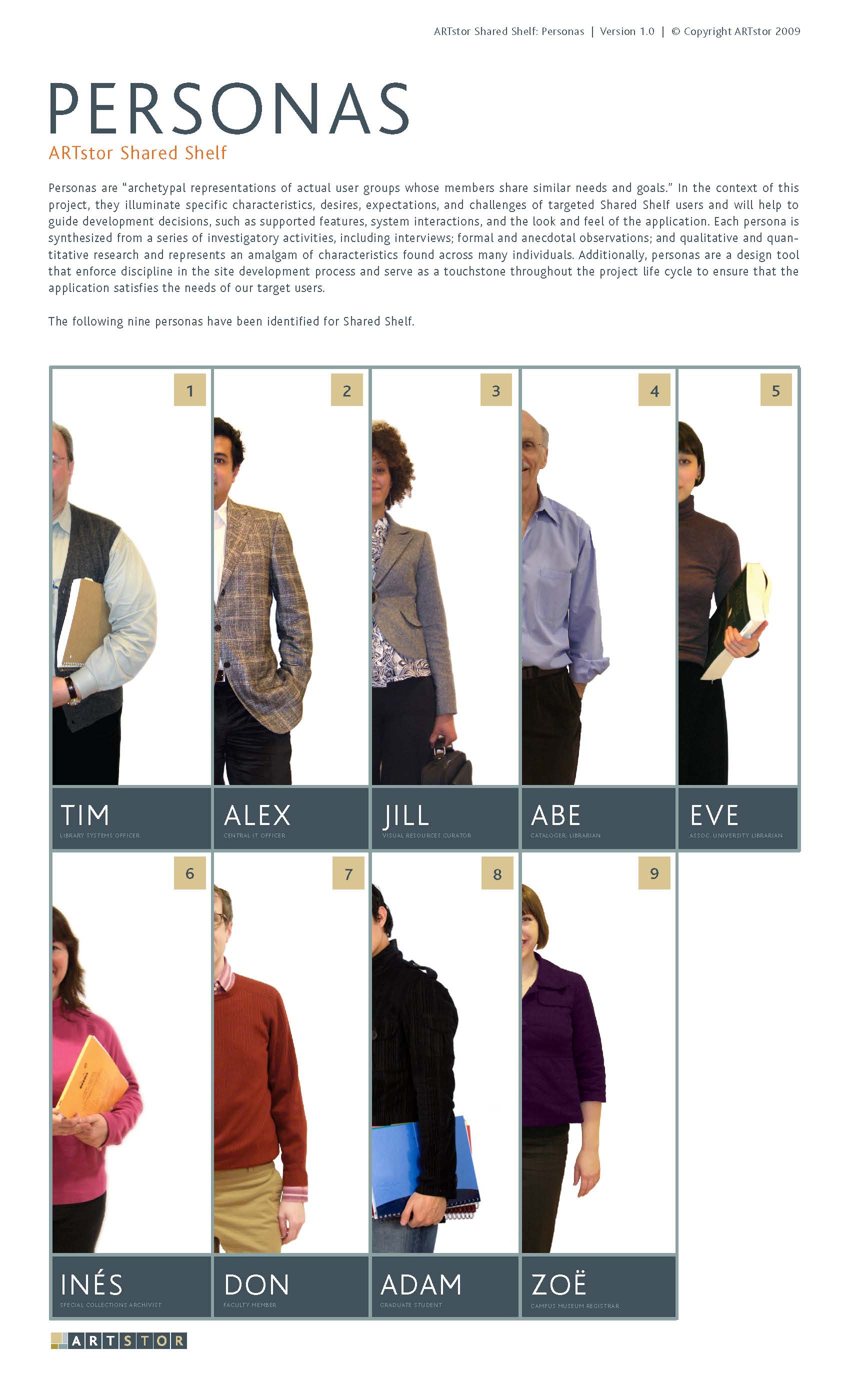
My other experience with proto-personas came when supporting the Shared Shelf project for Artstor. In this case, we also relied on non-user data to create the personas. I researched job descriptions for each user type, and created roles for each persona that were then validated by subject-matter experts on our team. The personas were then digitized by our Creative Director using a very sophisticated graphic style and presented to the clients for further validation.

These personas were used in user flows, and they seemed to work very well for this purpose. I do think that maybe the extended team wasn’t as invested in them as much as they might have been if the workshop method had been used. Granted this was in 2009, before either of these articles had been written.


Summary

My opinion is that the traditional approach is best, although I feel that the group participation aspect of the proto-persona workshop is very helpful in getting buy-in from the extended executive or client team. I am dubious that the particular approach my team used for the recreational vehicle client was at all accurate; it simply felt like make-believe, so I would not recommend that. The approach using the job descriptions was not entirely accurate either, but I felt that it was at least based on assumptions that other people familiar with the user roles had written. Whichever method you choose, it’s important to validate your creations with real users and to use your personas in your work.

I hope that these links and my stories are of use to you, in your team and in your practice.

Links:

Note that the second article was written by Jeff Gothelf, who wrote the book Lean UX (which advocates for proto-personas).

*If you’re not aware, personas are archetypes of users and are used to represent a user type as opposed to a specific person.

Building up HTML Skill

Normally, I do not spend a lot of my time using HTML or CSS, but I got a little caught up in reading on UX blogs and discussion forums about how web designers and UX professionals should or should not be required to know how to “code”. One person asked why they kept getting applications from UX designers who did not “code” (i.e., design from scratch with HTML, CSS, JavaScript, etc.) their own portfolio site. Those applications, according to the original poster, were apparently not good enough because he wanted someone who could design their own site rather than use a WordPress template or theme.

Much of the debate, which I won’t go into now, had to do with whether or not this type of UX person exists – some said this person is a mythical “unicorn” and the poster would be better off looking for UX designers who had a better grasp of psychology (which is also true). My question, and one of my arguments against this UX People Must Code, is that it does not specify the degree to which a (web-based) UX specialist should understand code. (And really, what they’re specifically talking about is HTML/CSS, not Java or .NET.)

I was curious: how much should a UX person learn about HTML/CSS and how fast can they do it? Well, in my own experience, I’ve found that spending a dedicated but serious amount of time learning something difficult (Russian, OpenFrameworks, driving) will not likely get you to mastery, but it will get you somewhere. I wondered if a UX designer dedicated, say, a month of time learning about HTML/CSS would that get them “far enough”?

I typed into my trusty Google search box “learn HTML in 30 days”…and voila! I came across a great website called TutsPlus.com. This site offers tutorials on all kinds of creative and design related topics, included web design and development. Web Development is actually on a sub-site, called webdesign.tutsplus.com. Turns out someone has already created a 30 day tutorial to learn HTML and CSS. And it’s FREE!

Checking it out, and skipping ahead, I was pretty impressed by this tutorial. I like movies and I love learning via video. The tutorial eventually has the pupil try to skin and recreate a website from a PS template. I became inspired to try something similar. Except I didn’t use a template. I used a page from a real website. It was an Etsy tutorial on how to sew a skirt. (I did make my own skirt, eventually, too.)

I’m still working on it, but I’m over halfway finished. The sidebar is a little bit tricky, so I’m taking a break. I’m using the 960.gs grid in 16-columns, and a few HTML5 tags. There’s not much need for CSS3 yet, but I think some of the buttons will need some styling for gradients and corners. It’s been fun, but I’m not sure I’d want to do it everyday. (Maybe, though…if I had more practice.)

*****

The funny part, is that the part of my brain that is working hard to format an HTML page and troubleshoot what could be going wrong with the CSS does not feel like the same part of my brain that comes up with UX inspirations and designs, and makes the associations between how a person would use a system with what the system offers. More on the Coding Designer later. For now, here’s a screenshot of my sample Etsy project and the real Etsy webpage. There’s still quite a lot of tweaking left to do, but you can see how it’s coming together.

My version of an Etsy webpage
Etsy.com Sew a skirt in an hour

Sketching!

With a little downtime at work, I’ve been catching up on some nice UX articles online. Here’s one I found about storyboarding iPad transitions using sketching called “Storyboarding iPad Transitions” by Greg Nudelman. The article calls out 7 principles that can be applied to storyboarding iPad transitions.

  1. Component Relationship (background-foreground)
  2. Illusion (motion perception and perceptual constancy)
  3. Exaggeration (highlighting states, actions, and changes in state)
  4. Staging (camera view, lighting, focus)
  5. Acceleration and Deceleration (slow in and out)
  6. Metaphors (using real-world analogies to convey complex digital events)
  7. Simplicity (avoiding noise)

Actually, I wish I’d seen this article about 3 months ago as it’s directly related to the mobile project I’m currently working on. I did create a lot of sketches, on Post-Its(!), but I didn’t think so much about documenting the transitions as much as focusing on the user flow, which is what I’ve posted examples of below.

Here are some examples of what I did:

There’s more available here.

The article really makes it sound like this is a fairly complicated process; a lot of work. But, I think it would be very helpful, depending on your project. Particularly for off-shore development. Unfortunately, my project has simply too many screens to efficiently even sketch the interactions out, let alone wireframe them all. I hope I get to try this out on another, smaller project.

Response to “A Brief Rant on the Future of Interaction Design”

Found this post yesterday:
http://worrydream.com/ABriefRantOnTheFutureOfInteractionDesign/

Summarized by…

“The next time you make a sandwich, pay attention to your hands. Seriously! Notice the myriad little tricks your fingers have for manipulating the ingredients and the utensils and all the other objects involved in this enterprise. Then compare your experience to sliding around Pictures Under Glass.

Are we really going to accept an Interface Of The Future that is less expressive than a sandwich?

With an entire body at your command, do you seriously think the Future Of Interaction should be a single finger?”

One of the problems I have with, I’ll say, mainstream UX design today (or whatever it’s being called lately) is that there’s too much emphasis on the screen, and “new” interaction design just ends up being different ways to package a touchscreen.

It’s frustrating that most UX design is limited to wire-framing. I guess I’m still stuck this “creative technologist” rant by that W+K guy. (A Creative Technology Director at W+K rants about Creative Technologists. http://blog.wk.com/2011/10/21/why-we-are-not-hiring-creative-technologists/. Basically, he states that to be a creative technologist, you have to live and breath programming.)

Honestly, I’m not too confident that I know what a creative technologist is and I certainly don’t infer from the title “coder-only”. His rant seems so defeatist that in order to do whatever the cool new thing is you had to be a coder…which is yet another screen.

Yeah, you have to use a computer to code, and many new interfaces (i.e., projections, sound-design, electronics/pcomp) sometimes require serious coding. But, coming originally from the dance world, and living in the real world, I know that screens are just a small part of what’s out there. Sometimes I feel that that gets forgotten with most types of interaction design.