Tumblr!

I’ve been using Tumblr for a long time now. But, as I’ve discovered with every new social media invention, it’s a little hard to figure out how to incorporate it into my regular life. I’d been using it to post random pictures of walks in the park, cats, and food. You know: life.

I’ve come to the decision to focus on using Tumblr as a re/branding platform. Explicitly, this means that my decision with is to post article links and quick thoughts, almost like a more centralized version of Twitter, and to use this blog as the place for long-writing and extended thoughts.

Hopefully it will work out and I can try to cross-post between them. Now I need to figure out how to incorporate both into the navigation of my website.

Anyway, as you might expect, the URL for my Tumblr blog is alliwalk.tumblr.com. Go figure.

Tips For Better Conference Calls

Recently in an interview with a company that has overseas offices, I discussed some tips I picked up while working at Chevron on how to have a good teleconferencing experience. Lots of companies have conference calls, but in my experience not many do a good job of hosting the call or running the meeting when on the phone. Here are a few tips I shared with them.

Background

After I left Chevron, I sort had the assumption that every company did things in the same way. Big companies often get criticized for having a lot of bureaucracy and you might feel burdened to conform. But, although they may have a strong culture, sometimes its for the best. In this case, I thought they did a great job with helping employees have conference calls and not feeling like someone was left out because they weren’t on the phone. Here are a few of my own tips, along with a few others I found online.

Tips

Be on time. This comes from Entrepreneur.com, and I agree. Since you have many people calling in from different locations, it’s a huge waste of time and money to have people sitting on a call waiting to start. If one person is in charge of the host line, and that person is running late, either let everyone know and/or give out the host passcode so that someone else can start the conference call. Plus, many people will simply hang up after 15 min if the host hasn’t joined.

A round of introductions. At the start of each meeting, everyone should say their name and possibly title, if it’s unclear who does what (if that’s important to know). If someone joins late, whomever is speaking pause long enough to make sure to let that person introduce themselves. Don’t sit in the back without speaking up.

Identify yourself. This is one of my pet peeves. Whenever someone in the conversation begins speaking, that person should say their name out loud, so that everyone knows who it is. This isn’t as important if someone has a distinctive voice, if it’s a small group of people, or if only one person will be speaking, like the CEO. But for a group of people that don’t know each other, saying your name before you speak will help personalize the entire experience.

Keep noises down. Side conversations during a conference call are a big no-no. This includes people in the room chatting quietly together or someone who gets a phone call. The microphones in conference call phones cannot distinguish between the noises next to the phone and those far away. So all the noises sound the same, which means that it’s hard to hear the person currently speaking. People in the room, or on the phone, should request that side conversations end so that people on the phone can hear what’s happening.

Mute is your friend. Likewise, use the mute button if you’re not talking. This goes for someone calling in from their desk, or people in a room together. However, if you’re in a room together, you need to be careful to know when the mute is on or off. I remember I once called into a meeting when I was at home with a head cold. I assumed my phone was on mute, but unfortunately it wasn’t before I blew my nose. Trust me, no one wants to hear you blow your nose or bite into your sandwich. Mute your phone.

Watch the microphone. Microphones can be good at picking up stray noises. Don’t be the dreaded mouth-breather! Learn to use your headset. (OK, this one was a useful tip, but also pretty funny. And a true story!)

Present documents slowly. Screen sharing apps are great but they can be kind of slow. Sometimes the people on the other line are still on page one, when you’ve jumped to page 3. Scroll slowly, or a little as possible, to give the other line a chance to catch up. In addition, use the cursor and a good description to help people orient themselves in the documents. I’ve seen companies present documents as though the people on the other line have worked on putting the presentation together with them. This leads them to give short and fast explanations, without giving the people on the other line a chance to understand what they’re seeing.

Be polite. The last tip comes from Jabra.com, and it might be the most important. Actually, I’d say to be extra polite. Tense conference calls are no fun. Give people the benefit of the doubt.


Ultimately, the goal is to run a good meeting. Other websites had tips about taking notes, stating the agenda, not eating, and paying attention, which are all tips about running a good meeting, too.

I hope these tips help you run your next conference call more efficiently and with better communication.

UX Design Fundamentals: UXApprentice.com

UXApprentice.com

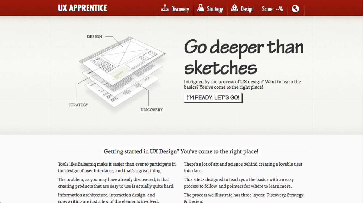
UX Apprentice is a static website that takes site visitors through a 3-step UX project to teach visitors about the process of UX. The steps the site goes through are Discovery, Strategy, Design.

As it states on the first page, each step describes what the step is all about, it provides examples, there’s a very short knowledge quiz, and a list of resources consisting of books, articles/sites, and a

As it states on the first page, each step describes what the step is all about, it provides examples, there’s a very short knowledge quiz, and a list of resources consisting of books, articles/sites, and a who’s who list of names.

Alphas:

  • Great connection between the description of the information, using the outlines and icons from the top of each page to the bottom.
  • Good use of navigation to prompt site visitors to go from one explanation to another.

Deltas:

  • The website provides a lot of information, but it’s highly biased to be accessible for people who already know a bit about UX. There just isn’t enough information to help someone who is totally new to UX get started.
  • Many of the articles are a few years old, and a few links for the books and articles are broken. For instance, I tried to take a look at the Kevin Cheng book on the Discovery page, and an article on the strategy page called “What is User Experience Strategy, Anyway?” Both links were dead. See update.
  • It’s an advertisement for Balsamiq. While I like the information this site provides, in the end the entire site is essentially an advertisement for the wireframing tool Balsamiq. It doesn’t hit you over the head with it, but it’s the truth.

Final Thoughts

I’d still recommend the site to someone as a possible resource, along with other resources, but I’d preface it by saying that there might be a lot of broken links in the reference sections.


Update

As you can read in the comments, Jessica from Balsamiq contacted me to let me know that they updated their links. I’ve checked it out and this appears to be the case.

Some of the people they’re linking to may have broken links, but that can’t be helped.

Checking out their resources, I found a 4-video series of Lean UX Strategy YouTube which I recommend because it won’t take more than 15 minutes to watch.

UX Design Fundamentals, Part 1: Getting started

Getting started in UX: a comprehensive list of resources. Part of a 3-part series on resources about the fundamentals of UX.

While I haven’t exactly been a mentor before, I have helped people learn more about the field of User Experience. In a few recent jobs, I’ve had someone ask how they can learn more about UX.

I provided my own responses, but since then I’ve come across a few different examples of comprehensive UX introductions that have a lot of good information to offer. I thought reviewing each would make a good blog post. First, I’ll include my tips, then the static examples. Finally, I’ll review a few video courses in the next post.

Part 1: My List

As I mentioned above, I’ve had people ask me about how they can learn more about UX. The thing to keep in mind is that these are people who are totally new to UX – as opposed to people who work in software development, visual design, or some other related field. Or people who’ve gone through some classes and are looking for more information.

One person in particular asked me about more information and I provided a comprehensive list of UX resources. My main focus was to provide a starting place to learn more about the field of UX, and less so about the process of UX. I’ve found that process can change, slightly or drastically, depending on where you work. I did not provide any resources on Lynda, though they’ve updated their site since then, because the resources felt like a starting point for someone who’s already gotten started in UX.


Everything below this point was originally sent in an email, called Lots of UX, though not necessarily in this order.

Also note that my links to Amazon go to smile.amazon.com, in support of the ASPCA.

One quick note!

The one thing to know about UX (which is really human-computer interaction), is that the core of it is psychology – think of it as the application of cognitive psychology. So, it can be applied in many different contexts, not just on traditional websites.

Also, not everyone who works in UX is a designer; some people only do research.

Quick Start!

Some things to think about right now, as you go about your way in the world…

Books 

  • The Design of Everyday Things – this will change the way you view the world. About Book
  • The Inmates are Running the Asylum – this discusses the importance of designing for the actual users, not the stakeholders. Book
  • Don’t Make Me Think – simple primer on what usability is all about. Can read in a day. Book
  • Universal Principles of Design – think of these as though they are from a cognitive psychology perspective vs a design perspective. Book

There are many other handbooks about actually designing and testing, but these are good to first get yourself in the right frame of mind!

Sites/Newsletters

A Few People

  • Don Norman, Jakob Nielsen, Bruce Tognazzini (I would look them up individually…)
  • Alan Cooper (designer) – …also look him up…
  • Alan Tufte – …and him, too.
  • Ben Schneiderman – see also his personal project with many names of other people you can learn about! (https://hcipioneers.wordpress.com/)

Accessibility
I don’t have a book, but you should also learn all you can about accessibility because it’s very important. It gets into the field of Ergonomics and Human Factors which is more about the design of chairs, handles, doorways, phones, etc.

http://www.w3.org/standards/webdesign/accessibility

Information-Seeking Behavior
OK, I’m sneaking this in… This is not likely in these books, because it’s a complicated, grad-level concept. Unfortunately, I wasn’t really able to find examples that are not long research papers.

Essentially, information-seeking behavior is the idea that all humans search for information in the same way that we evolved to search for food. We have a need, we act to satisfy that need, either actively or not. We do not always know for sure what we’re looking for, and so we satisfy our queries piece by piece, while all the time asking if this new information gets us closer to what we think we’re looking for or not. Like I said, it’s complicated so if this is still confusing, I can try to explain it to you in person!


Of course I then ended the email with a few nice words, but that’s my list!

The next post will be about a static site I found providing an intro to UX fundamentals, and other websites to add to this list.

Web/Portfolio Update – Part 2: Performance

Currently finished with the 90% of the HTML/CSS of my website. I found this great free photograph to use in the main image section of the site. (Looks so classy.) I need to post some of the portfolio image alternatives I came up, but decided not to use.

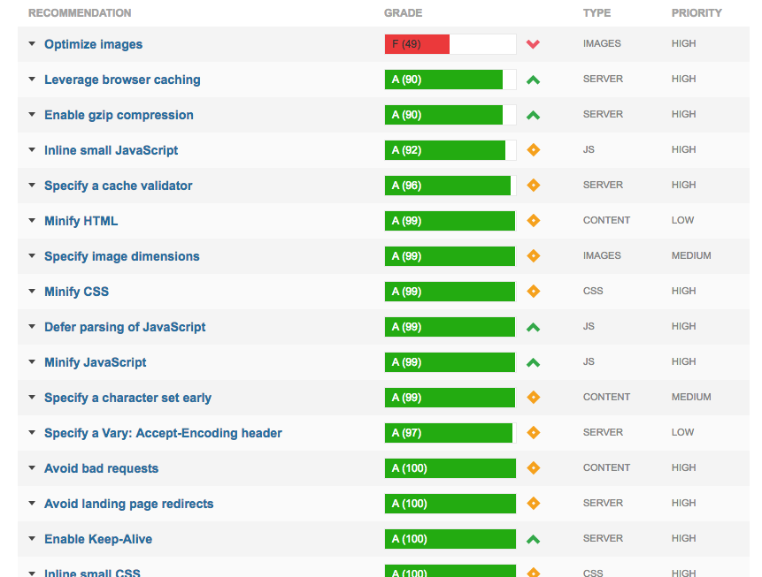
This post is all about site performance optimization, what I did and what I learned. (That big, fat, red F in my cover image is explained below!)

Getting Started
I wasn’t initially set on improving the performance of my site. (It’s only 1 page.) But, remembering all my lessons on Treehouse, I decided to minify some files anyway, like a pro. For CSS minification, here’s a nice simple site for that: cssminifier.com. This site also has a js minifier and image optimizers. In addition to working on my style.css file, I went through and deleted unnecessary classes for my font-awesome css file, and minified the CSS, since I only needed about 12 icons. (I’ve since added a few back.) I also minified the smoothscroll.js file, which gives my site that, you know, smooth scroll effect. It’s a pretty short file, but it doesn’t hurt.

Before I used cssminifier.com, I also took it through a clean CSS filter on http://www.website-performance.org/ to prettify* my style.CSS file before minifying it. While I was there, I also decided check out the site performance. Ouch! Some big issues, especially with compressing images, including my new classy photo. This is where I got started on improving site performance.

Optimizing Files
Two big problems were too many CSS calls and images that were not optimized. I realized that I needed to link to some CDNs to reduce CSS calls. Instead of including the jQuery.js, Bootstrap.js, and Bootstrap CSS files, I’m now linking to the the files via CDN. I tried using one of the above websites to optimize my images, and also convert some of them to PNGs, but the server couldn’t handle it. So I used good, old Photoshop.

“Gzip Compression”
I did not know what this term meant, but I got an F from a few site performance websites. GTMetrix explains that using a compressed, zip, file will save a lot of space. But it’s up to the browser to decide which file to use. GTMetrix and Website-Performance.org both suggested compressing my styles.ccs, bootstrap.css, and font-awesome.min.css files. Well, since I’m going to be using a CDN for the Bootstrap and jQuery files, I’m not too concerned about those. But I did continue as it advised for the relevant files.

Having done all this, I am happy my site loads fast, especially on mobile. And a learned a lot, not just from these websites, but also about the tools I used to complete them. For instance, Cyberduck, an FTP-transfer client doesn’t show .htaccess files, but Filezilla does.

screenshot of checklist of full site optimization recommendationsAnnoyances
The sites were a little pedantic about image compression, and they would complain about the need to compress images another 1-4% or so. Since I’m using a portfolio site, it’s not really that important to me to try to squeeze every last unnecessary pixel out of my images, especially since most of them aren’t visible when the page loads. The only one I might consider continue to optimize is the main hero image, because it’s the first one you see.

The optimization sites also pointed about how long it takes for an embedded Vimeo link to load. This is also not a concern for me, because the video is only visible in a pop-up. And the sites also dinged all my embedded CSS files and image files because they were not coming a CDN. I looked into the option of uploading them into a CDN, but abandoned that idea. (I think it might have required a payment, and per my previous entry, that was not going to work for me.)

Summary
For my next project, I’ll start with this site first, because it lists out everything that’s slowing down a site, such as a missing .htaccess file — or I may use it to improve the performance of my other project sites. The nice thing about the results it provides is that it’s very helpful for organizing tasks and working systematically through the performance optimization process.


* Yes, prettify is word!

Getting Simple

52weeksofUX.com has an article called, “What Does It Mean to Be Simple?“, published in 2011. The goal of the article is intended to help clarify what it means to be simple, when it comes to user experiences. It lists 3 main points:

  • Have a single core idea (not several ideas, or a partial idea)
  • Improve clarity over time (don’t overwhelm with inappropriate details)
  • Use consistency (avoid using unnecessarily unique interfaces and messages)

The author subdivides each point into more specific points, such as:

Be consistent through…Occasionally breaking the rules – know when an interface is genuinely unique–it’s probably not as often as you think.

I’d say that a lot of this advice is helpful and similar to concepts found in Don’t Make Me Think and in cognitive psychology. It’s a short read and I’d recommend the few minutes it takes to read it.

Shortly after reading the article, I came across a related question on Quora, “How to make my life simpler?” Having recently read the UX article, I wanted to see if I could extend the points in the article to other aspects of life. What I liked about doing this idea, is that 3 tips on keeping a simple life is incredibly to remember. Once you get to 5-7, even though those are easier to remember than, say 20, it’s still a lot to apply to all aspects of your life. I also liked the idea that repurposing these UX ideas would require them to become distilled down to basic points, that would possibly relate to day to day life, as opposed to just UI design.

Here is my response.

1. Focus on making your decisions binary. For example, President Obama said he chooses either a dark gray suit or a navy suit. “You’ll see I wear only gray or blue suits,” he said. “I’m trying to pare down decisions. I don’t want to make decisions about what I’m eating or wearing. Because I have too many other decisions to make.” Why Obama Doesn’t Pick Out His Own Suits: Decision Fatigue and How…

The goal is to reduce the amount of time you spend deciding on simple tasks, so that you have a greater cognitive reservoir for more important decisions.

2. Refine your life over time. As apparently many people have been doing, I recently read the book, “The Life Changing Magic of Tidying Up”. This process of tidying is something that is part of Japanese culture. There are actually a few Japanese authors who have written books on this topic, but the book by Marie Kondo is most accessible to English speakers. The main point is of this book to only have items around you that “spark joy”. In practice, this means pick your best gray and navy suits, and toss those other suits that you don’t really care for. This process involves a lot of introspection and reflection on your lifestyle and your needs. Once you do it, however, you will have a good idea of how to manage your life.

The goal is that by practicing this over time, you will eliminate items you don’t care for and only buy or keep items that bring you joy. I’ve been practicing this for a few months, and it’s so much of a relief to only keep items I truly love. (I also save money because I only shop for what I need or what I truly love.)

3. Focus on a routine. Basically, do the same thing every day. For instance, even my iPhone has started suggesting that I go to sleep at the same time every day. (I’ve actually had an alarm, for this purpose, for years.) Some people eat dinner at the same time every day, or workout early in the morning. Find your good habits and repeat them every day.

The goal is to find a pattern that works for you and that you’re comfortable with. Sometimes you’ll need to break your routine, or even change your routine, but the fact that you have one will keep your life simple.


I thought it worked, but there was still something missing. I thought about what the core message was: introspection. Understanding what’s important to each person…because having the best advice in the world means nothing if it’s irrelevant.

Several years ago, I saw a documentary film called Enlighten Up! at the IFC Center. The documentary is a skeptics take on the world of yoga. (Actually, it’s the filmmaker’s vicarious and voyeuristic film project.) Eventually, the skeptic ends up in India where he meets a guru, and is determined to get the guru to tell him which form of yoga is best for him to achieve enlightenment. The answers from the guru were enlightening:

“Everything depends on you. Hangs on you. You should feel the importance of yourself. You are the most important person for any decisions, all the decisions…

[Q. How to achieve happiness?] This is a good question. Let me put a little stress on it: [Look at how hard you are working to achieve your happiness.] Is there any happiness [in that]? You will have to question yourself. Where is it? Where can I get that happiness?

[Q. I am not a religious person.] If you don’t like [something], don’t do it. But you can still be a religious person.

[Q. How can that be?] Be yourself. Be your true self.

[Q. How do I do that?] As much as possible, try to get rid of what you are not and what you are unnecessarily wearing on yourself.

(Emphasis added.)

The guru’s final statement is what led me to add the following to my Quora answer – that ultimately what makes for a simple life is to understand of what is and what is not important to you, and to let life take its course naturally from that.

Whether or not you choose to follow these 3 tips or not, the decision is yours. To reiterate, the main thing is the self-examination of your life. In fully committing to this act, understand and appreciate your own self-worth. Understand and pursue goals that are important to you. When you find out what is truly important to you, allow yourself to decide and naturally remove what is not.*


pexels-photo-94327

So how would I turn the guru’s response into tips for simple UX design?

  1. Clearly define your goals. Know what’s truly important to achieve your goals. In the guru’s words, “Know what is true.” All manner of churn and delay will follow when goals are poorly defined.
  2. Stay on track. As much as possible, eliminate everything that doesn’t achieve these goals. This is probably as close to the 52weeksofUX article as anything.
  3. Don’t force it. If it doesn’t work, it doesn’t work. A related Italian saying, coming from the perfectly-imperfect Italian fashion sense Sprezzatura: “Always cut. Never pull”. Whatever the end result is, it should feel natural. For example, I once presented two designs for a website to my design colleagues. Everyone unanimously decided that they liked choice A over B, yet the group continued to discuss how to make B into a better design. In the end, I as the designer, recognized that the reason the group was still discussing B was because it was inferior but they were trying to force it into a better design. It was my own suggestion that because we had a good option already and we should simply eliminate option B, rather than force it to be something it wasn’t.

*Note: If I could include a clip of this one scene, I would. Unfortunately, most of the clips I found on YouTube were not great, so I’m not going to include them. I found an extended bonus clip, but it doesn’t include the parts I’m quoting above.