A recap of my recent experience with an intermediate JavaScript course on Lynda.
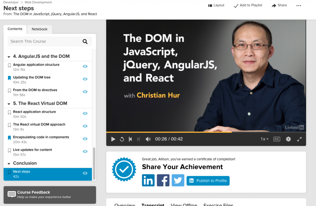
Click the image to watch the preview for ‘The DOM in JavaScript, jQuery, AngularJS, and React’ on Lynda.com.
I recently finished an interesting course on the DOM and different versions of JavaScript. I liked that it was just a taste of JavaScript, jQuery, Angular, and React. It’s called The DOM in JavaScript, jQuery, AngularJS, and React. It was released in 2017.
Much of the course was focused on regular JavaScript. I’m glad I’ve spent so much time studying JavaScript, because a lot of basic things didn’t need to be explained for me in this course.
Although I know about the DOM, using HTML, this focus on the DOM using JavaScript was an interesting approach. For instance, traversing the DOM (with classes and IDs) was fun:
document.body.children[4].children[1]
This selects the 5th child of the body, then the 2nd child from that. This is almost like using CSS selectors to select parent and child elements.
One of the things I love about Lynda is that they recommend additional courses to learn more about related topics. A few courses the instructor recommended included:
JavaScript Essential Training
jQuery for Web Designers
Angular 2 Essential Training
ReactJS Essential Training
They may have updated it, but I’ve already taken the JavaScript Essentials course before, so I’ll check if the others are already on my list. Angular is past version 2 by now, but maybe it’s easier to get started with that version.
A very brief overview of regular expressions after finishing the lessons on FreeCodeCamp.org.
Last on my list of JavaScript education was most recently regular expressions, which are ways for a programmer to search for strings in text. I followed FreeCodeCamp’s (FCC) curriculum. You can find more about Regular Expressions on MDN.
The short name for regular expressions is “regex”, or “regexp”. The basic outline of a ‘regex’ goes like this, which tests if “Happy” is in thisLine:
let thisLine = "Happy happy, joy joy!";
let thisMatch = /Happy/;
let outcome = thisMatch.test(thisLine);
console.log(outcome);
The outcome is true. The test method only results in true or false.
In addition to test, you might also use match and replace. I believe those are the only 3 methods used in the FCC set of lessons.
Let’s try match. If you wanted to match “Happy”, and only “Happy”, you’d write:
let thisLine = "Happy happy, joy joy!";
let thisMatch = /^H[a-z]+/;
let outcome = thisLine.match(thisMatch);
console.log(outcome);
The outcome is [Happy]. Probably the most important part of regex is using special characters, and that’s what’s going on in this example. The special characters are shortcuts to help you search for a specific string. This examples searches for a string starting with a capital H (^H) and is following by any letter from a-z ([a-z]), and repeats the search for as long as necessary until reaching a break (like a space) (+).
An even simpler way to write the above would be to use a special character (\w) to search for any non-digit character and flags to allow upper or lower case (i), and global to search the entire string (g).
let thisLine = "Happy happy, joy joy!";
let thisMatch = /^H\w+/ig;
let outcome = thisLine.match(thisMatch);
console.log(outcome);
You can also return only non-alphanumeric or digit characters.
let thisLine = "Happy happy, joy joy!";
let thisMatch = /\W+/ig;
let outcome = thisLine.match(thisMatch);
console.log(outcome);
The outcome is [" ",", "," ","!"]
There are many more examples of special characters, and I’ll be honest in admitting that I find it confusing. It took me a little while to figure out the second example above, partly because MDN separates their special characters onto different lines. Try these out in jsbin.
Anyway, regex are good to know if you need it.
From FreeCodeCamp:
Regular expressions are special strings that represent a search pattern. Also known as “regex” or “regexp”, they help programmers match, search, and replace text. Regular expressions can appear cryptic because a few characters have special meaning. The goal is to combine the symbols and text into a pattern that matches what you want, but only what you want. This section will cover the characters, a few shortcuts, and the common uses for writing regular expressions.
So when I was doing this project, I had this image set up in InDesign, ready to go. But, I kept skipping over it because I couldn’t figure out what to do with it. I really like this image, but it’s difficult to use because there’s so much going on.
In one of John McWade’s courses, he creates a business card for a flight instructor. And I thought, Hmmmm, I could invent a business to design for! And that’s what I did.
Rather than an airline instructor, I chose a travel agent or guide, specializing in unusual destinations or adventure travel. The company I created was called “Apex Travel”, given that the image is at the top of a mountain or hill. I chose the tagline: Travel differently.
I didn’t have a clear idea in mind of what I was ultimately going for, but I ended up created a kind of wordmark.
Results
Here is a WIP version, with guidelines in place. I ended up smushing the letters together, creating my own ligatures with the P and the E, the R and the A, and the V and the E. I also was careful to track the letters as well as I could. I used InDesign for this project.
Black and White
Finished version, b/w
Finished versions, color
I then used the landscape image, by inserting it into the letters.
Landscape, white
Landscape, black
Finally, I attempted a business card, which the travel guide would need. Probably needs a little more work.
Critique
Finished version, b/w
When I look at this now, I think the space between the A and the V kind of stands out. This is also the same amount of space as between the top of the E and the L. Of course, a good idea would be to simply fix this before posting, but in order to paste the landscape into the words, I had to create outlines. So I could do it, but it would be time-consuming at this point.
Final Thoughts
I really enjoyed all of these projects, the poster and magazine layout. Even though the business card didn’t turn out as well as the others, I enjoyed the process of creating it and the wordmark for Apex Travel.
Continuing with my ongoing education in design, I focused recently on typography and layout. And I went through two Lynda.com courses to do it.
Those courses are called Learning to Set Display Type and Learning Graphic Design: Set Perfect Text. They are both taught by John McWade.
The classes John McWade teaches are exceptional because he is such an excellent instructor and quite good at explaining the concepts he is trying to get across. I recommend both of the classes I mentioned above, as well as other classes in the Lynda library by this instructor. Here are previews of these two courses.
Neither of these classes include exercise files. But after watching both of these courses I was inspired and motivated to try my own type projects, to put his advice into use.
Type Rules I Learned
It sounds basic, but I wasn’t aware that some fonts have additional glyphs that can be used instead of the regular font. Bookmania is an example of a font with tons of extra options for letters.
I also learned about justifying text, using hyphenation and spacing to help words fit. I also learned about using hair-spaces and thin-spaces, and using drop-caps.
Actually, the class doesn’t go into how exactly one would create a dropcap. So, I turned to YouTube – or as I like to call it, the second internet – to find another tutorial.
And I found one. This one is actually by another Lynda instructor, Anne-Marie Concepcion. She makes it look so easy.
As soon as I learned how to do this, I wanted to try it right away. Voila!
Type Stuff I Made
dropcaps
Now we’re getting to the fun part. First is the dropcap I made after watching the YouTube video.
Used Bookmania and a Lynda tutorial to create a dropcap.
In this one, I was able to move the text corners so that the text flowed around the dropcap R. Looks cool.
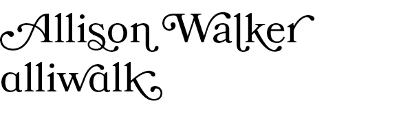
I was inspired to use the extra glyphs in Bookmania to create my own name. I used the smallcap version of the letter ‘A’ in the word, “alliwalk”.
Projects with Images
I like to collect stock photos – I know, it’s a bad habit – because I think that someday I’ll use one for a project. So, I end up with many stock photos that I don’t use. (Sometimes I use them here on my blog.) Well, I was finally able to put a few to good use.
All Dressed Up
The first is this nice “Man in a suit putting on a tie”. I wasn’t sure what I was going for. Maybe a book cover or magazine spread. But, I think what I have is some sort of flyer concept.
This image uses Bickham Script Pro and Didot.
This image uses Bickham Script Pro, which has tons of fancy glyphs, and Didot. Didot has a certain fashionable sense to it, and I think it works. I wanted this to have a bespoke aura about it, yet still masculine. The italicized Dido, and the extra swirls from Bickham Script Pro help to get that across.
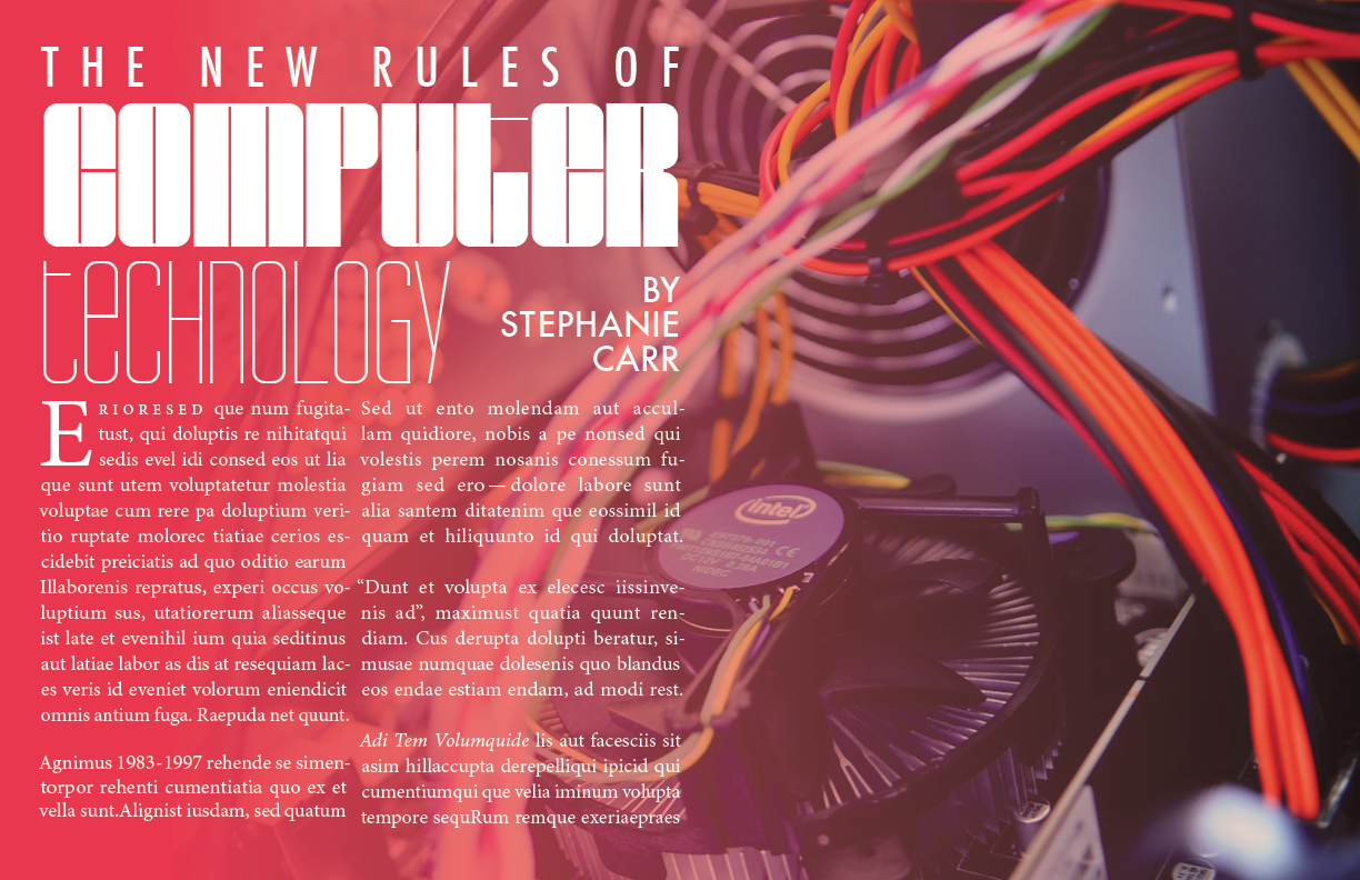
New rules of computer technology
BarryW90-Black, BarryW90-Thin, Futura Medium, and Minion Pro
In this case I wanted to use justified type, as John McWade had shown in his course. I stuck with Minion Pro, because it was easier to work with. And I added in a few random elements – a few numbers, some quotes, some pronouns – just to incorporate some of the lessons from the course. One thing I wasn’t able to replicate was keeping the subsequent letters from the word in the dropcap closer than the other words on lines 2 and 3. InDesign just wasn’t cooperating for me.
But I did enjoy this project. BarryW90-Black and Thin are highly stylized, very technical-looking fonts. I was inspired to find a new stock photo for them. Something computer-oriented.
Next time…
In my next post, I’ll talk about a few more projects in InDesign, and another type/logo(!) project I made for a fake company I invented called Apex Travel.
Continuing on from my previous post about my experience with the Khan Academy course, Pixar in a Box: The Art of Storytelling, the next lessons are ‘What if?’ and ‘World and Character’.
Lesson 3: What If?
Video 3 and Activity 3 are all about What if? Coming up with a story scenario, by asking “What if?”, the Pixar story tellers do a great job of putting popular movies into What if statements. For instance, what if our toys were sentient and could come alive? This is Toy Story.
Part A. What would the What if statements be for my favorite films?
What if unicorns still existed and could only be seen by a few people?
What if a couple accidentally adopted a girl, instead of a boy?
What if the King of England lost his mind?
What if the new Emperor of China was just a little boy?
The exercise is a little hard with true stories, but I guess they still work.
Part B: Come up with 3-5 What if stories
I have to admit something embarrassing. I created a list of about 30 what ifs about a week before I wrote this – but somehow, I lost them all! So I had to come up with new ones. I needed some inspiration.
Inspiration: Sanjay’s Super Team
For inspiration, I watched a short video called “Sanjay’s Super Team”. One of the Pixar storytellers mentions the movie. “Sanjay’s Super Team’s” What if question is: What if an Indian father could show his son, who loves action figures, what he sees when he’s praying? It is a pretty impressive video and it’s only about 7 minutes long, so no excuses!
Update: Unfortunately, Sanjay’s Super Team is no longer available online. But, there is a “Making of…” video available to view.
My What ifs?
Sanjay’s Super Team did inspire me. I didn’t come up with as many ideas this time around, but here are a few:
What if my cats could be real people?
What if pets could give their owners advice about life?
What if there was a world where your imagination rule everything?
What if my lost What if stories came true?
What if there was a land of lost and found, where every lost item lived?
What if my search to find my lost stories took me on a quest to an imaginary land, where my cats came along as my companions but were turned into humans?
Turns out, I’ve got cats and lost stories on my mind!
Lesson 4: World and Character
Part A: Identify the main characters and worlds in your three movies.
The Last Unicorn
World: Medieval world of magic. Most action is on the road or the woods, and then in a castle. Main Characters: Unicorn, Magician, Cook, Evil King Connection: I definitely connected more with the unicorn, but sometimes with the magician.
Anne of Green Gables
World: Small yet idyllic town in the 1800s. Main Characters: Anne, Marilla, Matthew, Gilbert, Donna Connection: Definitely connected with Anne!
Madness of King George
World: England, English palaces, late 1700s. Main Characters: King George, Dr Willis, Equerry Secondary: Queen, Lady Pembroke, Prime Minister, Lord Chamberlain Connection: I connected with the equerry, who’s just trying to do the right thing.
Part B: Mix characters and worlds from a different stories
Combining worlds and characters gives pretty interesting results. The first time I did this exercise, I used The Last Emperor instead of the Madness of King George. So I got Unicorn + Forbidden City combinations. The combinations that make the most sense would be Anne of Green Gables + The Last Unicorn. Helping a unicorn find other unicorns would be Anne Shirley’s life’s dream. I could also see the Evil King thriving in the Forbidden City, or the mad King George doing pretty well in the medieval world of magic.
[pic]
Part C: Pick your favorite What if statement. Imagine a possible world and character.
Going back to my favorite What if statement, I guess the last one is the most obvious. A main character would be someone socially anxious who spends a lot of time living in his head. My cats as people would be about 11 years old. One cat would be an energy-filled girl. Not that different from Anne of Green Gables, Pollyanna, or Pippi Longstocking. The other cat would be a girl that’s a little bit overweight. She would have a pleasant demeanor, but also be easily frightened. Both of them, would at times be absentminded and always ready to take naps. But they would be very loyal and supportive.
Final: Storytelling Advice
The final video in this lesson features Pixar storytellers giving advice to new storytellers. The thing that I connected with in this video, is that getting good takes practice. Even if you think you’re not getting better, what you will see over time is a stack of drawings and papers that show your progress. Sometimes what you think are mistakes are not mistakes. They are signs of the search for the right story.
It’s going to take some time for me to think about Part D of Activity 4: What would my world look like? Until then, I’m going to keep thinking about storytelling inspirations, and remember to keep chipping away at it.
I don’t know when the next section in the Khan Academy course will come out. But, in the meantime, I will post more articles about storytelling.
More artwork from Sanjay Patel, the creator of Sanjay’s Superteam, can be found at Ghee Happy. It’s just cool.
This is the third and final post in my series of posts about a project I completed as part of a Skillshare class on iOS design. This part of the course was about visual design, via a mood board and final mockups.
Mood Board
The instructor showed several inspirational examples of mood boards, including her own example for the class. I will admit at this point that this was the second time I went through the course. The first time was a quick pass to understand the process. In that first run-through, I wanted to take part in the mood board part of the course. I used my experience on another project to create 3 mood boards, which I’ve shared below. I had a lot of information before starting and it was easy to make different visual styles. So I expected that this part of the project would be exciting.
I knew going in that I was inspired by my friend’s wedding program. But I quickly learned that, aside from that, I did not have enough information about the users or client’s goals to differentiate between one mood board and another.
My first set of mood boards included 6 different color combinations! I felt ambiguous about each one. Here’s an early one where I used a lot of blue, and clips from library websites.
An early mood board that I did not go with!
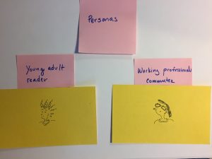
Returning to Personas?
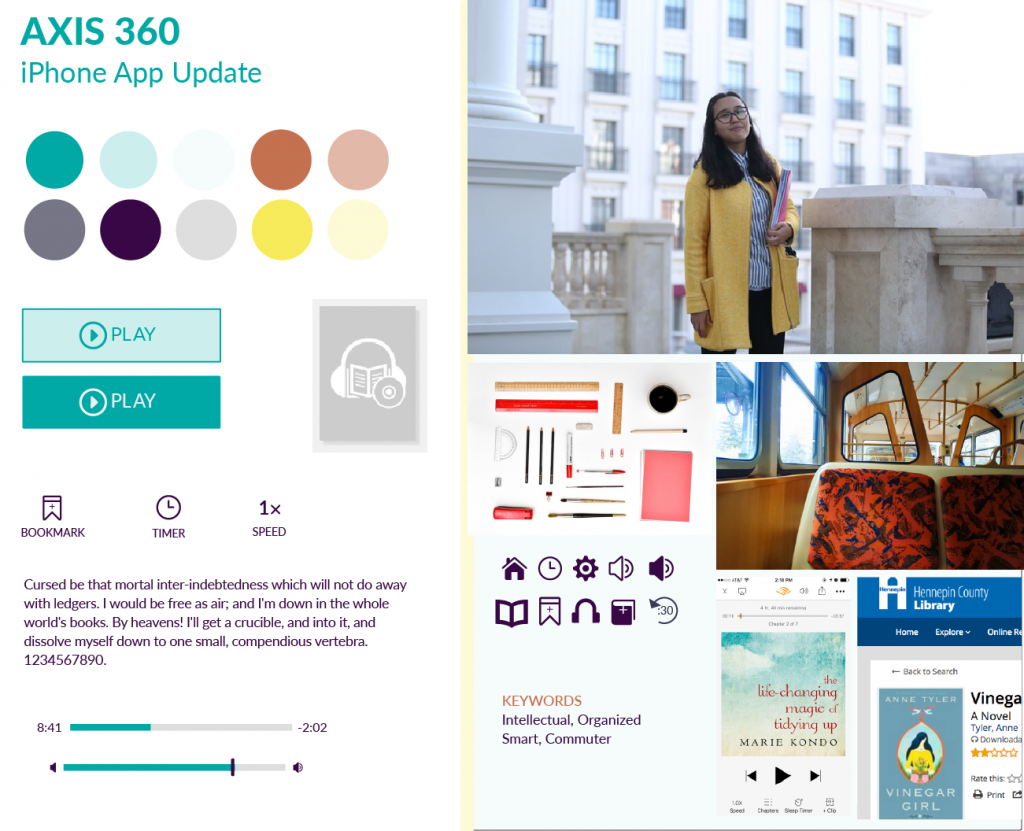
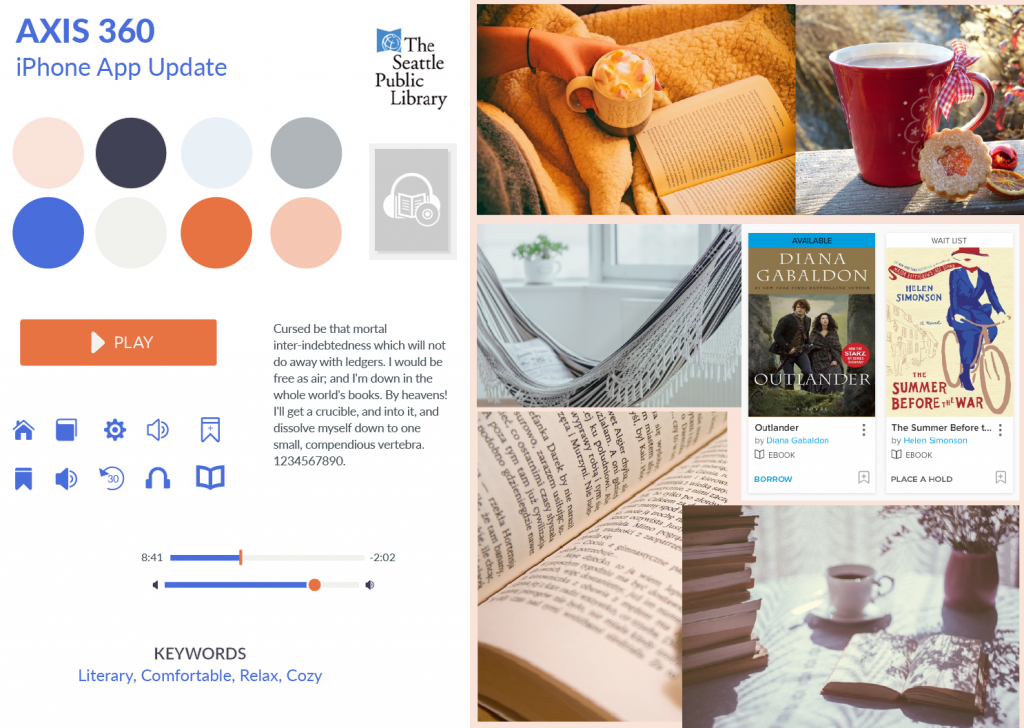
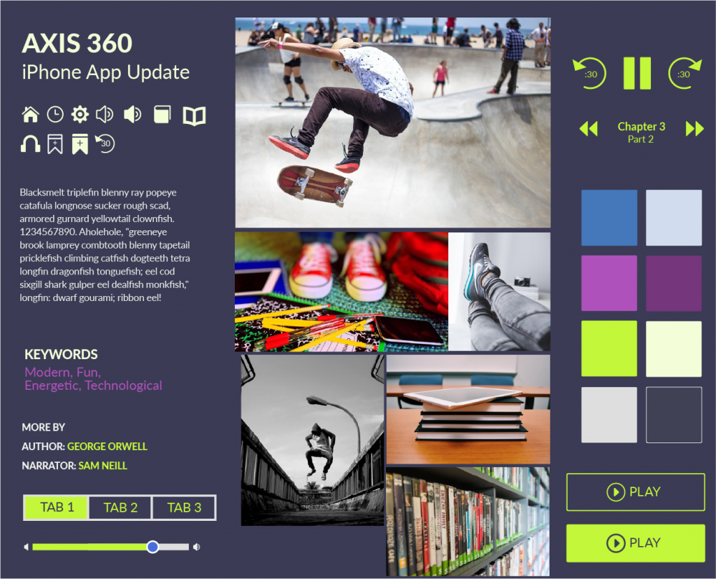
At this point, I thought back to the persona exercise and I decided to revisit this part of the project. I still believe that personas that are never verified with user or market data are useless for objectively informing user workflows and interactions. However, unverified “characters” can be helpful for putting together mood boards. (Although even then it’s good to have input from the client). Initially I had 2 characters in mind, but I ended up with 3:
a working-professional commuter
a retiree
a skateboarding middle-schooler
Here are the mood boards I put together. These were completed in Illustrator:
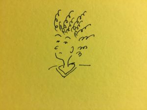
The app for this user is an escape.
This mood board is meant to capture quiet reading and relaxation.
I thought of a kid who isn’t afraid to express their personality. Someone who wouldn’t be afraid of bold colors.
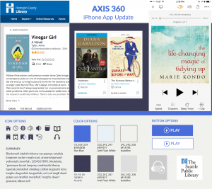
I selected the retiree character’s mood board to develop. I liked the color combinations best. The instructor suggested using a UI kit from Teehan + Lax. (Looks like their site is down, at the moment!) I thought it was a beautiful UI kit that was ugly to use. My CS5 version of Photoshop may have been to blame, but using the UI kit was more difficult than I expected. I also looked for UI kits on other websites, like Behance and Dribbble. There are many of these types of UI kits for iOS online. For example, here’s a list called “Best IOS8 / Apple Watch / UI / GUI Kits 2015 – Free Downloads“, found on jackrabbitmobile.com. Who doesn’t love free?
Anyway, for the Teehan + Lax UI kit, getting layers from one psd to another felt almost impossible. I ended up finding my own components or cutting out elements I’d made in Illustrator for the mood board. I was able to use the phone background and shadow, thankfully. Maybe they intentionally created a difficult to use psd, to encourage designers from using it. Given that I can’t even get to the UI Kit today, that might be the case.
For the work, I used layer comps to create the different states of the app I was recreating. It was helpful when exporting. I could probably use tips on proper layer naming conventions.
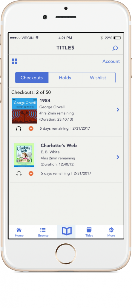
Here are the results:
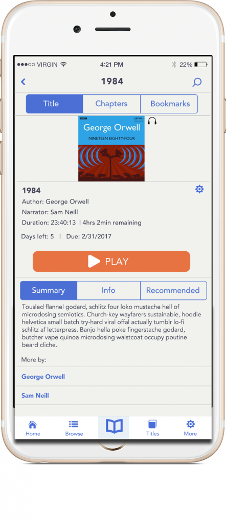
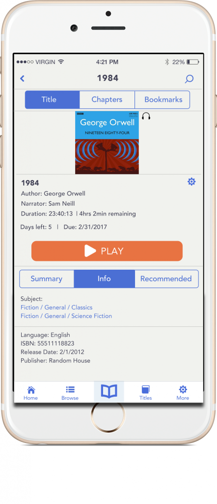
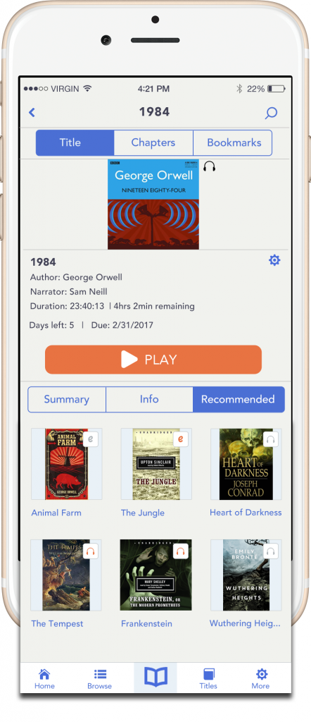
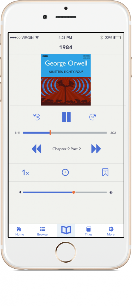
Remember what it looked like before?
Book detail
Final thoughts
The last part of the course was a prototyping section. I decided not to participate. Maybe I will take part in the prototype portion of the course, when I create more screens.
Outcome of the app
I like the final outcome of the app. I’m sure I’d get lots of good feedback from team members on small details here and there, if I had been working with others. With a team, it’s possible would have taken on more work, too. I wanted to get this done in about 1 week so I kept it simple.
Using Photoshop
Ha, well…I didn’t like working with Photoshop. That might be due to my working with CS5, but I almost quit and started using Illustrator. I can see now why Sketch has taken off so much. Photoshop is great for image editing, but it seems pretty clunky for visual design. But, I understand why it’s still used – on a team, it’s helpful to get consensus. I like putting my little web projects together straight from Sublime Text, but on those projects I’m the only critic.
Anyway, it was a fun project. I recommend the course and doing a fun, independent project like this to anyone looking for a creative outlet.