Ellen Lupton is a curator of contemporary design at Cooper Hewitt, Smithsonian Design Museum in New York City and director of the Graphic Design MFA program at Maryland Institute College of Art (MICA) in Baltimore. She is also the author of Thinking with Type, which is widely used in graphic design.
After recently browsing around on Skillshare, I discovered a few of her courses. Many are free and only around 30 min long. Here’s a short list. I haven’t taken them all, but I hope to review them sometime soon.
I’m not a big fan of the Skillshare interface — for one thing, the videos autoplay when you load the page. But, these are pretty short videos, about 30 minutes, so don’t let autoplay scare you. Plus, they’re all free.
A recap of my recent experience with an intermediate JavaScript course on Lynda.
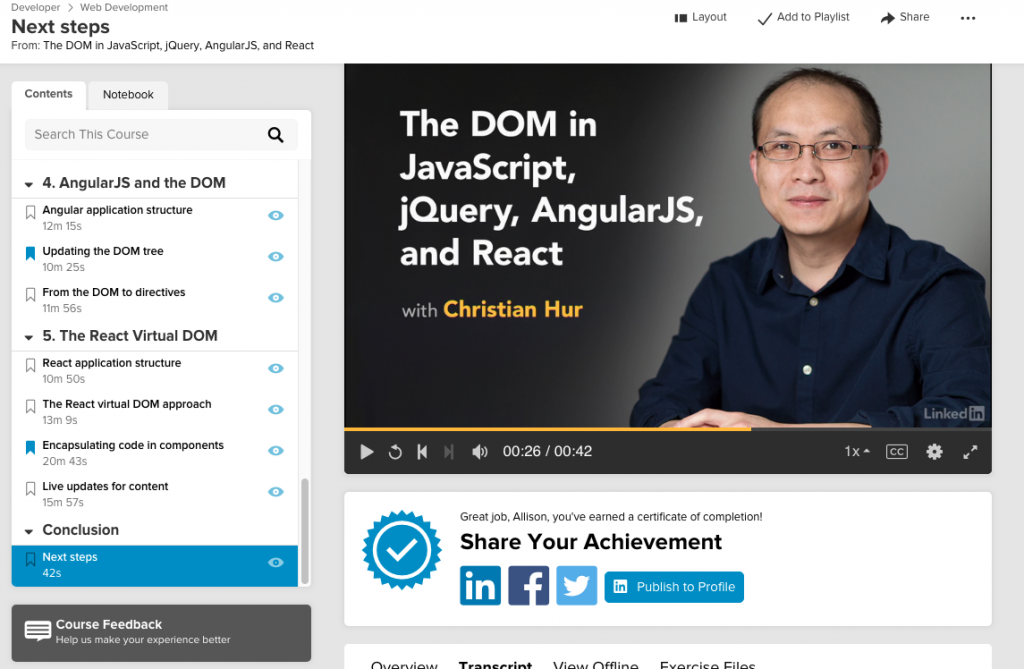
Click the image to watch the preview for ‘The DOM in JavaScript, jQuery, AngularJS, and React’ on Lynda.com.
I recently finished an interesting course on the DOM and different versions of JavaScript. I liked that it was just a taste of JavaScript, jQuery, Angular, and React. It’s called The DOM in JavaScript, jQuery, AngularJS, and React. It was released in 2017.
Much of the course was focused on regular JavaScript. I’m glad I’ve spent so much time studying JavaScript, because a lot of basic things didn’t need to be explained for me in this course.
Although I know about the DOM, using HTML, this focus on the DOM using JavaScript was an interesting approach. For instance, traversing the DOM (with classes and IDs) was fun:
document.body.children[4].children[1]
This selects the 5th child of the body, then the 2nd child from that. This is almost like using CSS selectors to select parent and child elements.
One of the things I love about Lynda is that they recommend additional courses to learn more about related topics. A few courses the instructor recommended included:
JavaScript Essential Training
jQuery for Web Designers
Angular 2 Essential Training
ReactJS Essential Training
They may have updated it, but I’ve already taken the JavaScript Essentials course before, so I’ll check if the others are already on my list. Angular is past version 2 by now, but maybe it’s easier to get started with that version.
I recently got through the Debugging set of lessons on FreeCodeCamp. Here are a few points I learned.
Error Types
There are 3 types of errors:
Syntax – misspelled word, missing parentheses, etc.
Runtime – detected while running the program.
Semantic – detected after testing output. Program works but result is wrong. Be careful!
Short List
1. Use DevTools on Chrome or Firefox
2. Use console.log(); a lot.console.log spits out the value of whatever is in the () to the browser console, which helps you keep tabs on how a value is changing in your code. Sometimes you have to move the console.log to a different place, like before or after another function, because order matters and the value of your value can change.
3. Use console.clear(); to clear the memory of a value in the console. Sometimes it’s ok to forget.
4. Use typeof to keep track of values. For instance sometimes a number is a numeral and sometimes it’s a string. Write console.log(typeof value); and that will tell you the type for value.
5. Lastly, you have to watch out for misspellings, missing brackets or parentheses, using ‘=‘ instead of ‘==‘, or getting the dreaded infinite loop.
Resume writing tips to help you get that interview.
Over the past few months, I’ve gone to the Science, Industry and Business Library (SIBL), a research branch of the NYPL, for seminars related to job hunting. The library is a great resource for all things related to business and work. They offer free seminars on entrepreneurship, retirement planning, and job hunting.
Like other NYPL free library events I’ve been to, such as the author and book talks at the Mid-Manhattan library, I initially wondered what kind of people would be there. Public libraries tend to bring in all kinds. One day I sat next to a woman with the neatest and most beautiful handwriting I had seen in a long time. I wondered why someone with such meticulous handwriting would need a seminar on job hunting. Everyone’s story is different and a lot of different people go to the library for different reasons. Anyone can use these tips regardless of their employment status. Remember: anyone can find themselves needing to update their resume!
Anyway, I’ve been sharing some of the things I’ve learned with friends, but I wanted to formally write down a few tips I’ve learned, specifically on resumes. I know how daunting it can feel to face a blank page and feel like you don’t know where to start. Or the feeling you get, driving yourself nuts, trying to update your resume for this job and that one.
So here they are. These are not my tips. These tips are the collective advice from different seminars, from about 4-5 job hunting specialists. Like all things, do what works for you.
Put the job title at the top of the resume and match it to the job posting. If the job says Instructor, but your last job was Teacher, write Instructor up top. If your last job was Web Designer and the posting says Web Specialist, put Web Specialist at the top. Pretty simple. Also, if you’re not putting the job title at the top, you should!
Keep it to one page, but don’t sell yourself short. Meaning, don’t write an essay, but if you’re cutting off your accomplishments in an attempt to get it to one page you’re only hurting yourself. I’m guilty of this one. I have been so focused on one-page, it’s led to cutting off a lot of good info. Try writing a long resume, then editing for content. Also use a good font and don’t make it too small.
You can include unpaid work. Just because you did pro-bono work and didn’t get paid doesn’t mean it doesn’t count. People reading your resume don’t need to know that project you did last year was unpaid. It was work. Go ahead and include it.
You don’t need that many resumes. The idea that you should spend time tailoring your resume for every single job is a myth. You should tailor your job title to the job you’re posting for, and update your keywords section, but you’ll drive yourself crazy trying to tailor your entire resume for every single job.
Use a keywords section. The key is differentiation. Use the section at the top of your resume to differentiate yourself from the competition. Use keywords from the job posting to catch the eye of the recruiter or hiring manager. Use a branding statement or summary to differentiate yourself from the pack.
Summarize your accomplishments at the beginning of your resume. In addition to keywords, simply include a list of maybe 4-5 accomplishments right up front on your resume. (You see? Your resume simply cannot be one-page!) You can pull these accomplishments from the rest of your resume. (Just make sure to follow the next tip.) Also, you don’t need to use the work “successfully” as an adverb. Let your accomplishments stand for themselves.
Target your resume for the industry you want to work in. When you list your accomplishments, make sure they make sense for the industry you’re targeting. Ex: If all your accomplishments sound like they’re good for banks, but you’re trying to get into fashion, update your list so they make sense for hiring manager in fashion to understand how your accomplishments will help them. This might be how you would end up with 2 resumes, with one for banking and one for fashion.
Put your name, state+ZIP, email address, phone, and LinkedIn URL in the header of your resume. Presumably, you’ll be updating LinkedIn to match your resume, so include that right in there. If you have a portfolio, probably a good idea to link to it from there, too. Are you worried about putting your email address in your resume, because you post it online? There are 2 solutions for that. 1) Don’t post your resume online. You don’t know what job you’re targeting anyway and it’s very much out of context. 2) Use an alternate email address for people to contact you. Create a pseudo-email address that you use strictly for LinkedIn or your portfolio site, so people can contact you. The advice I got from the expert is to leave it offline, then send it on request. Case in point: I’ve been contacted by headhunters who are trying to fill a job for their client before the client has fully baked their job description. Or the headhunter claims the client is looking for X, but the description is for X, Y and Z. Would you want to work for someone who doesn’t even have the time to write a basic job description? Or worse, can’t decide (or doesn’t know) what they want? This rule filters out these jobs.
If you need to, modify the presentation of your job titles/workplaces so you look your best. It’s a little confusing to understand, so let me give an example. Let’s say your current job title is “Consultant” for a pharma company, but you’re trying to work in media. And you’ve been putting your workplace first, in your Experience section on your resume. What you would do here is update your “consultant” title so that it’s more descriptive of your job, and put that first and the company name second. In other words, don’t do this: HealthCareInc – Consultant, (2017-Present). Do this: Acting Head of Finance / Consultant – HealthCare Inc, (2017-Present). It will be backward, but it makes you look better.
Tell a story and be specific. Humans are natural storytellers and we love listening to stories. Stories are engaging. Like the one-page tip above, don’t sell yourself short by leaving out detail. The more specific you are, the less opportunity there is for the hiring manager to imagine something that didn’t happen and makes you look less than your best. Focus on: what (the beginning), how (the middle; the problem; what wasn’t anticipated), and the result (how you recovered, who benefitted, how much). This is tip is probably more helpful for a portfolio and for interviews, but the part about being specific I think is relevant.
Don’t let headhunters get you to rewrite your resume for their purposes. Don’t undo all your good work! Staffing agencies are trying to fill a very narrow set of criteria, to fill one single job. When I think about the resumes I’ve been writing lately, I think working with headhunters has influenced my writing a lot, in a bad way.
Get a friend to review your resume. This is just good advice in general. Have someone else take a look and check for errors, and to give their overall opinion about how you’ve written your resume – especially according to these tips.
How have these tips helped me? Well, I’m still working on it, but I have implemented other advice related to other seminar topics. Aside from resumes, they have included cover letters, LinkedIn profiles, overall job hunting, story telling, interviews, etc. And my resume has certainly expanded! It’s possible few will read past page one(?!), but my accomplishments are on the first page so I’m OK with that.
If you’re having trouble coming with accomplishments, try using the Seven Stories method to think of ideas. (Just do a Google Search, because you’ll probably have to refer to it later anyway.)
And, finally, here’s a resource if you need some help coming up with creative verbs to describe your accomplishments, livecareer.com/quintessential/action-skills. You might want to create your own list, which is what I did, to help read this list better.
Ultimately choose the tips that work best for you and help you stand out from the crowd.
A quick search for fonts that look similar to fire-writing, the handwritten font J. R. R. Tolkien invented in 1953.
I recently attended the Tolkien: Maker of Middle Earth exhibit at the Morgan Library, and I wondered if anyone had created a true Tolkin-esque font. I did a search for fonts that look similar to fire-writing, the handwritten font J.R.R Tolkien invented in 1953. You can see an example on the exhibition web page. My findings are below.
There are plenty of runic or “elvish” fonts, but I was only looking for Tolkien-esque fonts that resembled fire-writing.
I evaluated a guest and event management platform using personas, a competitive analysis, and a heuristic evaluation.
Summary
Over the course of several weeks, I completed a UX audit of a guest management platform including personas, competitive evaluation, and heuristic evaluation. The research revealed an internal user base, many usability issues, and a number of competitive features to consider for future redesigns.
Note: DOOR3 had their own UX/presentation templates, which I followed for each of these deliverables.
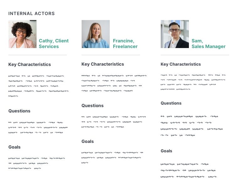
I. Personas
Personas are used by design teams to create representations of end-users that can help ground the design team in the realistic capabilities and expectations of users. I conducted interviews with the client, to learn more about their users and develop personas.
Introduction
The template for DOOR3 organized personas by the following:
Characteristics: What do we know about them?
Goals:What are they trying to achieve by using our product or service
Questions: What are some of the common questions they have while using our product?
Personas were then separated into Internal Actors and External Actors.
Client Interviews
In order to answer these questions, I set up an interview with one of their lead client services managers and a product manager. I also read job descriptions for some of clients they worked with, such as an event manager or director of development. Using this information, I created six personas, which the client reviewed and validated.
“Internal actors” are primary users.
“External actors” are secondary users.
(Note: These are replicated originals.)
3 Key Learnings
I learned three key pieces of information that affected the user experience:
Roles & Permissions Restricted Functionality: User roles and permissions was a core aspect of the user experience. Many functions required could only be accessed if permission was granted by admins.
Internal Core User Group: Most end users were internal members of the client services team; many did not have admin access. Only a small minority of users were actual customers. Of those, only a rare few had accessed the site independently. There were no plans to add user registration so that new customers could sign up on their own.
Extensive Training Required: I learned that the platform required a significant amount of training before users could became sufficiently productive. The reasons for this became clear during the heuristic evaluation.
II. Competitive Evaluation
The competitive evaluation or analysis is a common stage in product design. I identified at least 20 competitors and related industries, to gain knowledge of industry conventions and identify potentially useful features.
3 Tiers of Competition
To locate competitors, I reviewed Capterra and Software Suggest, and included obvious choices such as Eventbrite and Splashthat. I included a few I’d learned of during the interviews. Competitors were organized into 3 tiers of competition: direct, secondary, tertiary.
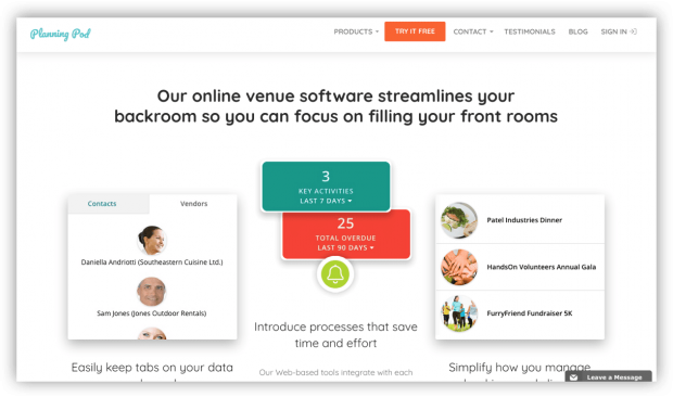
Planning Pod, a direct competitor, has a robust set of features focused on event and guest management.
Secondary Competitors
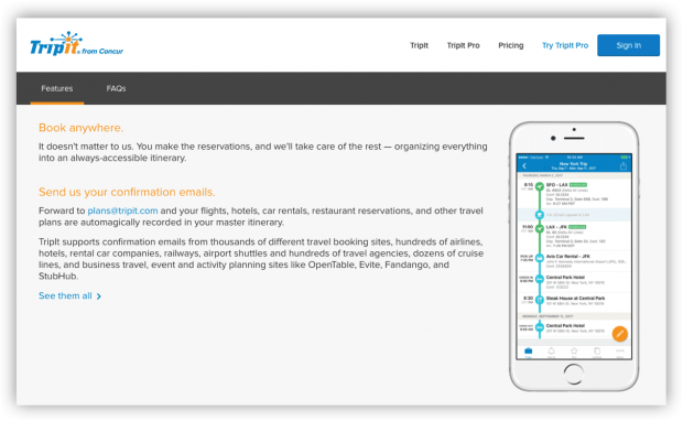
Offered the same functionality but specialized in specific types of events, like weddings or travel. I identified 2 and evaluated 1: TripIt.
TripIt specializes in helping their users keep track of travel itinerary. The client’s owner said he was a user of TripIt.
Tertiary competitors
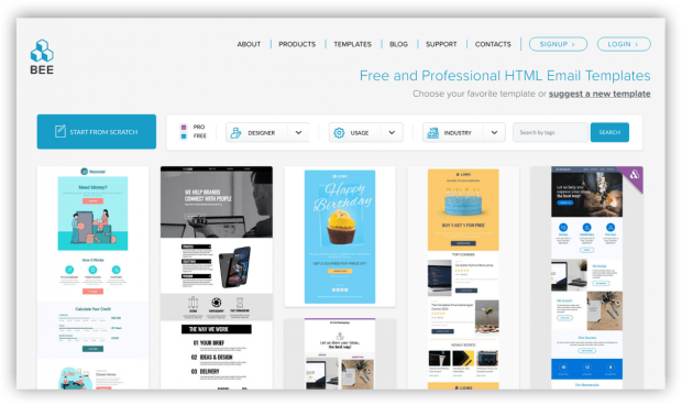
Represented tools or industries that the users encountered frequently as a part of their work, such as airline websites or industry news. I identified 7 options and evaluated 4: SendGrid, BeeFree, Flight Stats, BizBash. These services specialized in only certain features and I wanted to review the functionality they did well.
BeeFree (BEE) has services related to email marketing. I reviewed this tool because it was mentioned by the client. I was impressed by the cute animations and whimsical email character throughout the site.
4 Categories of Findings
Findings were organized into 4 categories, based on functionality or features users would be likely to find important. Examples are below:
Competitive Overall Features — integrations with third-party apps and services, (e.g., MailChimp, GoldStar, Zapier, etc); branded user profiles
Platform-Specific Features — ability to create and share a favorites list or vision board; easy access to help or reference guide
Design and Information Architecture — high-contrast between foreground and background colors; strong global and sub-task navigation
Additional Event Capabilities — real-time RFID event tracking; ability to preview and export name badges
III. Heuristic Evaluation
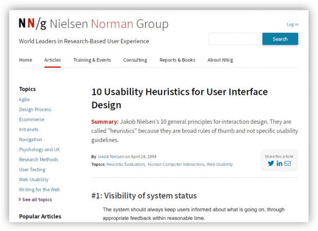
The bulk of my time was spent on the heuristic evaluation. In a heuristic evaluation, a UX expert uses an established guideline to identify potential usability issues.
A large number of issues were revealed during the heuristic evaluation. While many were not critical, the cumulative amount was a concern.
I identified over 70 usability issues, from their main platform as well as their public website. For each usability issue, I included a suggested recommendation on how to fix it. I also included an appendix with additional UX references on typography, accessibility, and navigation.
Many of the main issues had to do with inconsistent use of UI elements, navigation, or labels, as well as accessibility issues like low contrast. There were also technical issues, cryptic error messages, and confusing workflows.
Presentation of Findings
I presented the evaluation so that the most important findings came first, then organized the rest of the findings by section such as groups or account tools.
Since their users were internal, I focused on the connection between usability issues and productivity — that is, a interface with a shorter learning curve would save money in training and overhead costs.
During my presentation to the client, they revealed that they were aware of many of the usability and design issues I identified, but they had been backlogged in favor of “hot fixes” due to many issues in the code.
Outcome: Prioritization
The DOOR3 team worked with the client to help identify all the issues with the platform — front-end, back-end, design, future features. The issues were then prioritized, so that they could be put into a backlog and managed over time.
The client continued working with DOOR3 on engineering updates and some design updates.
Thanks for visiting! Feel free to read my latest blog post, or if you came from my portfolio head back there.