In a previous post, I mentioned attending World Information Architecture Day 2017, in New York City, and how I connected with a few of the presentations. I also mentioned a decision to put together a post collecting videos and links from other cities.
Since I only speak English, I’ll only include the videos and presentations that are in English. But, presentations took place all over the world and there are presentations in other languages, so do your own search if you are looking for more presentations.
It was a little difficult to find presentations, but I found some from 5 cities. I’ll post more if I find them.
I like this insight: “When we look at our products in North America, trust is generated by institutional cues, like how well a company did the past year, how many awards a product has won, etc. But in others cultures, people’s trust in a system is highly dependant[sic] on already uses it.”
Several weeks ago, I attended World Information Architecture Day, held at Bloomberg. In case you’re wondering what World Information Architecture Day is, here is an explanation from their website:
“World Information Architecture Day is a one-day annual celebration hosted by the Information Architecture Institute and held in dozens of locations across the globe.”
It takes place in 58 locations, across 24 countries, on 5 continents on one day. Pretty neat. As it was one day long so there weren’t that many presenters. Two presentations stuck out for me.
The speaker had a friendly demeanor and it’s easy to feel an emotional connection to the topic of team dynamics. I felt an easy connection to this presentation. On slide 24, the speaker talked about helping people feel comfortable being themselves. He warned that this is not the same as fitting in. He made the observation that sometimes team members can end up forming little cliques, because people like hanging out with others who are like them.
The other presentation was called Beyond User Research. It promotes using a combination of quantitative and qualitative research to continuously improve a user interface. This presentation got me thinking about the field of User Experience and remembering that it’s not all about making things look pretty. The speaker made a well-observed comment about introverts, which I connected with, too. 🙂
The presentation showed that in order to provide real value, UX designers and architects should regularly incorporate a wide variety of research into their practice. UX architects should be open to using web analytics research, in addition to traditional UX research.
I liked slide 36 because it was easy to see the relationship between the different research techniques in one view. The slide comes from an article from Nielson-Norman Group, called When to Use Which User-Experience Research Methods:
Summary: Modern day UX research methods answer a wide range of questions. To know when to use which user research method, each of 20 methods is mapped across 3 dimensions and over time within a typical product-development process.
Another Speaker Event, Meetup
Meanwhile, I’ve been trying to get out more and attend more Meetups. Shortly after the World IA Day event, I attended a Digital Product Design Meetup for the first time. The speaker for this event gave a presentation called Evolving the Design Game. There is a link to a video of the presentation. (This is video is expertly produced. Very well done.) There is no link to the slides themselves.
I didn’t have the same takeaways with this presentation as I did with the other presentations. However, the presenter did get across that he felt his work was misunderstood and under appreciated, and he felt that was true across the industry.
At one point in the presentation, he asked the audience about their experience with a CEO making a color change request. He said that he did not have a solution to stop that type of behavior.
Finding Solutions
At its heart, engineering is about using science to find creative, practical solutions. It is a noble profession. – Queen Elizabeth II (http://Read more at: BrainyQuote)
What popped into my head as a solution to this problem was slide 26 from the Beyond User Research presentation. I was thinking about research, not design.
I’ve observed a growing emphasis on the visual design skill of UX designers, including mandates for specific wireframe software. In contrast, I observe very little emphasis on research methods. My conclusion is that non-UX designers, coming into contact with the field, end up doing the same thing: overemphasizing looks and under-appreciating research.
The solution could be as simple as getting back to basics. A long-term commitment to research, treating every aspect of the work thoughtfully and deliberately, might help designers earn greater respect and appreciation for their work from their clients and co-workers. In an upcoming blog post, I’ll write about using the UX audit as a part of a UX research plan.
Or…maybe the answer is to watch more videos from World IA Day! In an upcoming post, or on my Tumblr, I’ll post videos or links. Or you can search on Twitter at #WIAD17 or #wiad17.
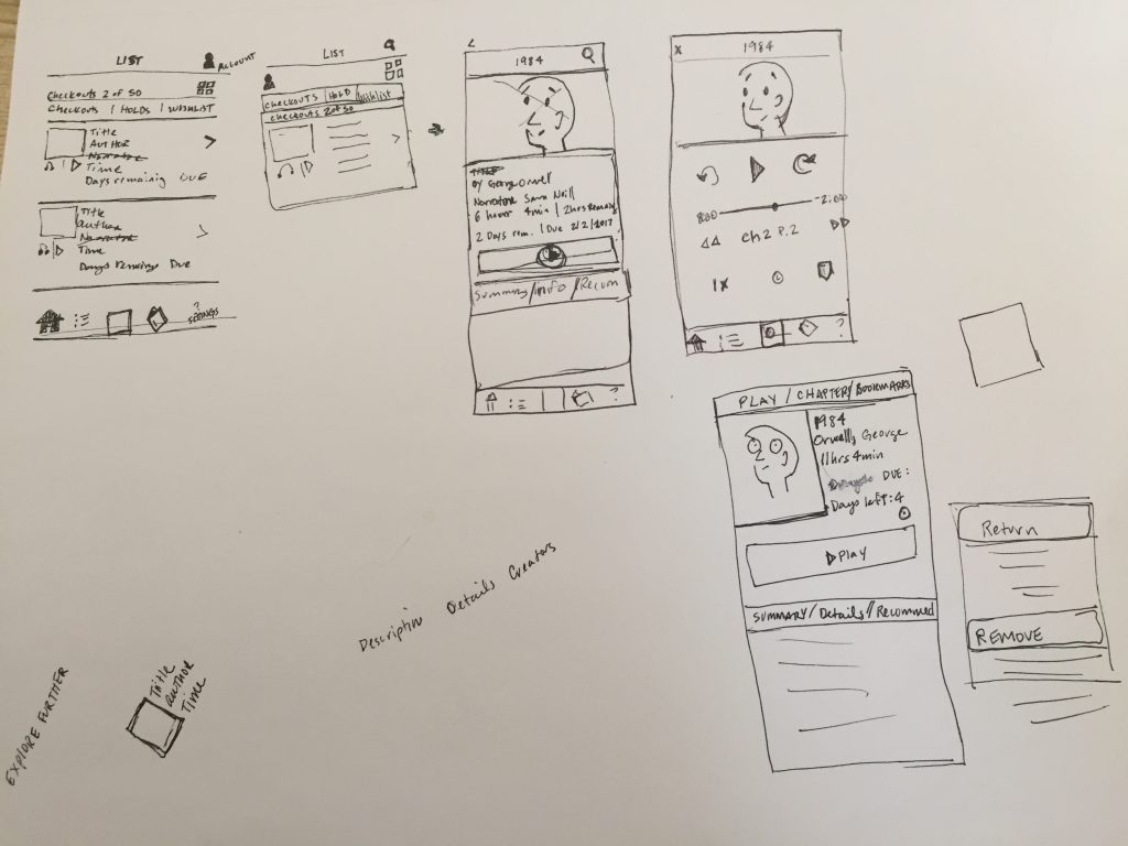
This is the third and final post in my series of posts about a project I completed as part of a Skillshare class on iOS design. This part of the course was about visual design, via a mood board and final mockups.
Mood Board
The instructor showed several inspirational examples of mood boards, including her own example for the class. I will admit at this point that this was the second time I went through the course. The first time was a quick pass to understand the process. In that first run-through, I wanted to take part in the mood board part of the course. I used my experience on another project to create 3 mood boards, which I’ve shared below. I had a lot of information before starting and it was easy to make different visual styles. So I expected that this part of the project would be exciting.
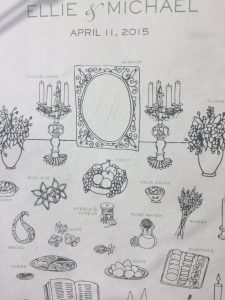
I knew going in that I was inspired by my friend’s wedding program. But I quickly learned that, aside from that, I did not have enough information about the users or client’s goals to differentiate between one mood board and another.
My first set of mood boards included 6 different color combinations! I felt ambiguous about each one. Here’s an early one where I used a lot of blue, and clips from library websites.
An early mood board that I did not go with!
Returning to Personas?
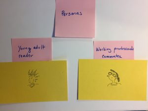
At this point, I thought back to the persona exercise and I decided to revisit this part of the project. I still believe that personas that are never verified with user or market data are useless for objectively informing user workflows and interactions. However, unverified “characters” can be helpful for putting together mood boards. (Although even then it’s good to have input from the client). Initially I had 2 characters in mind, but I ended up with 3:
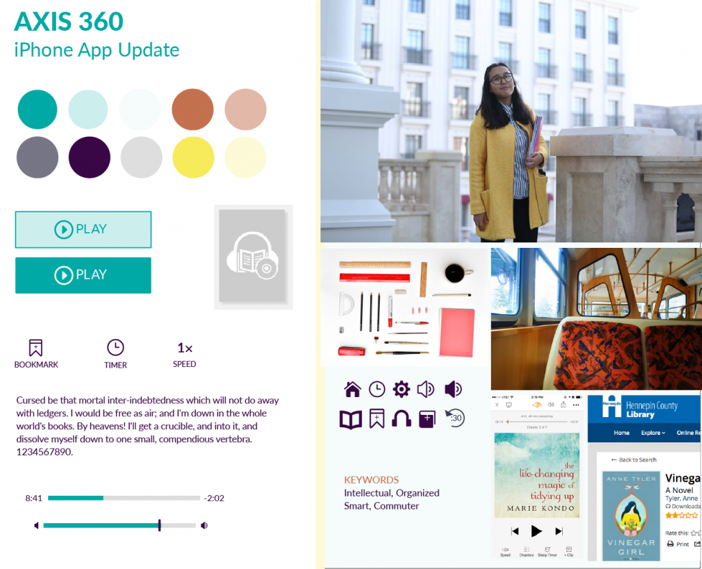
a working-professional commuter
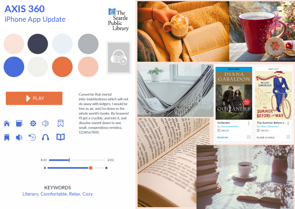
a retiree
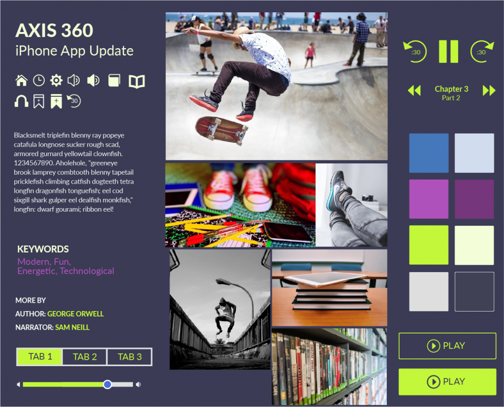
a skateboarding middle-schooler
Here are the mood boards I put together. These were completed in Illustrator:
The app for this user is an escape.
This mood board is meant to capture quiet reading and relaxation.
I thought of a kid who isn’t afraid to express their personality. Someone who wouldn’t be afraid of bold colors.
I selected the retiree character’s mood board to develop. I liked the color combinations best. The instructor suggested using a UI kit from Teehan + Lax. (Looks like their site is down, at the moment!) I thought it was a beautiful UI kit that was ugly to use. My CS5 version of Photoshop may have been to blame, but using the UI kit was more difficult than I expected. I also looked for UI kits on other websites, like Behance and Dribbble. There are many of these types of UI kits for iOS online. For example, here’s a list called “Best IOS8 / Apple Watch / UI / GUI Kits 2015 – Free Downloads“, found on jackrabbitmobile.com. Who doesn’t love free?
Anyway, for the Teehan + Lax UI kit, getting layers from one psd to another felt almost impossible. I ended up finding my own components or cutting out elements I’d made in Illustrator for the mood board. I was able to use the phone background and shadow, thankfully. Maybe they intentionally created a difficult to use psd, to encourage designers from using it. Given that I can’t even get to the UI Kit today, that might be the case.
For the work, I used layer comps to create the different states of the app I was recreating. It was helpful when exporting. I could probably use tips on proper layer naming conventions.
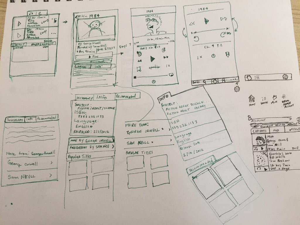
Here are the results:
Remember what it looked like before?
Book detail
Final thoughts
The last part of the course was a prototyping section. I decided not to participate. Maybe I will take part in the prototype portion of the course, when I create more screens.
Outcome of the app
I like the final outcome of the app. I’m sure I’d get lots of good feedback from team members on small details here and there, if I had been working with others. With a team, it’s possible would have taken on more work, too. I wanted to get this done in about 1 week so I kept it simple.
Using Photoshop
Ha, well…I didn’t like working with Photoshop. That might be due to my working with CS5, but I almost quit and started using Illustrator. I can see now why Sketch has taken off so much. Photoshop is great for image editing, but it seems pretty clunky for visual design. But, I understand why it’s still used – on a team, it’s helpful to get consensus. I like putting my little web projects together straight from Sublime Text, but on those projects I’m the only critic.
Anyway, it was a fun project. I recommend the course and doing a fun, independent project like this to anyone looking for a creative outlet.
In my last post, I discussed a project I had been completing as part of a Skillshare class. This is the second post in that series.
Sketches
As I left off in my last post, I skipped over the persona portion of the course. I did return, in part, to personas but not until the visual design.
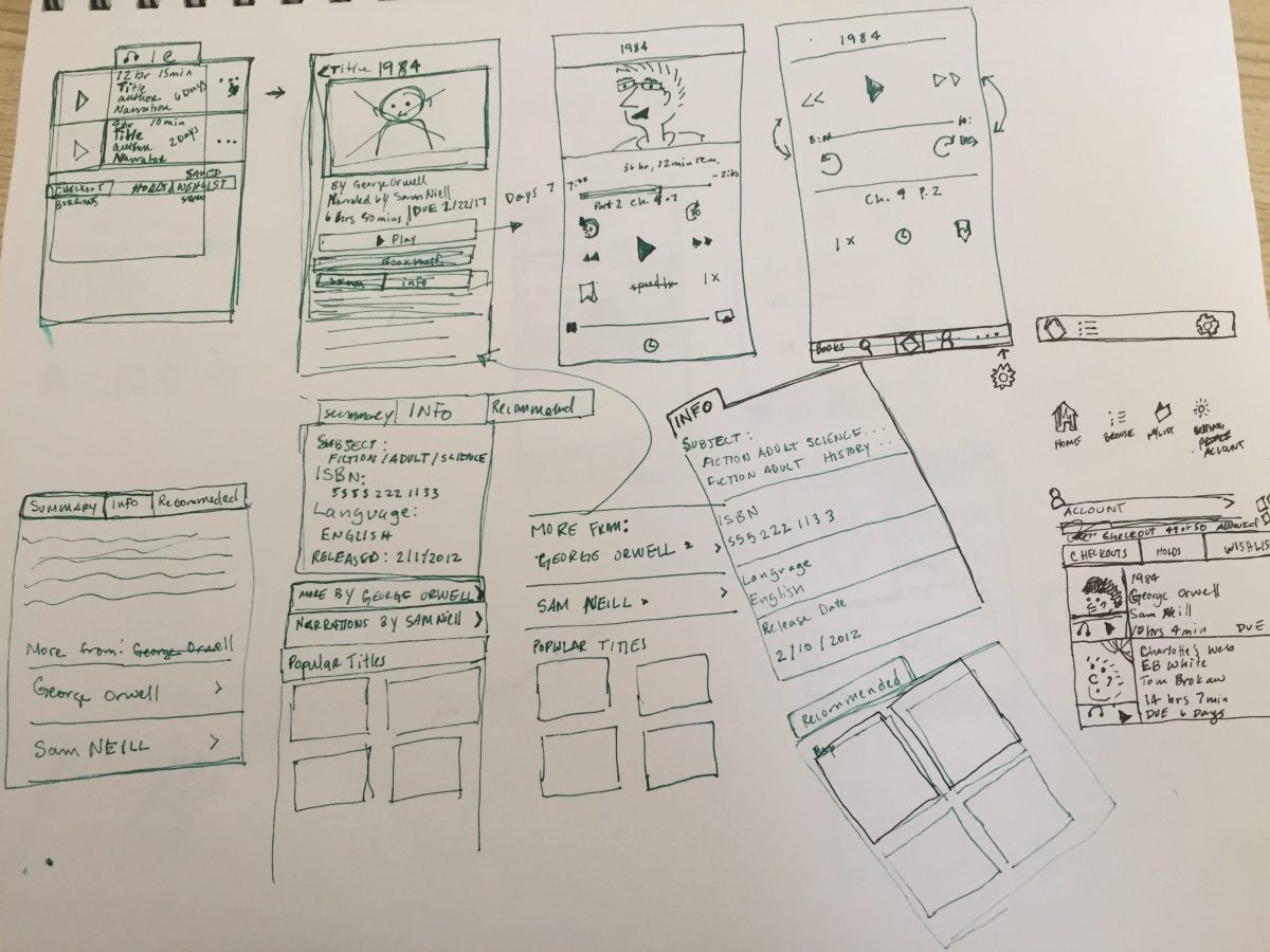
I ended up doing about 3 pages of sketches. My documentation shows how I worked out smaller interaction elements, like navigation elements.
Sketches
Sketches (green ink)
Final sketches
This is the part of the workflow is where the interaction design and user experience start to come together. The instructor chose to update the Southwest app. The visual design looked great and I liked her workflow overall. But there was a piece of this workflow that was missing – and that was competitive research. There was little in the way of looking at related apps to get an idea of what people might experience from something similar.
It’s easier to become efficient with a new interface if it contains familiar elements. This is one reason why I research competitors. I’ve also found that using real life examples helps convince others on the team that the product is actually feasible and can implemented as designed.
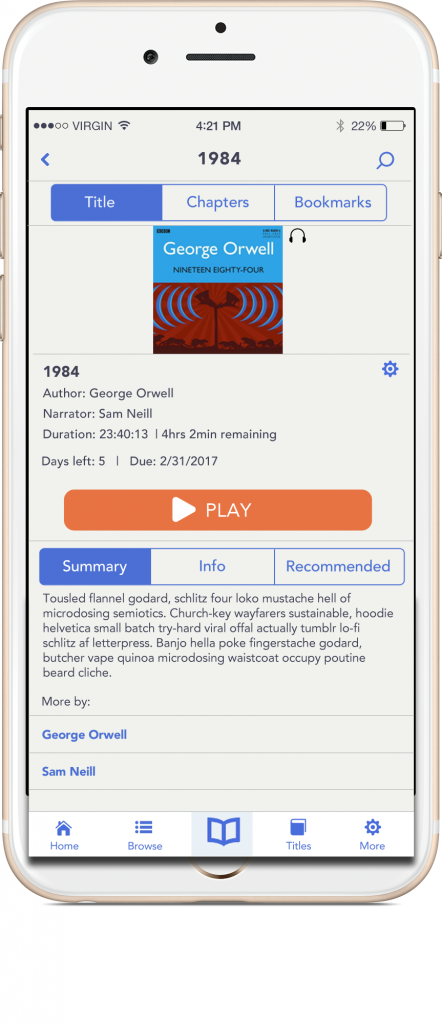
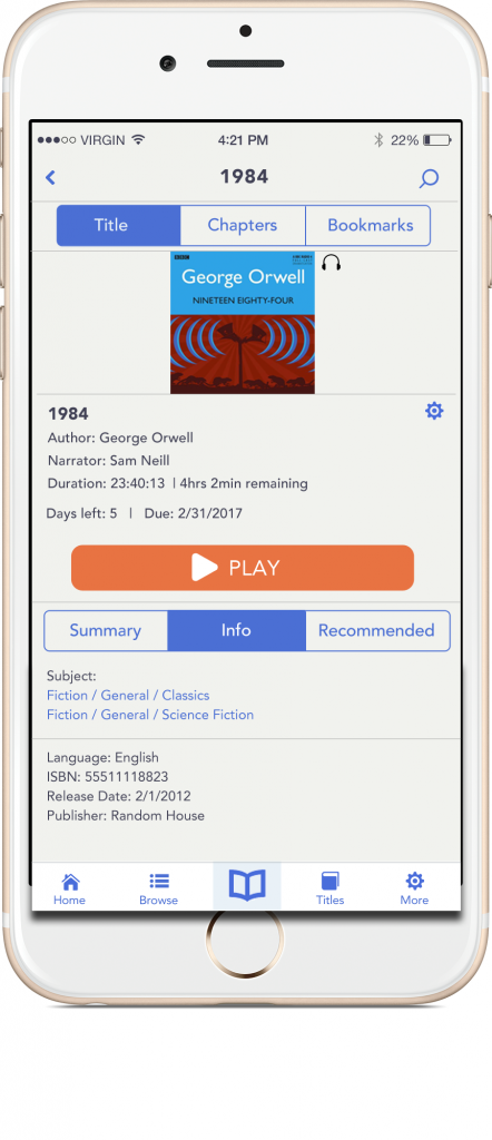
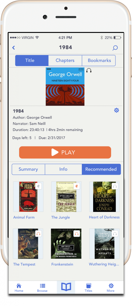
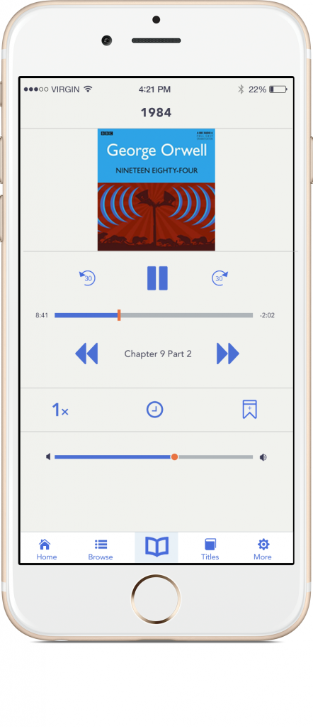
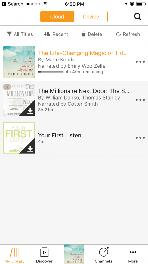
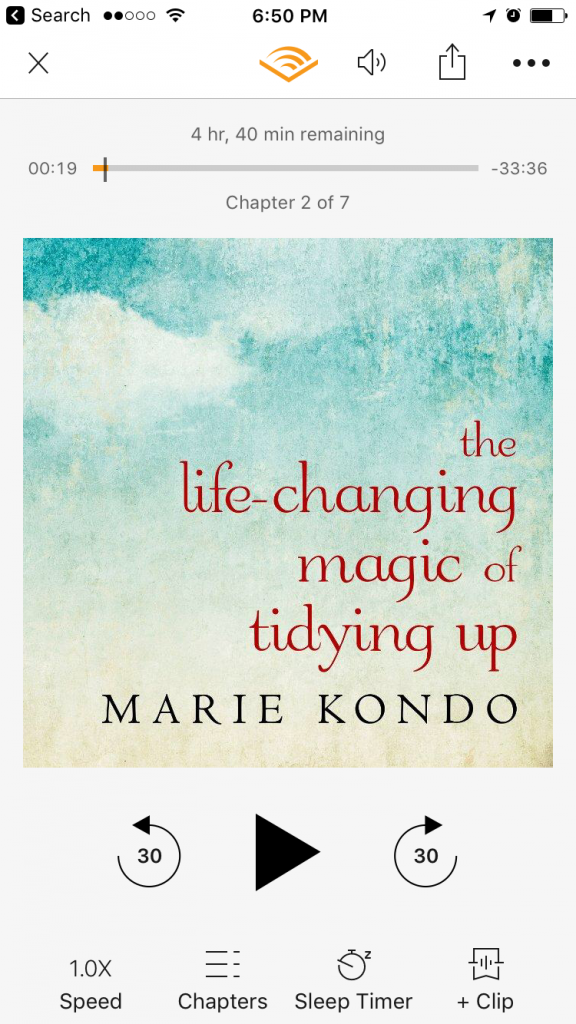
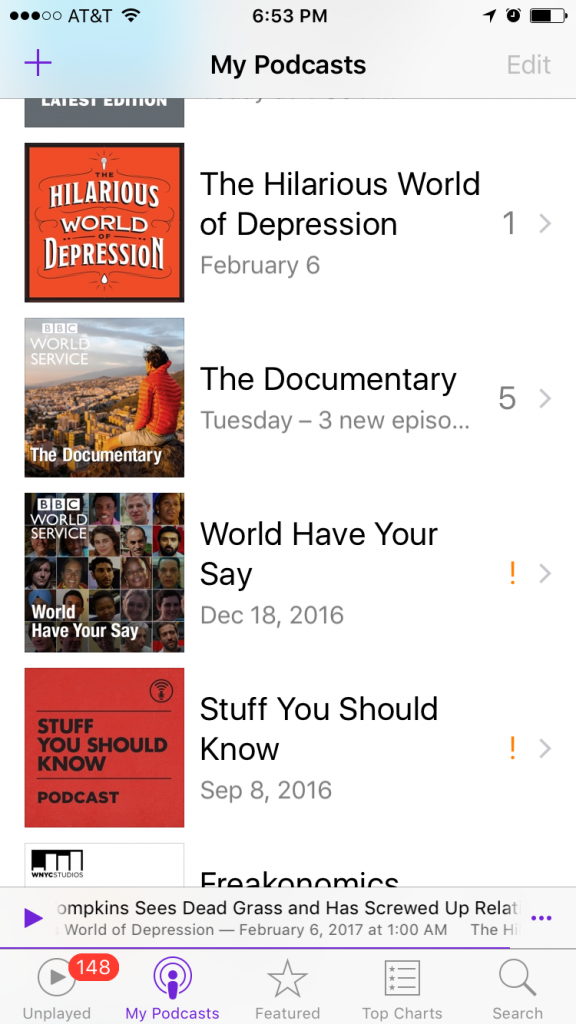
I did some looking around on my own, finding screenshots from different library websites. The Audible, the Apple Music and Podcast apps, and SoundCloud were helpful. It may be confirmation bias, but this competitive research was far more useful than the personas I didn’t create.
Audible books
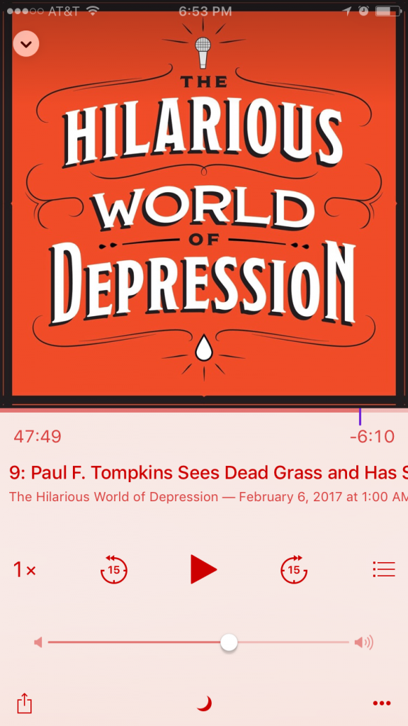
Audible playback
My Podcasts
Podcast playback
SoundCloud
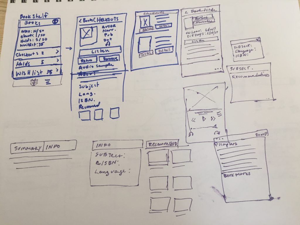
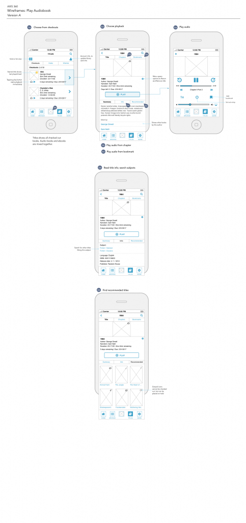
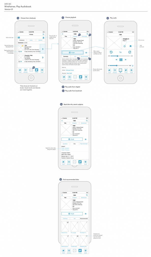
Wireframes
The difference in the wireframes for this project, and projects I’ve done at work, is how she used a vertical layout to present her work. I thought that was pretty smart. And, though it wasn’t specified in the course, I included annotations because I wanted to include ambiguity. (Normally I’d include more.)
For the actual wireframes, I created 2 layouts. I noticed when reviewing the other apps that there’s often a large image in the center of the screen. I felt that this was unnecessary, especially on the playback screen. My solution was to reduce it and focus on the controls.
Final wires
Traditional alternative
Next Post…
The next and final post in this series will be about the visual design work I did for this project.
As I mentioned in a previous post, I recently completed a Skillshare class on iOS design. The focus of the course is to take an existing app and update it. Part 1 of the 3-part course is all about UX design. The instructor takes students through planning, personas, user journeys, and wireframes. Here is the work I did for Part 1.
Planning
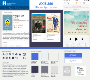
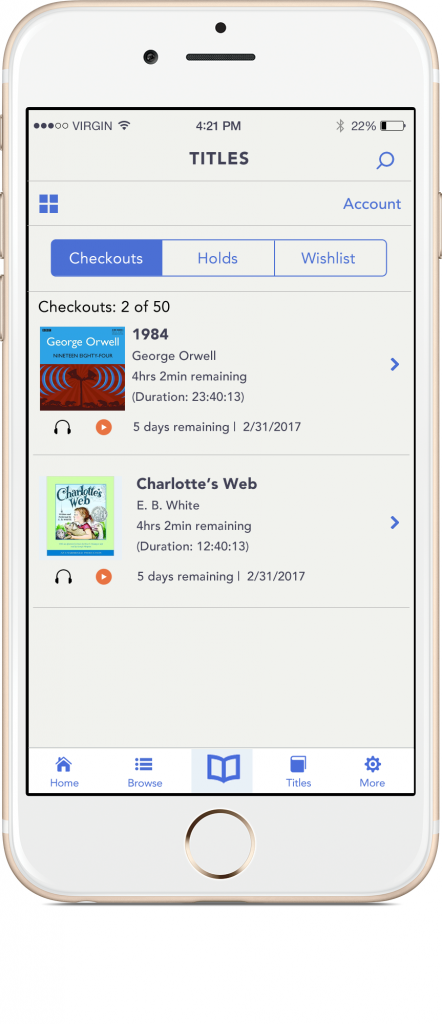
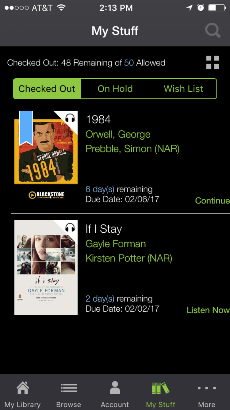
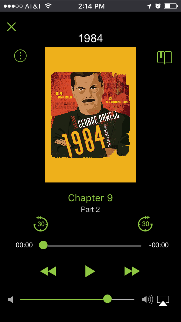
The app I selected was Axis 360. This is an app that allows people to checkout audiobooks and e-books using their library card. It’s an app that I’ve been using quite a bit and I wanted to focus on improving it if possible.
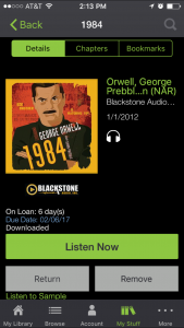
The first thing I did was take screenshots of the existing app.
“My Stuff”
Book detail
Playback
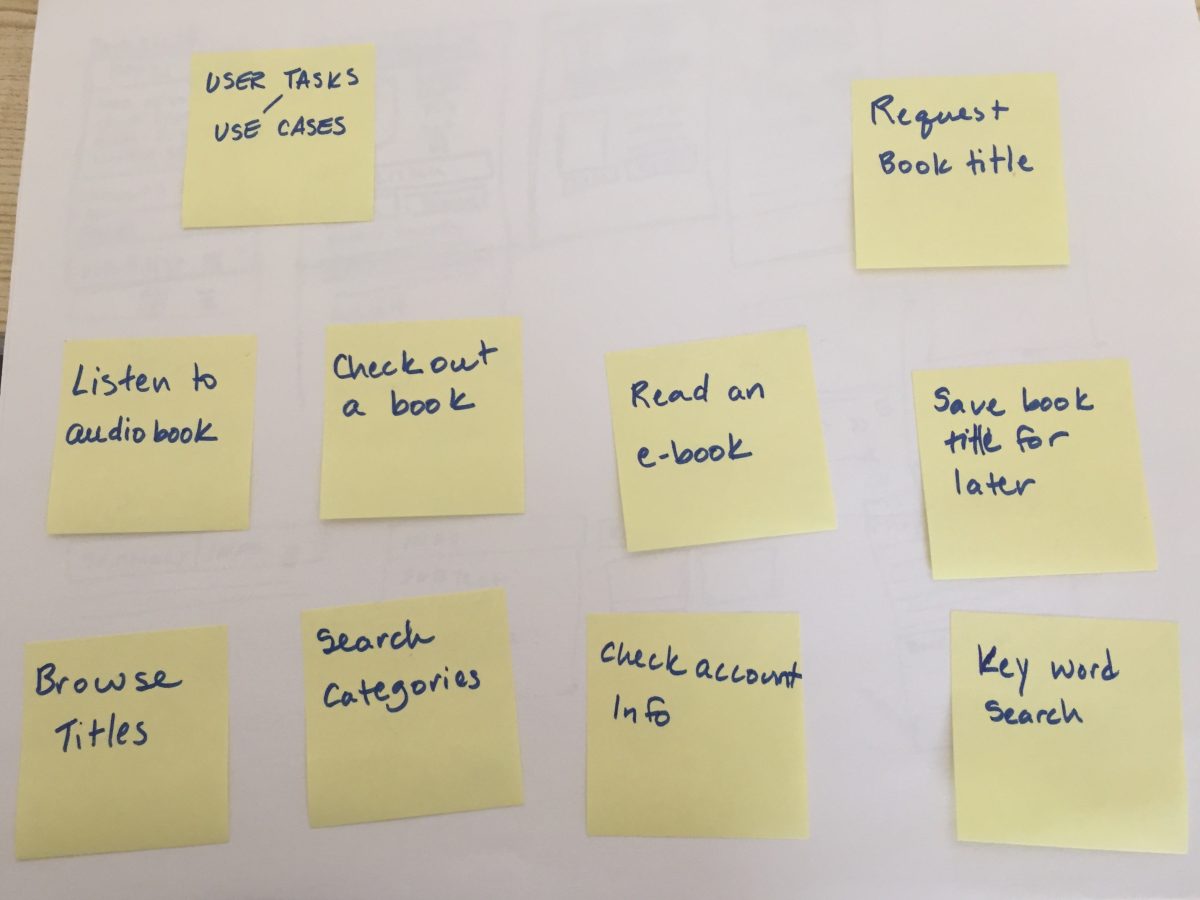
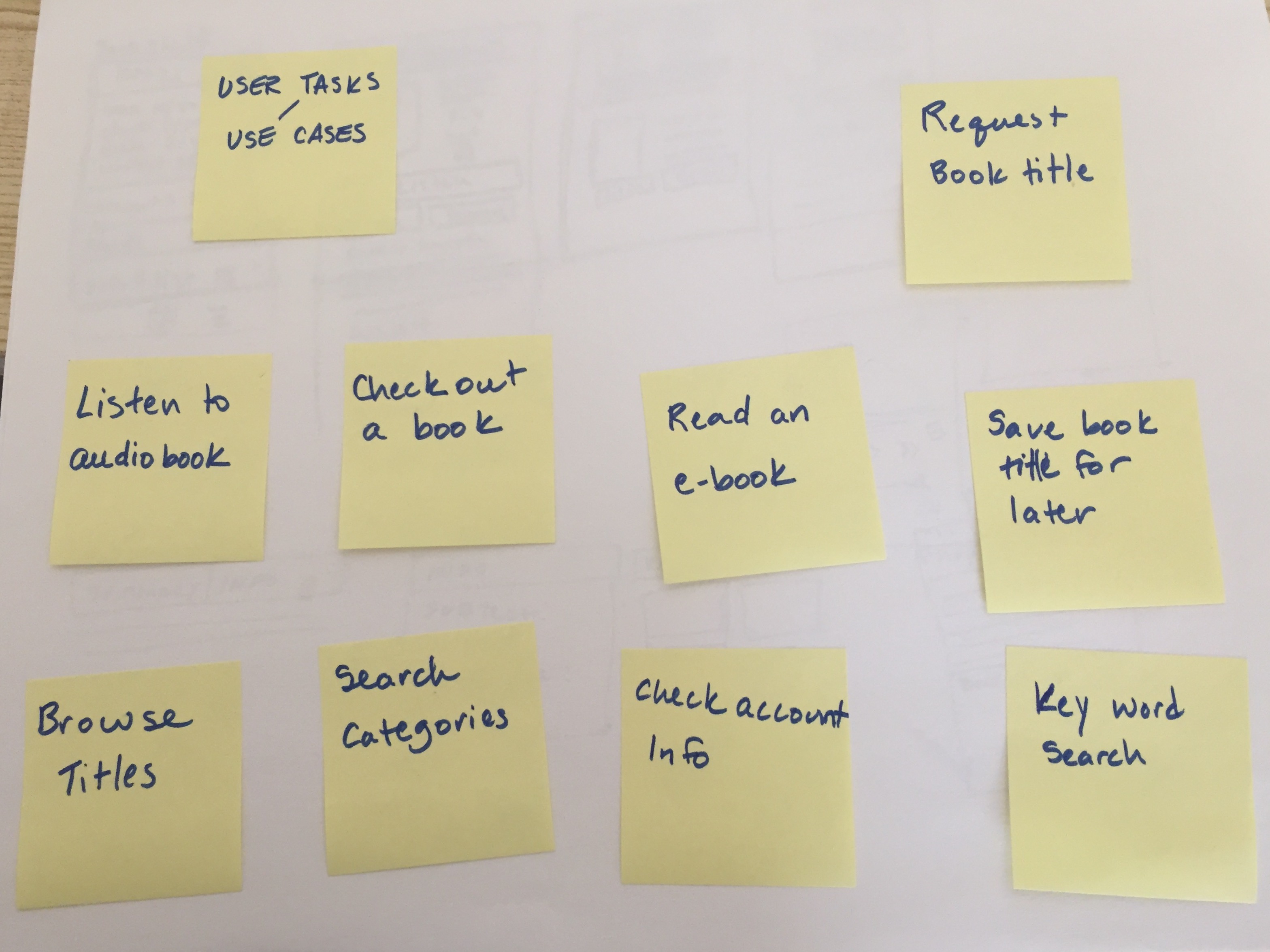
The course then begins by creating a high level list of activities someone can complete on the app. I focused on listening to an audiobook. The instructor used sticky notes, so I did too.
Scenarios. (You can see sketches on the reverse page.)
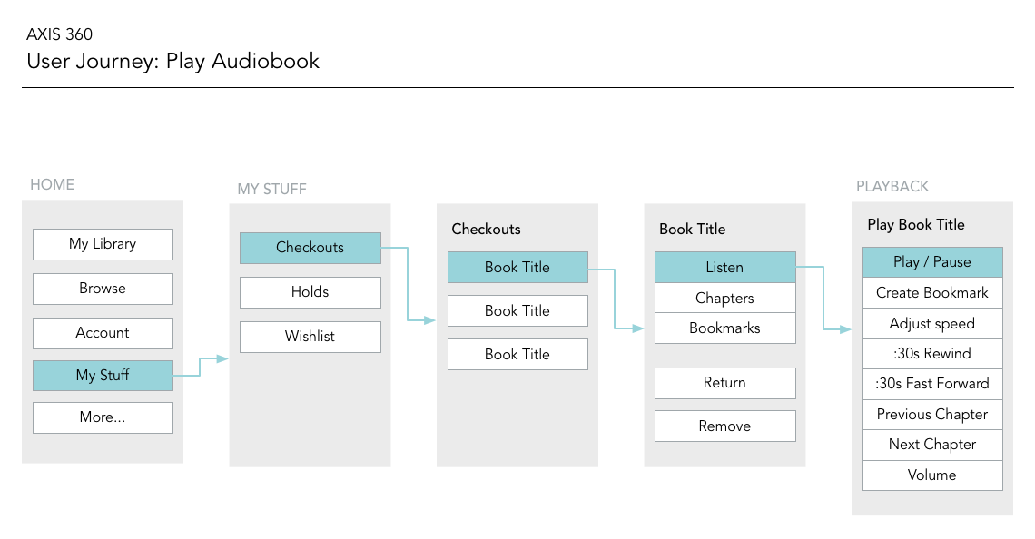
User Journey
From there, I created a high-level user journey. This includes a screen with a list of checked out books, a book detail screen, and a playback screen.
User Journey, for Axis 360
Personas
At this point in the course, the instructor introduced personas. In this case, these were proto-personas. I admit that I did not complete this part of the 3-part course.
My philosophy is that personas are only useful if they can be validated by objective data. This includes providing completed personas to a client, or by interviewing potential users. In my case, I had neither a client nor potential users. Unvalidated user needs, demographic data (age, marriage status, gender), and interests (stock-car racing) would be a work of fiction and thus useless in directing the experience. So, I skipped this step, although I came back to it during the visual design phase.
Next up…
In the next post, I’ll talk about sketches and wireframes.
Following up my earlier posts about online resources that teach the fundamentals of UX, here is a review of a few video courses. There are a lot of good websites and “schools” that specialize in video-based learning. The courses I’m reviewing today are from Lynda and Skillshare.
Overview
Lynda offers classes on many creative topics. Topics include web design, graphic design, programming, music composition, and more. It’s a great site to use to get structured overview of a topic. For instance, if you want to learn the basics of After Effects, Lynda would be a good source. It’s been around for a while, but somehow many of their courses still seem relevant. Lynda offers a consistent site experience with high production quality. Sometimes it can seem like their courses are out of date.
Skillshare also offers classes on creative topics. I haven’t checked, but they seem to have a few more lettering courses. The service is new and they don’t have as much content as Lynda. Skillshare emphasizes the teachers over the subjects. Teachers sign up to teach classes; they do their own recording and supply site the content. The result is that the site experience is inconsistent. Some classes are good, but have low production quality. But since it seems like a startup, the content feels more “fresh”.
Membership
Lynda is by paid membership only, although you can get a free trial for 10 days. They have paid plans for individual members and organizations, that start at around $25/month. But, many public libraries will let their patrons sign up for free Lynda memberships. Check with your local library to see if they offer this, and if they do you’re all set. If not, you can still sign up with Lynda by getting a library card with another city. Although the rules for out-of-town library cards depends on each library.
Skillshare requires site registration, but it has both free and paid accounts. The paid accounts are “premium” accounts which opens up “premium” classes. I was able to find a 3-month coupon for Skillshare which allowed me to take a few premium classes. I am not confident in recommending a premium account, though. I am not convinced premium classes are “better” than non-premium. Unfortunately, Skillshare is still too inconsistent for me to recommend a premium account.
Teaching style
If it hasn’t become obvious yet, I am a Lynda. I prefer the Lynda teaching style, for a few reasons. One reason is that each instructor is very rehearsed before they record their lesson. The result is a smooth lesson with instructors that speak with clarity about their topic. Lessons are well-organized and logical, with the course description listing class topics.
Some Skillshare instructors are well-rehearsed but many others are not. Even having an organized instructor doesn’t always result in a good class. One pet peeve of mine is the poor audio quality for most Skillshare lessons. Lynda classes sound high-end. I suspect they are either recorded in a sound studio or with a good microphone on a set. In comparison, Skillshare instructors sound amateur, recorded at home or with inferior microphones. You may find yourself adjusting the sound level between lessons. The course descriptions are pretty good, but they could be better with a list of the class topics.
Relevant classes
Finally, the relevant classes! Remember, the classes I am reviewing fit the pattern of being either a what is UX class or a how to UX class. That’s what I’ll go through next with Lynda and Skillshare.
Lynda
What is UX
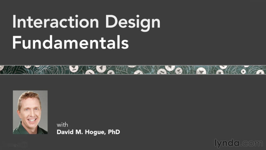
Interaction Design Fundamentals with David Hogue provides an overview of interaction design. What I liked about this class was that it described theory and application. For instance, there was a lesson on tools, and then another lesson on UX principles. Course topics included cognition, neural models, and vision. They even mentioned cognitive load! I definitely recommend this 3-hour class.
Interaction Design Fundamentals with David Hogue (Lynda)
How to UX
UX Design Techniques, from instructor Chris Nodder, is all about how to do UX. This is actually a set of 7 videos, that go from user analysis to implementation. Topics include observation and experience mapping. Techniques include as personas, scenarios, storyboards, and paper prototyping. Each lesson builds on the previous one. There’s a UX playlist that only includes 6 courses, so make sure to include this one if you decide to take this course, too.
Analyzing User Data with Chris Nodder (Lynda)
I enjoyed this class a lot. I became a fan of the method he describes. It seems fun to create paper prototypes. My only hesitation with this method is that it might be difficult for teams of one. It also focused on building a new product. I find that I get involved in many redesigns of existing products.
Skillshare
On Skillshare, there are again two sets classes I want to mention focused on what is UX and how to UX.
What is UX
The What is UX class is UX Design Fundamentals: Everything You Need to Know (and More) by Joe Natoli. The description for this premium class states that it is a comprehensive overview on UX. This is a 12-hour, 8 chapter course. Each video is between 8-15 minutes long.
I’m not against long classes, and 12 hours sounds like you’re getting your money’s worth. Yet…I couldn’t finish the course. Despite this instructor being well-organized, he has a speaking style that is too hard to follow. His style is too loose and casual. He has a tendency to interject rhetorical jokes and questions. And he makes statements that only serve to confirm his own points, such as below:
Paths on the other hand are what users leave to enter and leave. (pause) Ok? Pretty straightforward.
“Ok? Pretty straightforward” may not sound like much. But, it’s pretty noticeable when happens in every other sentence.
I also noticed that the slides don’t always match the voiceover. I felt that I was constantly fighting a cognitive disconnect between what I was seeing and what I was hearing.
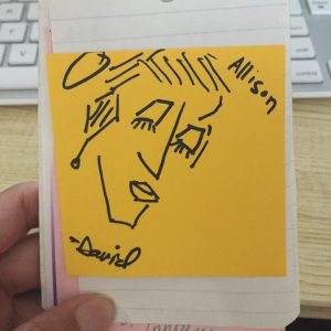
To summarize, I do not recommend this class. It’s far too long and his speaking style will drive you nuts. In lieu of a screenshot from the course, I will include this Placekitten.
Placekitten
How to UX
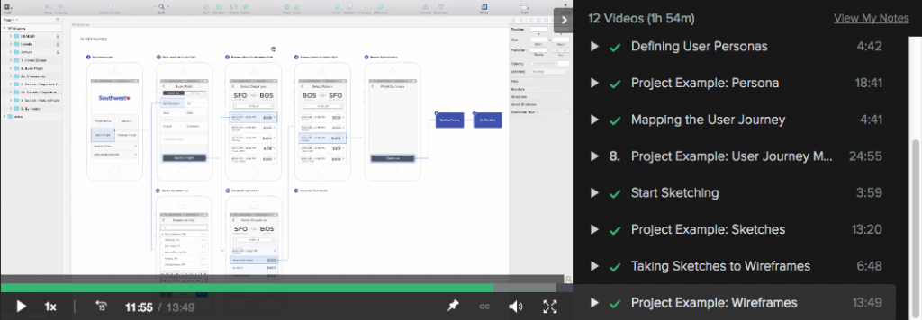
iOS Designby Kara Hoedecker is a good hands-on course in UX design. This is a three-part course on redesigning a mobile app.
She takes the class from planning stages and sketching, through wireframes and visual design. She ends with prototyping and testing. Her class wasn’t perfect: she had some technical issues with her class. For instance, her cat walking into the room where she was recording was pretty cute. Her longest class is almost 2 hours; the shortest is a little over 30 min.
iOS Design I: Getting Started with UX (Skillshare)
What I liked about this class was how she went through the class. First, she presented the idea and what the final outcome should be. Then she went through the exercise herself, showing how she did the work. This was important for me because when I watched her going over her work, I felt very confident that I could do the work, too. I was so confident, I ended up doing my own project. (I’ll post my work in a separate post since this one has become so long.)
She also emphasized sketching a bit more so than I’ve done in the past. Her course includes visual design, so it expands the definition of UX to a wider range of skills than is typically associated with UX.
Conclusion
If you like video-based learning, Lynda and Skillshare both offer courses on UX theory and techniques. My conclusion is that Lynda is more consistent overall. Skillshare has some good resources, but it’s a little hit or miss without a premium account. As for what I learned, I liked the sense of accomplishment I had completing the Skillshare course. There were a few techniques from each course that I look forward to using soon, such as the sticky-note experience mapping or group ideation sessions from the Lynda course. I also hope to use sketching more than usual, and I will start taking on UI design tasks. A combination the techniques used in each class would be beneficial in any UX practice.